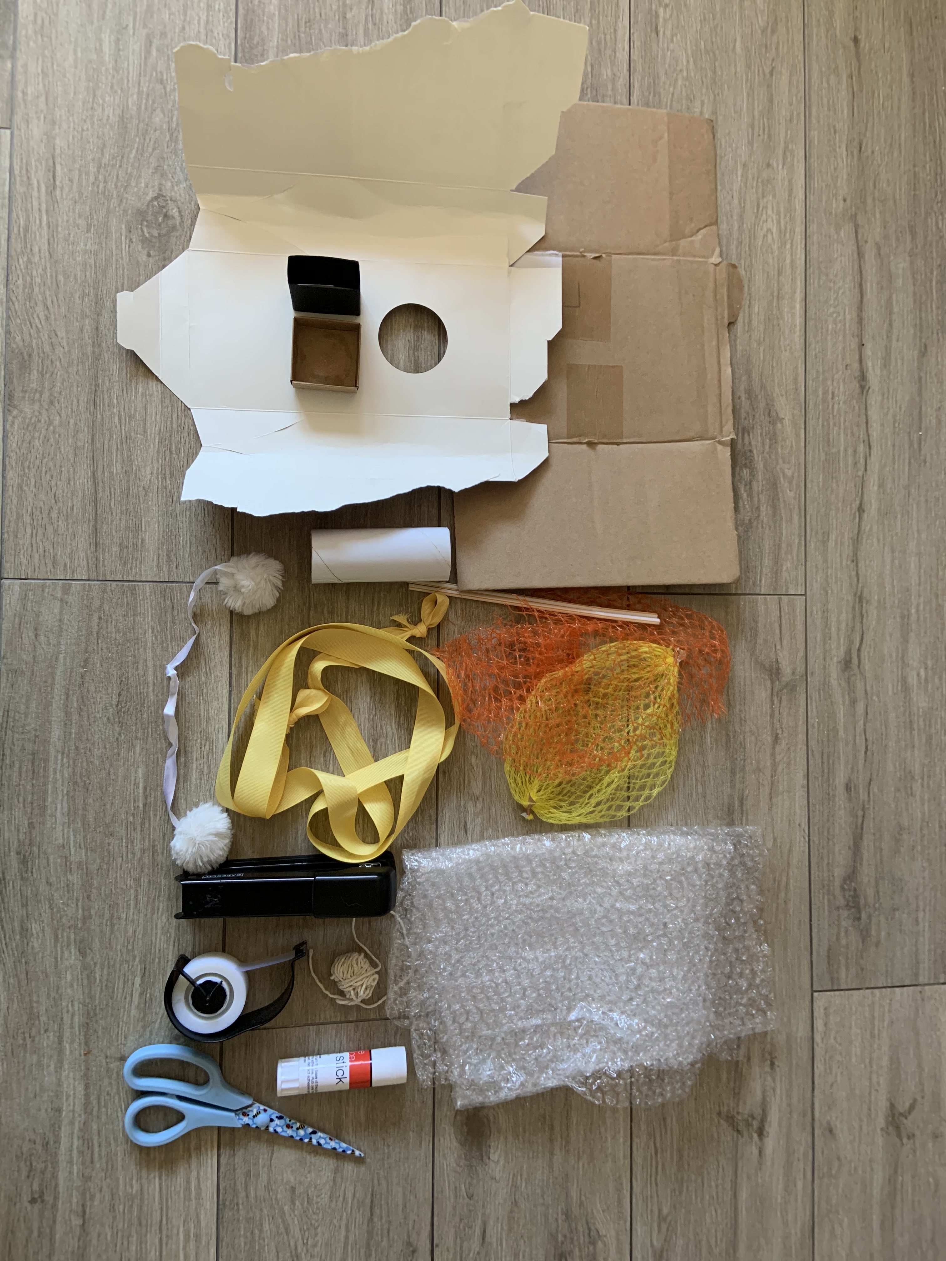
I gathered some materials, not knowing which of them I’ll need. Just collected some scraps I was hoping will be useful for this exercise.
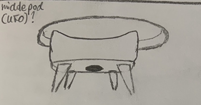
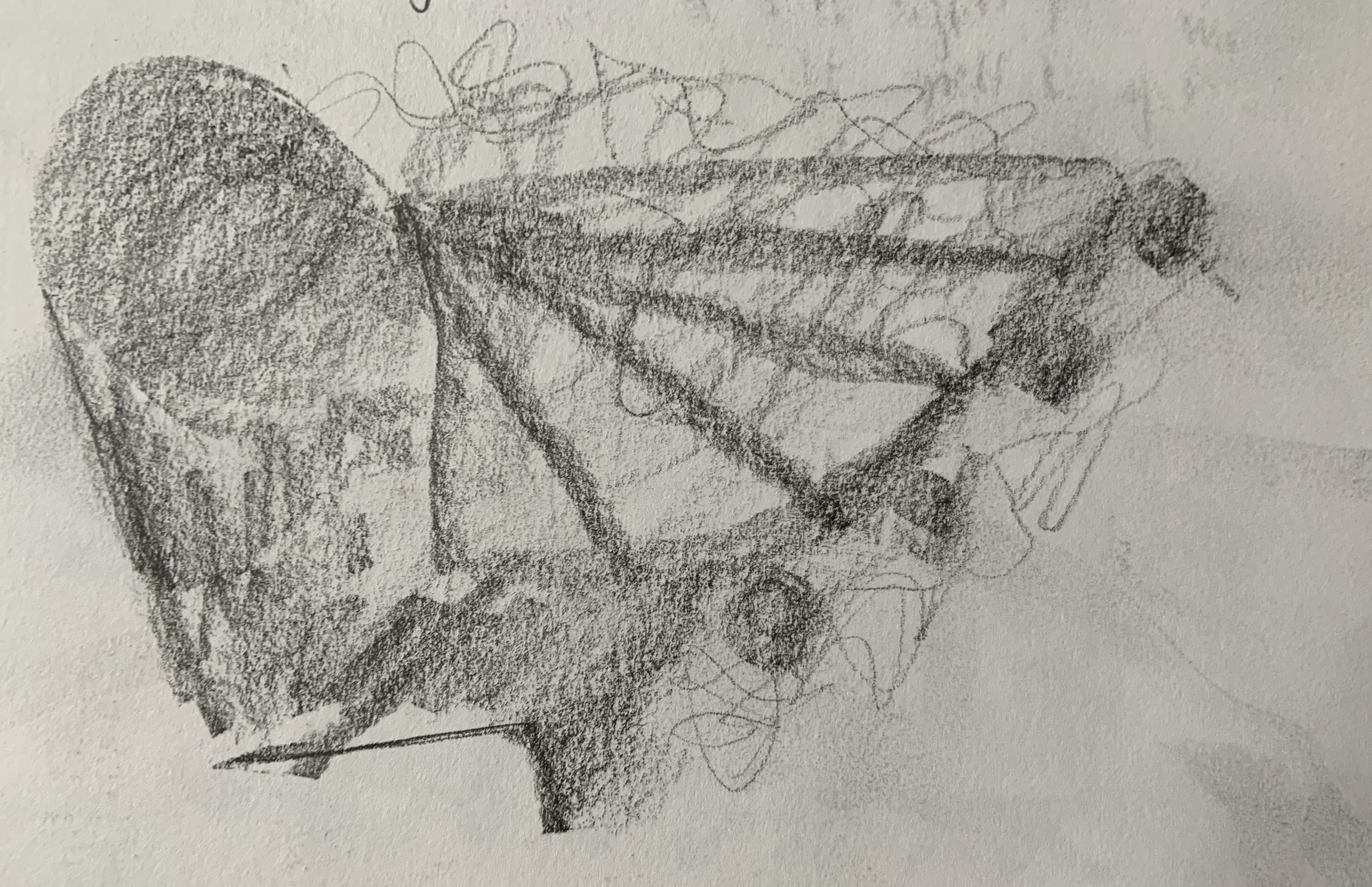
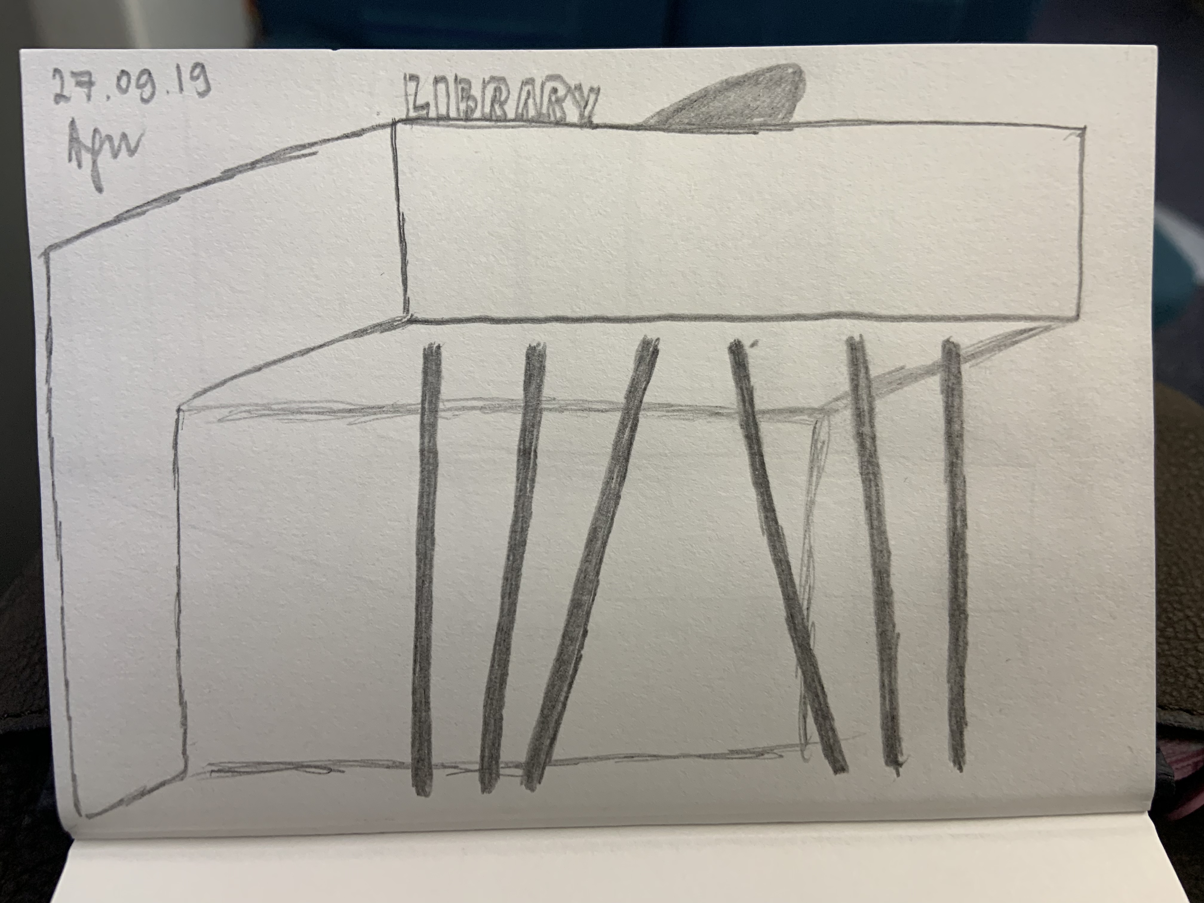
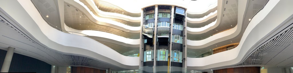
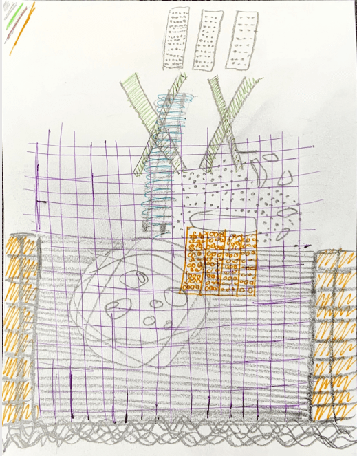
I had a look through my drawings from my second visit to Peckham Library. At first I was going to try and recreate this drawing into 3D sketch model:
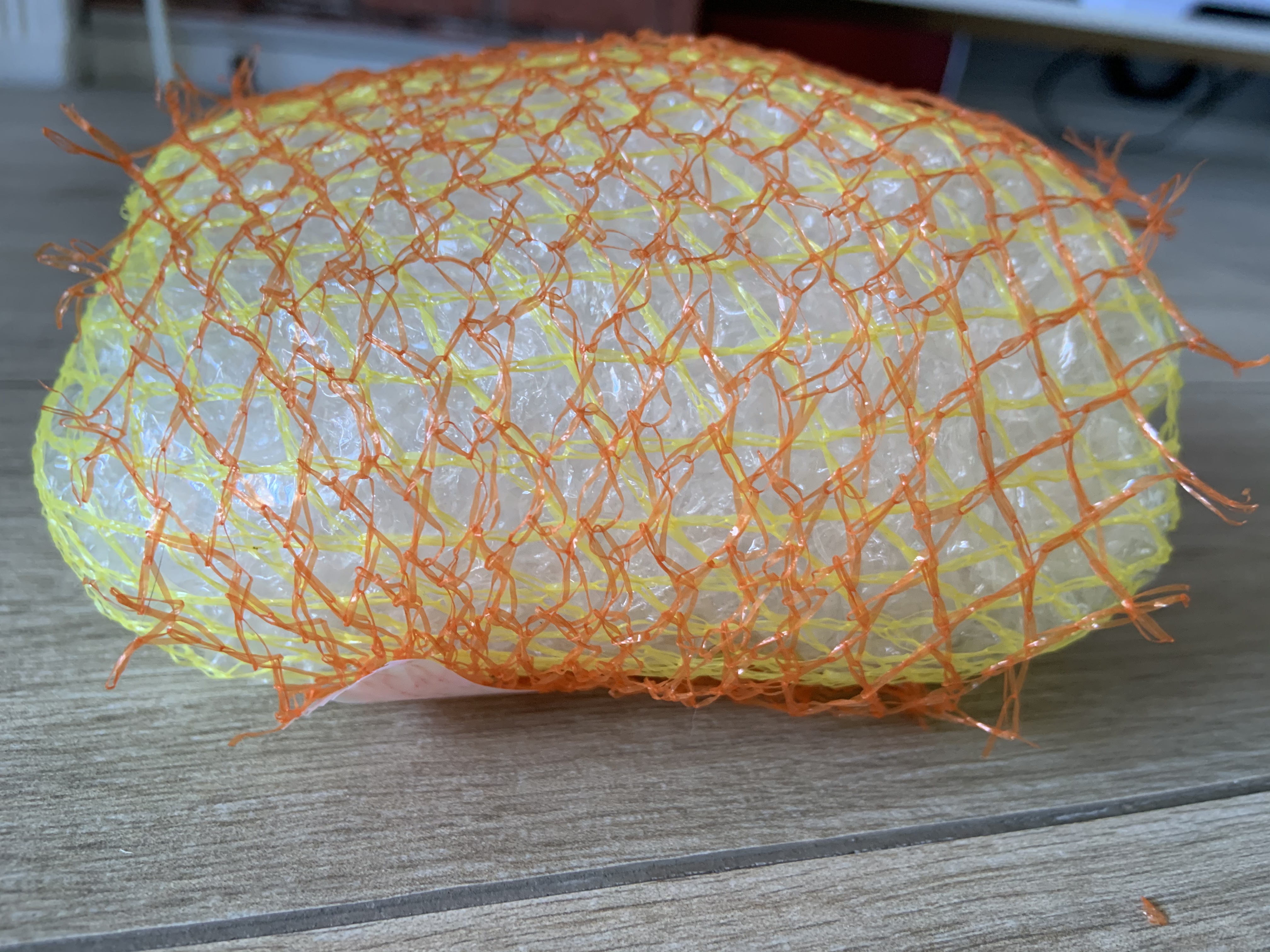
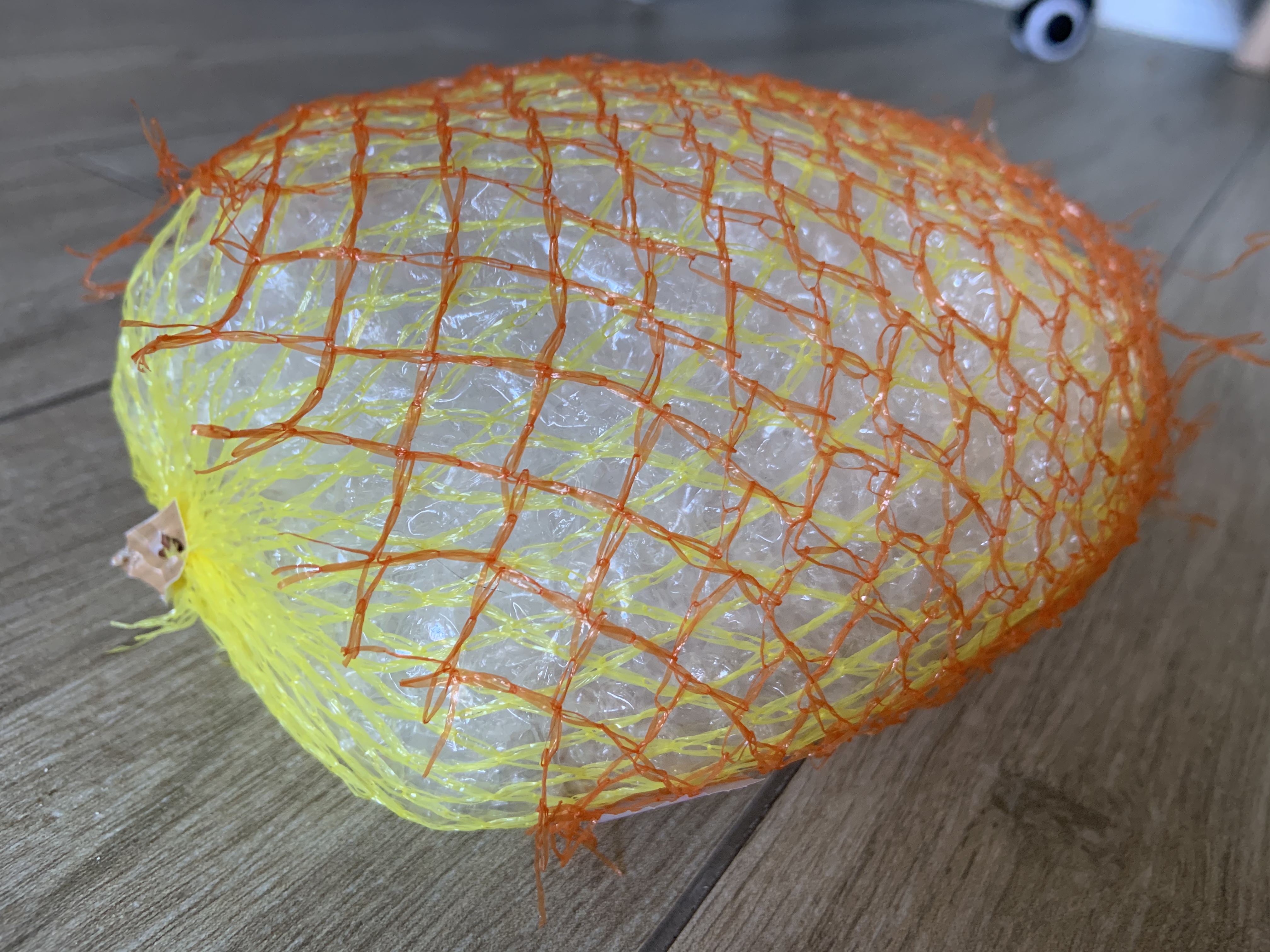
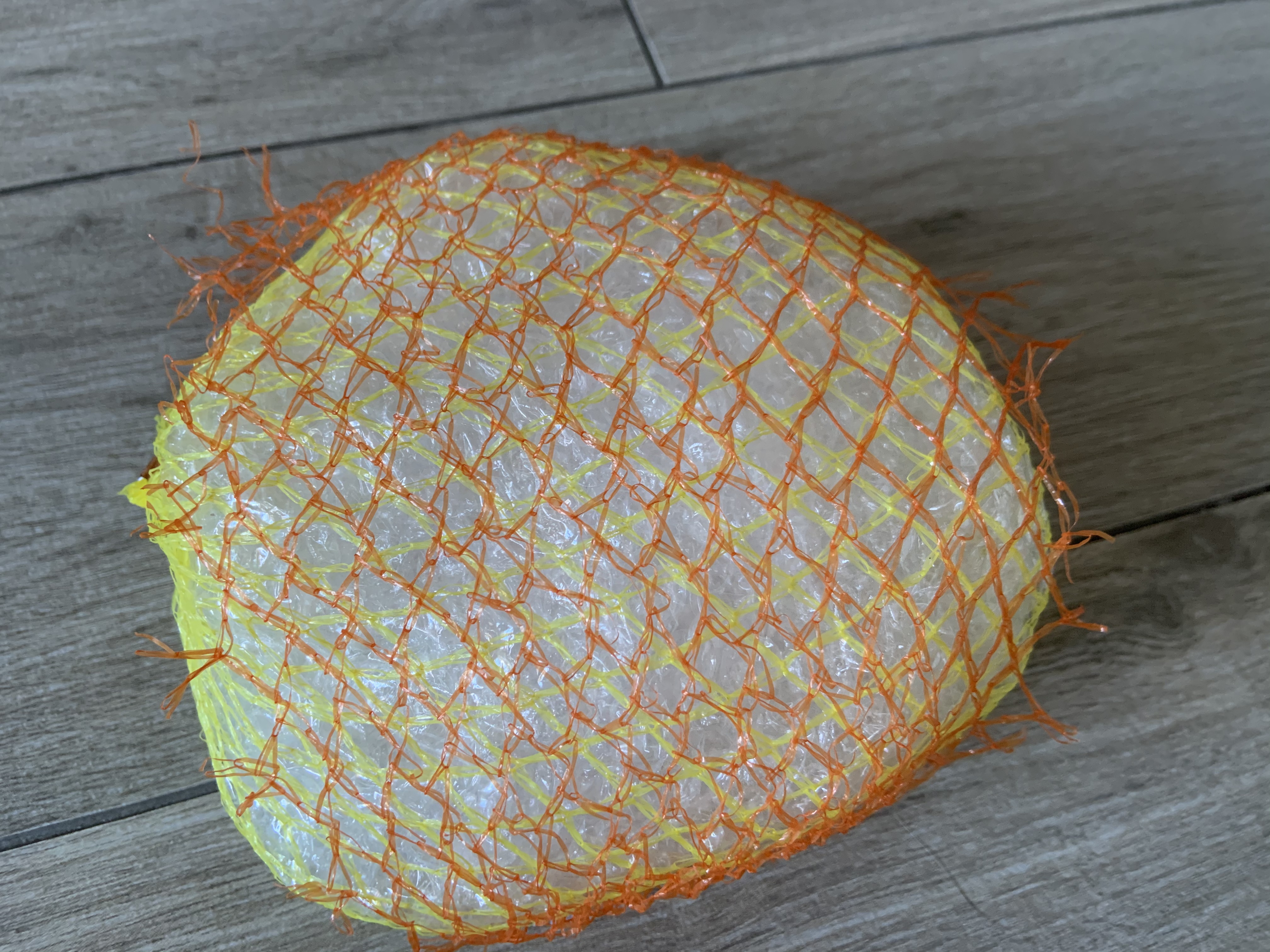
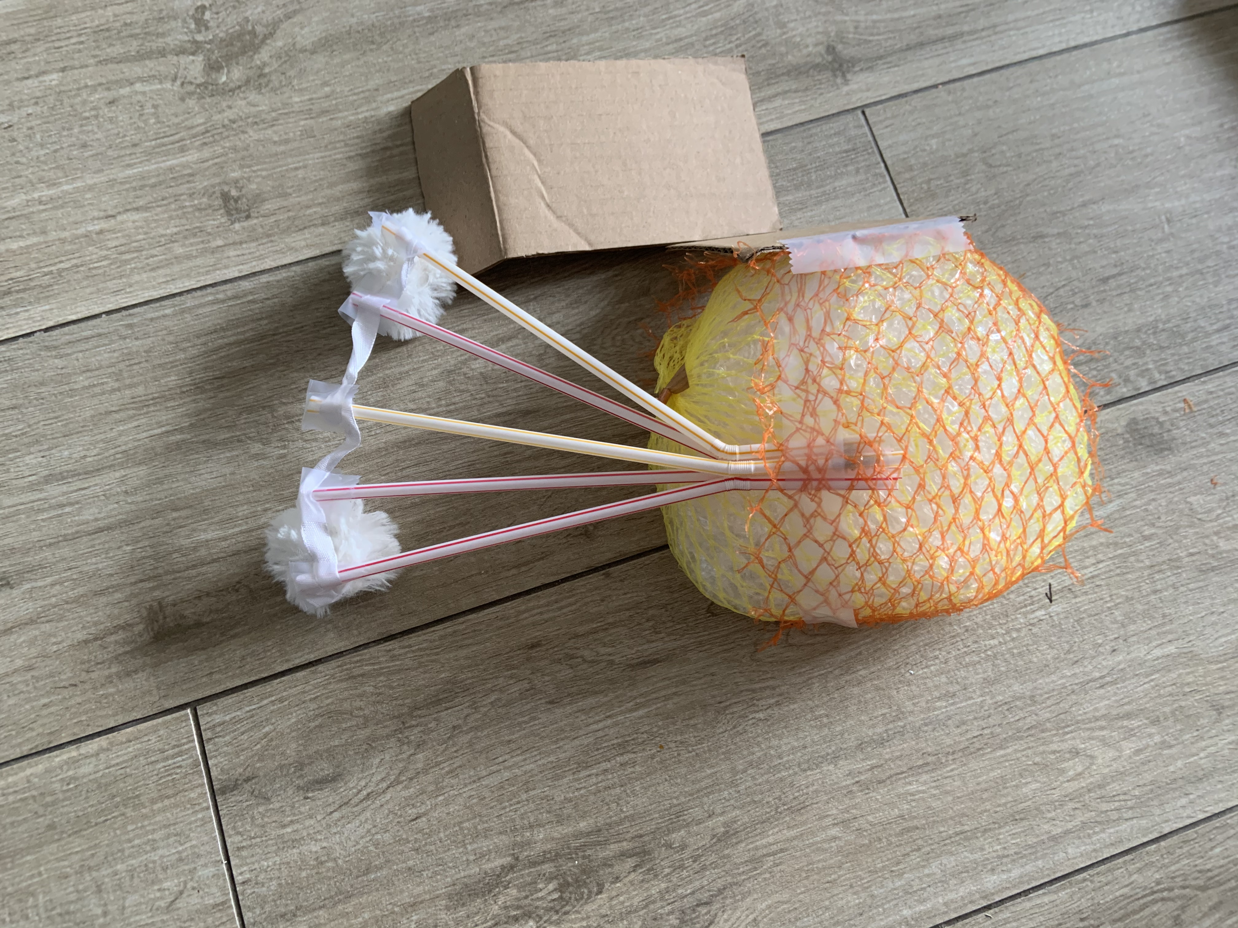
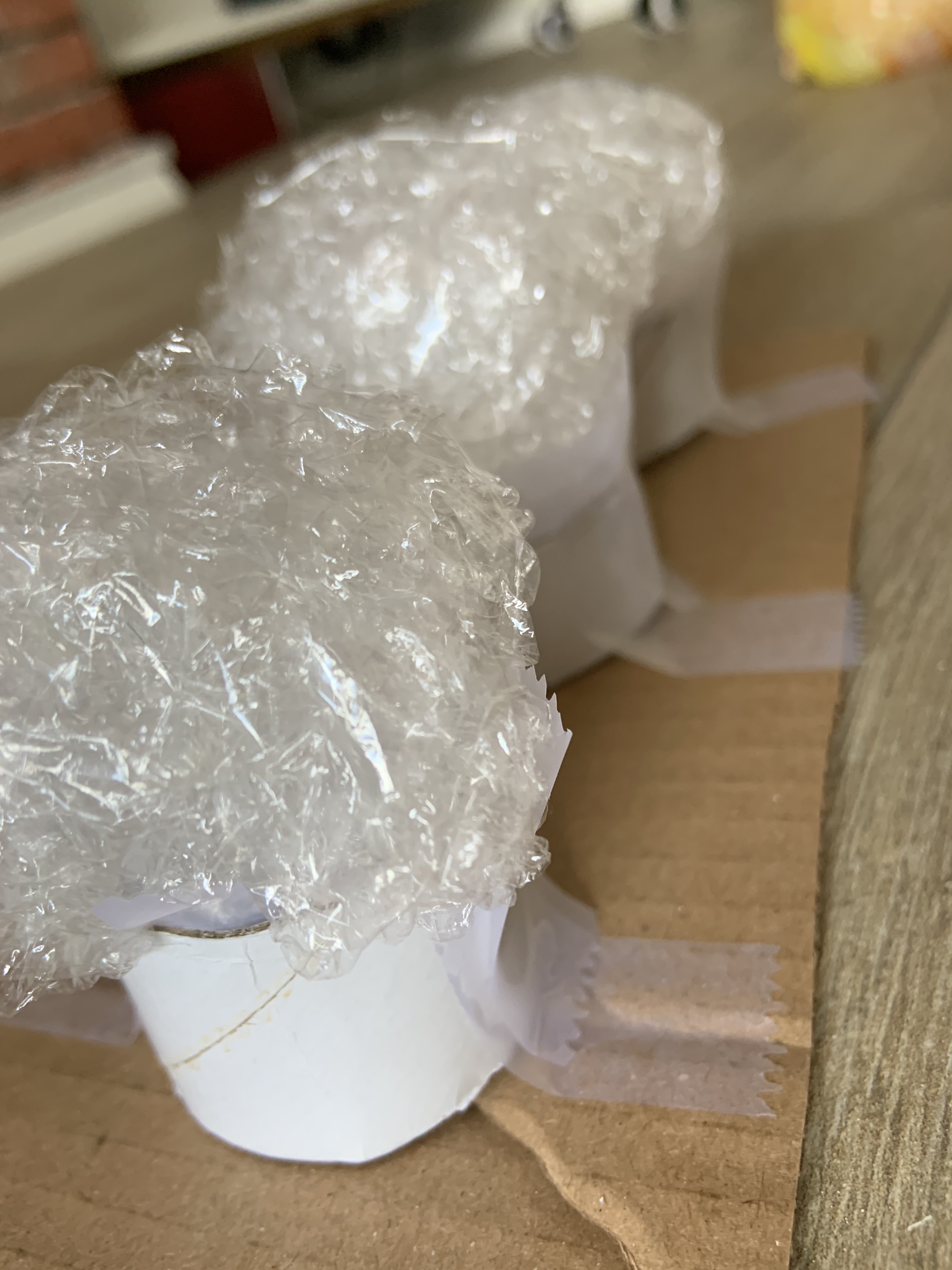
Well I Was actually going to try and recreate the pod alone. So to start with I made a loose, irregular ball using bubble wrap, sellotape, and wrapped the whole lot in some nets from citrus fruit.
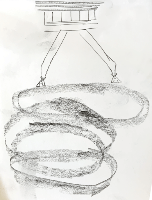
After I made it I decided it won’t represent the atmosphere sketches as the drawing was of an actual object, not of atmosphere or experience. So I decided to use it to make a model of this drawing:
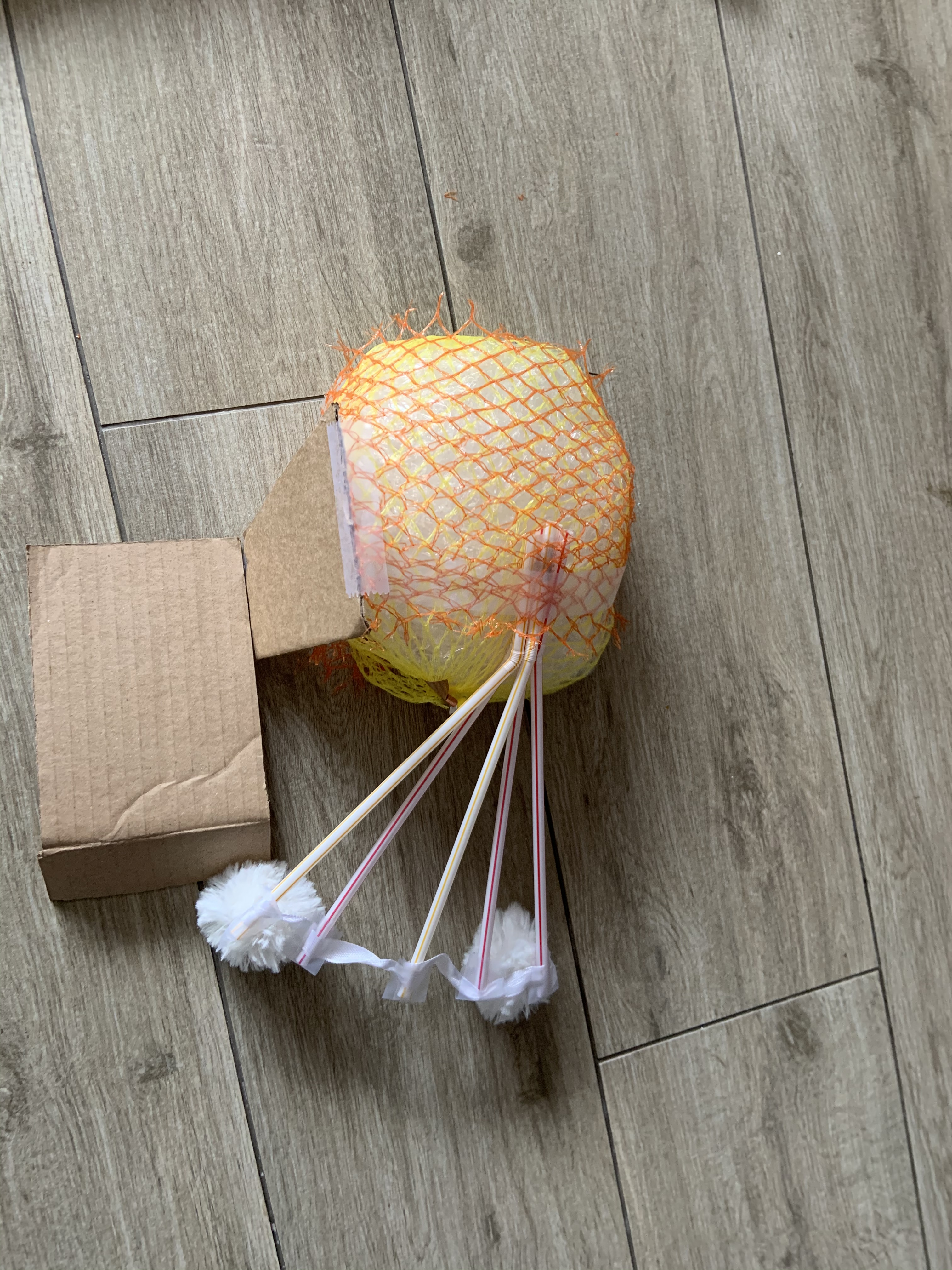
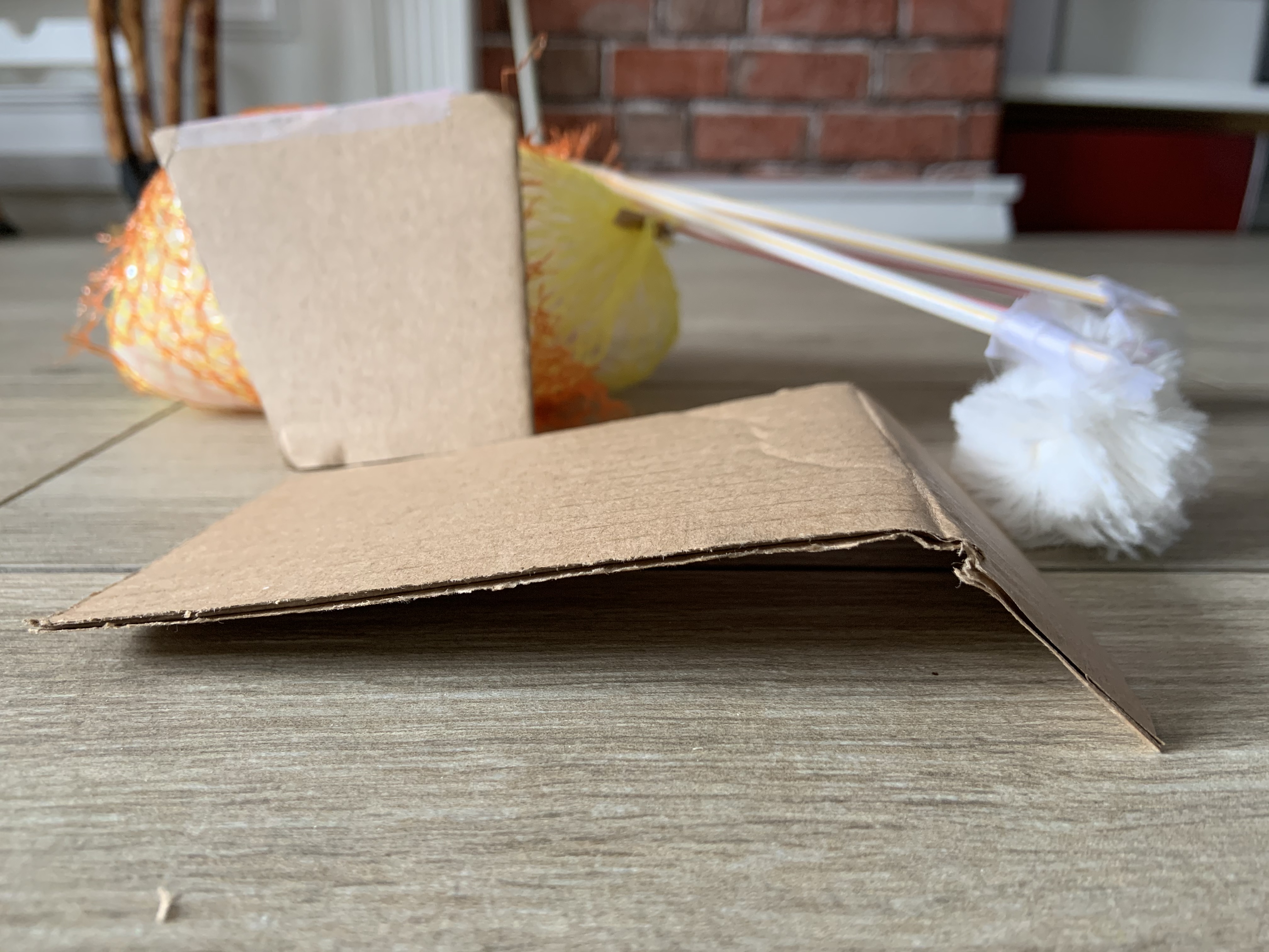
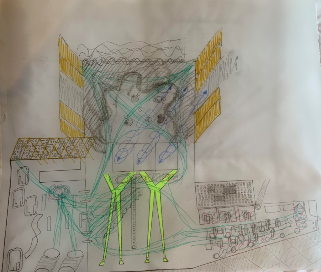
Below are photos of a model I made using the bubble wrap, sellotape, plastic straws, citrus fruit nets, cardboard, ribbon with fluffy balls.
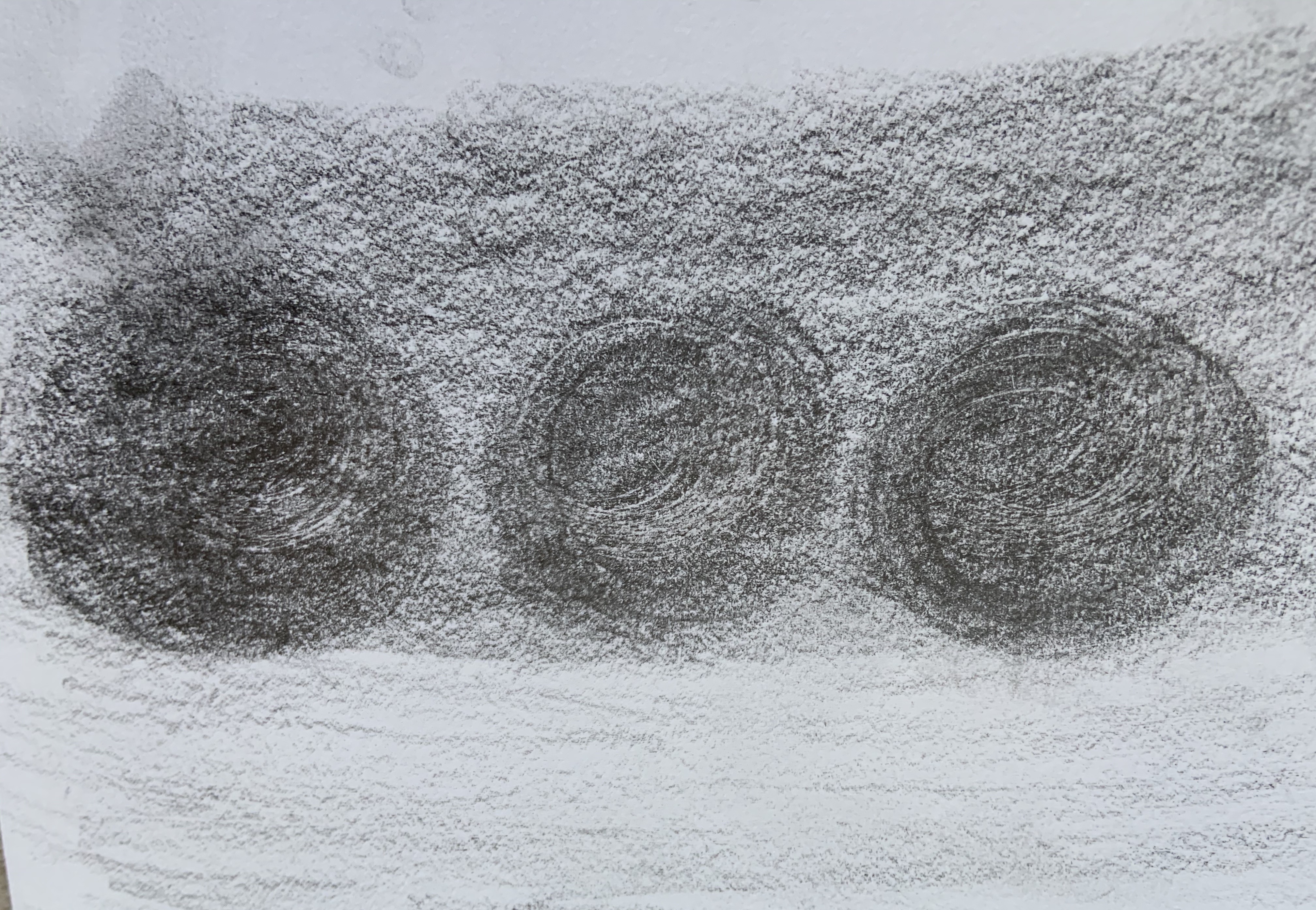
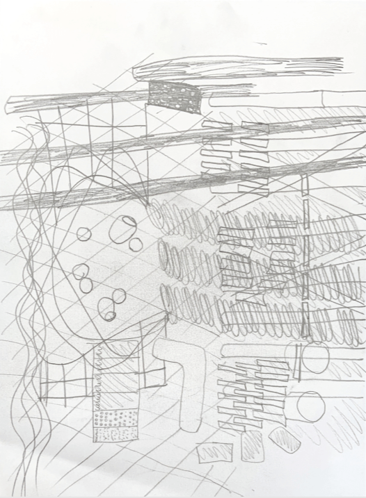
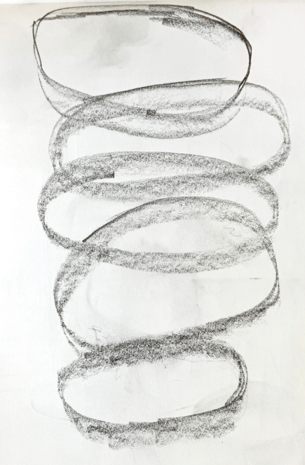
As promised in the course book the exercise got easier as I got going. So I decided to make a sketch model of another drawing.
I made the model using cardboard, bubble wrap and sellotape.
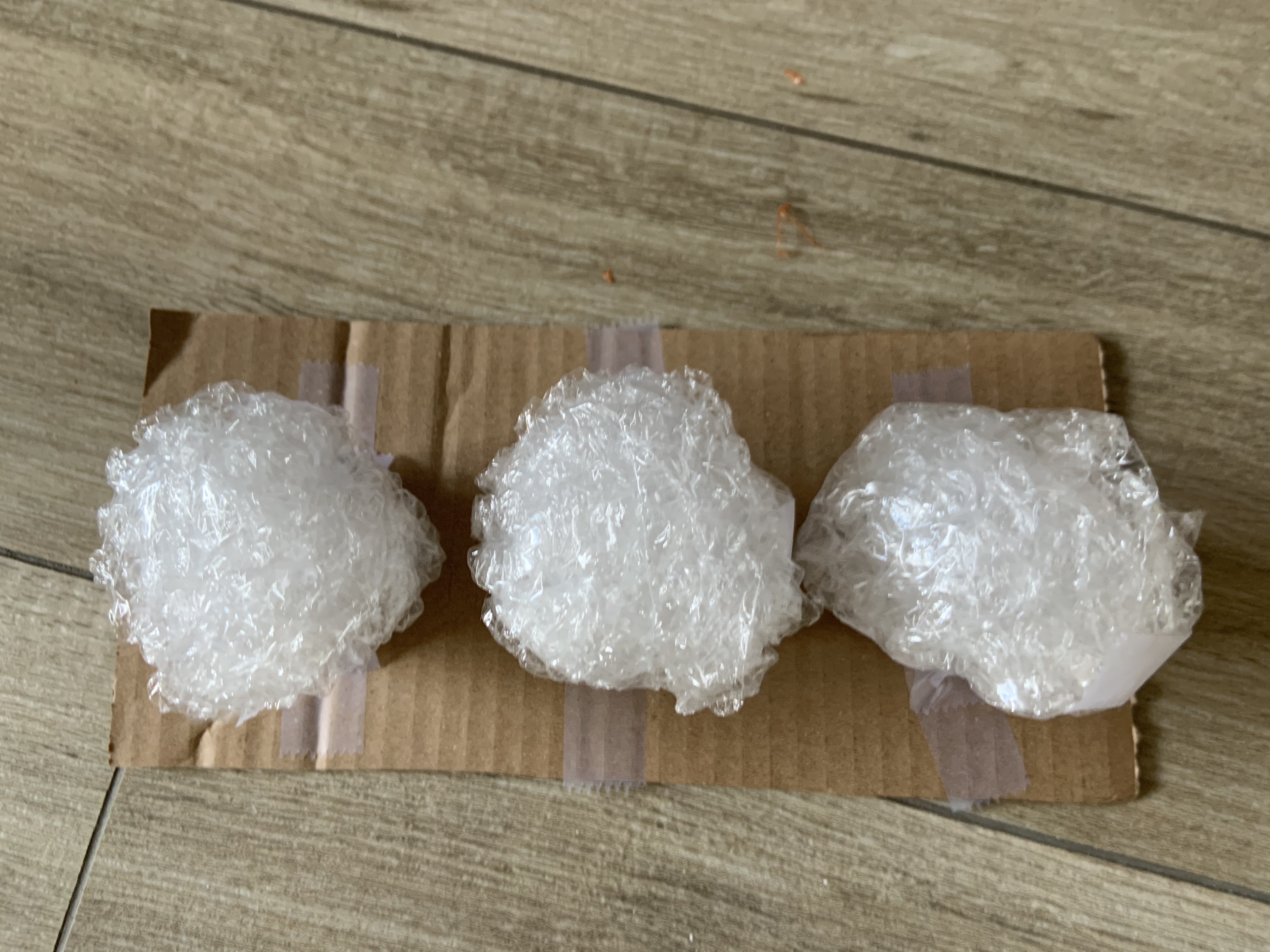
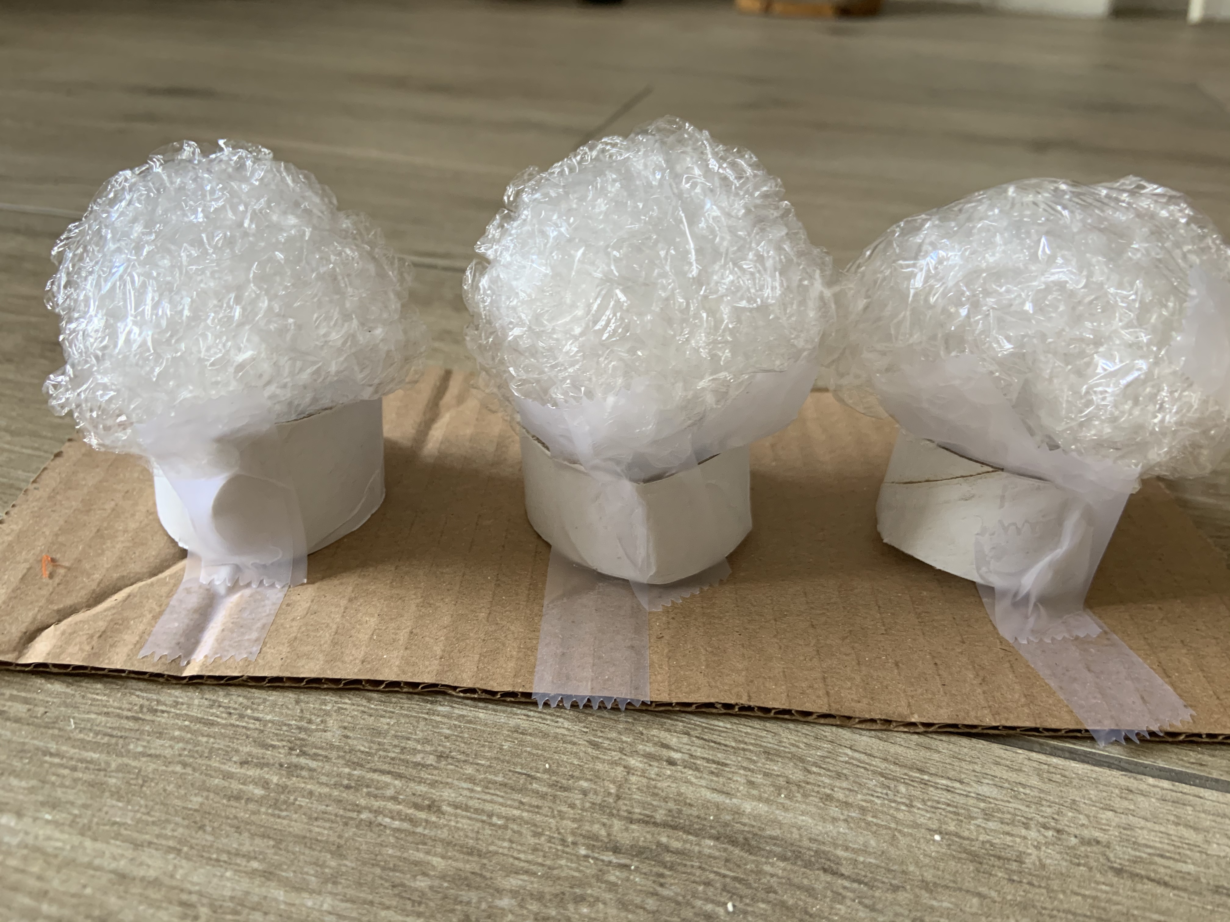
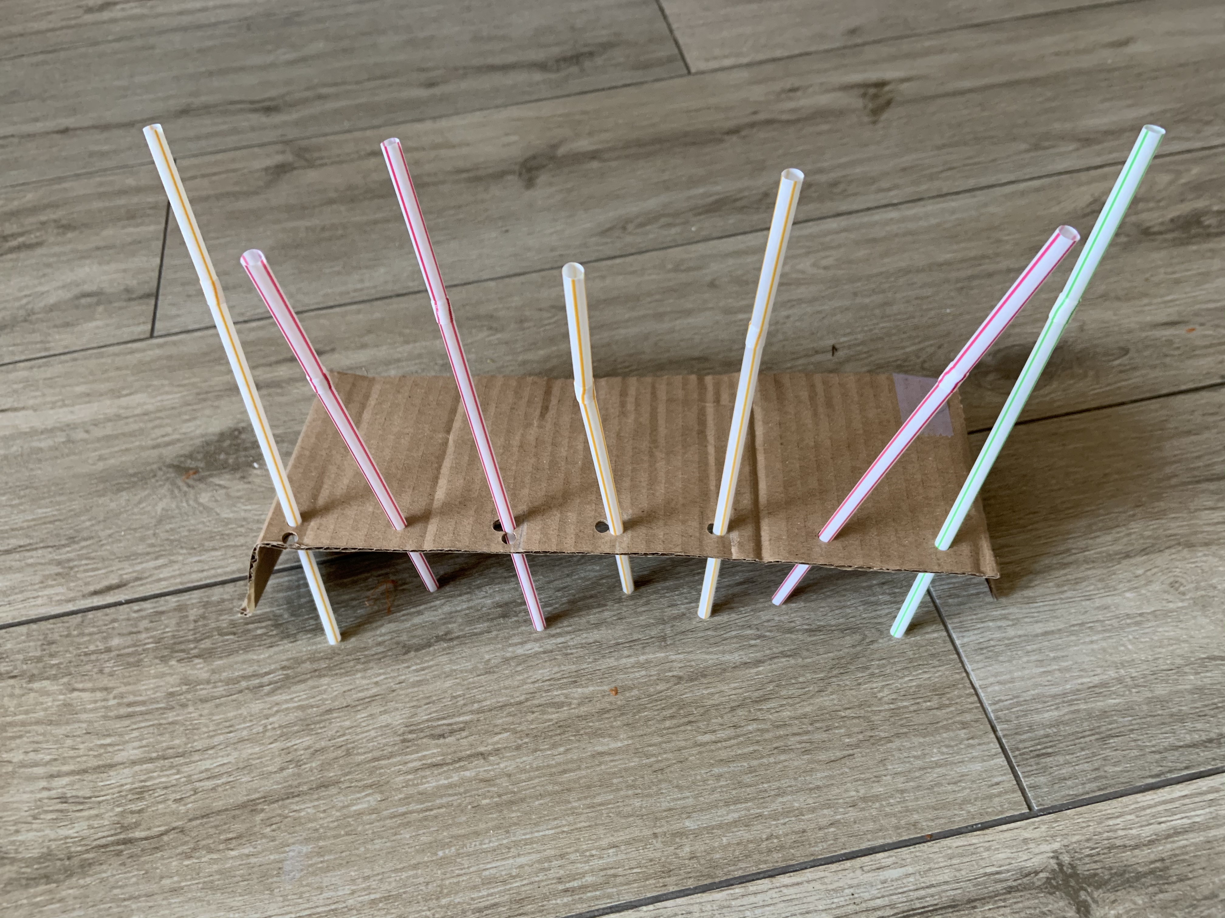
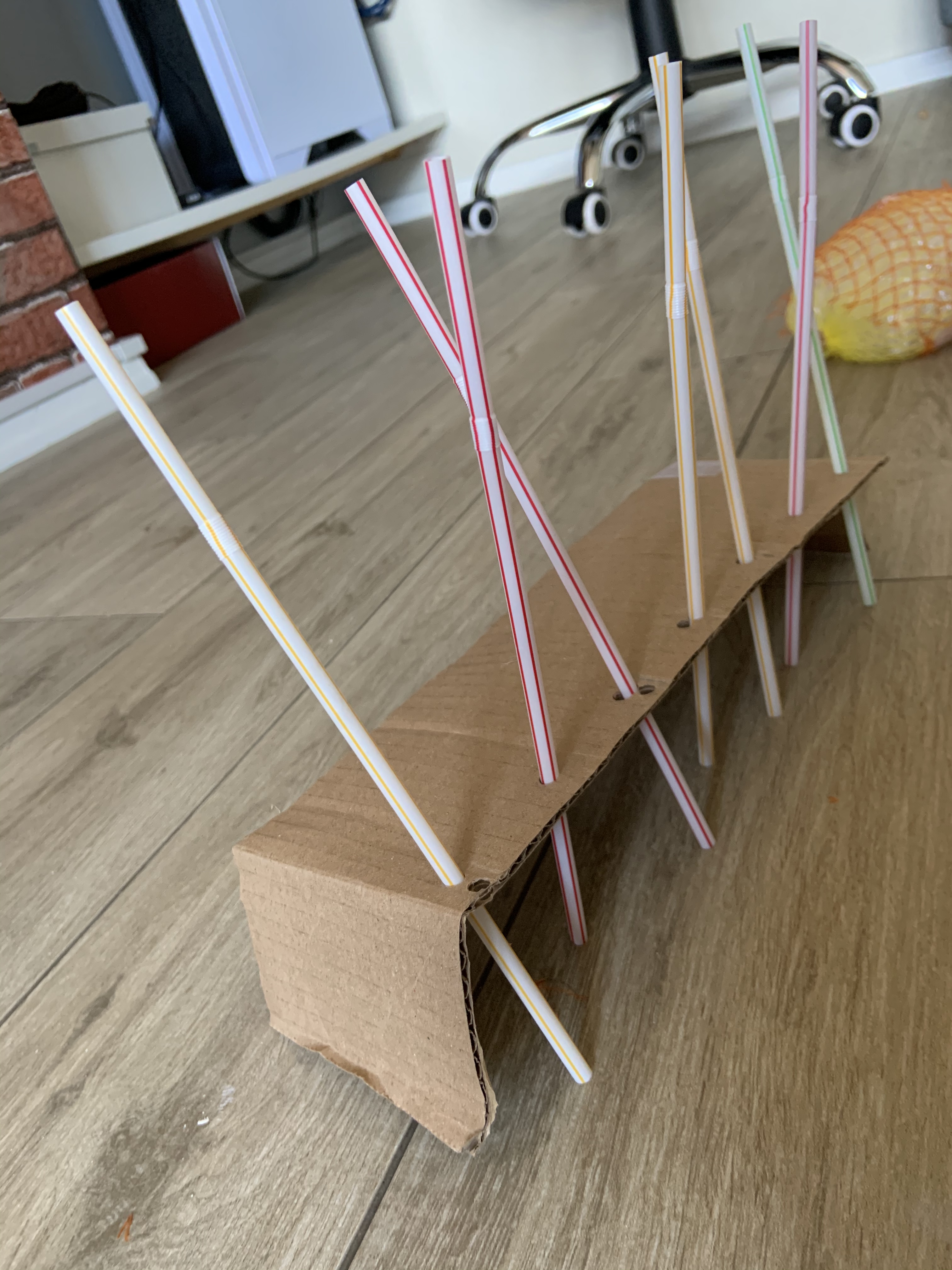
Lastly I made the model of this drawing which represented columns and their odd angles.
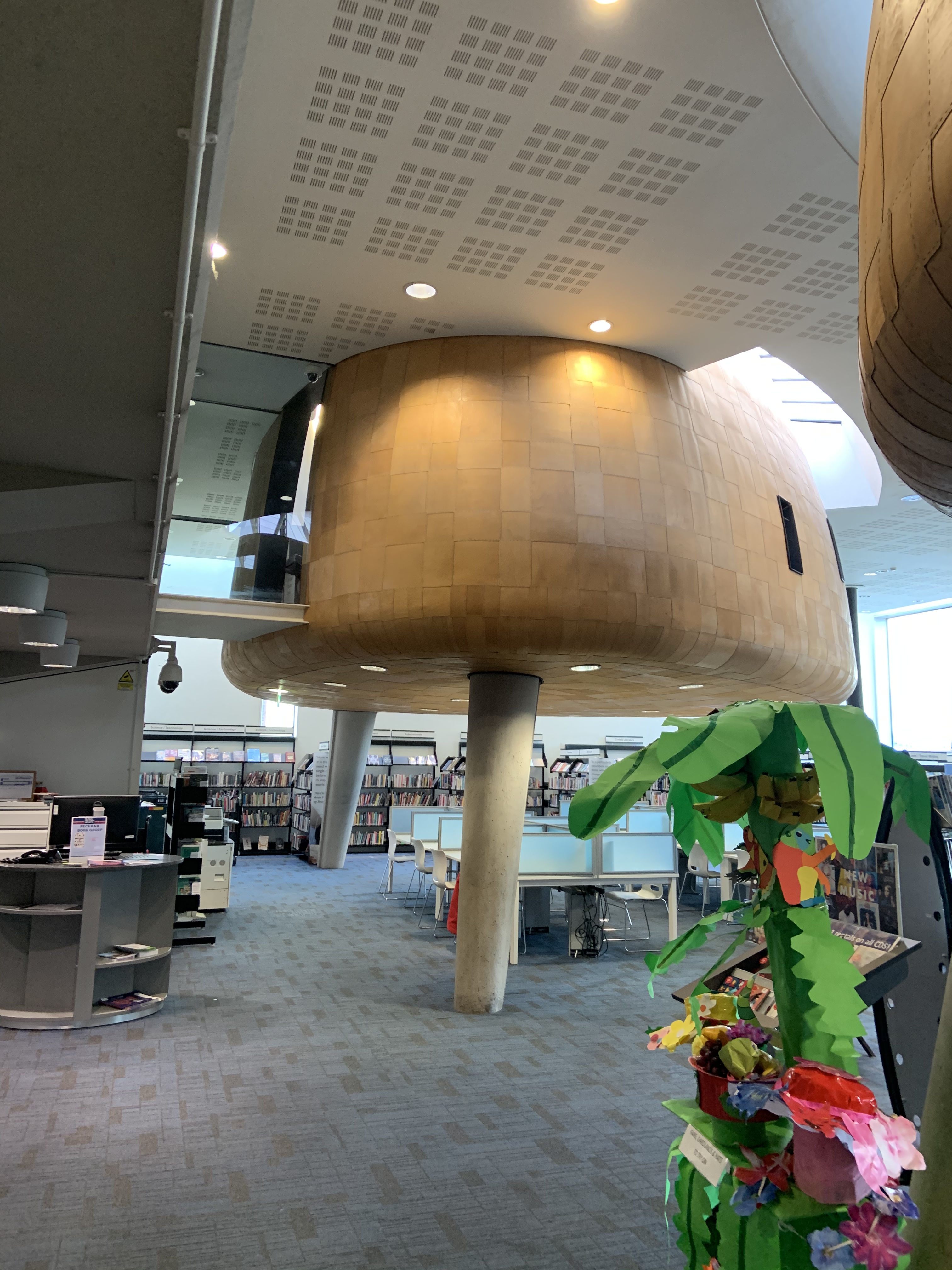
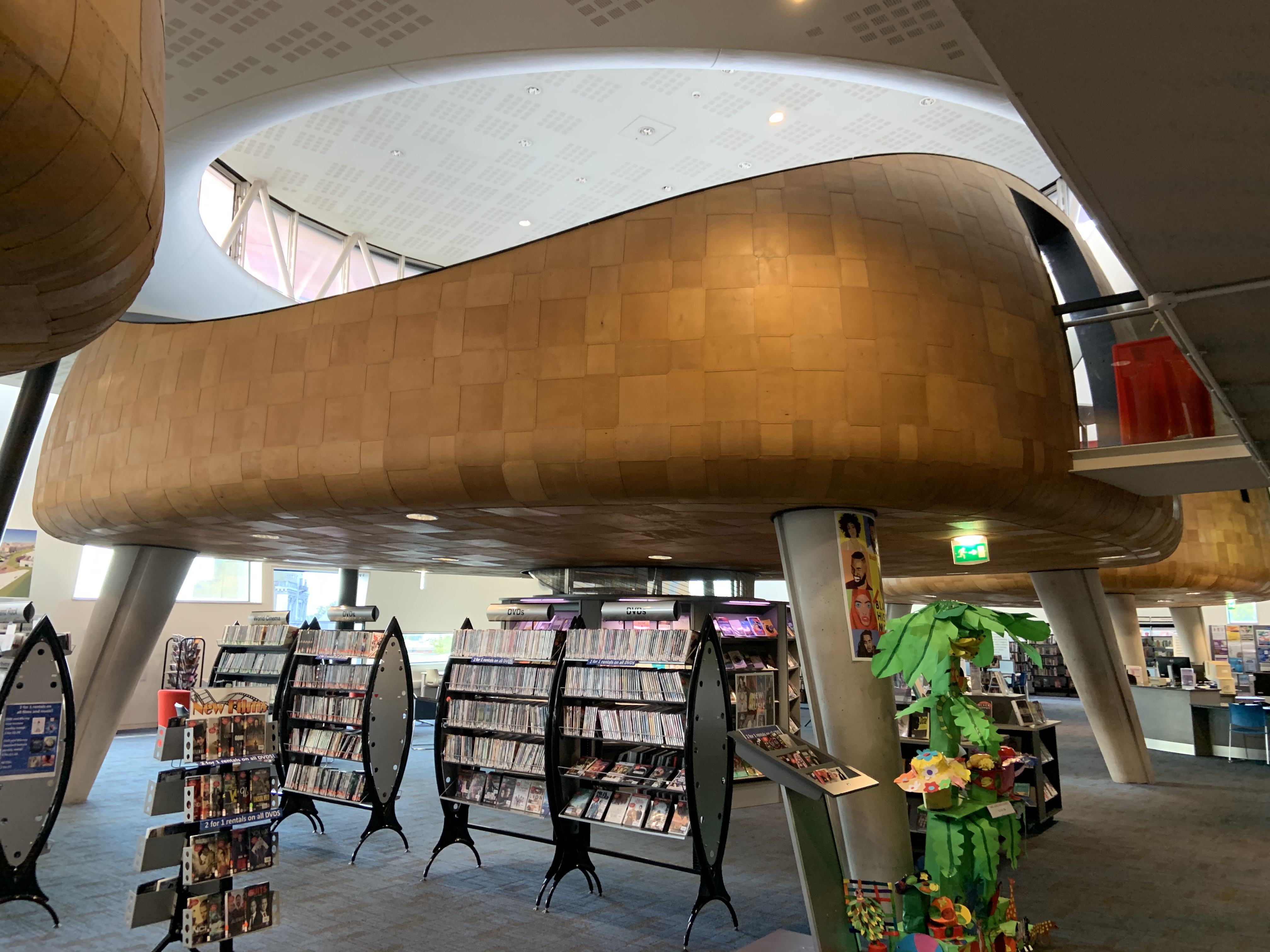
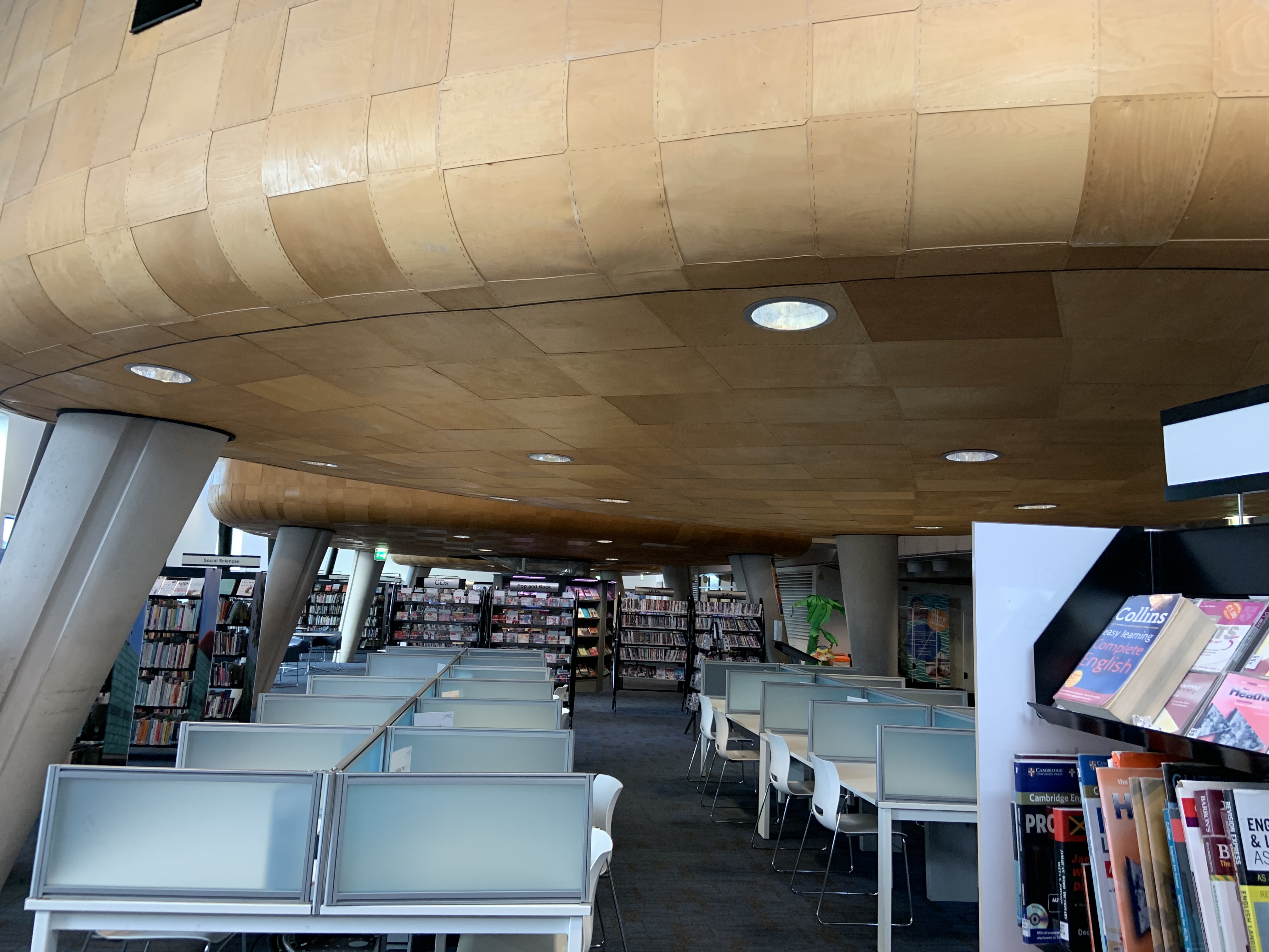
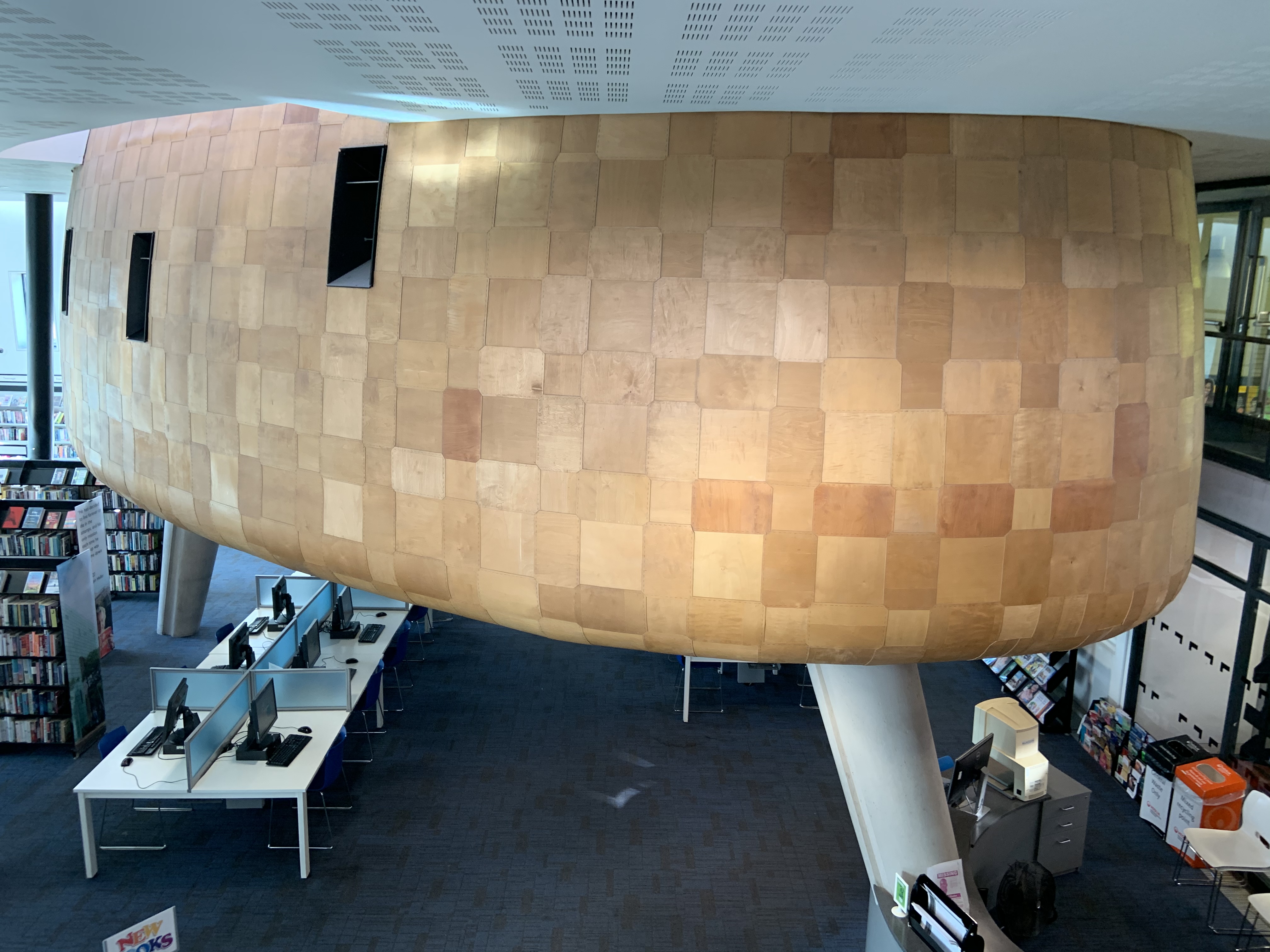
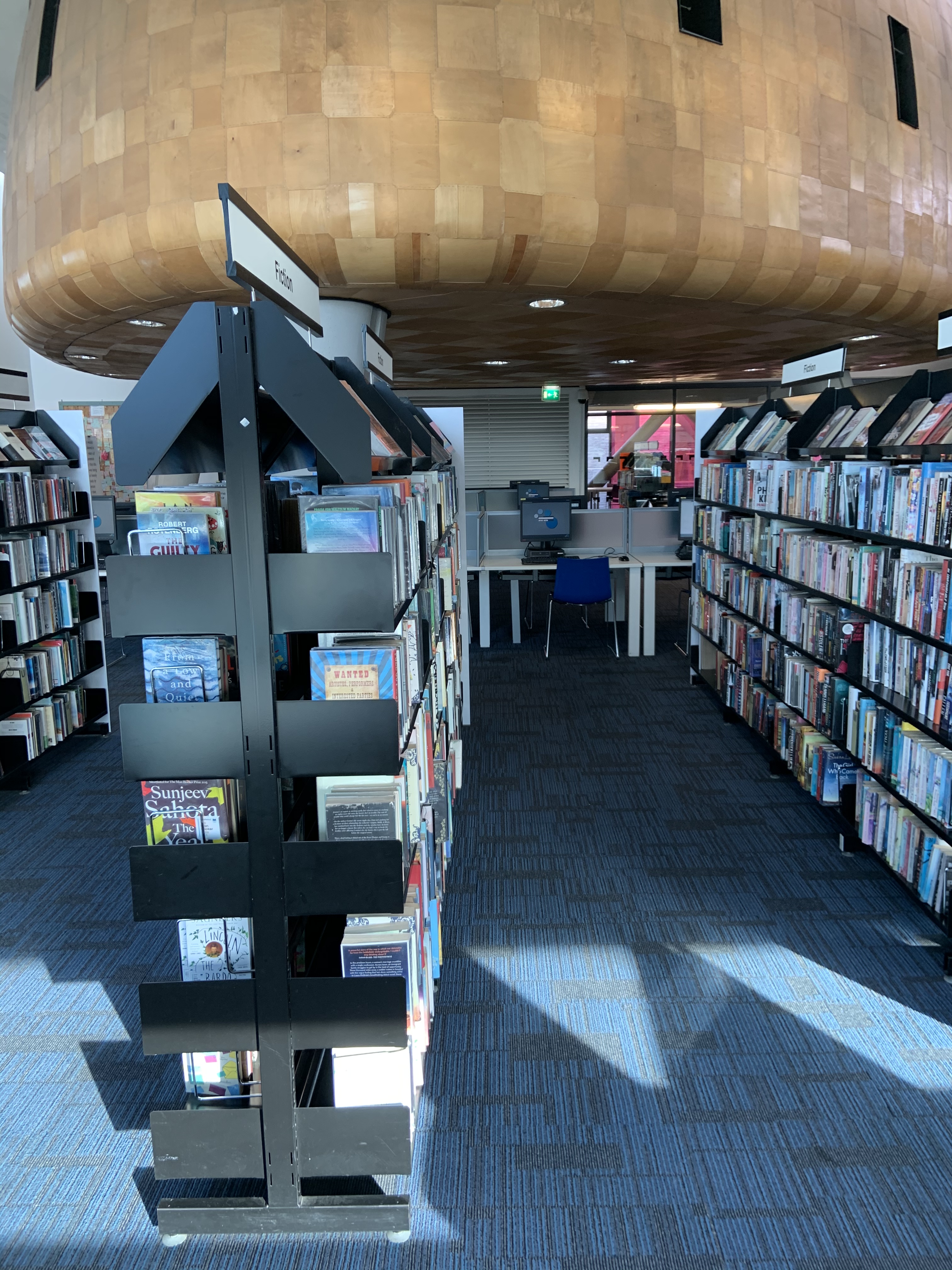
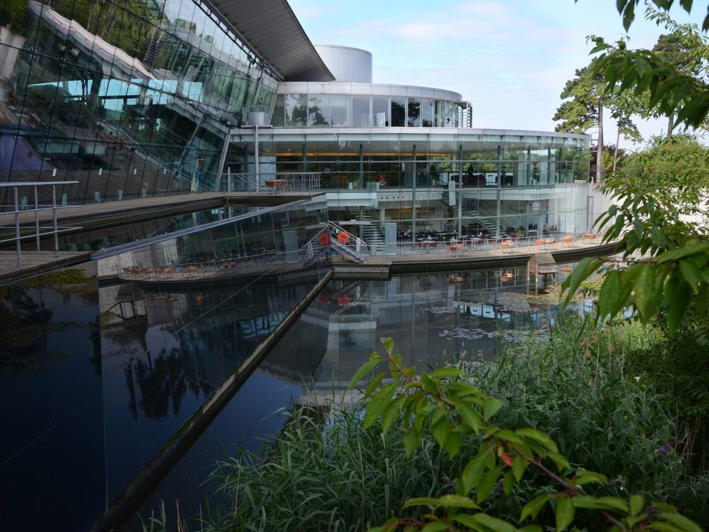
The exterior of the pods is covered in natural colour, thin, flexible looking timber slices. I’m guessing it’s plywood. They are attached with metal staples.
The legs are made of smooth, very light grey concrete.
There are also black window frames, I’m guessing metal. And glass within the windows.
Lights built into the base, shining below are metal and plastic.
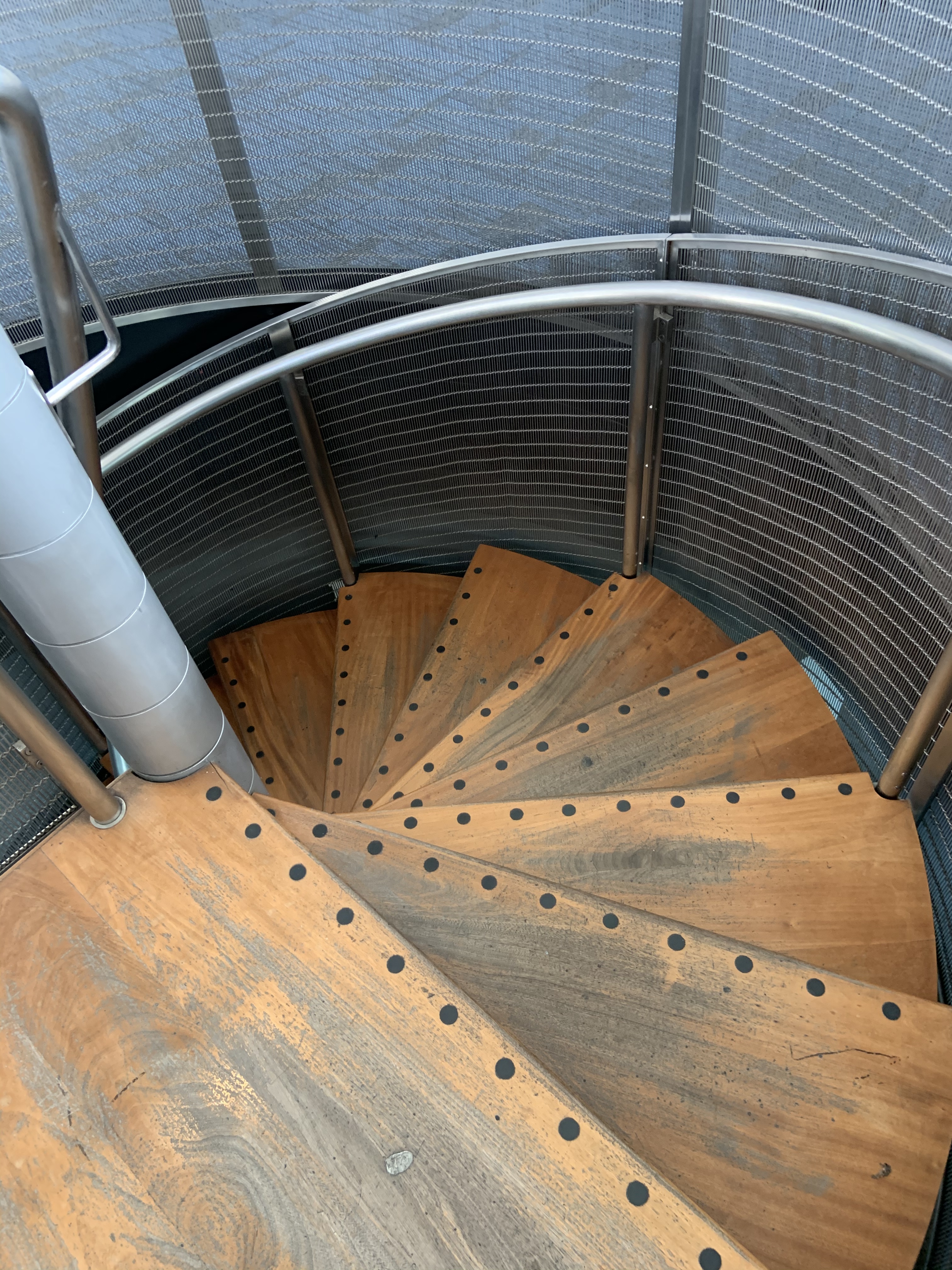
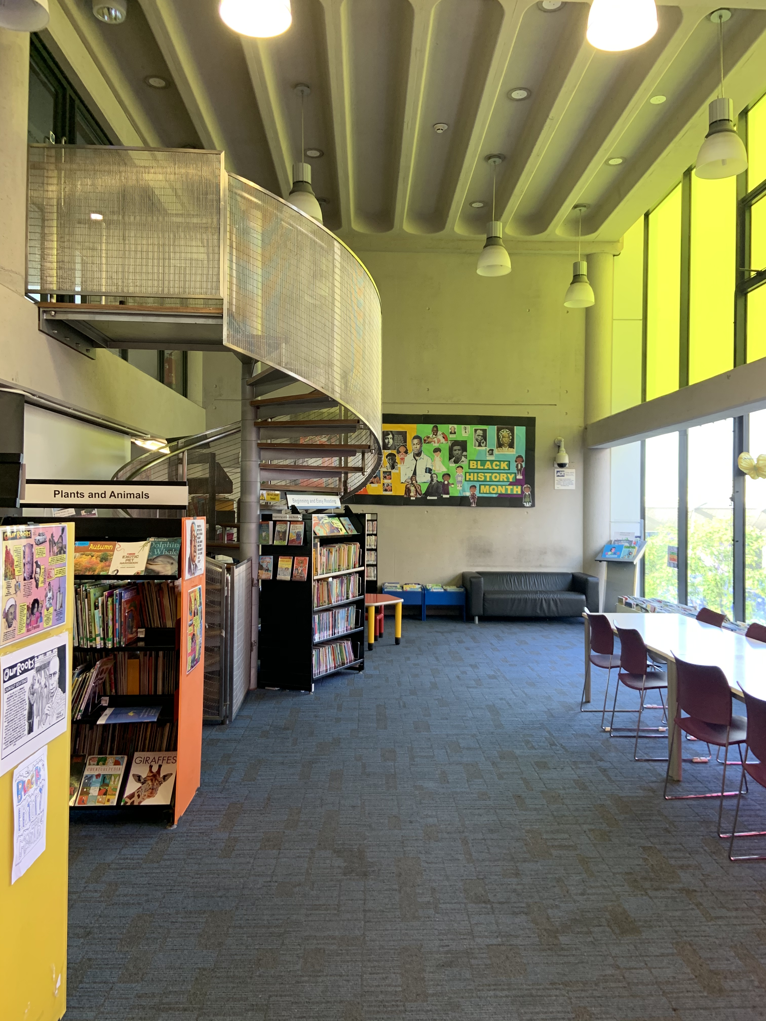
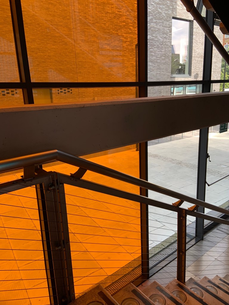
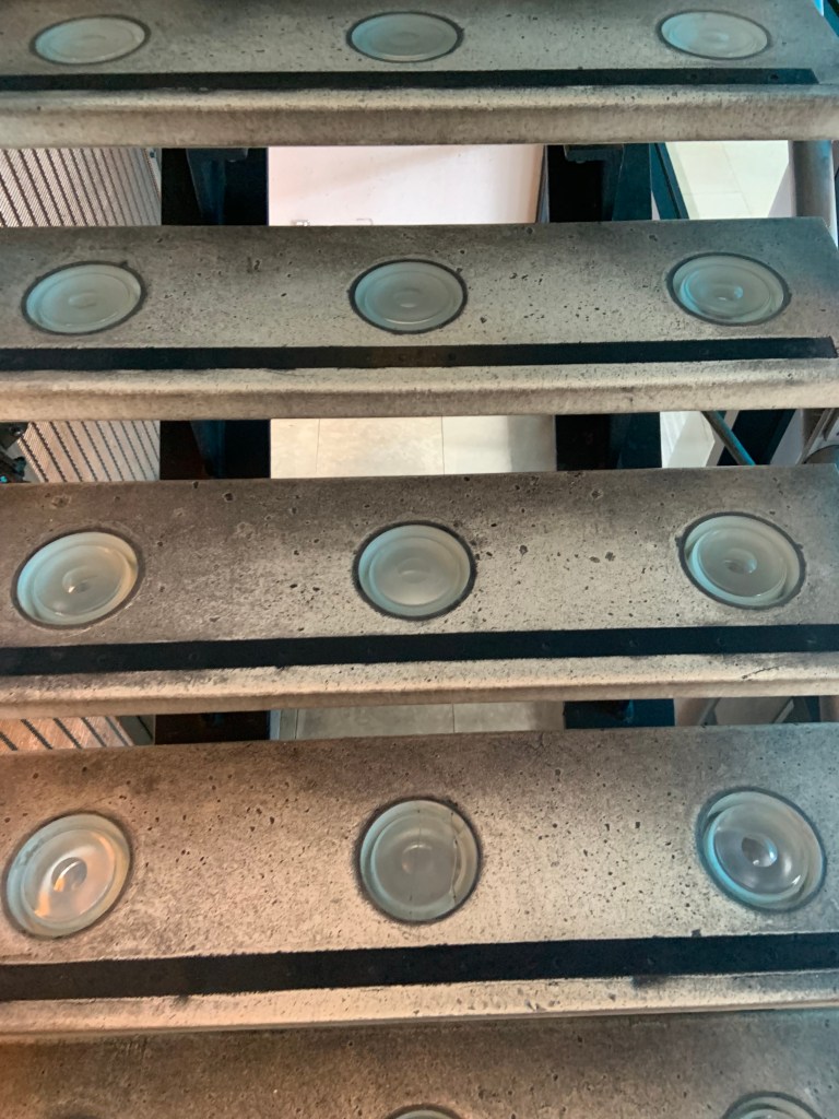
There’s a metal staircase with worn wooden steps leading to the middle pod.
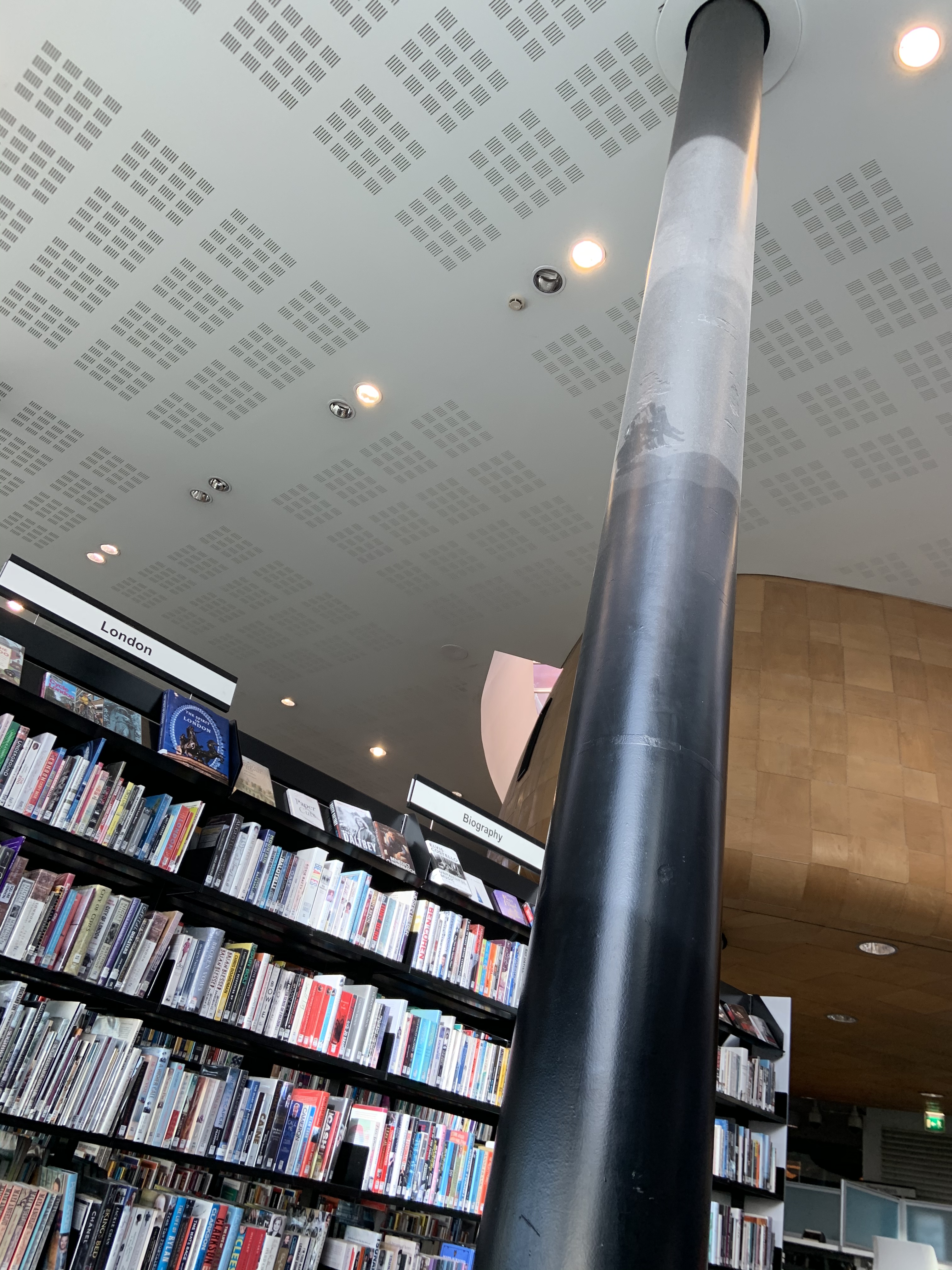
The columns are steel painted sheen black. They’re smooth. They are dusty in higher parts.
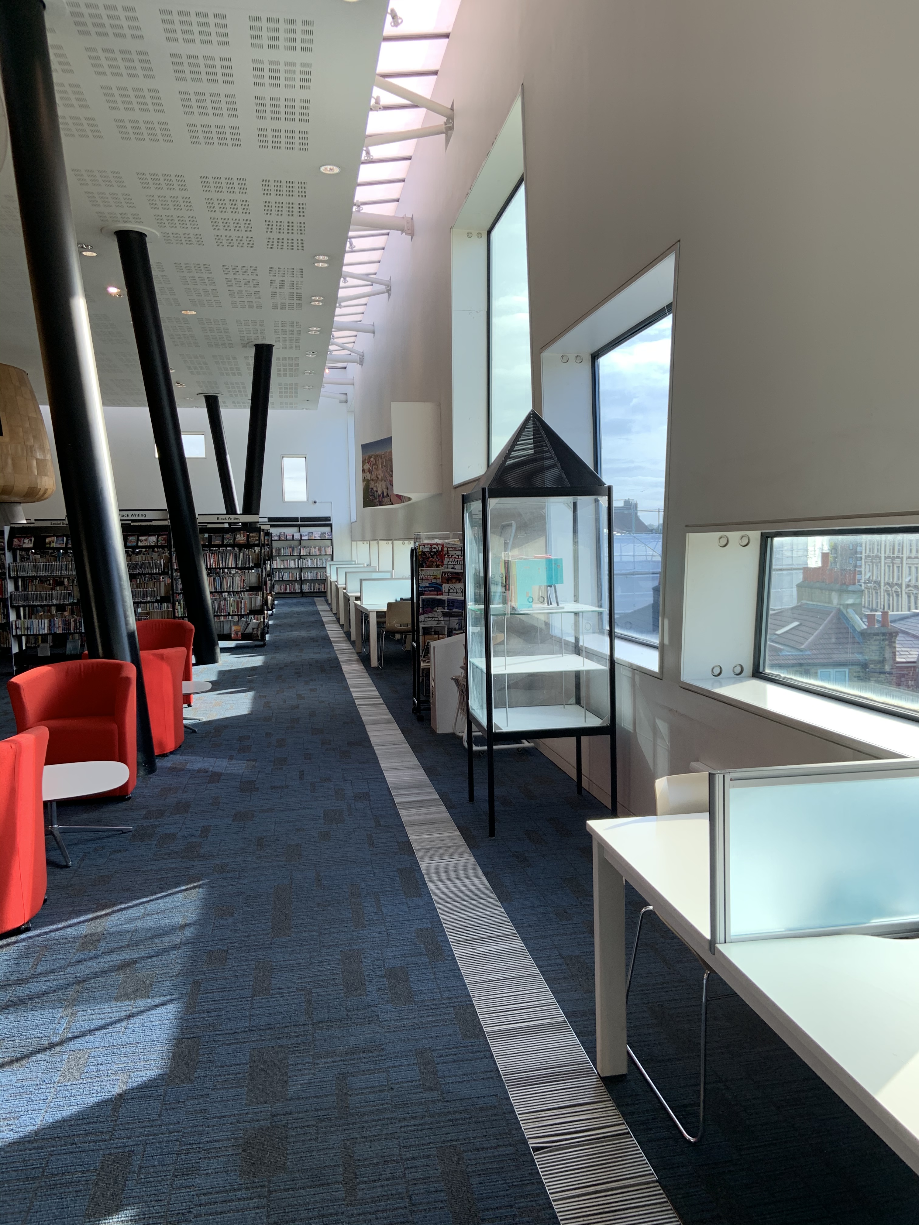
Windows: glass panes within black metal frames. Even the glass walls are consisting of smaller panes (still quite large, the sizes of walls are vast) framed in black metal.
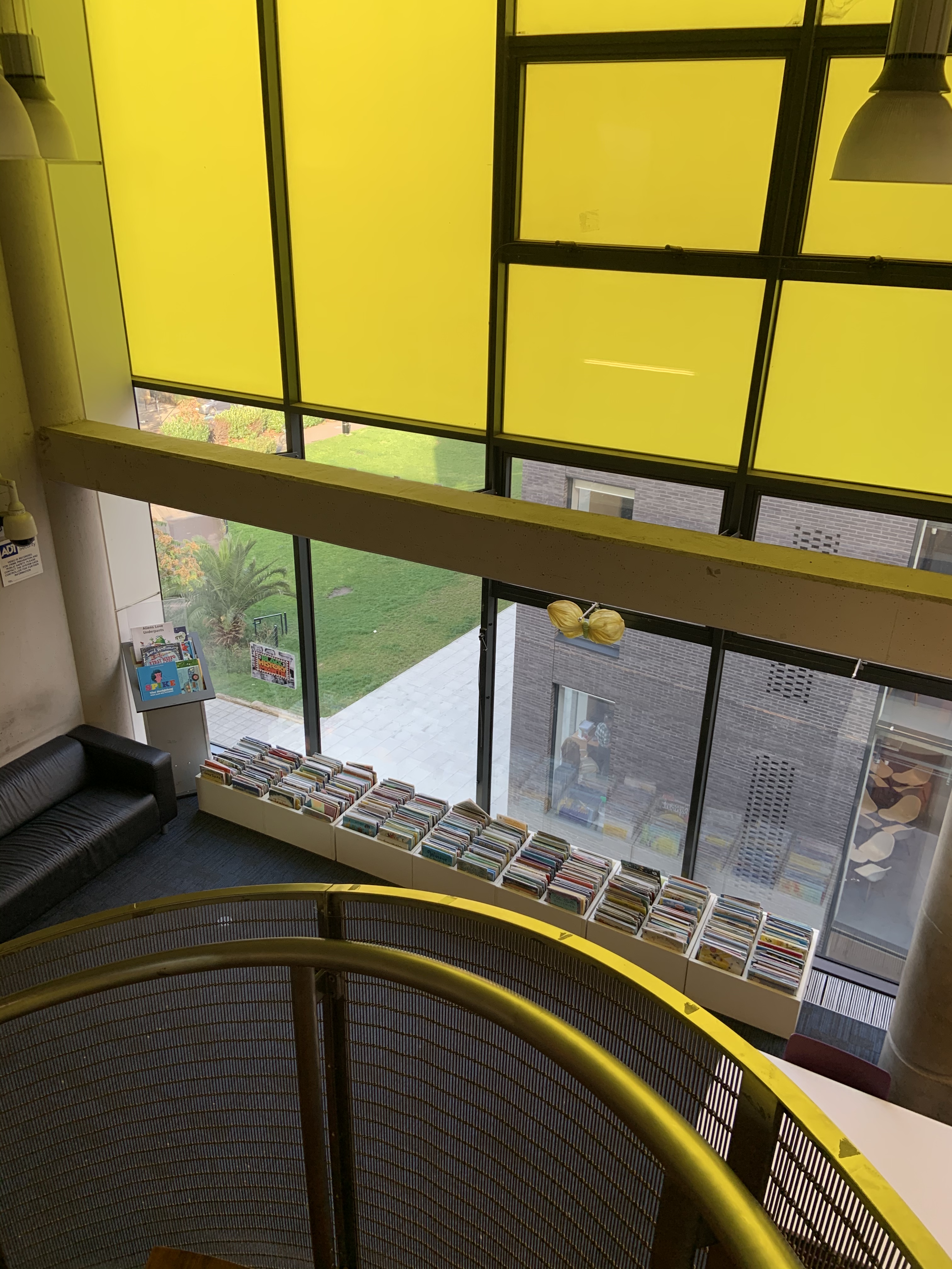
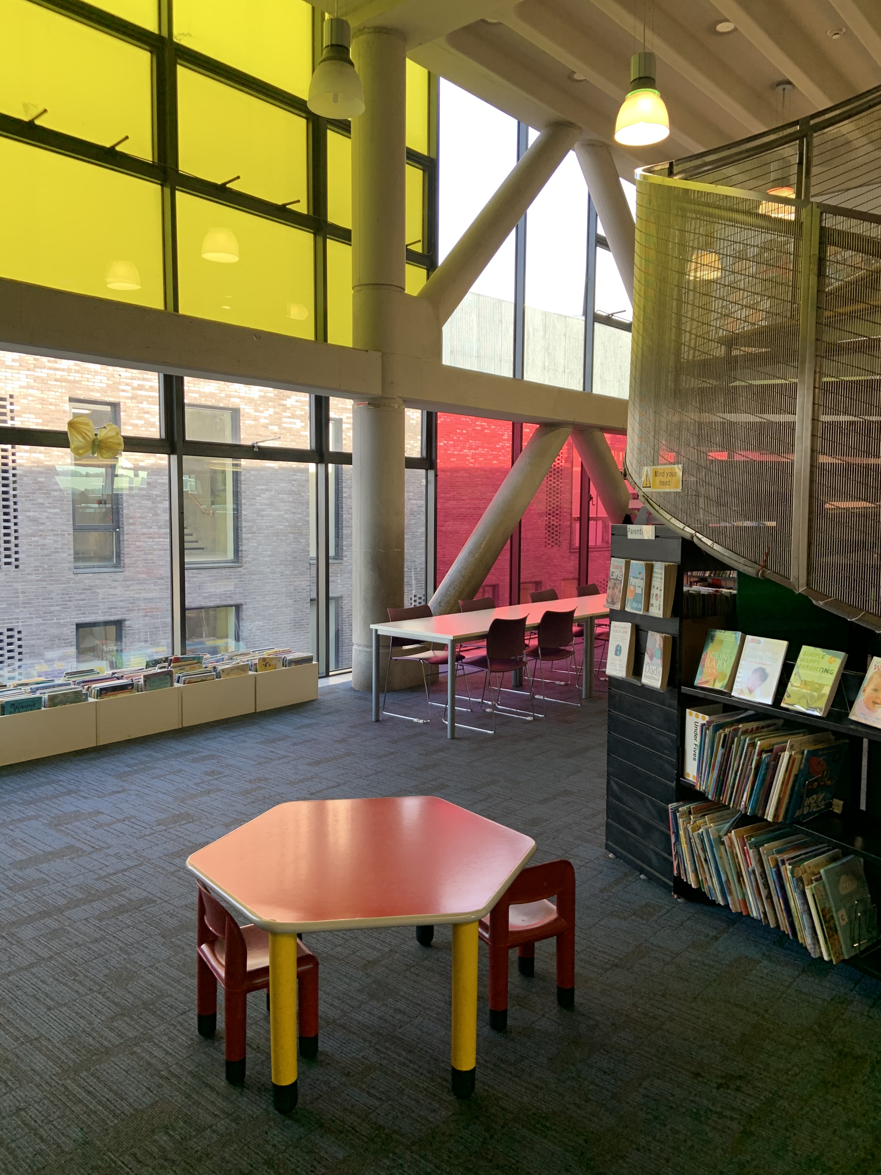
The rear of the building has many coloured glass windows.
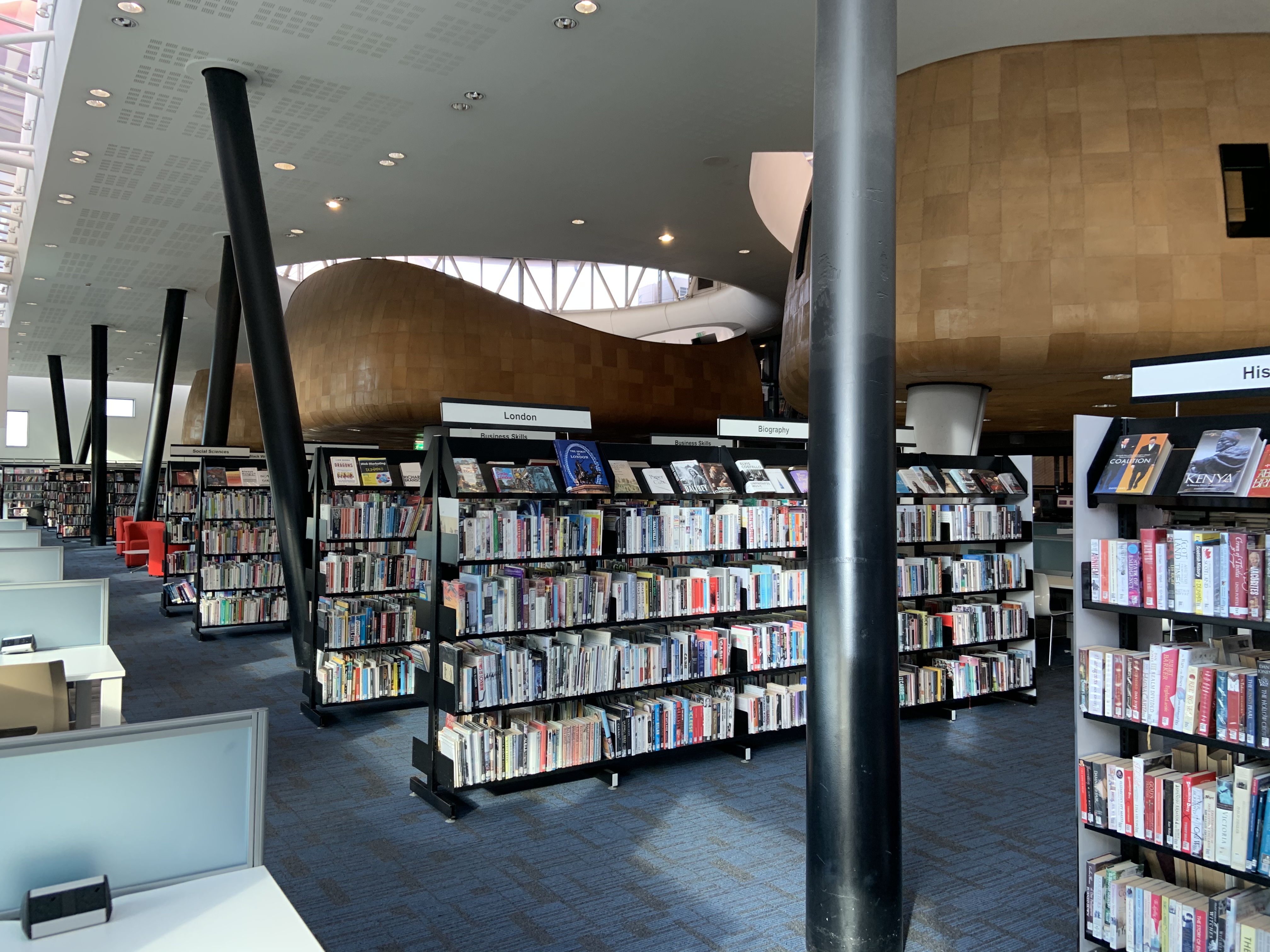
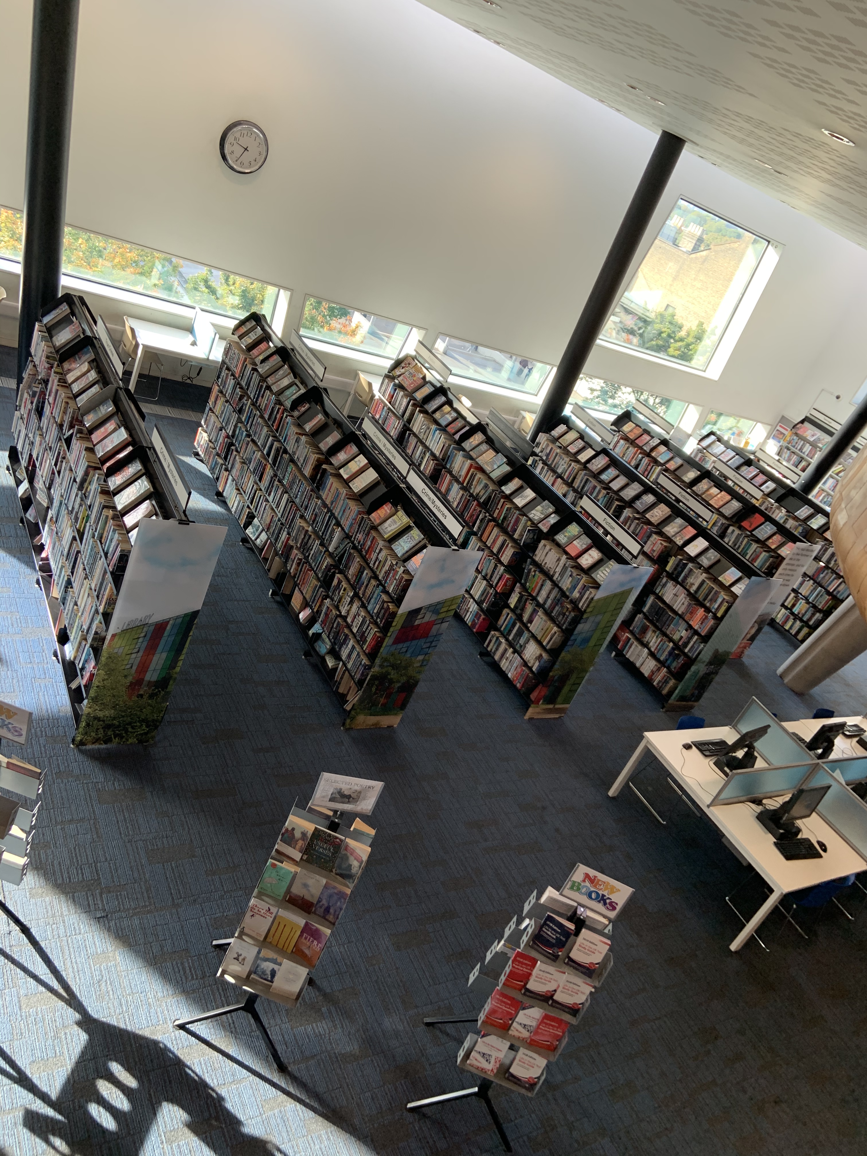
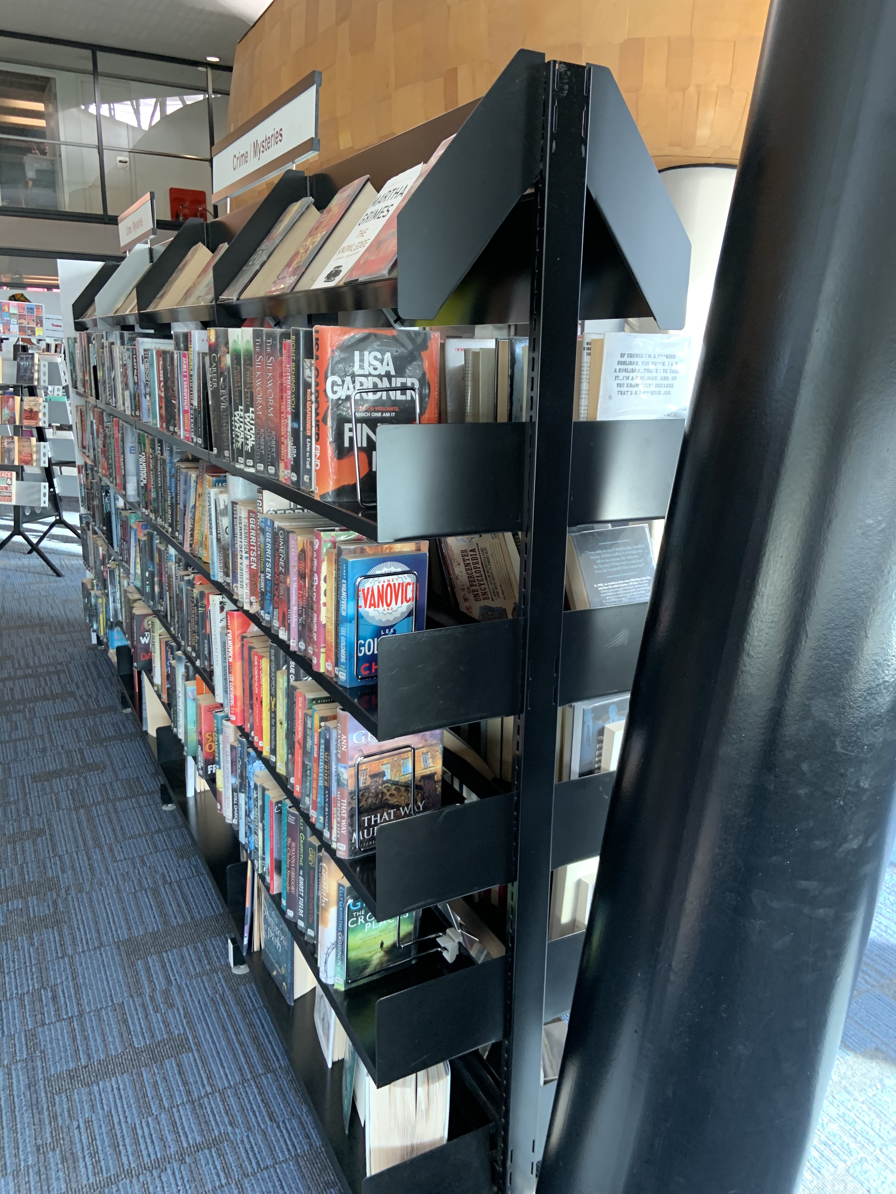
Bookcases are made of metal, painted black. Smooth surfaces and sharp looking edges.
There’s a carpet on the floor, hard wearing type. It has geometrical pattern of blue and black with cream specks.
I think the walls are covered in plaster, painted white.
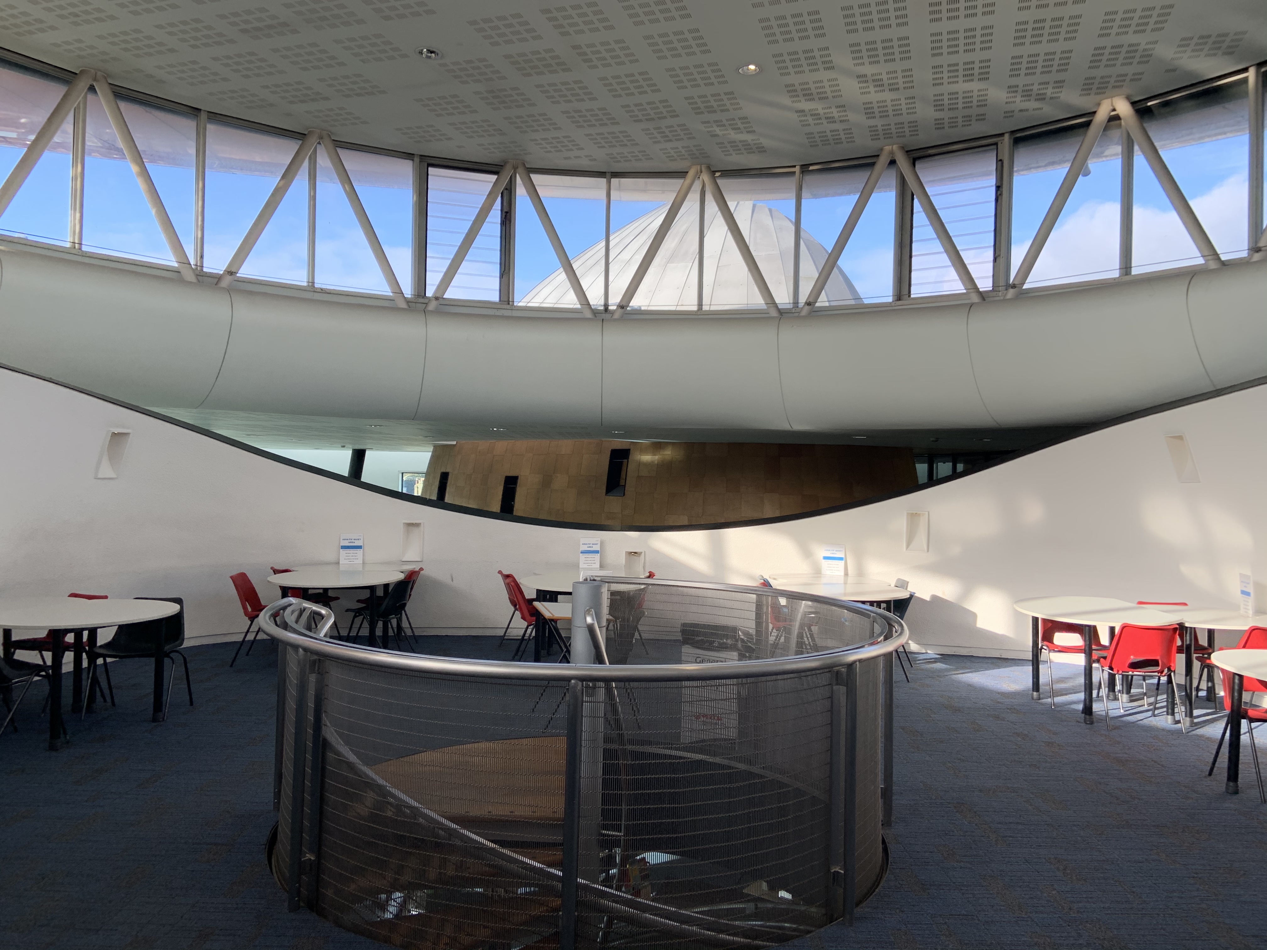
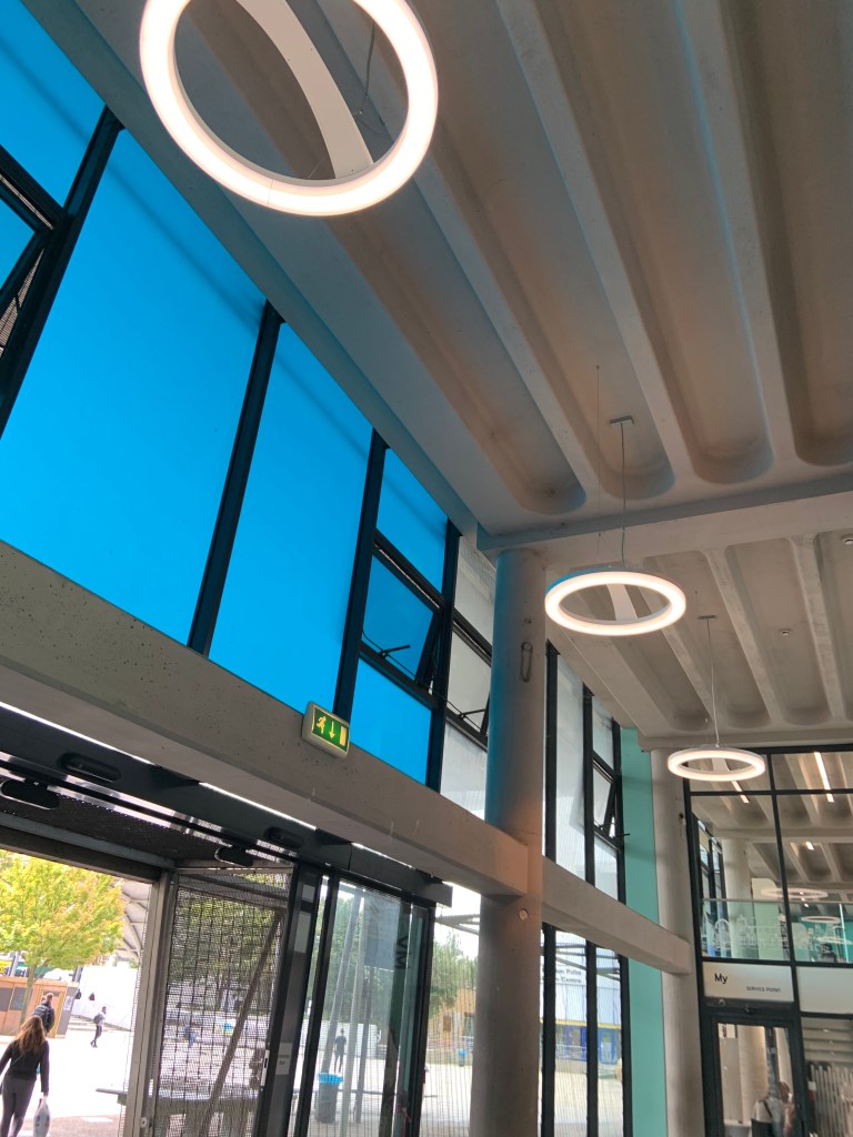
The high ceiling has an open work pattern, as if for ventilation. It’s white. Towards the edges there a gap around that lets the light in.
Ceiling above middle pod. Structure on the roof looks like the other pod is extending through the roof. Ceiling in children library has unusual design, looks concrete.
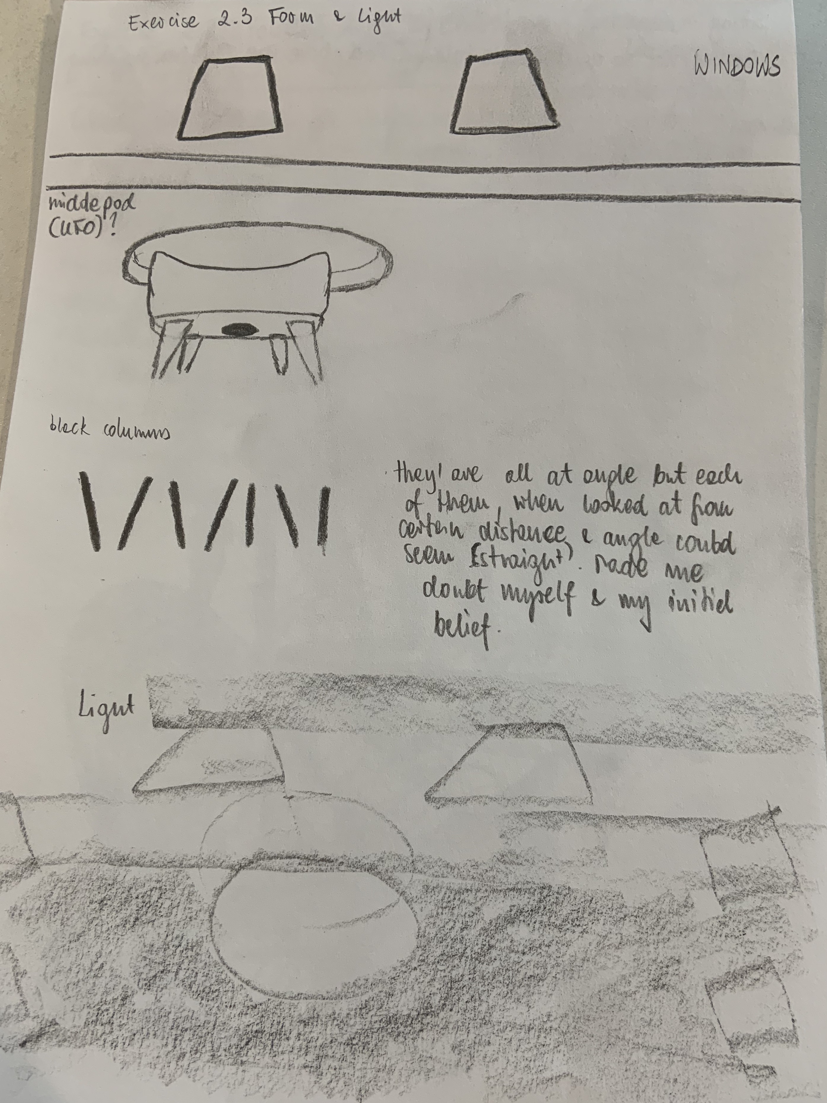
Look at the forms and shapes in space, make sketches and notes.
Forms & Shapes
Windows have interesting unusual shapes. They are either long and narrow or very large trapeziums.
I’m still impressed by the pods forms, the middle one dissapears into the circular opening in the ceiling, looks like a space ship about to take off.
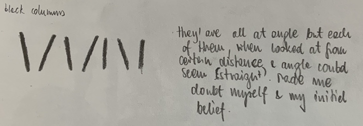
The back columns are at interesting angles, none of them is at straight angle but from certain perspective some of them seem that way. Initially it made me doubt myself and my initial belief which turned out to be right.
Light:
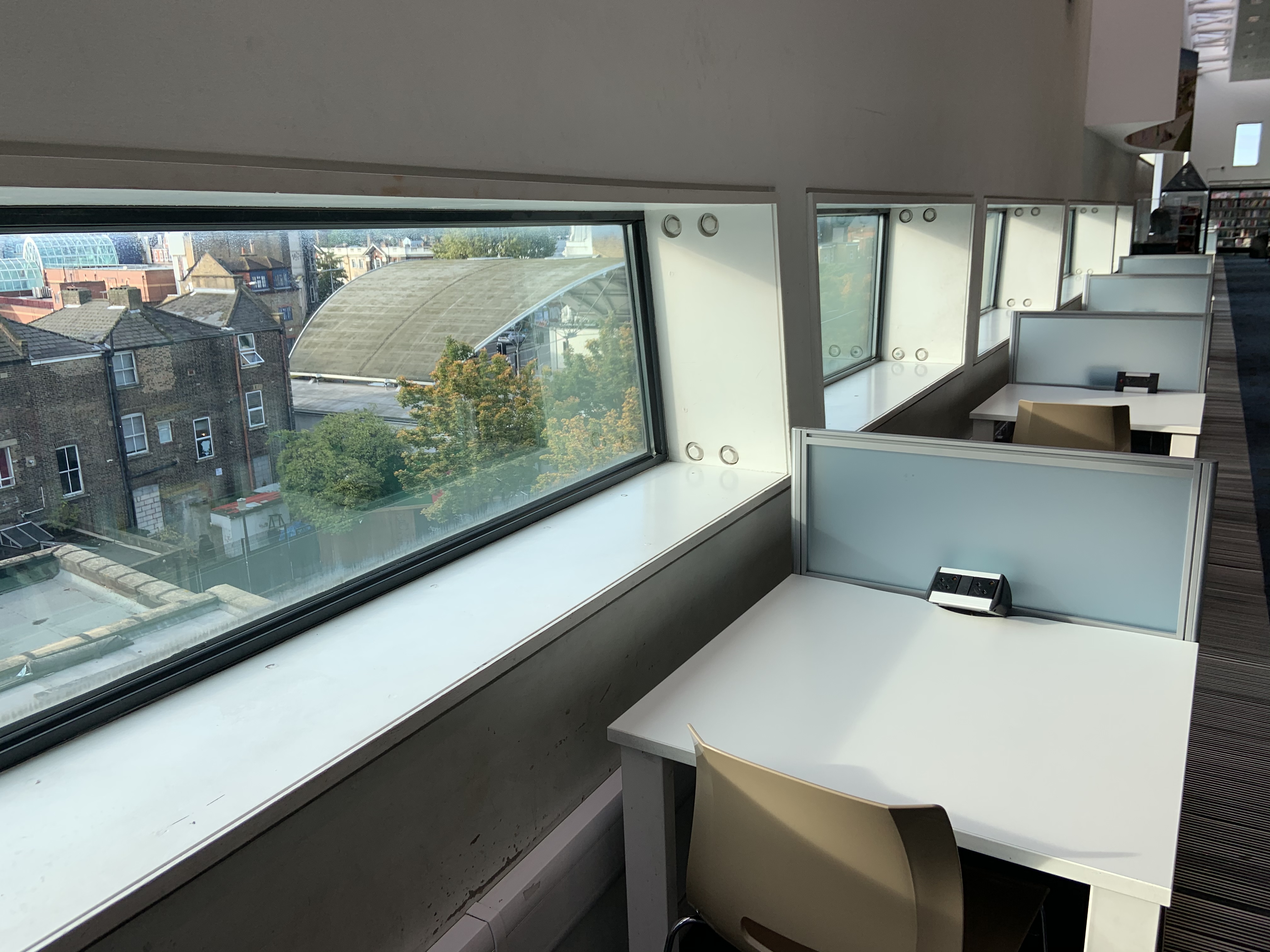
Near the window there’s plenty of natural sunlight. The trapezium windows are large and placed high up, they let plenty of day light in. A little deeper in are the pods, they create shady areas, block the natural light. There’s plenty of spotlights, but the artificial light can’t compete with unobstructed daylight.
Sounds: Created by other visitors to the library, talking, walking, placing items on surfaces. I think this place is a little loud for a library.
Touch: I’m sitting near the window, the sun is shining on me. Feels nice and warm. Then the clouds arrive, it’s not so warm anymore, not uncomfortable, but I preferred the sunshine. I’m siting in a plastic chair, reasonably comfortable, but not amazing. I can feel plastic surface of the table, smooth but a little grainy. It’s temperature is neutral.
I’m feeling relaxed but not too comfortable. I’m blaming plastic furniture.
Below is the drawing of my feelings as described above. I found it quite difficult, drawing sounds seems like a piece of cake in comparison!
After I completed this drawing I moved to a new area, the quiet zone under pod where the computers are.
It was darker there, also quieter than other area but could hear people nearby talking. Also someone tapping on the keyboard. A small child nearby (in the pod above me?) shrieking.
Touch: same surfaces as before, smooth but grainy plastic surfaces. Temperature is comfortable, I’m wearing my coat, without it I would probably be a bit chilly.
I’m feeling less comfortable in this area but still calm and fairly relaxed.
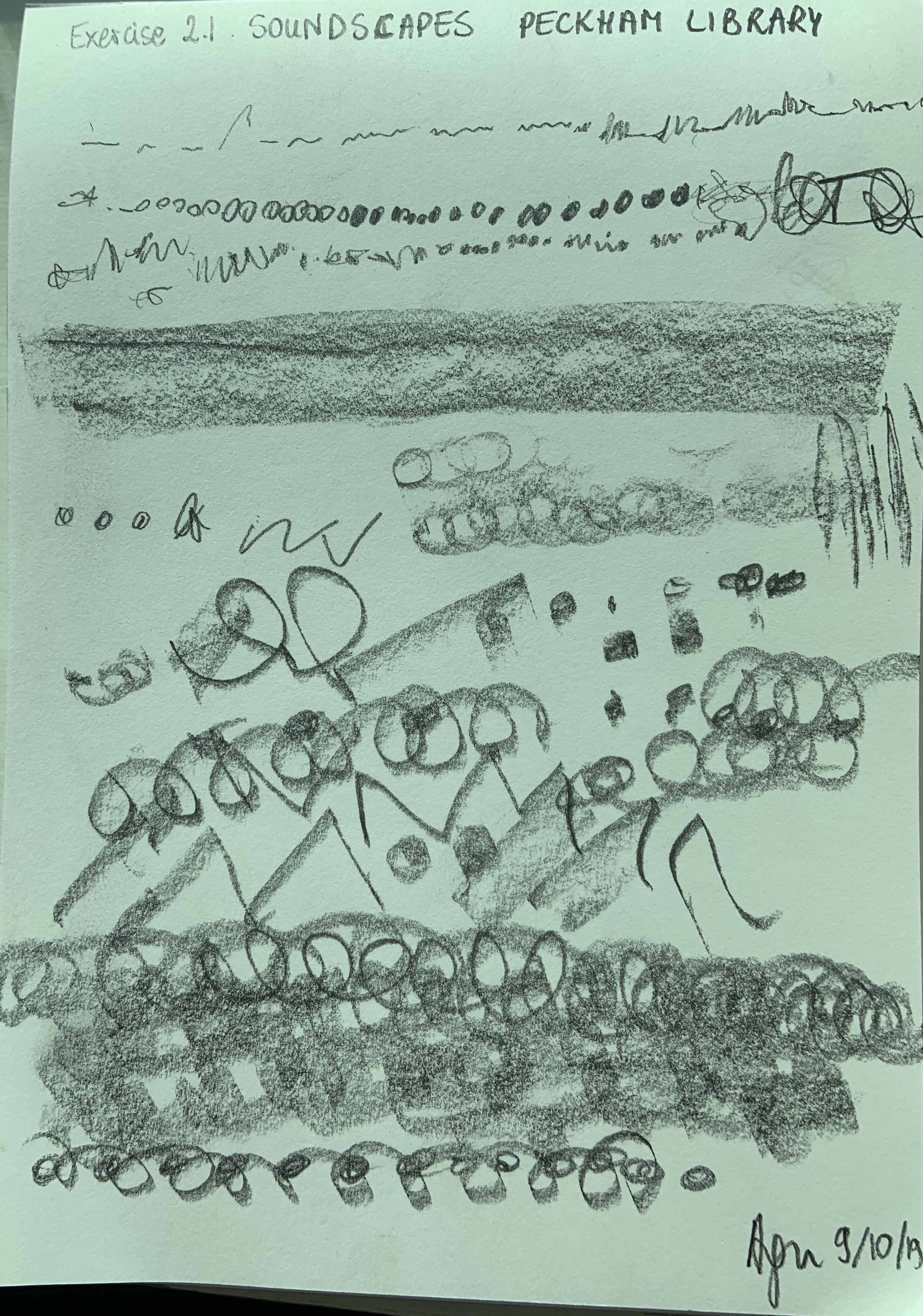
I visited Peckham Library again today. They let me in before they opened so I could take some pictures. My ‘listening experience’ drawing started before opening times, so the sounds I heard were created by library staff. I closed my eyes and tried to draw what I was hearing…
I’m pleased I brought an a4 pad this time, drawing sounds requires good space
Then the library opened to the public for the day, people started to come in, the place got louder, the sounds changed. At first it was mainly staff on the phone, people walking, someone hoovering in the distance. Suddenly it got crowded, place got instantly busy. Loud talking, multiple conversations at once, steps everywhere, squeaking floorboards, items laid out on tables, rustling of paper, someone sighed.
In the drawing above I pictured steps as circles, voices as twirly lines, sharp noises as sharp angular lines. I drew them as I heard them, in order.
Critically reflect on the concept of phenomenology.
Designers have to explore and have in mind emotions different people may have in the spaces. It must require sensitivity, compassion. The designers must be able to predict how users will feel. It’s a very difficult job as everyone is different and has different experiences shaping how they feel about certain things. For example someone may love a certain smell as they would associate it with a pleasant memory, while someone else may hate it due to personal taste or not so happy memory. I believe architects and interior designers spend long time dwelling on how users will feel in certain spaces during the process of planning. I think it’s easier if it’s a private space. We can just ask future users what are their likes and dislikes. Public spaces must be so much more difficult. Not only making sure that the ‘desired’ feelings are as intended but also not offending anyone (unless offence is a goal).
When I keep writing this my mind keeps wandering back to Jewish Museum in Berlin. Daniel Libeskind designed the Void, a space that zigzags through the complex and is visible from multiple staircases opening on to it, it can be also accessed on the ground level. There are tall, smooth concrete walls, that would magnify powerful echo, everything is pretty bare and raw. The floor is laid with what looks like thousands of metal plates depicting faces, mainly screaming. Users are forced to walk on them, and every step creates unpleasant noise, that’s is magnified by echo. I can’t imagine anyone being comfortable in that space. And I think that was architects aim. If you want users to feel warm and fuzzy you add soft corners, warm fabrics, plenty of diffused lights, and natural light. Usually darker spaces are less welcoming. I think phenomenology is about whether users feel welcome, comfortable and want to be in the space, or whether they don’t like it and would rather leave. I don’t think users concentrate on their feelings of spaces all the time, we usually come somewhere with a task and don’t dwell on how we feel. But The Void intentionally is the way it is, to make users contemplate on Jewish History and its dark moments. That space surely shocks an unsuspecting user and will leave a lasting impression.
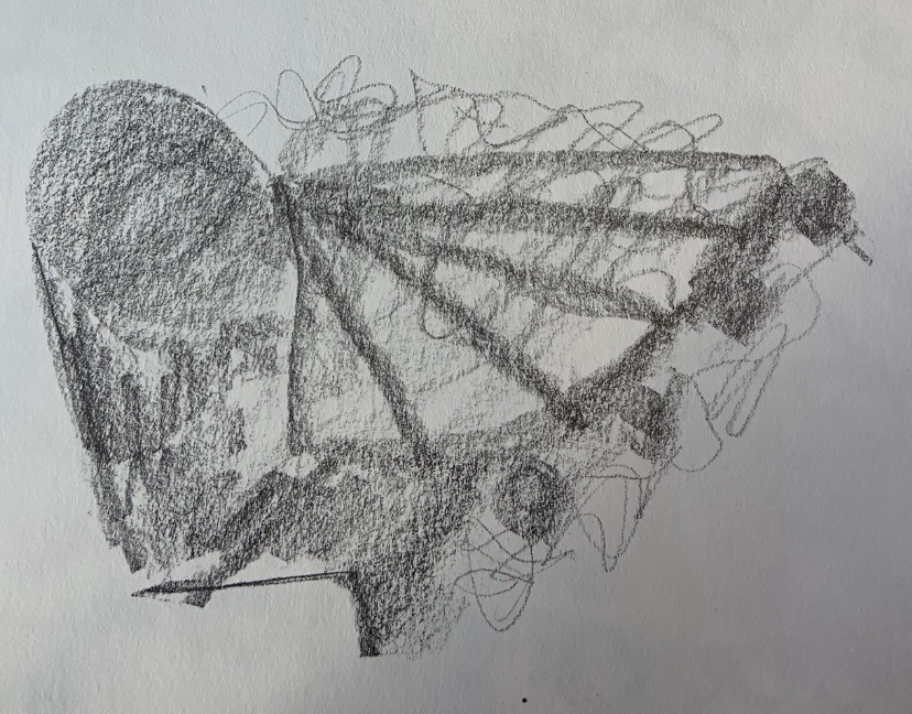
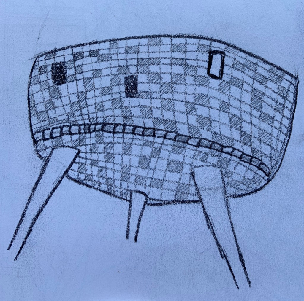
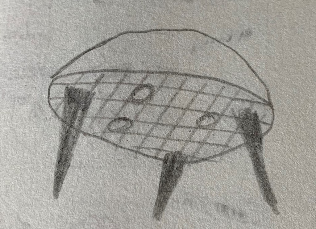
I felt that I couldn’t move on to my final map until I got the pod drawing right. I looked for an image online to base my drawing on and selected this one:
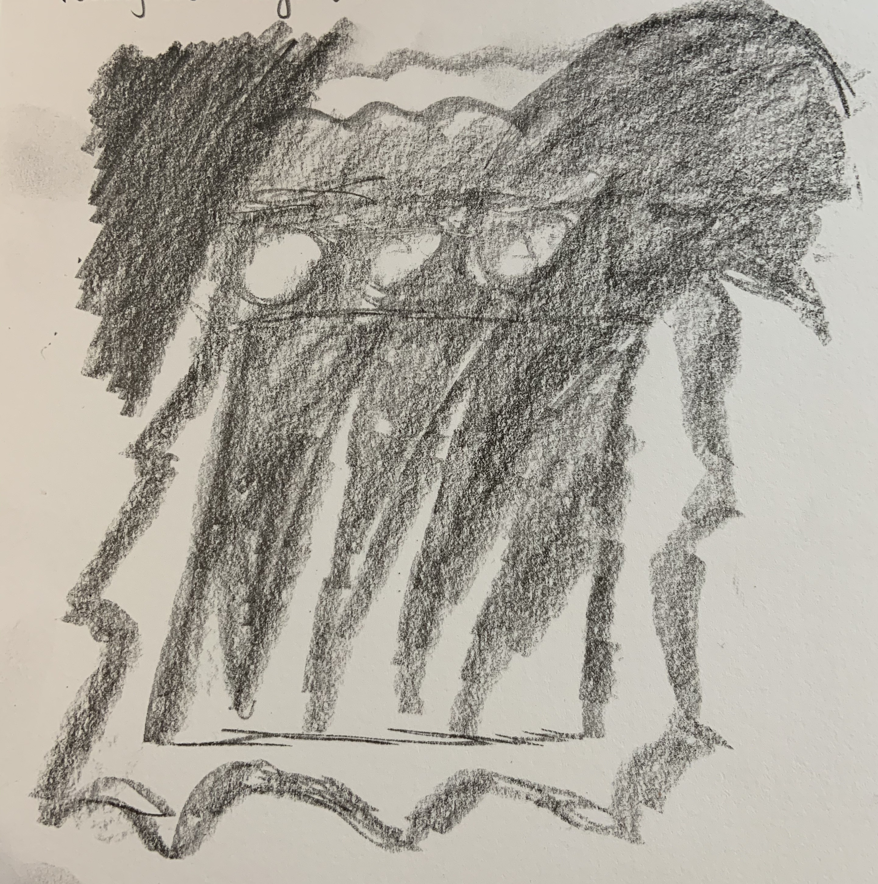
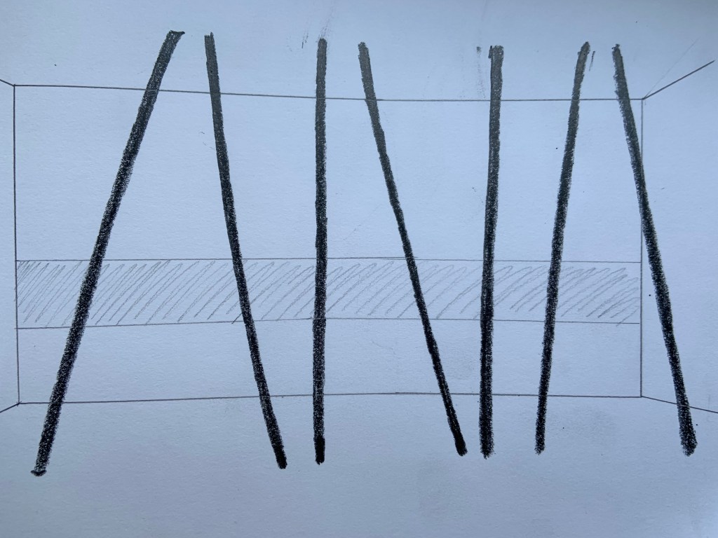
Then I realised I didn’t visualise the columns properly either, so here they are, since they are a simple form I decided draw them from my memory. They are slim, tall and each of them is at different angle.
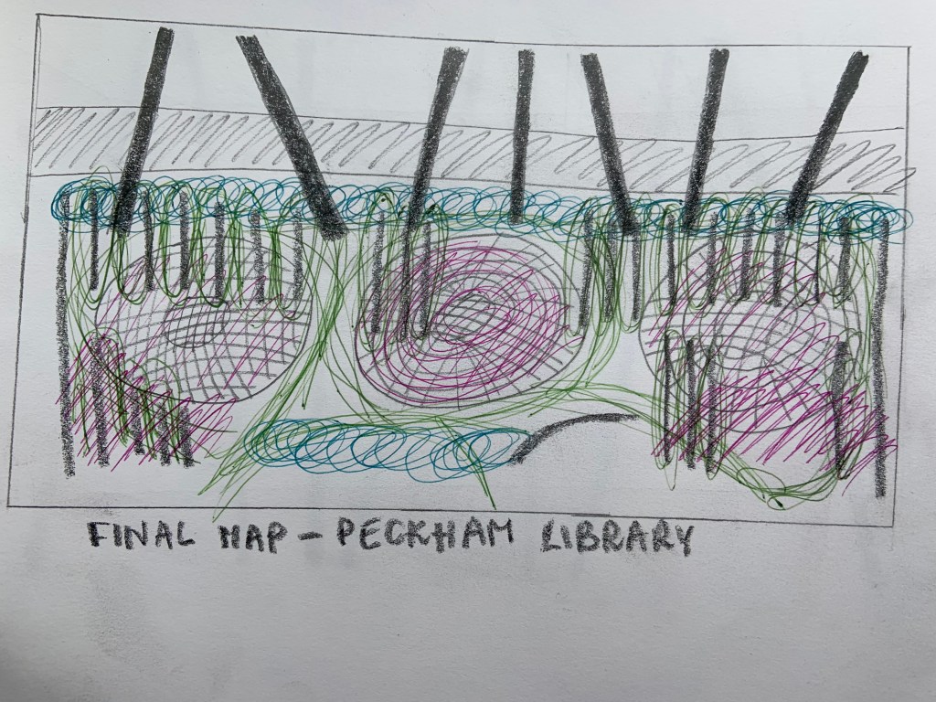
Only now I feel I can move on to drawing my final map.
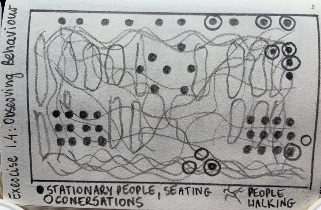
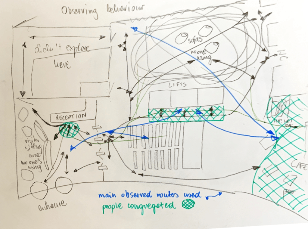
Record how people interact with and within interior. What are they doing? How they behave? What routes they take? Where to, where from? How are they acting?
I decided to make a drawing to present my observations, based on simple rectangle that presents the floor space.
People that spend time here are mainly seating down at many spaces designed for that purpose. They’re either working on computers, reading while seating on comfortable looking chairs with lower coffee tables or sitting by study tables near the ‘window wall’. Not many people are walking, I drew more routes than I observed, especially between the bookshelves. I haven’t observed many users there, however I felt it was important to highlight routes forced by the bookshelves for users looking for a particular book. Most people I observed walking were along two longer walls, with majority nearer the reception desk, walking to and from reception to speak to staff.
Unfortunately I was refused permission to take photos due to privacy issues. So I decided to draw instead.
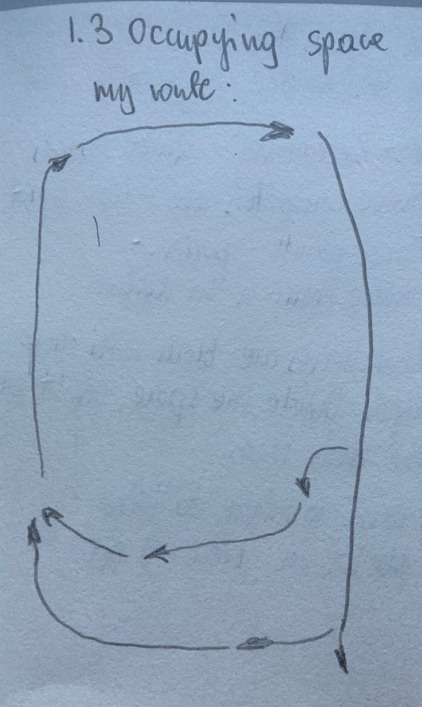
I walked around the room, first I made a bigger circle, then I walked nearer middle pod.
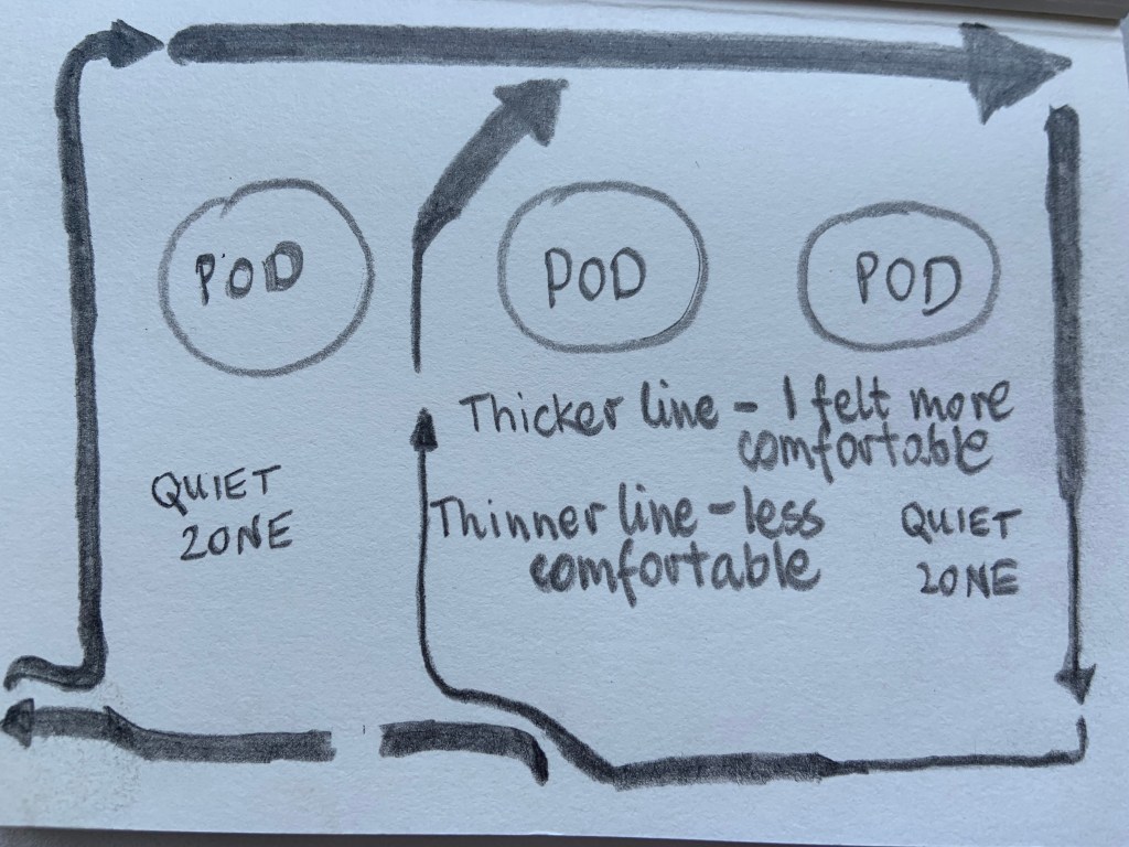
Area that I felt was more welcoming was by the windows, I believe due to plenty of daylight. Less welcoming areas would be the quiet zones, probably because there were signs to be quiet and people were working there. I felt like I was an intruder, disturbing their concentration. Spaces under pods were darker than area near the windows, which made them less pleasant to be in. Bookshelves are dominating the space, they are black with sharp edges, divide the space, can’t see much through them. The pods look very interesting and are the focal points, drawing your eyes to them.
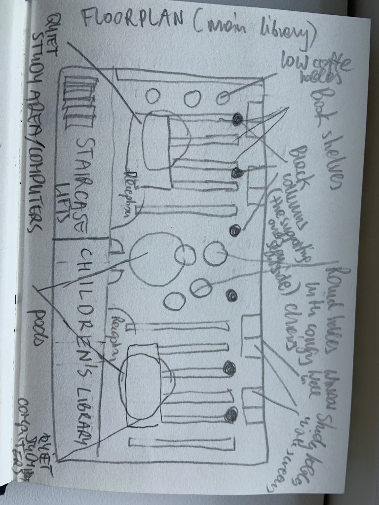
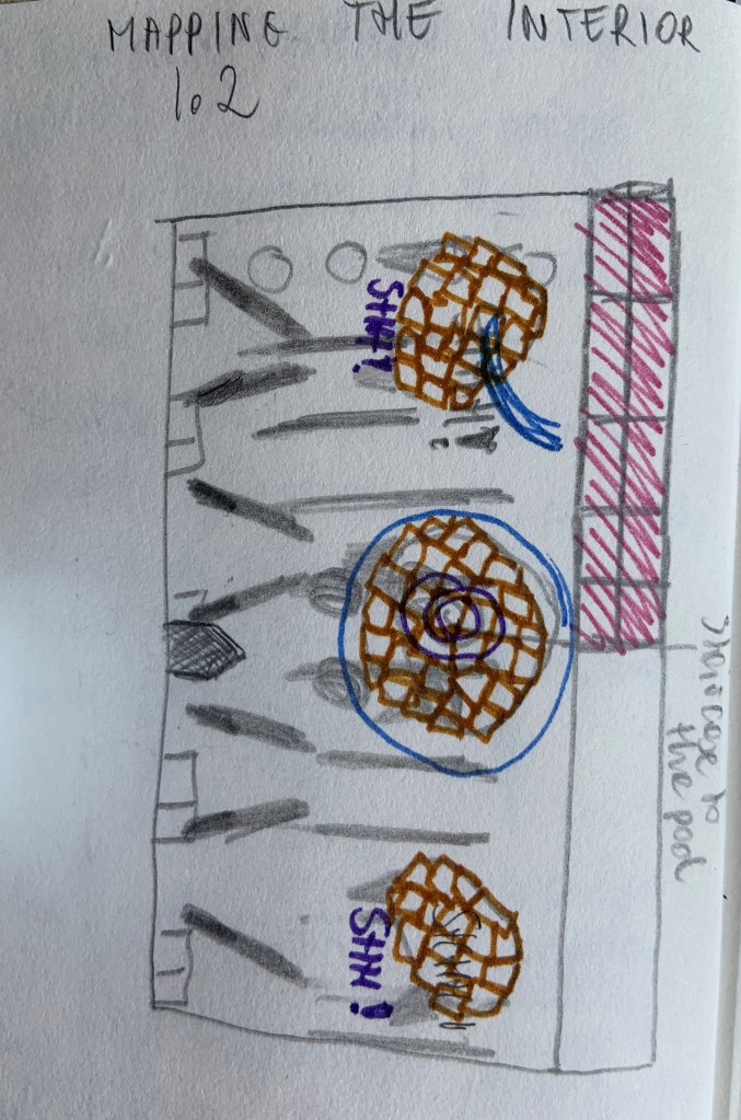
The interior of main library space consists of many zones and elements within them so I decided to try and draw a floor plan first to help me understand the space better.
There are different zones within this space: reception, quiet study zones with computers, reading desks near the window, seating/ reading zone with more comfy chairs and lower tables under middle pod and bookshelves in between. Book shelves make the space feel more closed. The most interesting features are the meeting rooms in pods and black columns that ‘pierce’ through the floor and reach the ceiling at different angles. These are the same columns that support the building outside.
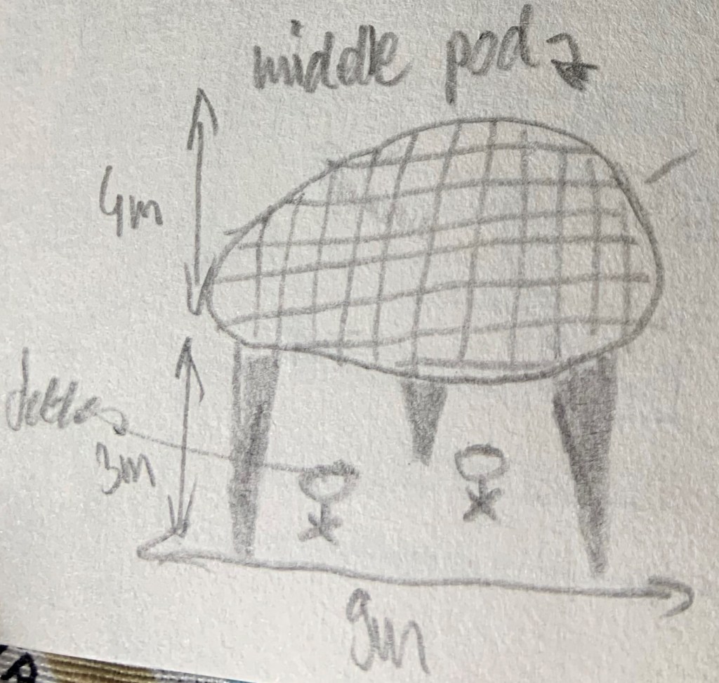
There are three big pods that contain meeting room, study area and a crèche. They are raised on three or four legs each about 3 metres above floor level. The middle one is accessible through a winding staircase at the bottom of it, the side ones are accessible from the level up, through step free access. The pods have irregular shape and are covered in irregular, wooden looking plates, creating ‘patchwork’ effect. I tired to draw them but found it really difficult to get the perspective right.
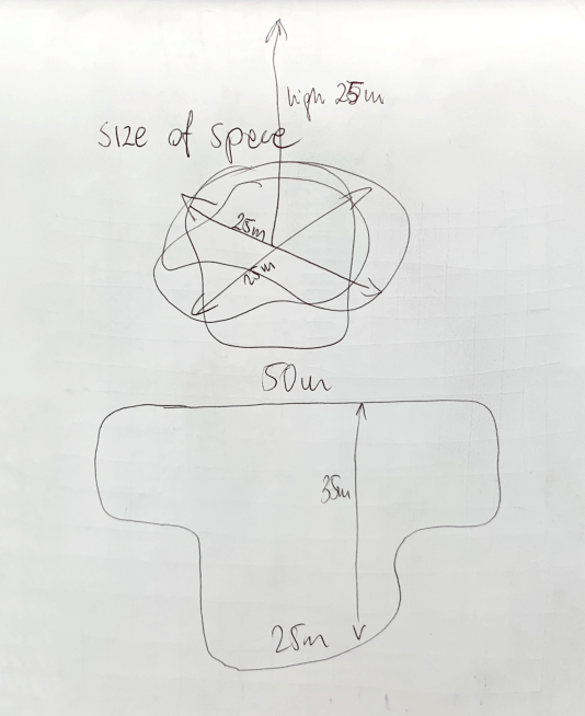
Estimating the dimensions of the space: I walked around and counted my steps to help me estimate the size of the room. I estimated it to be 45m long and 15m wide. I find estimating the height of the rooms more tricky but first I estimated he size of the pods and then assumed the room is about 7m high.
Mapping the interior:
Reflection:
I found the process of mapping this interior quite difficult. Firstly there are many elements and I felt I should not include them all as my map would be completely illegible. Secondly there are unusual shapes and angles and it was hard to rely these onto my drawing. If I was doing this exercise again I would bring bigger notebook to draw in more detail. I feel that my map identified the most important elements of this space: the pods, raised circular ceiling above middle pod, pink glass between main library and children library, black columns, quiet areas and the bookshelves.
I visited on a week day around 10am, so the users were mainly adults, most tables were occupied, around 30-40 people on my floor. It was busy, despite people being stationary it felt busy. In relation to noise levels it was relatively quiet , some people were having conversations, but most were working alone. People that spend time here are studying and reading.
Reflection on why I chose this space:
Peckham Library is an interesting building that won the Stirling Prize for Architecture in 2000. It has many features to explore and it is a public space which means I won’t have any issues accessing it. Most important for me is: the building has been designed with a lot of thought, and I’d rather study a building that has a purpose and it’s been well designed to serve the community rather than any space that may be useful, but may be less interesting. This building is interesting, useful, and is well designed.
Staircase at the back of the buildingSteps leading to the main library, which is high above ground levelMain entrance area on the ground floorOutside the library public space is maximised thanks to ‘upside down’ design of the building
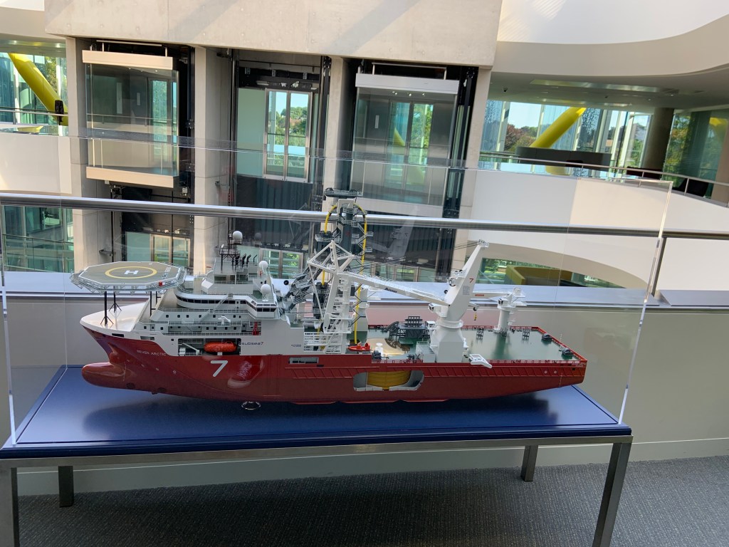
Unfortunately I am unable to return to Subsea7 to continue exploring that space.
I wanted to select another original and interesting building that’s also in convenient location and I chose Peckham library. I’m looking forward to exploring this public space, despite being close to my workplace I never visited to see the interiors of this unusual building.
I tried to sketch the shape out of the building, after many attempts here it is:
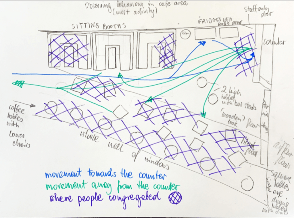
In this space people either walked or congregated. I drew main routes of movement and areas where people were stationary at times. As most of people I observed walked either to or from café area I decided to draw another plan for that area specifically.
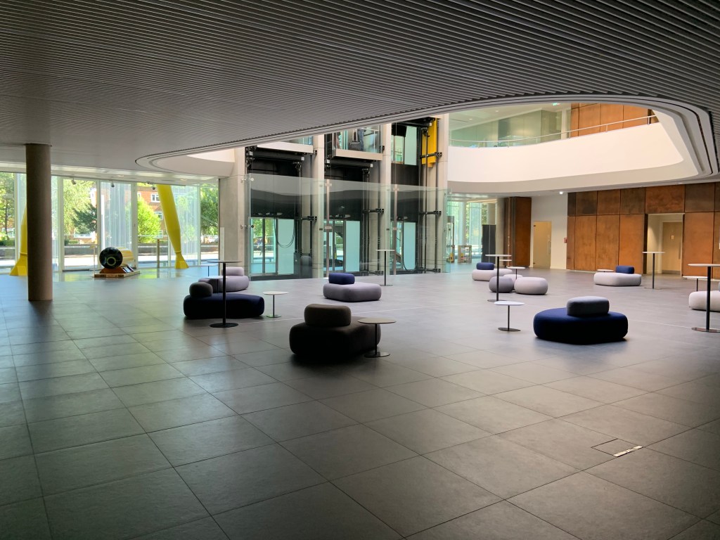
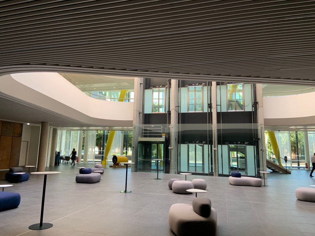
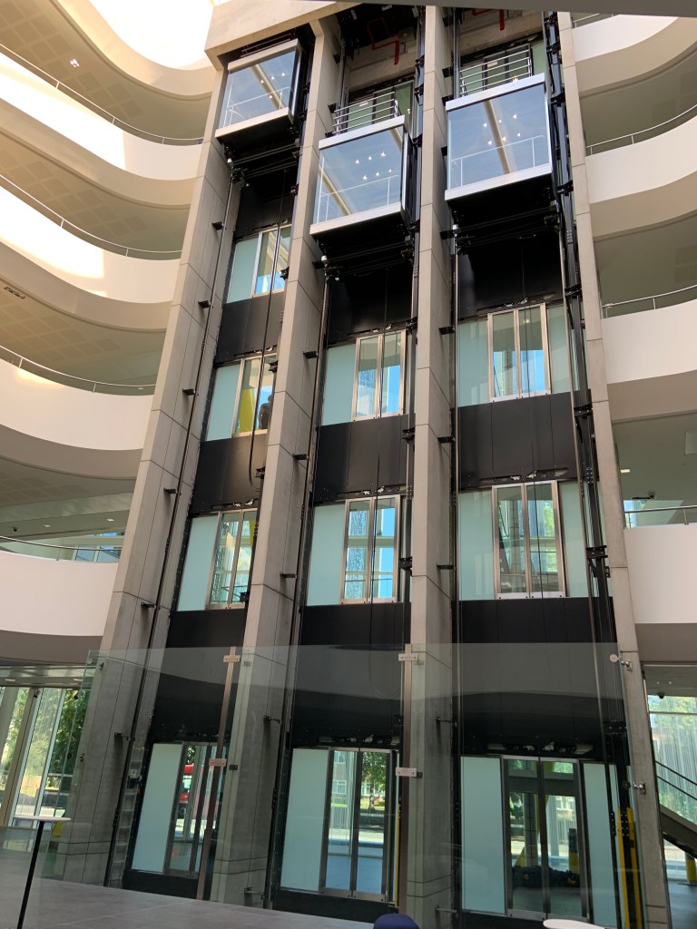
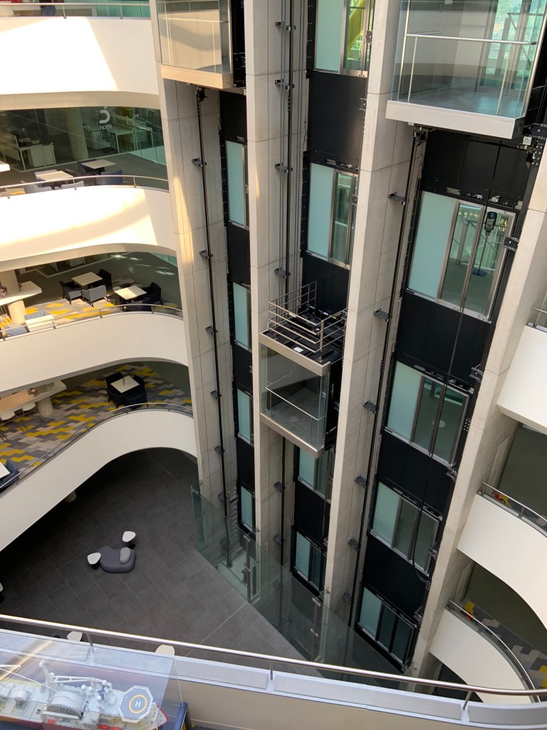
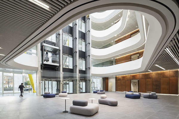
I walked through the interior starting at the main entrance and reception area. I headed towards the lifts but was drawn into the atrium area which had plenty of daylight. I went back, walked in front of the lifts, looked into the atrium again, from a different angle and moved on to the café area.
I then walked back to the reception area and started recording my journey, I took some videos of the space but I think pictures will be the best medium for this exercise.
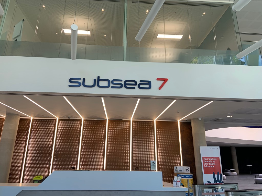
Reception desk
Reception desk
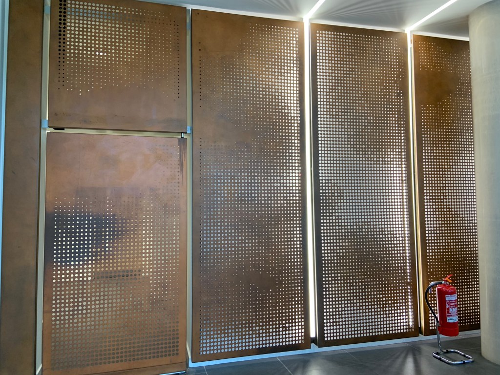
Rusted steel panels
Reception sitting area
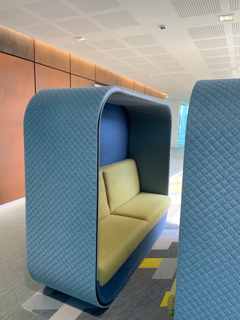
Pod in reception area
In front of the lifts
Atrium and lifts
Upstairs rest area
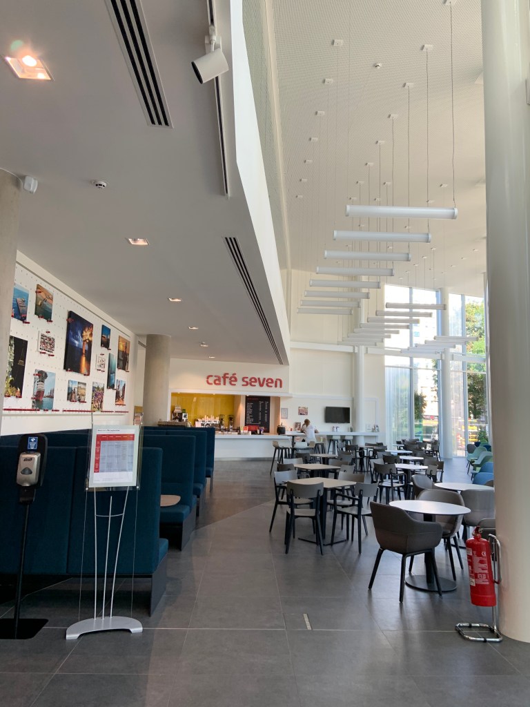
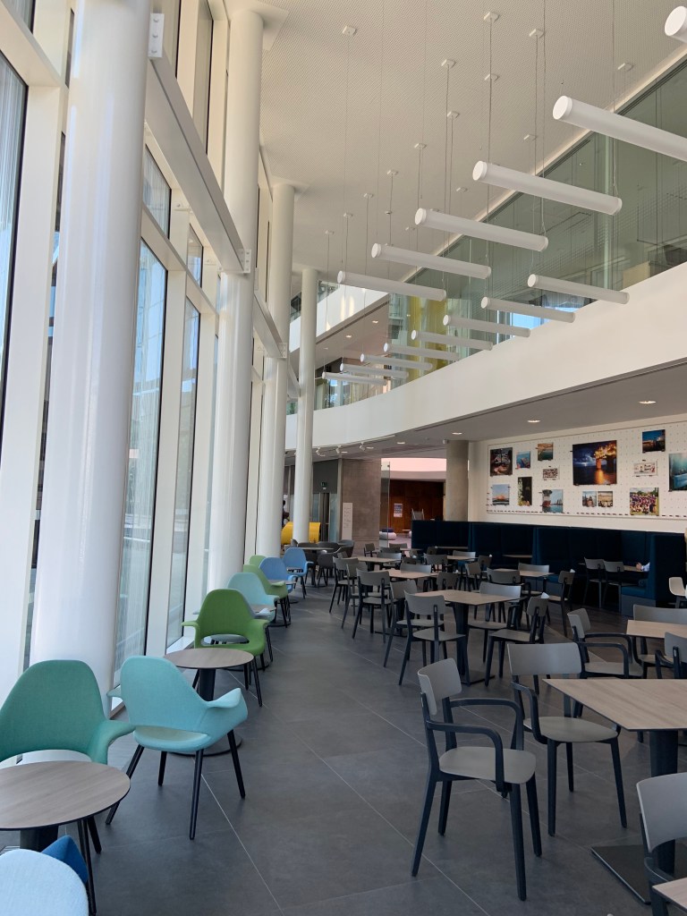
Café
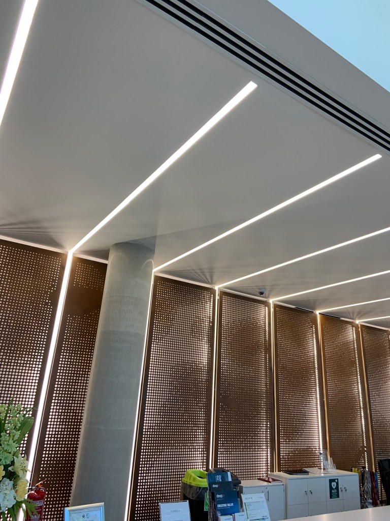
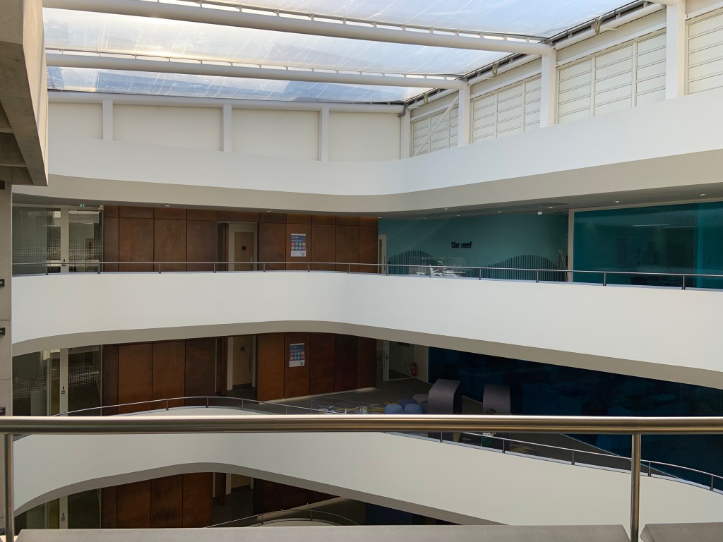
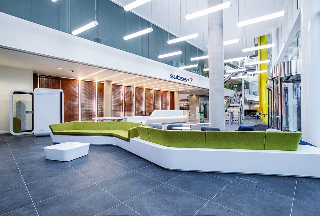
The reception area was a very high space, with cladding matching that on the outside of the building. The space nearer the reception desk felt more welcoming than where the long couches are. I think these feelings would be affected by difference in ceiling heights, lighting and rusted steel panels which added warmth, as opposed to sharp angles and cool colours.
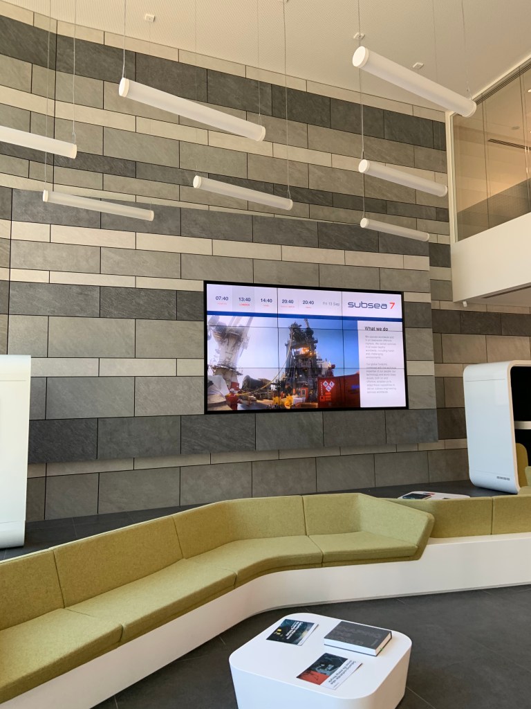
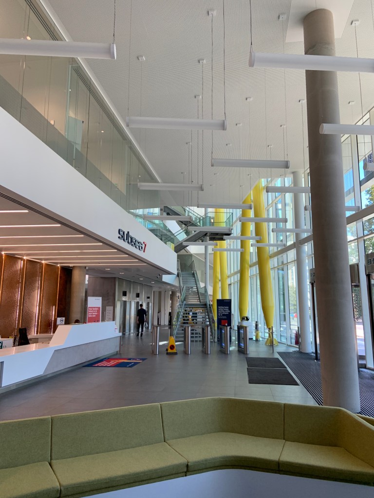
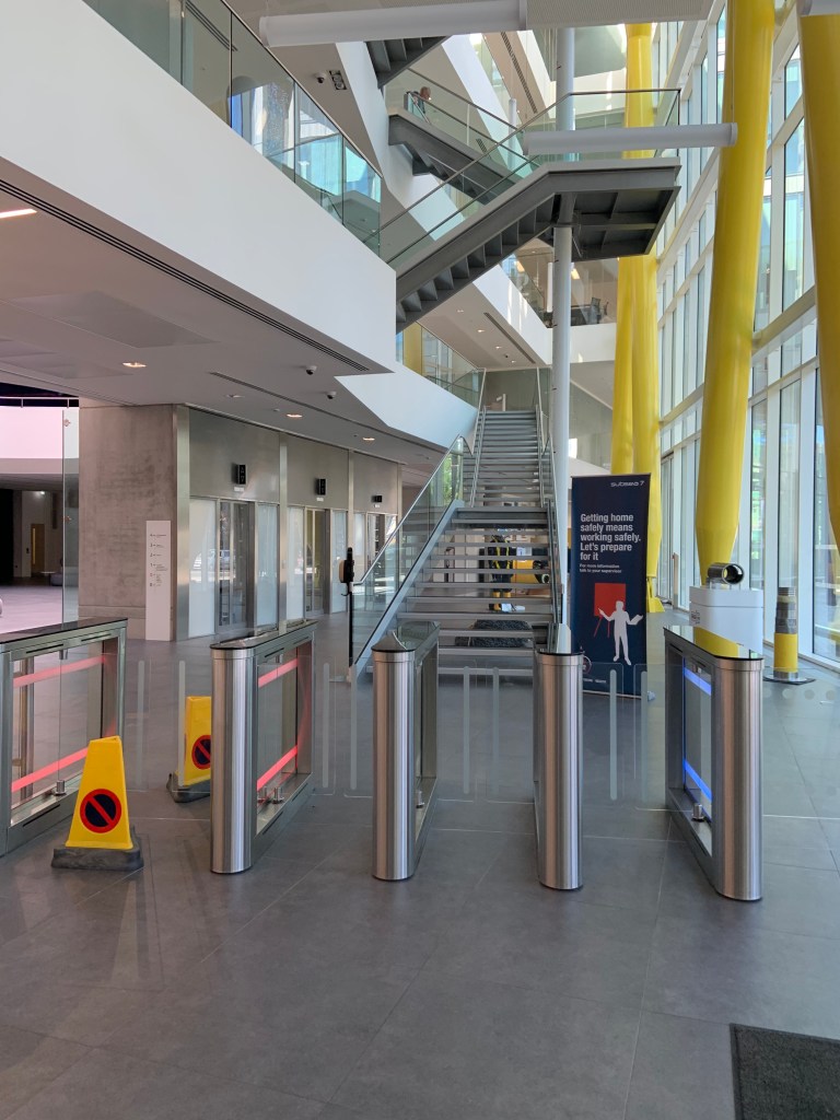
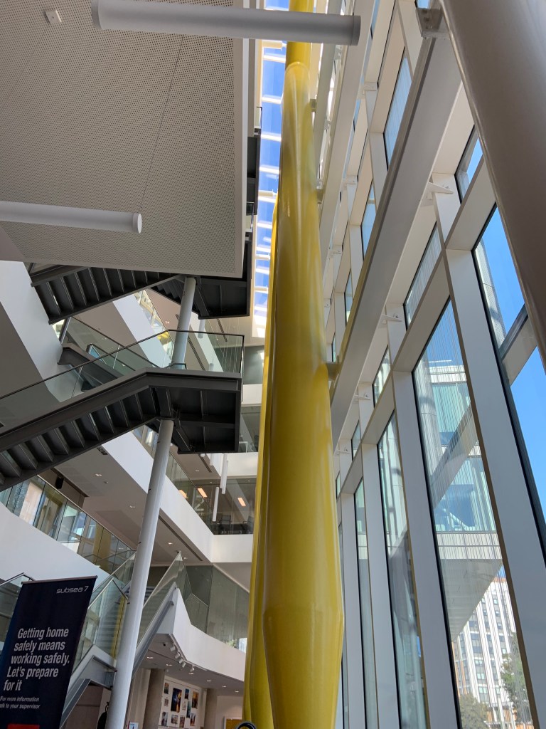
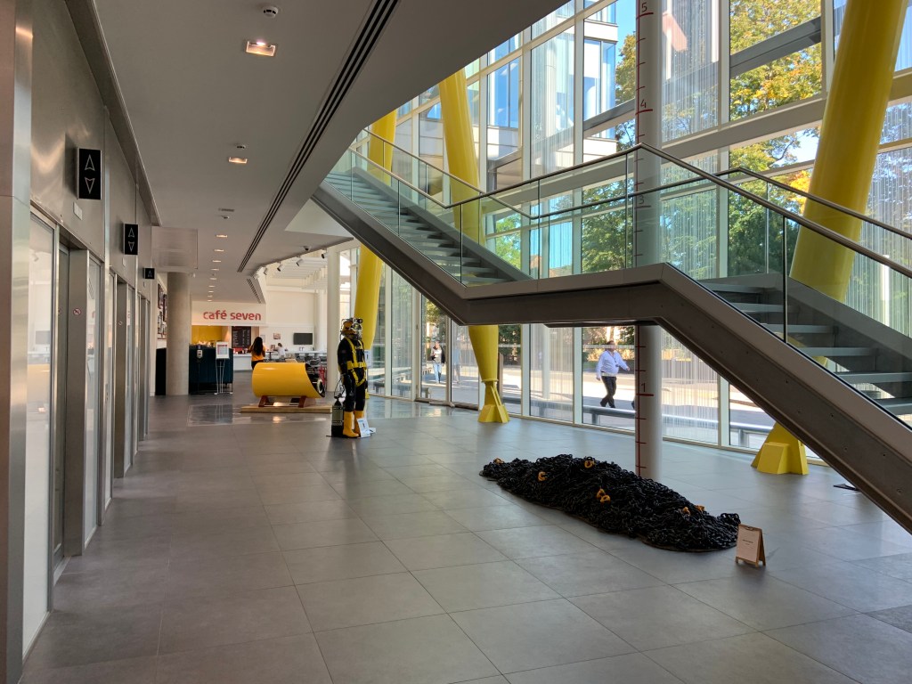
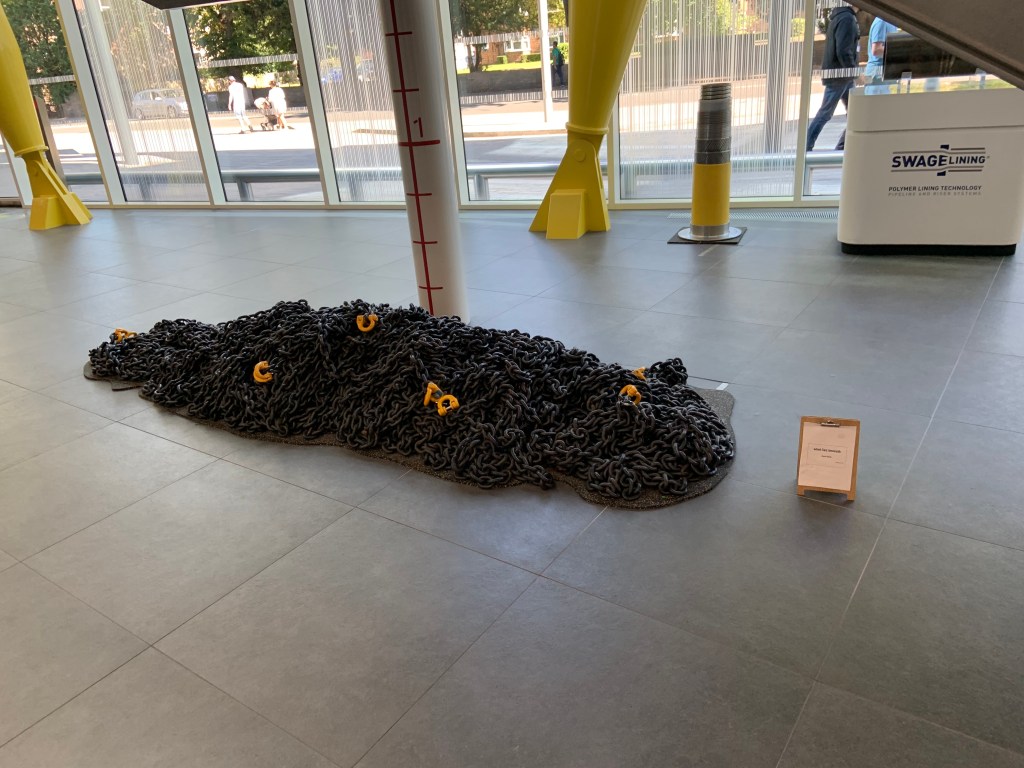
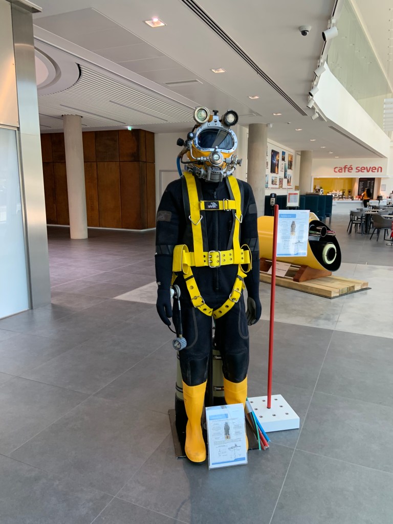
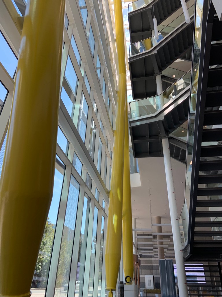
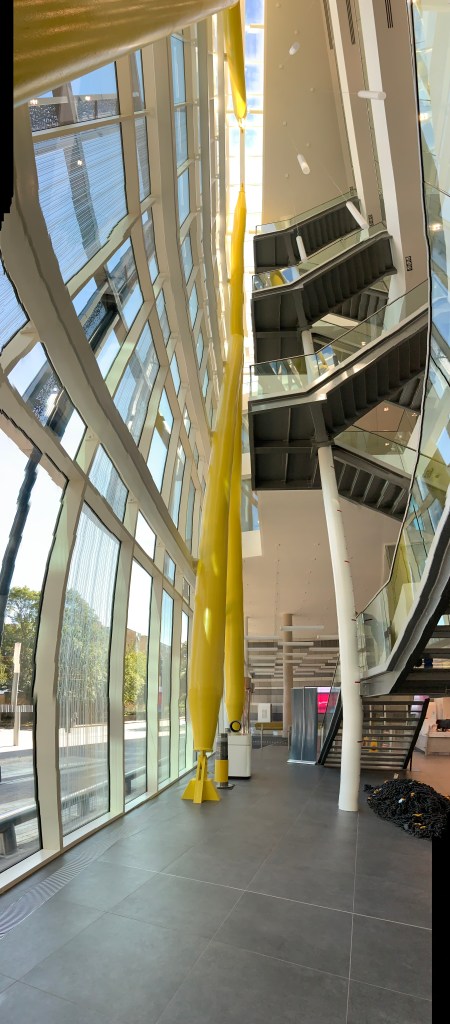
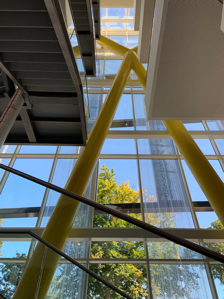
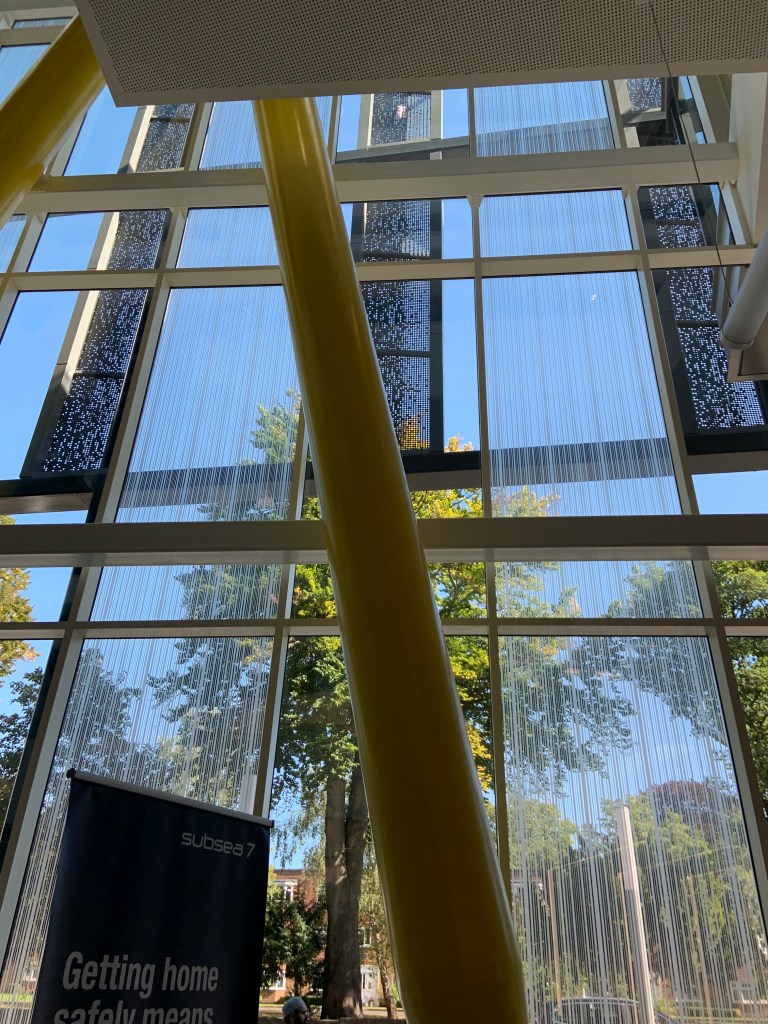
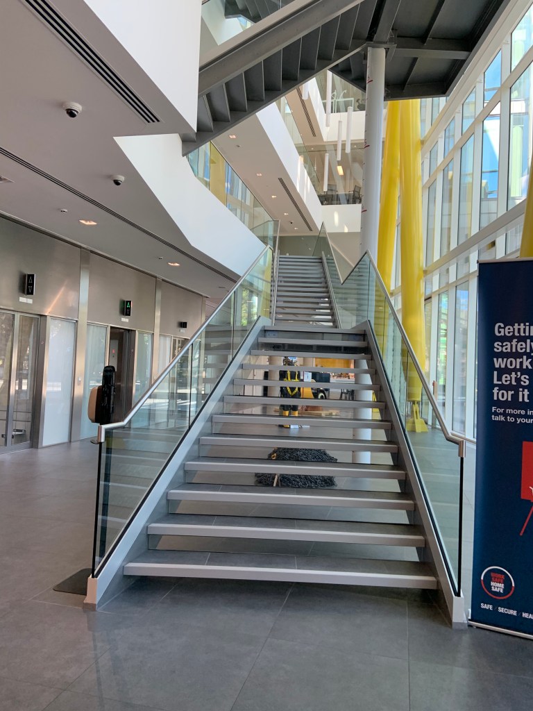
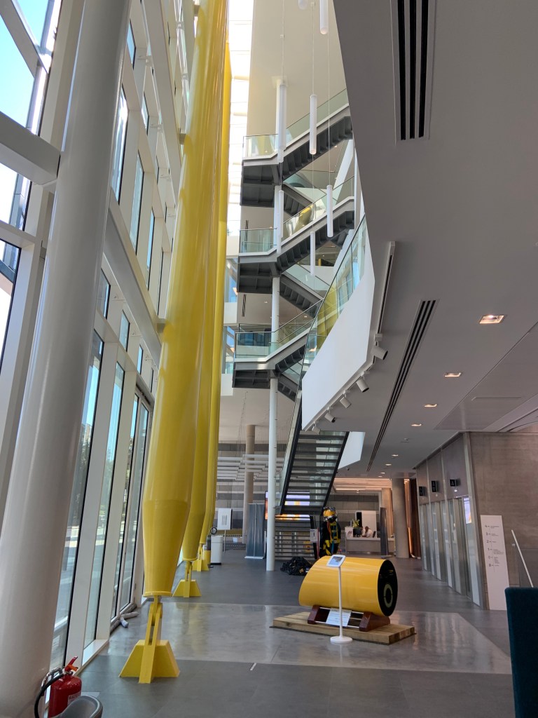
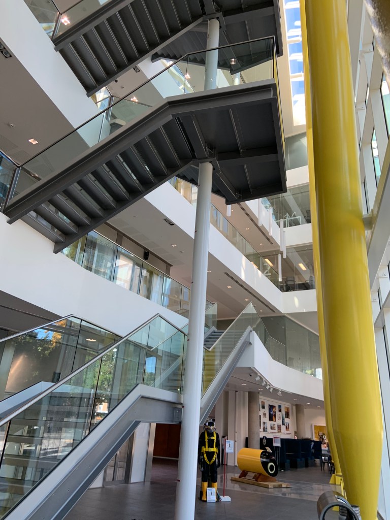
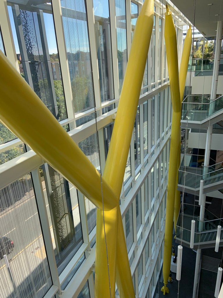
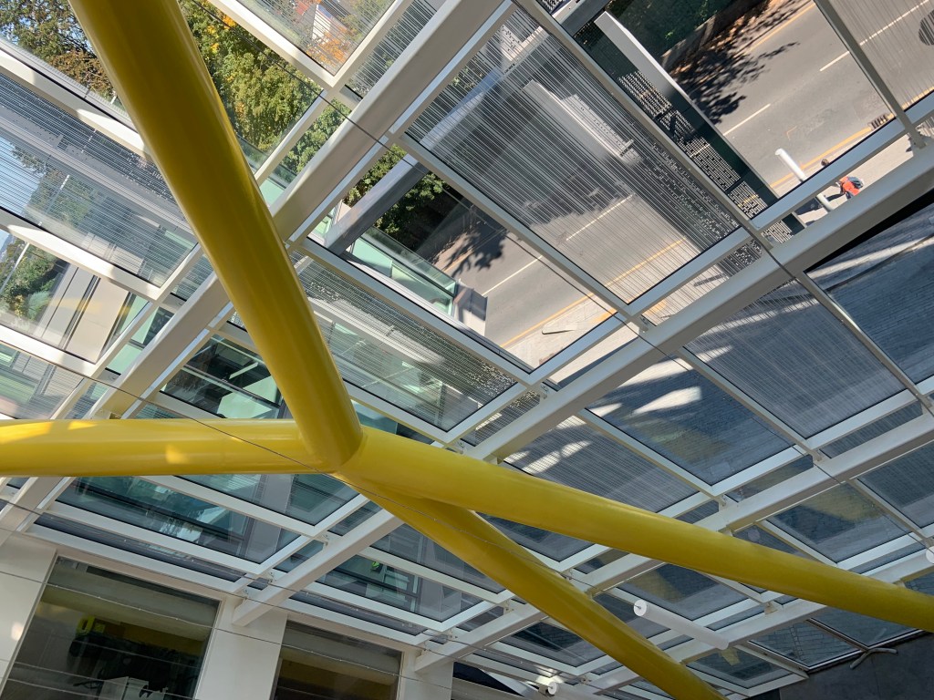
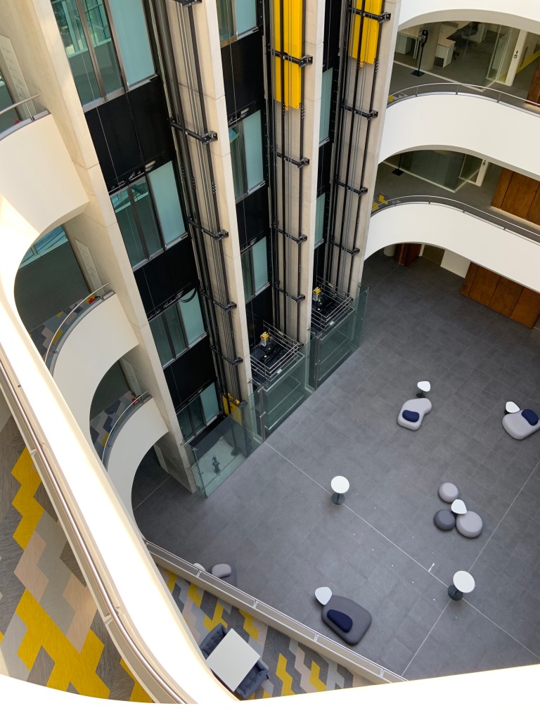
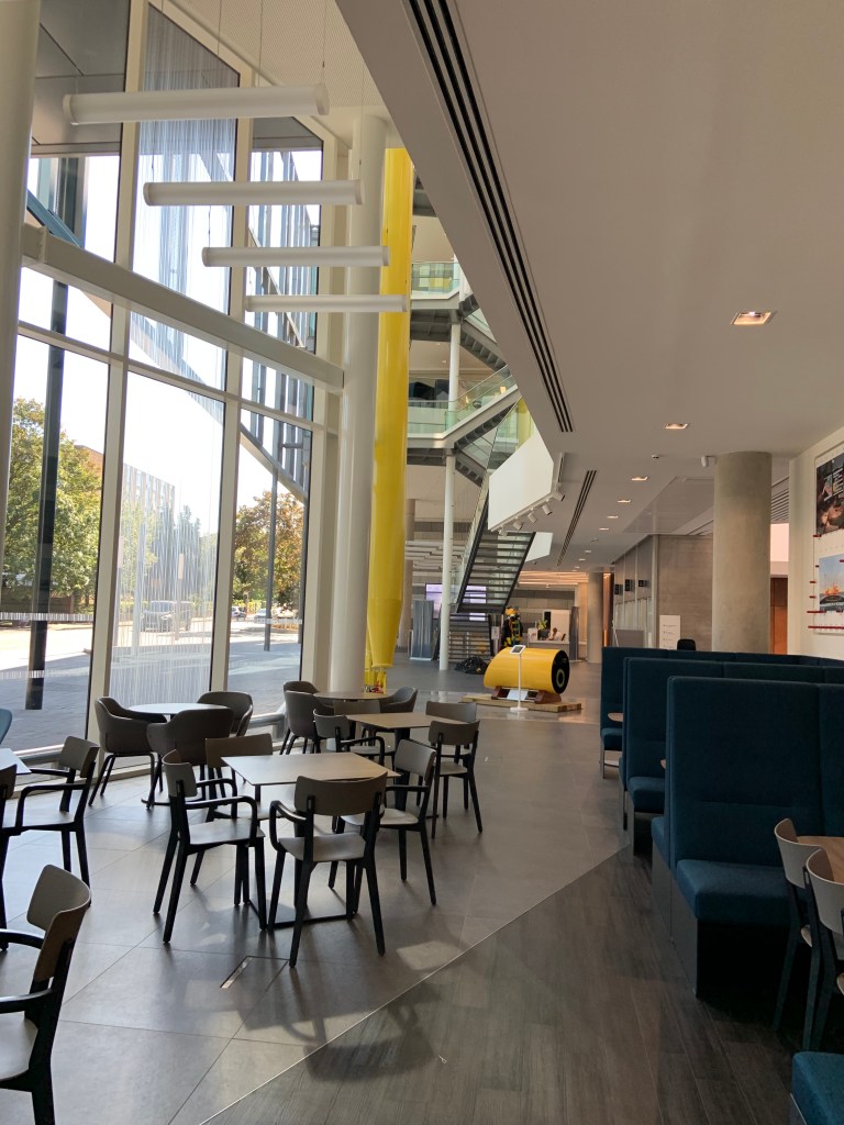
The space where the stairs and fronts of lifts are, is a clear commuting space, lifts, stairs etc. It would look very plain if not for added yellow columns crossing at height and other yellow elements (mainly display of Subsea7 designs and products). In this space I felt overwhelmed by the space and height of yellow columns.
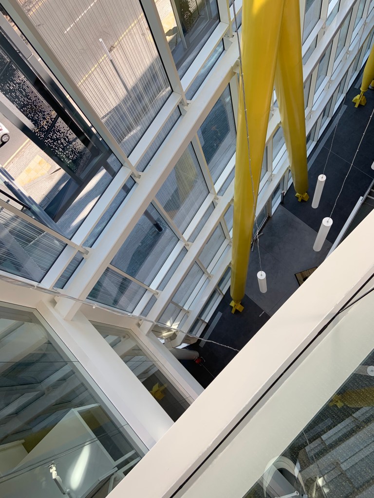
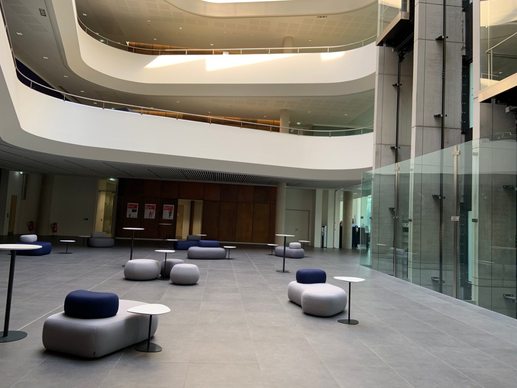
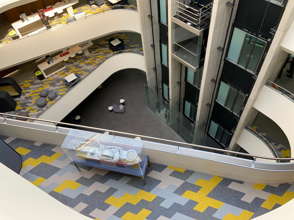
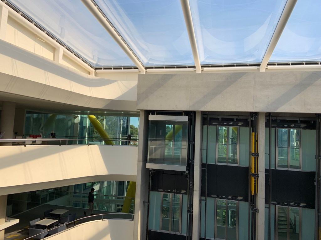
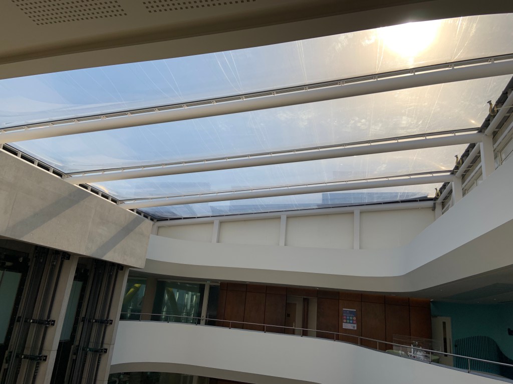
My favourite space was atrium which had a very high, clear ceiling that let plenty of light in and was overlooked by irregular shapes of open floors above, with clear panes of the back of the lifts to one side. One wall opposite the lifts hid a state of the art – pull out seating system concealed behind a tall curtain. In this space I really liked the ceiling, well the ‘first’ ceiling actually – composed of metal, pipe-like elements and the rusted steel walls which added interest. I felt the sofas were small for this big area and looked ‘lost’. However I understood the fewer of them, the easier it is to set up the pull out audience seating for big presentation etc. That atrium was also a ‘commute’ route with people often crossing through. I really liked how it felt in atrium, with the daylight and the ‘balconies’, as if it was an outside space.
Panoramic picture of the atrium
Café area was quite a popular spot, it felt more cosy with a narrowed entrance and lamps hung in a way to make the space fell less high. The homely feeling was increased by adding upholstered seating in greens and blues (as opposed to yellow accents in the rest of the building) and colourful pictures on the walls.
I visited Subsea7 in Sutton on Friday 13th (!) of September.
From the moment I entered I was overwhelmed by beautiful and functional design of the place. The building has only been in use for about 3 years, so it is modern, designed in a way to improve productivity and has a pleasant aesthetic vibe.
The image above I drew quickly. I identified important features easily. They are the yellow criss – crossed columns (they are green on my map), rusted steel elements (orange), stripy ceilings, wall of tall curtains, lifts and atrium with open floor ‘balconies’ looking down at it.
Estimation of size of space. First drawing is of the atrium; second, entire ground floor.
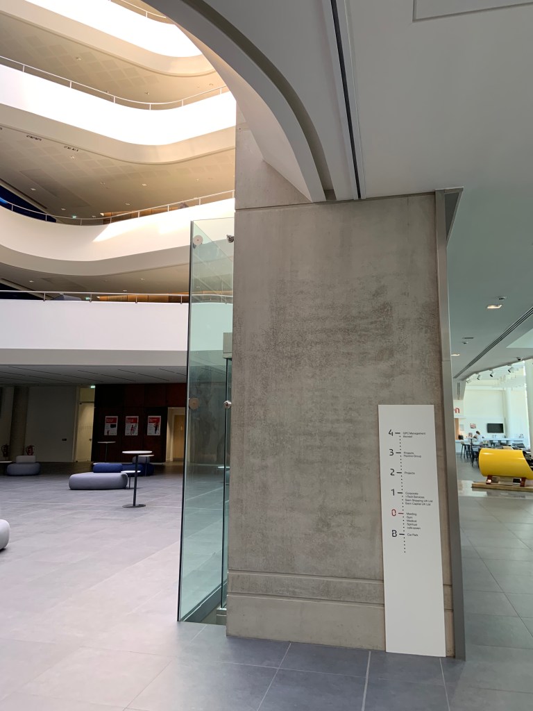
I found it quite hard to estimate the size. The columns helped me estimate the height, I estimated 2 metres on the columns and assumed all floors have same heights of 5 metres. Later on I found out that the floor to top ceiling distance is 20m – thanks to handy ‘measuring’ column next to the staircase. The width and length dimensions I worked out by imagining how many living rooms from my flat will fit in there.
Map 2
After drawing the first map and estimating the size I decided to draw another map, detailing more elements. The map 2 details most of elements from map 1, and has added entrance, three lifts (as opposed to one on first map), lighting, columns, stairs but I felt I could not include stripy ceiling on this one.
Drawing of open plan floors opening to the atrium, yellow columns and ceilingDrawing of open floors above the atrium.
Reflection on how I found the process of mapping the interior.
I found it surprisingly easy. I started off with quite an exact drawing of the floor, but as I was adding more elements the image was becoming more and more abstract. I felt it was important to add the patterns present, like the stripy ceiling and rusted steel panels behind reception desk that had openwork, irregular, dotted patterns. I found it difficult to portait those patterns in my drawings. I didn’t feel adding furniture was as important in this space as the space was huge comparing to the sofas etc. Nevertheless I added a few sofas in the middle of atrium. I wish I had a yellow pencil or pen so the columns could stand out on my map as they do in real life.
I chose a few potential sites to possibly visit and explore. To be honest from the moment I knew about the task of exploring a selected space I knew which one I will go for despite never being inside. So over a week ago I started a process of getting a permission to access and I got it! I will be visiting Subsea 7 Sutton Office next week.
Two of three chosen spaces I would have to have a permission to enter (Subsea 7 and Toyota Epsom).
The only space I visited previously was 601 Queen’s Rd -restaurant and bar in Wimbledon, London. I liked this space as it had a design style that matches my personal taste. Lots of space and natural light and a trendy design. I particularly liked the bar stools which looked stylish and comfortable. They were quite popular with guests. The colour pallete was greys, blues, whites and black. Bar and stools were finished to high standard whereas nearby distressed tables were surrounded by mis-matched chairs and plush sofas. Fresh herbs in in rustic wooden pots were decorating the bar and some tables adding to a homely feel. Urban and retro looking lights were adding to a nice atmosphere. I liked that space it was thought through, had plenty of sunlight on the day I visited and was inviting to relax and spend time with friends.
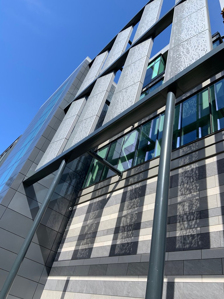
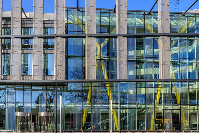
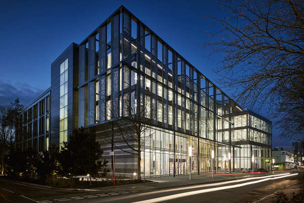
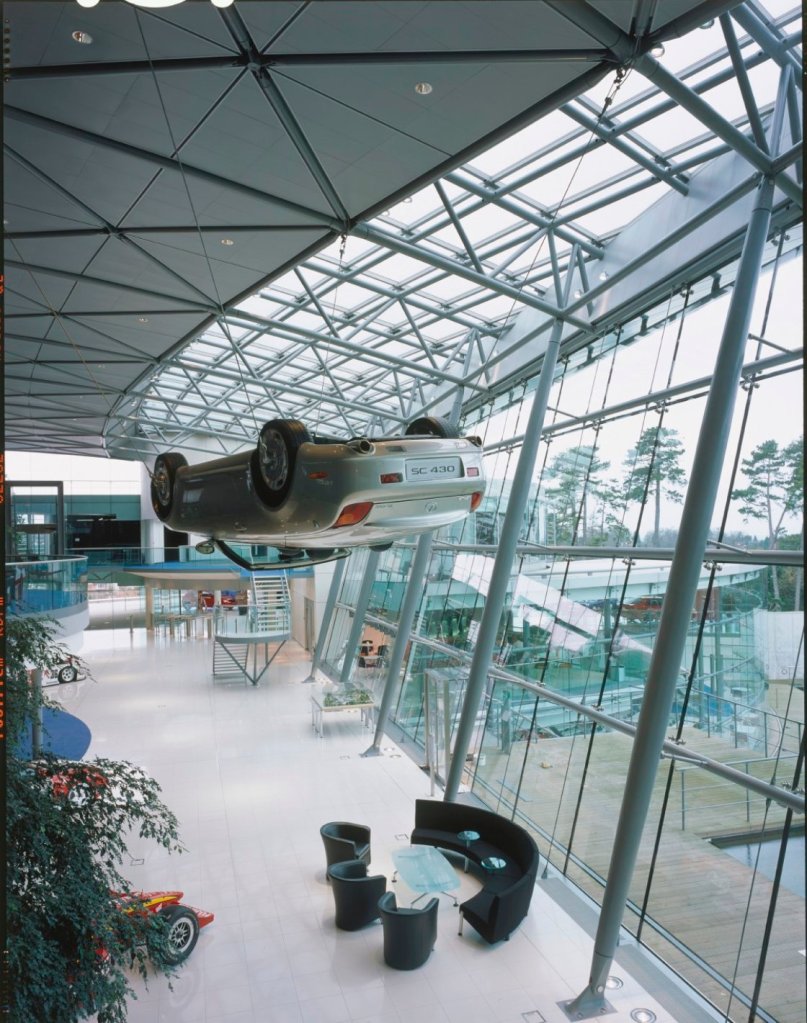
Nevertheless I liked Subsea 7 more, despite never visiting. Sometimes I drive next to that building, and even before I started to study Interior Design I was intrigued by external design of the building. Here’s some images of the outside:
Architectural Photography of Subsea 7 Office, by London Architectural and Interiors photographer, Matt ClaytonArchitectural Photography of Subsea 7 Office, by London Architectural and Interiors photographer, Matt Clayton
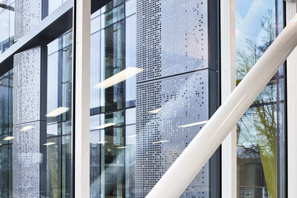
The open work panels have always intrigued me and I remember having thoughts that it was a great design idea as it adds extra interest to the outside of the building. I also imagined it would shield some of the sun on hot summer days. That was of course just my guessing but I remember paying attention to that building for a while now.
From outside you can clearly see tall yellow columns inside. They seem to be a structural element, but their colour makes a statement.
I am delighted I will be able to visit it and spend some time there.
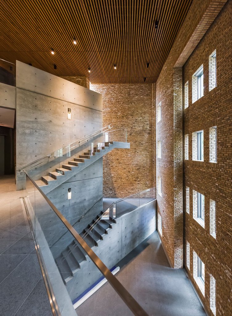
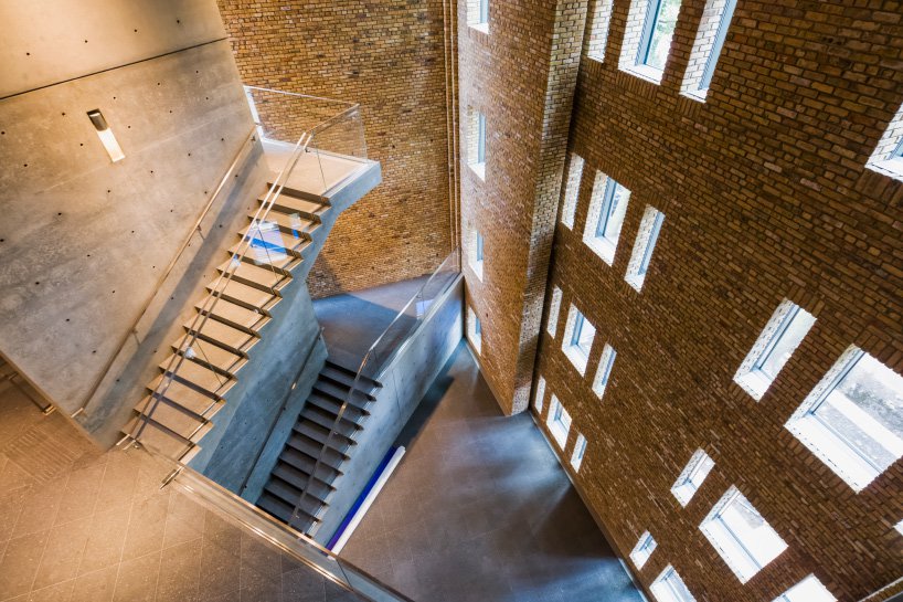
Previously 1920’s apartment building in Chicago transformed into architecture and socially engaged art gallery by Pritzker laureate, Japanese architect Tadao Ando. The space opened to the public in late 2018.
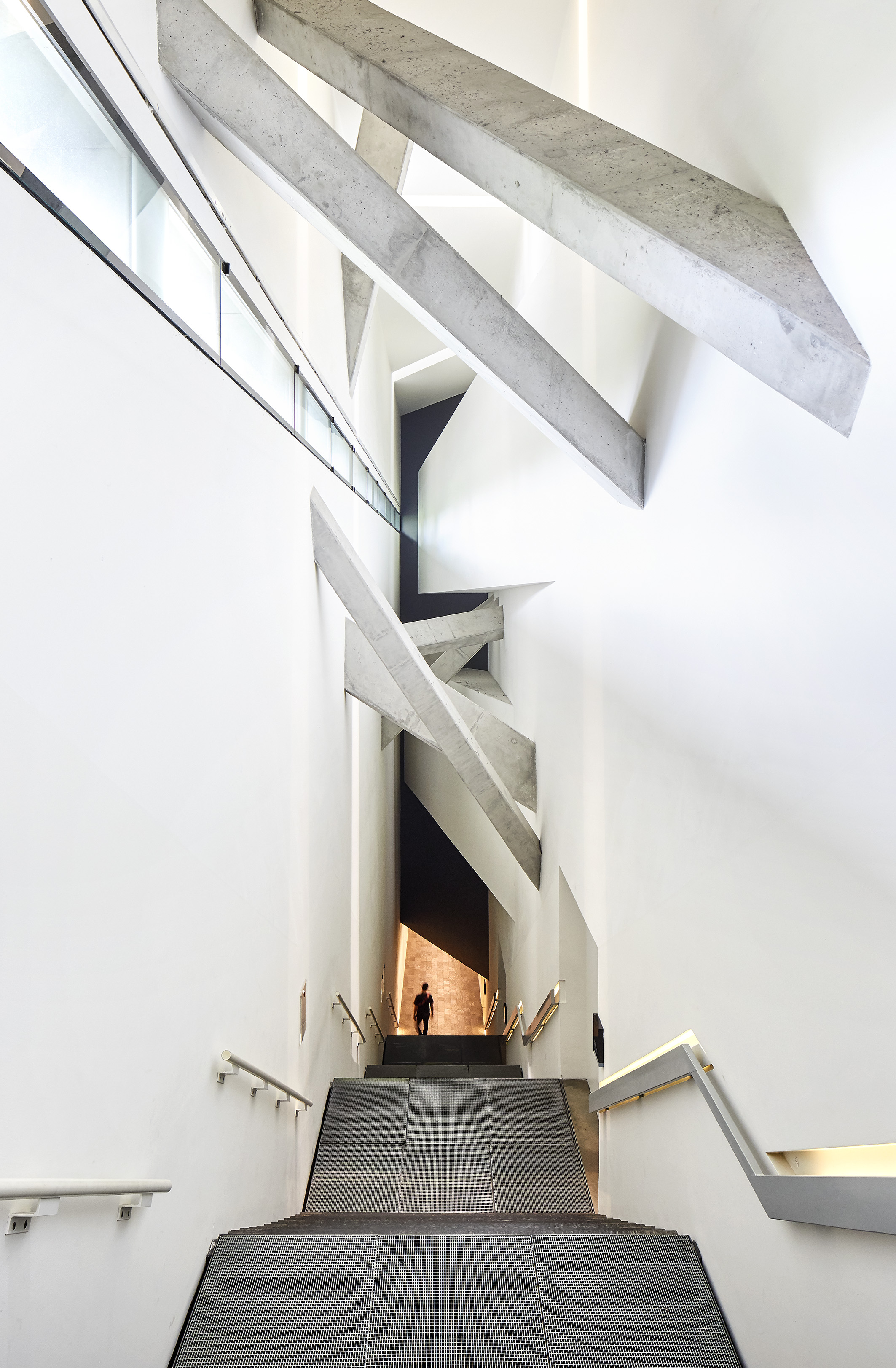
Techniques used to create atmosphere in images above include use of abundant daylight, very high ceiling, choice of very few finishing materials, straight lines and open spaces. The architect managed to create a warm and welcoming atmosphere by introducing bricks and natural wood, the glass balustrades keep the space open. The staircase winding up around a huge concrete post looks sturdy. Everything including brickwork and wood panes is straight and organised to perfection. This place seems to be inviting the visitors to follow the stairs up. It looks quiet and I believe there must be incredible echo with every step taken which would force the users to slow down and contemplate the interior and the art within.
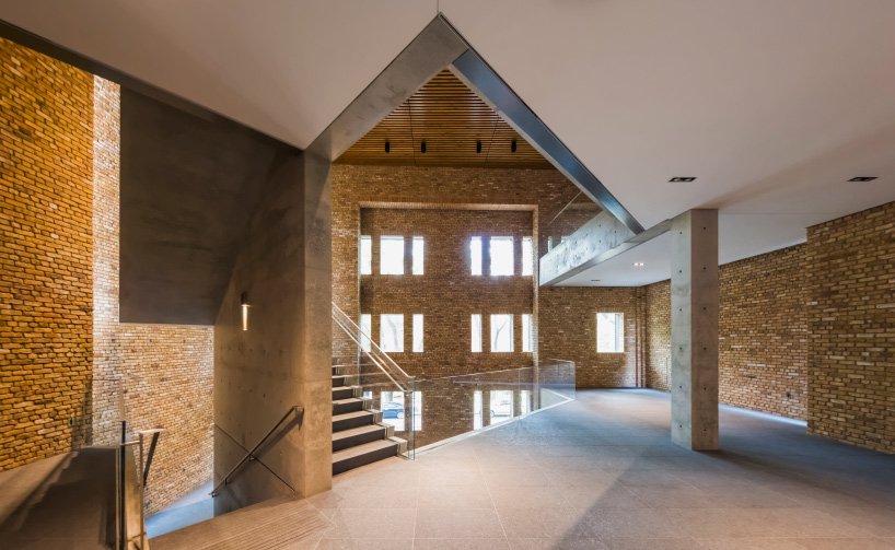
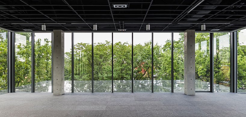
The images above represent the interior of forth floor extension added to the building. There seems to be a serene atmosphere created by straight lines, natural light entering through wall to ceiling windows covering 3 external walls. In sunlight the inside is reflecting in the windows creating translucent image blending with outside and giving impression of a bigger space. Vertical window frames create straight lines of shadow, nearby tree tops seem to be entering the room which increases the calm atmosphere. The ceiling is build of black metal squares and contrasts with simple white lamps installed on white rails. There are concrete walls, floor and columns, but here they add to the calm atmosphere.
‘An international figure in architecture and urban design, Daniel Libeskind is renowned for his ability to evoke cultural memory in buildings. Informed by a deep commitment to music, philosophy, literature, and poetry, Mr. Libeskind aims to create architecture that is resonant, unique and sustainable.’ (https://libeskind.com/people/daniel-libeskind/ accessed on 03.09.2019)
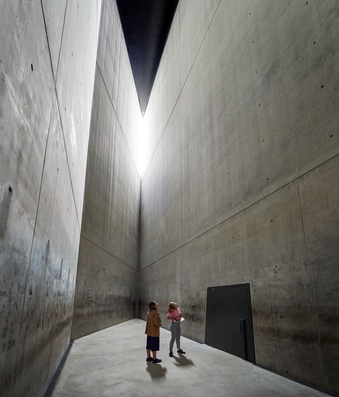
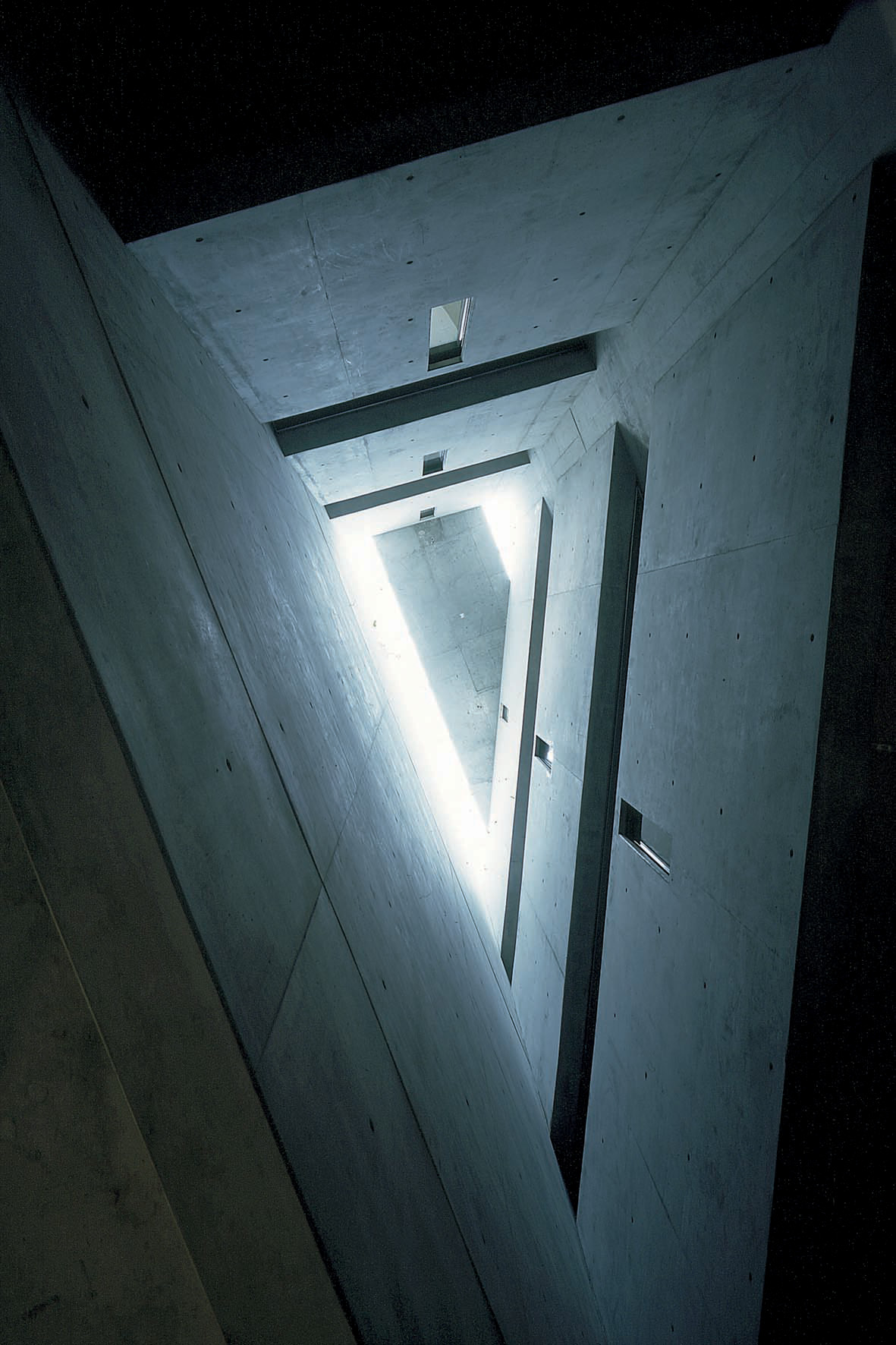
Elements used to create atmosphere in the room above are very tall concrete walls, composed of large scale plates, straight lines and sharp corners. There is light coming from the top of sharp corner and it is contrasting with dark ceiling. Even the door isn’t a usual rectangle, looks heavy and has a massive handle. The whole room seems to be a work of modern art that is intended to create thought. It is a raw design, created by choice of a few materials.
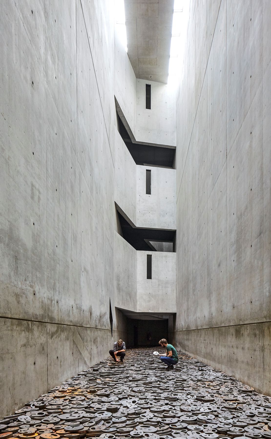
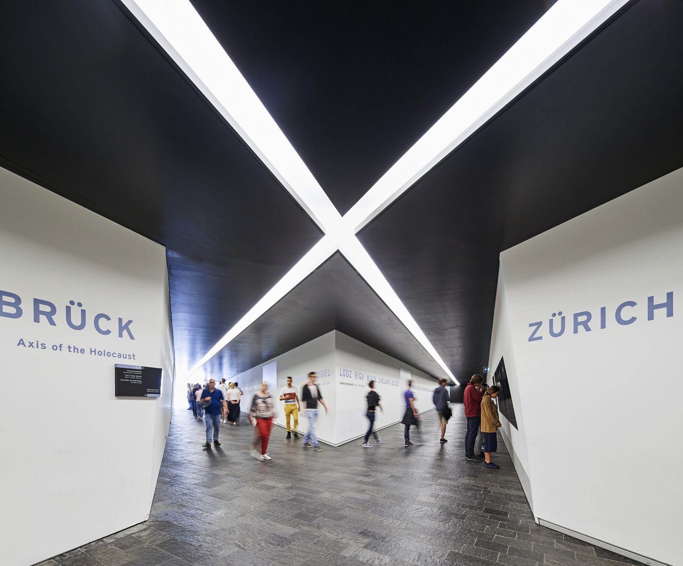
The Void at Jewish Museum – there are 60 staircases that connect exhibitions and they are all opening to the void. Two images below represent the Void from different perspectives.
The most powerful element of design in the image above are rusting iron plates in various sizes, all depicting mainly screaming and some serious faces. I watched youtube videos of this room and the loud metal clanking under visitors steps was magnified by the echo created by smooth tall walls. From my point of view that is sort of sound that could make one feel uneasy. Other elements include tall, smooth, concrete walls and sharp staircase openings.
The image above represent view from the void towards the ceiling in between the staircases. There are sharp angles, concrete walls and ceilings and a lot of straight lines. The material is mostly smooth concrete with the exception of glass window panes in the narrow windows. There is natural light coming from slits near the ceiling. There is a serious atmosphere in this room.
The above interior is near the entrance at the start of visitors journeys through the building. It is less ‘threatening’ than previous rooms by use of plain white walls, a lot of light in form of long strips in the ceiling indicating walking directions. All previous rooms had a lot of concrete elements, here I can’t see any. Comparing to the previous rooms which had powerful atmosphere here I cannot sense much. This seems more like a ‘utility’ corridor, a place to direct visitors onward. It may have been designed this way to give visitors something ‘normal’ to then shock them with designs and provoke the mood of seriousness during their visit.


