My tutor noticed effort and attention to detail and said it will pay off.
As usual there were some great tips in my feedback, here my tutor recommended to help capture perspective of circular object or a circular space to position my objects linear, the visible difference in sizes will help.
My tutor suggested to work / concentrate on one drawing, rather that doing too many different ones. ‘Reworking can produce more textured results.’
Research:
My tutor noticed the work I put in research of movement in interiors. I researched various examples and noticed ‘different types of movement’. I also tried to apply to apply the knowledge gained through my research to my own work.
Doing additional research (as I did with perspective lines on my walks) will improve my skills in observing spaces.
Creativity:
My tutor said that I continue to develop my creativity and it is showing more, especially in abstract drawing of still life. She recommended the group drawing sessions. I should also remember that this type of drawing does not have to represent exact image of my object. I need to trust my hand more and draw on larger sheet of paper.
Even though I had a good start at photoshop I should try and play more with images in photoshop, such as layering and adding background, it will make the abstract image look more ‘real’.
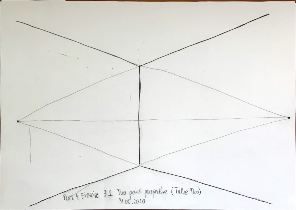
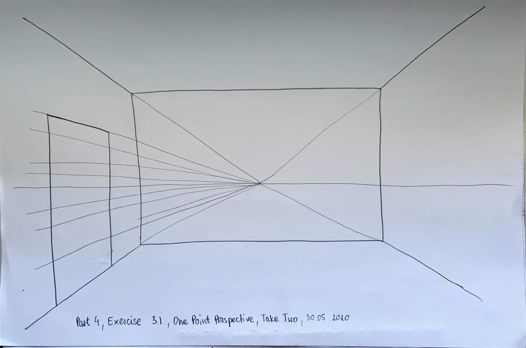
My tutor said my perspective drawing attempts were a good start, I received a helpful tip to place vanishing points outside of my paper.
Communication & Presentation:
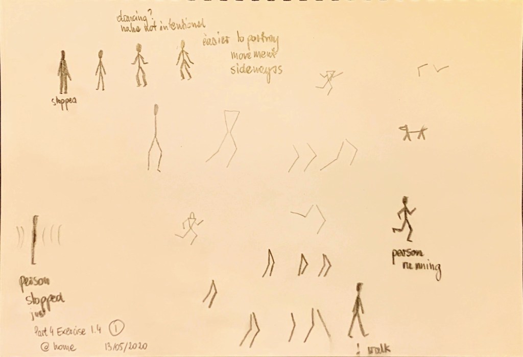
My tutor said that drawing movement and people is difficult, but I gave it a good go, trying different approaches.
I should practice drawing people using freeze-frame on TV and do quick stick drawings, showing angles and lengths of limbs. Also including, wrists, elbows and knees will help express the movement and make the figures look right.
My ways of expressing movement using lines, spirals, colour, and gradients were successful.
I am pleased to know that navigating my learning log is easy and that the layout is clear.
Critical reflection:
My tutor said that my personal reflection is detailed, and I explain my thoughts and processes is an easy to understand way.
She also noted that ‘I can think across the tasks and make connections in my work which show development in my understanding.’
I am very pleased with these comments as not only I need to learn; I also need to show what I learnt through my learning log and reflection. I am glad I am doing it right.
My James Turrell contextual study showed what I learnt about light and framing views. It also showed how I applied that new knowledge to different interior spaces, and I was ‘referencing it back and forth’ – which will ‘enrich my future design work.’
To improve my work:
I should improve my drawing skills by practising as much as I can, quick 10-minute sketches of random views of spaces and objects I observe.
Life drawing practice would help me understand the proportions of human body better. Free online classes were recommended by my tutor as well as OCA workshops (that I signed up for already).
My tutor said not to be too careful with it, just to follow through even if it does not look right it will all fall into place.
I am very pleased with the feedback I received, I shall follow the tips and recommendations specified in my feedback.
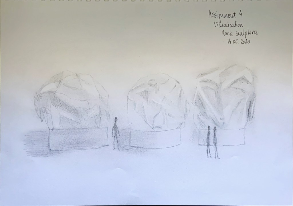
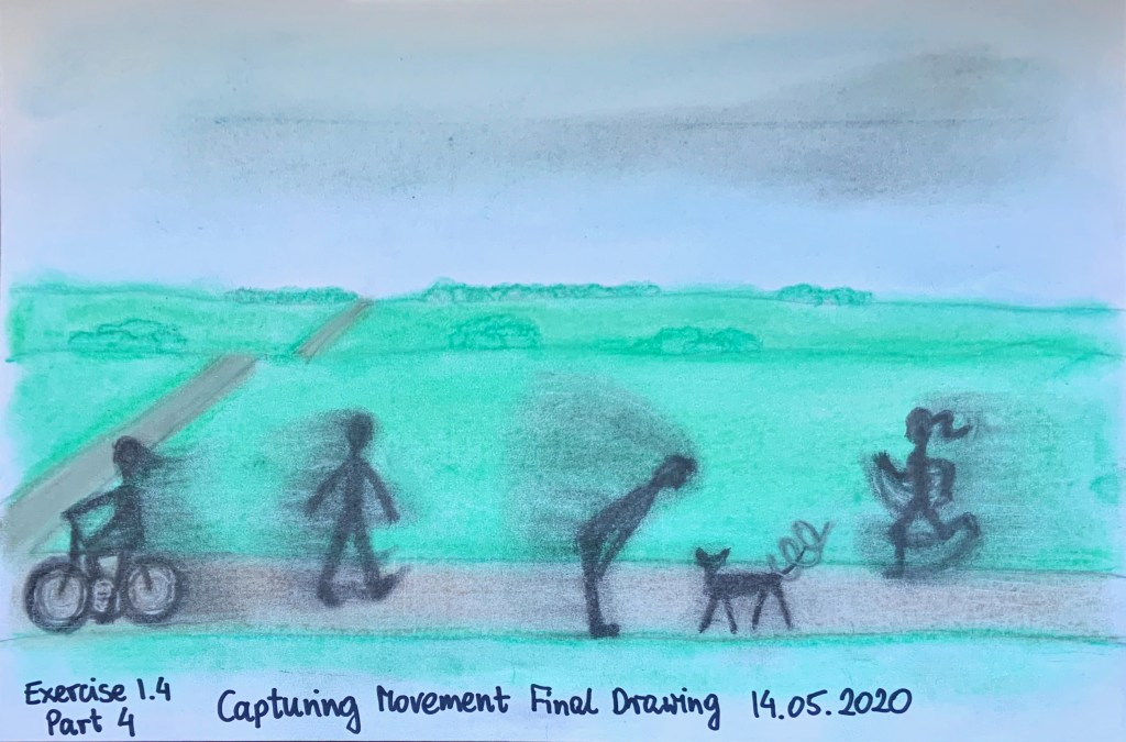
I arranged some small scale figures around my model from assignment 1 and imagined the objects are rock sculptures (Fig. 1). I tried rely hardness of the material in my drawing. Due to size and weight it would most likely be an outdoor exhibition. The below drawing was completed on A3 sheet of paper paper using HB automatic pencil and precision eraser to lighten up parts that are not in shade, to increase the contrast between light and shade, and also to emphasize the hardess and sharp finish of the sculptures.
Fig. 1 Rock sculptures
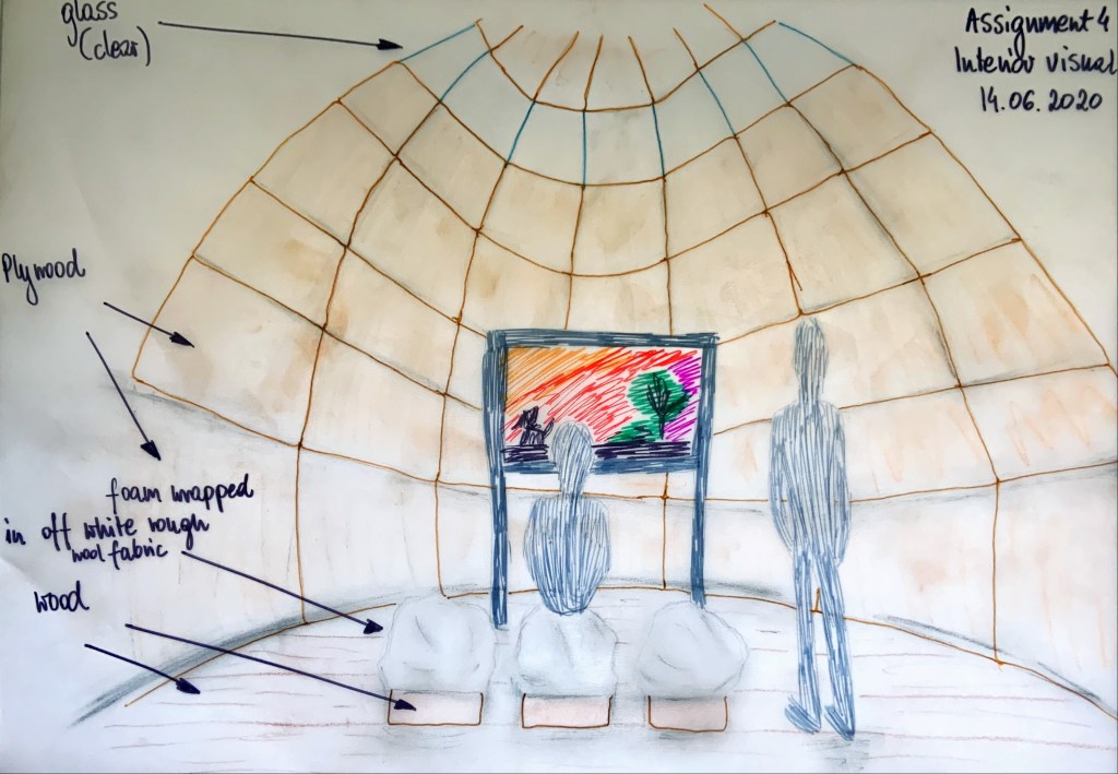
Then I decided that my model could also make a nice stool, made of foam wrapped in rough, off white wool fabric. I tried to rely the softness of the structure in my drawing again using play of light and shade but this time more toned. The bases of my stools would be made of wood. In my visual I drew a person sitting on one of the stools and looking at the artwork to clearly indicate function of the object. I placed the stools inside a small art gallery, the interior shape is inspired by my models. The walls and dome ceiling are clad in light plywood. I selected this material because it is light, cosy and simple. It will not take attention away from the art displayed. I inserted a strip of windows near the top of the dome to engulf the interior in natural light. The floor is covered in simple wooden planks (Fig. 2). I completed this drawing using pencil, felt tip pens, fine liners, and soft pastels. I am hoping I managed to capture movement in the shape of the room and repetition of pattern on the walls.
Fig. 2 Interior visual
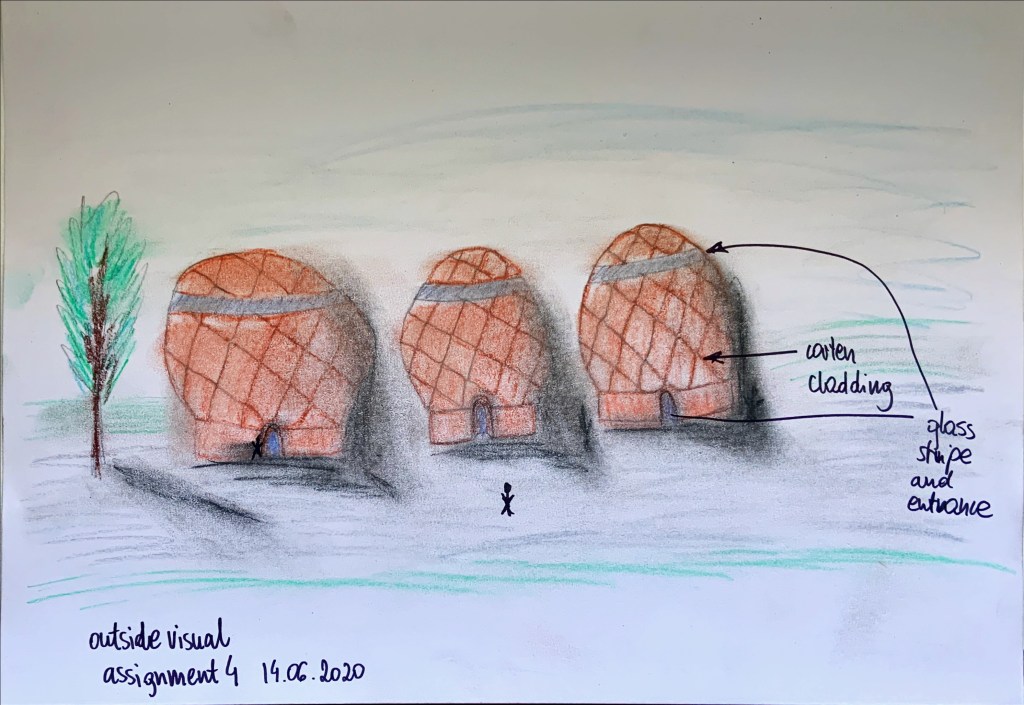
Then I decided to draw the actual buildings of the gallery (Fig. 3). There would be three of them as there are three objects in my model. I would like them to be positioned in an open green space. The shapes of the buildings are unusual but finished in limited materials of CorTen (weathered steel) and clear glass. I think CorTen’s colour and matt texture would contrast dramatically with the greenery around. The shiny glass in the stripes of skylights and doorways will on the other hand contrast with CorTen, adding interest to my buildings. Also, the top of the dome, floating like a hat above the rest of the building and glass stripe was my idea of adding movement to the exterior design.
Fig. 3 Outside visual
Reflection on completing the Assignment Four and Part Four:
The drawing exercises in Part Four were useful, especially the tonal ones. They really helped get the texture of rock sculptures in Fig. 1 of my Assignment 4.
I thoroughly enjoyed all drawing exercises, I just like drawing, even if I am not very good at it.
Exercise 1.1 opened my eyes to different techniques giving different results, not sure if blind drawing or drawing with eyes closed would get me far… I was most pleased with the result of tonal drawing in that exercise.
I liked experimenting with media and surprising results of those experiments, especially in the drawing with fine liners on greaseproof paper. I think that was my best drawing in that exercise, it was precise and smudged at the same time. Some of the methods I tried turned out quite messy (charcoal) but I am pleased I tried them; charcoal is great for creating shade.
I purchased a set of soft pastel pencils recently and I think it is my favourite medium, you can so easily change the intensity of the tone, and rely light, shade, and colour better. But sometimes simple coloured pencils did the job too, it made me realise that we do not always have to use complicated methods, sometimes drawing may be in a spur of a moment, and then any medium could suffice.
Doing collage was fun, I embraced the creative process and tried to find the most unobvious pieces to paste. Also learning how to use photoshop for the first time was great, still way to go with learning it, but I enjoyed the start.
Contextual studies as usual were extensive and time consuming, but I learnt a lot from them. How to look at the interior and try to see movement: what an abstract task, yet it is a doable activity, it just needed some imagination. I enjoyed looking at different interiors and selecting the ‘ones’ I did. My favourite one was Opium Pop Up Store (The Flip Flop) – its interior screams movement (and lines). Polet Restaurant Interior would be a good example in truth to materials exercise in Part Three, most materials are natural and bare.
Contextual Study: Light was difficult. It was easy to find images of James Turrell’s work, but it was hard to answer the questions. I needed a few days to dwell and few nights to sleep on it before the answers came to me. Light and shade are to capture movement and atmosphere of the space. Also, without the light we could not see. James Turrell’s work and philosophy were coming back to me when completing the Assignment Four, the study inspired the stripes of skylights in Fig. 2 and Fig.3.
Capturing Movement drawing exercise was a real pleasure. I may not be the best at drawing people, and I’m not sure if opting for opaque figures is the way to go but I really enjoyed exploring the options on how to capture different movements I saw, how to make them move while being in a still drawing. I hope I got it right. I think to capture movement you need pattern and contrast.
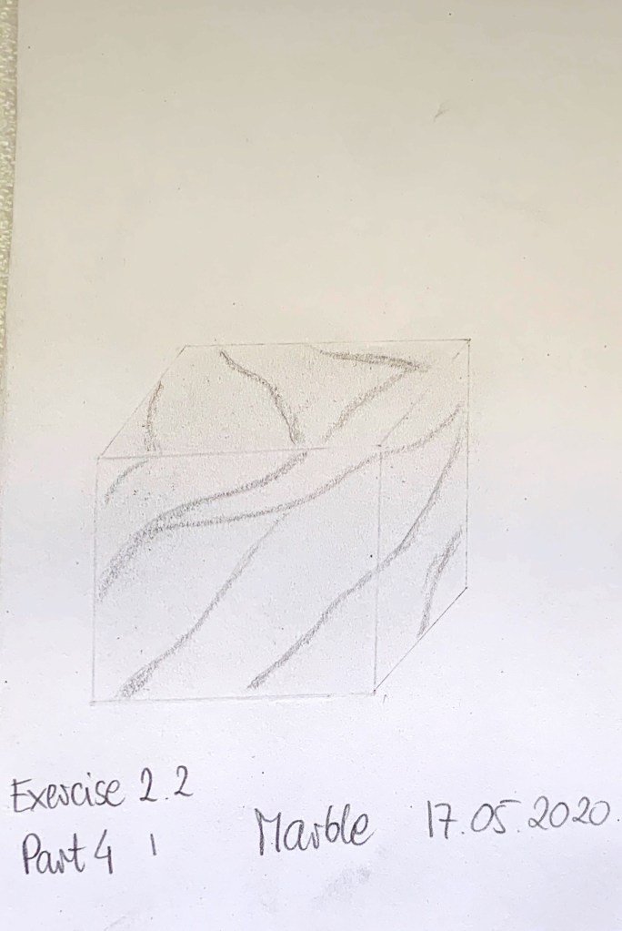
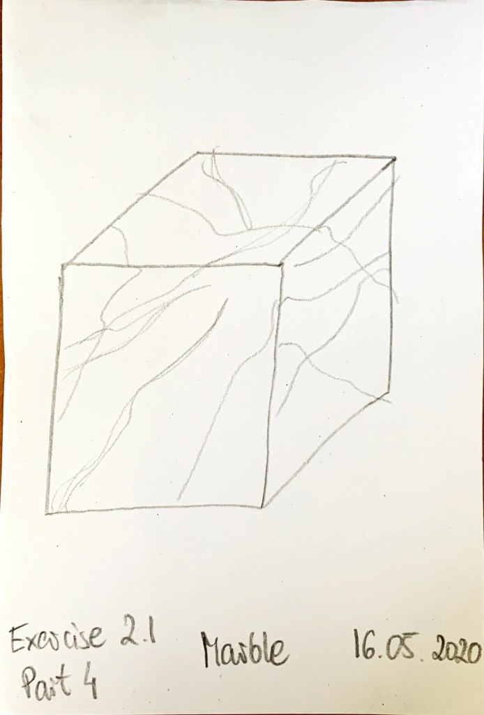
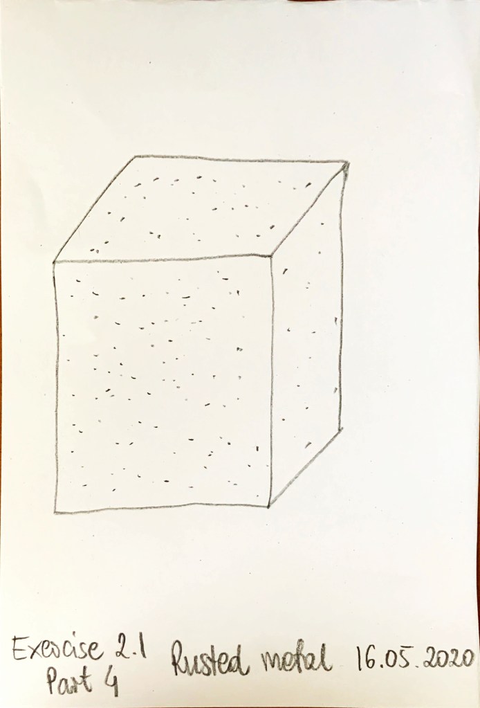
20 second renders were not easy; I think the only one I remotely managed to capture was marble. The following render exercise was not easier, despite having more time and a selection of different drawing materials. Some cubes took more than one drawing trial. I think sometimes it will be better to use software to render or to annotate drawings by hand to specify the finish or material.
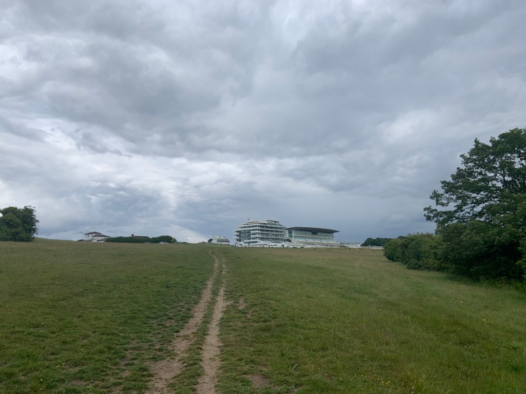
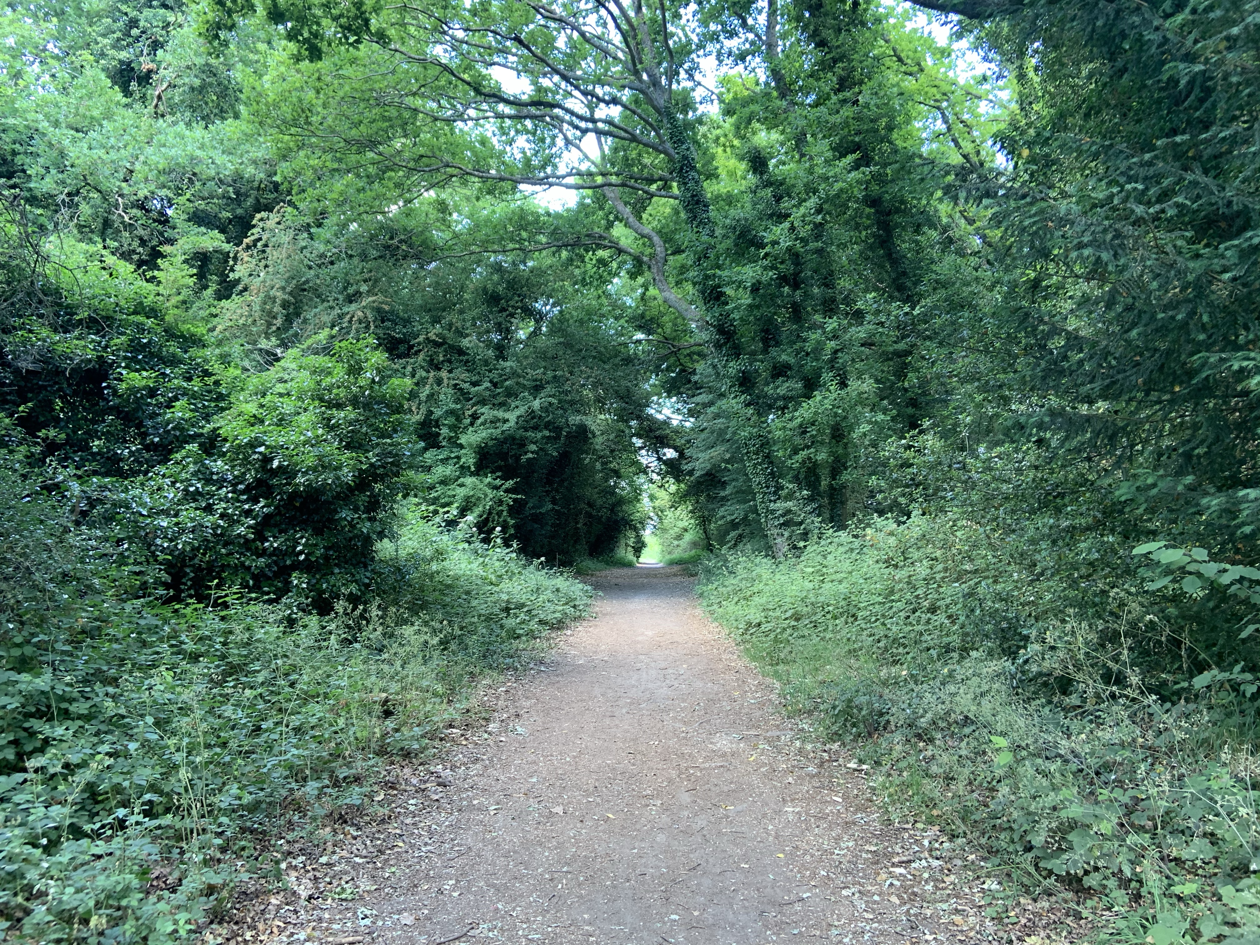
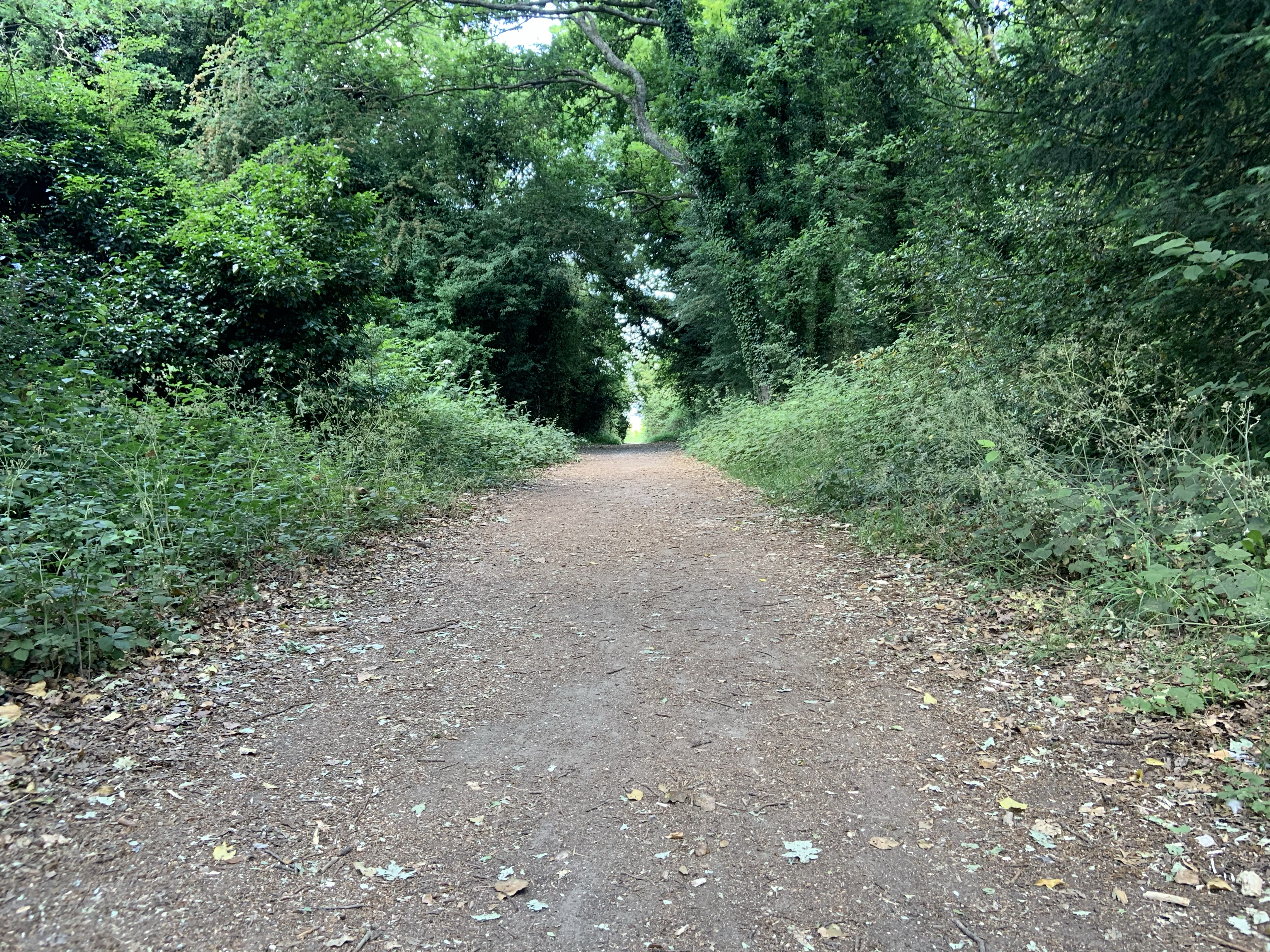
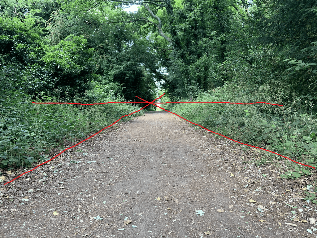
One-point perspective drawing was quite easy compared with two-point perspective. I enjoyed both exercises and since completing it I try to look and see I can pinpoint vanishing points in two-point perspective views. I took the photo in Fig. 4 as an example of two-point perspective view when we can see corner(s) of building(s). I would usually stop and look and see if my eyes can follow the invisible guidelines to find the vanishing point.
Fig. 4 Two-point perspective.
I struggled capturing perspective in my Assignment Four. I blame my unskilled hand and the fact the objects are circular. I am also hoping I am too harsh on myself and maybe it is not as bad as I think.
Looking back at my perspective with tone and colour I think the one without colour relies atmosphere and light and shade better. This exercise made me practice noticing the play of light and shade, and I am hoping I was successful utilising this skill when completing drawing in Fig. 1 of my assignment 4.
What “experience” is James Turrell trying to create and what specific techniques is he using in his designs?
Can you describe them and propose ideas of how and why they might be effective at engaging the viewer?
Can you draw any comparisons to James Turrell’s work and a design visual of an interior design?
Using your learning log, along with pictures of James Turrell’s work, discuss these ideas and reflect on how you might incorporate these ideas in your visuals. Keep the post to a minimum of 200 words.
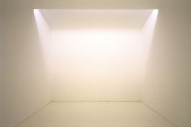
James Turrell is an American artist who trained as psychologist and is an avid pilot. He was born in 1943 and created many light installations or other works of art and architecture that use light and empty space as medium. He often gets his inspiration from the feeling of space and light while he is in the air, piloting a plane. His artworks are spread around the world and since 1977 he has been involved in the ongoing creation of Roden Crater – a large scale artwork – a fruit of his lifelong research into visual and psychological perception. He is in the process of creating a unique destination, occupying a dormant volcano crater in the middle of Arizona Dessert.
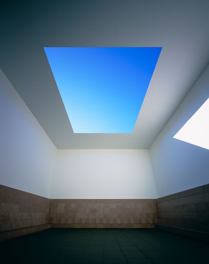
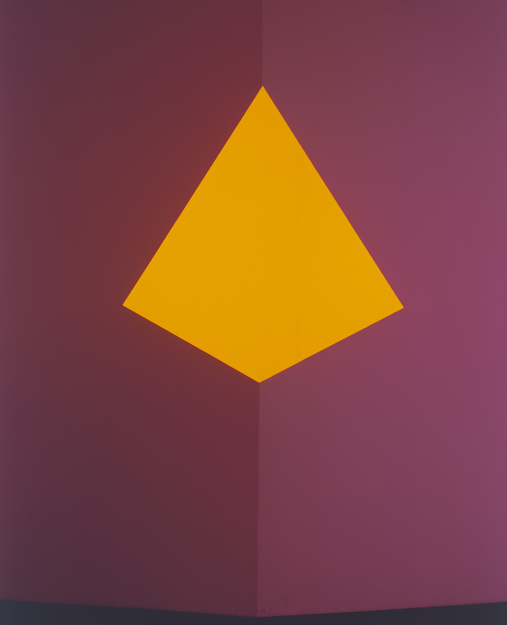
In my opinion through his designs he is trying to make people being in thought, to contemplate, to consider the environment around them. He wants people to stop and look, just look, perceive, and feel, perhaps feel surprised while they see a lit space that may appear to be in a different dimension than it actually is. An example of this could be a frameless opening in the roof (Fig. 1), that looks almost like a picture (and at night a dark rectangle contrasting with the lit room – Fig. 2); or light shining on a corner in such a way that it looks like a 3D object that shares the same corner and at the same time like a flat object whose front hides the corner (Fig. 3).
Examples of James Turrell’s work: from left Fig. 1 (Blue Planet Sky during the day and), Fig. 2 (Blue Planet Sky at night) and Fig. 3 Raethro II Peach
His artwork engages the viewer through contrast between light and shade (or darkness) and through perception that is different to reality.
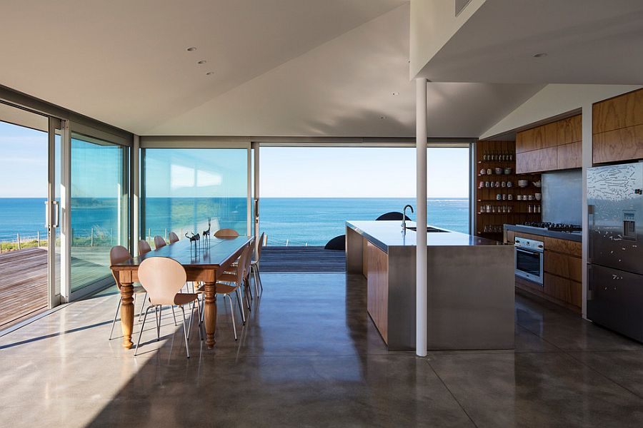
Interior design visuals where outside is brought inside use similar techniques to some of James Turrell’s work. These visuals would have large windows with beautiful scenery, landscape or urban visible and being a focal point of the interior (Fig. 4).
Fig. 4 Modern kitchen overlooking the ocean as it flows into the timber deck outside
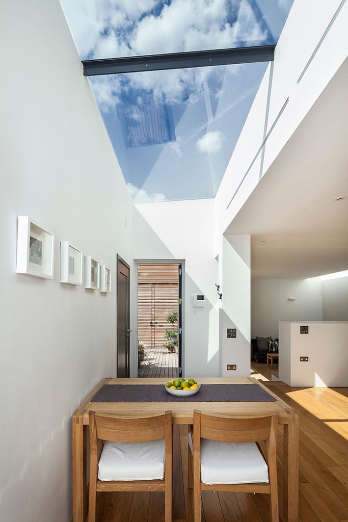
Visuals with skylights showing the sky especially on a beautiful day (Fig. 5) use similar technique to J. Turrell’s too. I think these features make user stop and contemplate and hopefully feel happy.
Fig. 5 Fabulous contemporary dining room offers a stunning window to the sky
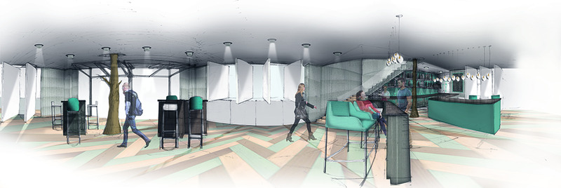
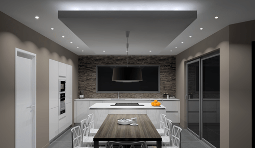
Other visuals especially hand drawn can incorporate the contrast of light and shade by highlighting the light from lamp or window in a light or yellow colour (or perhaps even in a different colour). (Fig. 6)
Fig. 6 Visual 1 / Panoramic View
If I was designing a space with a beautiful outside, I would try and incorporate it within a design, try to bring it inside in my visuals, make it a feature. Also, when sketching I could incorporate light patterns cast by daylight or lamps (similar to my drawings in perspective exercise 3.3 where I tried to capture shade cast by the shutters).
Some interiors designs feature led strips along edges of dropped parts of the ceiling or above it (Fig. 7) or under steps.
Fig. 7 Kitchen LED Strip
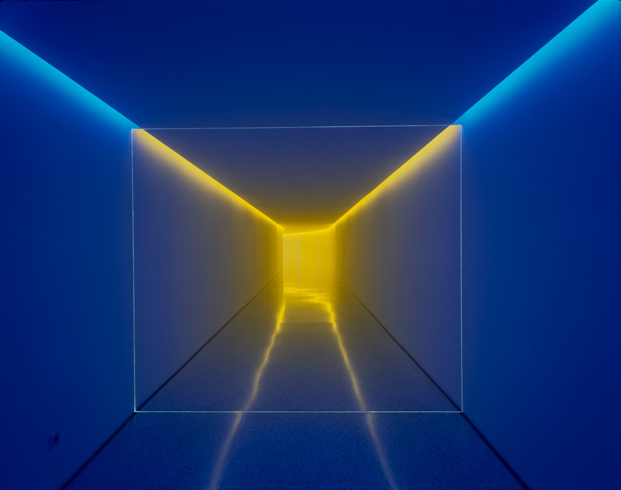
I am not a fan of the lights highlighting the ceiling in that way but perhaps lighting whole wall or just artwork on it may be a good idea. It would all of course depend on the interior and the clients wants and needs too. On the other hand James Turrell created something similar to what in theory I’m not a fan of – I’m talking about his Inner Way piece (Fig. 8) It has strips of light by the ceiling but I think it’s brilliant. It only shows that you (or a client) need to see something to be convinced – right visuals highlighting the right features are so important.
Fig. 8 James Turrell’s work: The Inner Way
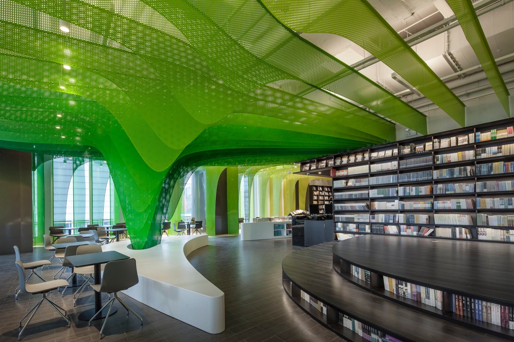
In commercial or public spaces using light to highlight architectural or other features adds sense of grandeur (Fig. 9).
Fig. 9 Gallery of Metal Rainbow-Zhongshu Bookstore in Suzhou / Wutopia Lab – 1
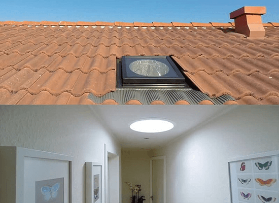
Sun tunnels bring daylight into an otherwise dark space (Fig. 10 ) in a similar way to James Turrell’s light veils (Fig. 11) providing natural, bright and dispersed light. With the difference that light veil include both natural and artificial light. In both instances the user cannot see the light source. I stayed in house that had a light tunnel and I remember the surprise I felt every time I entered the room. The amount and the quality of light was astonishing.
From left Fig. 10 Sun tunnel and Fig. 11 James Turrell’s Virga
The bottom line is – we need light in our interiors, preferably different sources at different brightness and concentration but light is needed for human (and other creatures) survival and wellbeing.
Reflection on the task:
As usual with contextual studies the hardest thing was to get started. I read about James Turrell and his work on the internet and then needed a couple of days to dwell and get the information in order. Then I sat down and noted most of the facts from my head. So in the end I enjoyed it, I just worried about what to include unnecessarily.
I learnt from this exercise that light plays vital role in the interior design, particularly how natural light enters and travels through the space, but also design and placement of artificial lights have tremendous impact on the atmosphere and usability of the space as well as on the experience of the space. Light also facilitates sense of movement in a space as seen in Fig. 9. Moire pattern visible there along with vivid colour sheer sheets intersected with lights and rounded, repeated shapes create movement. Without light the effect would be rather flat.
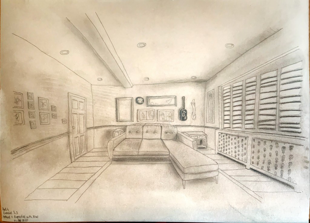
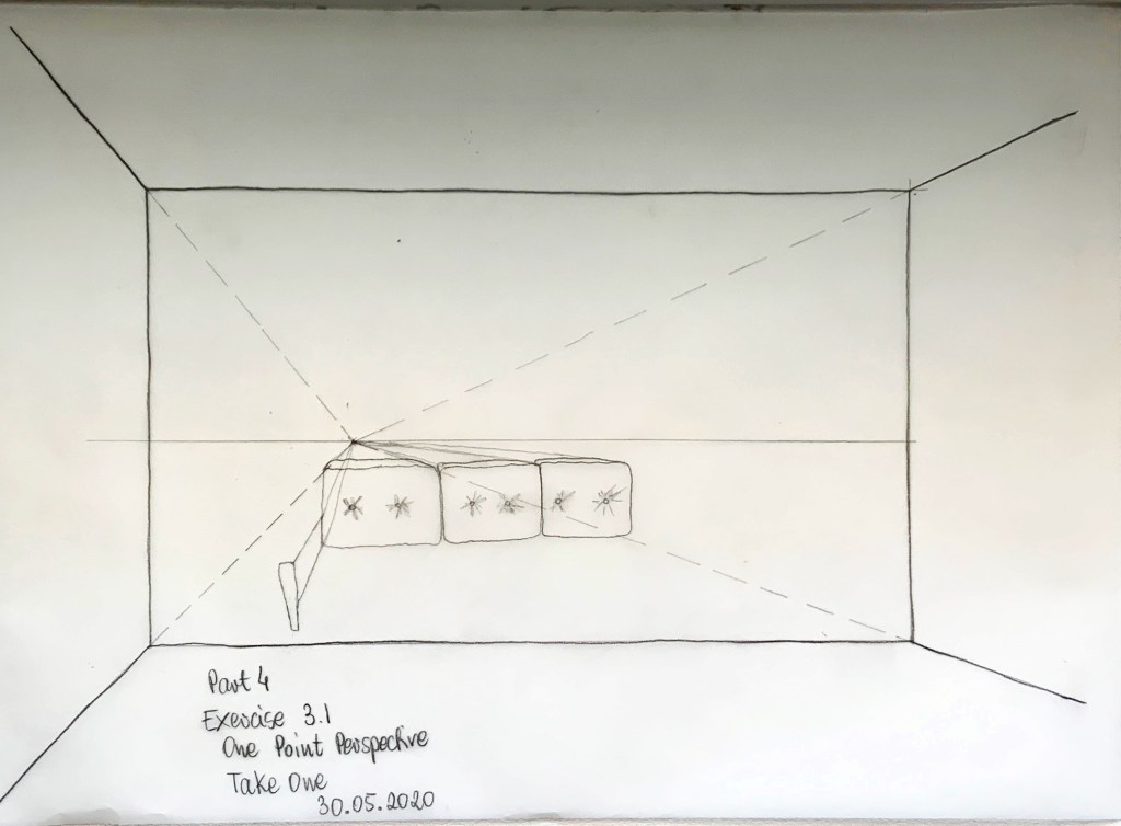
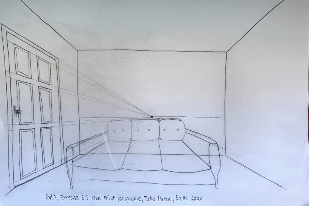
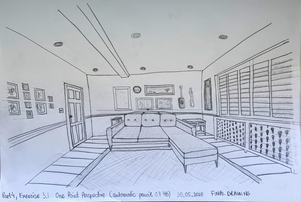
I selected one-point perspective drawing from exercise 3.1, I think it was a ‘better’ drawing of the two. I copied it using a 0.3 HB automatic pencil for both methods.
Method 1:
I used a 9B pencil and smudged it to create my shades. To add light and patterns I used rubber
Perspective with tone
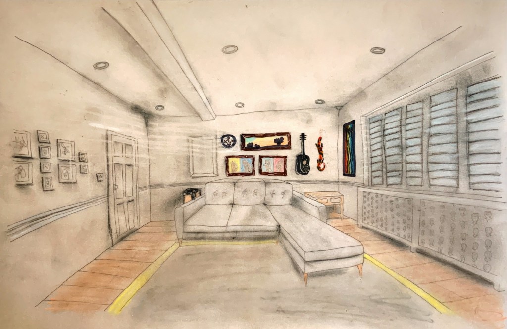
Method 2:
I used fine liners where I wanted the colour more intensive and coloured pencils and pastels for more muted colours. The room has a very calm colour scheme, mainly grey and white, with pops of colour in the artwork, I wanted my drawing to represent that. I used grey charcoal and black and grey pastels to create shading and rubber and white and very light blue pastels to create light.
Perspective with tone and colour
I really enjoyed this exercise. Especially the part when I was looking for shadows and patterns cast by daylight coming through the shutters and trying to rely this onto my drawing.
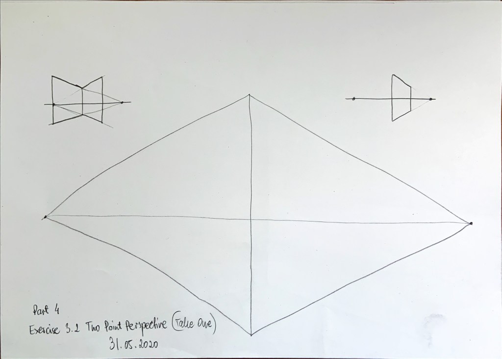
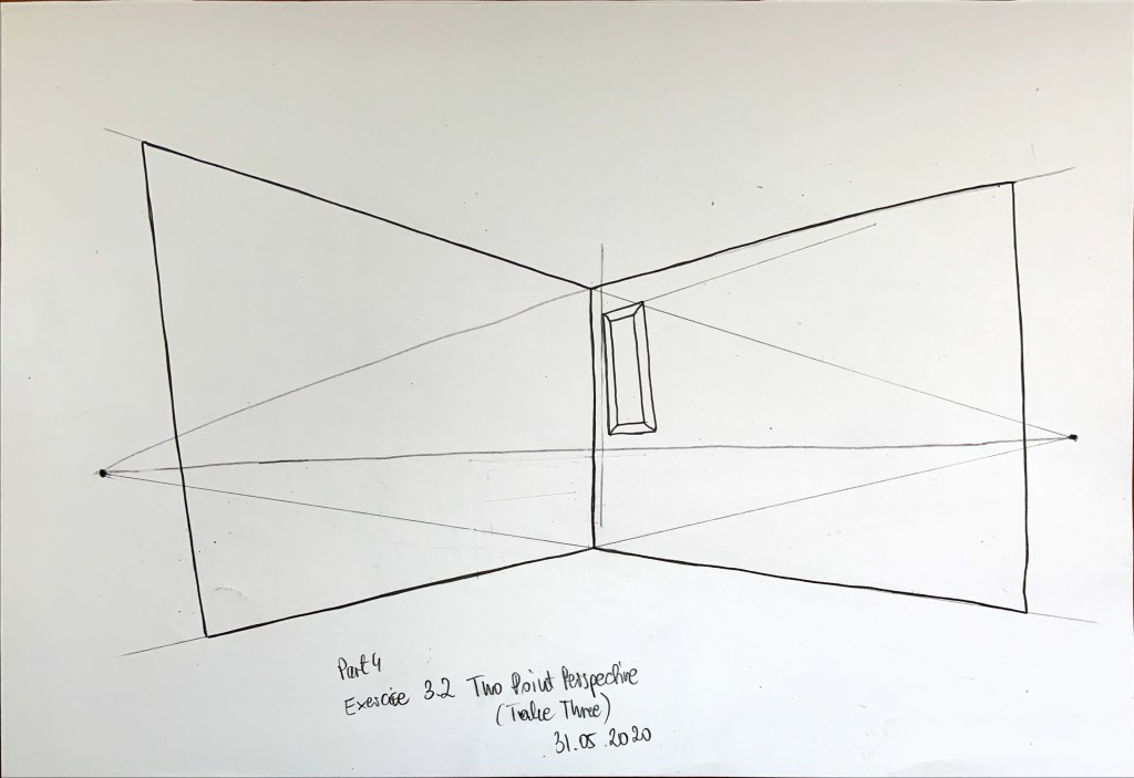
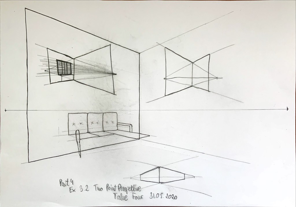
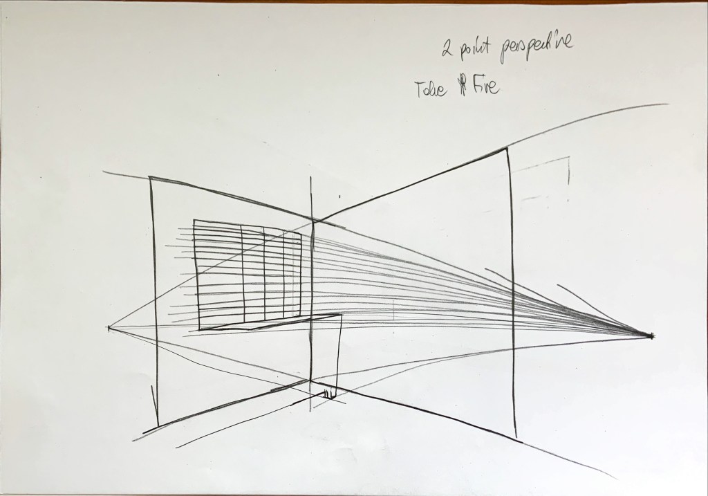
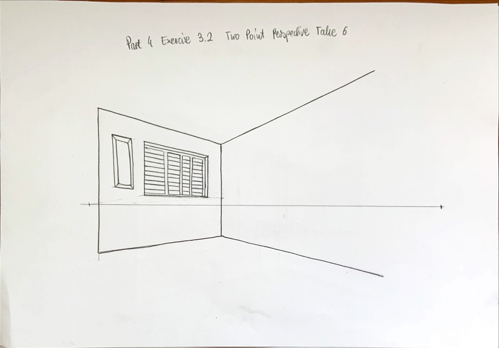
Two point perspective is much more difficult than one point. I really struggled with the window recess. At first I selected a different corner of the room, but then I decided sofa makes it really complicated, so I changed the corner. Here’re my less successful attempts.
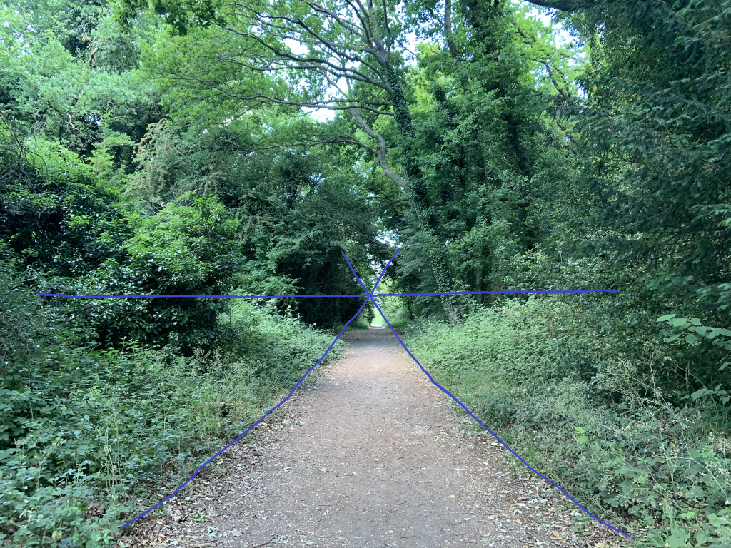
I went for a walk today and took these to photos that’s show how the view closer to the viewer changes depending on the eye level height. The difference is quite dramatic
I tried to find my eye levels and vanishing points by drawing freehand lines (just though it may be a good practice to understand perspective better). I can see the height difference very clearly here.
As in previous exercises I needed to do some ‘warming up’ of the hand and the skill. The three drawings below I started and abandoned as I was unhappy with the results.
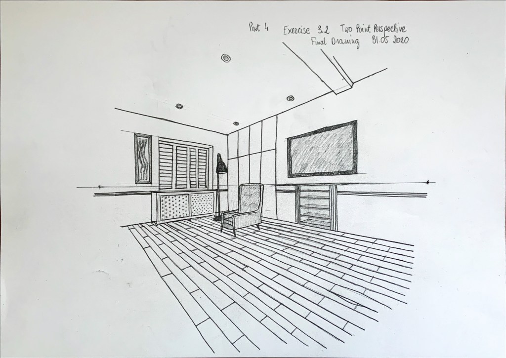
Then I decided to make the wall I’m facing smaller and it went smoothly from there. It was quite difficult, especially trying not to use a ruler. I think I should have used it for shutters, radiator cover and floor pattern, the drawing would have a better perspective. However the not so straight lines seem to look good, like there’s more ‘life’ there. My final drawing is below, I’m pleased with the result, it was a useful exercise.
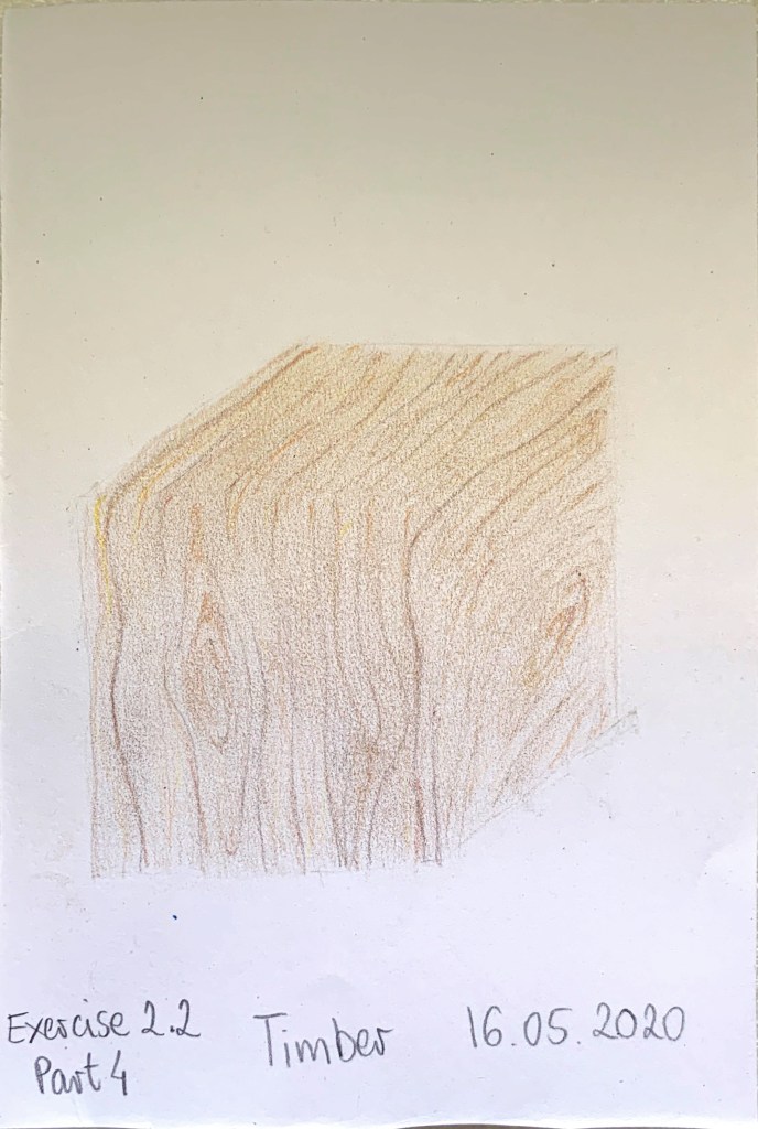
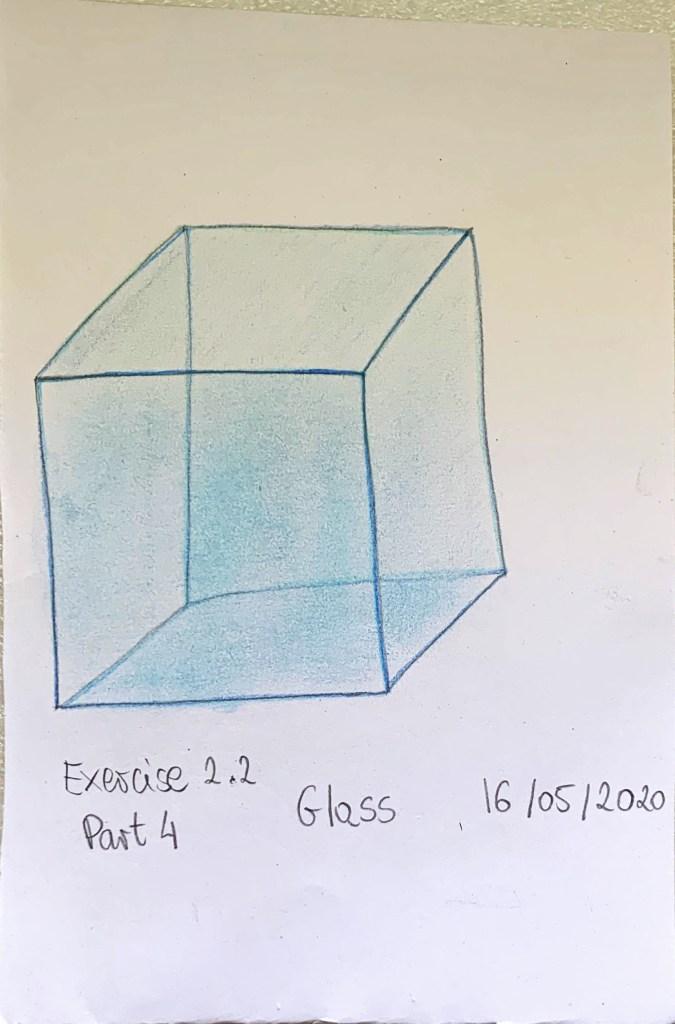
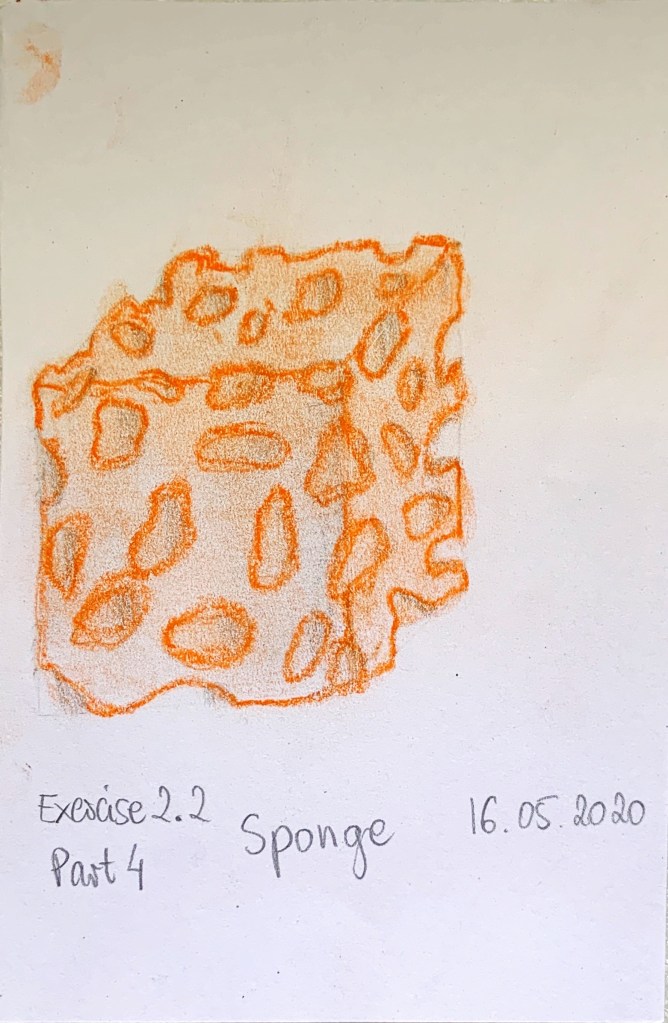
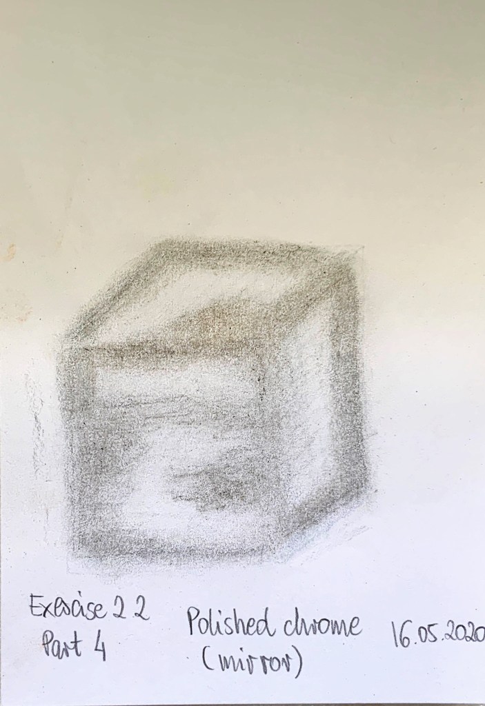
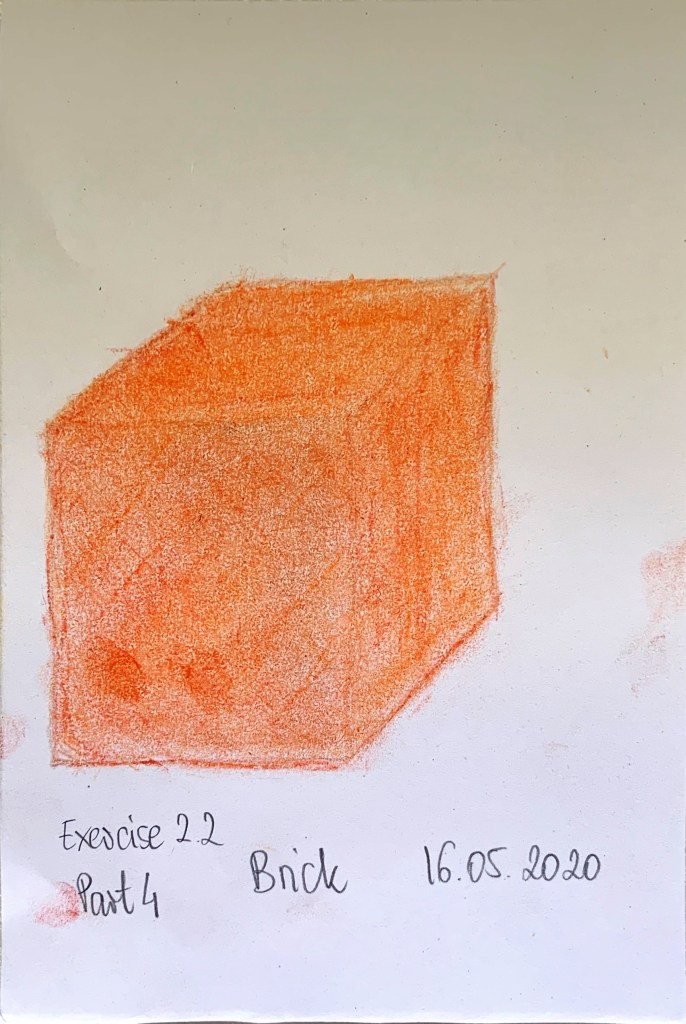
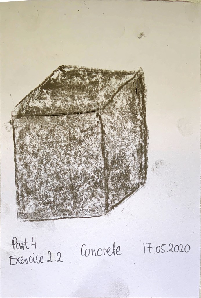
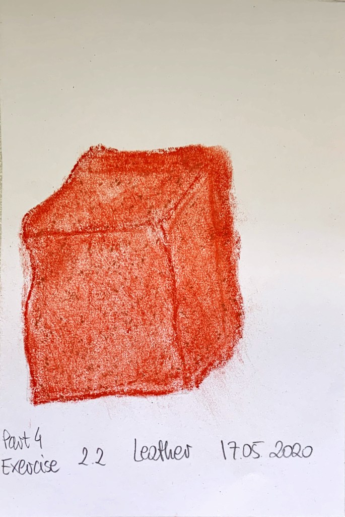
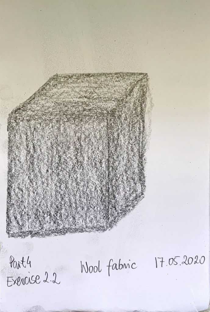
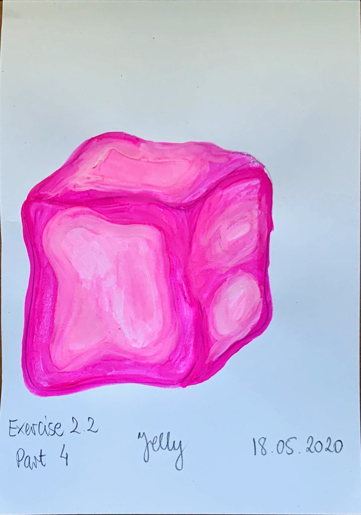
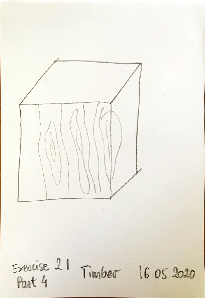
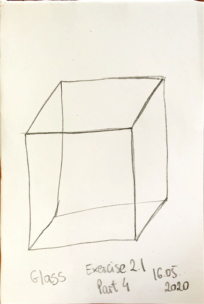
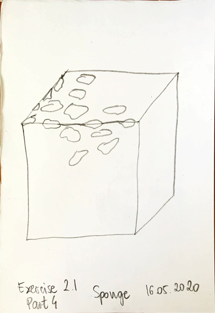
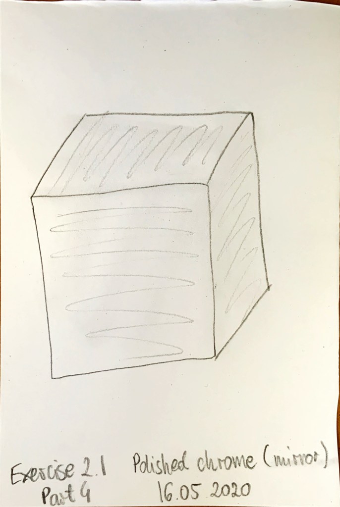
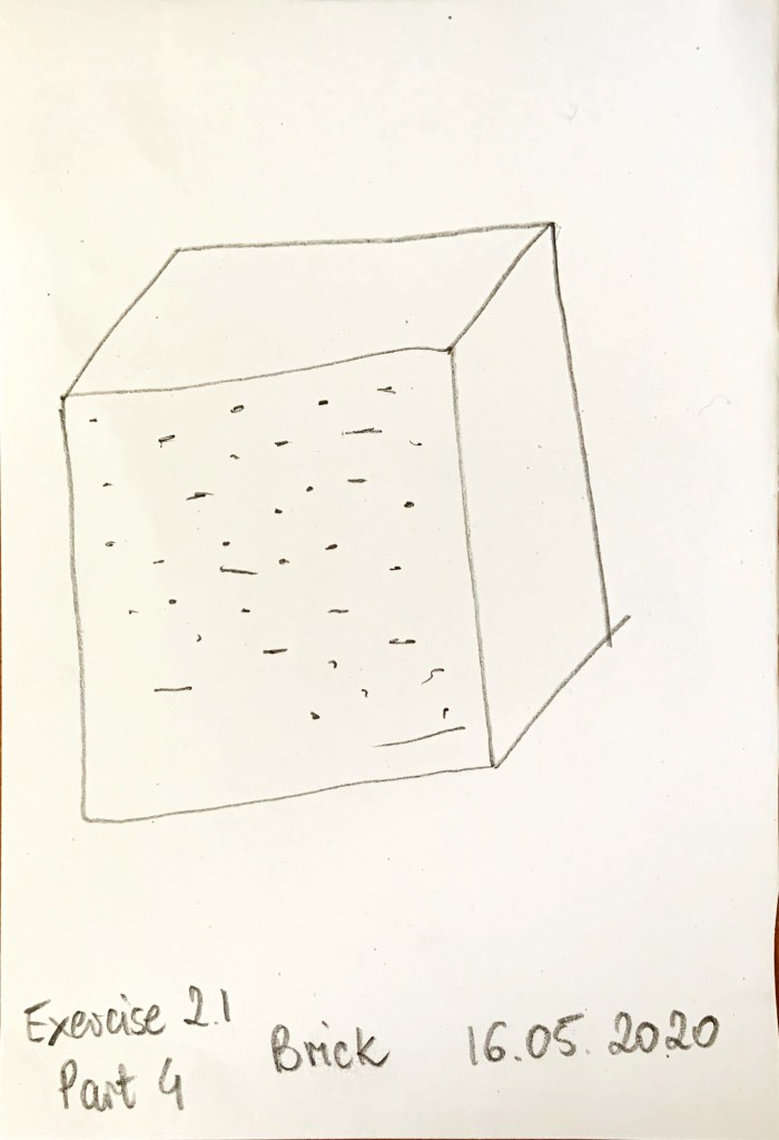
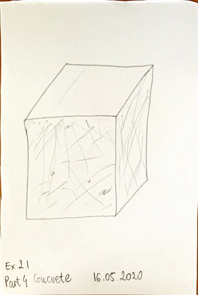
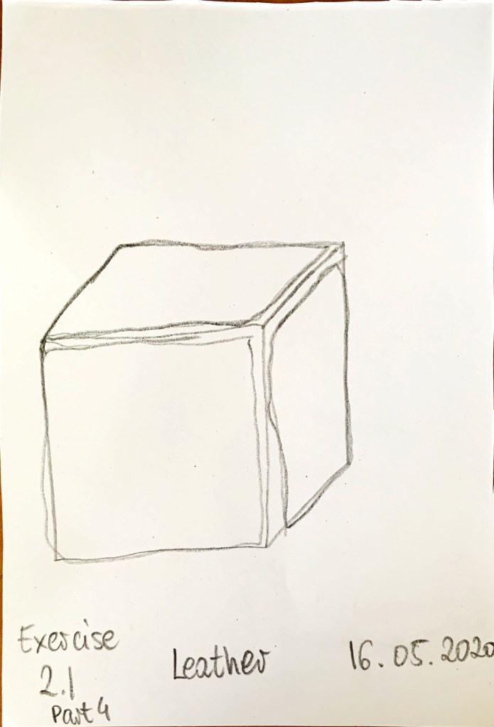
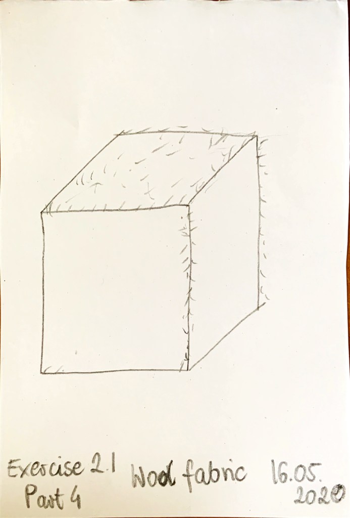
That was a difficult exercise. I think the drawings in exercise 2.2 look more realistic than exercise 2.1 (with exception of marble which gave comparable results in both exercises). The main positive of exercise 2.2 was ability to use colour which helped make the material look more realistic. Being able, have to time to erase bits also helped. Different mediums helped to rely the texture better. Longer drawing times gave me time to rely hardness (or squishiness) and shine (or its lack) and whether its smooth or rough. The hardest one was leather and polished chrome. Pencil was great for marble and wool fabric. I used pencil and grey soft pastel to convey polished chrome, I’m not sure if the result is convincing. Just soft pastels created concrete. Mix of coloured pencils and soft pastels worked great for timber, sponge, glass, and brick while watercolour paints worked wonders on the jelly. Some of these longer drawings were fast (concrete, wool, marble) while others needed more time and attention (sponge, jelly) due to more detailed structure. Being able to use different media helped to convey more detail. Some of the materials I wish I could make a collage off (leather, polished chrome, brick).
20 seconds was not long enough for most of them. It was good exercise for quick thinking about the textures etc. Some of them are quite hard to draw realistically without colour.
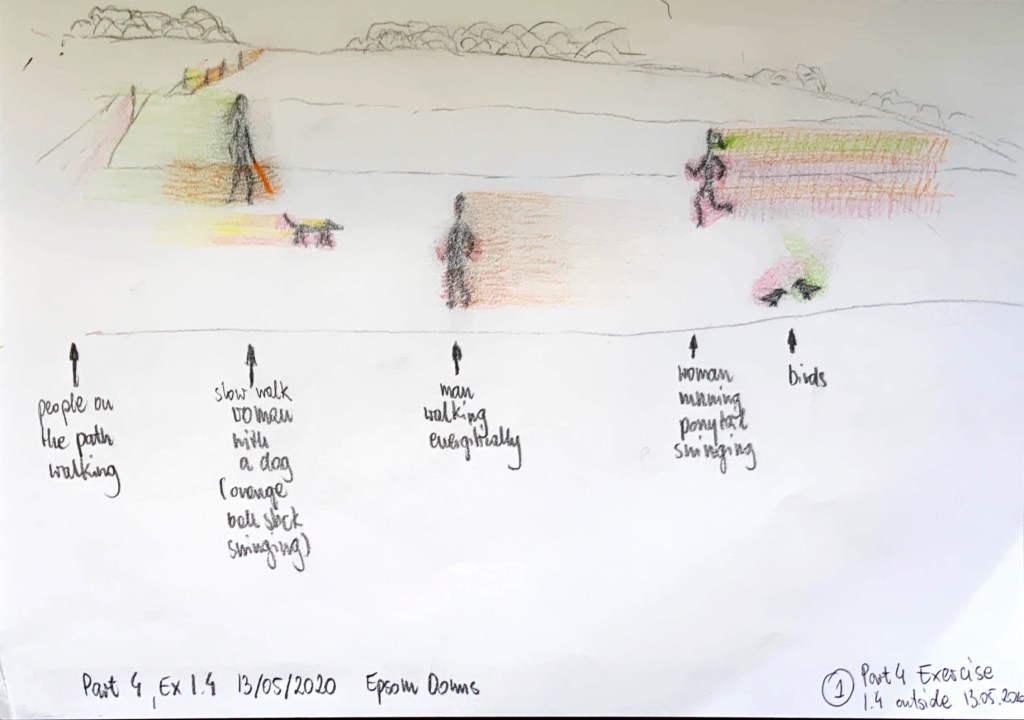
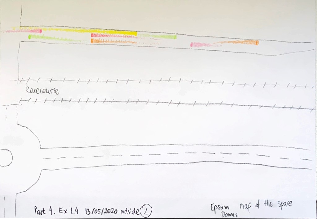
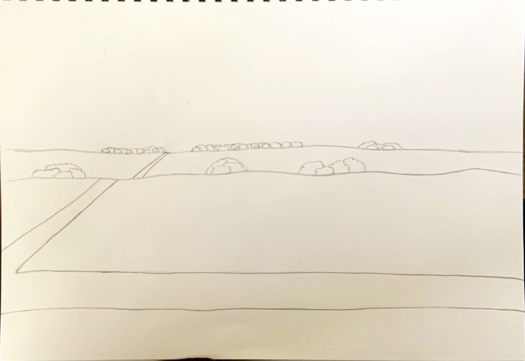
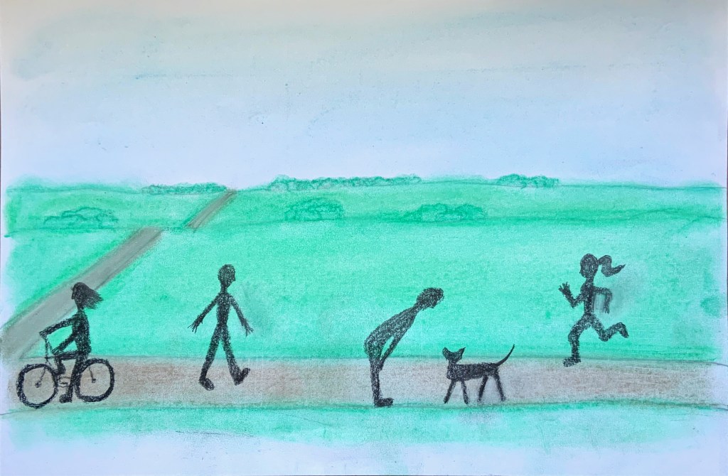
I selected Epsom Downs Racecourse as my space for this exercise due to restricted access to alternative sites due to Covid19. I selected this space because it is an open space and a popular walking, running etc spot so I knew I will see movement there.
I sat down on the ground and observed people passing by and drew Fig. 1 and Fig. 2. I used an automatic pencil and coloured pencils. The day was quite cold and windy, so I didn’t hang out there for much longer, just took a few photos in case I needed to refer to them I at home.
Fig. 1 Outside
Fig. 2 Outside plan view
The drawing in Fig. 3 shows outside space. I drawn it with pencil and used it as a base for all Epsom Downs Movement drawings. My final drawing is drawn over Fig. 3 drawing.
Fig. 3 Space
After I drew the space, I realised I have no idea how to draw people, leave alone people moving. So Fig. 4 – 7 show my practice, trying different techniques etc.
Fig. 4 Movement development 1
Fig. 5 Movement development 2
Fig. 6 Movement development 3
Fig. 7 Movement development 4
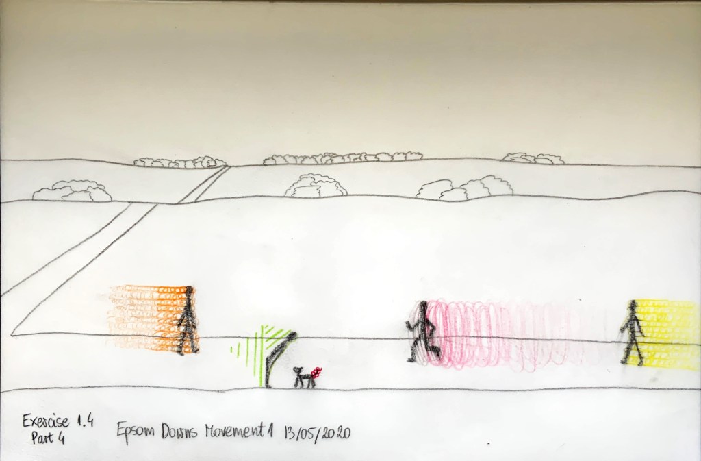
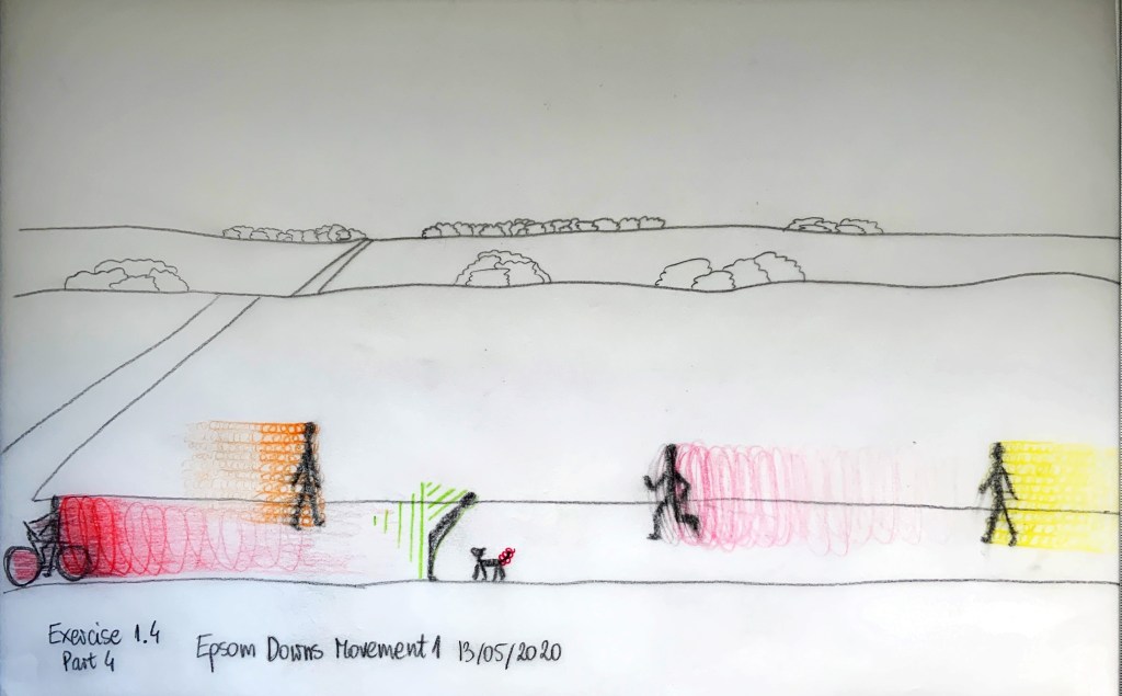
Fig. 8 – Fig. 9 are all drawn on tracing paper. I copied the landscape from Fig. 3 to speed up the process, and for clearer comparison of my movement on each.
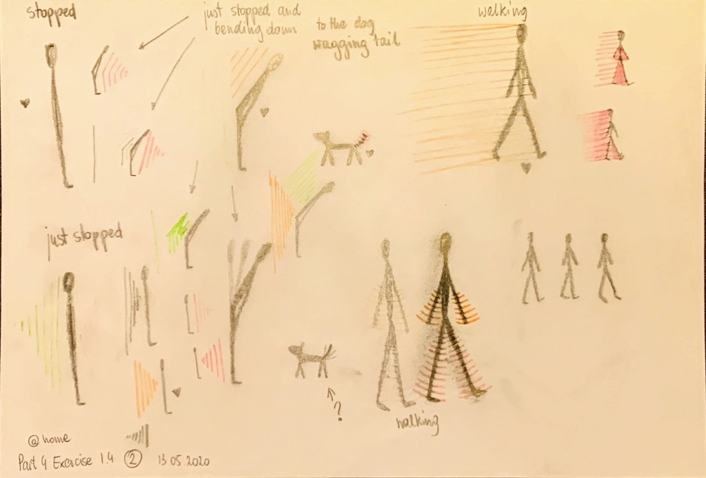
Fig. 8 is drawn on the tracing paper with soft pencil, coloured pencil and pink fine liner (dogs tail). I think it shows the energy well, but I would prefer the colours to be more vibrant.
Fig. 8 Epsom Downs movement 1
In Fig. 9 I added the cyclist using soft pencil and coloured pencil.
Fig. 9 Epsom Downs movement 1 v.2
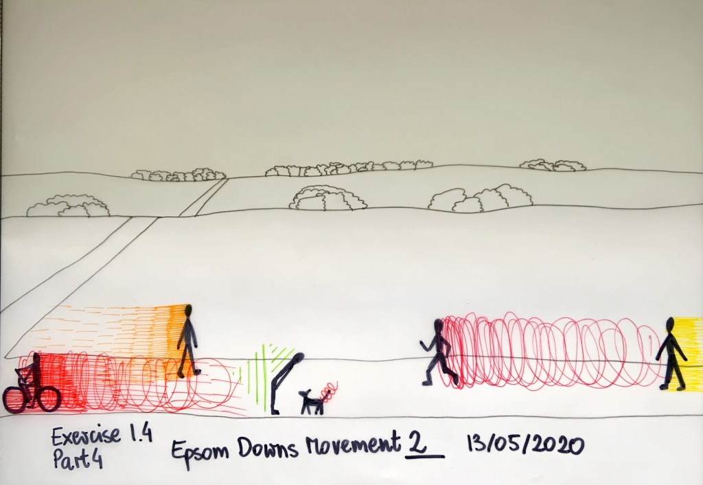
Fig. 10 was completed using fine liners and a sharpie. I thought It shows energy well, but I was not able to use gradient colours with this technique. The vibrant colours are great.
Fig. 10 Epsom Downs movement 2
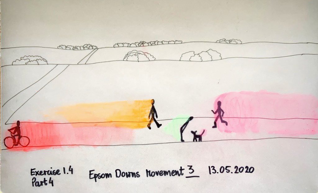
In Fig. 11 I drew scenery and people in fine liners and a sharpie. Then I tried to capture movement using soft pastels. I do not think I captured movement well here, a bit too washed out.
Fig. 11 Epsom Downs movement 3
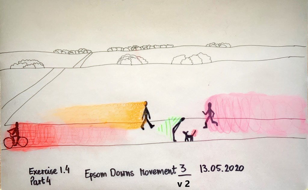
So I added patterns using coloured pencils (Fig. 12). A bit better but not quite. Now I think the trails are too long, they sort of miss the point, at the time I had no opinion yet.
Fig. 12 Epsom Downs movement 3 v. 2
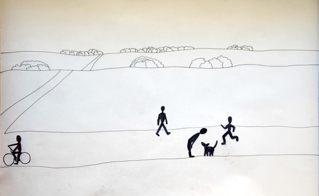
Like in previous ‘Epsom Downs Movement’ drawing I first drew landscape and people using fine liners and a sharpie (Fig. 13)
Fig. 13 Development of Epsom Downs movement 4
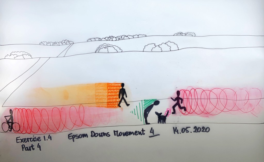
Then I added movement with fine liners, coloured pencils, and soft pastels (in that order) – Fig. 14. I think it has good energy and movement of people in space but it doesn’t really show hair, hands or legs movement (apart from dogs tail).
Fig. 14 Epsom Downs movement 4
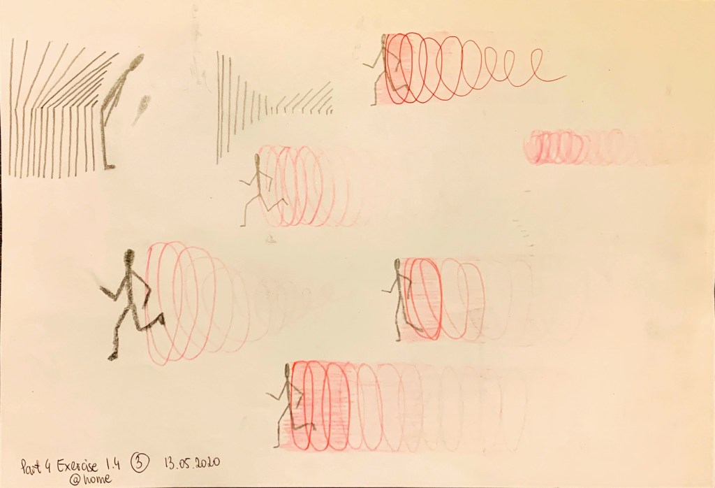
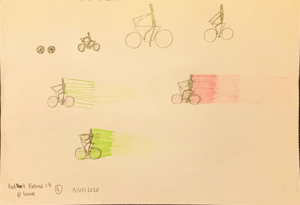
I decided to try capture both movement is space and movement of body parts. So I took softest pencil I have (10B) and started drawing, smudging and evaluating the effect.
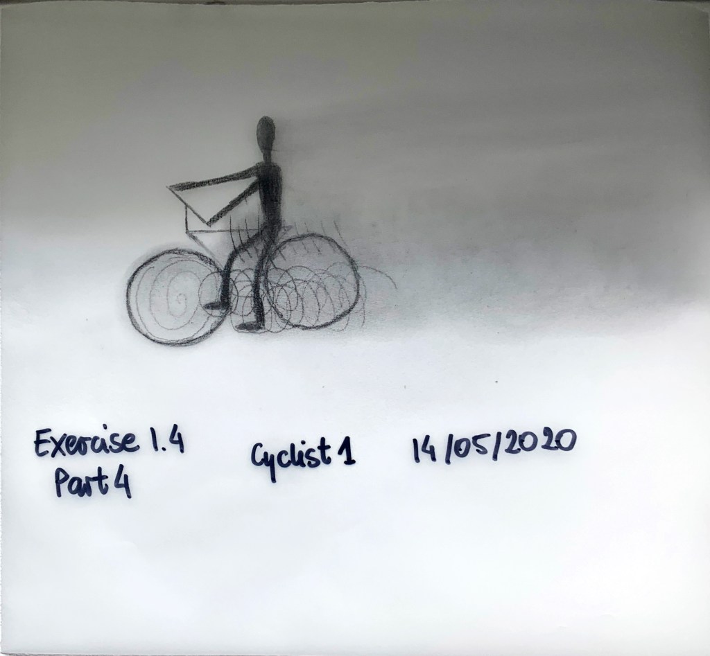
Fig. 15 Shows my first go at detailed cyclist. I wasn’t pleased with that.
Fig. 15 Cyclist 1
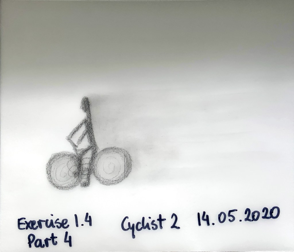
Fig. 16 is another go at cyclist, I still struggled to capture movement of the legs and wheels.
Fig. 16 Cyclist 2
Fig. 17 Cyclist 3 development
Fig. 18 Cyclist 3 development 2
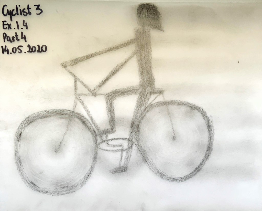
3rd time lucky. I used precision rubber on the wheels. I also thought that stripy gradient pattern shows movement is space better (Fig. 19). At this point I knew I will have to draw these people in soft pencil, smudge and erase bits to show movement patterns.
Fig, 19 Cyclist 3
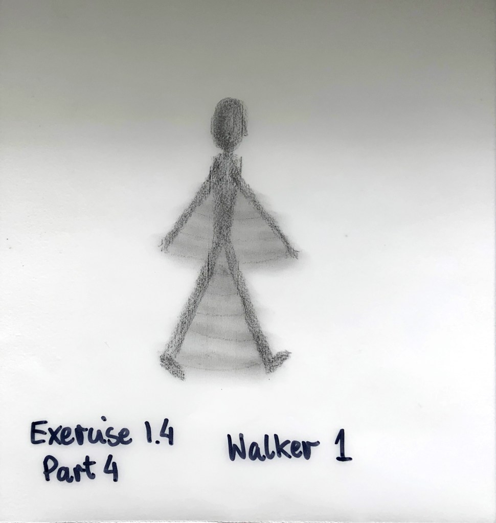
Fig. 20 shows my first go at the walker, I was not happy with this.
Fig. 20 Walker 1
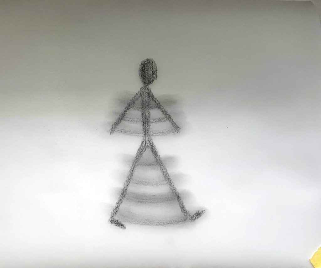
Fig. 21 is another go at the walker. This time the shading and grading is a bit better, showing arms and legs moving.
Fig. 21 Walker 2 development
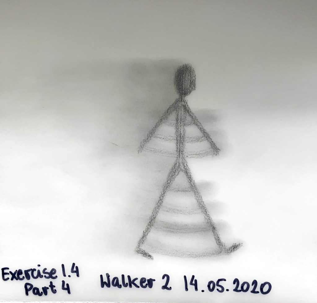
I then added some shading at the back to show direction of the movement (Fig. 22)
Fig. 22 Walker 2
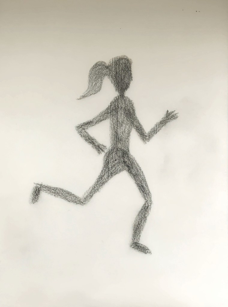
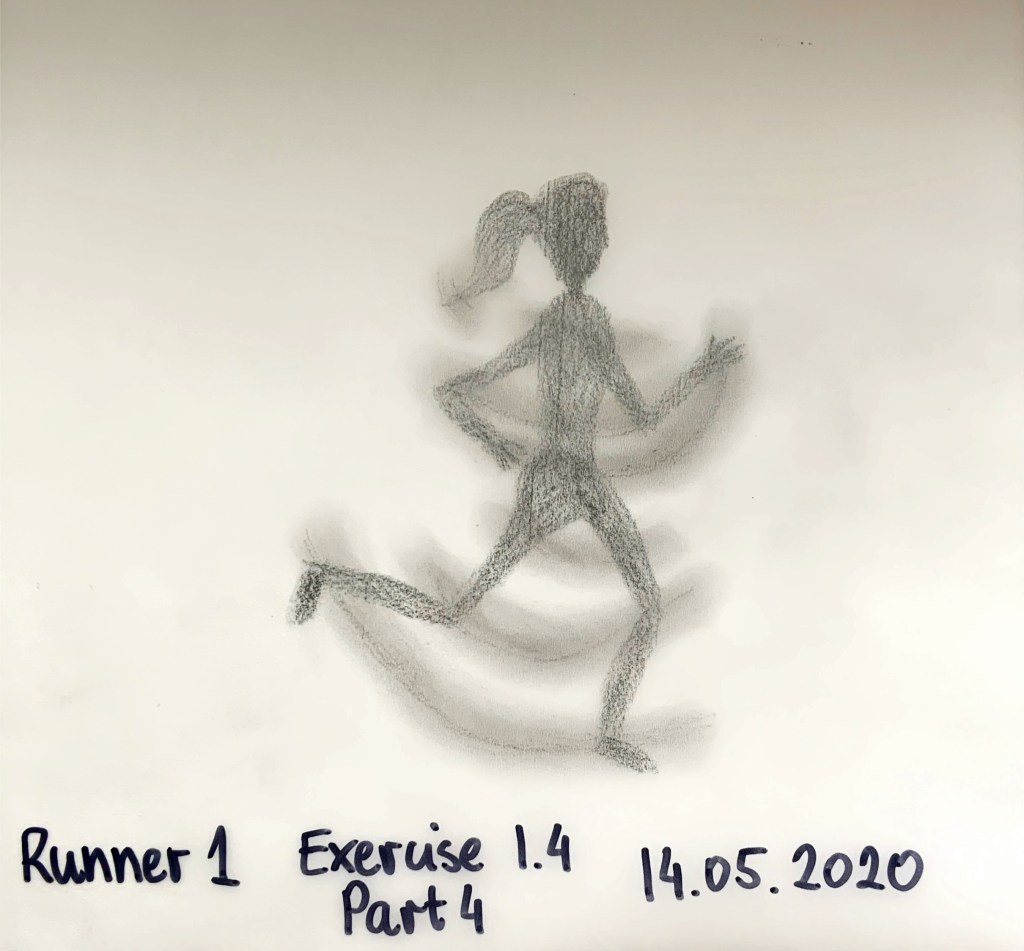
Fig. 23 and 24 show the runner and development. If you zoom in, you should see ponytail bobbing (I hope I got this right). I was not quite happy with the shades I got, I thought they were a bit too sharp.
Fig. 23 Runner 1 development
Fig.24 Runner 1
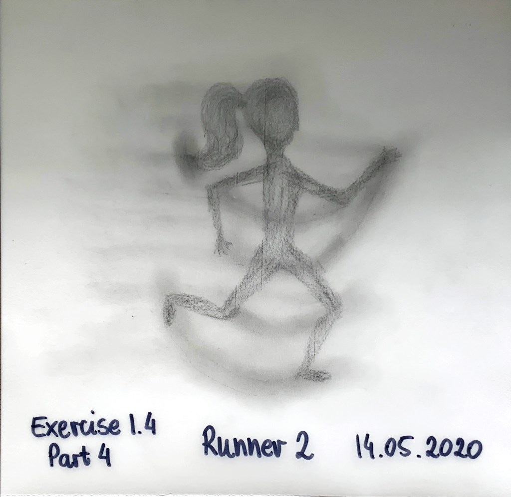
I created Runner 2 in Fig 25 using same technique but blended a bit better and added graded stripes at the back to show the movement in space.
Fig. 25 Runner 2
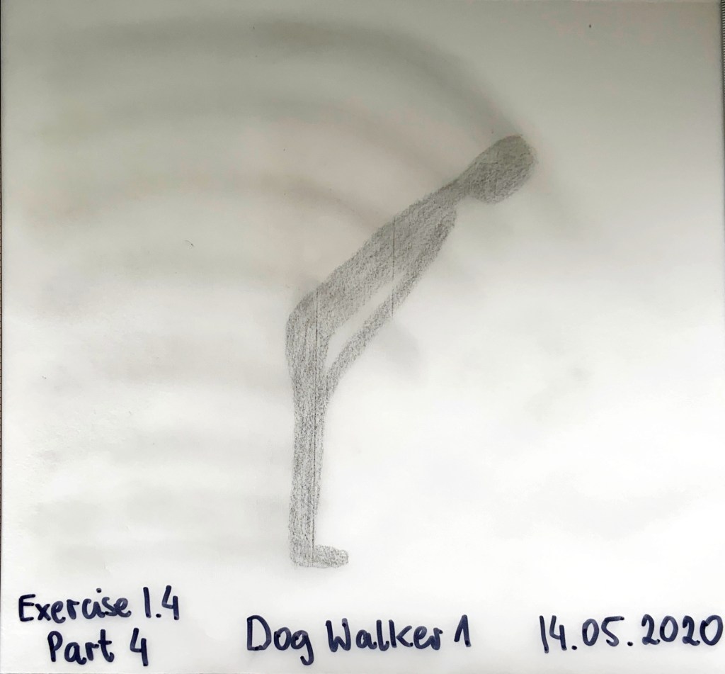
Dog walker was quite hard (Fig. 26 and 27). I was not sure how to show a person who just stopped walking and is looking down at a dog. I hope this captures it. I cannot make up my mind whether this version or one in Fig. 9 is better.
Fig. 26 Dog walker development
Fig. 27 Dog walker
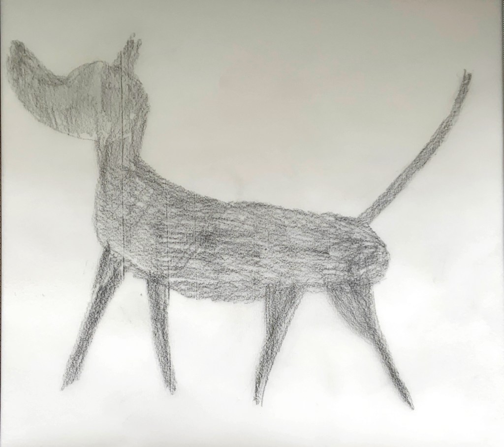
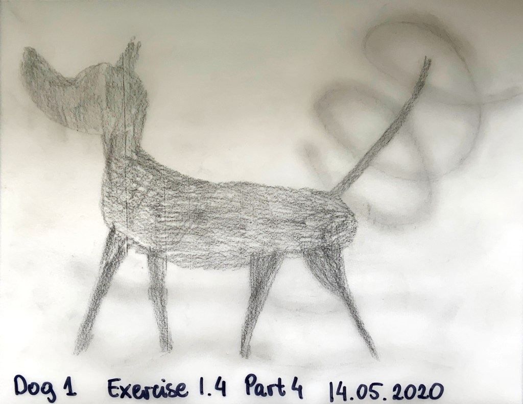
I did not realise dogs are so difficult to draw. I think my first one looked like a small horse. Never mind the body though, I think I captured the movement well, especially the tail wagging (Fig. 28 and 29).
Fig. 28 Dog development
Fig. 29 Dog
After I practiced all people and the dog, I was ready to create my final drawing. I created the landscape using soft pastels over my pencil drawing as in Fig. 3. I wanted to add some colour to the drawing (Fig. 30).
Fig. 30 Final drawing development
Then I added the people and the dog with a soft pencil (Fig. 31)
Fig. 31 Final drawing development 2
After that I smudged and erased to make some areas of movement darker and lighter to capture the movement. I used my finger for general, and cotton bud for ‘precision’ smudging.
Fig. 32 Capturing movement final drawing
Reflection on the task:
It was difficult, my people drawing skills are very rusty. Nevertheless, I really enjoyed creating each drawing, I like to get stuck in and draw. As predicted the contextual study about movement was coming back to my mind. Just smudging is not enough, you need pattern. Pattern is great for conveying the energy of movement but needs grading to give it direction. Movement capture needs a bit of contrast (my dark is smudged, but lighter bits are small and sharp).
Can you find 5 other examples of interior design that appear to capture movement in their designs?
Add images to your learning log with analysis of the space, including what methods have been used. Eg. form, lines, texture, lighting etc.
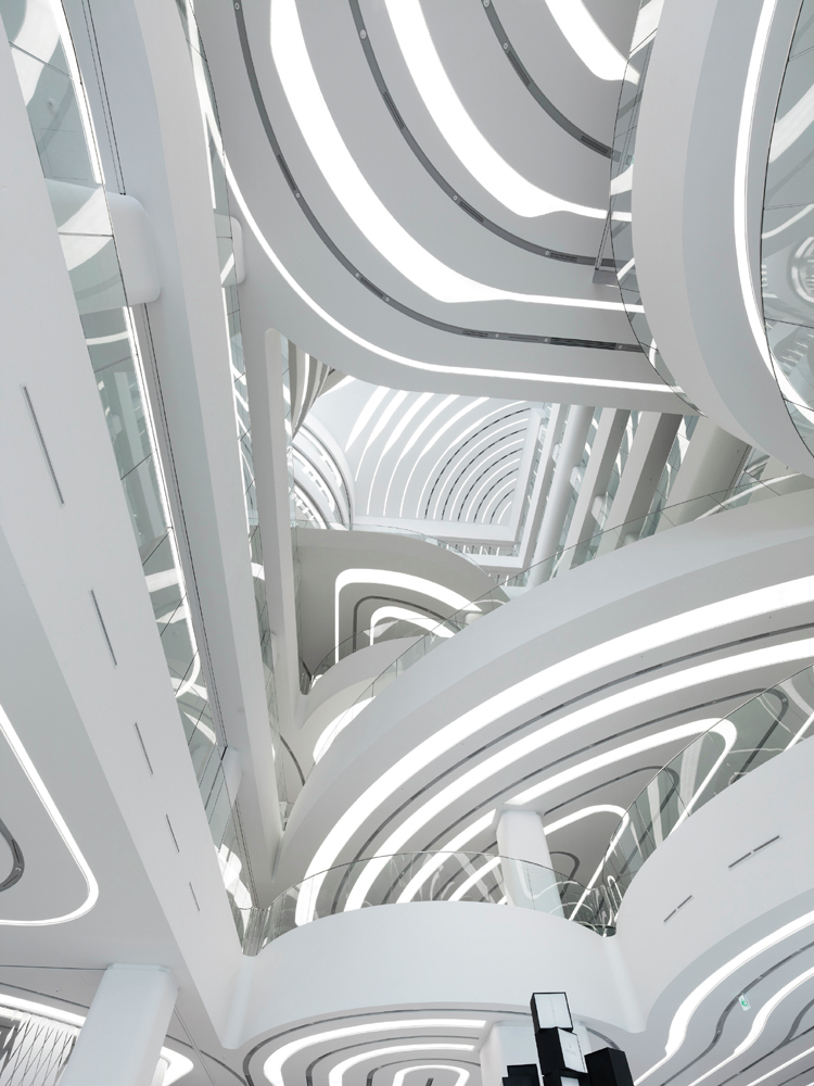
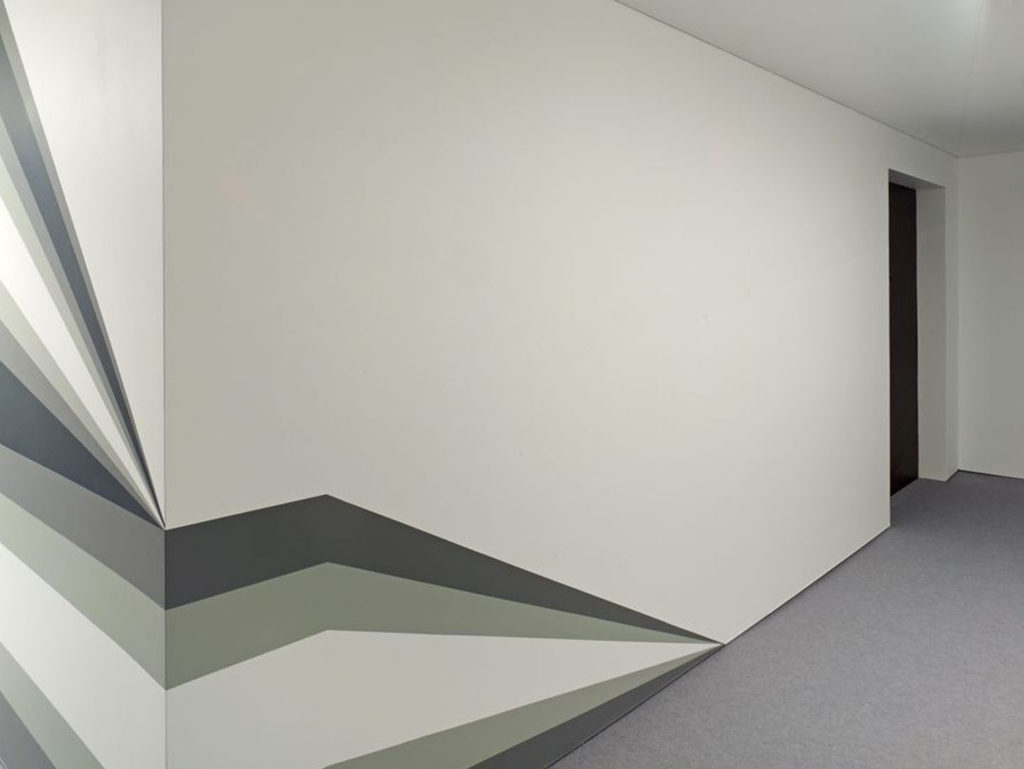
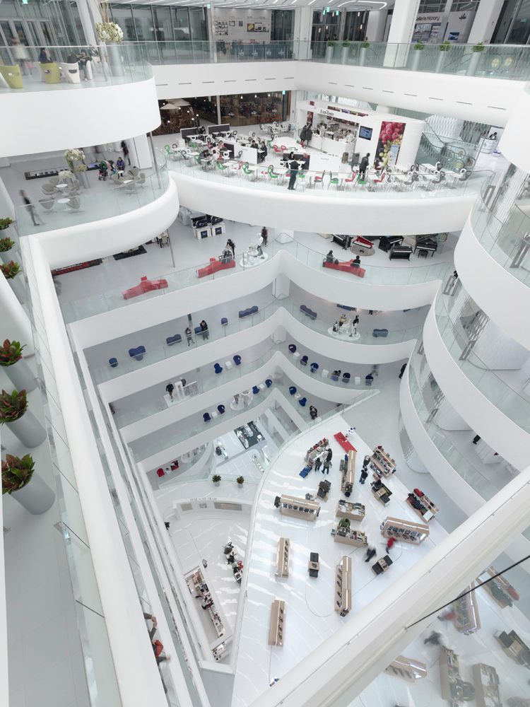
1. Galleria Centercity in Cheonan, South Korea designed by UN Studio
Fig. 1 Gallery of Galleria Centercity / UNStudio – 7
The space is a department store, with a food court, an art and cultural centre and roof terrace, so an all in one place to shop, eat and socialise. Fig. 1 shows interior from the entrance looking up. The user entering the space will be enticed to look up by the repetition of pattern on each visible ceiling (edges, lights and what I’m guessing are grooves). The design is repeated but slightly differently on the top panel unit hung just below the ceiling where through curved gaps light seeps down. The platforms look a bit angled, as if not quite level, the interior was designed with an upward exploration in mind. The interior is tall and light with very limited colour palette but by no means boring. The glass balustrades make the space feel more open, at the same time I can imagine they invite to come closer and have a look.
Fig. 2 Gallery of Galleria Centercity / UNStudio – 12
Fig. 2 shows same interior (as Fig. 1) but seen from opposite perspective. Somehow looking down does not seem as exciting as looking up. The patterns are not visible. We can still see shape of the platforms but without the light enhancing them they do not seem as inviting. The opening of the plateaus into the void aid orientation within the space. I think the voids presence and patterns cast by sunlight capture the movement best in this view. We can see repetition of shapes which are identical on each level on the left-hand side and pattern cast by the ceiling panel onto the shiny floors below, filtering the sunlight through, these patterns will move as the day goes by.
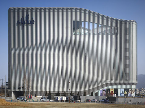
Fig. 3 dzn_Galleria-Centercity-by-UNStudio_2
The façade of the building is clad with two layers of vertical mullions which create a moiré pattern effect (Fig. 3). As the viewers position changes so does the pattern on the façade. The architect incorporated visible movement even if it is only optical illusion. The cladding also works as light openings and light shades, it cleverly lets the light in through openings but not too much, which is good for preserving energy on lighting and cooling the space.
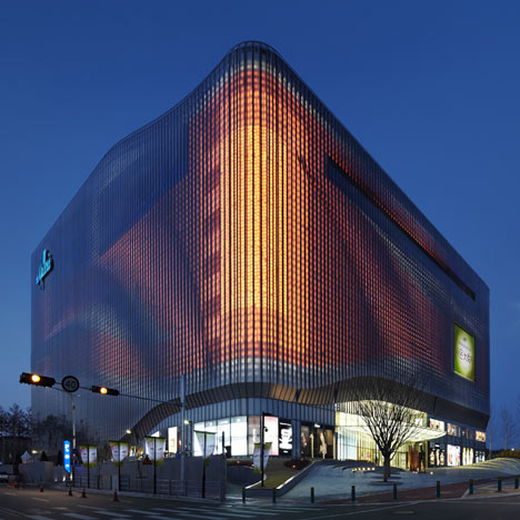
Fig. 4 dzn_Galleria-Centercity-by-UNStudio_9
UNStudio designed dynamic lighting effects and animations to be displayed on the façade of the building at night (Fig. 4). This is facilitated by 22000 LED lights installed in the façade. So even after the sunset the movement is still visible on the façade.
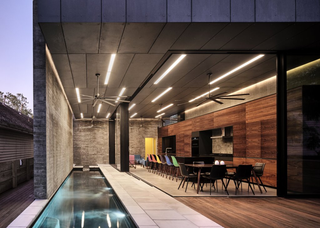
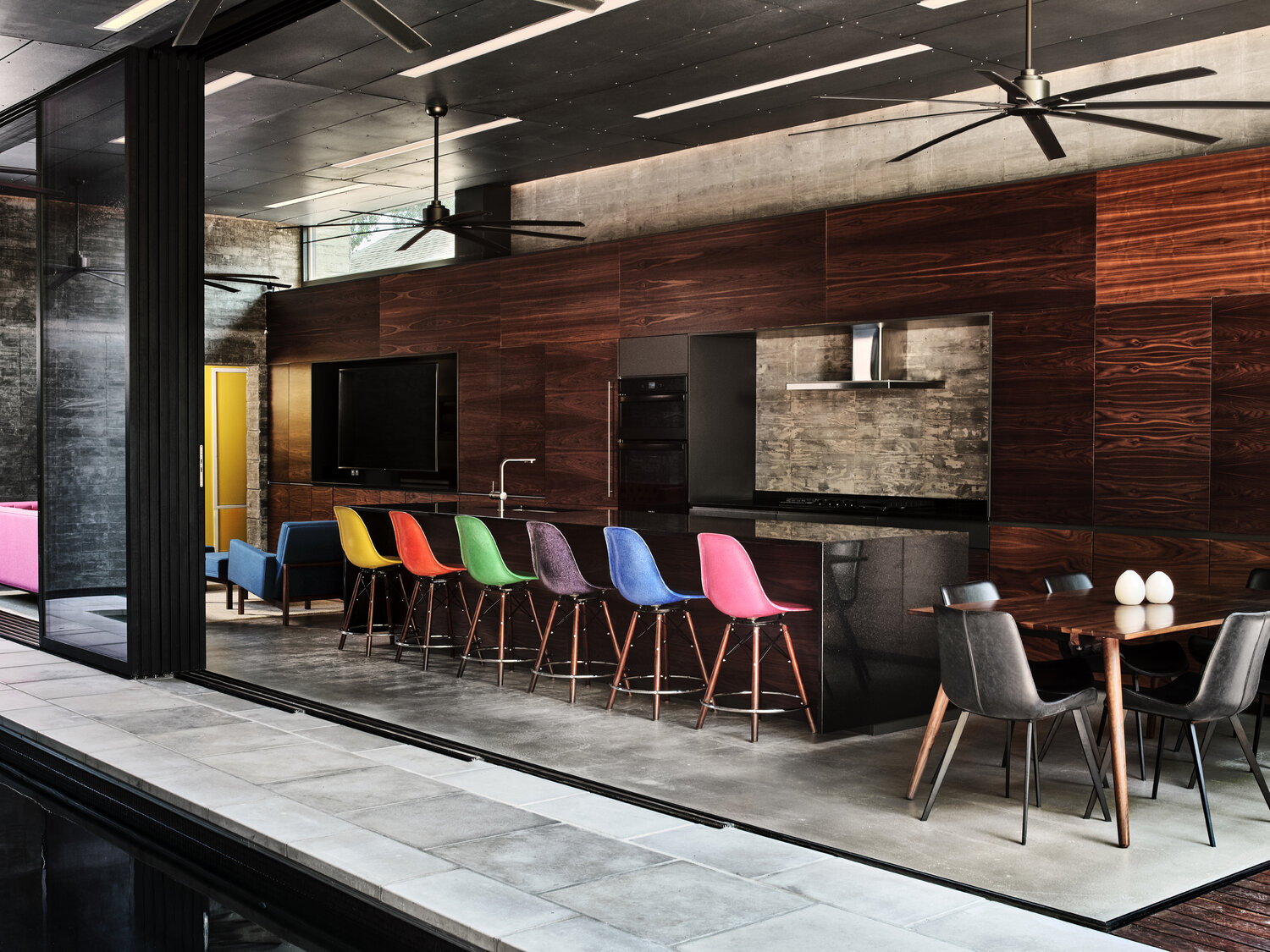
2. Bienville House in New Orleans, USA designed by Nathan Fell Architecture
Fig. 5 07-Rear+Unit-1st+Floor
Fig. 5 shows open plan kitchen/ dining / living room. The interior space has sliding doors in place of two walls, so it fully opens to the swimming pool and outdoor decking. There’s multitude of materials visible, concrete floor tiles, concrete wall cladding, wooden deck and kitchen are made of different types of wood, outside cladding turning inwards and covering the internal ceiling of this space. glass sliding doors framed in black metal, black metal fans hanging from the ceiling. I think the movement in this space is visible in the linearity of materials. They are arranged very straight but at different patterns. The most movement is visible in the ceiling lights: straight, long, narrow, they really stand out against the anthracite ceiling. Their form reminds me of passing lights at night, at high speed; that is what dotted lights in movement would appear like.
Fig. 6 05-Rear+Unit-1st+Floor
Fig.6 shows same space as fig. 5 but in different perspective. We can see the structure of the wood on furniture units. In my opinion the organic patterns of the wood grain have a certain ‘flowy’ sense. of movement. We can also see floor finish in a closer view and the black window profile as a border between inside and outside. I can imagine the fans, moving air will give a very physical sense of movement, not only visual, one could feel the air on their skin. This combined with the ceiling lights will add to the feeling of movement of this room. I must also mention the chairs next to kitchen island, their vibrant colours make them pop out and it seems as if angled legs might start walking any minute.
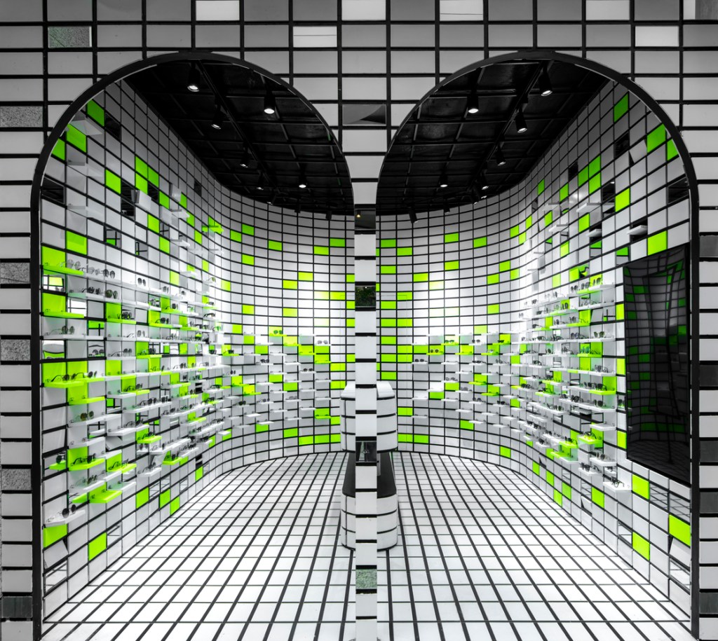
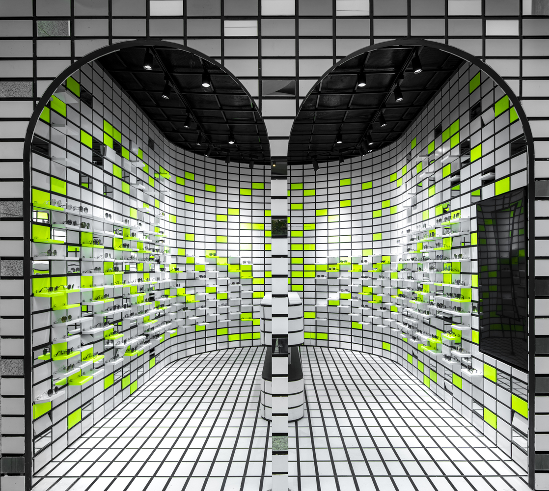
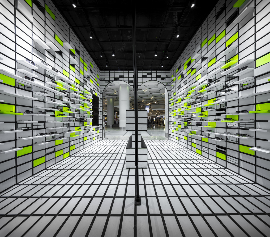
3. Opium Pop Up Store (The Flip Flop) at Mumbai Airport, India designed by Renesa Studio. The project is called The Flip Flop because of an ingenious display technique, where the singular shelves on the walls can be flipped open.
Fig. 7 Gallery of The Flip Flop / Renesa Architecture Design Interiors Studio – 1
This design really captured movement. In Fig. 7 we can see it in repetition of black grid on the floor and walls, arched doorways which look like they have been copied and pasted along with the interior (also this shape is repeated in the floorplan), and fluorescent green display units for sunglasses. The ceiling is painted black with a square grid just below, upon which spotlights are placed. The movement is captured by repetition of pattern and contrast of black, white and fluorescent green.
Fig. 8 Image 12 of 55 from gallery of The Flip Flop / Renesa Architecture Design Interiors Studio.
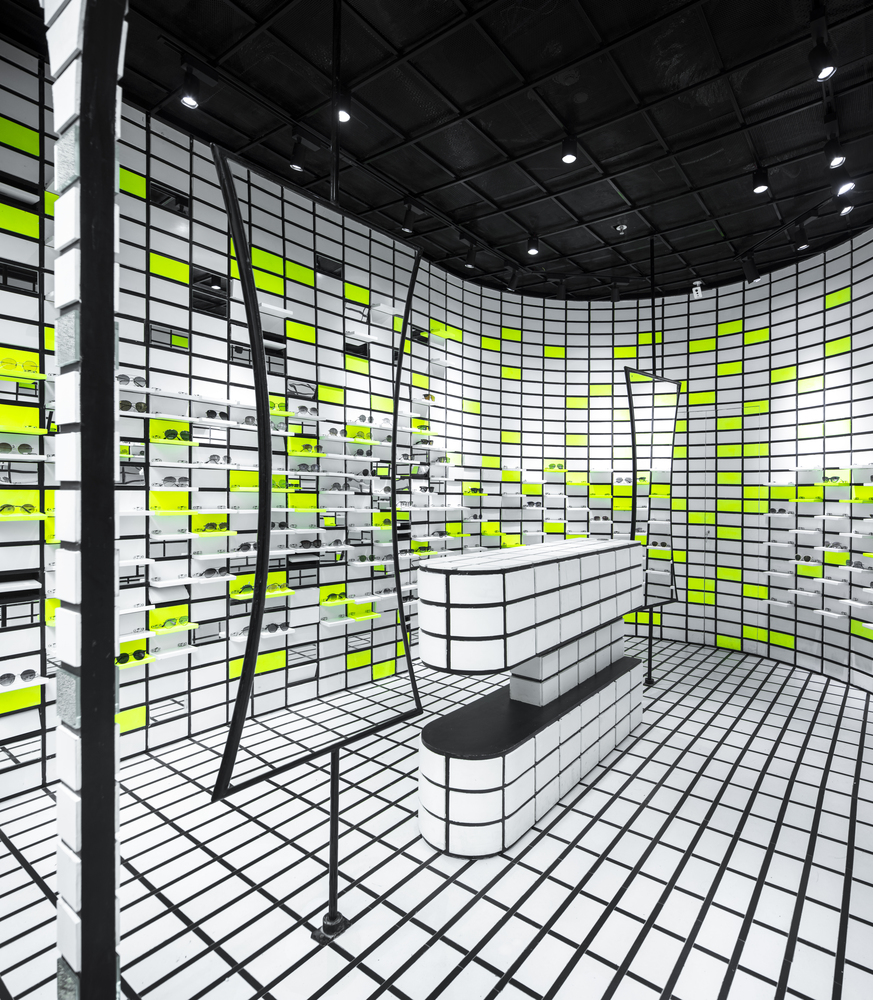
In Fig. 8 the same space is viewed from a slightly different perspective. Here we notice black framed mirrored in hour-glass shape that can be swivelled. I also noticed a sales counter that repeats the shape of doorways and the floor plan. The design looks sharp because of very limited colour palette and only 3 shapes are repeated in a very bold manner.
Fig. 9 Image 16 of 55 from gallery of The Flip Flop / Renesa Architecture Design Interiors Studio.
In the image above (Fig. 9) the movement is captured in the curvature of the wall, emphasized by its contrast to the straightness of the floor. The black gaps on the curve seem to flow towards the lens.
Fig. 10 Image 5 of 55 from gallery of The Flip Flop / Renesa Architecture Design Interiors Studio
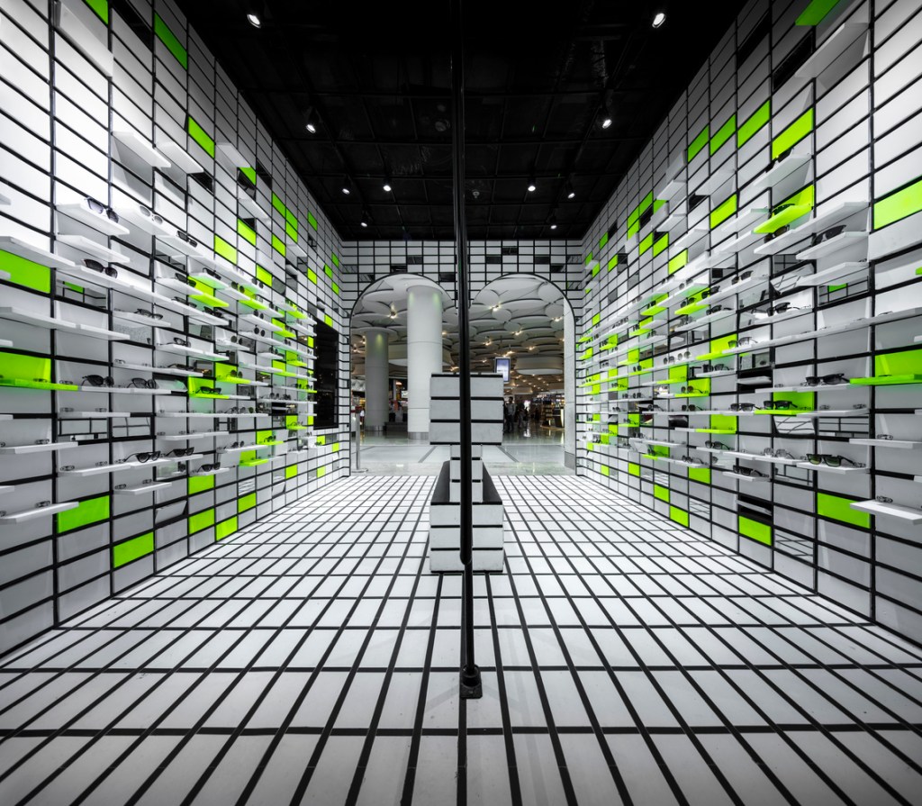
In the photograph above (Fig. 10) it seems that the interior is moving, while the viewer is stationary. As on previous images we can appreciate the strictness of the design and the grid size implemented, as well as perfect execution. Here we can also see how the interior relates to the space outside, and interesting patterned ceiling outside. Outside looks almost like it is in another dimension.
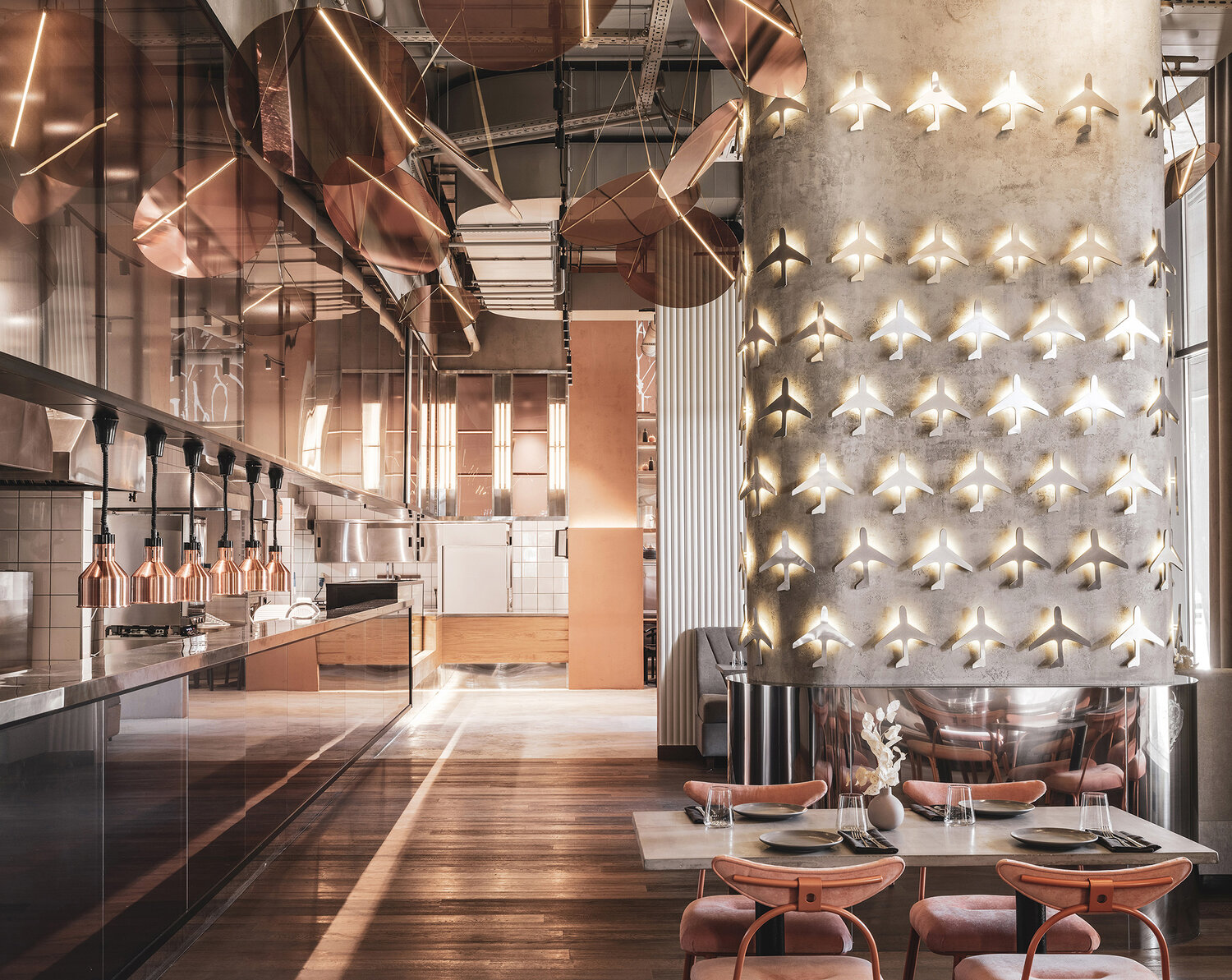
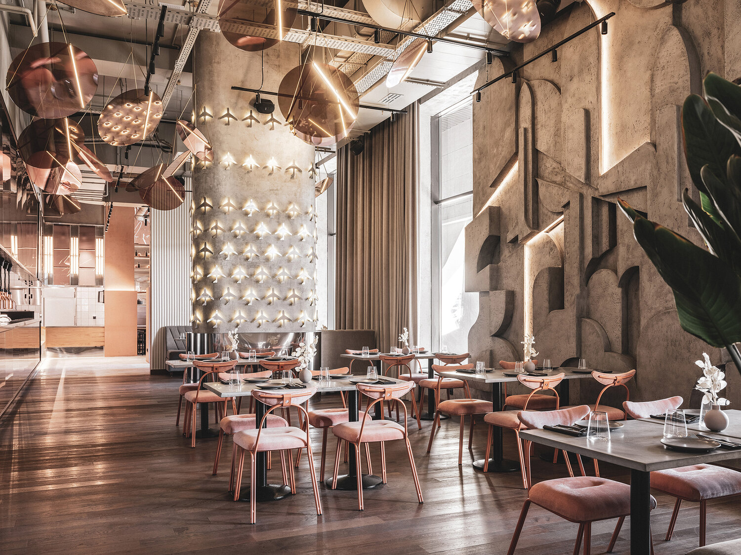
4.Polet Restaurant in Moscow, Russia designed by Asthetique– this project won Platinum A’Design Award 2020.
Fig. 11 No title 1
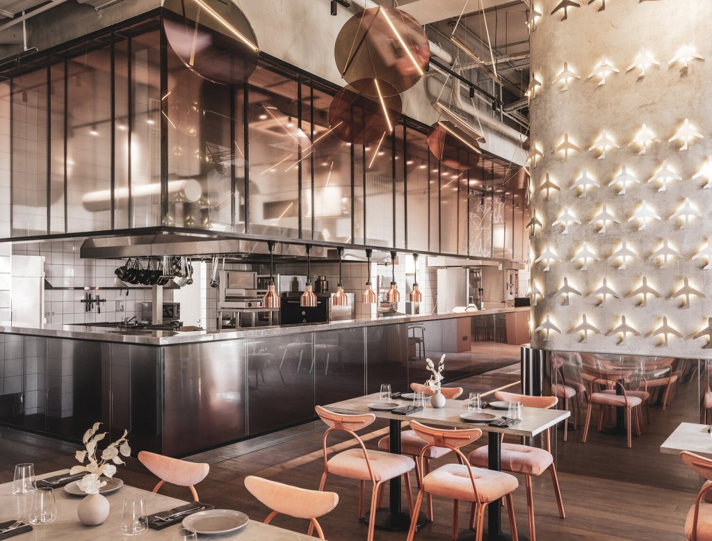
In the space above (Fig. 11) the movement has been captured by the use of interesting light fittings in a form or coloured, translucent circles hung at different angles (they seem to be captured half-swing, although I’m sure that isn’t the case), the row of copper lampshades over the counter, three tall and narrow fittings with tube bulbs (across the room)and of course the lit from below airplanes installed on the cement column. The shiny surfaces on the left-hand side and stainless-steel cladding on the column contrast with cement and wood on the floor, and along with the play of daylight across the floor they add to the sense of movement. The ceiling in this high space was left exposed showing all the systems just below.
Fig. 12 No title 2
In the photo above (Fig. 12) we can see cement wall that has carved-in artwork depicting planes next to some abstract parts, it has clean looking edges, and it really attracted my attention, Also here we can appreciate the grand size of the room emphasized by the lights; massive windows with floor to ceiling curtains; white, vertically striped panel past the column and aforementioned carving. I also appreciate the limited colour pallete of copper, blush pink, black, beige, grey and wood. There are multiple textures visible that I think improves the cosiness of this place; rough and geometrically shaped concrete walls and smooth concrete tables, warm wood floors, shiny and smooth metal and glass surfaces and soft and plush seats on copper frames.
Fig. 13 No title 3
In Fig. 13 we can see same space but from yet slightly different perspective. Here we can see how the shades of glass in circular light fitting and glass screen above the counter add to the movement capture. They’re both in pink-coppery-brown shade. The lit-up lines across the circles add interest and contrast with black lines around the glass screens. I can also see the finish of stainless steel better, it is mirror smooth and shiny, it reflects objects nearby. Those reflections are deformed and would move as we move. The strip of spotlights behind the glass screen looks milky-blurred and attracts attention. The visitors can also see into the kitchen which is finished in white tiles with dark grouting, stainless steel, and black accents.
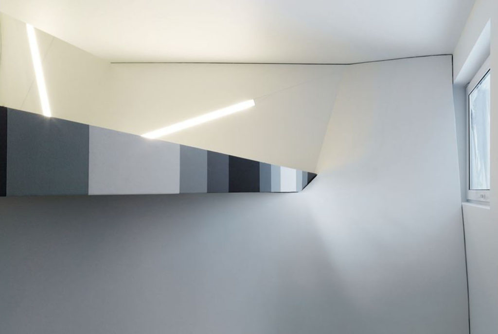
5.Rooftop Office in Dudelange, Luxembourg designed by Dagli+ Atelier d’Architecture. This Office is a showroom extension to HQ of local building engineering firm.
Fig. 14
Fig. 15
Fig. 16
The above 3 images (Fig. 14, 15 and 16) show that interior design does not have to be complicated, busy or ornamental to capture movement. The interior has white walls and ceilings, grey carpeted floor but somehow there is a flow to it. Its secret lies within the grey gradient stripes that either run parallel (staircase in fig. 14 and 16) or meet at a very sharp point (Fig.15). I selected this space when I saw the photo as seen in Fig. 15. I thought that is movement captured, before I read anything about this project. The only other element that adds to the movement would be the light fittings, long bright lines – they seem to be showing the direction of the movement.
Reflection on the task:
That was something really abstract to research (again). I thought ‘how can you capture movement in something still?’. I really enjoyed researching, looking at the photos and contemplating how was the movement captured. I am expecting, that once again (like with lines) I will become obsessed with the idea of movement in design and start noticing it everywhere. I am looking forward to it.
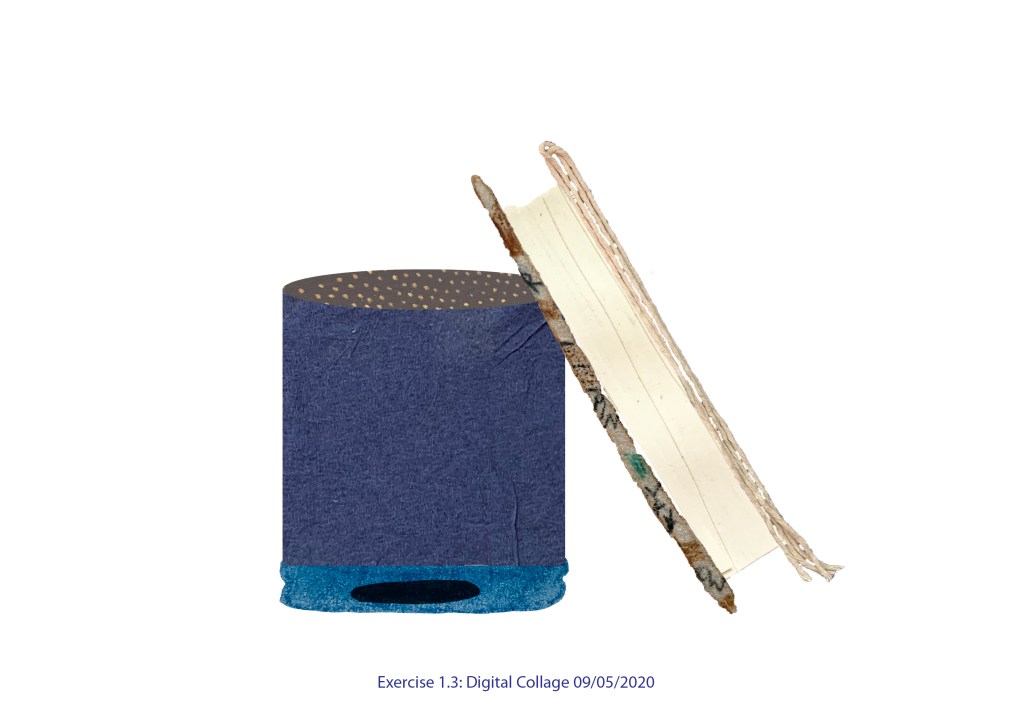
This was my first go at Photoshop. I photographed my previous drawings and collages and copied and pasted part of them to create the version in Fig. 1.
Fig. 1
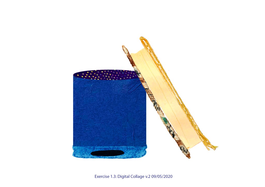
Each part of my collage was a separate layer and I played with settings changing hue, saturation, vibrance etc. The result can be seen in Fig. 2
Fig. 2
I liked version 2 more than first one, it looks more interesting and vibrant, has more ‘life’.
Then I decided to add some shadows, here they are in Fig. 3
Fig. 3
I enjoyed this exercise and my first steps with the software. It is a complex program and I’m looking forward to getting to know it better.
I decided to keep my objects from previous exercise.
I gathered different scraps of paper and various drawing materials.
Method 1: Drawing using different media
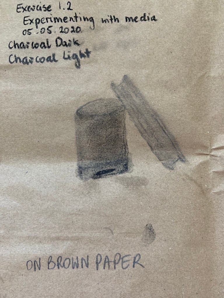
Fig. 1 below shows my objects drawn with charcoal on brown paper. This is first time I used charcoal, I found the process messy. I think charcoal can be useful in creating tonal or mood in visuals.
Fig. 1
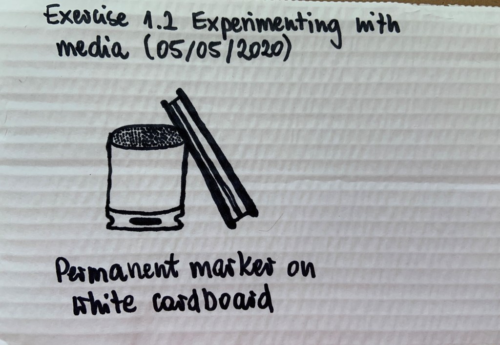
Next I used some white cardboard and drew using permanent marker. It was interesting to see how cardboard soaked up the ink from the marker, sort of ‘spilling’ on the surface (fig. 2).
Fig. 2
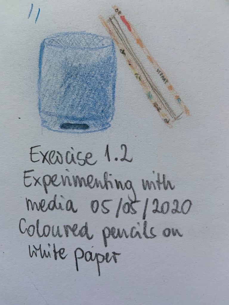
Fig. 3 drawing was done with coloured pencils on white paper. It is a technique I was already familiar with. I was pleased with level of detail on the cover I could include.
Fig. 3
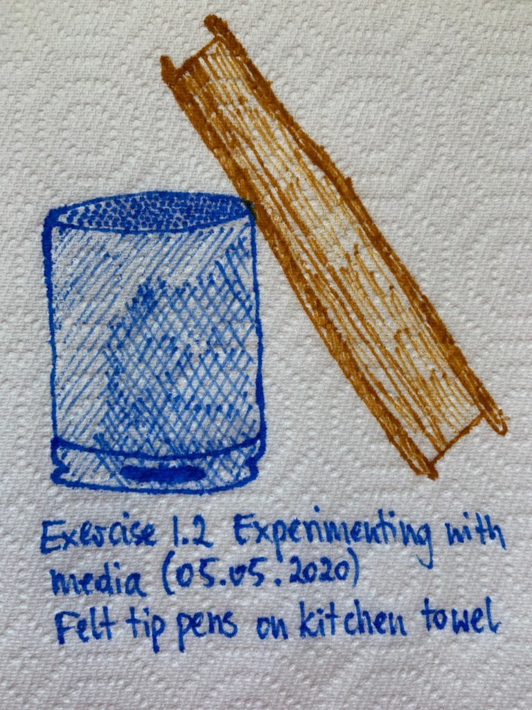
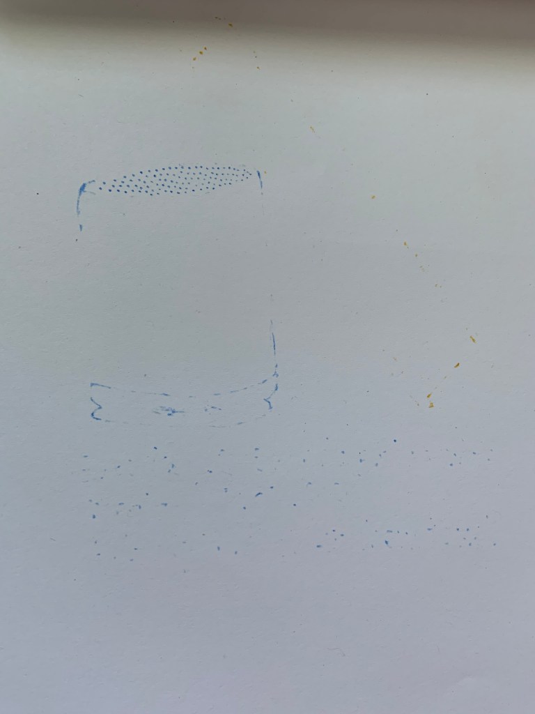
I used kitchen towel and felt tip pens to complete the next drawing (Fig. 4). The towel was soaking up the ink. I drew over a white piece of paper and some of the ink left a pattern on the underlay. I must remember this; I quite like the effect there (Fig. 5). I think the dots in Fig. 5 would be a perfect top of the speaker in negative (white dots on blue background)
Fig. 4
Fig. 5
Fig. 5
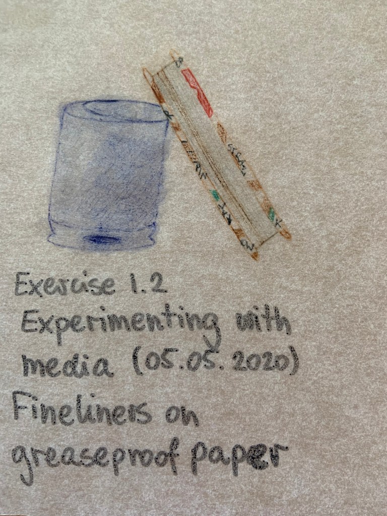
I used fineliners on greaseproof paper to draw Fig. 6. I was able to smudge while fresh or leave it to dry. It was first time I used this technique. I made an error on top of the speaker, but this is one of my favourites in method 1. The writing on bottom was completed in permanent marker, we can see how different it is here (washed out) than on cardboard in Fig. 2.
Fig. 6
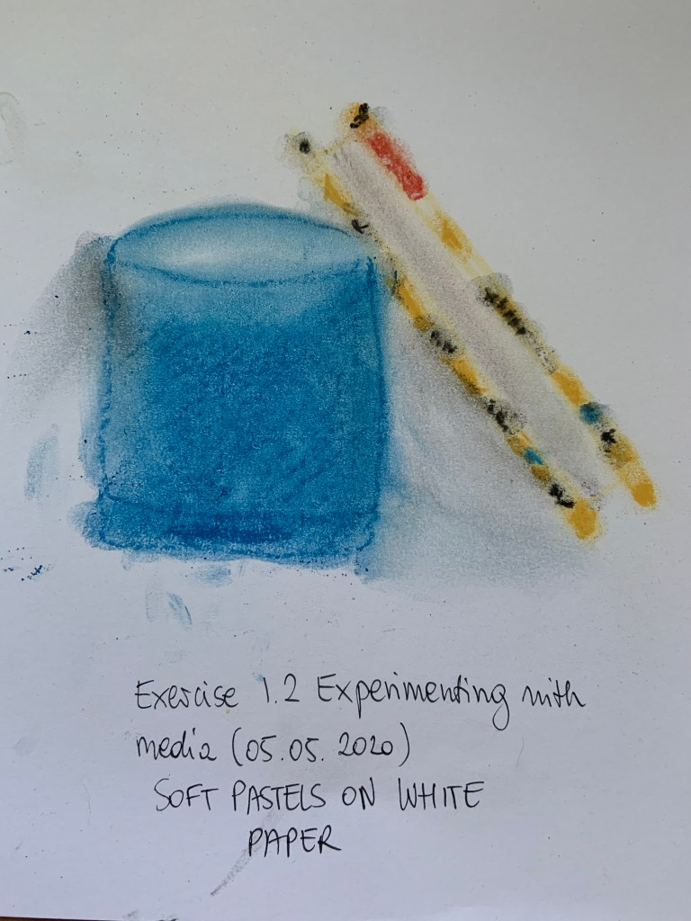
The final drawing in method 1 was completed with soft pastels on white paper. I haven’t used pastels for a very long time, it probably wasn’t the ‘right’ technique, but I just drew with them on paper and then smudged. We can see where I didn’t wipe my finger and made a black smudge on the left hand side. I don’t think it matters though, I like this drawing too, the colours and even the details, a bit smudged but still showing clearly enough.
Fig. 7
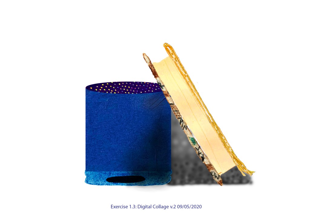
Method 2: Collage
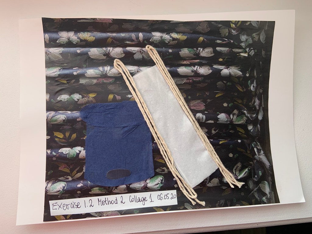
I used some string, facial tissue, navy napkin; with textured edge used for the top, and smooth middle for the body of the speaker. Sadly the texture mostly disappeared when I treated it with glue. The background is from Hilarys advertisement sourced from Ideal Home Create Your Dream Bedroom extra to Ideal Home magazine issue November 2019 (Fig. 8). It was difficult to glue the string and soft tissue and napkin. I may need to research and get some craft glue.
Fig. 8
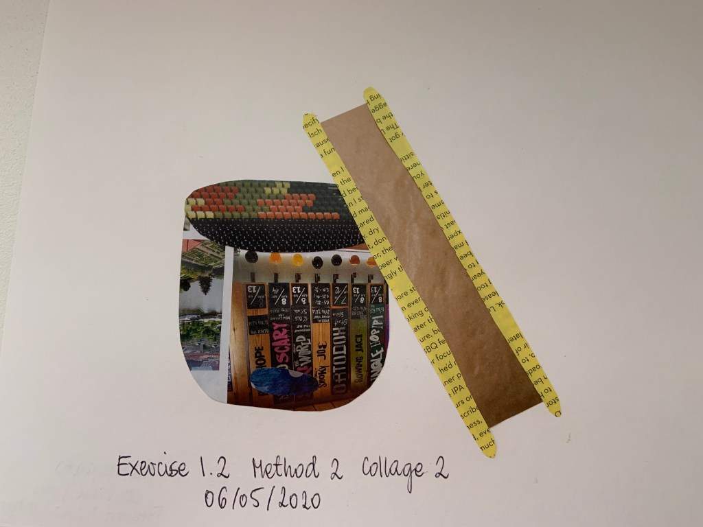
I created the following collage (Fig. 9) using cut outs from the Ferment Magazine (March 2020 issue)
Fig. 9
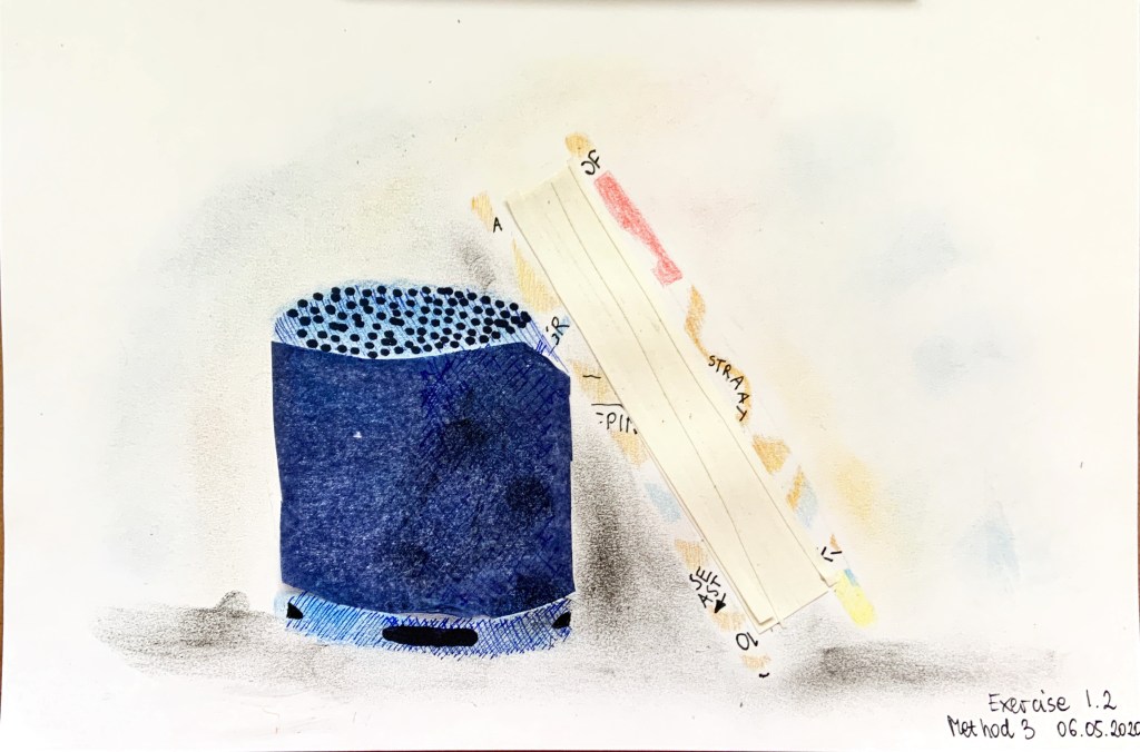
Method 3: Mixed media drawing including collage
To create Fig.10 I used most of techniques I just tried in two previous methods.
The notebook is drawn using pencils and fine liners, the pages bit: I used the actual page from the notebook cut it into smaller longer pieces and pasted in the middle. The speakers’ mid body is pasted blue napkin, top and bottom and the napkin are coloured with pencil, fine liner, and soft pastels (this time applied to finger, then paper). I used permanent marker for black details and pastels for shading all over.
Fig. 10
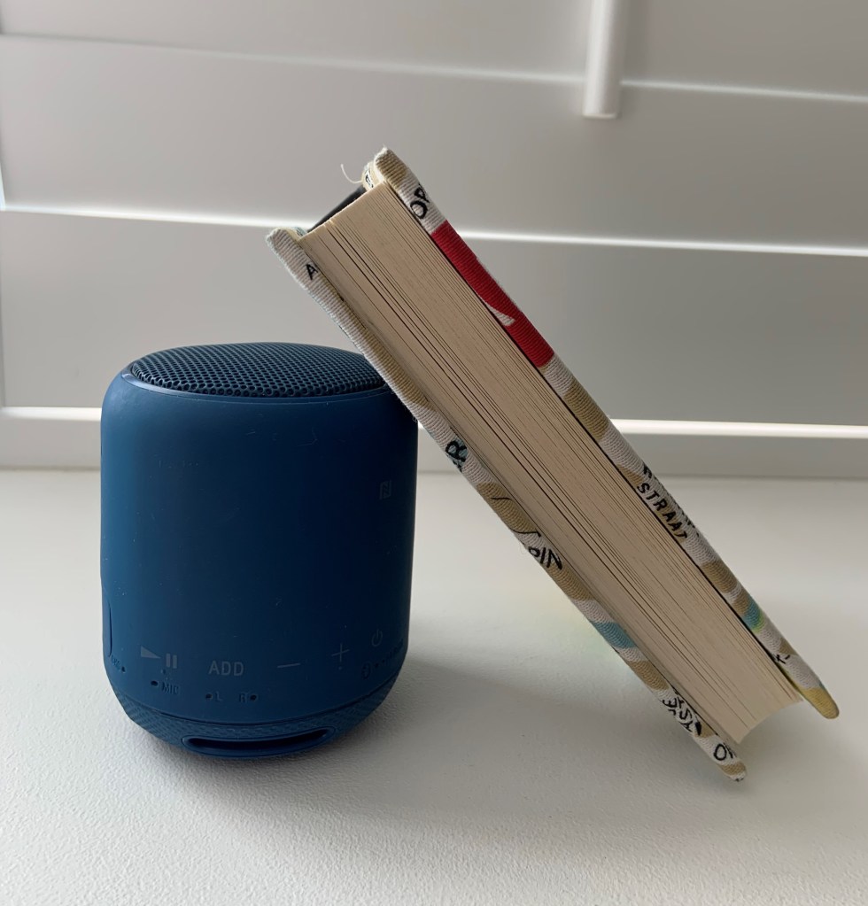
I think I should include a photo of my still life arrangement so here it is in Fig. 11
Fig. 11
Reflection on the task:
I thoroughly enjoyed the task. It was a good experience of discovering different techniques I would not normally use. The most surprising and satisfying outcome was the fine liners on greaseproof paper. I can see how different techniques could be applied, depending on the intended outcome. I understand that I should continue practising different methods to be able to confidently apply them in my visuals. I could see the more drawings I completed the better they got, so… practice, practice, practice!
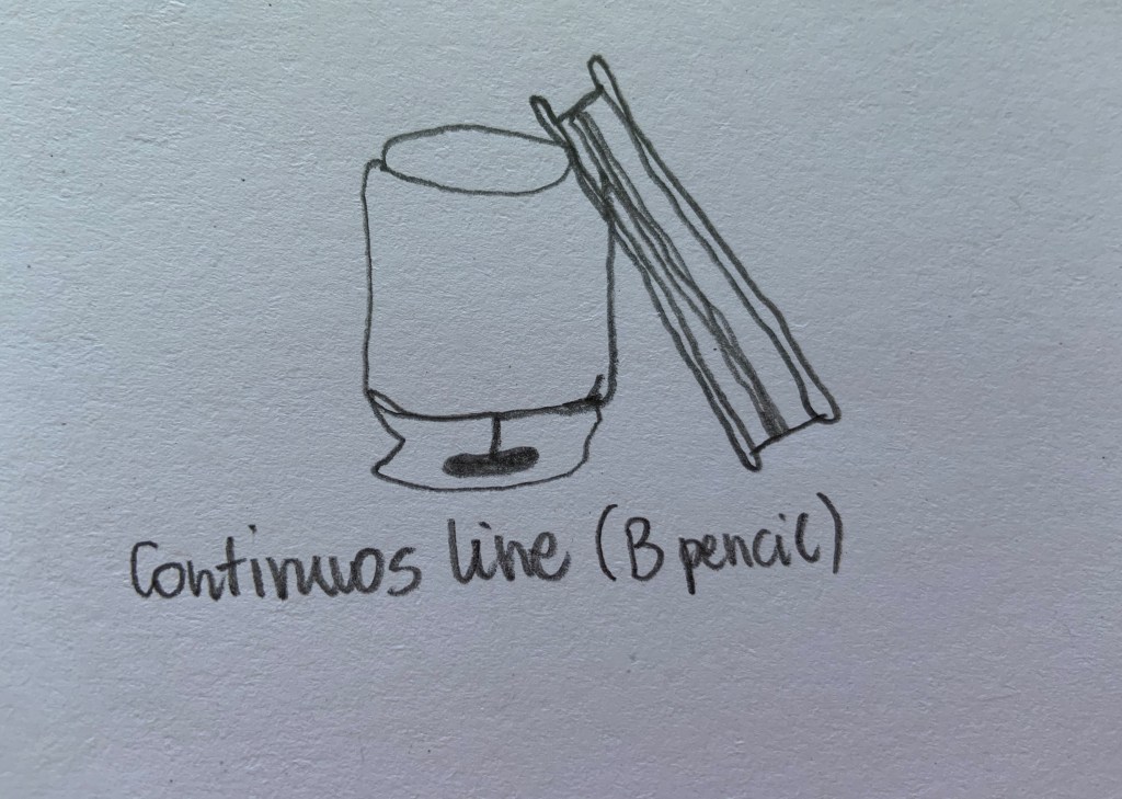
I arranged a small notebook resting on a Bluetooth speaker.
Continuous line (Fig. 1). I learnt that drawing a straight freehand line is difficult
Fig. 1
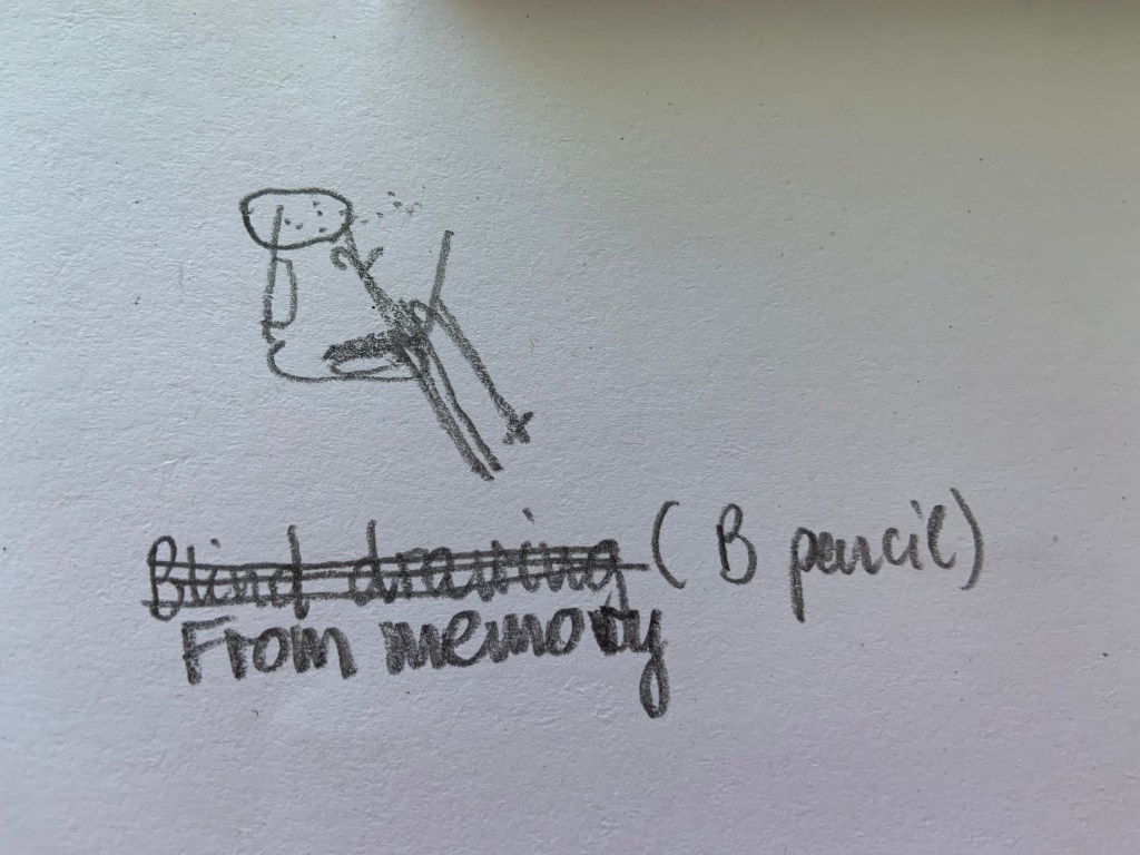
From memory – drawing with eyes closed (Fig. 2). The result is unsurprisingly not similar to original objects. I bravely attempted to draw a pattern of holes on top of the speaker.
Fig. 2
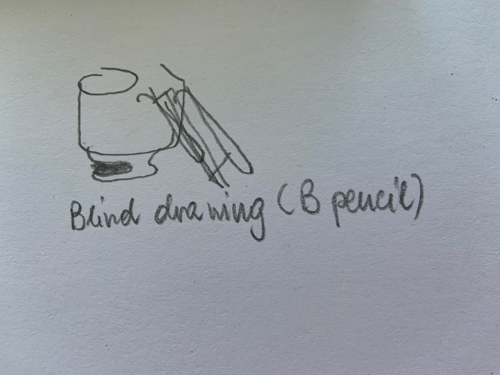
Blind drawing – looking at objects not at paper (Fig. 3)
Fig. 3
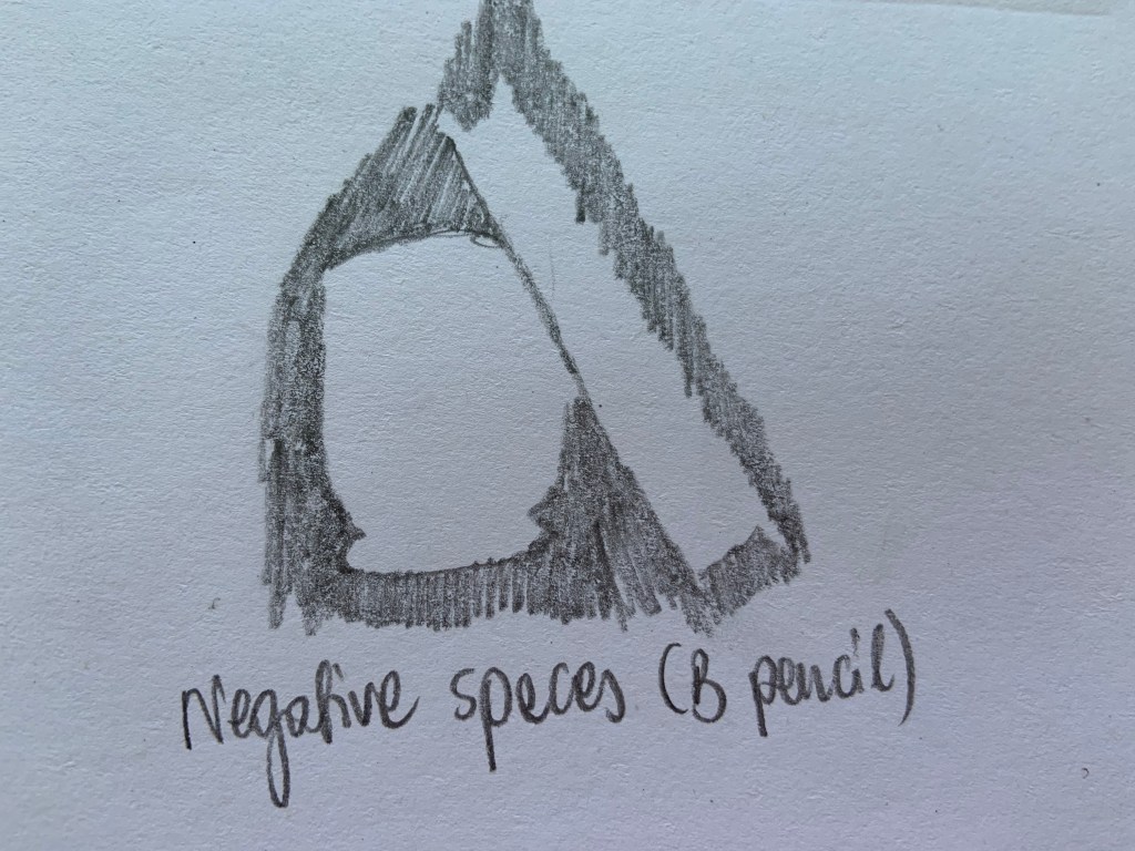
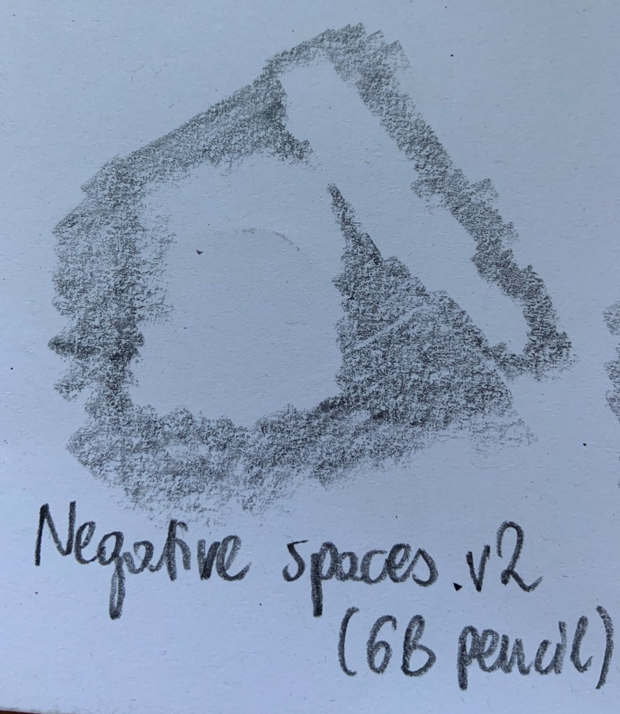
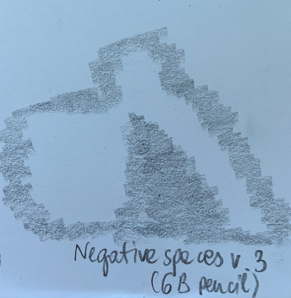
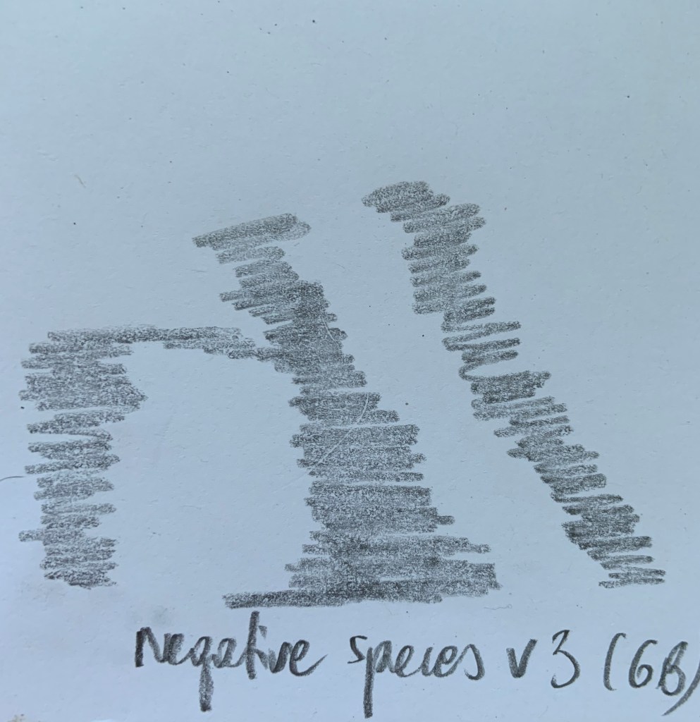
Negative spaces. Fig. 4 was my first attempt. Then I thought that perhaps I shouldn’t have drawn outlines of my objects, so I completed Fig. 5, Fig. 6 and Fig. 7 (in that order)
From left Fig. 4, Fig. 5, Fig. 6 and Fig. 7
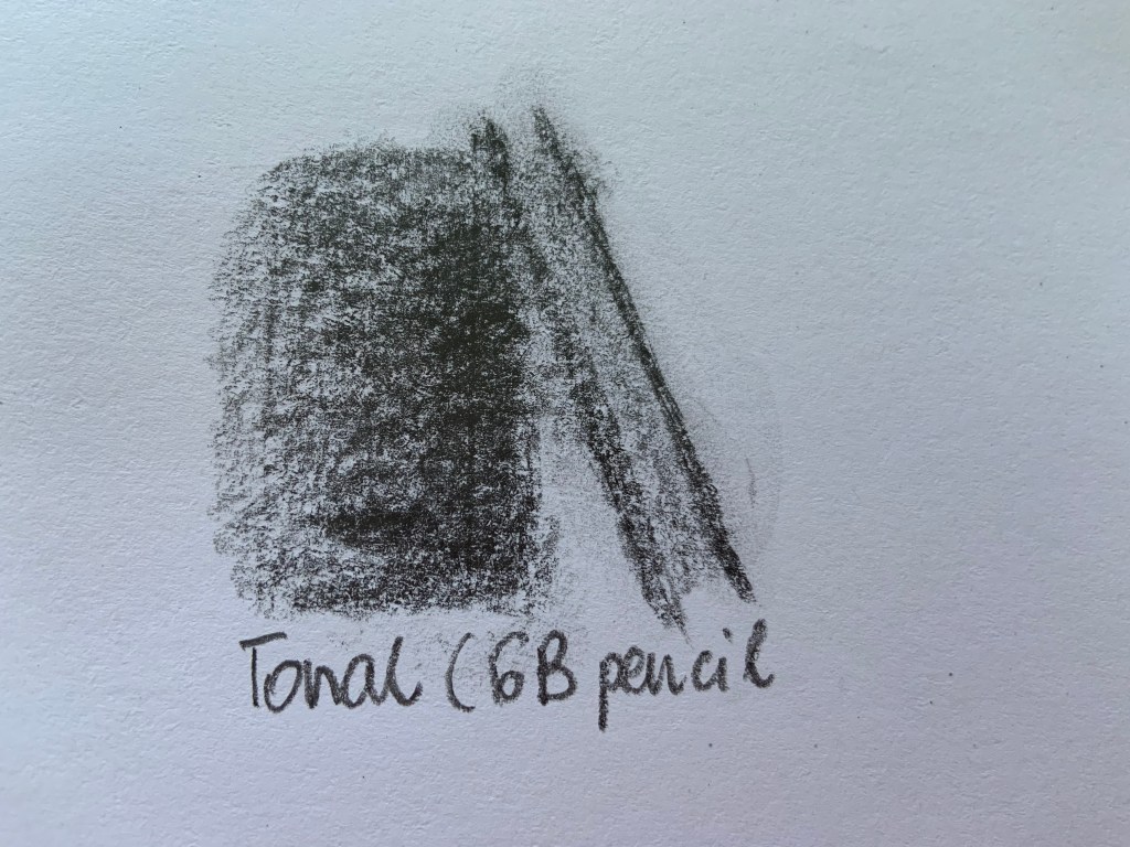
Tonal (Fig. 8) – by far this one is my favourite. It best shows the shape and relationship between the objects.


.jpg?1502945065)