Assignment and Part Three Feedback Reflection

I received feedback from my tutor. As always, I found feedback helpful in understanding what I am doing right as well as challenging me to consider doing some things differently.

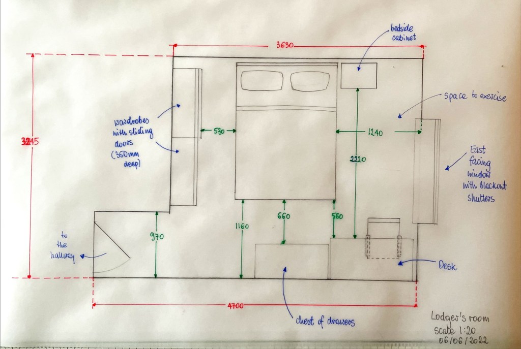
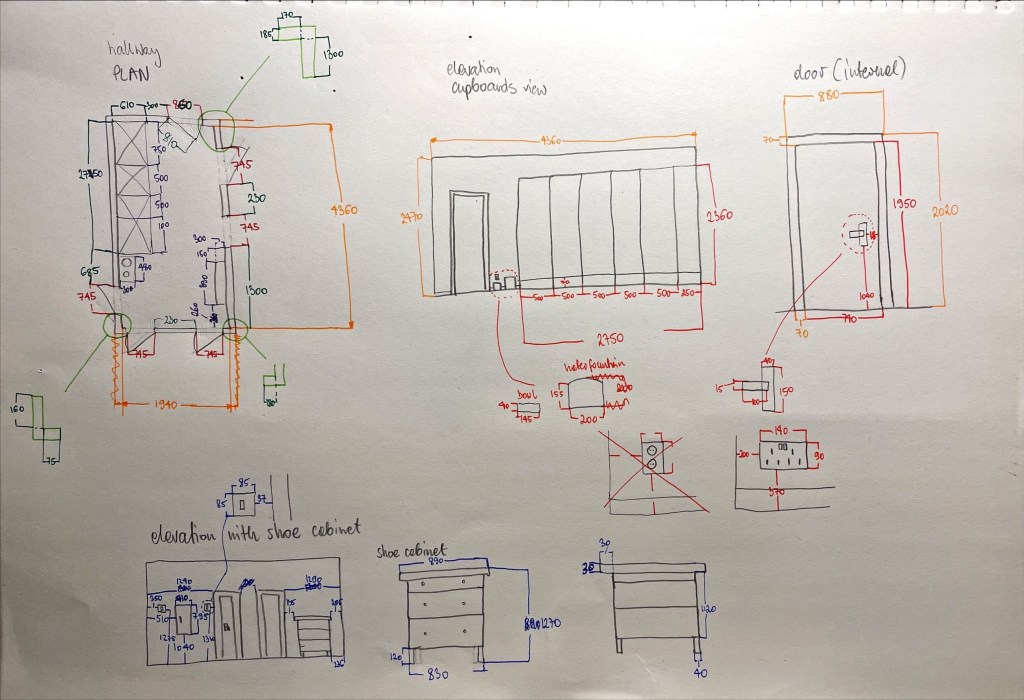
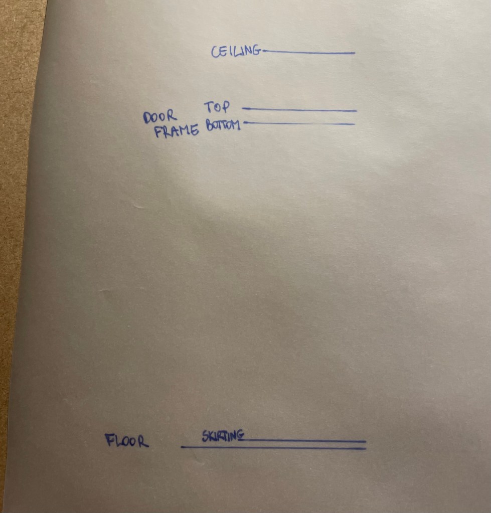
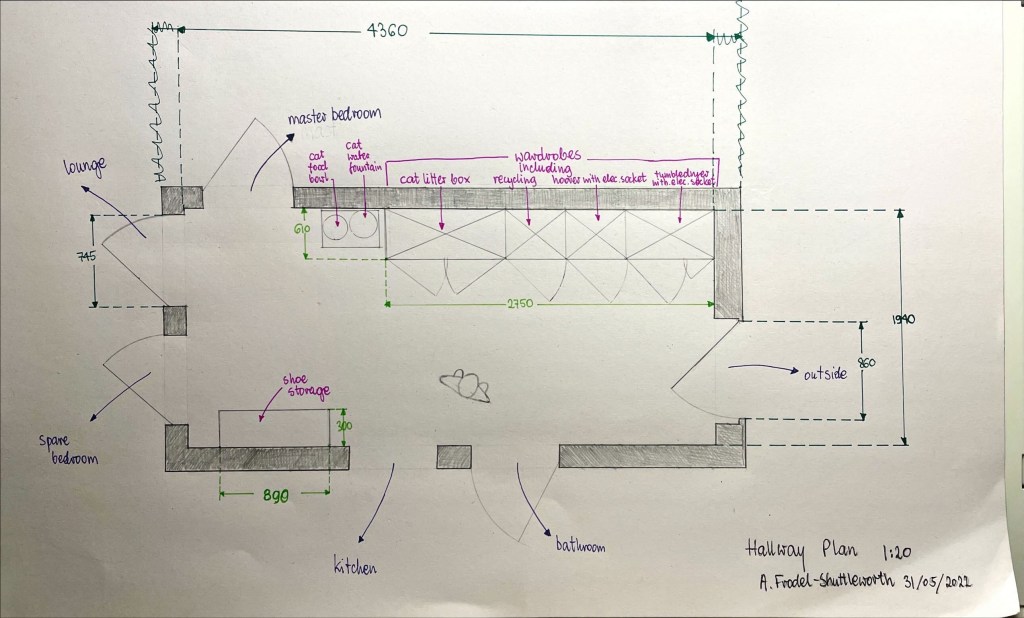
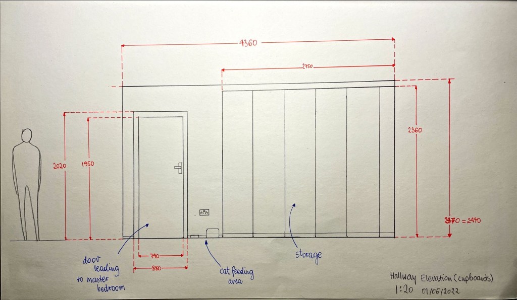
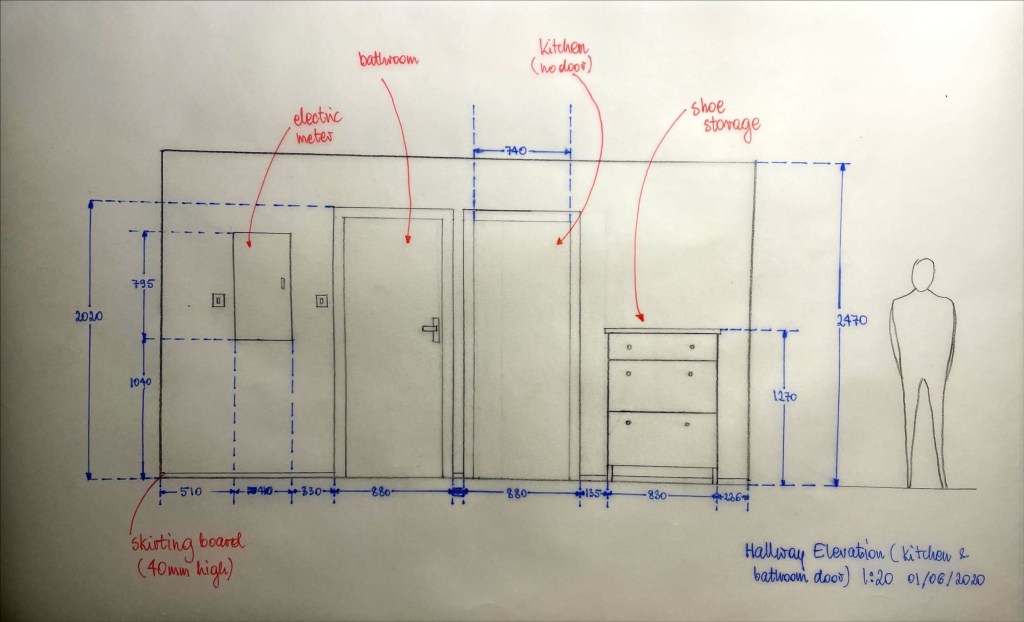
Hallway and lodgers room survey and drawings: It was good choice to draw in people to demonstrate the scale as well as using different colours for measurements – this aids understanding of the drawing. Next time – if drawing only plan, I should note the ceiling height on the plan. It is handy to draw elevations as well as plan drawings, as elevations show many aspects that plans don’t, such as ceiling, door, skirting board heights. Perhaps also light fittings, pendants etc, how low they drop could indicate and conflict (I’ve seen some homes where doors interfered with pendant lampshades)

My tutor noted that it ‘would be more helpful to see move development work’. I must admit this is the hard bit. Often there isn’t a lot to show. Mainly because I come up with an idea in my head and just do it. So, what I put on the learning log, is all there is to show. I suppose it makes tutors work harder, trying to understand my process, that’s mainly in my head. My tutor recommends making more sketch models, which I find the hardest to do.

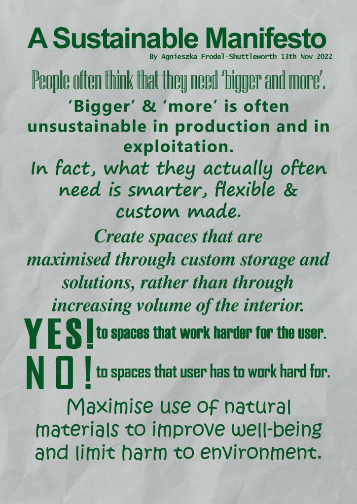
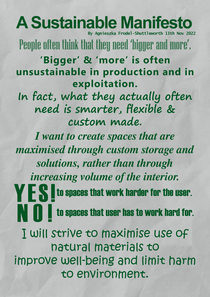
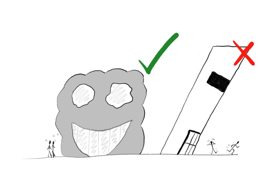
For my manifesto my tutor suggested some challenging ideas, such as remove the ‘I’s (want, will etc) and also make ‘yes’ and ‘no’ statements in different fonts to make them contrast with each other. I tried it and I like my manifesto more now. The statements are stronger now, the manifesto looks punchier. As I reflect and look back now, I realise that one of the design inspirations for my manifesto was a poster with message in different fonts. I can’t remember by whom or where I saw it… My tutor also challenged me to think about how / where my manifesto could be presented – I think this particular one would look good in print – poster or a t-shirt but could also be placed on a website. I don’t think Billboard would be good – they use a lot of material to display the message (therefore not sustainable, contradicting my manifesto), also the layout of a page would have to be changed (which of course is possible, just needs changing).

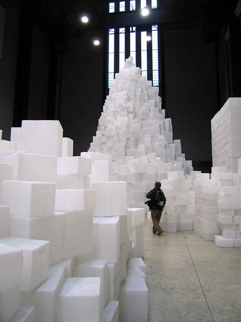
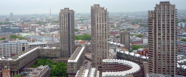
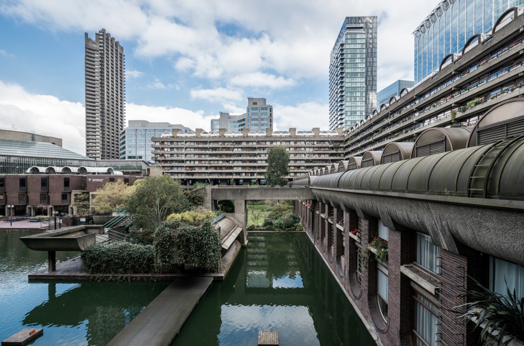
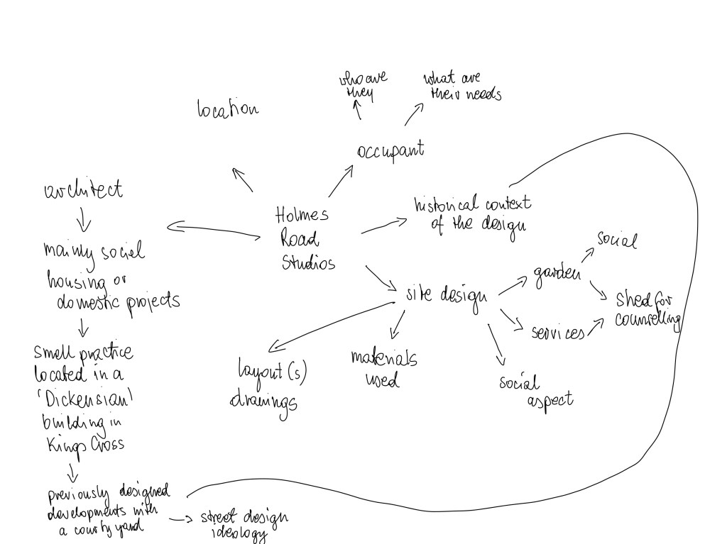
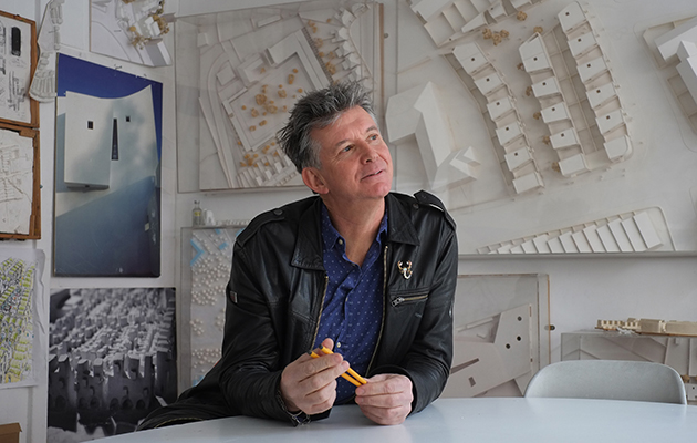
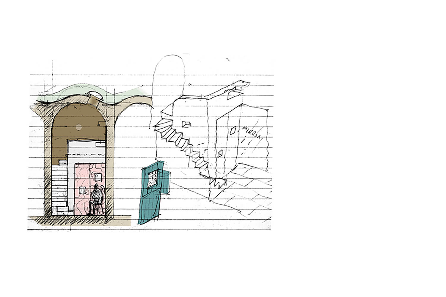
My tutor recommended that in future research task / study presentations I should research, analyse, and include images of technical drawings for the researched projects. This will allow me to discover more in depth what made the design work, as well as enhance the already in-depth research. I can see how it would have helped me if I looked up Barbican original plan drawings or Holmes Road Studios Design Development Documents.

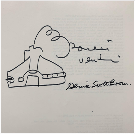
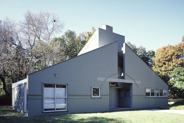
 My Es Devlin’s manifesto research had a good level of personal response (as opposed to Roberto Venturis analysis). I should try and include my personal responses all the time. I could have dived deeper in the analysis of manifesto’s and compared the ones I analysed with each other. Doing so would have helped me form opinions and improve my critical thinking and analysis skills.

Including more of my own drawings is also suggested by my tutor. I should show more development work, perhaps redevelop ideas I already put to paper, tweak them a bit (as I did in this reflection with my manifesto), test and retest the ideas. This will help me refine the ideas as well as give my tutor an insight into my processes.

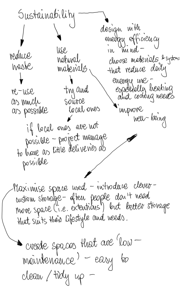
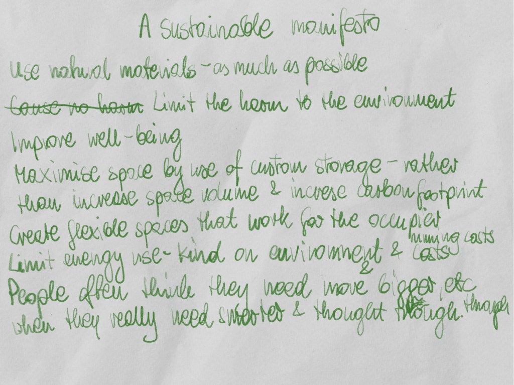
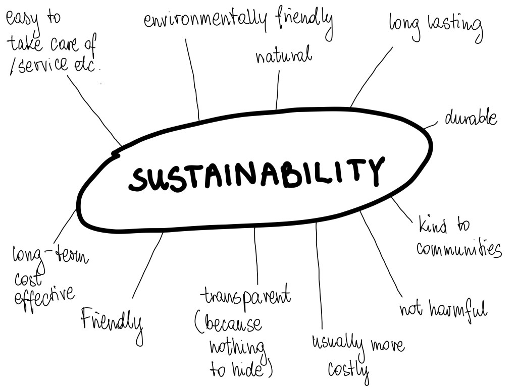
Looking back, I should have researched the idea of sustainability before creating my mind map, to enrich it.

It will be beneficial to me if I include such ‘looking back’ in my future reflections – think of what I could have done better or just differently and how this could have benefitted my progress or even research results.

Assignment Three: Your Design Manifesto for a Living Space

Drawing on the methods and processes learnt throughout Parts 1, 2 and 3, make

or write your own Spatial Design Manifesto to be used throughout the rest of this

unit.

Develop your manifesto to celebrate and visually present your position on an

issue related to spatial or interior design. Present it to reflect your position. For

example, you may want to explore the enjoyment of playful spatial design, the

importance of functionality through the material choices you make or

demonstrate your position by presenting examples of design you think are

unsuitable, ugly or dull.

Use your manifesto to say what key elements of interior design you find good,

interesting, bad or beautiful – and why. You may want to use quotes from other

artists or designers as part of your manifesto.

Reflect on your own experience as an occupant-of-interior-space. What kinds of

spaces do you enjoy and how do other spatial designers help to support this?

Celebrate these examples of good practice or innovative approaches by

proclaiming what makes for a better spatially designed world!

Use the most appropriate means or medium to do this (written, modelled,

2D/3D, digital, technical or hand drawn) to ensure that your manifesto ideas are

communicated in a coherent, clear and concise manner.

Reflection on the assignment / how did I get there:

First, I thought long and hard about what is important to me and why. My main interest is in the interiors that have custom designed features, to suit the user needs. Sustainability is equally important to me. I believe that often we don’t need more space – we just need to use what we have wisely. I jotted some notes and then thought about how I can present my ideas. I purposely made my manifesto very concise. I want to get my message across, but I wanted to keep it short and sweet. Our lives are fast paced, and I wanted my manifesto fit in it. To underline the sustainability issue, I created a background of a crumpled piece of paper – one that you might discard otherwise – yet still perfectly usable. I made the text green as that colour is often associated with nature and well-being. I used different fonts for different points to add to the interest. I uploaded the manifesto into the padlet.

Finding the issue for my manifesto was relatively easy, yet it took longer than the hard part of deciding on the look of it.

I wanted my manifesto to look like poster, I think I achieved that goal.

Reflection on the unit as a whole:

I enjoyed most work in this unit. I found all exercises interesting and most importantly informative.

I found it interesting to read about philosophical approach to the idea of a home in research task one, now I am thinking I should actually read the entire books I briefly studied in 1st research task.

Case study: small space of living was just wonderful. I found it really interesting reading about the architect (Peter Barber), the project Holmes Road Studios and the architecture aiding the therapy. Creating the research presentation document also helped me brush up on the InDesign skills once more.

‘Your living space’ and ‘AN Others space’ exercises helped me brush up and improve my site surveying skills. I also chose to draw by hand for this exercise, despite my preferred method being digital – just to practice on paper.

Research into Barbican helped me to practice sifting through vast amounts of material available and selecting the important bits to present. It’s so easy to get lost in the research!

193 Grove Road research – I feel just grateful to learn it. Fascinating story but it was quite hard to find extensive information on what Sydney Gale might have been feeling. Just had to imagine I was in his position. Despite his bruised ego, it’s a shame the artwork was destroyed…

I found researching and analysing manifestos quite hard. Mainly because personally, I find most of them pompous and quite frankly many of them are long and boring… It was helpful to be given specific tasks in regard to the manifesto text –it helped me fleece out the relevant information out of it. I was pleased I chose Roberto Venturis ‘Non-straight forward manifesto’. Such a joy to find that signature with a shape of a house he designed in the past. It was also useful to just analyse his manifesto in bullet points.

It was a bit harder to draw it. Took me a while to come up with a concept but once it popped in my head, I knew what to do and had it ready in a matter of minutes.

Finding the right contemporary manifesto to analyse took a little bit of searching. Luckily, I came across Dezeen 15 Festival where 15 artists / designers wrote special manifestos for the occasion. I chose ‘Swap card for trees’ by Es Devlin’s the easiest to read and understand. Manifestos should be able to reach the reader rather than just exist for the benefit of its creator. It was also just nice to dream about what the future could look like. This text really spoke to me, I keep thinking about it – hope it comes true soon!

Jimmy Caunty and his ‘Riot in a jam jar’ was quite a hard story to research. There is a lot of information about him but not a lot about the exhibition. I even watched some music videos from his music career, and oh boy – some of them are something else. (The KLF – What Time Is Love? (Live at Trancentral) (Official Video) – YouTube )

Mind maps were invaluable in helping me to create my own manifesto.

Great part, enjoyed the work in part three very much!

Exercise 7: Making a manifesto

Look again at the manifesto chosen for further research and analysis in exercise 4. Taking your list of bullet points as a starting place – and using any additional research you may have done – remake the manifesto as a 2D-graphic or 3D-model. Challenge yourself to re-present the words and intent of the manifesto without using any written words.

Remember you are trying to convey and communicate the main ideas outlined in the original written manifesto.

Research task 2: James Cauty, Riot In A Jam Jar, 2011

A manifesto – or a big idea – can also be represented as objects rather than as words. As Marshall McLuhan said, the medium is the message. The medium that you use to convey your idea can be part of what you have to say. The artist James Cauty made a series of works titled Riot In A Jam Jar . Find out as much as you can about these works and write 250 words in your learning log explaining the big-ideas that are represented through these small physical objects.

Jimmy Cauty, an anarchist musician come artist has created an exhibition titled ‘Riot in a Jam Jar’ which was on display in L-13 Gallery in Clerkenwell in 2011.

Each jam jar on display contained a historic or imagined riot scene. They have been created using traditional model making methods and architectural figures that were amended and repainted to fit the scheme. They were pocket sized snapshots of sometimes funny but mainly shocking, bloody violence.  

The artist was trying to draw attention to the way media portrays these situations. He protested trivialising the issues, presenting them like bullets of information, sensational news and basically being clickbait. Instead, he was trying to emphasise that nobody wants to riot, yet the socio-political situation forces people to rebel against authority, in attempt to change things.

 Jimmy Caunty likes to shock, to draw attention by unusual actions or techniques, such as giving a £40k worst artist award to Rachel Whiteread for the ‘House’ or dropping a dead sheep at the Brit awards after party.

Fig. 1 Off Wiv Their Eds: Prince Charles is pulled from his car by student protestors who then attempt to behead him while his wife, Camilla, looks on.

List of Illustrations:

Fig.1 L_13.org (n.d.) Off Wiv Their Eds: Prince Charles is pulled from his car by student protestors who then attempt to behead him while his wife, Camilla, looks on. [Photograph of artwork]  https://fadmagazine.com/wp-content/uploads/Off-Wiv-Their-Head_James-Cauty_A-Riot-in-a-Jam-Jar.jpg (Accessed 05/11/2022)

References:

ArrestedMotion (n.d.) Showing: James cauty – “A riot in a jam jar” @ L-13 [Online]. Available at https://arrestedmotion.com/2011/06/showing-james-cauty-a-riot-in-a-jam-jar/ (Accessed 5 November 2022).

djphilmanns (2011) James cauty – Riot in A Jam Jar – London news coverage [Online]. Available at https://www.youtube.com/watch?v=oJkGSj5Xbmo (Accessed 5 November 2022).

Evening Standard (2012) Jimmy Cauty is the Jam Jar rebel [Online]. Available at https://www.standard.co.uk/culture/jimmy-cauty-is-the-jam-jar-rebel-6404473.html (Accessed 5 November 2022).

Farley, S., Coles, B., Hewett, I., Knapton, S. and Styllis, G. (2011) “A Riot In A Jam Jar: controversial artworks by Jimmy Cauty, formerly of The KLF,” Sunday telegraph, The Telegraph, 1st June [Online]. Available at https://www.telegraph.co.uk/culture/culturepicturegalleries/8548321/A-Riot-In-A-Jam-Jar-controversial-artworks-by-Jimmy-Cauty-formerly-of-The-KLF.html (Accessed 5 November 2022).

L-13.org (n.d.) A riot in A jam jar – L-13 light industrial workshop [Online]. Available at https://l-13.org/projects/jimmy-cauty/riot-in-a-jam-jar/ (Accessed 5 November 2022).

Westall, M. (2011) Jimmy cauty A RIOT IN A JAM JAR at L-13 private view Tuesday 31st MAY 2011 [Online]. Available at https://fadmagazine.com/2011/05/31/james-cauty-a-riot-in-a-jam-jar-at-l-13-private-view-tuesday-31st-may-2011/ (Accessed 5 November 2022).

Exercise 6: Starting your own manifesto

  • Sustainability is about being environmentally friendly by offering often natural, long-lasting products
  • Sustainable product is not only kind to environment, but also often kind to communities who are making the product.
  • The sustainable process is transparent as there is nothing to hide and is not harmful (to environment or people)
  • As the production process is not as developed as mainstream the initial purchase cost is usually higher.
  • The long-term cost of using the product is often lower due to its effectiveness, durability and quality. 

Reflection:

The process of creating this mind map and bullet points felt incredibly easy and quick. I hope I did it right! I knew straight away that the main issue many designers currently face is about sustainability. It must be hard to juggle to project cost against the prices of different solutions – and the sustainable ones being often higher. Yet it is so important that the designers influence the clients, convince them that it is worth if – for the long-term use, their conscience, health and planet. Just realised I should have written ‘healthy’ on my mind map too…

Exercise 5: Researching contemporary manifestos

Using contemporary design journals and/or online resource, research and find a

contemporary manifesto, or statements or sentences from a recent manifesto

document – i.e. one published within the last 24 months. The quotes that you find

should have some relevance to issues concerning interior or spatial design today,

and also, be ideas that you are happy to adopt or apply in your own design work.

Record your findings in your learning log, and reflect on the issues raised in the

manifesto that you have found. Make reference to how they relate to your own

practice of interior and spatial design.

Fig. 1 A rendering of a car-free Paris produced by Es Devlin Studio

I found a brilliant manifesto by Es Devlin, written for Dezeen 15 Digital Festival in 2021. I liked it because it was easy to read, unlike other manifestos I’ve read, that were written in a pompous tone and used complicated language. Es Devlin’s manifesto is titled ‘Swap cars for trees’ and the whole text can be found here: https://www.dezeen.com/2021/11/01/november-2036-every-city-swapped-cars-for-trees-says-es-devlin/amp/

It’s a dream like story, imagining what the world could be like in just 15 years (at the time of writing) – in 2036. 

She mentions every product made and sold would have entire life cycle, including servicing and recycling / disposal at the end incorporated in the transaction. Wouldn’t that be just amazing? If the businesses instead of caring for making quick profit,  cared about how their product will affect nature in the end? Not only at end of life, but during production too. The lifespan of products would be extended by having prepared servicing etc.

This led to the next point raised in the manifesto: Designers and architects would have to sign an oath to do no harm to the planet. That’s why every product sold would have servicing, repairs, parts available throughout its entire life span. On the other hand, I’m a little worried about the economy, wouldn’t that cause a massive recession? Isn’t the GDP supposed to be growing? Less consumption will lower the growth. 

But if we continue on the current path then we will destroy the planet and humankind. 

I am also curious how construction of new buildings will develop, currently construction is the biggest landfill waste contributor. 

The title of manifesto is ‘Swap cars for trees’ and it proposes pedestrianising all city centres on the entire planet and planting trees instead of having parking spaces. This would improve general health and quality of life. It would also reduce pedestrian and cyclists’ mortal accidents. All this would be facilitated by improved public transport, cycling lanes etc.

Essential workers would live in affordable, cleverly designed micro homes.

It is a bold proposal, one that sounds utopian. 

It sounds amazing, but my initial feeling was of not believing it could happen, with economy shrinking who would spend that sort of money. The world would need a tru revolution to make it happen, however…

The manifesto mentioned Oslo pedestrianised its city centre in 2019. I checked it out and according to the article I read about it, the change has made the city centre a destination (as opposed to going out of town). The city centre also became attractive residential area (due reduced noise and pollution) and the footfall in the shops within the area has increased by 10%. (https://www.wired.co.uk/article/oslo-pedestrianisation

The manifesto compares the change to the smoking bans implemented since 2006. How it denormalised smoking. Es Devlin believes it will be similar with this change, and car free city centres can soon become a new norm.

A few years ago, my tv broke. It was only 4 years old. Yet it could not be repaired due to lack of parts available. Current mentality of every business is: why repair if we could sell more and increase profits? This has to change. I remember feeling bitter about having to dispose this large appliance, complete waste of resources with such a negative impact on the environment. 

I liked this manifesto for it dreamy tone. A gentle nod towards sustainability benefitting everyone. Lets hope and see…

List of illustrations:

Fig. 1 Es Devlin Studio (n.d.) A rendering of a car-free Paris. [Visual] At: https://static.dezeen.com/uploads/2021/11/es-devlin-dezeen-15-manifesto_dezeen_2364_col_12.jpg (Accessed 02/11/2022)

References:

Devlin, E. (2021) “It’s 1 November 2036 and every city has swapped cars for trees” says Es Devlin [Online]. Available at https://www.dezeen.com/2021/11/01/november-2036-every-city-swapped-cars-for-trees-says-es-devlin/ (Accessed 1 November 2022).

Ralston, W. (2020) Oslo got pedestrian and cyclist deaths down to zero. Here’s how [Online]. Available at https://www.wired.co.uk/article/oslo-pedestrianisation (Accessed 2 November 2022).

Exercise 4: Researching and analysing a manifesto

Choose one manifesto from the core text, 100 Artists’ Manifestos: From the Futurists to the Stuckists, that interests you, and that you would like to research and explore further. Find out all you can about the person or group that wrote that manifesto, the era that they were living in and what other factors (global, social, local, cultural) may have influenced their thinking. Present your findings as a series of bullet points that give the reader a core understanding of the main points of the manifesto you have chosen, and also an understanding of when/why/how it was written. As your work is just simply bullet points you need to make every word count – try to not be ‘fluffy’ or ‘flowery’ with your language and use really precise/concise words that say exactly what you mean.

Robert Venturi (1925-2018)

  • an American architect
  • often referred to as a father of postmodernism in architecture (according to O. Wainwright at: Robert Venturi: the bad-taste architect who took a sledgehammer to modernism | Architecture | The Guardian).
  • Living in post WW2 world with modernist, brutalist architecture prevailing has influenced his outlook on need for new architecture trends.
  • He seems to have been an original, fun-loving guy, if judging by his signature which included a quick sketch of the elevation of the house that he designed for his mother.

Fig. 1 He even signed his name in a fun way 💔 RIP Bob Venturi.

Fig. 2 Vanna Venturi House in Chestnut Hill, Philadelphia, Pennsylvania.

Non-Straightforward Architecture: A Gentle Manifesto (1966) by Robert Venturi

  • ‘More is not less’
  • Architecture of complexity and contradiction
  • Yes, to complexity and contradiction
  • No, to incoherence and arbitrariness (autocracy or being based on personal whim)
  • No, picturesqueness and expressionism
  • Yes, to richness and ambiguity bringing similar experience as felt with art
  • Increasing dimension and scale of projects makes design work more difficult
  • Yes, to vitality and validity
  • Orthodox Modern Architecture is intimidating
  • Hybrid over pure
  • Compromising over clean
  • Distorted over straightforward
  • Yes, to both – and   
  • No, to either – or  
  • Ambiguous over articulated
  • Perverse and impersonal
  • Boring and interesting  
  • Conventional over designed
  • Accommodating over excluding
  • Redundant over simple
  • Equivocal (with more than one meaning) over direct and clear
  • Messy vitality over obvious unity
  • Richness over clarity of meaning
  • Pro ‘non sequitu’ (A conclusion that does not logically follow from previous argument)
  • For both implicit and explicit function
  • Black and white and grey over just black and white
  • Architecture should engage on many levels, should be readable and workable in many ways simultaneously
  • The truth of architecture must be in its totality
  • Architecture must embody the difficult unity of inclusion
  • Architecture must reject the easy unity of exclusion.

List of illustrations:

Fig. 1 Wainwright, O (2018) He even signed his name in a fun way 💔 RIP Bob Venturi. [Photograph of a signature of R. Venturi’s] At: https://www.instagram.com/p/Bn8Oakhgd5d/?taken-by=ollywainwright (Accessed 30/10/2022)

Fig. 2 Unknown (n.d.) Fig. 2 Vanna Venturi House in Chestnut Hill, Philadelphia, Pennsylvania. [Photograph] At: https://www.architectureartdesigns.com/wp-content/uploads/2019/03/Vanna_Venturi_House_in_Chestnut_Hill__Philadelphia__Pennsylvania_LCCN2011631388.0-630×420.jpg (Accessed 30/10/2022)

References:

Bernstein, F. (2018) Robert Venturi, Architect Who Rejected Modernism, Dies at 93. In: The New York Times 19/09/2018. At: https://www.nytimes.com/2018/09/19/obituaries/robert-venturi-dead.html (Accessed 30/10/2022)

Danchev, A. (2011). 100 Artists’ Manifestos. London: Penguin

Wainwright, O. (2018) Robert Venturi: the bad-taste architect who took a sledgehammer to modernism. In: The Guardian 20/09/2018. At: https://www.theguardian.com/artanddesign/2018/sep/20/robert-venturi-the-bad-taste-architect-who-took-a-sledgehammer-to-modernism (Accessed 30/10/2022)

Exercise 3b: Someone else’s shoes

Using your research from the first part of this exercise, try to look at the information in an emotional way. Your emotional response to an interior, a building or a piece of sculpture will be different to someone else’s response – and similarly, when thinking about a space for living – your emotional ‘wants’ will affect the way you work. The people that you work with will often have a different point of view to yours – and it is up to you to learn about and understand others’ points of view which may be different to your own. It is your job as an interior designer to be able to put yourself in someone else’s shoes. Put yourself in Sydney Gale’s shoes and try to imagine what he may have felt when his home was used to make a piece of sculpture in a park. Try to empathise and understand how you might feel if the same thing happened to you, to your home, or to someone close to you. See if you can find any reports from the time giving Sydney Gale’s point of view. Make a few short paragraphs giving factual information first – and then more emotional information about how you would feel in Sydney Gale’s shoes.

Sydney Gale resisted the eviction from his home, which was soon to be turned artwork. After ‘the house’ has been created he commented “They’ve taken the wee wee out of me.” (published in east London Advertiser, issue unknown, source https://www.eastlondonadvertiser.co.uk/news/rachel-s-inside-out-house-turns-art-world-upside-down-7654580 ). His comment was supposedly referring to his views on the budget granted to the artwork and his belief that the money would have been better spent on providing more social housing.

I believe he was upset by the whole situation. Being forced out of his home (he really wanted to stay and fought for years), extravagant ‘waste of money’ and his private space, his home being exposed for everyone to see. I believe all these issues topped one another and contributed to his negative feelings towards the outcome. What for many was a brilliant piece of art, for Sydney Gale must have been a very in your face remainder of his defeat…

I find quite easy to dwell on other people’s situations and how they may feel about them. Obviously, I cannot be sure if I am right about Sydney, as I found it quite hard to find any interviews or extended information about him. Usually, I would be more careful about voicing these opinions, but I often have them. In my daily life I often consider other people’s behaviours and what situations and what feelings may have caused them (usually to try and resolve a problem).

References:

Haines, G. (2021) Rachel’s inside-out’ house turns art world upside down. At: Rachel’s inside-out’ house turns art world upside down | East London Advertiser (Accessed 20/06/2022)

Exercise 3a: 193 Grove Road, Bow, London

The aim of this exercise is to begin to understand the emotional attachment a person may have to particular spaces, and why. To explore the difference between a house and a home; to look at the theoretical concept of ‘home’.

Method: Find out as much as you can about the artist Rachel Whiteread and the 1993 work House. Use the information given above to begin your search and find out about how and why the piece came to be sited in its particular location, 193 Grove Road, Bow, London.

The previous occupant of the building used to create the work House was a man called Sydney Gale; there was much local opposition to Rachel Whiteread’s project at the time and it was considered to be controversial for a number of reasons. The project caused a flurry of comment in both local and national press. Reflect on why you think this may have been so controversial at the time; was it controversial locally, nationally? Was it controversial in all social or cultural circles – or was it enjoyed or appreciated more positively by some?

Rachel Whiteread is a British artist born in 1963 in London. She is currently living and working in London.

She became famous for her sculpture ‘Ghost’ that was on display in Tate Modern in 1990 and her sculpture ‘House’ which was on display on Grove Road in Bow in late 1993 / early 1994.

Fig. 1 Ghost, plaster with steel frame, 269 × 355.5 × 317.5 cm.

Both these works were casts of interior spaces. Ghost was a plaster cast of a living room; the artist said that it was similar to a living room from a house she lived in as child, and it was bringing memories of her childhood.

House was a concrete cast of an entire Victorian terraced house that was destined to be demolished by the council. Ms Whiteread selected it as it was not surrounded or attached to other houses, therefore could be viewed from all angles.

Fig. 2 Rachel Whiteread’s house view of Grove Road.

The house was previously occupied by Mr Sydney Gale, who battled the council against evicting him from his home. He finally lost and was relocated to a property nearby. The council could then go on and demolish the last standing house of the former terrace and proceed with its plans of finishing the green space that was supposed to benefit the residents of the nearby high-rise blocks of flats.

The row of houses has been partially damaged during WW2, in fact the first bomb that landed in London during the conflict fell in the local area.

The area was at the time predominantly working class; the project, especially £50’000 funding it received, angered many.

The project seemed to be controversial in all circles, social and cultural. There were fans and haters everywhere.

Perhaps because it was a first of a kind sculpture like this in Britain, created out of someone’s home. Someone’s that did not want to leave. At the same time, it was a brilliant novelty; filling a building with cement and subsequently creating a cast that was revealed after the surrounding building was taken away, brick by brick. It accentuated the void of the home, the space previously occupied by life of the occupants – being on show.

It showed the house inside out – the interior standing proudly, not covered by a façade and walls, roofless. The private space exposed, the boundaries gone.

The project has been so controversial that Rachel Whiteread received prizes from opposite ends of the spectrum: a prestigious Turner prize and the ‘worst artist of the year’ by K Foundation.

The council decided to tear the house earlier than initially agreed, yet even that vote was a very close one – only one vote difference.

The project was discussed in parliament and more than 100’000 people viewed it in the period it was standing.

Despite the movement to save the cast from demolition Ms Whiteread did not wish to relocate the house, as she said it was specific to its location. The house was demolished after mere 10 weeks of its completion.

The artist created other works that consisted of casted objects and spaces.

In 2000 in Vienna her Holocaust Memorial has been unveiled, a cement cast of a library room.

Fig. 3 Holocaust memorial.

She also made ‘Embankment’, which was an installation of 14000 polyethylene boxes in 2005, it was displayed in Tate Modern.

Fig. 4 London – Rachel Whiteread – Embankment 03

As an artist she seems to be attracted to the invisible, encased by the boundaries. She wants to bring the inside out, for all to see. Her work is inspired by intimacy of the closed spaces and human form.

List of illustrations:

Fig. 1 Whiteread, R. (1990) Ghost, plaster with steel frame, 269 × 355.5 × 317.5 cm. [Photograph] At: https://publicdelivery.org/wp-content/uploads/2019/06/Rachel-Whiteread-Ghost-1990-plaster-with-steel-frame-269-%C3%97-355.5-%C3%97-317.5-cm-106-%C3%97-140-%C3%97-125-in.jpg (Accessed 16/06/2022)

Fig. 2 Hoffman, D. (1993) Rachel Whiteread’s house view of Grove Road. [Photograph] At: https://romanroadlondon.com/wp-content/uploads/2019/09/Rachel-Whiteread-house-credit-David-Hoffman.jpg (Accessed 16/06/2022)

Fig. 3 Brownlow, M. (2022) Holocaust Memorial. [Photograph] At: https://www.visitingvienna.com/wp-content/uploads/2022/02/holocaustmemorial.jpg (Accessed 16/06/2022)

Fig. 4 Watz, M (2006) London – Rachel Whiteread – Embankment 03. [Photograph] At: https://live.staticflickr.com/42/110028472_b5e3e5da38_b.jpg (Accessed 16/06/2022)

References:

Artangel (2022) House. At: https://www.artangel.org.uk/project/house/ (Accessed 14/06/2022)

Frieze (2020) Rachel Doesn’t Live Here Anymore. At: https://www.frieze.com/article/rachel-doesnt-live-here-anymore (Accessed 15/06/2022)

Searle, A (2000) Austere, silent and nameless – Whiteread’s concrete tribute to victims of Nazism. At: https://www.theguardian.com/culture/2000/oct/26/artsfeatures6 (Accessed 15/06/2022)

Public Delivery (2022) Rachel Whiteread’s 14,000 white cubes at Tate – Embankment. At: https://publicdelivery.org/rachel-whiteread-embankment/ (Accessed 15/06/2022)

Public Delivery (2022) Why did Rachel Whiteread’s House earn her the title Worst Artist? At: https://publicdelivery.org/rachel-whiteread-house/ (Accessed 15/06/2022)

Thacker, S. (2015) Rachel Whiteread’s House: why was this Bow landmark demolished? At: https://romanroadlondon.com/rachel-whitereads-house-bows-legacy/ (Accessed 15/06/2022)

Warde-Aldam, D. (2013) Ghost House. At: https://www.apollo-magazine.com/house/ (Accessed 15/06/2022)

Case study 2: A bigger space for living

Fig. 1 Barbican Aerial View

Brutalist in style, composing mainly of concrete and glass; Barbican estate has been built on a site that has suffered catastrophic bombing during WW2. Previously busy market area has had its community decimated with just a handful remaining there after the war. The site has been left derelict. A decision has been made to bring the community and life back into the area by changing the function of the space from commercial to residential with all amenities. There was a notion of the area becoming a factory city, rather than a place for living. Between 1971 and 1982 twenty-one residential blocks containing over two thousand flats were built along with schools, arts centre, shops and so on. The architects were Chamberlin, Powell and Bonn. They carefully thought of designing a place that is crowded, but at the same time gives you air. They introduced a large pond that reflects the sky and gives an air of space. The whole area is raised above traffic, so it is relatively tranquil for a central London location, the lake and green spaces aid that feeling. The designers took care to ensure all flats get at least some sunshine for at least portion of the day.

Fig. 2 The Barbican.

The care was taken during the building, ensuring no shortcuts or cheap substitutes were used, as opposed to similar developments built prior and afterwards in the UK.

The estate was intended for rental, but it was aimed at more ‘upmarket’ tenants – the rent was to be more expensive. Interestingly that Barbican has not suffered a plague of crime like other housing estates did.

The flats were designed so the utility areas such as kitchens and bathrooms were deeper in the building and living areas were closer to the windows therefore brighter.

There were spaces designed for families, couples and single people.

I looked at some flats available for sale in the estate and all that I looked at had a balcony and large windows letting plenty of light in.

Some of the flats, especially the ones located high in the towers have magnificent, far-reaching views of London.

I cannot imagine what a mammoth task it must have been, designing such a grand estate in every detail, without a CAD program, especially I can imagine much of the design of the flats was copy and paste, they layouts seem are quite repetitive.

The estate has been grade II listed in 2001, in 2003 it has been voted the ugliest building in Britain (in a poll organised to launch London Design Festival). It seems as British as marmite – you either love it or hate it.

List of illustrations:

Fig. 1 Rudquist, C (n.d.) Barbican Aerial View. [Photograph] At: https://barbicanlife.com/wp-content/uploads/2016/06/Flatwatch-intro-image.jpg (Accessed 07/06/2022)

Fig. 2 Lulko, M. (2018) The Barbican. [Photograph] At:  https://live.staticflickr.com/1766/42795703934_9a23a9ca55_k.jpg (Accessed 07/06/2022)

References:

City Of London Corporation (2020) Barbican Estate history. At: https://www.cityoflondon.gov.uk/services/barbican-estate/barbican-estate-history (Accessed 07/06/2022)

Gray, H (2019) The Barbican at 50 – BBC London News. At: https://www.youtube.com/watch?v=B9ybWuOQ7K4 (Accessed 07/06/2022)

Hazzard, J. (2022) The Barbican in Brief. At: https://www.youtube.com/watch?v=Dp-v9W_Iygg (Accessed 07/06/2022)

London Metropolitan Archives (2012) Barbican, 1969: The development of the Barbican Estate following World War II. At: https://www.youtube.com/watch?v=vLPlJsoVq8k&t=2s (Accessed 07/06/2022)

Montcalm (2018) History of The Barbican Centre. At: https://www.montcalmroyallondoncity.co.uk/blog/history-barbican-centre/#:~:text=The%20name,shops%2C%20traders%20and%20market%20stalls. (Accessed 07/06/2022)

Exercise 1b: A N Other’s living space

I chose my flatmate’s room, as we never spend time together in that room, and I can only have a vague idea how he uses the room.

This time when noting the dimensions on the plan drawing, I concentrated more on the usable space between the walls and furniture, and I though the space between the window and the bed would be suitable for exercise.

He has a double bed, plenty of storage in the room and a desk with a gaming chair to play computer games.

Exercise 1a: Your living space.

I chose my hallway for my space. I drew it in plan and two elevations of the longer walls, I supported myself with some measuring sketches and guidelines.

Dimension sketches
Guidelines I placed below tracing paper.

The main functions of this room are:

  • entering and leaving the flat,
  • traffic circulation between all other tooms in the house,
  • place to put on, remove and store your shoes and coats
  • Greeting and saying farewells to the guests
  • Having conversations during the parties, or at the end of gatherings
  • Utilities in the wardrobes: tumble dryer, hoover, recycling boxes, cat litter
  • Cat feeding area

The room is very well lit despite not having own window, the front door is glazed, and it is facing west, sun shines through in the evening. During the day the light enters from other rooms facing north (kitchen) and south/east (lounge and second bedroom). On top of that there are several spotlights in the ceiling, providing artificial light as needed.  

That hallway made an amazing impression on me when we first viewed the place. I still remember the amazing feeling of airiness and space. The colour of the walls and cupboards is white which aids that feeling. People often comment on how large and wide our hallway is. We often have long chats in there with friends that are about to leave, but somehow it usually gets prolonged. It is a good social space. Four people can stand, put their shoes and have a chat comfortably.

I especially like it when I come home in the early evening in the summer, and the room if fully of sunshine.

At first, I did my technical sketches not including human figure, but then I though I’d add it, for better understanding of the scale.

Plan
Elevation with wardrobes
Elevation with shoe cabinet

Case study 1: A small space for living.

Reflection:

What a wonderful project! Seems like every detail has been carefully considered, along with any potential resident’s needs. The cottages look cute, tiny homes – mini safe havens for vulnerable adults to start the new life in such pleasant surroundings. I can imagine that it will have a great success rate in helping the homeless start over and move on to a better future. Hopefully in future there will be a study into effects of this or a similar project into the outcomes of these people journeys. Usual hostels can be depressing and dangerous places – here the therapy should be so much more efficient. Architecture and design – when user is at its heart – can really help achieve goals.

I created a rough mind map to help me get started on my document.


List Of Illustrations:

Fig. 1 Google (2022) Holmes Road Studios Location. (Screenshot, edited in photoshop) At: holmes road studios – Google Maps (Accessed 30/05/2022)

Fig. 2 Davies, K. (2018) Peter Barber at his Kings Cross Studio. [Photograph] At: https://www.iconeye.com/wp-content/uploads/2018/04/7677-Peter-Barber.jpg (Accessed 29/05/2022)

Fig. 3 Barber, P. (2019) Development Sketch. [Drawing] At:  https://aggie.video.blog/wp-content/uploads/2022/05/a0c61-typical-unit.jpg (Accessed 30/05/2022)

Fig. 4 Barber, P. (2019) Interior. [Photograph] At: https://aggie.video.blog/wp-content/uploads/2022/05/b69fc-vonr1297.jpg (Accessed 30/05/2022)

Fig. 5 Von Sternberg, M. (2018) Holmes Road Studios, a homeless facility in north London. [Photograph] At: https://www.iconeye.com/wp-content/uploads/2018/04/Peter_Barber_Holmes_Road.jpg (Accessed on 30/05/2022)


References:

Barber, P. (2019) Holmes Road Studios. At: http://www.peterbarberarchitects.com/holmes-road-studios (Accessed 30/05/2022)

Bevan, R. (2020) London housing shortage: architect Peter Barber’s calls for more social housing and a ‘Hundred Mile City’. At: London housing shortage: architect Peter Barber’s calls for more social housing and a ‘Hundred Mile City’ | Homes and Property | Evening Standard (Accessed 30/05/2022)

Emms, S. (2021) The story of Holmes Road Studios. At: http://www.klsels.com/index-31.html (Accessed 30/05/2022)

Hohenadel, K. (2016) This Award-Winning London Homeless Shelter Is Based on a 10th-Century Design. At: https://slate.com/human-interest/2016/07/holmes-road-studios-in-london-by-peter-barber-architects-is-an-award-winning-homeless-shelter-design-based-on-poor-houses.html (Accessed 30/05/2022)

RIBA (2022) Holmes Road Studios. At: https://www.architecture.com/awards-and-competitions-landing-page/awards/riba-regional-awards/riba-london-award-winners/2021/holmes-road-studios (Accessed 30/05/2022)

Slessor, C (2021) Peter Barber interview: housing’s architectural evangelist. At: Peter Barber interview: housing’s architectural evangelist (architectsjournal.co.uk) (Accessed 30/05/2022)

The London Borough of Camden (2022) Holmes Road. At:  https://www.camden.gov.uk/holmes-road (Accessed 30/05/2022)

The London Borough of Camden (2021) Holmes Road Hostel wins prestigious RIBA London award. At:  https://www.camden.gov.uk/web/cip/news/-/blogs/holmes-road-hostel-wins-prestigious-riba-london-award (Accessed 30/05/2022)

Volpe, S. (2021) Camden’s Holmes Road homelessness studios win architecture award  At: https://www.hamhigh.co.uk/news/housing/camden-homelessness-architecture-riba-awards-8279146 (Accessed 30/05/2022)

Welsh, A. (2020) Holmes Road Studios, Kentish Town. At: https://www.e-architect.com/london/holmes-road-studios-kentish-town (Accessed 30/05/2022)

Research task 1: Ideas of Home

There seems to be as many ideas on what the home is as many elements (both physical and non-physical) a home contains – the list would be extensive.

According to Otto Friedrich Bollnow (author of ‘Human space’) home provides shelter and protection, gives a sense of safety. The size of the space matters can’t be too big or too small, but the dimensions are not set in stone; it is flexible depending on the occupants need. Another important aspect of homeliness is the temperature. The homeliness or cosiness seems to be about striking the right balance, not too much… not too little…  And the rules are fluid, depending on who the occupants are, what are their needs, tastes, lifestyles, and histories. Comfort is needed for homeliness – be it in the form of lovingly cared for interiors and furnishings or just that ‘feel-good’ sensation when we are just content.  The ability to shut off the outside world and be safe and unbothered in one’s space is the ultimate comfort. The common denominator is that home is a place where we can relax, feel safe and comfortable. And if we can’t life is difficult.

According to Edwin Heathcote (author of ‘The meaning of home’) house and its elements were at heart of language development. A home could be a ‘container of meaning’ and history.

Thinking of different forms, we use the word home in our everyday life; the feeling at home has such a special meaning – it is about ‘feeling’: safe, comfortable, confident, content. That feeling can be felt outside of one’s home.

References:

Bollnow, O. (2011) The human space. London: Hyphen Press. At: Bollnow – Human Space – PDFCOFFEE.COM (Accessed 24/05/2022)

Heathcote, E. (2012) The Meaning of Home. Frances Lincoln. At: The Meaning of Home by Edwin Heathcote (goodreads.com) (Accessed 24/05/2022)

Design a site like this with WordPress.com
Get started