Reflection on my tutor’s feedback (Part 5 and Assignment 5)

I consider my recent feedback to be a very positive one, I received a lot of praise from my tutor with only a few things to reconsider.

My tutor noted that my skills and confidence improved throughout unit 5. She also complimented me on thoroughness, attention of detail and amount of work I put in. 

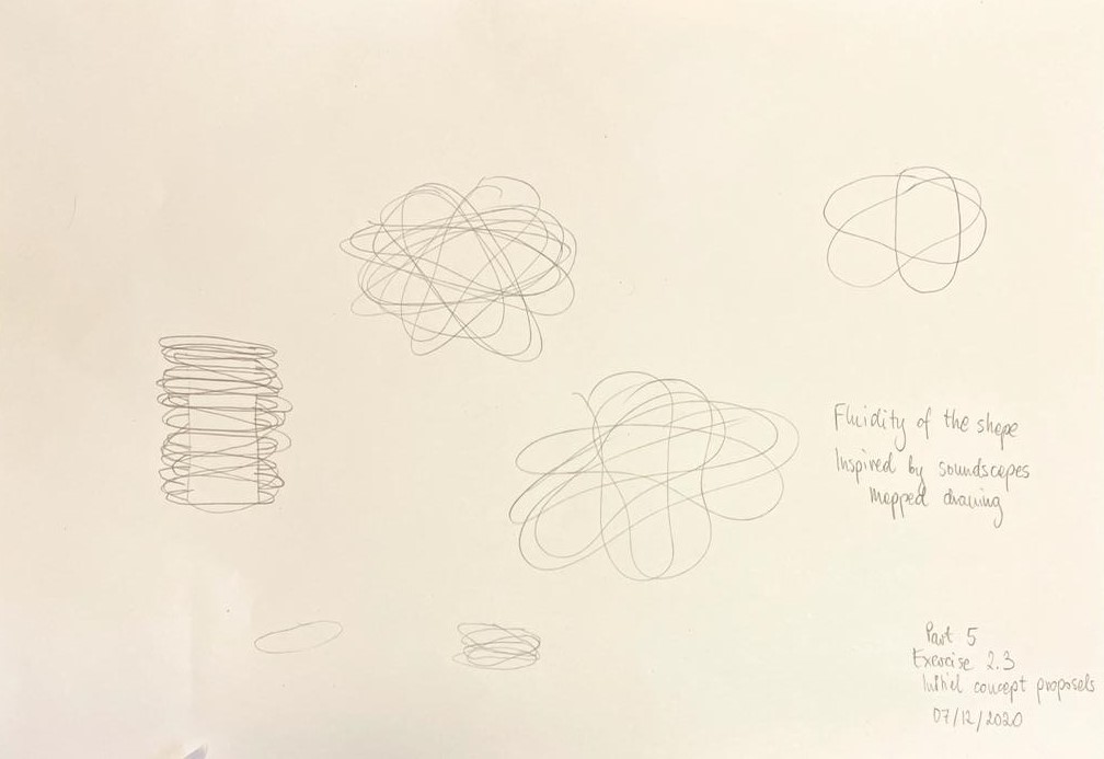
My observation that software knowledge is a tool to enable creativity was correct. 

My tutor noticed that I took on board her previous comment about reworking a design which resulted in great progress. 

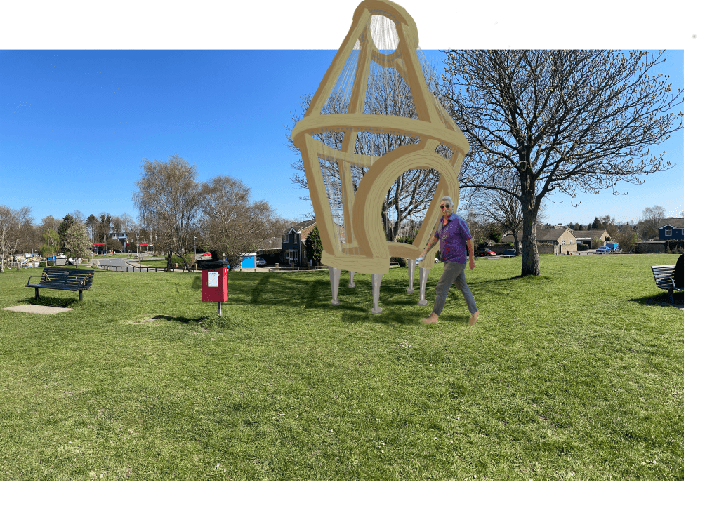
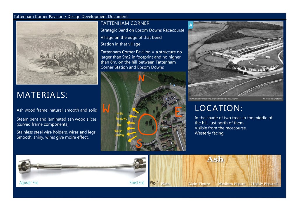
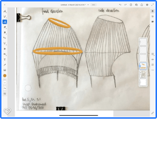
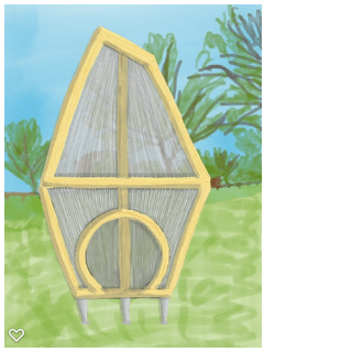
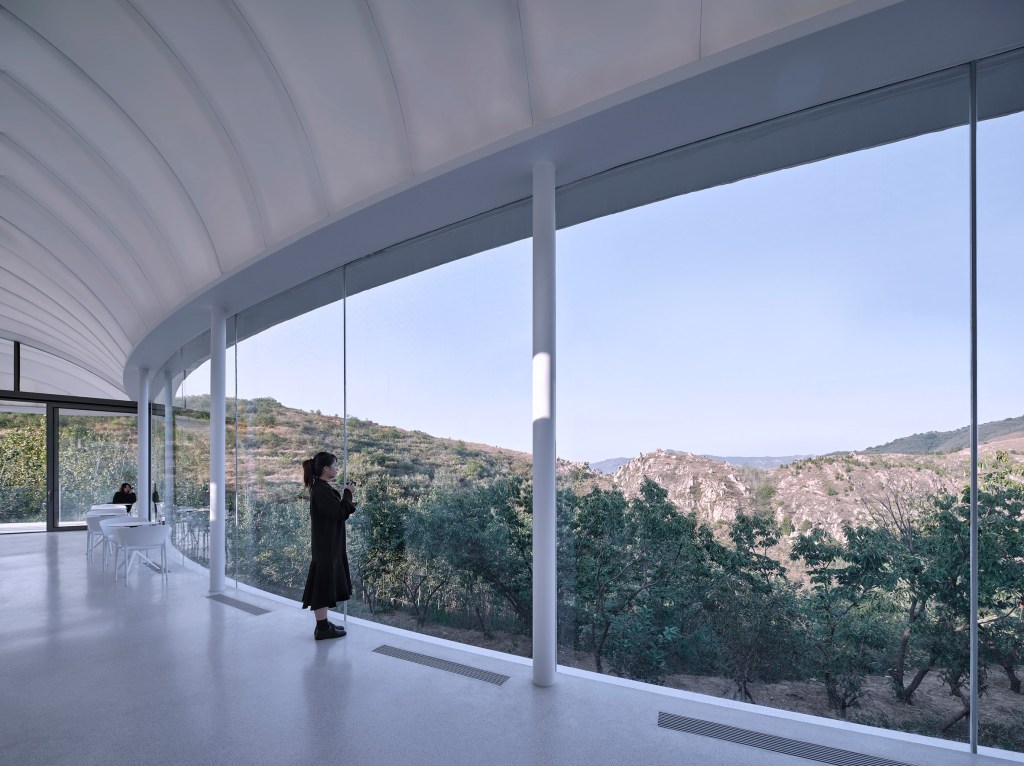
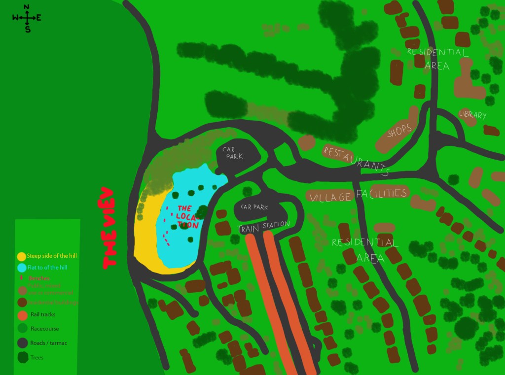
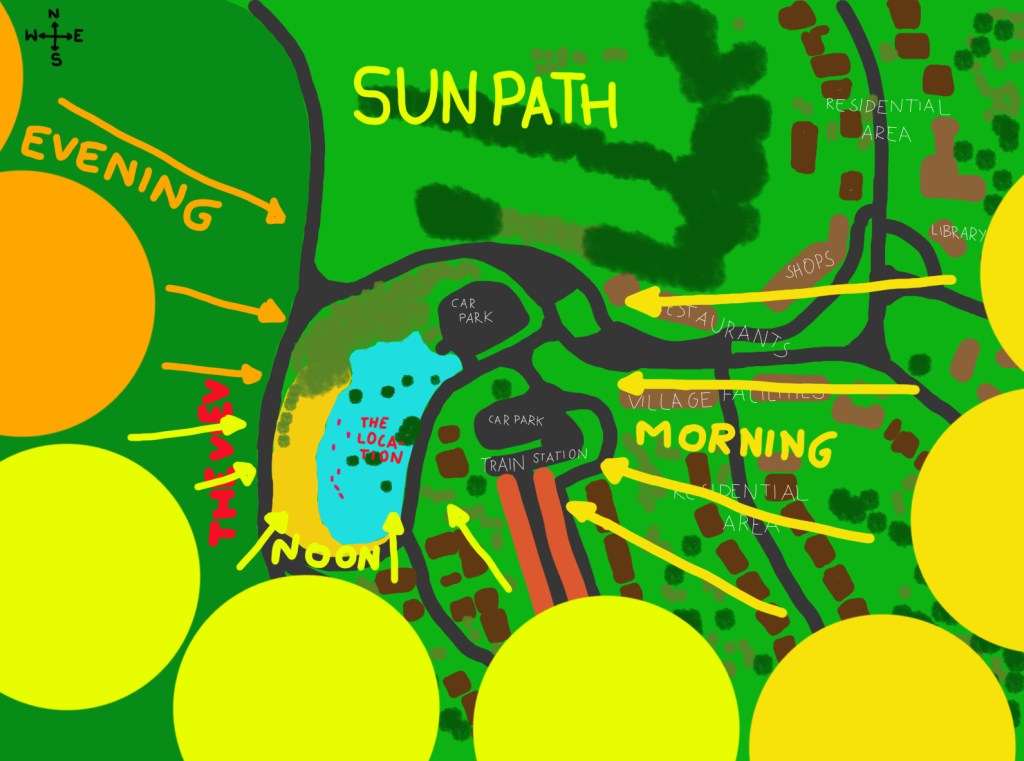
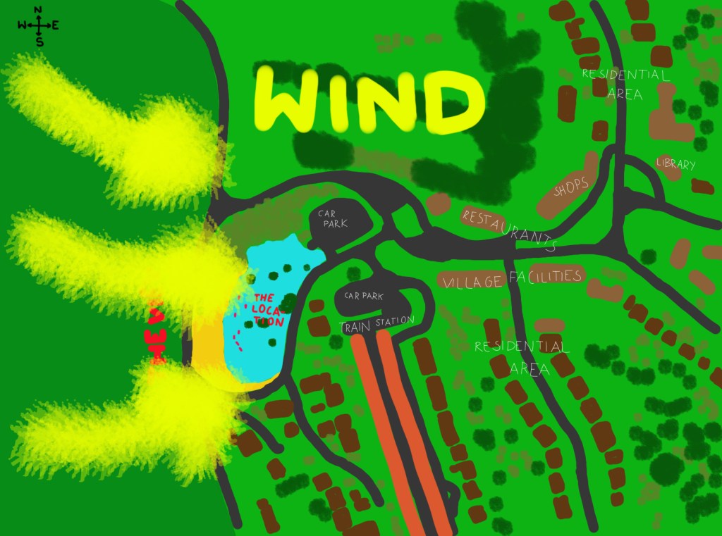
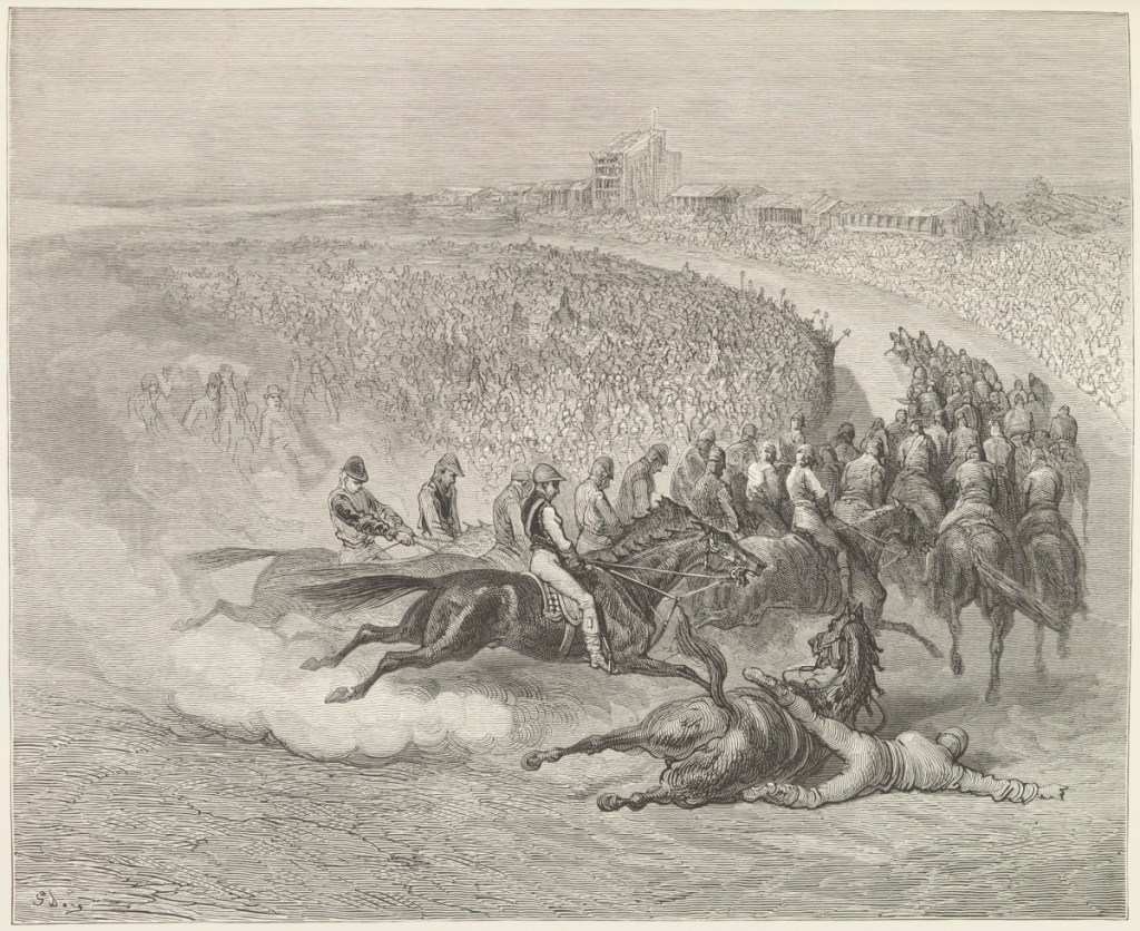
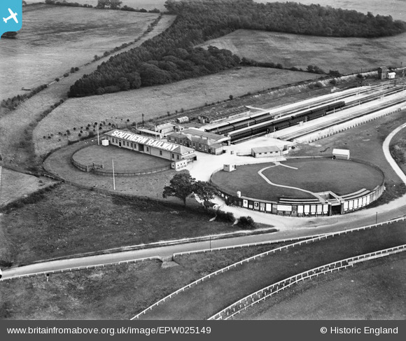
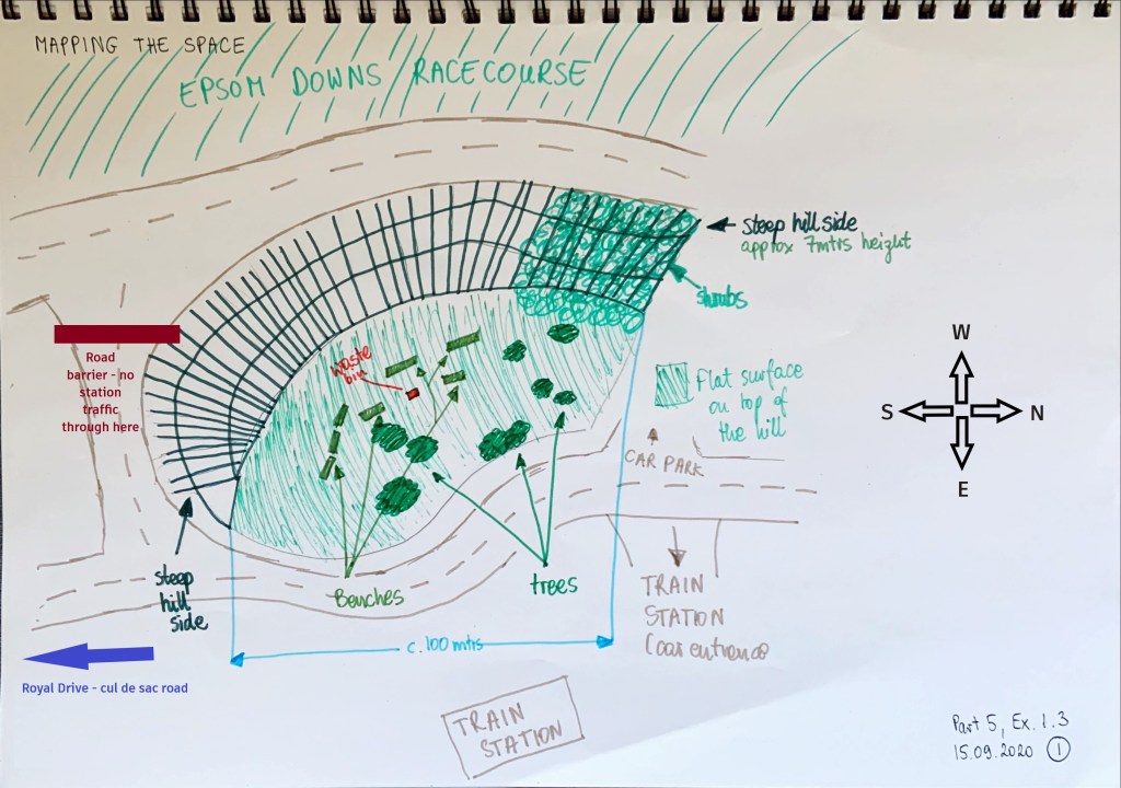
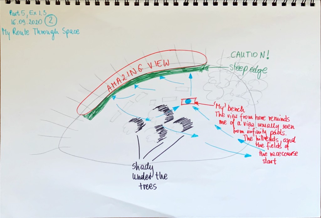
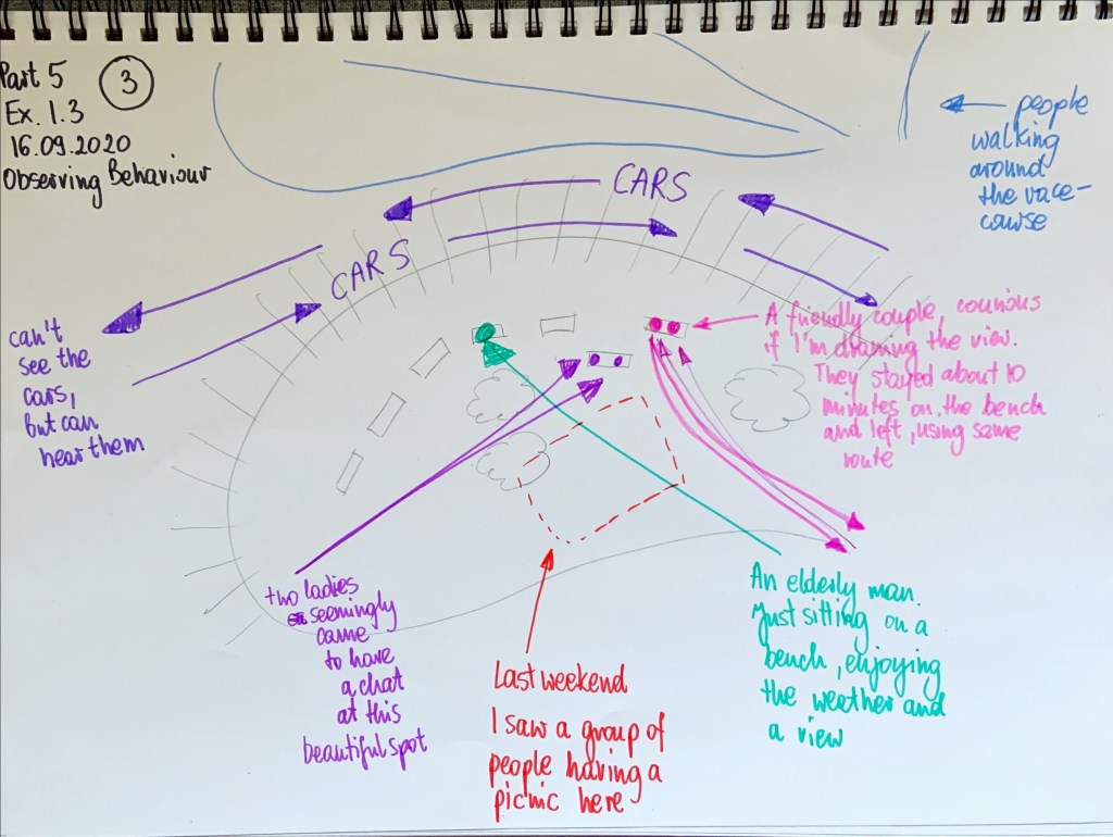
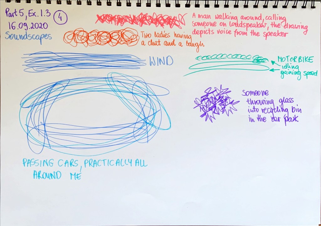
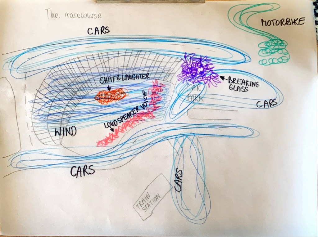
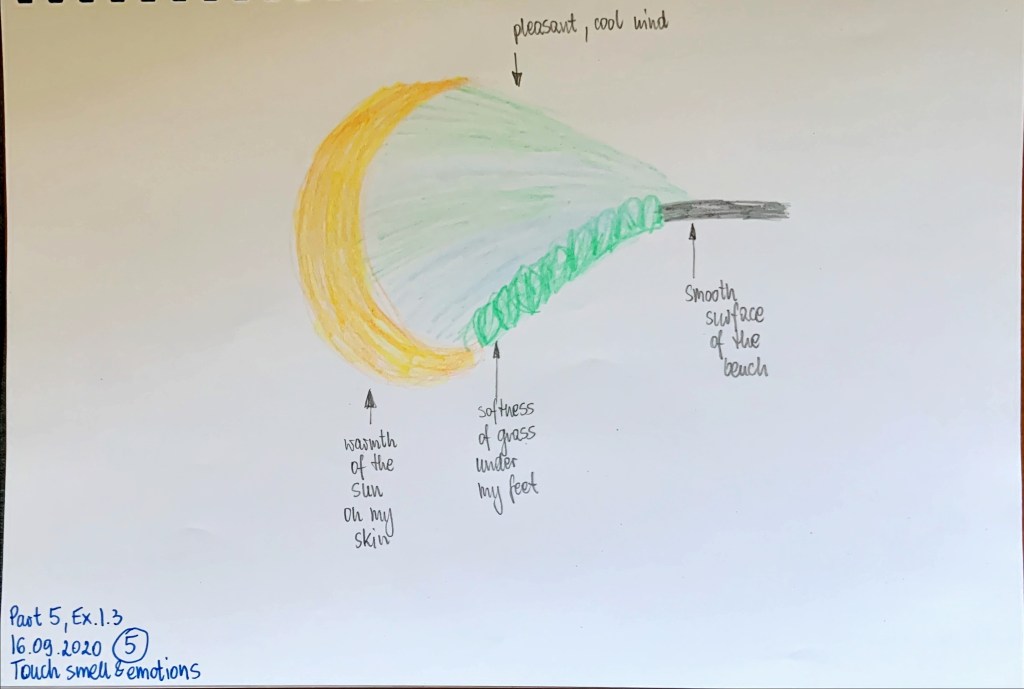
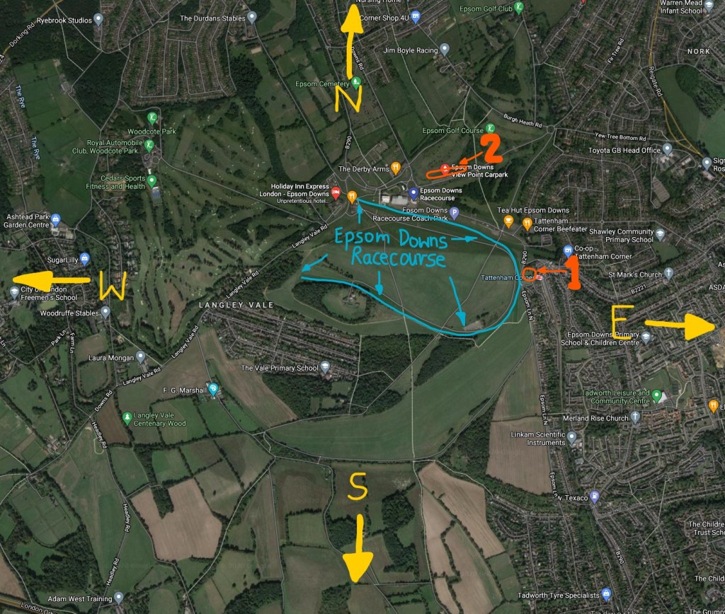
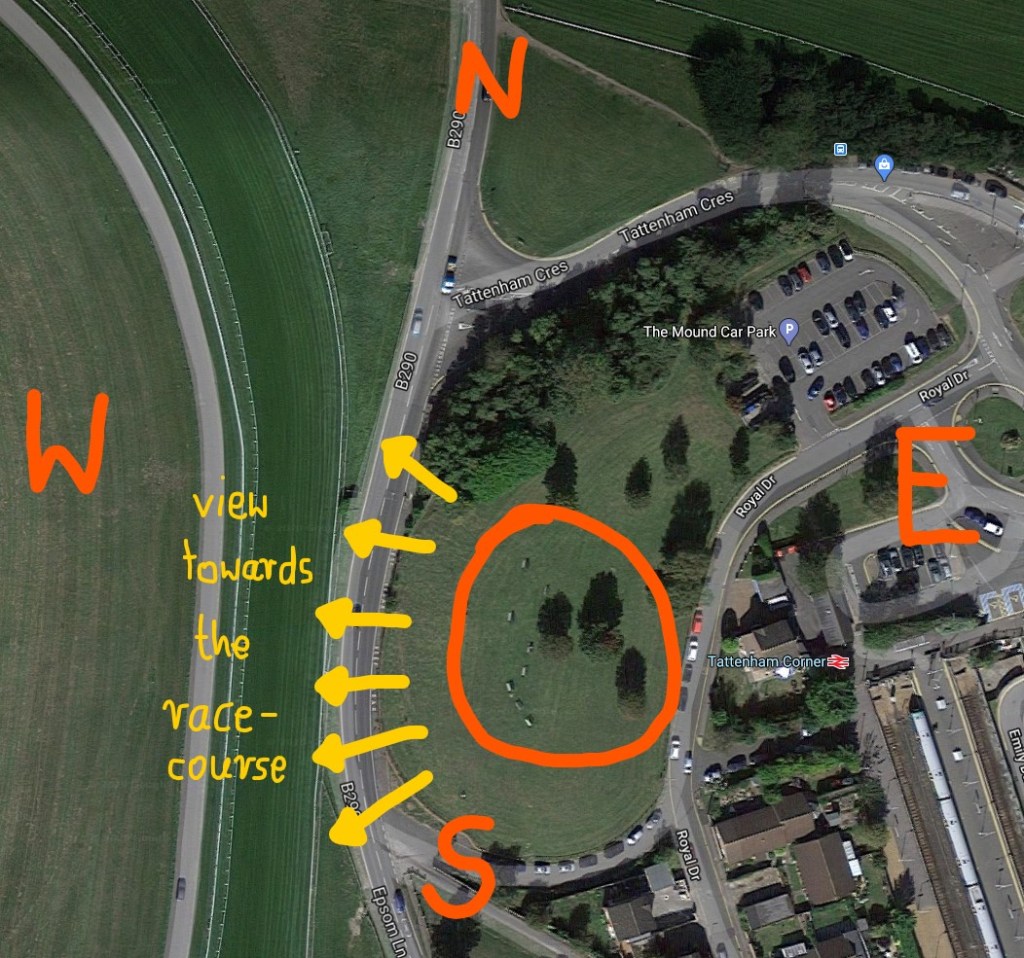
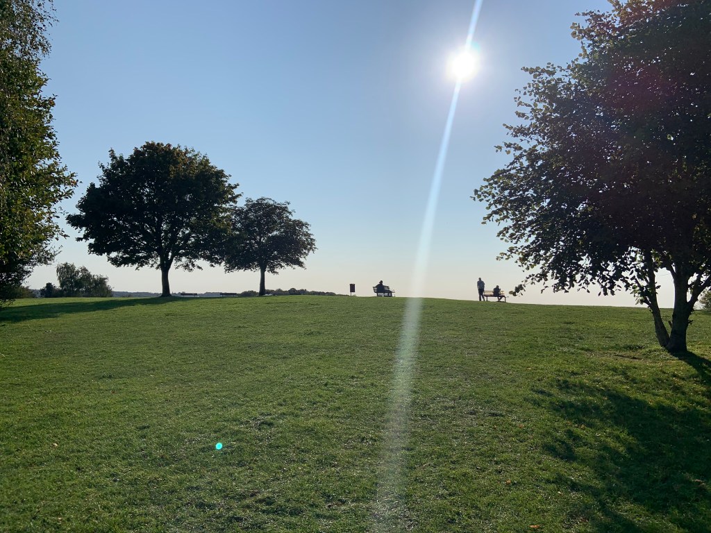
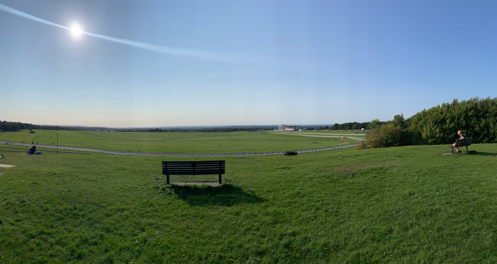
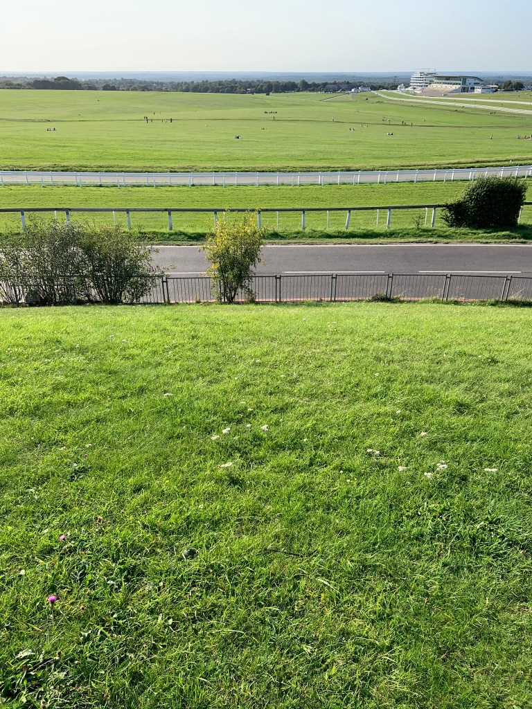
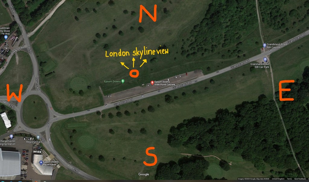
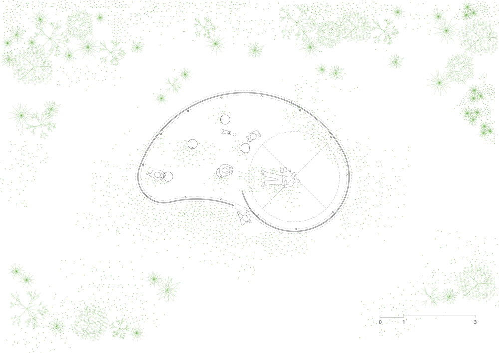
My research was in depth and on topic. I observed relevant points and described them in a way that my tutor approved. Acknowledging the view of my pavilion from the racecourse showed my consideration of the design from all aspects. 

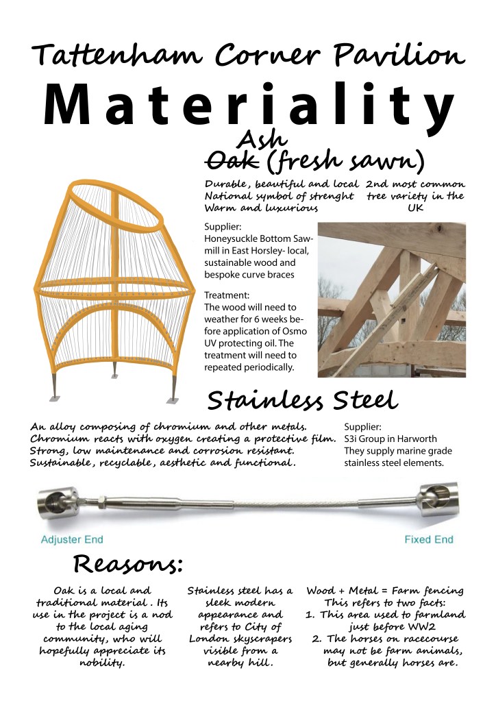
My tutor noticed that certain examples from my precedents feed into my design, but I had practical aspects of my location in mind. My tutor said it was the point of the precedent research: to inspire my design and it happened in this case. I got a ‘well done for speaking to suppliers’ as they are an invaluable source of knowledge on materials and their processing.

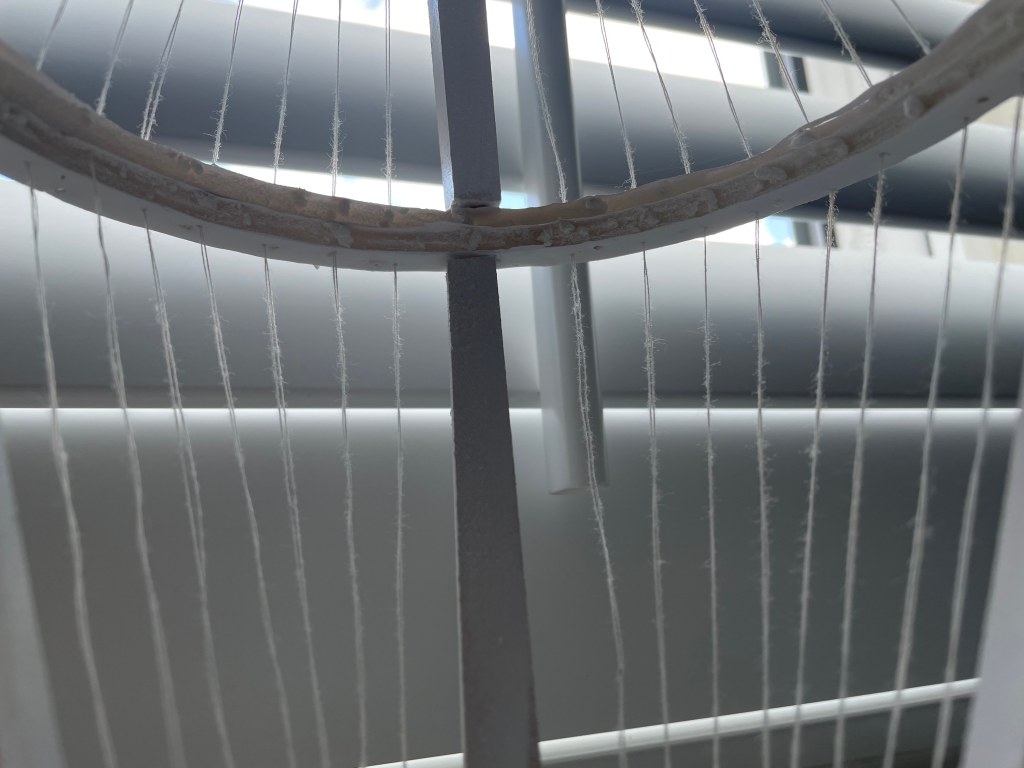
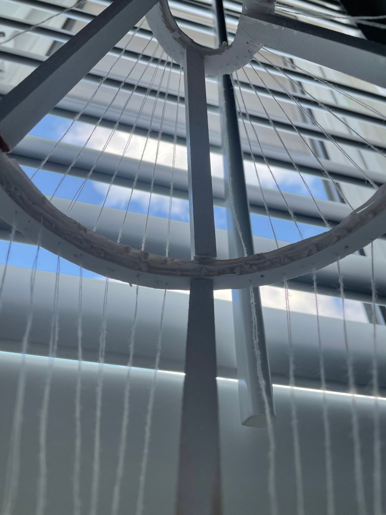
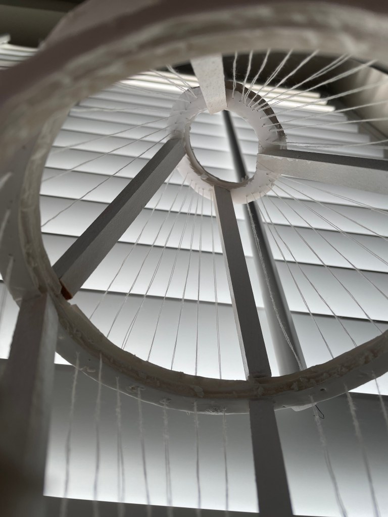
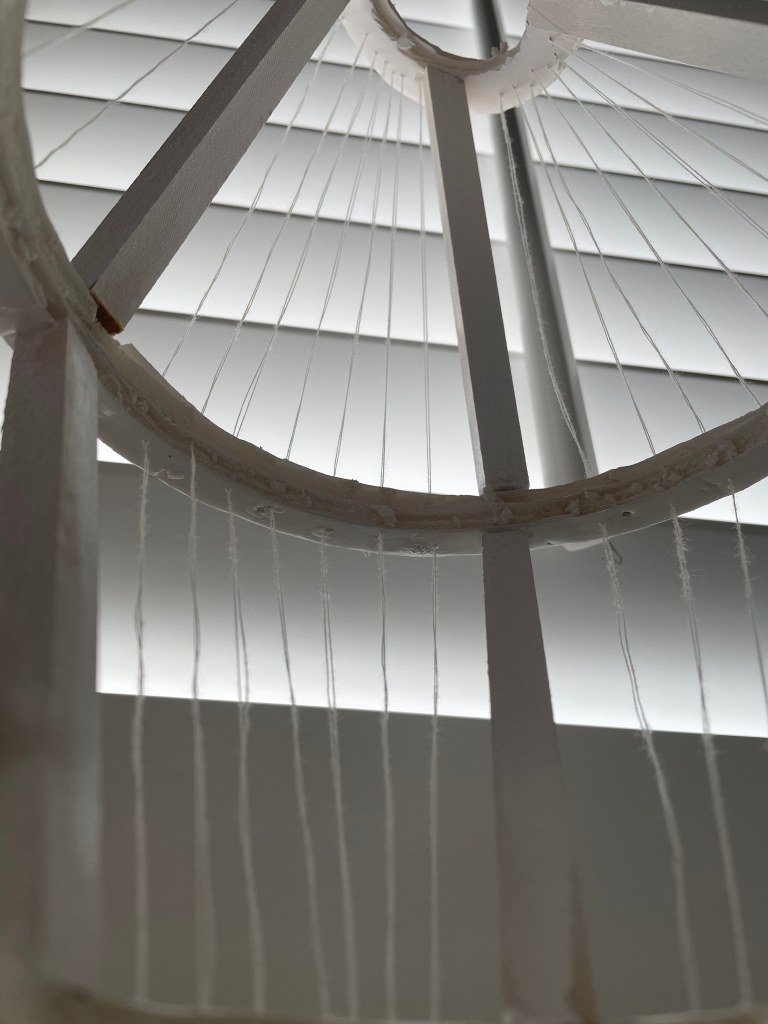
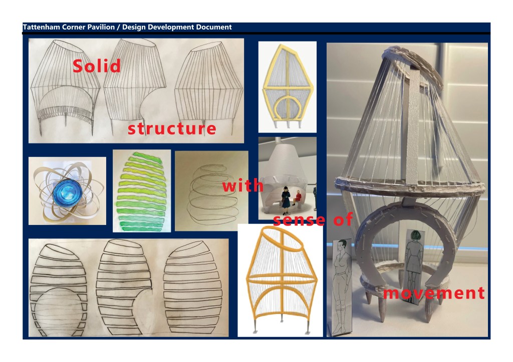
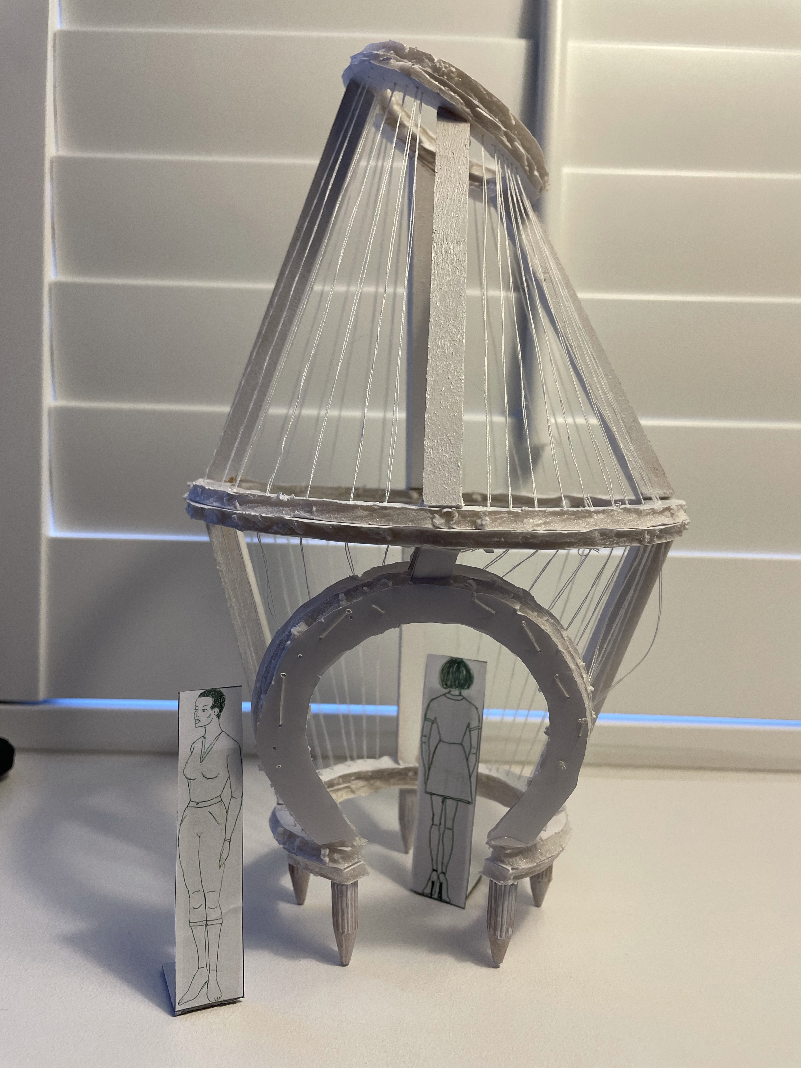
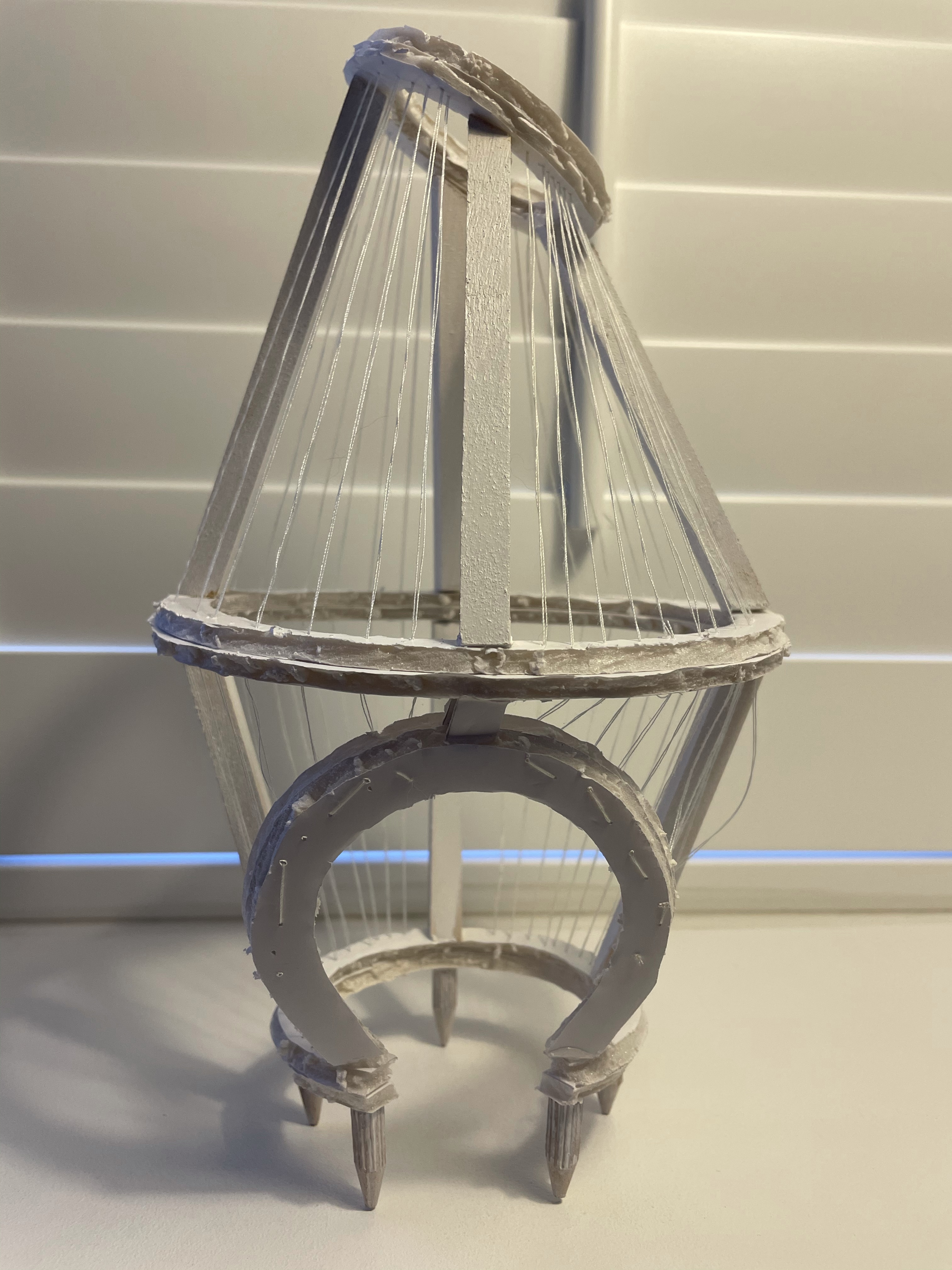
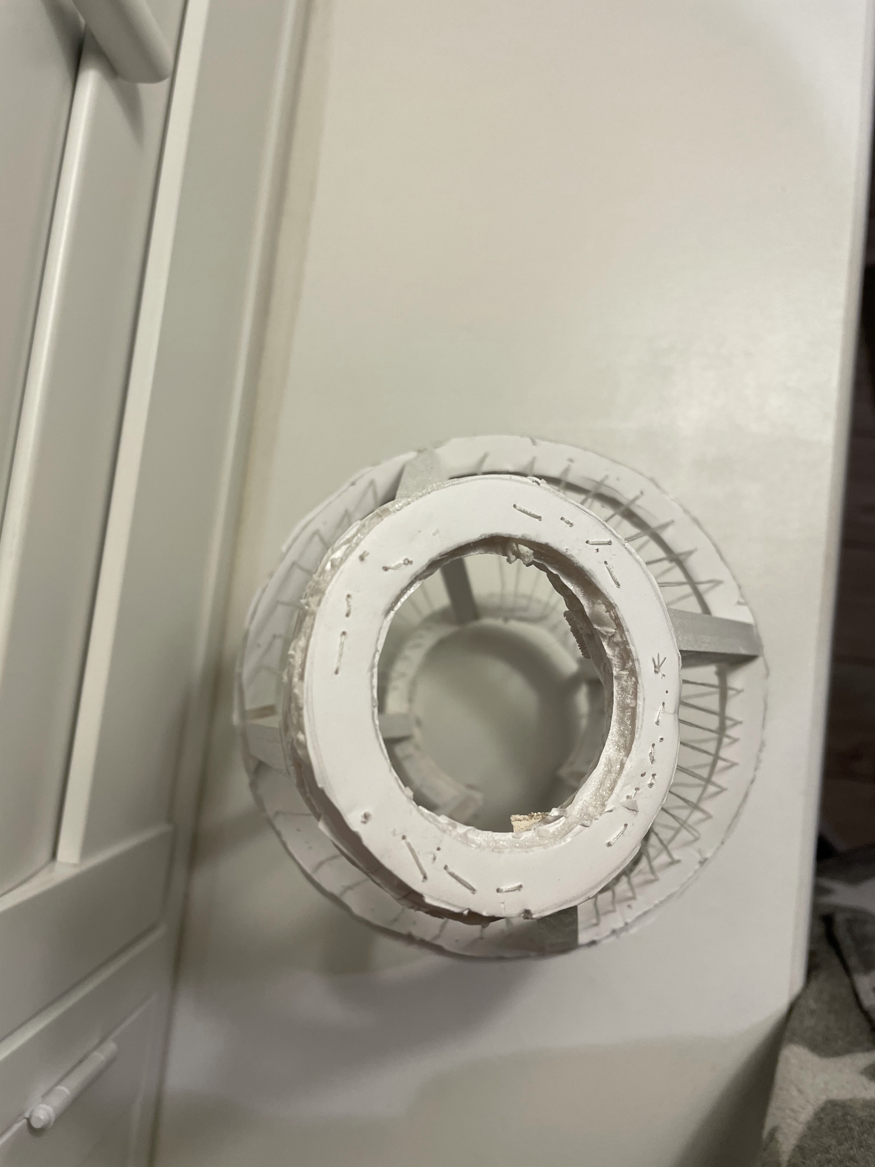
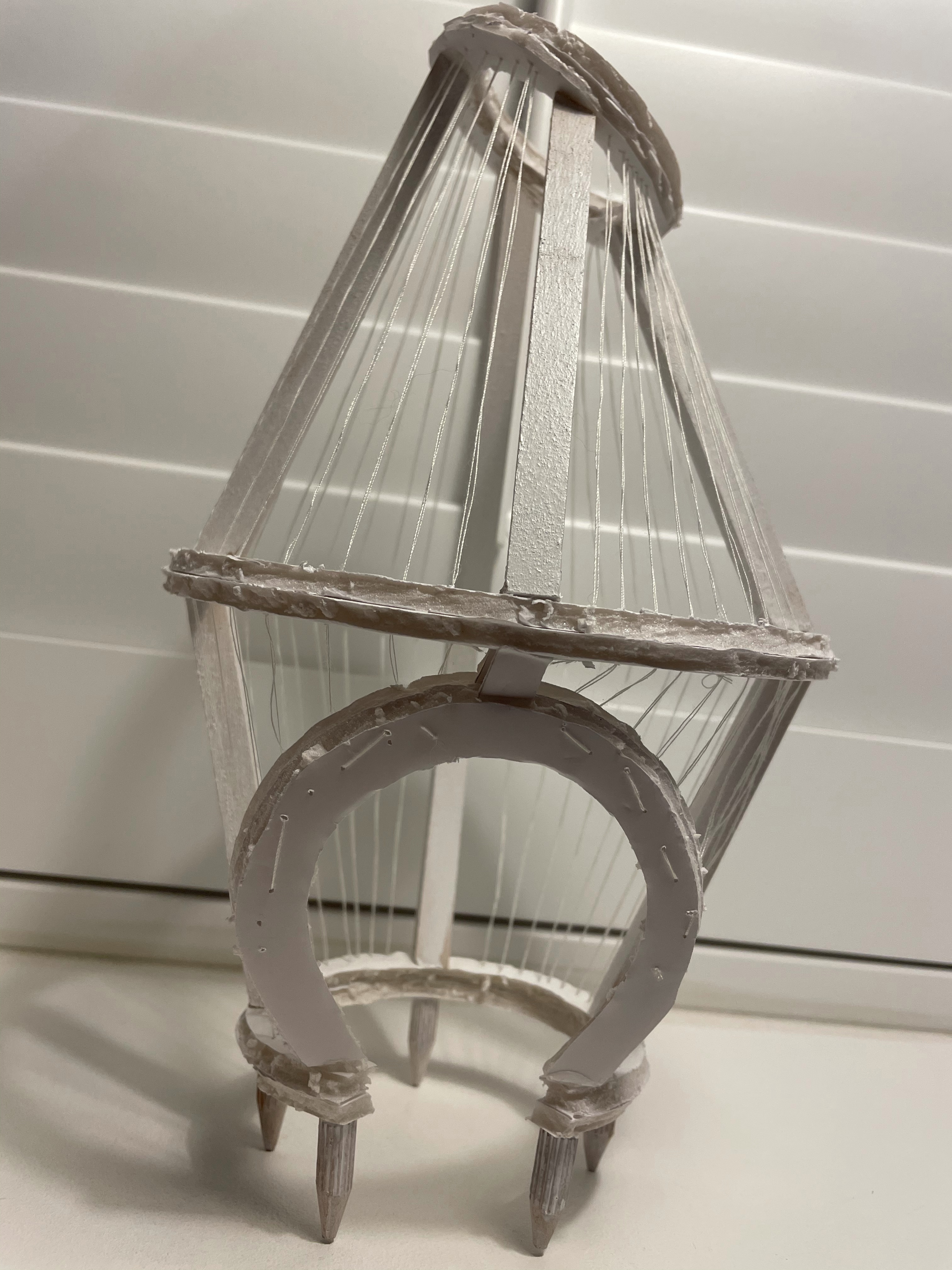
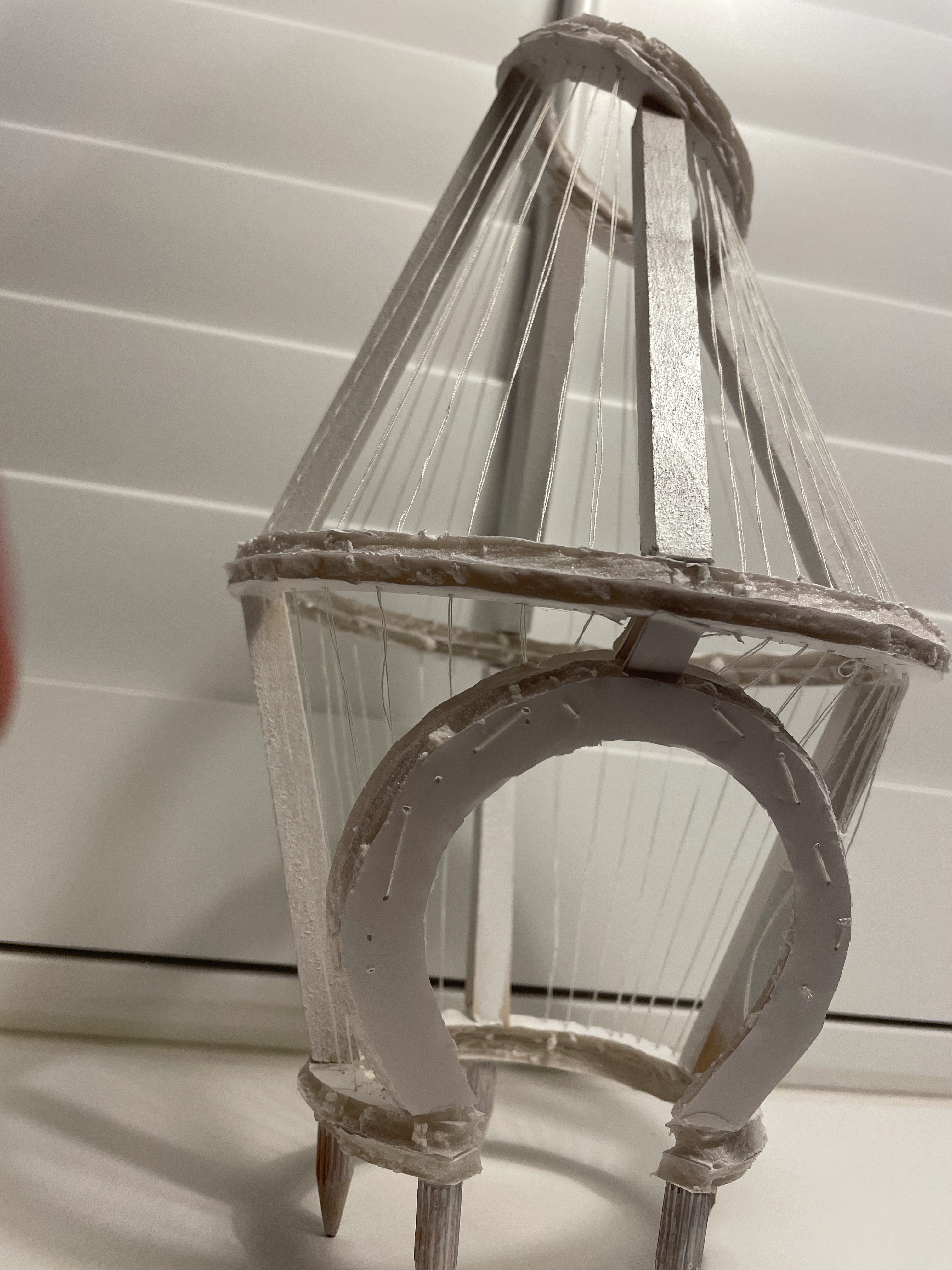
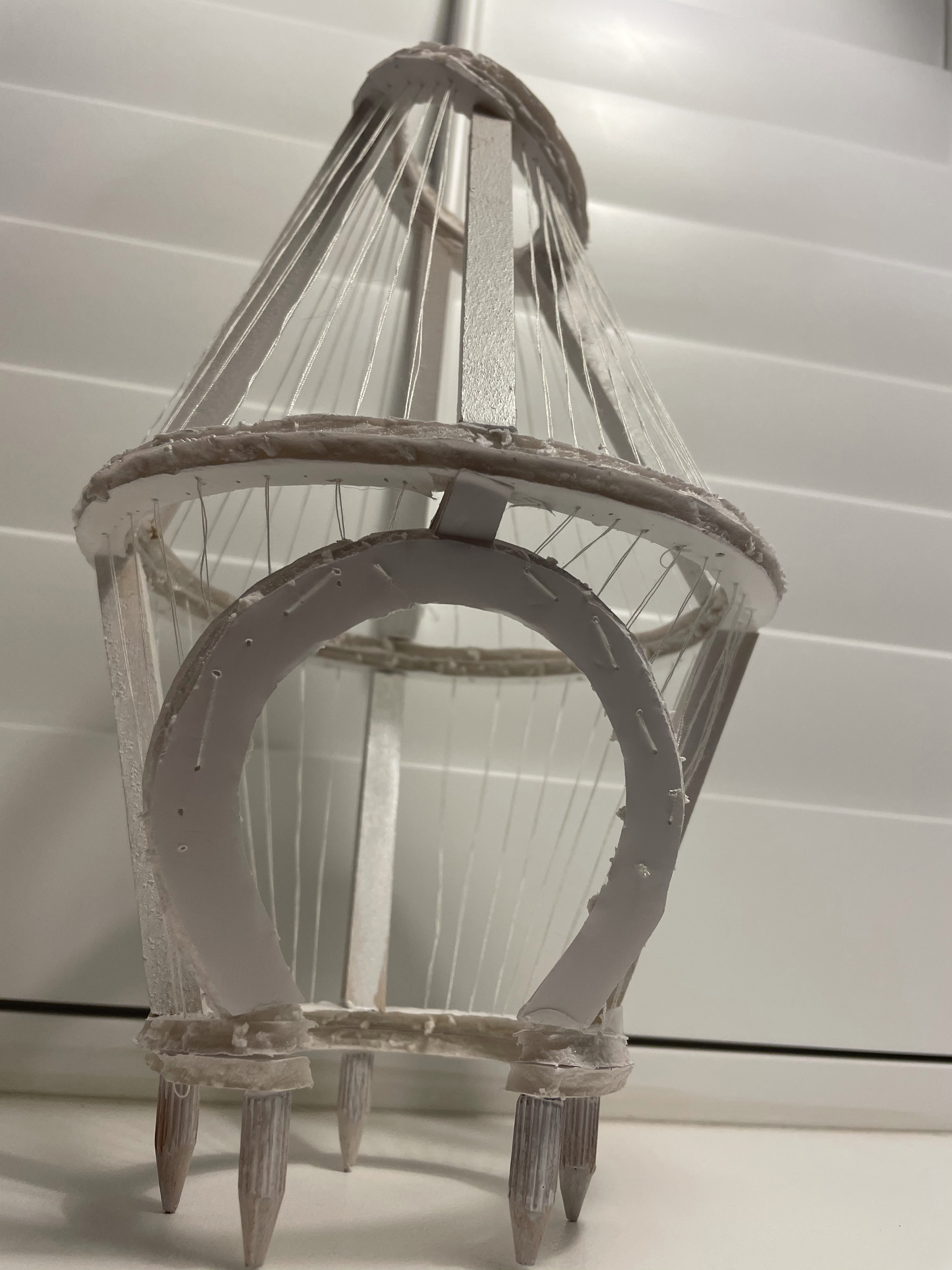
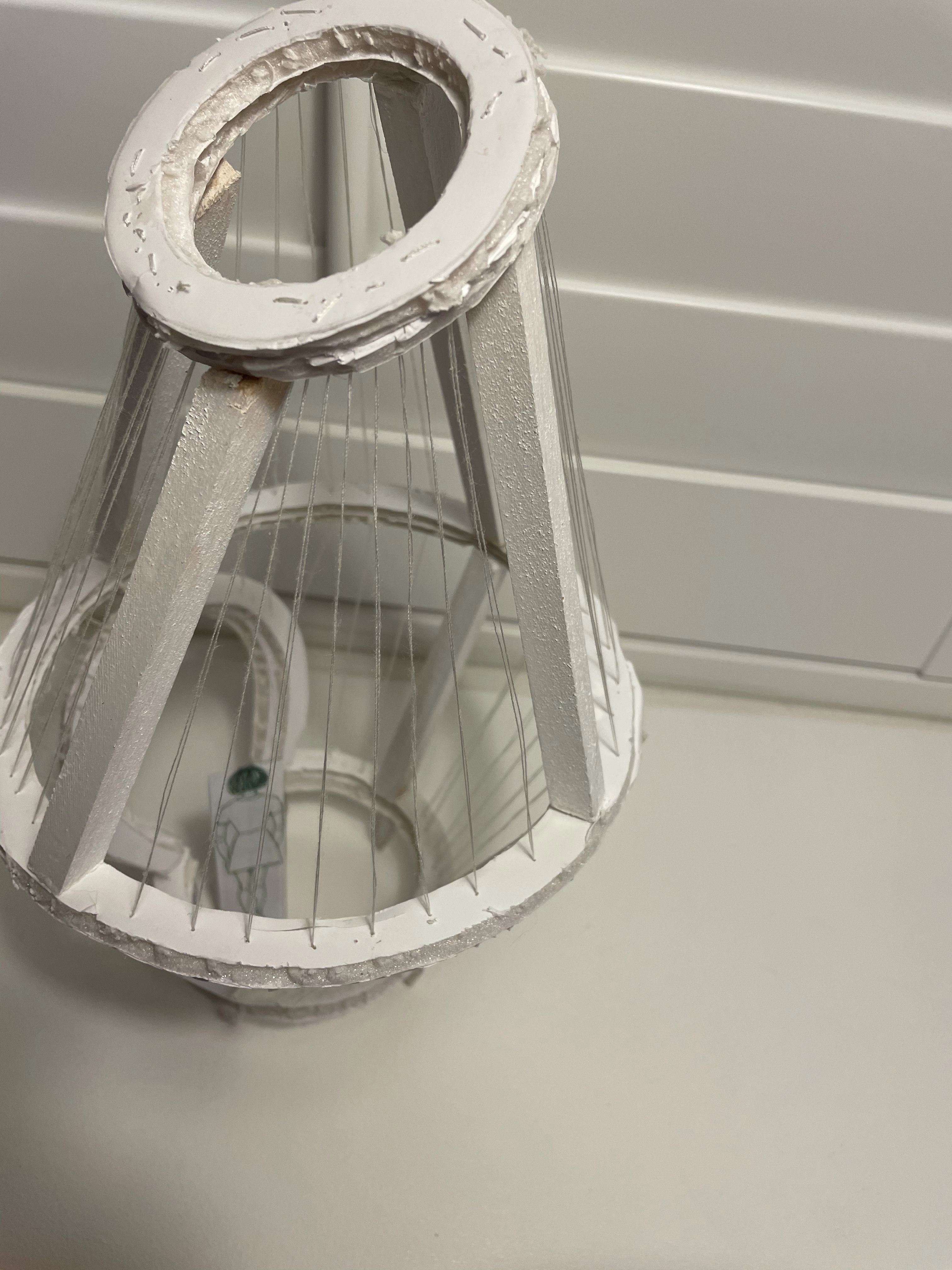
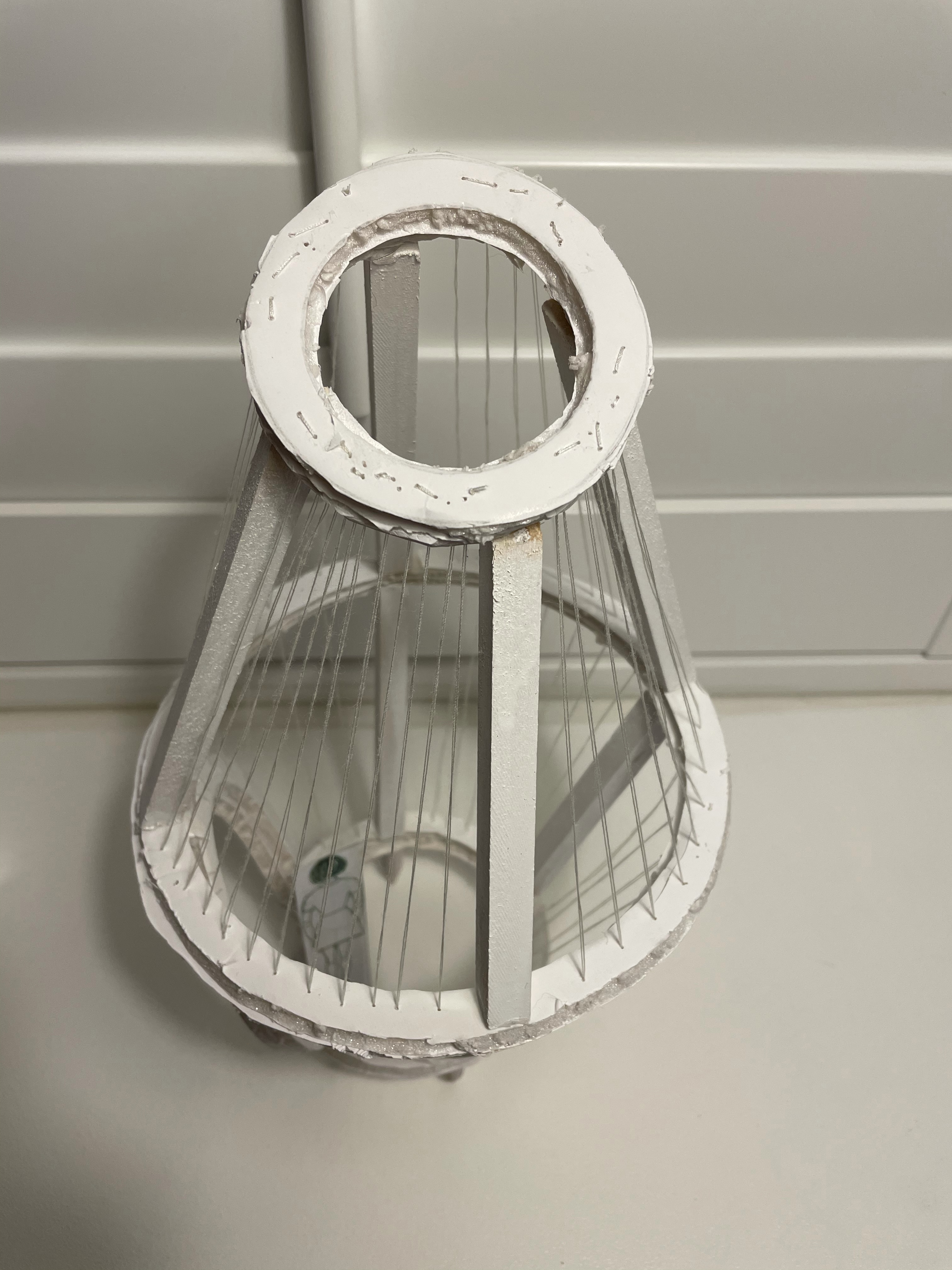
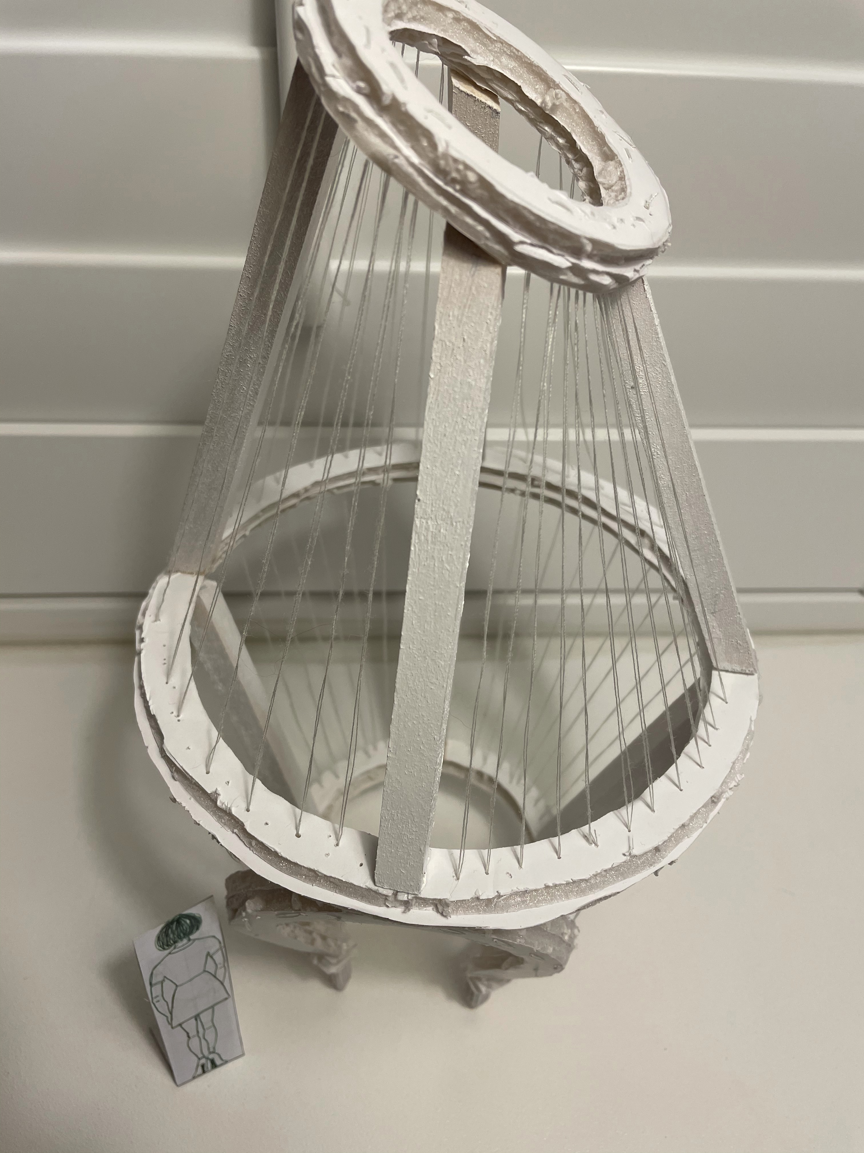
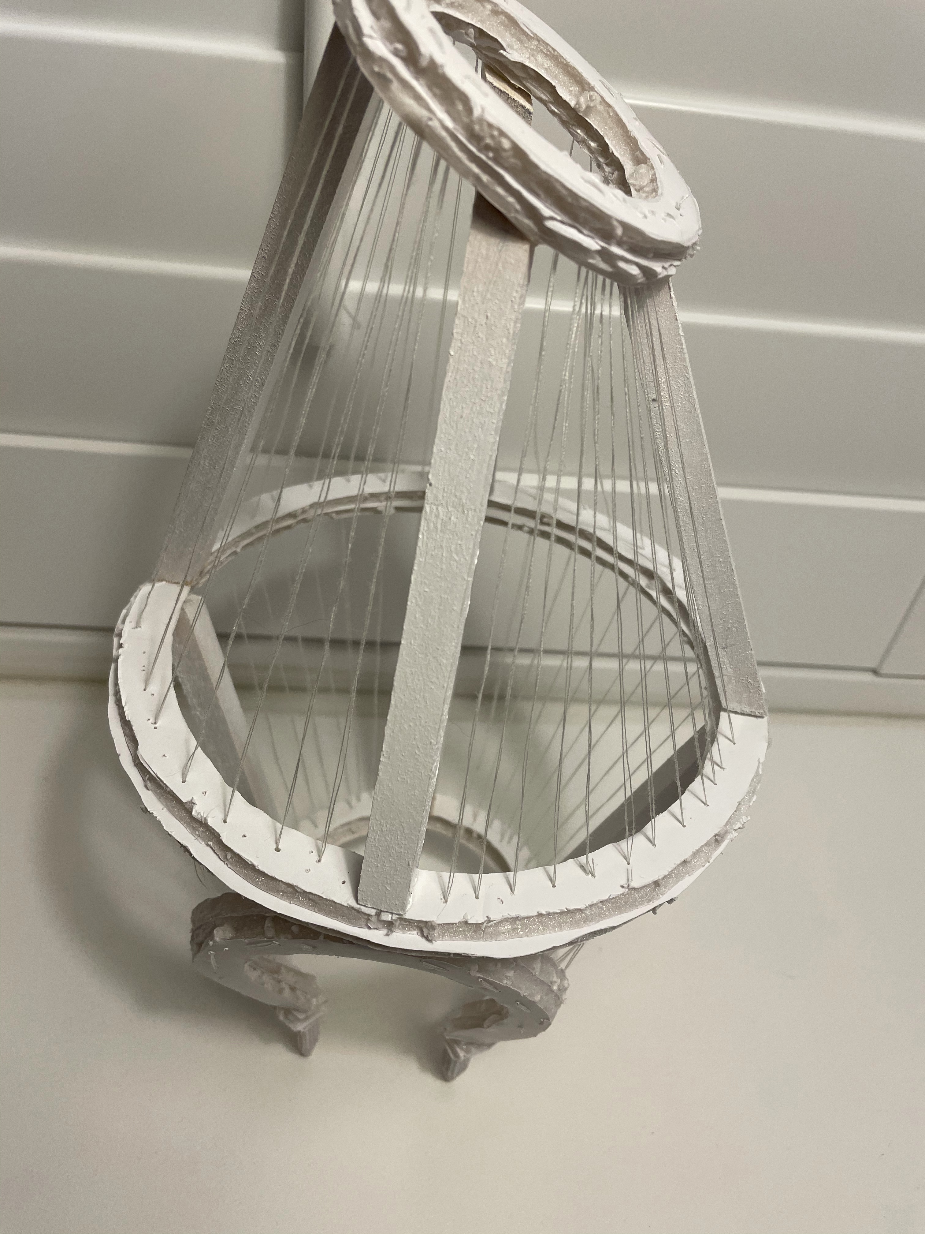
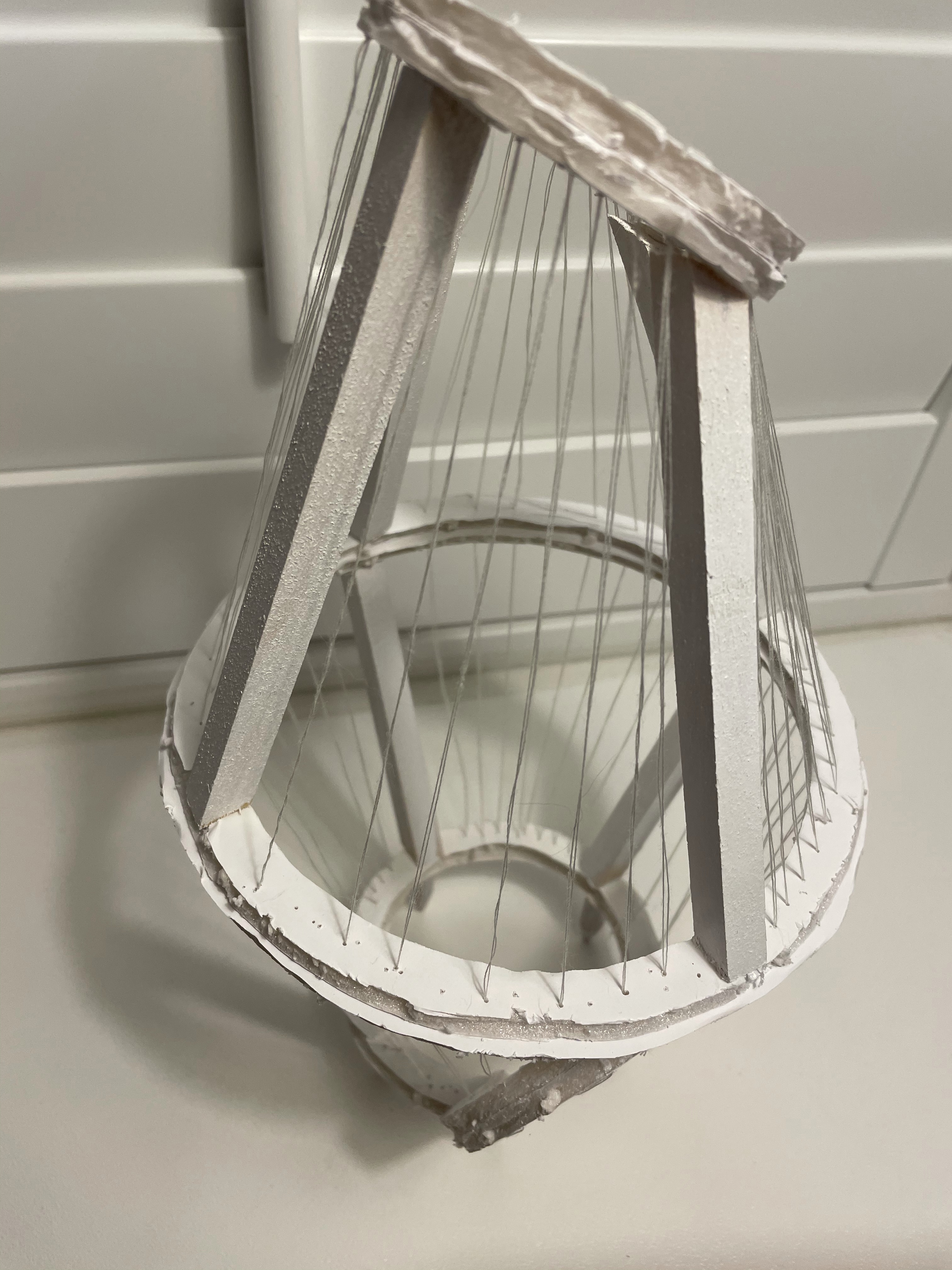
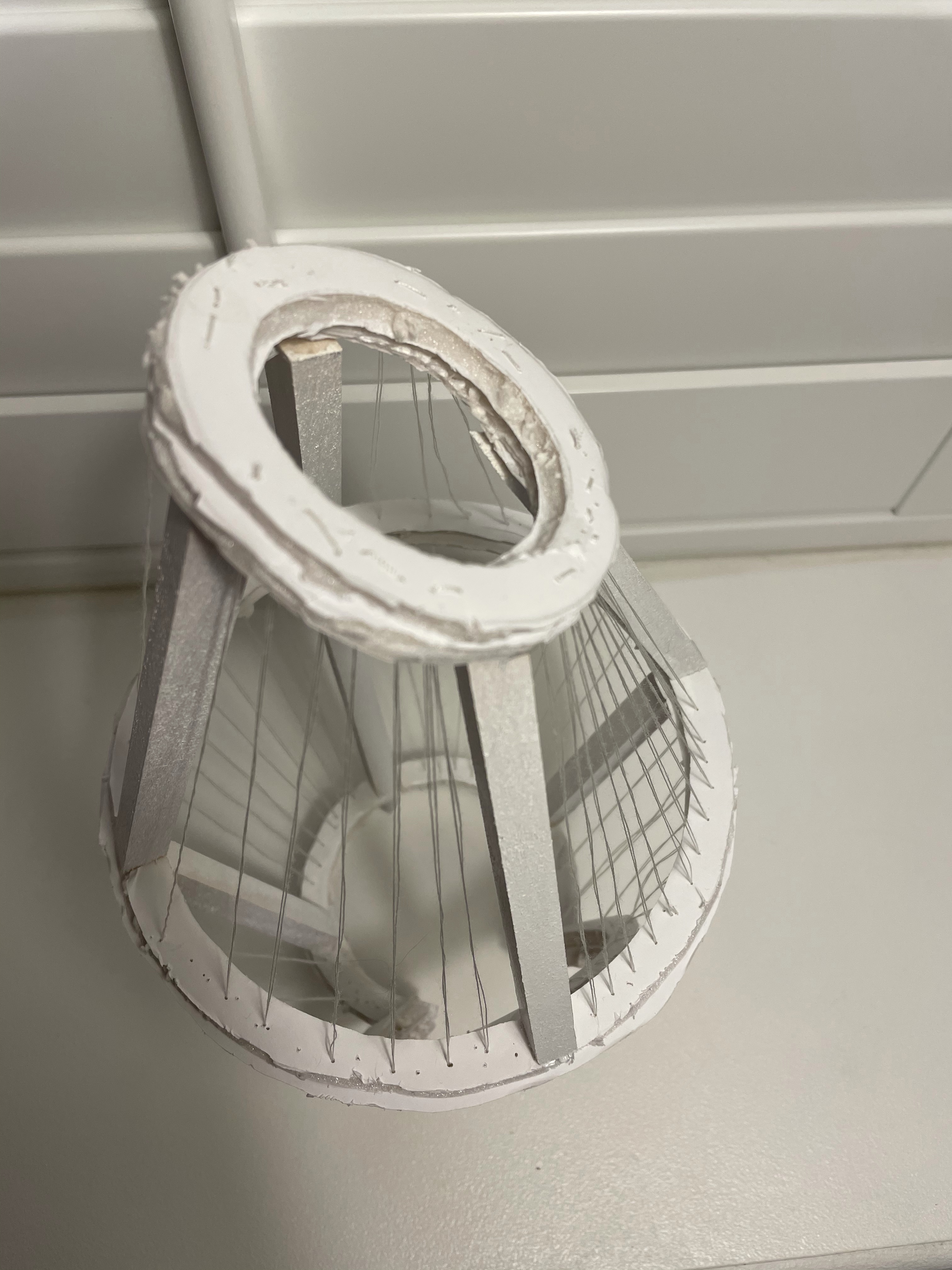
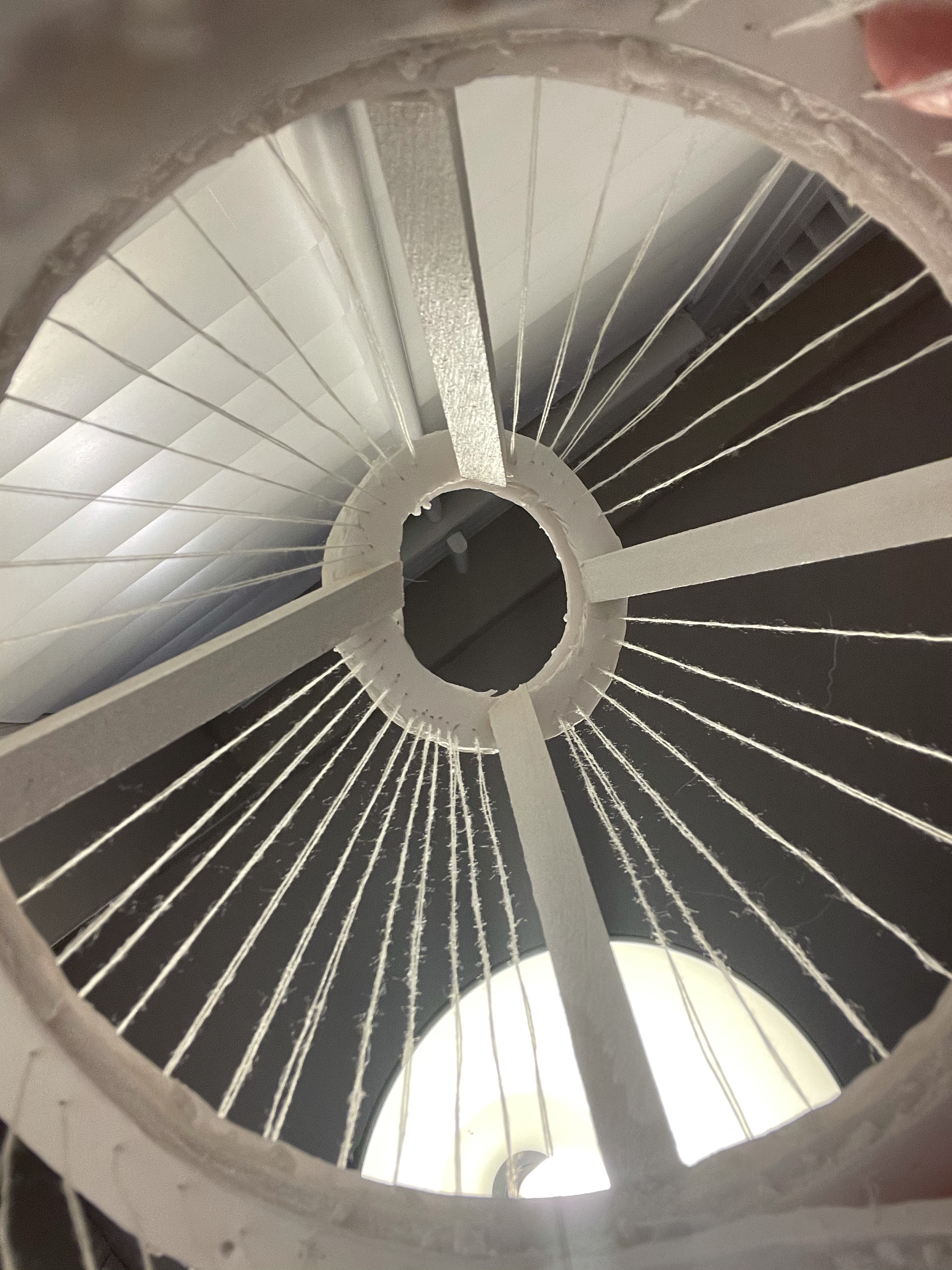
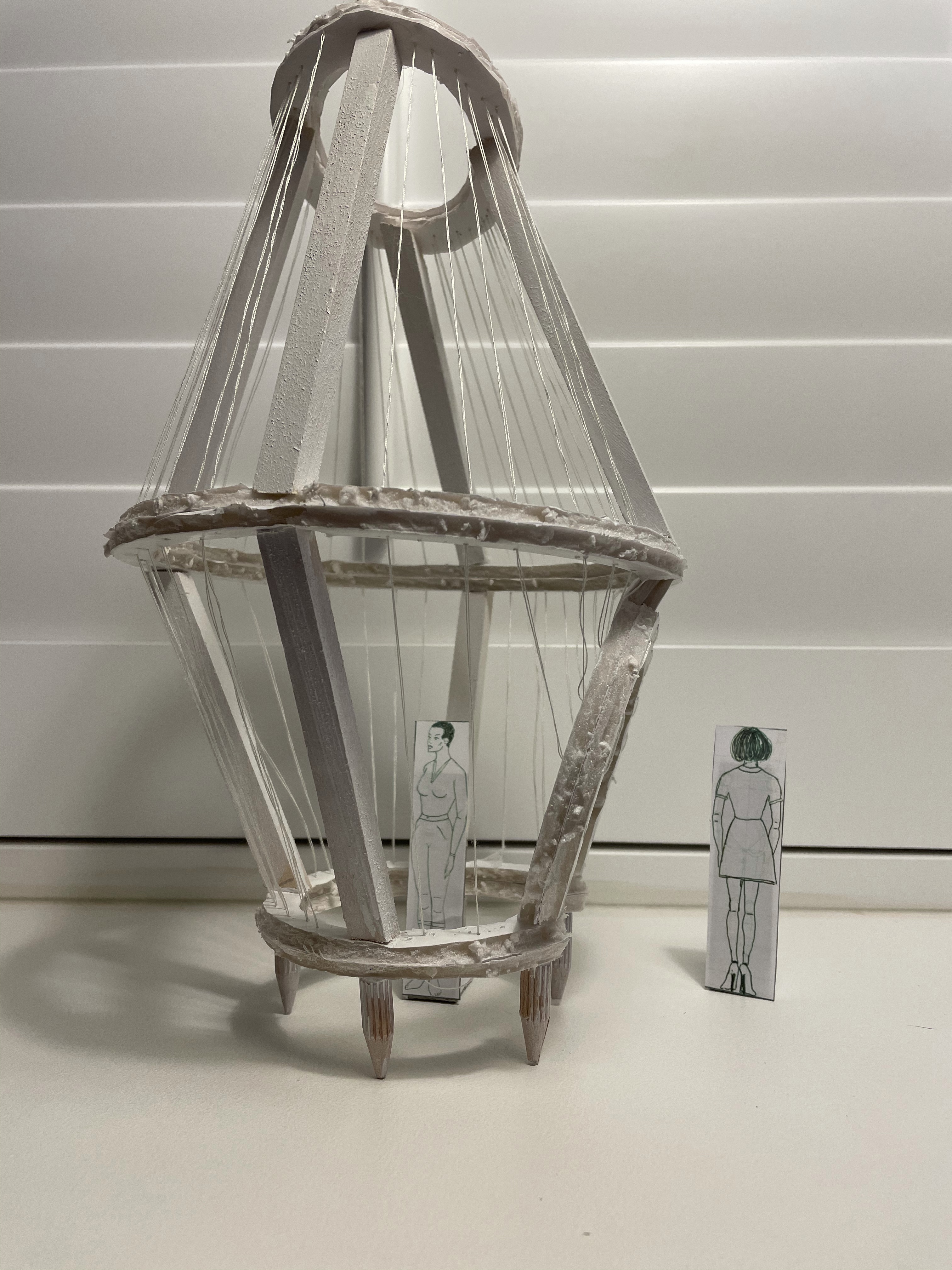
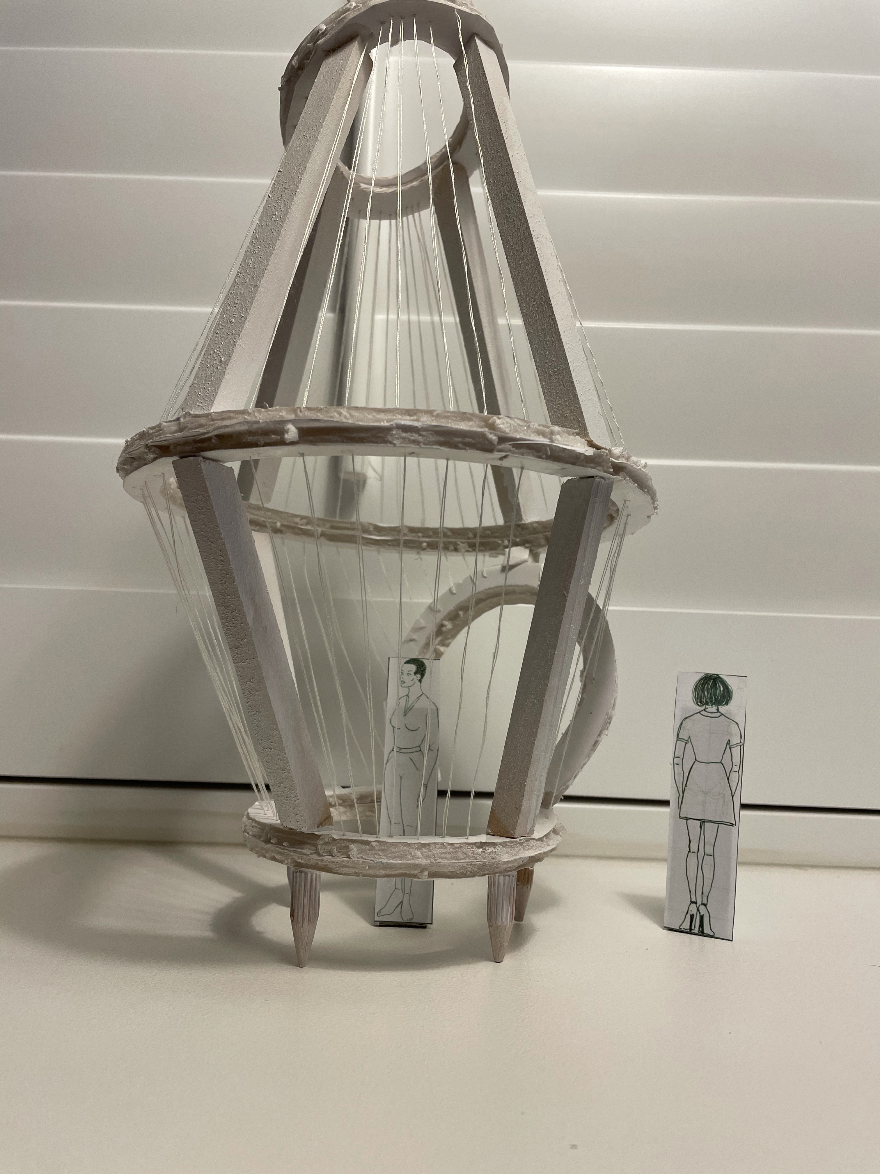
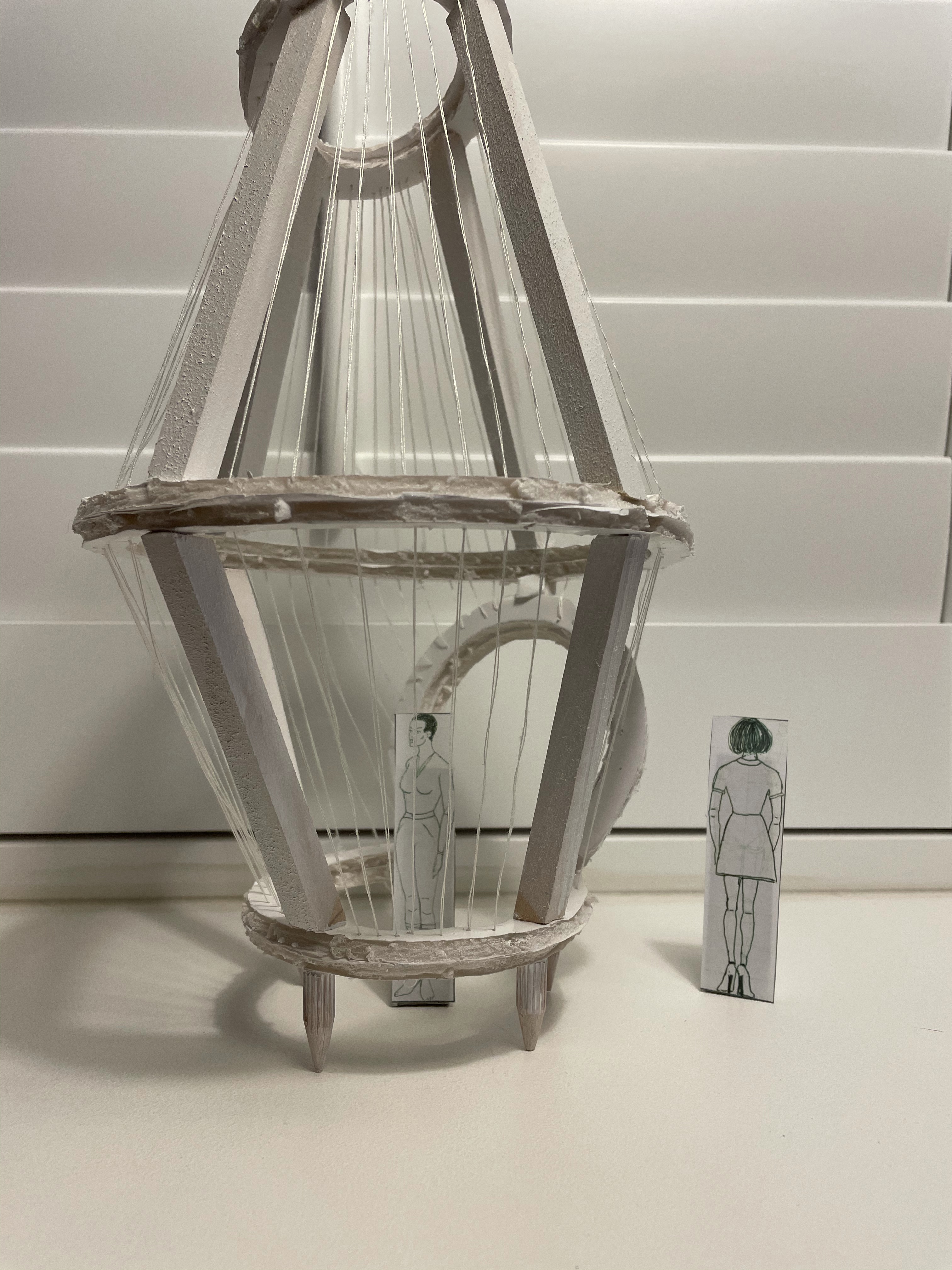
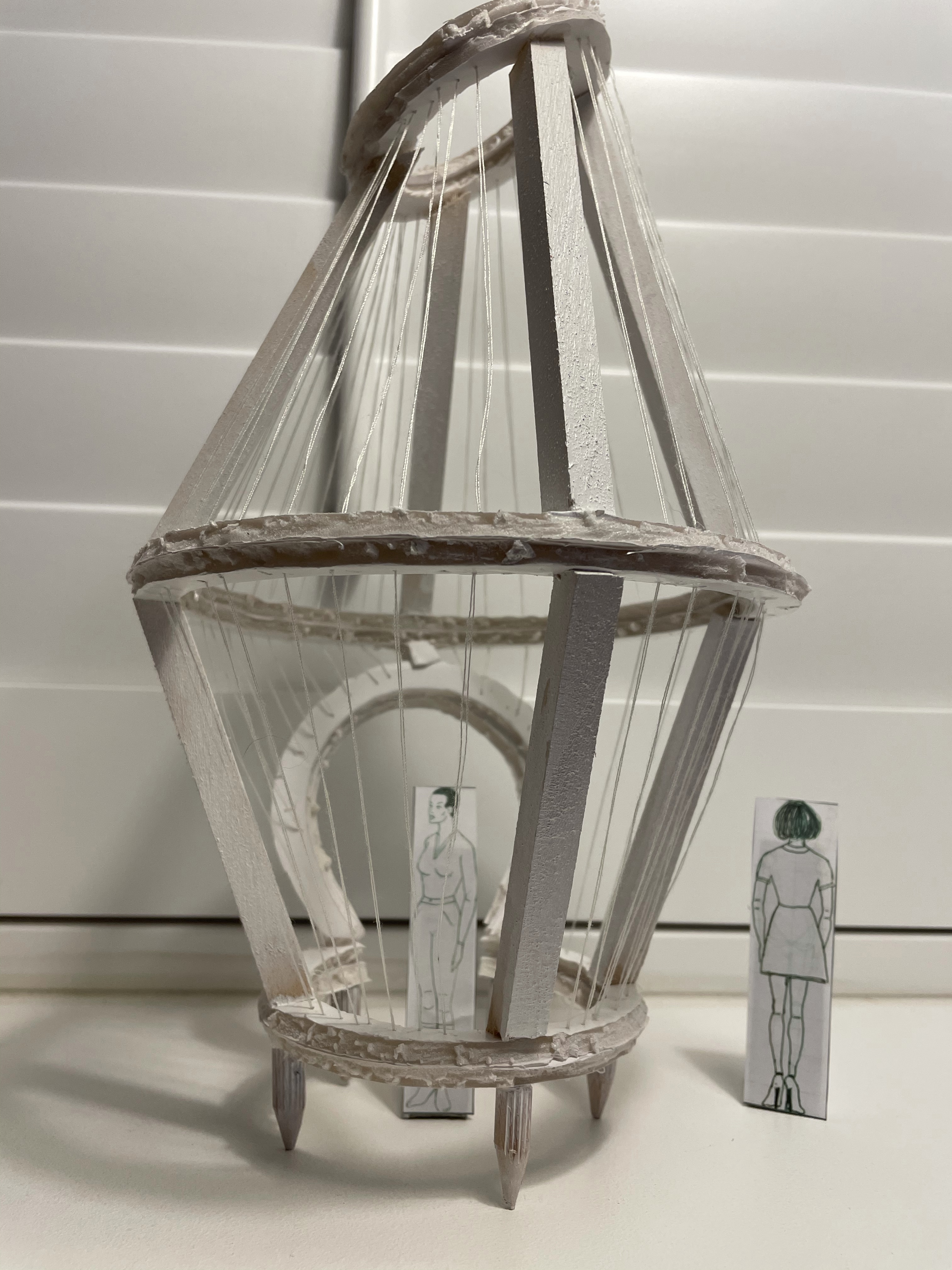
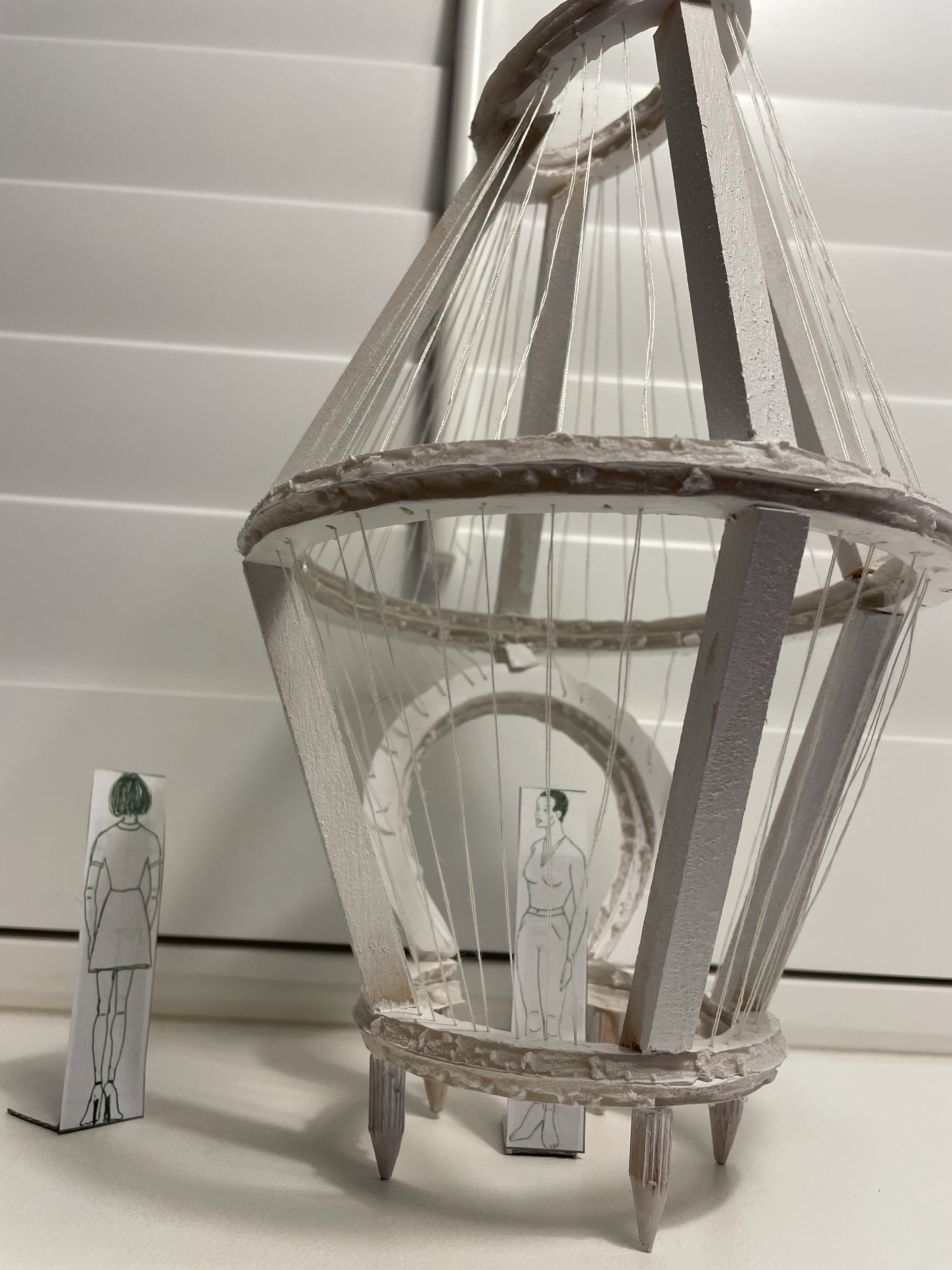
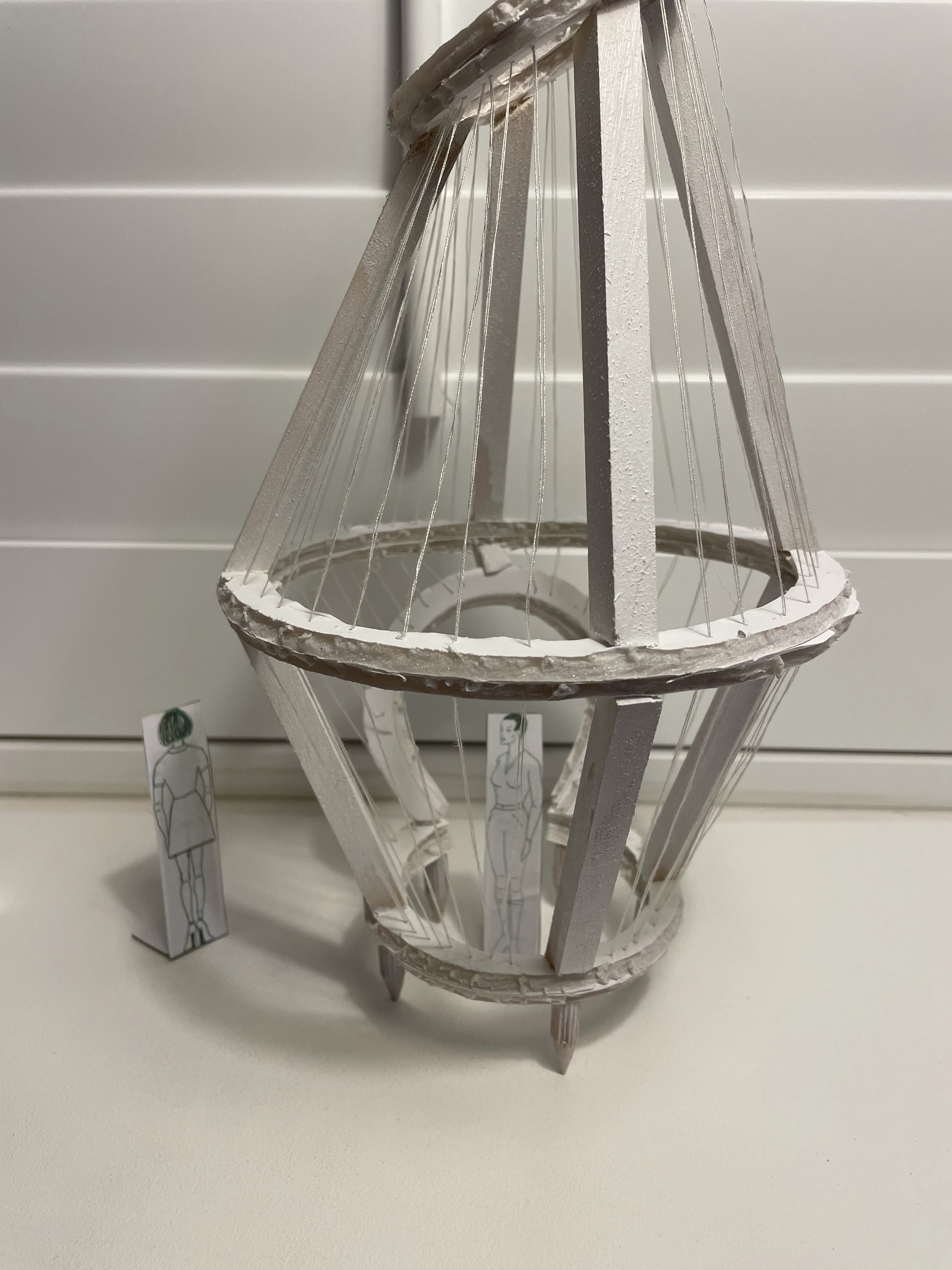
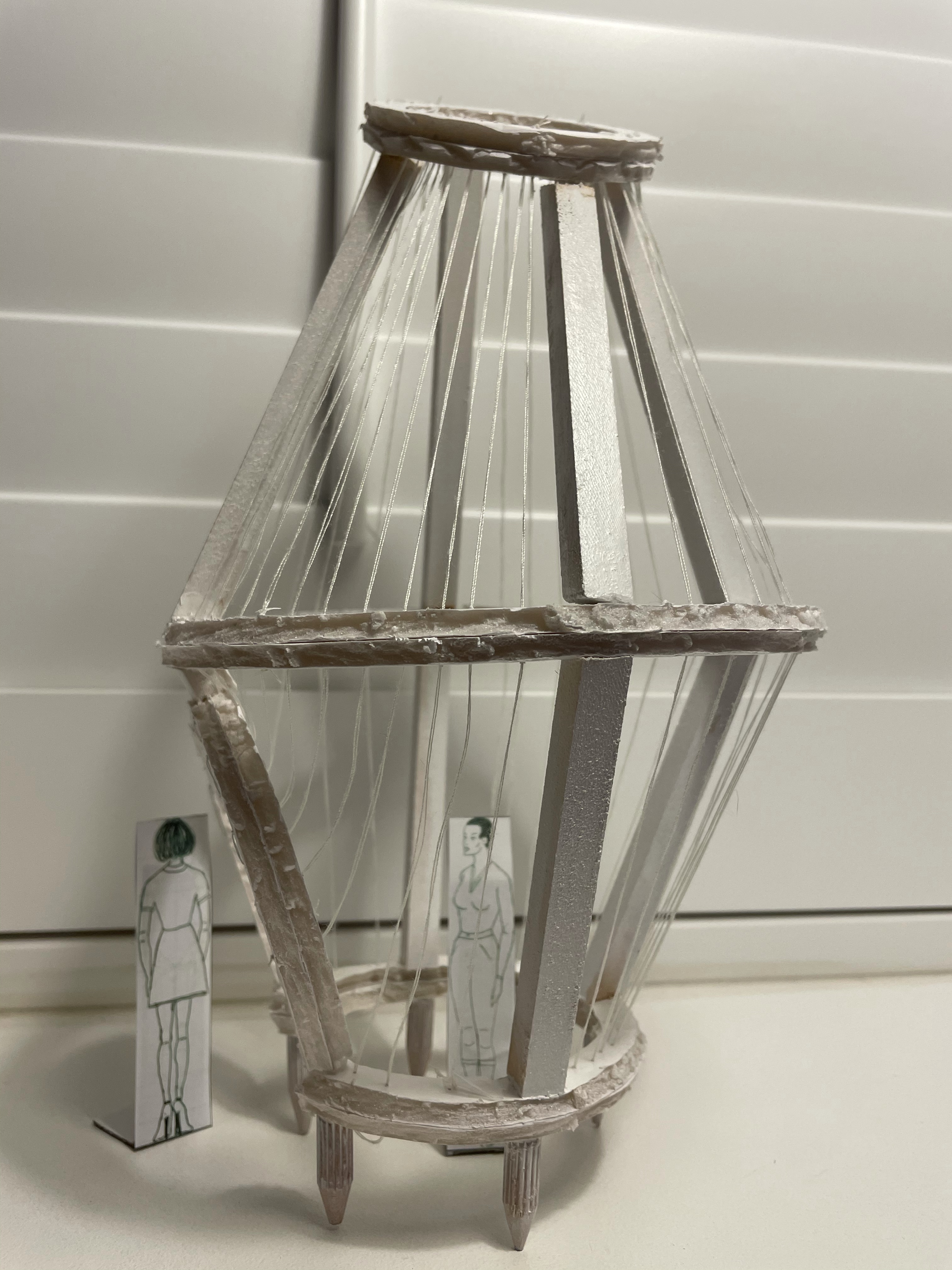
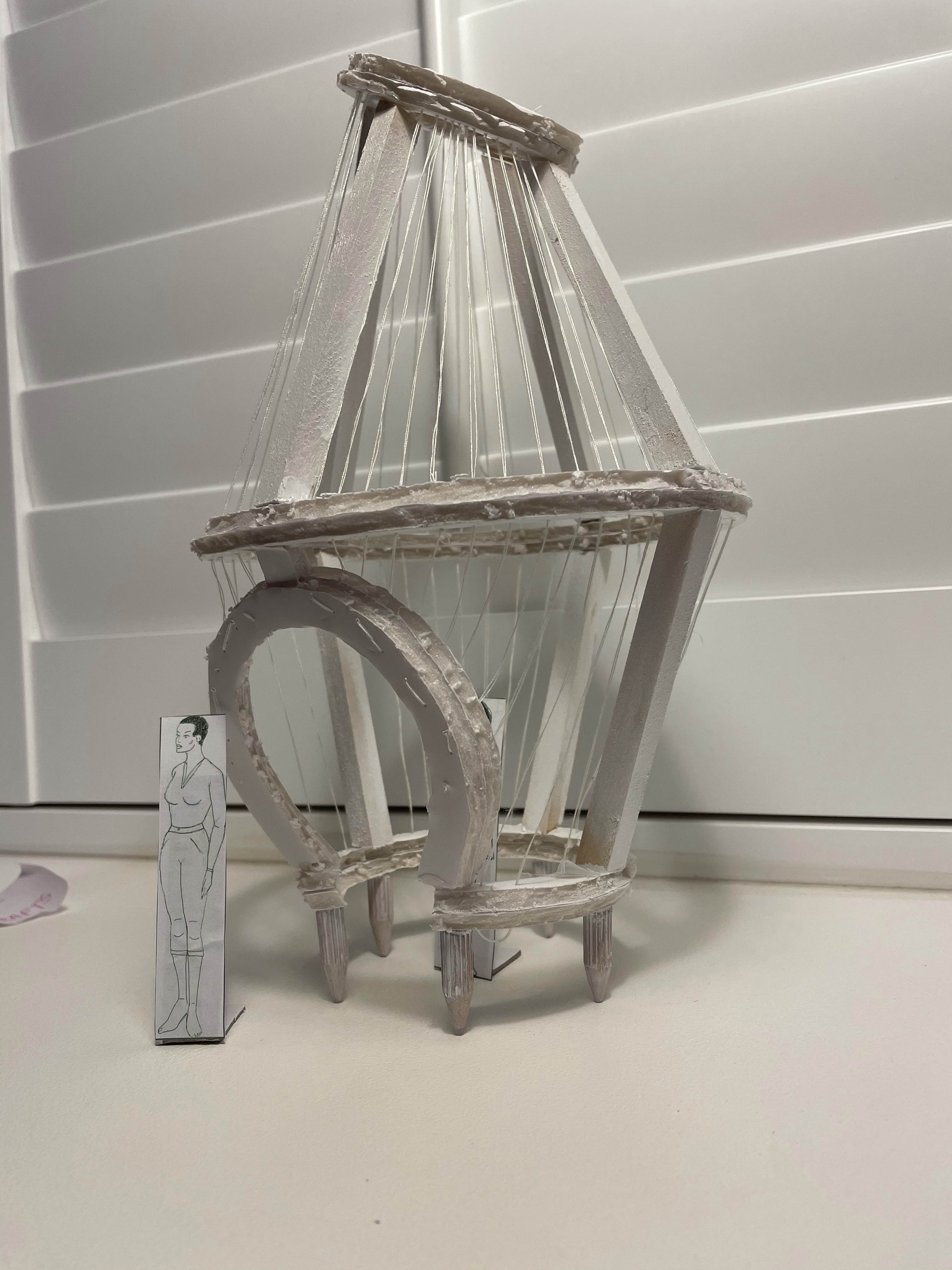
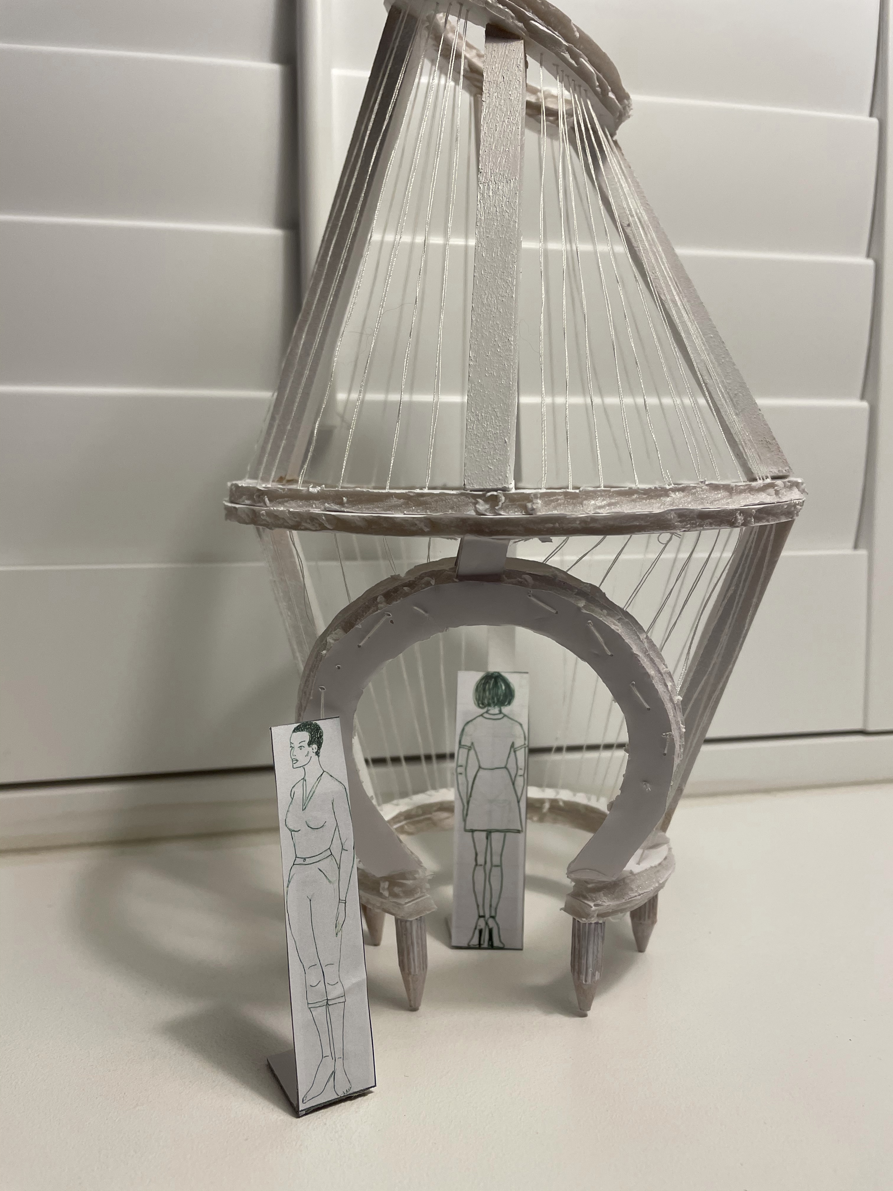
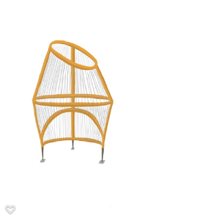
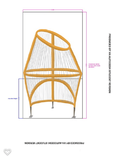
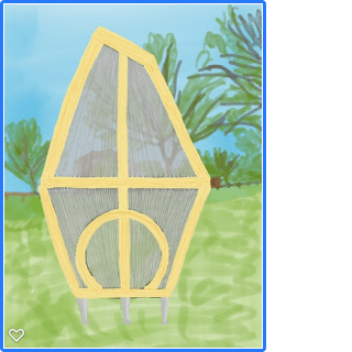
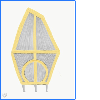
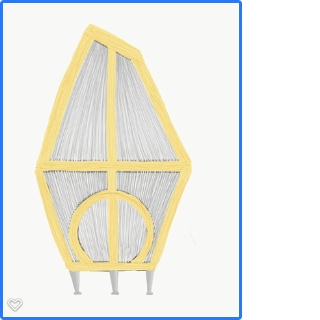
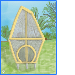
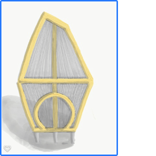
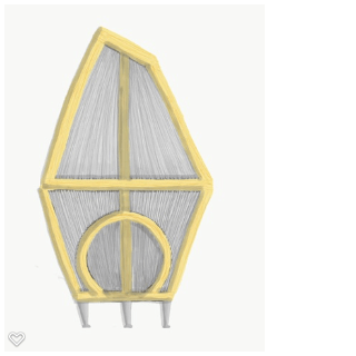
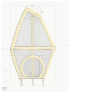
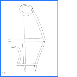
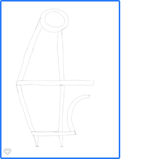
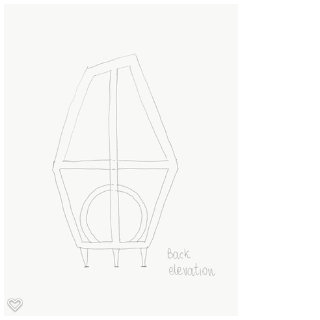
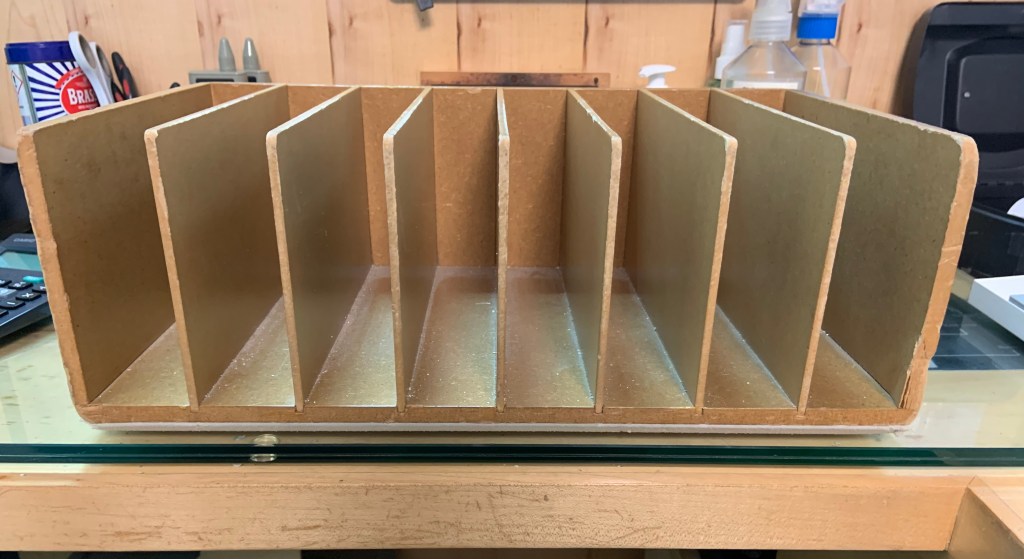
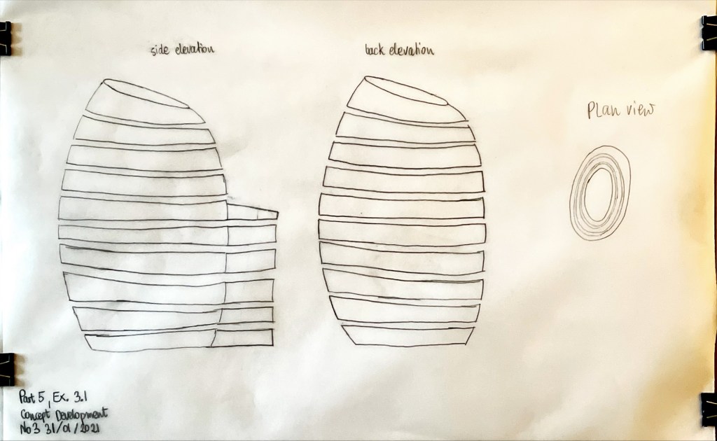
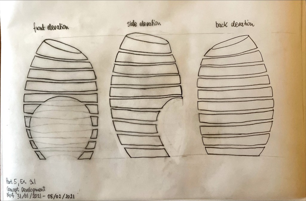
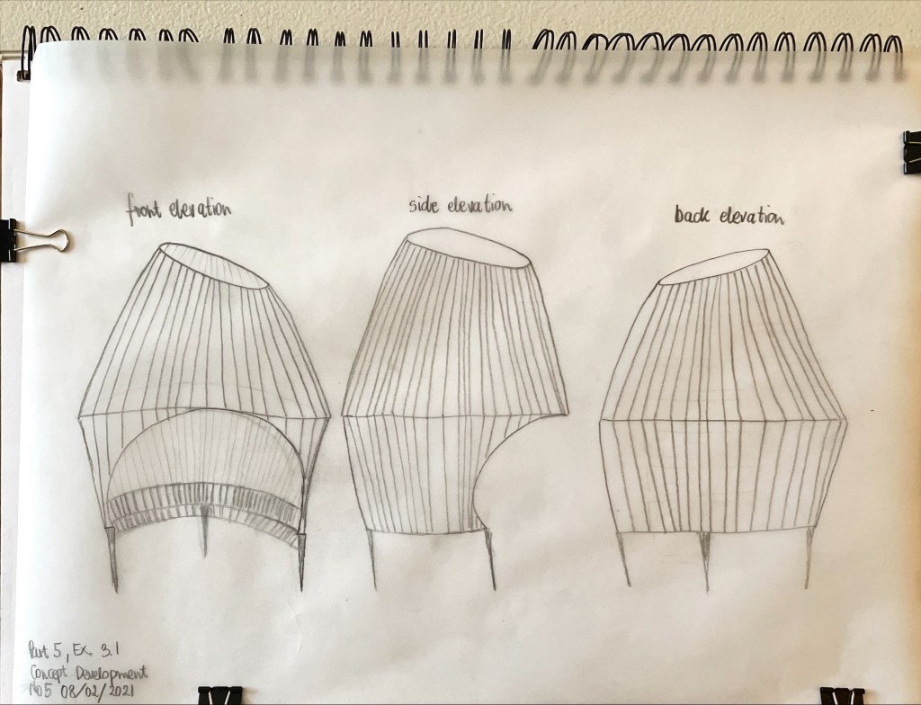
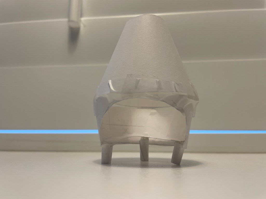
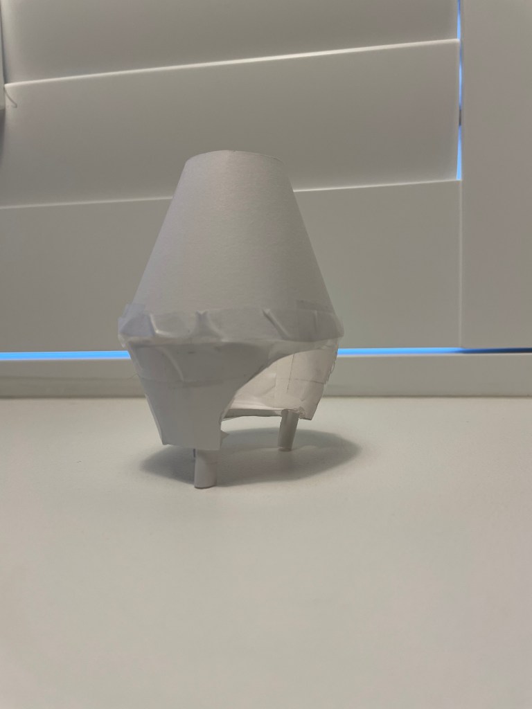
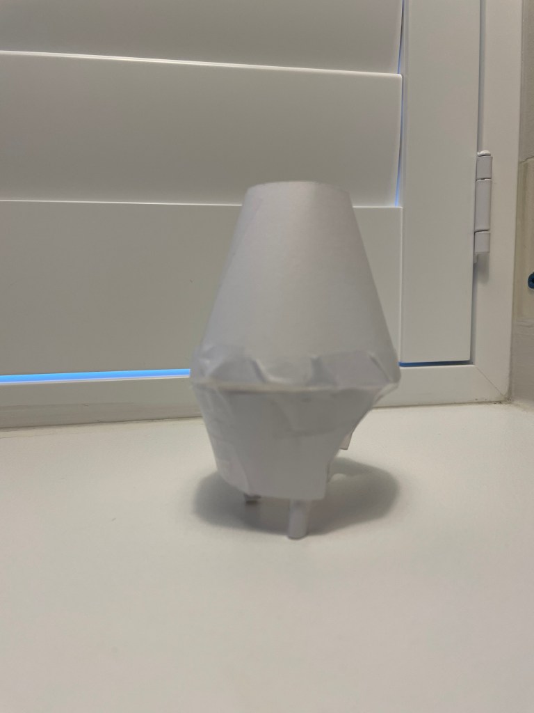
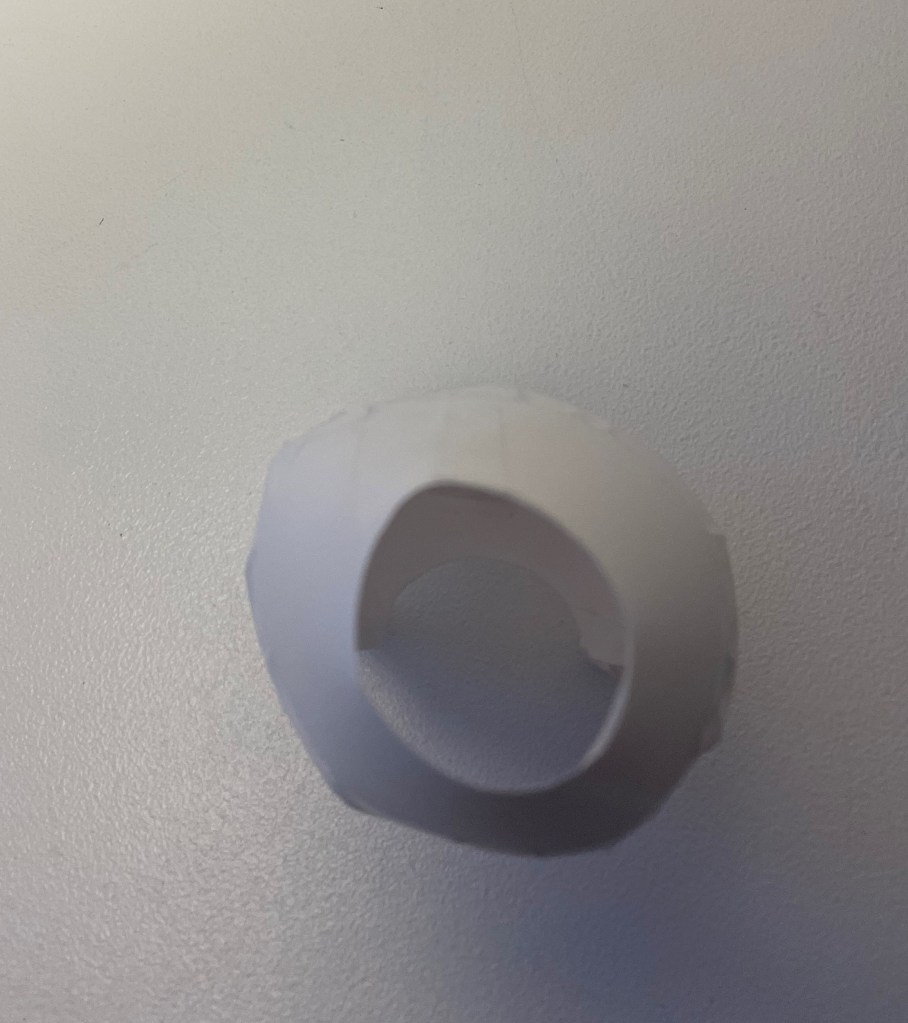
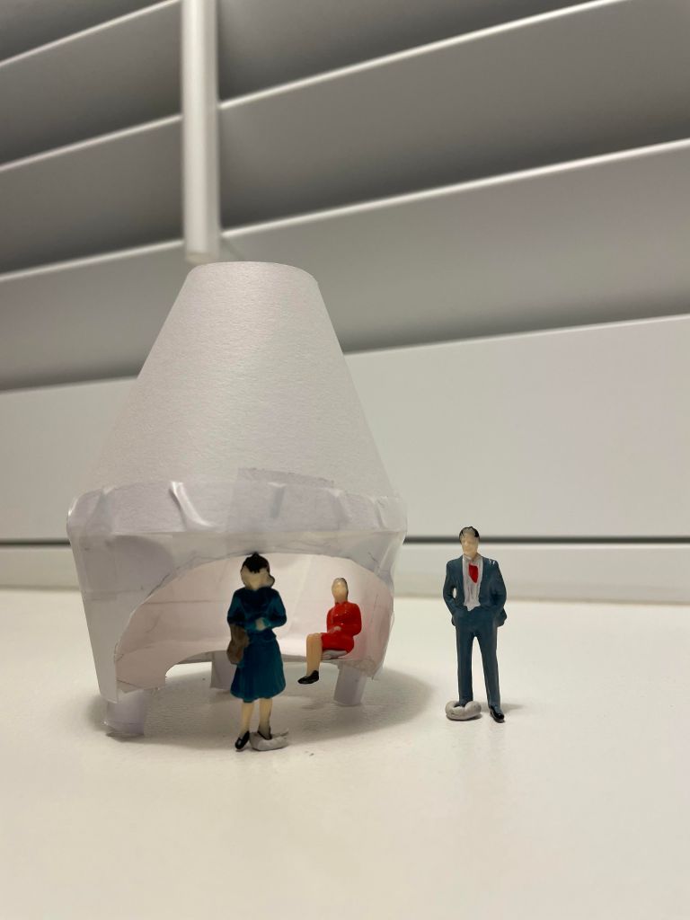
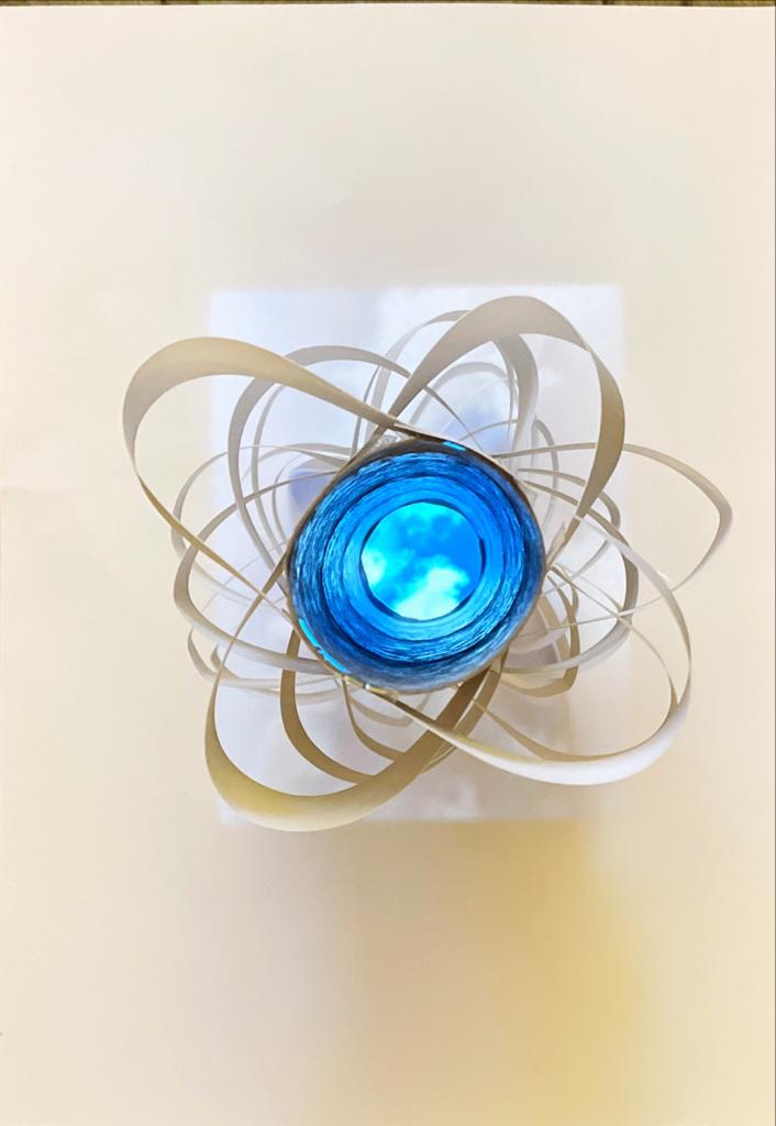
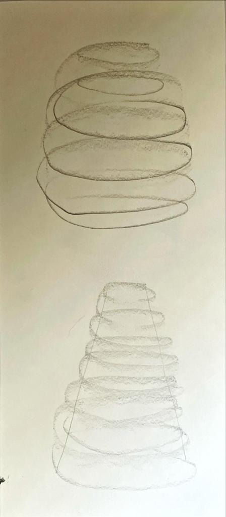
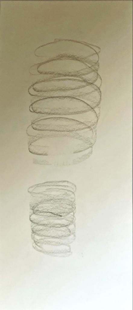
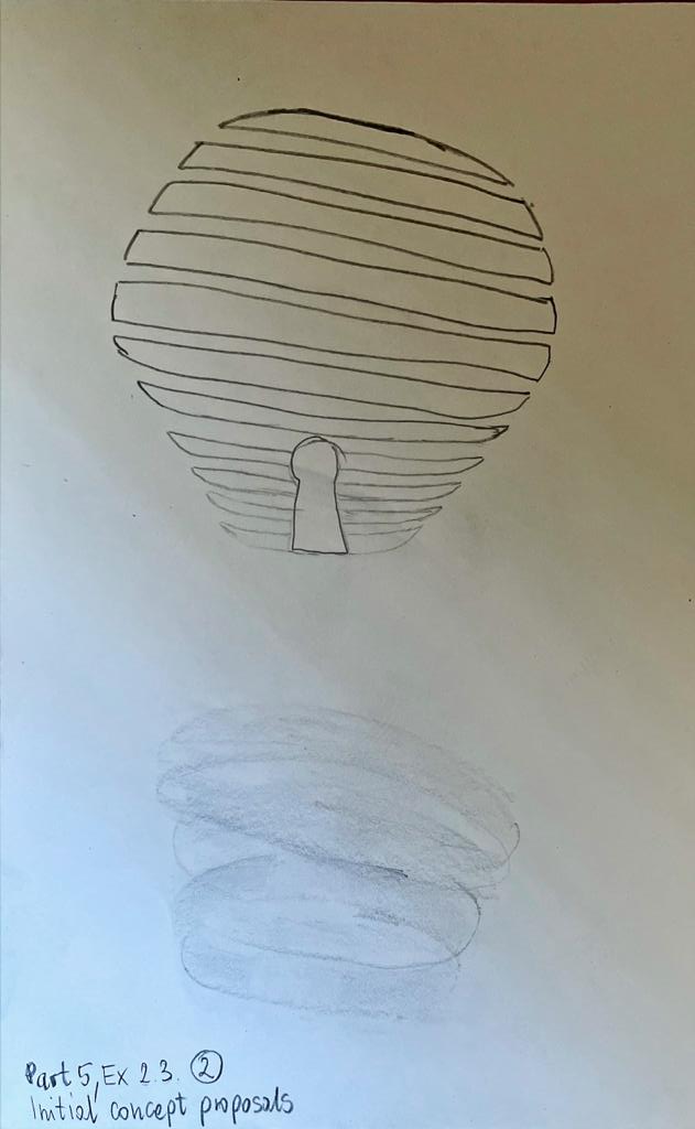
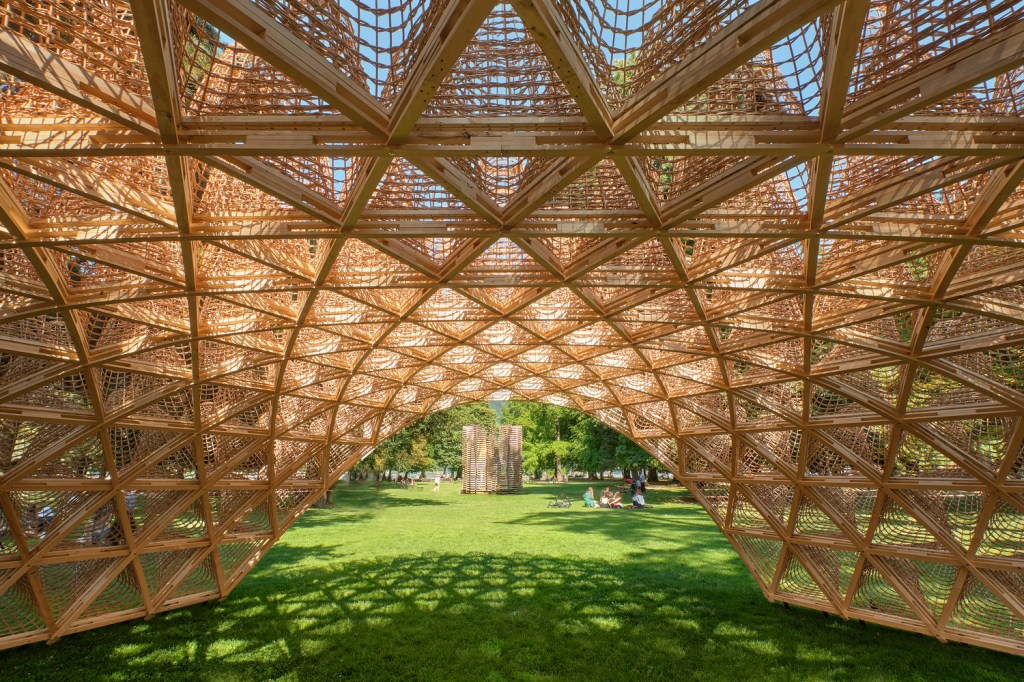
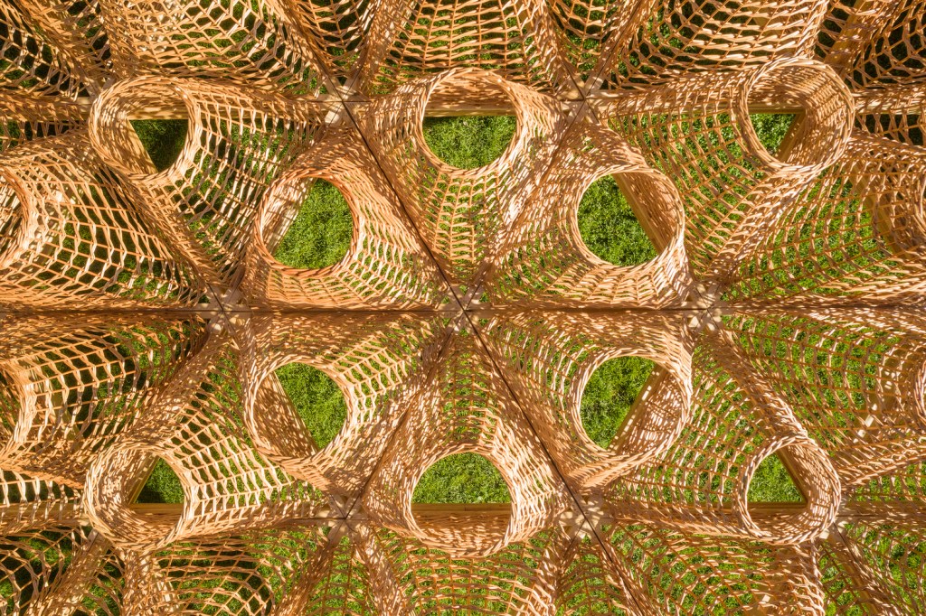
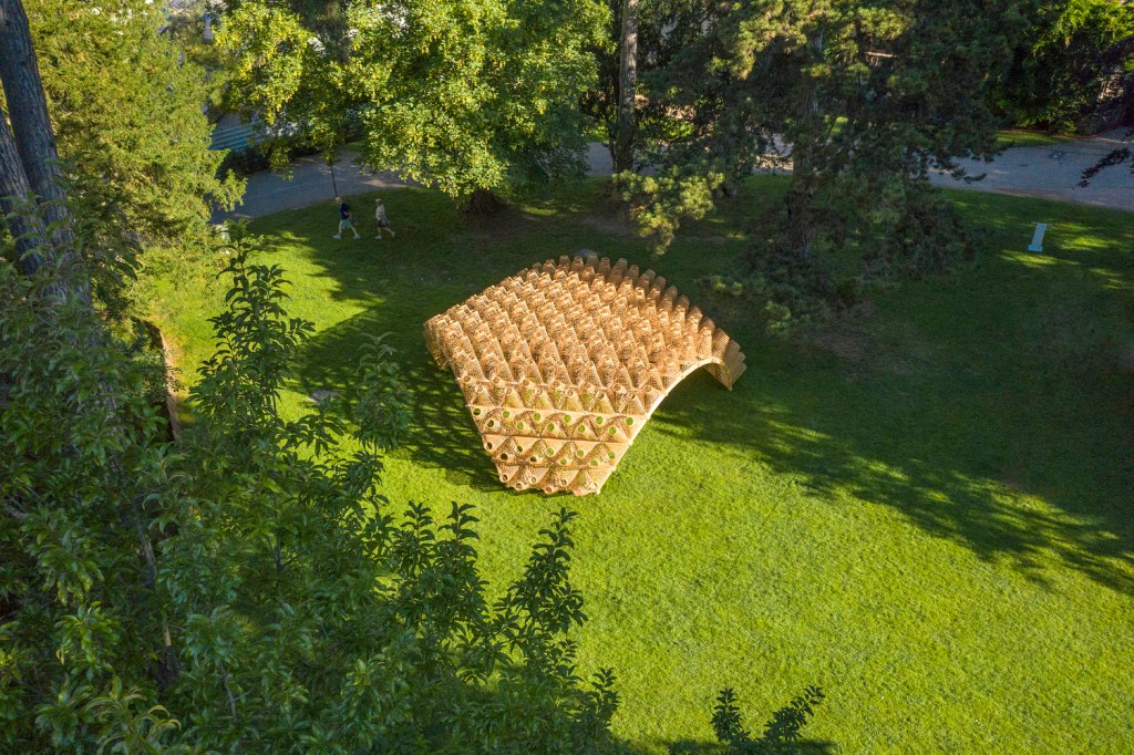
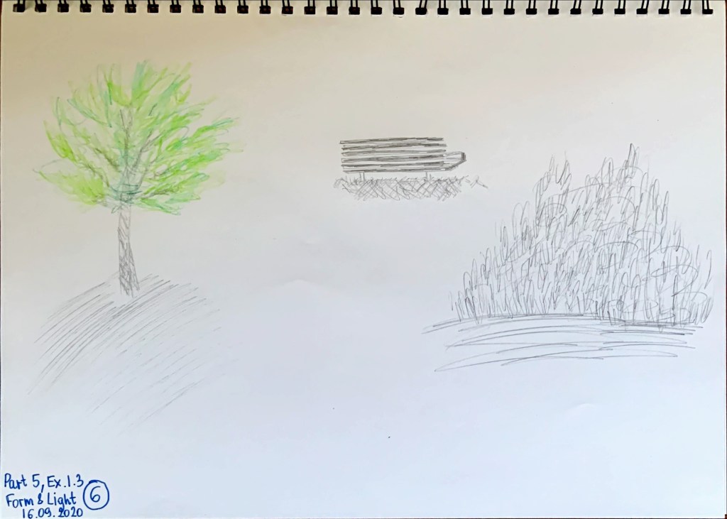
My tutor especially liked my cardboard pavilion model with scale people. She mentioned that making a quick model helps understand the design better, especially if I am stuck on drawing phase. Model gives 3D dimensions, and I can physically see how things go together and look from different aspects. Making my final model certainly helped me to understand what I want and what I do not want in my design and really aided my understanding of side elevation of my pavilion.             

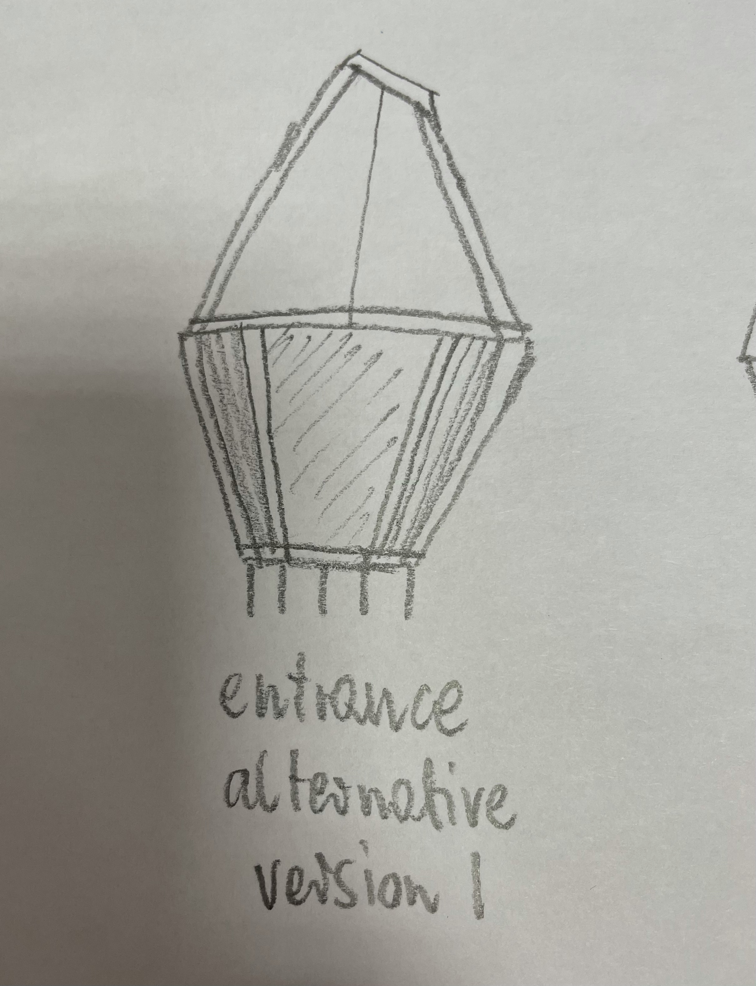
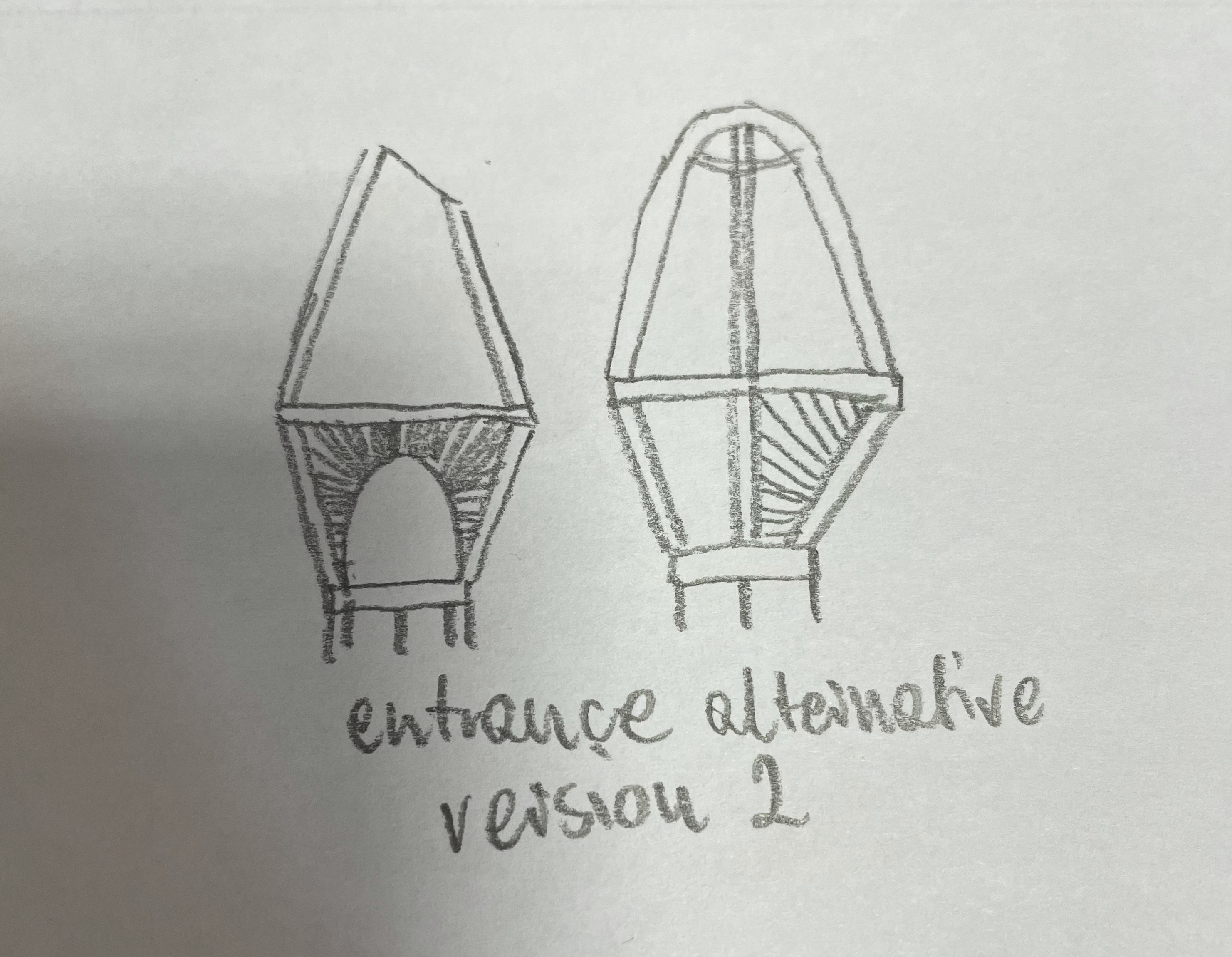
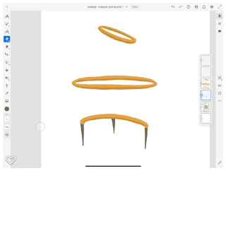
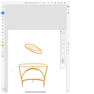
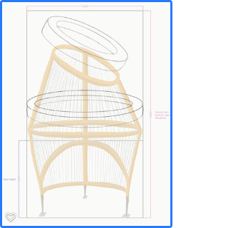
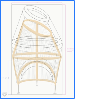
 My software skills are improving (Adobe fresco and photoshop) and continued experimenting with them is encouraged. My tutor particularly liked my pavilion drawing that I did for materiality exercise. Sadly, I lost some of the designs elegance when I was making dimensions decisions as I was worried about sturdiness of the structure. It seems that as I am improving with creative software my creativity improves as well. Additional drawing exercises (such as life drawing) will help me to ‘see’ as drawing is about the ability to observe. My tutor noted that adobe fresco seems to be working for me. I think it is because of ease of selecting colours exactly as intended and erasing errors does not leave ugly marks as it would on the sheet of paper. Also drawing over images (such as a picture of my model for amended visual) helps me get drawings more correct. Therefore, the outcomes seem more elegant. I continue discovering new features in the program as I go along. I really enjoy digital drawing, more than by hand.

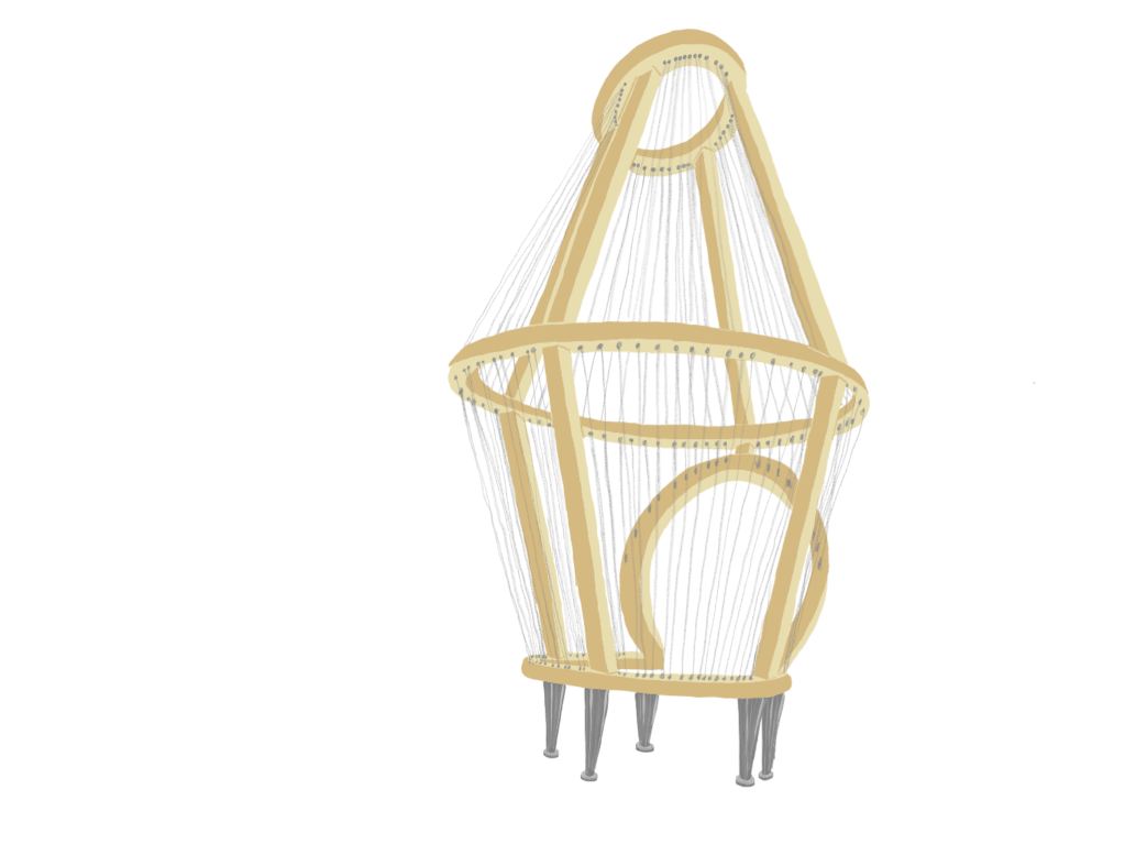
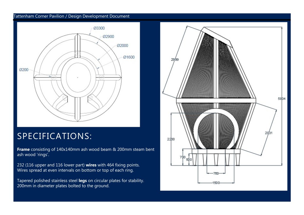
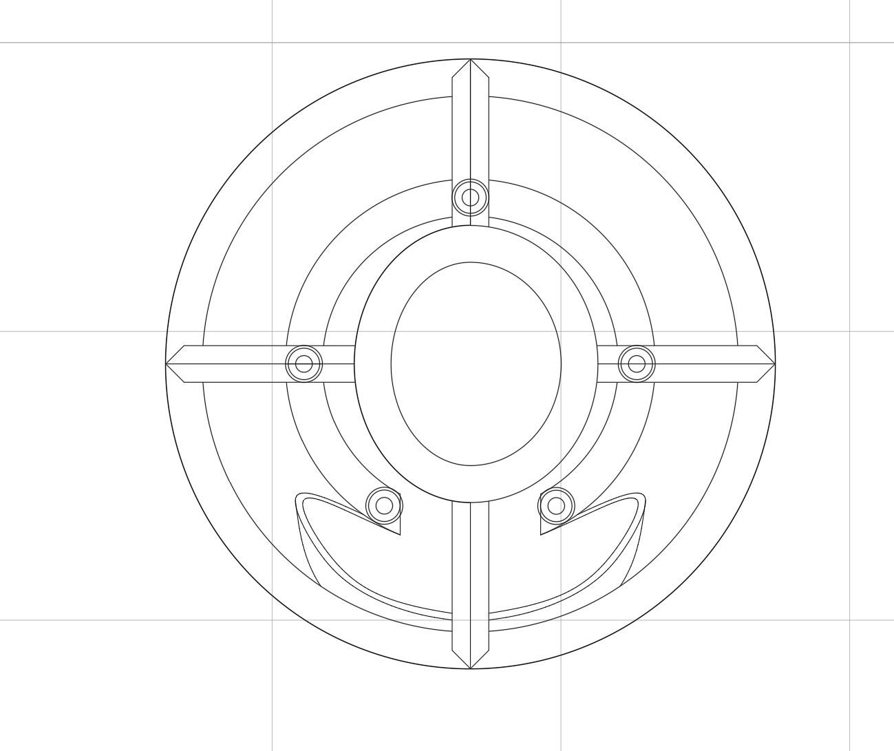
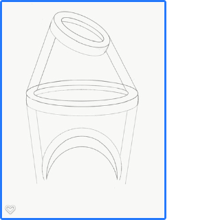
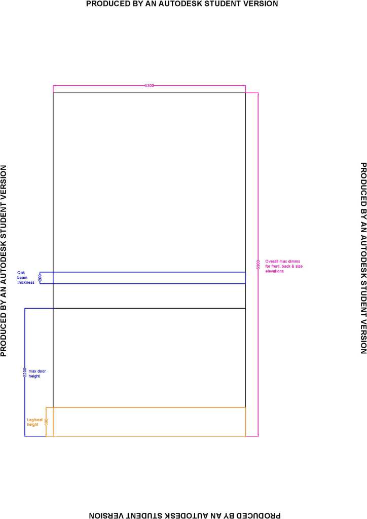
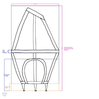
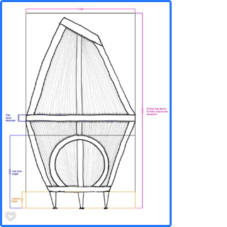
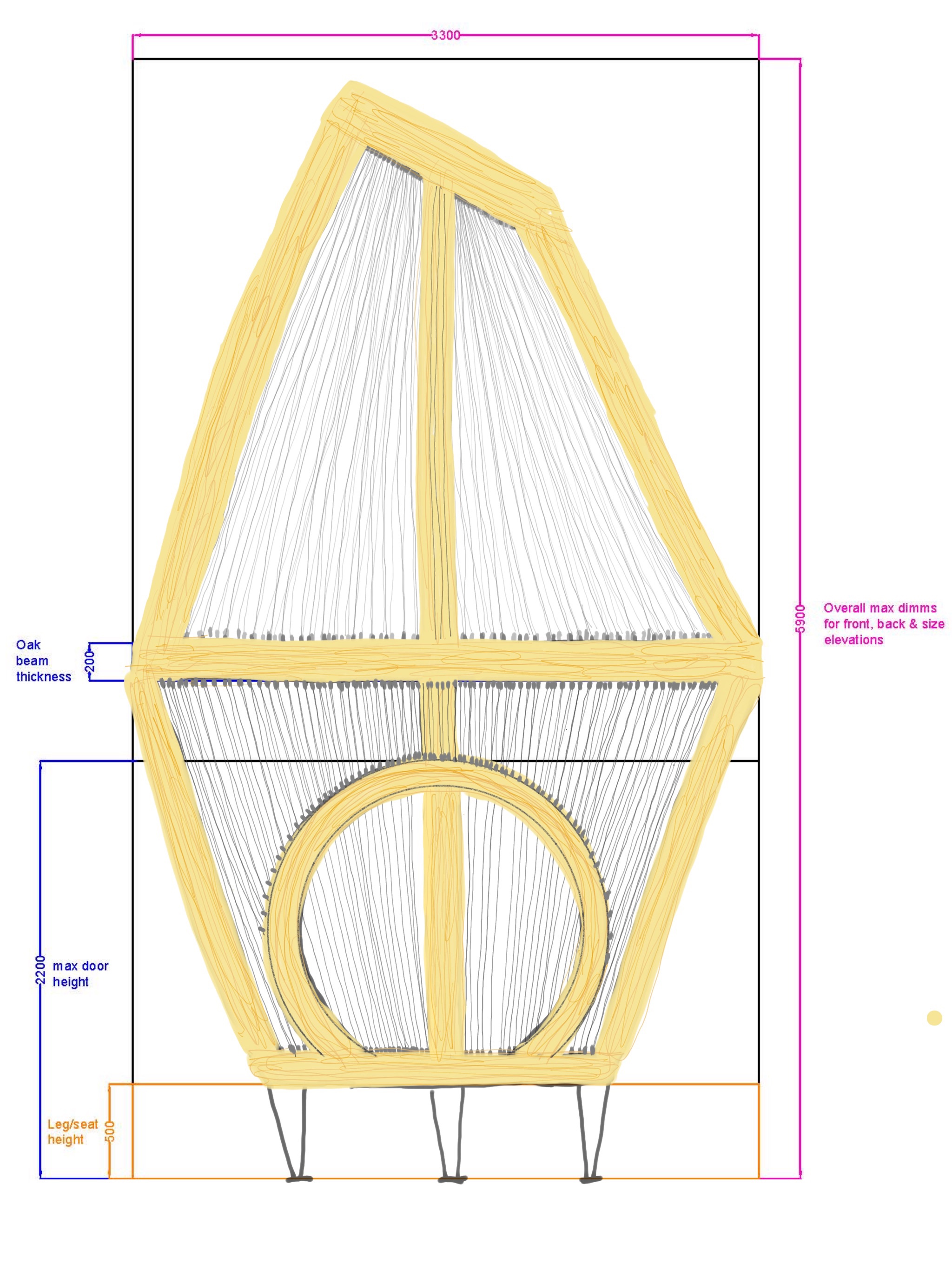
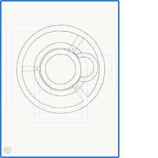
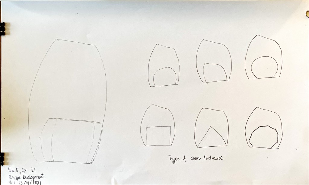
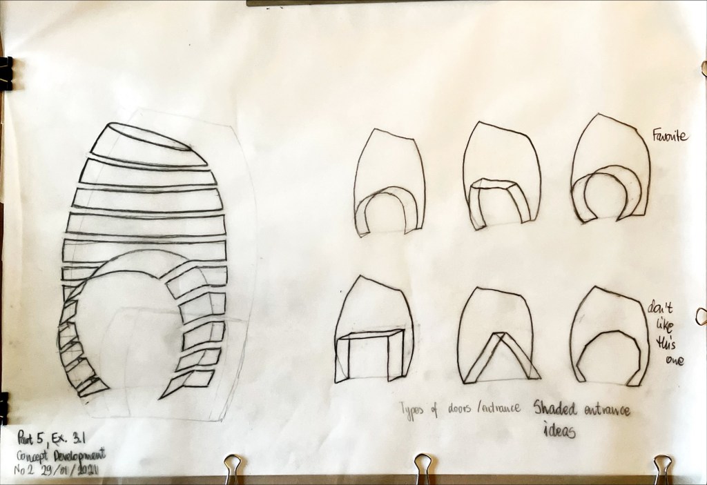
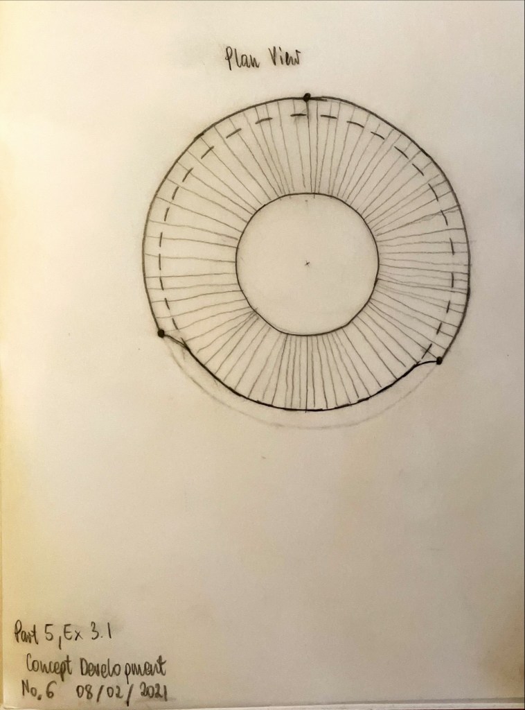
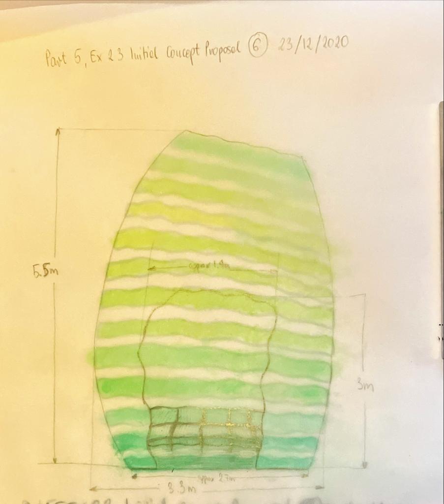
I received some pointers for the future. When designing the public space, I should include all users (e.g., incorporate wheelchair turning point, make sure my entrance is wide enough and seating at correct height). Now I know minimum wheelchair turning circle has diameter of 1500mm. Internal diameter of the bottom ring is 1600mm in my design, and it is a little tight, especially if we consider another user (or a bench) that may be inside. My tutor made a comment about my seating being too high, but that was intentional, like ‘lean on’ benches we see at bus stops. I did not feel there was enough space in the interior to have a bench, also people seating down take even more space than standing/ leaning. It all must be reconsidered as I am not sure if aging population will be comfortable leaning back on something that is not next to a secure wall. The point of this bench was so people could lean on it and gaze upwards while inside my pavilion.

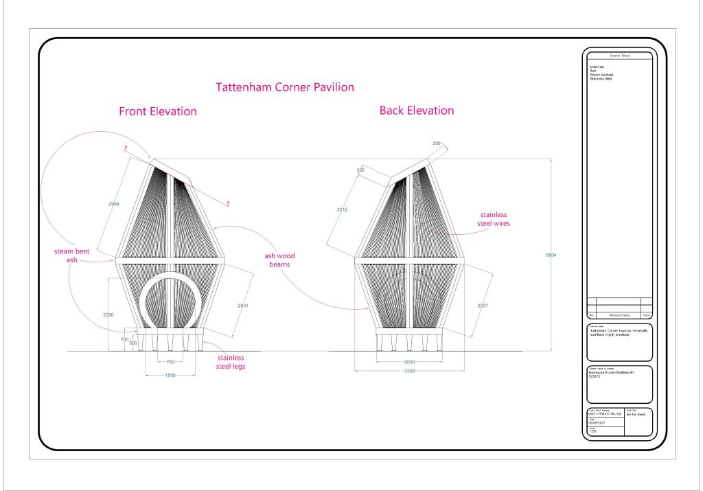
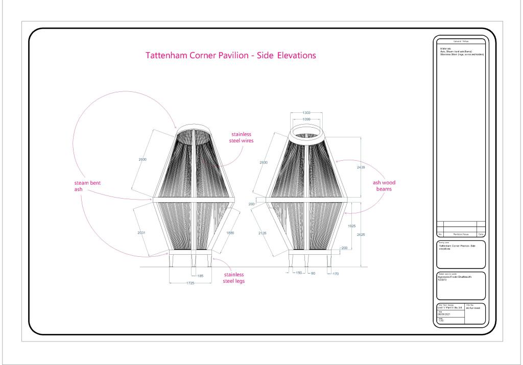
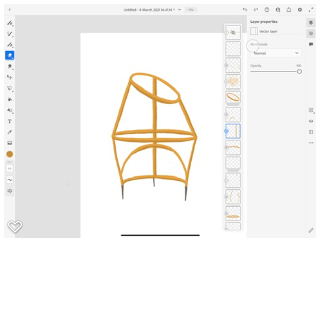
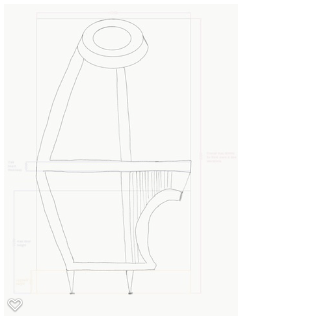
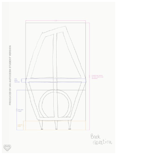
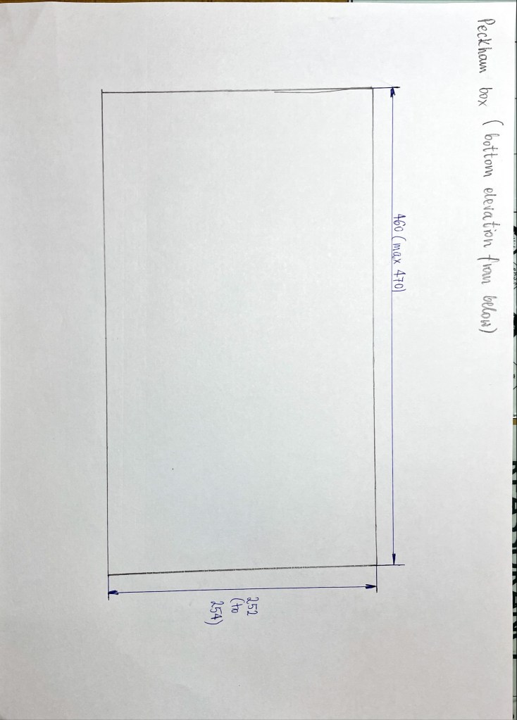
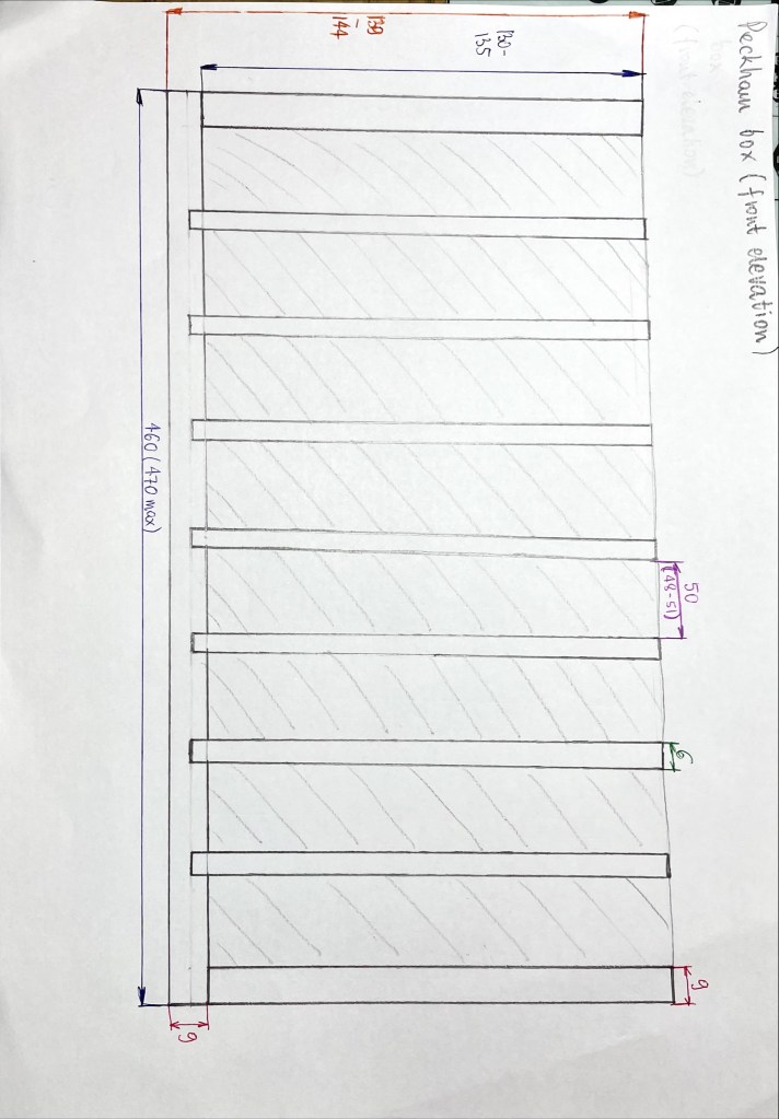
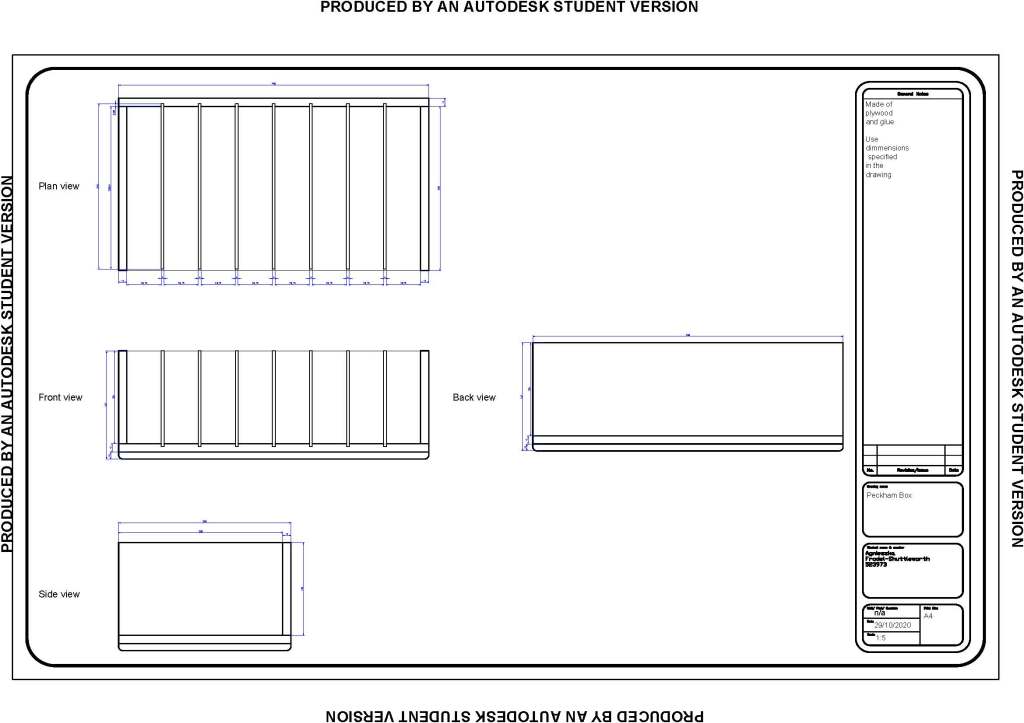
My technical drawings start to look and feel as professional drawings.

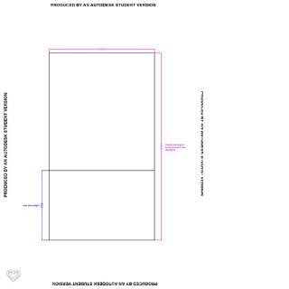
I was reminded to add ground line to elevations (so they are not floating in space). My tutor also advised me to annotate the technical drawings. There is plenty of space around and people rarely look at the title block, so I included some additional information and added them to my section drawings.

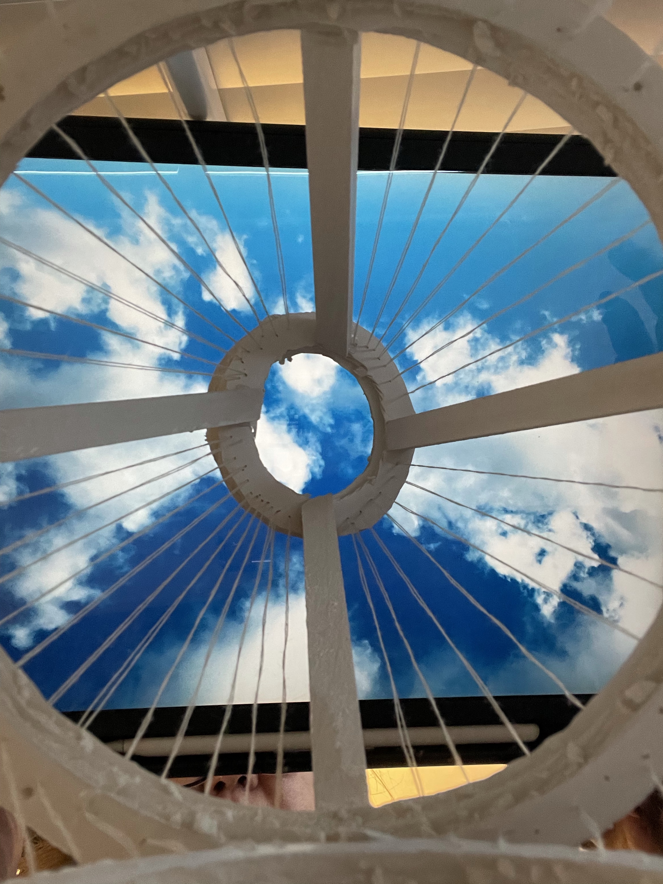
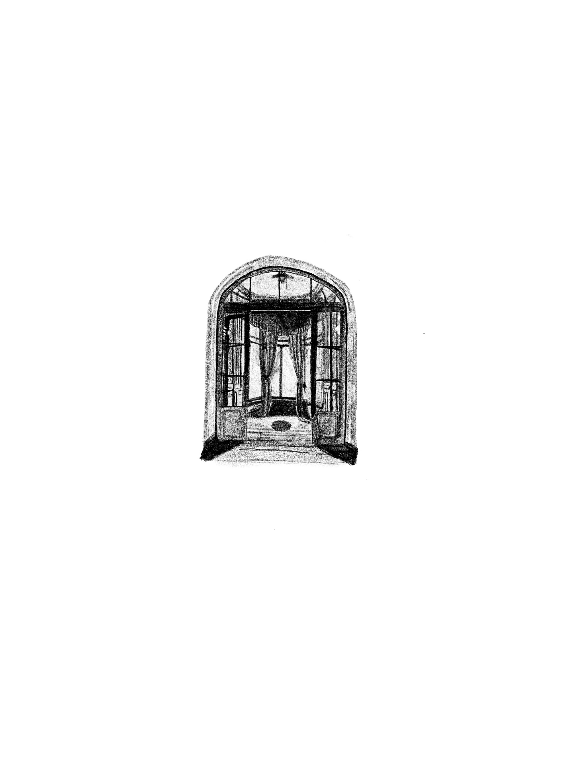
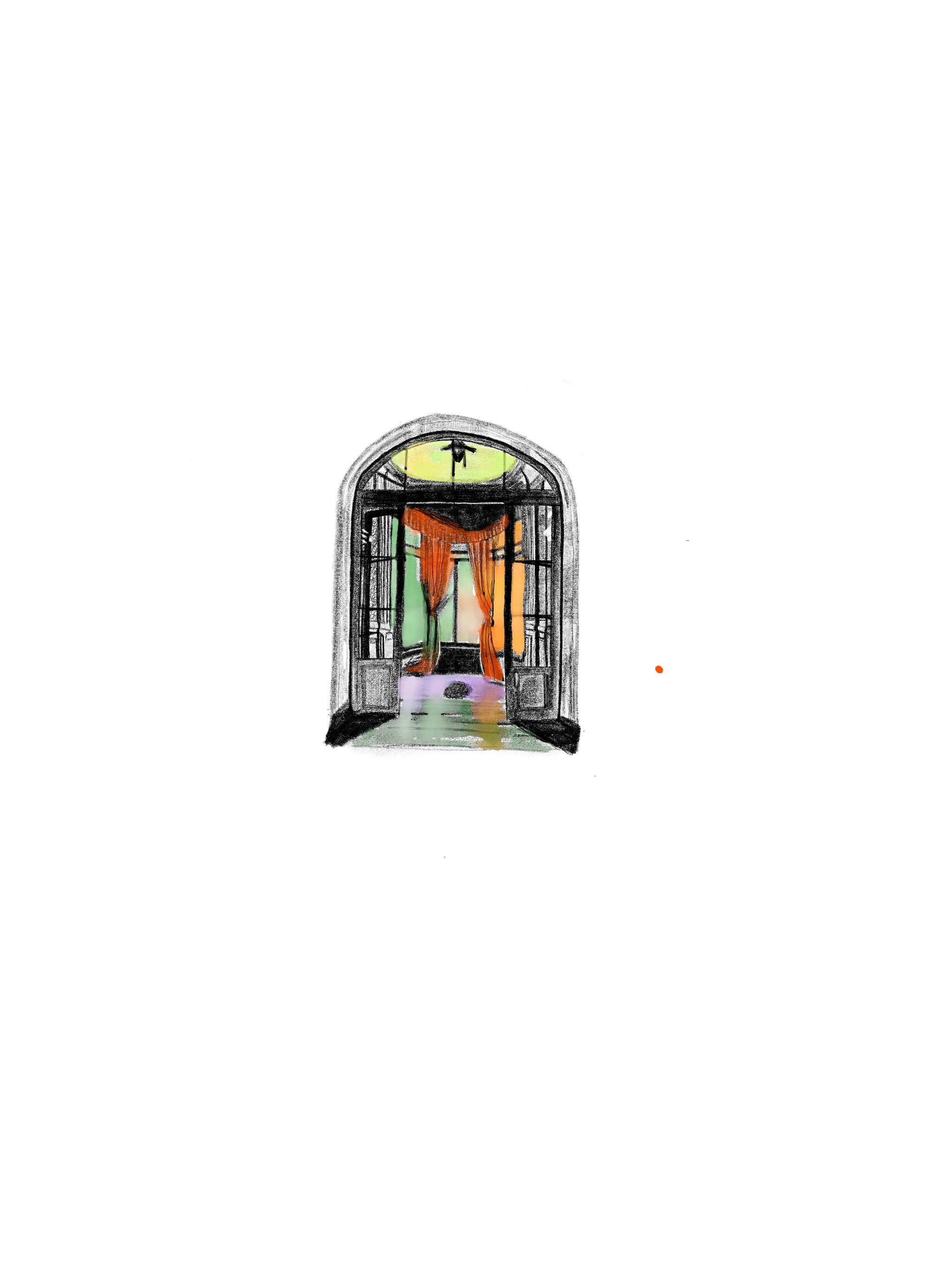
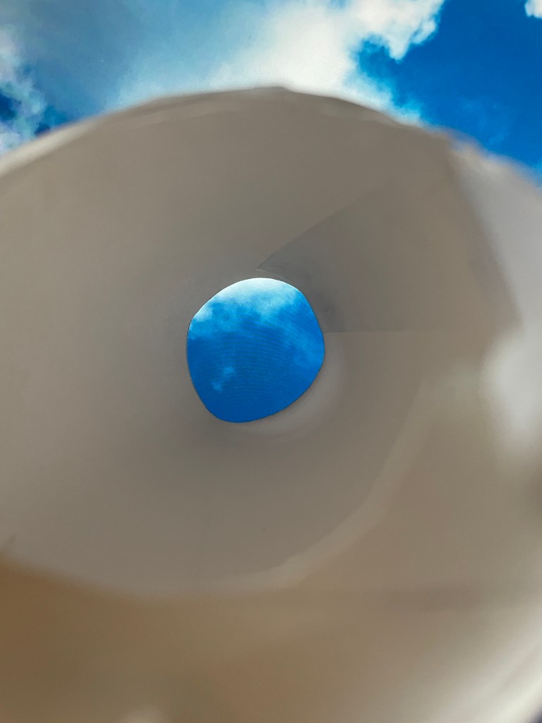
My tutor suggested to try and take photos of the interior of my model, to show users interior view. It was a little awkward to get the camera in but not impossible. What a great piece of advice!  

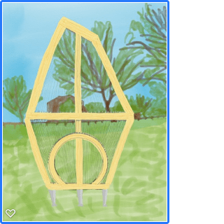
My tutor said that she enjoyed my final visual, but my site photo choice was not the best as the red bin was stealing the attention. I redrew my pavilion from different perspective (using adobe fresco over a photo of my model) making the beams more slender and placed it on a different photo from my previous site research. I absolutely agree with my tutor, this visual is better at ‘selling’ the design.

My tutor said my level of reflection is ‘really good as it shows my critical and measured approach’. It is great that I was already suggesting alternative designs when I was not too happy with all aspects of my design. I had also been told to not be too hard on myself, as I am just starting my learning journey.

My tutor mentioned I correctly reflected on jumping back and forth between tasks in design process, she said I will experience it again in next part of the course. I am excited to be starting next unit soon.

Assignment 5 Part 5 Reflection

Part 5, finally finished. It was the toughest so far. Because it was hard, I learnt a lot. For example, doing each part of the design once is not enough. I should have allowed more time and repeat some parts of the process. At each step you discover that you need to redo something at previous step. I feel my design is unfinished. If I were to have my pavilion built, I would have to go back and refine the details (such as wire placements and perhaps review wire attachments and the shape of the entrance). I also could have drawn the rings as bent slices of wood. I realise that the rings could not be infinite circles, yet I did not include the arch connecting detail in any of my drawings. There are other mistakes I noticed that I mentioned in my blog. Yet it took so long to draw all these details. Nevertheless, I am pleased with the outcome. I am very new to this, and my design skills fell victim of my imagination. I think it is brilliant I came out with a difficult shape; I just need to improve my drawing skills so next time there will be no shortfalls. On top of that I need to improve my time management skills and plan better in future.

Exercise 3.4 Design Communication – Development Document

Reflection on task:

It is first time I had to do a design development document. I believe this is something I could show my client, so they understand the design.

I am not sure if this is correct format or information, but I hope so.

The process of selecting most important pieces was enjoyable.

List of illustrations:

(All images used previously used in my learning log unless specified below)

Fig. 1 Hearne Hardwoods Inc. (2021) Ash. [Photograph] At: https://www.hearnehardwoods.com/wp-content/uploads/2019/01/ash_wood_title_2.jpg (Accessed 11/05/2021)

Reflection on technical drawing task for exercise 3.4, part 5, unit 1

I really like how wires on technical drawing on screen convey ‘moire’ effect I had in mind. It would look even better in shiny stainless steel in real life.

One of the most difficult and satisfying tasks in this exercise was drawing the top rings in side elevation. It took some time to work out what it should look like.

The entrance in plan view was also really tricky. Initially it looked like this:

I realised that I never included the material of legs – it’s stainless steel.

I’m afraid I encountered a ‘design fail’ in my technical drawing. Side elevation wires have a gap that is not attractive. To fix that I would need to change the design of the entrance and/ or positioning of the wires. Unfortunately time restraints did not allow it. I feel I should have discovered it at previous exercise (design development). Someone once said that design development can go forever and I think I have a perfect example here. If I had a time restraint like this in ‘real’ design life, I would probably submit what I have to the client and propose the following versions around the entrance.

I particularly like version 2. The entrance is circular in the top and goes straight down the sides (rather than narrowing like in original design). I think wires in ray like position would give even better moire effect as well.

Another solution would be to do what I did in model building. I attached the wires to the back of the entrance and therefore they went ‘lower’ on the frame.

During the process of technical drawing I decided that some of the wires attachments around the entrance would be different to the rest of them. I opted for a different mount, a vertical type, that would have to be installed at the same angle that the wire meets the frame.

It’s all very complicated and I feel that more research and development work is needed.

I also realise I didn’t do all wires as I should have. I.e. I didn’t use guidelines to place them on relevant spots on the frame. Instead I just spread them evenly in elevation views even though it would not look like that. They would be closer together towards the edges of the view and further apart in the centre of the view. It took such a long time to draw and position all the wires. I think I spent around 40 hours on technical drawing task. I was thinking lines, I was dreaming lines… I kept thinking of contextual study about lines from previous exercise. I was very grateful for the existence of guidelines, without them this task would have been impossible.

I feel I should have started with ‘rough’ technical drawing, followed up by scale model building and then refined technical drawing.

I think in design work you would normally jump back and forth between such tasks as you refine the design. Here I did them once and in specific order.

Exercise 3.4 Design Communication – Scale Model

I built my model in scale 1:20. I used model foam sheets, wood sticks, white thread, dowels sharpened with pencil sharpener. At first I was using removable glue dots to ensure right proportions and stability of the frame. Later on I used super glue to make it more rigid. I painted all wood elements with white spray paint.

I imported some of my iPad people drawings on to cad and scaled them to be approx 1650mm high, then I printed them in scale 1:20 and attached to pieces of cardboard.

The process of building this model was not easy. I chose such a complicated shape! I had to research model building materials, tried balsa wood (difficult to cut neat circles without specialist tools) and metal wire for wires (difficult to position without piercing the foam).

I’m happy with my model, despite it being a bit rough around the edges. I can think of two ways my model could have been neater:

1. Creating a 3d version of it in software and the printing it on a 3D printer. This option also wouldn’t inform me how each piece relates to other pieces.

2. Getting specialist model building electric tools and building the whole frame from wood.

Both of these options were outside of my already overstretched budget.

Exercise 3.3 Design Development


I believe I started this exercise when creating my drawing for materiality sheet.
I opened one of my previous hand drawings in Adobe Fresco app and started drawing on top of it. Here is the process: (Fig. 1 – fig. 6)


As in this exercise I am meant to look at function and whether the size is big enough I had to work out my initial design into maximum dimensions required. So I looked at my brief again and worked out I would like the biggest circle diameter to be 3300mm which fits within 9m2. Then I worked out my head room in the doorway to be 2200mm in the tallest point. It is quite tall for the door but I need to have in mind that it will be lower to the sides.

I set maximum height at 5900mm giving me 100mm space just in case I later decide to create base for the pavilion.

I drew these dimensions in cad, including 200mm beam thickness for reference. I then saved it as a .jpg and imported to a drawing app on my iPad.

I drew and experimented with the front elevation view of my pavilion.
I even created one with background (by drawing over a photo of relevant view) and one with shadow (even though usual elevation drawings would not include it).
(Fig. 7 – fig. 26)


Then it was time to move to side elevation. (Fig. 27 – fig. 30)

It was really tricky as the top ‘ring’ is at an angle (I’ll let cad tell me later what angle this is) therefore it cannot be just flat rectangle in side view. The entrance was also really tricky. As I’m typing it up I can see that side view with entrance facing left contains quite a few errors. Such as the beam not reaching to ring in correct place and top ring positioning and angle in general.

That is something I’ll correct when completing technical drawing for my design.

I think I best work out details of that when drawing technical in cad later on.

Then I moved to drawing back elevation. It was simple to do by drawing over front elevation with only major difference being the angle of top circle and front/back reversed (Fig. 31 – fig. 32)

After that I needed to workout my rings diameters. I already knew that the largest, middle ring will have external diameter of 3300mm and internal 2900mm.
I needed to work out other diameters.

I used the image of front elevation drawing with visible cad guidelines. I cropped it as close to external rectangle of guidelines and then inserted the image into cad. I then resized the image to fit into a 3300 x 5900mm box. From this point I was able to roughly (but still fairly accurately) work out my other rings diameters by drawing and measuring lines on them.

After that I was able to place the rings on my floor plan drawing.
I centred them in the same spot (for even weight distribution and stability of my structure).
I’m not sure if I should have pictured top ring (smallest one) as a slight oval because it’s angled. I find it really confusing.
I can use the similar way later in CAD (or even by hand) to work out the angles in my pavilion.
At this point I’m starting to think that it may be easier to build a model in cad (or perhaps real life model will help me enough) (Fig. 33)

Fig. 33


Drawing the entrance in plan view has been quite tricky, a semi ring at an angle! I think oval represents it better (Fig. 34 – 35)

Fig. 34 – 35

The lowest ring (middle one on the plan) will be at knee level and will be the most space restricting feature. I worked out its internal diameter at approximately 1600mm. It took me a some time to work out if it is enough to move around. In the end I measured my outstretched arms span and it is almost the same. So I was able to imagine that it would be enough space at knee level for two people. The place will feel roomier than that as the diameter widens until it reaches 2900mm internally at the largest ring level which is way above average eye line. I am not sure if I should include any seating. Perhaps a small two person bench opposite the entrance (if any).

Exercise 3.2 Materiality – further information and changes

I have been doing a lot of thinking about how my pavilion will be put together. I called Honeysuckle Bottom Sawmill and they said you cannot bend thick pieces of wood and that they don’t provide curved braces (despite their website saying otherwise).

After this news I was thinking of other ways of creating wooden circles for my structure. I found a local furniture restoration company and I spoke to the owner who has wealth of experience in steam bending wood.

He advised me that it is not possible to bend thick pieces of timber. For my thickness of 200mm x 200mm he would slice them lengthways into 1mm slices and then steam bend and then laminate them together. I asked about drilling and attaching things to the laminated side (top being plane of wood, side where you see slices). I found out it should not be a problem.

He also said that oak is not the best choice for bending and that ash is much more suitable for this purpose. I decided to change my wood choice to ash following his advice.

I am a little worried about the context. I selected oak for reasons specified in my Materiality sheet and gave all the reasons why… Ash is a local tree, I have one (according to a tree surgeon) at the bottom of my garden…

References:

Handsome & Co: School of Fine Woodworking & Design (2021) Timber bending services. At:  Handsome & Co. | Timber bending services. (handsomeandco.com) (Accessed 12/04/2021)

Biggs, T (2021) Steam Bending Wood. At: Tobias Biggs Furniture Restoration – Home (Accessed 12/04/2021).

Peckham Jewellery Pad Box Design / Leading to title box in AutoCAD

In late 2020 I needed to make a drawing for our carpenter to build these boxes at work. Normally I would just give him one but we need them daily and they started to fall apart. So I decided to practice my new skills and draw what he needs to do.

This along with photos of the old box were explanatory enough for him to build them to my specification.

The images above are of final version. After I gave the contractor the initial drawing, I was asked what is the error margin. I did it with comments on maximum an minimum dimensions that were important for the design to work (I needed to measure the space in storage for these boxes and the jewellery pads to ascertain this). In the mean time I created CAD drawing based on one of the former measurements (just for fun and practice of it).

Today I was trying to work out how to create and insert title box, I decided to work on my old Peckham Box drawing. Here it is, a CAD drawing with title box.

Peckham box CAD drawing with title box

Here is what the old box looks like:

I am still awaiting new boxes for Peckham, in the meantime had some built for another shop. I was pleased my drawings were sufficient to make something.

Exercise 3.2 Materiality

Notes etc.

Exercise 3.2 Materiality

Oak – durable and beautiful wood. It refers to local area. There are English oaks growing in local woods. According to Woodland Trust English Oak is ‘the 2nd most common tree variety in the UK and a national symbol of strength.’ I would like to use this traditional material as a nod to the local aging community, who will hopefully appreciate its nobility. The wood can be used for outside projects, and it will be very durable if it is properly treated. I would like to treat the oak frame with a clear, UV protecting oil that will show of the natural colour and pattern of the wood. I presume I will have to choose fresh sawn oak (also called ‘green). It will need to be weathered for 6 weeks before applying oil. I would like my structure to be sustainable and durable so the treatment will need to be repeated periodically.

I found a local supplier called Honeysuckle Bottom Sawmill (http://www.surrey-oak.com/) who supply the wood and bespoke curved braces to curve the timber to project specifications. Their products are sustainably and locally sourced. They even supplied wood to film sets.

Fig. 1 Shaped or curved beams

Stainless steel – an alloy composing of chromium and other metals. Chromium reacts with oxygen creating a protective film. Stainless steel is strong, low maintenance, corrosion resistant, sustainable, recyclable (does not deteriorate through recycling), aesthetic and functional. I chose it for its appearance and suitability for an outdoor project.

The wires are simply surface mounts and balustrade wires. They are made to measure and supplied by S3i Group (located in the UK). The ball and socket design allows up to 42 degrees angle.

Fig. 2 Surface Mount Balustrade Wire
Fig. 3 Balustrade wire passing through an intermediate post.

The components I used – wood and metal wire are a high-end nod to farm fencing. It has a loose connection with horses on Epsom Downs and the fact the local area used to be a farmland not so long ago. The warmth of natural oak should provide comfort for users and the wires add interest without spoiling the view.

List of illustrations:

Fig. 1 Honeysuckle Bottom Oak (2021) Shaped or Curved Beams. [Photograph] At: http://www.surrey-oak.com/wp-content/uploads/2017/12/curved-oak-beam2-400×400.jpg (Accessed 23/03/2021)

Fig. 2 S3i Group (2021) Surface Mount Balustrade Wire. [Photograph] At: https://www.s3i.co.uk/image/s3i/B&Sassembly-with-text-and-diagram.jpg (Accesses 28/03/2021)

Fig. 3 S3i Group (2021) Balustrade wire passing through an intermediate post. [Photograph] At: https://www.s3i.co.uk/image/s3i/runningthrough2.jpg (Accessed 28/03/2021)

References:

Honeysuckle Bottom Oak (2021) Welcome to Honeysuckle Bottom Oak. At: Oak Sawmill in Surrey » www.surrey-oak.com (surrey-oak.com) (Accessed 23/03/2021)

S3i Group (2021) Self Assembly Wire Balustrade Kits, Tube Mount. At: Balustrade Wire Kits | Tubular Mount | S3i Group (Accessed 28/03/2021)

S3i Group (2021) Stainless Steel Surface Mount Balustrade Wire. At: Surface Mount Balustrade Wire, Made To Measure | S3i Group (Accessed 28/03/2021)

Tyssenkrup (2021) Properties of stainless steel. At: Properties of Stainless Steel & Applications – thyssenkrupp Materials (UK) (thyssenkrupp-materials.co.uk) (Accessed 28/03/2021)

Wood Finishes Direct (2021) Osmo UV Protection Oil Extra At: Osmo UV Protection Oil Extra | Exterior Wood Protection (wood-finishes-direct.com)

Woodland Trust (2021) Oak, English. At: English Oak (Quercus robur) – British Trees – Woodland Trust (Accessed 23/03/2021)

Additional drawing exercises

My tutor suggested to practice drawing people. I felt particularly inspired after recent oca life drawing session. I also wanted to experiment more with new drawing ‘gear’ I got recently.

I downloaded an image of female body proportions, made it less opaque and drew over it in another layer. I believe if I keep drawing this way I will get the hang of the proportions. Hands and feet are still very tricky, but the guides helped a lot. Third figure, at a slight angle seems to be the most useful for interior design visualisations. I realise this body type may not be most representative, or inclusive, but I’ll get to those later, when I understand proportions better.

I also watched ‘Life drawing live’ on bbc catch up and attempted the last pose (19 mins). Below is my brave attempt.

Exercise 3.1: Concept Development

I completed my drawings using automatic 0.9 pencil, HB. I just love how the pencil glides on paper.

I looked at my drawings from previous exercise and decided to go in that direction. First, I played with the shape of the entrance (Fig. 1).

Fig. 1

Then using tracing paper I redrew them with shaded entrance option, I liked rounded option most and the bigger drawing was my last drawing on this page. (Fig. 2)

Fig. 2

I quite like the rounded, shaded entrance but after drawing it in side elevation I did not like it as much (Fig. 3).

Fig. 3

Using tracing paper, I drew the shape again, but this time with more simple entrance (fig. 4). I felt like the shape of my pavilion is somehow inspired by ‘Gherkin’ building in London.

Fig. 4

As much as I was happy with proportions and aesthetics of my design I kept worrying that for it to be translucent and light it would have to be made either of glass (heavy and expensive) or pvc (unsustainable and also pricey). Also, I was afraid that on a warm day it would turn into a ‘glass house’ despite many gaps and opening in the roof.

It took me a while to come up with the next design (Fig. 5 & 6). Funnily enough it was Peckham Library pods that inspired me. The three legs and rounded shape are ‘borrowed’ from there. I have not decided what material it will be yet. There are some options that I will explore further in next exercise. Using string as in Oasis Pavilion may be an option, I found that interior very peaceful.

Fig. 5
Fig. 6

I loved using tracing paper in this exercise. It made it quite easy to repeat the proportions that I wanted to keep.

Lastly, I decided to photograph my model with some scale figures (Fig. 12). As ‘tried them on’ I realised the supporting columns are too high, so I shortened them. Now sadly the entrance is a little lower than I would have liked, but this is just my first model and I think it shows my idea well.

Fig. 12

To me this whole task was the most difficult so far. It is hard to think of the design but only concentrate on one aspect of it. I keep thinking about the materials, the brief does not specify whether it will be a permanent or temporary structure… We also have no budget (which may be a good thing at this stage). It was interesting to see how I came from my first drawing in Exercise 2.3 (https://aggie.video.blog/wp-content/uploads/2021/01/fig.-1.jpeg) to this model.

Exercise 2.3 Initial Concept Proposals

Fig. 1 Fluidity of the shape.

I looked at my work so far and felt particularly inspired by my soundscapes mapped drawing (https://aggie.video.blog/wp-content/uploads/2020/09/fig.-4a-soundscapes-mapped.jpeg?w=1024). I struggled to draw what I had in mind, so I decided to make a model. I especially like shade cast by this model.

Then I thought what it would be like inside. So I placed my model over a tablet with a photo of the sky. That would be the view inside – upwards.

I realised that shape was not practical for my pavilion. The gaps on the sides would take too much of the maximum 9m2 footprint, so usable interior space would be too small. I do not consider creating this model a waste of time as it inspired me further and I started ‘doodling’ some ideas.

The idea is a rounded structure on an oval shaped plan. The structure narrows as it goes up, with a large circular opening in the roof and gaps between sheer components of the walls. The oval shape refers to the Tattenham corner sharp bend in the racecourse, the large opening in the roof is inspired by James Turrell’s work but also by precedent examples I studied (especially Serpentine Summer House and Oasis Pavilion). The sheer of the walls is inspired by Oasis Pavilion and the overall shape by cones on the Wicker Pavilion. I think the Wicker and Oasis Pavilions were the most peaceful from my precedent examples. I believe drawing inspiration from these will aid the function of my pavilion which is supposed to be a resting place for aging community. I decided to go for shades of green which is a naturally calm colour and further refers to the green surroundings of my pavilion and grass covered Epsom Downs racecourse nearby. The shape of my pavilion has been is also inspired by my drawing of the bush in form & light drawing. (https://aggie.video.blog/wp-content/uploads/2020/09/fig.-6-form-light.jpg?w=1024)

The last drawing in Fig. 13 specifies approximate dimensions, entrance and seating.

List of  illustrations

Fig. 1 Shuttleworth, A. (2020) Fluidity of shape. [Abstract drawing] In possession of: the author: Epsom

Fig. 2 Shuttleworth, A. (2020) Soundscapes model 1. [Photograph] In possession of: the author: Epsom

Fig. 3 Shuttleworth, A. (2020) Soundscapes model 2. [Photograph] In possession of: the author: Epsom

Fig. 4 Shuttleworth, A. (2020) Soundscapes model 3. [Photograph] In possession of: the author: Epsom

Fig. 5 Shuttleworth, A. (2020) View Upwards [Photograph] In possession of: the author: Epsom

Fig. 6 Shuttleworth, A. (2020) Doodle 1 [Drawing] In possession of: the author: Epsom

Fig. 7 Shuttleworth, A. (2020) Doodle 2 [Drawing] In possession of: the author: Epsom

Fig. 8 Shuttleworth, A. (2020) Idea Development 1 [Drawing] In possession of: the author: Epsom

Fig. 9 Shuttleworth, A. (2020) Idea Development 2 [Drawing] In possession of: the author: Epsom

Fig. 10 Shuttleworth, A. (2020) Idea Development 3 [Drawing] In possession of: the author: Epsom

Fig. 11 Shuttleworth, A. (2020) Idea Development 4 [Drawing] In possession of: the author: Epsom

Fig. 12 Shuttleworth, A. (2020) Idea Development 5 [Drawing] In possession of: the author: Epsom

Fig. 13 Shuttleworth, A. (2020) Idea Development 6 [Drawing] In possession of: the author: Epsom

Exercise 2.2: Precedent Studies, Example 4: Serpentine Summer House by Barkow Leibinger.

Serpentine Galleries Architecture Programme was expanded by additional four summer houses in 2016. Serpentine Summer House was one of them. It was located in London’s Kensington Gardens and was designed by Berlin studio; Barkow Leibinger.

Fig.1 Serpentine Summer House 1

In above image we can see the striking shape of structure in place of the roof. It has very fluid shape and openings on top allow plenty of gentle light in. The whole structure consists of curves, even the benches have unusual shapes. I think that sort of filtered light could aid relaxation in my pavilion.

Fig. 2 Serpentine Summer House Vision.

In the above image we can see the fantastic shapes implemented in the roof structure. The user looking up will be able to see the sky without being blinded by direct sunlight. I really like that idea. I also like the semi-openness of the structure. I think I could be able to think of something similar in my much smaller pavilion. The material used is plywood, I think that may not be my first choice of material as it would not be very durable in an outdoor setting. I think using limited materials and colours aids the relaxing atmosphere of the interior.

List Of Illustrations:

Fig. 1 Baan, I (2016) Serpentine Summer House 1. [Photograph] At: portada_barkow_leibinger_-_photo_c_iwan_baan_3.jpg (1496×1000) (adsttc.com) (Accessed 25/11/2020)

Fig. 2 Barkow Leibinger (2016) Serpentine Summer House Vision [Visualisation]. At: barkow-leibinger-serpentine-gallery-summer-houses-2016_dezeen_1568_4.jpg (1568×1120) (Accessed 25/11/2020)

References:

Archdaily (2016) Serpentine Summer House / Barkow Leibinger. At:  https://www.archdaily.com/790032/serpentine-summer-house-barkow-leibinger (Accessed 25/11/2020)

Frearson, A. (2016) Serpentine Summer Houses include looping wooden pavilion and inverted replica building.  At: https://www.dezeen.com/2016/02/24/serpentine-gallery-pavilion-summer-houses-2016-kunle-adeyemi-barkow-leibinger-yona-friedman-asif-khan/

Exercise 2.2: Precedent Studies, Example 3: Wicker Pavilion by DJA

The Wicker Pavilion has been built as a part of Annecy Paysages landscape architecture festival in 2020. The structure is in Gardens of Europe, Annecy, France. It was designed by a Latvian firm – DJA (Didzis Jaunzems Architecture). The wicker baskets have been handwoven by Latvian craftsmen. The look of the pavilion will evolve with its age, becoming darker, grey in colour.

The overall form of the structure is rounded and organic. The structural elements and wicker baskets cast beautiful, geometrical patterns on the lawn below. The structure is semi open but the pattern on the ground sets boundaries of the zone – I like that. The simplicity of the materials and colour would aid the purpose of relaxation as well.

Fig. 1 Wicker Pavilion.

The pattern of interior makes it look busy, but in a beautiful way. I can certainly sense some movement there. We can also see how the arched opening is framing the beautiful view outside, I am sure the positioning of the pavilion has been carefully considered by the architects to get the best views. This is something I would like to achieve in my pavilion – a peaceful, relaxing space that is not only beautiful but also taking advantage of beautiful surroundings.

Fig. 2 Wicker Pavilion – View Through The Arch

The repetition of simple patterns (triangles on the frame, rectangles on the baskets and circular openings on top) aids the sense of movement in the interior. The round openings in the ceiling remind me of James Turrell’s work. The semi-transparent structure casts a soft shade, inviting the user in, on a hot day.

Fig. 3 Wicker Pavilion – Towards The Sky
Fig. 4 Wicker Pavilion – From Above

The shape and form of this pavilion reminds me of a giant hedgehog.

Fig. 5 Wicker Pavilion – Aerial View

List of Illustrations:

Fig. 1 Bozis, E. (2020) Wicker Pavilion. [Photograph] At: https://images.adsttc.com/media/images/5f1f/71f7/b357/653f/3b00/0322/slideshow/Wicker_Pavilion-07.jpg?1595896293 (Accessed 11/11/2020)

Fig. 2 Bozis, E. (2020) Wicker Pavilion – View Through The Arch. [Photograph] At: https://images.adsttc.com/media/images/5f1f/7222/b357/653d/3a00/04f2/slideshow/Wicker_Pavilion-09.jpg?1595896337 (Accessed 11/11/2020)

Fig. 3 Bozis, E. (2020) Wicker Pavilion – Towards The Sky. [Photograph] At: https://images.adsttc.com/media/images/5f1f/724c/b357/653d/3a00/04f4/slideshow/Wicker_Pavilion-11.jpg?1595896378 (Accessed 16/11/2020)

Fig. 4 Bozis, E. (2020) Wicker Pavilion – From Above. [Photograph] At: https://images.adsttc.com/media/images/5f1f/717b/b357/653d/3a00/04ee/slideshow/Wicker_Pavilion-03.jpg?1595896169 (Accessed 16/11/2020)

 Fig. 5 Bozis, E. (2020) Wicker Pavilion – Aerial View. {Photograph] At: https://images.adsttc.com/media/images/5f1f/7143/b357/653f/3b00/031d/slideshow/Wicker_Pavilion-02.jpg?1595896116 (Accessed 16/11/2020)

References:

Annecy Paysages (2020) ‘Wicker Pavilion.’ At: http://www.annecy-paysages.com/en/wicker-pavilion-2/ (Accessed 16/11/2020)

Ebert, G. (2020) ‘Sunlight Filters Through a Shell-Like Pavilion Covered with Wicker Baskets in Annecy, France.’ At: https://www.thisiscolossal.com/2020/08/wicker-pavilion-annecy-dja/ (Accessed 16/11/2020)

Katsikopoulou, M. (2020) ‘DJA introduces triangular wicker mesh pavilion in france, woven by latvian craftsmen.’ At: https://www.designboom.com/architecture/dja-triangular-wicker-mesh-pavilion-france-latvian-craftsmen-08-17-2020/ (Accessed 16/11/2020)

Pintos, P. (2020) ‘Wicker Pavilion / DJA.’ At: https://www.archdaily.com/944591/wicker-pavilion-dja?ad_source=search&ad_medium=search_result_all (Accessed 11/11/2020)

Exercise 2.2: Precedent Studies, Example 2: Jiunvfeng Study by gad·line+ studio

Location: China, Daiyue District, Tai’an City, adjacent to the Shenlong Grand Canyon, to the west of Mount Tai. Jiunvfeng Study is overlooking Mount Tai, which is (according to Unesco) ‘the most famous sacred mountain of China, with exceptional historic, cultural, aesthetic and scientific value.’

The pavilion has been completed in September 2019 and the construction process took only 6 months. The whole process and components have been designed to make it during the summer with suitable weather allowing the built.

Fig. 1 Location of Jiunvfeng Studio

The back wall is built from local stone, I would like to use local material in at least part of my project, to aid sustainability. The structure is built from light steel. I like how part of the structure incorporates the sheltered balcony that follows the shape of the roof. I think I could make my pavilion half indoor / half balcony under the roof – necessary with a glass banister like in Jiunvfeng Study – to allow undisturbed views. The interior is lit by led strips installed above white membrane, producing even, dispersed light. I like this solution but my pavilion (if I went with this lighting option) would need a softer, warmer light to provide more cosy, relaxing space at night.

Fig. 2 Jiunvfeng Studio At Night – Balcony

The interior of Jiunvfeng Study is peaceful, predominantly white with large windows allowing unobstructed views of the mountains. I like the idea of glass wall offering the views. I suspect that shape and colour of the roof would help keeping the interior cool on a hot day. This is something I am conscious when considering my pavilion, I would like to avoid a greenhouse effect in my interior.

Fig. 3 Jiunvfeng Studio – Interior

The pavilions shape is adapted to the terrain of the location. We can see it very clearly in Fig. 4 below. ‘My hill’ is different shape but I should have the surrounding terrain in mind when considering the shape of the building.

Fig. 4 Jiunvfeng Studio – The Curve

List of illustrations:

Fig.1 ZY Architectural Photography (2019) Location of Jiunvfeng Studio [Photograph] At: https://images.adsttc.com/media/images/5dee/63dd/3312/fd2a/6a00/0574/slideshow/5_%C2%A9%E7%AB%A0%E9%B1%BC%E8%A7%81%E7%AD%91.jpg?1575904206 (Accessed 31/10/2020)

Fig. 2 ZY Studio (2019) Jiunvfeng Studio At Night – Balcony [Photograph] At: https://static.dezeen.com/uploads/2020/05/jiunvfeng-study-on-mount-tai-gad-line-studio-architecture_dezeen_2364_col_10.jpg (Accessed 09/11/2020)

Fig. 3 ZY Studio (2019) Jiunvfeng Studio – Interior [Photograph] At: https://static.dezeen.com/uploads/2020/05/jiunvfeng-study-on-mount-tai-gad-line-studio-architecture_dezeen_2364_col_13.jpg (Accessed 09/11/2020)

Fig. 4 ZY Studio (2019) Jiunveng Studio – The Curve [Photograph] At: https://static.dezeen.com/uploads/2020/05/jiunvfeng-study-on-mount-tai-gad-line-studio-architecture_dezeen_2364_col_3.jpg (Accessed 09/11/2020)


References

Block, I (2020) Gad Line+ Studio perches white cloud-like pavilion to overlook sacred mountain in China. At: https://www.dezeen.com/2020/05/08/jiunvfeng-study-mount-tai-china-gad-line-studio/ (Accessed 09/11/2020)


Gad·Line+ Studio (2019) Jiunvfeng Study on Mount Tai / gad·line+ studio. At:   https://www.archdaily.com/929883/jiunvfeng-study-on-mount-tai-gad-star-line-plus-studio (Accessed 31/10/20 20)

Unesco World Heritage Centre (2020) Mount Taishan. At: https://whc.unesco.org/en/list/437/ (Accessed 31/10/2020)

Exercise 2.2: Precedent Studies – Oasis Pavilion

Example 1: The Oasis Pavilion by OBBA

The Oasis Pavilion has been designed by a South Korean studio OBBA (Office for Beyond Boundaries Architecture). The built has been completed in July 2015. This temporary structure’s function was to provide a relaxation space for visitors to APMAP (AmorePacific Museum of Art Project) 2015. The exhibition was located in Amore Pacific R&D Center (Research and Development).

I chose this precedent due to similar function – resting place. I especially like the string curtains, their translucency, their movement. The atmosphere inside the pavilion seems serene. I think similar wall design in my pavilion would help keeping it cool on a sunny day, I must think of curtain screening (but using different material than string as the strings would get knotted in the wind).

Fig. 1 Oasis Pavilion – Exterior

The pavilion is placed outside and it seems to be getting sun all day long. It is interesting to see translucent shade created by sun entering through the circular opening in the ceiling and hitting the curtain.

Fig. 2 Oasis Pavilion – Interior 1

It looks light and peaceful. It is interesting to see the seats placed at different heights, some seem to be to high for seating.

Fig. 3 Oasis Pavilion – Interior 2

The circular opening in the roof allows the light in. It also made the whole structure less heavy allowing to use thinner supporting columns and smaller amount of them. The opening frames the sky in a similar manner to some of James Turrell’s works.

Fig. 4 Oasis Pavilion – Plan

On the plan drawing we can see how the designer intended for the space to be used. The space directly under the opening was meant for relaxing on the ground and gazing at the sky.

List of illustrations:

Fig. 1 Roh, K. (2015) Oasis Pavilion – Exterior. [Photograph] At: https://static.dezeen.com/uploads/2015/11/The-Oasis_Pavilion_OBBA_AmorePacific_South-Korea_dezeen_936_10.jpg (Accessed 11/10/2020)

Fig. 2 Roh, K. (2015) Oasis Pavilion – Interior 1. [Photograph] At: https://static.dezeen.com/uploads/2015/11/The-Oasis_Pavilion_OBBA_AmorePacific_South-Korea_dezeen_936_4.jpg (Accessed 11/10/2020)

Fig. 3 Roh, K (2015) Oasis Pavilion – Interior 2. [Photograph] At: https://static.dezeen.com/uploads/2015/11/The-Oasis_Pavilion_OBBA_AmorePacific_South-Korea_dezeen_936_7.jpg (Accessed 11/10/2020)

Fig. 4 OBBA (2015) Oasis Pavilion – Plan [Drawing] At: http://static.dezeen.com/uploads/2015/11/The-Oasis_Pavilion_OBBA_AmorePacific_South-Korea_dezeen_2_1000.gif (Accessed 11/10/2020)

References:

ArchDaily (2015) The Oasis / OBBA. At: https://www.archdaily.com/775505/the-oasis-obba (Accessed 03/10/2020)

Gibson, E (2015) Translucent curtains surround “floating” Oasis pavilion by OBBA. At: https://www.dezeen.com/2015/11/09/obba-oasis-pavilion-translucent-curtains-apmap-exhibition-seoul-south-korea/ (Accessed 03/10/2020)

Kwok, N. (2015) OBBA blurs boundaries with their floating oasis pavilion in south korea. At: https://www.designboom.com/architecture/obba-architects-amorepacific-museum-of-art-the-oasis-south-korea-10-17-2015/ (Accessed 03/10/2020)

Office for Beyond Boundaries Architecture (2015) APMAP 2015 Yongin – THE OASIS. At: http://www.o-bba.com/projects/18 (Accessed 03/10/2020)

Project 1 Reflection on site selection and analysis (Project 1 Exercises 1.2 – 1.4)

I found these exercises helpful in selecting and learning about my site.

All information I gathered was useful. I enjoyed learning interesting facts about my area. I feel that the exercise that was most beneficial to my knowledge was researching the history of Tattenham Corner. I never had much interest in horse racing so it was great to find out that Tattenham Corner is not only a village but also a bend in the racecourse. I was particularly pleased when I found the website with old aerial photos (https://www.britainfromabove.org.uk/) showing sites previous use. I must remember it for my future UK location research. I found all the research useful, even the weather patterns got me thinking about my future pavilion design and comfort of the user. Right now I feel that the design should have some reference to the horses or racing while taking advantage of the elevation and view from the site.

Project 1 Exercise 1.4 Site Analysis Physical and Historical Context

This time I decided to ‘explore’ my location in a digital way (to also brush up on my computer skills). I imported google maps image of my location to photoshop and drew over it to create my map. I chose to mark the proposed pavilion location in contrasting blue colour, so the viewer can see it immediately. Most residentail buildings on the map are detached, low rise houses, often in mock tudor style (dark brown on my map), village centre has a few higher rise blocks (light brown on the map, these buildings are no higher than 4 floors) which have shops, restaurants and other facilities on the ground floors.

Fig. 1 The location and surroundings map

After that it was quite easy to show sun path in relation to the location.

Fig. 2 Sun path

Sun path will be an important part of design. The location gets sun all day (on a sunny day) and the users’ comfort will need to be considered. Ideally the pavilion should be warm on a chilly day and not too hot on a warm day. The design will have to be centred around the best feature of the location – the view of the racecourse. As the location is elevated the viewer needs to look slightly down to see the fields. The benefit of that is that the sky is a massive part of the view. My design will have to be conscious of that.

Fig. 3 The wind

As the location is elevated and surrounded by open fields to the west and north, and low rise buildings to the east and south it can get quite windy. Most of the wind comes from the racecourse / west side. I live around a mile north (in straight line) of the location and I noticed that even in more built up , residential area the wind blows mainly from the racecourse. Apart from this local weather patterns are typical for South East England – wet and windy winters, and warm, sometimes hot, mild summers. I would like my pavilion to provide shelter from wind on cold days.

The location is next to Tattenham Corner Station, which has a direct, albeit infrequent (every 30 mins in peak) link to London Victoria Station. The location is well connected by road, ample parking is available nearby. There is also bus stop in the village – it takes 10 minutes to get to Epsom Town Centre.

Current use of the location – a green with some benches, viewpoint of the racecourse.

Historical events in or near the site.

The name Tattenham Corner comes from the famous, strategic, sharp bend on the eastern side of the racecourse also called Tattenham Corner. Looking at the image in fig. 4 I can see (from the position of the buildings in the distance) that that bend is in perfect view from our location. The image also shows the popularity of the Derby with large crowd of spectators gathered.

Fig. 4 The Derby – Tattenham Corner (1873)

Tattenham Corner rail station was built in the late 19th / early 20th century to serve ever so popular Epsom Derby. It is the nearest station to the racecourse. The area of the village was sparsely populated, mainly fields for farming and cattle pastures etc. prior to the development of the village that followed the opening of this transport hub.

Fig. 5 Tattenham Corner Railway Station, Tattenham Corner Sta, 1928

Looks like our hill has been purposely made to provide exit and entrance to the train station. Nowadays there are no steps down and the hill has more organic, natural shape. The station building, we see here in fig. 5 has allegedly been knocked down by a drink-driving train operator. Currently the station sports a modern brick station building.

According to Ruppert Mathews (The History Man blog) my location hill was created to level station area and to provide exclusive viewpoint of the derby for senior rail employees and their guests. Nowadays, the hill is said to be always packed on the race days.

Tattenham Corner village housed (amongst many other facilities) a café. That café has become an engineering site, producing military components during WW2. The site later reverted to a restaurant, sadly it was later demolished to make space for the current Belmont Garage building (which offers little aesthetic value).

The racecourse itself has a rich history. The races are believed to have started in the 1640s, following the discovery of Epsom Salts.  They were later banned by the Commonwealth and resumed in 1661. By 1780 Epsom Downs Derby was a major sporting event and an opportunity for a day out to Londoners.  The Derby Day attracted both aristocracy and workmen. Illegal gambling and bare-knuckle boxing matches were providing extra thrill to the visitors.

On 4th of June 1913, a protesting suffragette, Emily Davison stepped in front of the Kings horse during the derby at Tattenham Corner part of the racecourse. She never regained consciousness and died soon after.

During WW1 Epsom Downs was an assembly point for troops.

List of illustrations:

Fig. 4 Doré, G. (1873) The Derby – Tattenham Corner. [Wood Engraving] At: https://d1inegp6v2yuxm.cloudfront.net/royal-academy/image/upload/c_limit,cs_tinysrgb,dn_72,f_auto,fl_progressive.keep_iptc,w_1200/yusmimmzfgub9rj62bas.jpeg (Accessed 28/09.2020)

Fig. 5 Britain From Above (1928) Tattenham Corner Railway Station, Tattenham Corner Sta, 1928. [Photograph] At: https://britainfromabove.org.uk/sites/all/libraries/aerofilms-images/public/580w/EPW/025/EPW025149.jpg (Accessed 28/09/2020)

References:

Bouchard, B. (2017) Tattenham Corner Restaurant, Tattenham Corner, Epsom, A Production Facility For Epsom Engineering Company Ltd In WW2. At: https://eehe.org.uk/?p=29881 (Accessed 28/09/2020)

Matthews, R. (2014) Tattenham Corner railway station, the early years. At: http://thehistorymanatlarge.blogspot.com/2014/12/tattenham-corner-railway-station-early.html (accessed 28/09/2020)

The Jockey Club (2020) The Derby & The Suffragettes. At: https://www.thejockeyclub.co.uk/epsom/events-tickets/epsom-derby/about-the-event/the-derby/suffragette-derby-and-thereafter/ (Accessed 28/09/2020)

The Jockey Club (2020) The Epsom Derby Early Years. At: https://www.thejockeyclub.co.uk/epsom/events-tickets/epsom-derby/about-the-event/the-derby/the-early-years/ (Accessed 28/09/2020)

The Jockey Club (2020) The History Of Epsom Downs Racecourse. At: https://www.thejockeyclub.co.uk/epsom/about/history/ (Accessed 28/09/2020)

Racing fixtures (2020) Epsom Downs. At: https://www.racingfixtures.co.uk/courses/epsom-downs.php (Accessed 28/09/2020)

Southern Railway E-mail Group (2004) Tattenham Corner. At: https://sremg.org.uk/location/tattcnr_01.html (Accessed 28/09/2020)

Tattenham Corner Community (2020) Tattenham Corner… At: http://www.tattenhamcorner.co.uk/ (Accessed 28/09/2020)

Wikipedia (2020) Tattenham Corner. At: https://en.wikipedia.org/wiki/Tattenham_Corner (Accessed 28/09/2020)

Project 1 Exercise 1.3: Site Analysis: Personal Response

I visited my location on a nice and sunny day, around midday. The view from the hill was stunning as usual. I was lucky with the weather, my drawings, experiences and observations would have been very different if the weather was horrible.

Mapping:

Fig. 1 Mapping

I referenced the layout of the space against google maps images on my phone. The top of the hill is easily accessed from the direction of Tattenham Corner station. The west and south-west facing hill edge is quite steep, not easily accessible from that side. Top of the hill is quite flat, ‘furnished’ with scattered trees and benches. All the benches are facing west or south-west – towards the view. There are quite tall shrubs on the north-west edge of the hill, providing the barrier between the calm, natural space and the car park. The road between the hill and the racecourse is fairly busy but because of the difference in elevation the traffic noise isn’t overpowering. Royal Drive is on similar level to the hill and cars moving there are creating more perceived noise than on the busy road below (despite traffic on royal drive being quite slow)

Occupying Space:

Fig. 2 My Route

I entered from the car park side, chose an empty bench, and sat there for a while. The view from benches reminds me of views usually seen from infinity pools –I could not see the road below, the hill edge merged with the Racecourse fields. The edge of the hill is quite steep so not too nice to be there. Also, the road below is visible from the edge and ruins the view. I walked back as the arrows indicate, between the trees. I marked shades cast by trees, I think these areas are very important especially on a hot day.

Observing Behaviour:

Fig. 3 Observing behaviour

The space was quite busy, some people came and went as I spent my time there, others were there when I arrived and stayed after I left. All the users seemed to be visiting this space for the beautiful views and tranquil atmosphere. People there are relaxed, happy, friendly. Of course, we must not forget the people walking in the racecourse. If I locate my pavilion on this hill, it will be visible from the racecourse.

Soundscapes:

Fig. 4 Soundscapes

I closed my eyes and listened. Unwelcome sounds were the loudspeaker voice (pink) and breaking glass (purple). The other sounds were ok, not quite music but not unpleasant either. The ladies chatting nearby had infectious giggle. As I started describing my drawing in fig. 4 I realised I should have placed the sounds on a map. So I quickly drew a map and placed my sounds on it.

Fig. 4a Soundscapes mapped

Touch, Smell & Emotions

Fig. 5 Touch, smell & emotions

I closed my eyes to contemplate the space this way. I felt warmth of sun on my skin with an occasional, cooling blow of light wind. I realise that had I visited the space on a less glorious day that drawing would be very different. I touched the soft grass under my feet, it was cool and springy. I felt a smooth, metal surface of the bench under my skin. I tried to draw these experiences as I concentrated on them.

Form & Light

Fig. 6 Form & Light

It was a bright, sunny day so the contrast between light and shade was stark. I tried to capture the contrast of it on a black metal bench. The sun was shining from the left front side ,making some slats black and some shiny and light. The trees were casting lovely big shades, the shape of the trees complex and simple at the same time. Another interesting form was the large group of overgrown shrubs between the hill and car park. I tried to depict the general shape and patterns within it.

Project 1 Exercise 1.2 Site Selection & Documentation

Location: Epsom, Surrey

Epsom is a historical market town located in North Surrey, on the southern outskirts of London (around 15 miles from Central London), just inside the M25. During 2011 Census the population of Epsom was counted at 32311.

Main historical events that contributed to towns development were:

  1. The early 17th century discovery of Epsom Salts in a spring in Epsom Common led to the town becoming a popular spa destination.
  2. Epsom Derby is one of the oldest and most renowned horse races. It began in the spa period and continues to this day. Epsom Downs Racecourse is home to Epsom Derby. It is located on the outskirts of Epsom, amongst woods, fields, and small, picturesque villages.

During Covid-19 crisis this year I walked often around the racecourse area and even then, I started to assess prospective suitable locations for my pavilion. Initially I considered area just south of the racecourse, still within recourse grounds. I later dismissed it due to likely access issues.

I noticed the area was popular with walkers, and I thought it would be nice to have somewhere to take shelter on a hot or rainy day, to take a break. I decided to look for a suitable location around the racecourse. I used my first-hand knowledge of which spots are specifically popular as rest areas, and unsurprisingly these are the ones with the best view.

Number 1 in fig. 1 shows small hill overlooking the racecourse, there are already some benches for people to relax on. The view over the racecourse is stunning. This location is also very close to Tattenham Corner Rail Station, and village facilities. For the purposes of this task I titled this spot as Location 1.

Number 2 in fig. 1 shows another location with a north facing view of central London and beyond. On days with particularly good air clarity a viewer can even notice Wembley stadium on the horizon. For the purposes of this task I titled this spot as Location 2.

Each of the locations could do with a pavilion:

Location 1 is very near train station, so could be a nice spot to spend a few minutes before or after your journey, especially in winter weather – the view it would provide would make the space more attractive than even the fanciest station facilities. The train service is infrequent (every 30 mins in peak time), so any unlucky commuter who missed their train could de-stress there.

Location 2 is next to a very busy 40m/h road. It can get quite noisy. There also are no benches, so the space is more for people who drive and who often bring their own seating to relax while they admire the London skyline. A pavilion there could be a good idea as certain construction types could provide noise shelter; it could also have some seating for those unable to bring own chair.

After careful consideration I decided to go with Location 1. Mainly because it has a guaranteed view of the racecourse – regardless, the weather and visibility. I also like it because it is more elevated than location 2. I think pavilion there will be more practical too. People can admire the view at location 2 without leaving their car, location 1 does not have that option so a pavilion there will be more useful than at location 2. There also could be a legal issue in Location 2 – the green belt next to car park belongs to Epsom Golf Club – I cannot imagine the management would be happy to put a pavilion there, inviting even more walkers to their grounds. This year they put up special orange fences to stop the ‘lockdown’ walkers treading on their grass.

Fig. 1 Epsom Downs Racecourse and Surroundings
Fig. 2 Location 1 Street view
Fig. 3 Location 1 Zoomed in Map
Fig. 4 Location 1 – view from station side
Fig. 5 Location 1 – panoramic view over the racecourse
Fig. 6 Location 1 – Standing near the edge of the hill.
Fig. 7 Location 2 – Zoomed In Map
Fig. 8 Location 2 – Street view
Fig. 9 Location 2 – View towards London Skyline

List of illustartions:

Fig. 1 Google Maps (2020) Epsom Downs Racecourse and Surroundings. [Map/Edited Screenshot] At: https://www.google.com/maps/search/epsom+downs/@51.3090834,-0.2595061,3906m/data=!3m1!1e3 (Accessed 13/09/2020)

Fig. 2 Google Maps (2020) Location 1 Street view. [Screenshot] At: https://www.google.com/maps/@51.3087969,-0.2440703,3a,75y,26.87h,93.16t/data=!3m6!1e1!3m4!1sPY0k6hKvxVZt7u58oLnVhQ!2e0!7i13312!8i6656 (Accessed 13/09/2020)

Fig. 3 Google Maps (2020) Location 1 – Zoomed In Map. [Map/Edited Screenshot] At: https://www.google.com/maps/search/epsom+downs/@51.3093161,-0.2443427,288m/data=!3m1!1e3 (Accessed 13/09/2020)

Fig. 4 Shuttleworth, A. (2020) Location 1 – view from station side. [Photograph] In the possession of: the author: Epsom.

Fig. 5 Shuttleworth, A. (2020) Location 1 – panoramic view over the racecourse. [Photograph, panoramic] In the possession of: the author: Epsom.

Fig. 6 Shuttleworth, A. (2020) Location 1 – standing near the edge of the hill. [Photograph] In the possession of: the author: Epsom.

Fig. 7 Google Maps (2020) Location 2 – Zoomed in Map. [Map/Edited Screenshot] At: https://www.google.com/maps/search/epsom+downs/@51.3147582,-0.2515405,387m/data=!3m1!1e3 (Accessed 13/09/2020)

Fig. 8 Google Maps (2019) Location 2 – Street view. [Screenshot] At: https://www.google.com/maps/@51.3142628,-0.2508613,3a,40.5y,350.41h,92.63t/data=!3m6!1e1!3m4!1saxsCrSxWLiPaWnrir-MFbA!2e0!7i16384!8i8192 (Accessed 13/09/2020)

Fig. 9 Shuttleworth, A. (2020 Location 2 – View towards London Skyline. [Photograph] In the possession of: the author: Epsom.

References:

Dalton, T. (2019) Discover some amazing historical facts about Epsom. At: https://www.timeandleisure.co.uk/epsom-history-snippets/ (Accessed 10/09/2020)

Epsom & Ewell History & Archaeology Society (2020) A Brief History of Epsom and Ewell. At: http://www.epsomewellhistory.org.uk/local-history/4545527639 (Accessed 10/09/2020)

Exlopring Surrey’s Past (2020) Epsom. At: https://www.exploringsurreyspast.org.uk/themes/places/surrey/epsom_and_ewell/epsom/ (Accessed 10/09/2020)

Surrey I Your Insight into Surrey (2011) 2011 Census town/village summary: Epsom.

At: https://datapress-files.s3-eu-west-1.amazonaws.com/surrey/dataset/2011-census-summaries-for-towns-and-villages/2018-05-10T13%3A53%3A22/Epsom%20and%20Ewell%20towns.pdf?X-Amz-Algorithm=AWS4-HMAC-SHA256&X-Amz-Credential=AKIA34OJCNUVXSUMRHGO%2F20200913%2Feu-west-1%2Fs3%2Faws4_request&X-Amz-Date=20200913T094734Z&X-Amz-Expires=300&X-Amz-Signature=cb1024e3cd2c4b2e5c3fd44076b398182bb0e2954cd703b7c7d37b9ab0ca6b1f&X-Amz-SignedHeaders=host (Accessed 13/09/2020)

Project 1 Exercise 1.1: Pavilion Research

Using the skills and techniques you developed in Part 2 – Research: Context & Material, find some general information and interesting examples of, pavilions.

Some questions to help get you started could be:

•What is a pavilion?
•What are they used for?
•Who uses them?
•Why do they exist – what is their history?
•Where are they located?
•How big are they?
•Are there some contemporary examples of pavilions?

Reflection on the task

It was useful to learn how versatile the term ‘pavilion’ is. As usual with research task I now want to go and visit the pavilion I researched, albeit serpentine pavilion is different every year. It is nice to know I have a pavilion too. InDesign continues to be difficult software, but it was nice to have a go again. It was quite hard to get back to study after a long break, but now I can feel the motivation to push on.

List of illustrations:

Fig. 1 Baan, I. (2016) BIG’s Serpentine Pavilion [Photograph] At: https://images.adsttc.com/media/images/5756/e8db/e58e/ce8b/5100/0003/slideshow/big_pavilion_-_image_c_iwan_baan_5.jpg?1465313479 (Accessed 23/07/2020)

Fig. 2 Baan, I. (2016) BIG’s Serpentine Pavilion Interior [Photograph] At: https://images.adsttc.com/media/images/5756/e802/e58e/ce8b/5100/0001/slideshow/big_pavilion_-_image_c_iwan_baan_2.jpg?1465313262 (Accessed 23/07/2020)

Fig. 3 Brighton Museum (date unknown) The East elevation of the Royal Pavilion [Photograph] At: https://brightonmuseums.org.uk/royalpavilion/wp-content/uploads/sites/2/2014/10/Royal-Pavilion-Exterior-e1414068845417-1024×455.jpg (Accessed 02/09/2020)

Fig. 4 Tunnel, T. (2019) Steampunk Pavilion [Photograph] At: https://images.adsttc.com/media/images/5d9d/223e/284d/d133/de00/008b/slideshow/feature_-_06_Steampunk_TAB2019_%C2%A9To%CC%83nu_Tunnel.jpg?1570578958 (Accessed 02/09/2020)

Fig. 5 Erazo, S. (2019) Geçit Wooden Pavilion [Photograph] At: https://images.adsttc.com/media/images/5d26/e5b1/284d/d1c1/d200/0065/slideshow/IZM_D06_09.jpg?1562830234 (Accessed 02/09/2020)

Fig. 6 Shuttleworth, A (2020) Private garden pavilion [Photograph] In possession of: the author: Epsom.

References:

Brighton Museum (2020) Royal Pavilion History At: https://brightonmuseums.org.uk/royalpavilion/history/ (Accessed 02/09/2020)

Build your own pavilion (2020) What is a pavilion? At: http://buildyourownpavilion.serpentinegalleries.org/what-is-a-pavilion/#:~:text=A%20Pavilion%20might%20be%20used,lawn%20of%20the%20Serpentine%20Gallery. (Accessed 23/07/2020)

1st quick practice drawing

As recommended by my tutor I made my first quick drawing of an everyday object. It had to be very quick as I drew it on the plane and the object I drew belong to another passenger, so I couldn’t know how soon it will be moved. I had a very good view of it. Due to the location the drawing took place I had limited media (automatic 0.7HB pencil and precision eraser). The drawing is fairly small as for practical reasons I used a small notebook. The object is a small plastic cup with a plastic straw in it. It was an interesting experience trying to capture the transparency, smoothness and light reflections on the item using just a pencil. Eraser helped creating the shine. I concentrated on relying the shine and transparency. It felt a bit odd to draw on a plane, being surrounded by people able to look over my shoulder. But soon I forgot about them and enjoyed the task. Really nice activity to pass the time. It’s a shame that the arrangement was moved as there was a water bottle too, and I would have drawn it if I had a chance. I could have also added the surrounding; the fold up table and back of the seat. Maybe on my way back!

Design a site like this with WordPress.com
Get started