There are several communal living set ups withing the UK. There must be much more all over the world. Funny, I was never aware of such organisations. I always thought communal living had to do with flat sharing, squatting or a sect of some sort.
Osho Leela is a spiritual commune in Dorset. New members are accepted based on what skills they can bring into the community. There are weekly group meditation sessions, which may include some shouting to get rid of negative emotions and help dissolve conflicts between the residents. Visitors can come and stay for a nominal fee. The residents don’t pay but instead help out with the upkeep etc.
Forgebank in Lancaster started as a community of 15 houses in 2012 but now consists of 41. It is a sustainable development for people who want to leave sustainably. The houses are powered by solar power, bio-mass boiler, and micro-hydro scheme (installed in the nearby Lancaster canal). This all aided by community sharing of laundry facilities, cars (there are 7, of which 3 are electric), cooperative food store (into which the residents pay in). All homes have own kitchen but in addition to that there is a big communal kitchen where meals and time are shared amongst the residents. The community has achieved Passivhouse standard – which means low carbon footprint through build and subsequent exploitation of development.
LILAC in West Leeds stand for Low Impact Living Affordable Community. It started in 2006 and first residents moved in 2013. It is a mutual home ownership society ensuring permanent affordability of housing. It is Low Impact because it is sustainable in many ways. They achieved low carbon footprint during construction by using panel timber walls insulated with straw bale. There is a passive solar / MVHR (Mechanical Ventilation Heat Recovery) system in place, which helps to maintain high air quality without the need to open the windows (and thus lose the heat / waste the energy). There are solar panels for each house, plus extra for the common house, also solar thermal system installed for air and water heating. Additionally, the community is sustainable through sharing of cars, equipment, tools, laundry facilities, office space. They also share meals twice a week, growing own produce on allotments (I’m sure this gets shared too) and shopping locally.
It sounds like a great way of living. To share instead of waste… Kind to our planet too. Many areas suffer with anonymity, no community feel. This in turn results in mental health issues etc. Perhaps community living could be an answer too. Keep thinking through this task of Holmes Road Studios where a small community living with gardening activities improving that community help people out of homelessness.
Org.uk (n.d.) Diggers and dreamers – intentional community in Britain [Online]. Available at https://diggersanddreamers.org.uk/ (Accessed 30 December 2022b).
Suzanne Bearne (n.d.) Evening standard: Is co-living the New Way for millennial Londoners to flatshare? — [Online]. Available at https://www.suzannebearne.com/new-page-42 (Accessed 30 December 2022).
Thedrive.coop (n.d.) The drive housing co-operative [Online]. Available at https://thedrive.coop/ (Accessed 30 December 2022).
There are many other different examples of small-spaces-for-living or small spaces that can be occupied. Do some background research into the design and use of Japanese capsule hotels. Can you find several different examples? How are they used? What considerations have determined the design of these small spaces?
Document your research in your learning log.
I started my research by googling the phrase ‘capsule hotel’. One of the first results was a hotel comparison site, so I thought it would be a great starting point to see how the offer varies.
I first looked at Resol Poshtel Tokyo Asakusa. It is only possible to book either male or female single bedrooms. They are competitively priced for a single traveller at £36 per night. I gather there must be male and female sleeping sections. It seems the capsules/ bedrooms have no fixed / locking doors but just curtains hanging, in a similar fashion to store changing rooms. There are shared bathrooms (I assume also divided into male/ female) that are similar in set up to what you may see at a modern gym. The bedrooms are very small, with a single bed each and suitcase space under each bed. The location of the hotel is in close proximity to multiple points of interest. I am sure it offers value for money; I am not quite sure I could stay there (mainly due to lack of locking doors and a lack of privacy). I suppose this place is just half a step up from traditional hostel with a more luxurious bathroom. It may however work for solo travellers, giving them opportunity to meet new people as all spaces, even the bedrooms seem quite communal. The compact design allows to fit more bedrooms in a smaller space which I am sure comes at a premium in Central Tokyo.
Nine hours Otemachi Imperial Palace in Tokyo offers single capsule rooms in either female or male sections. Soundproofing or sleep analysis upgrades are available. A night there can cost as little as £26. The design of this place seems less cosy than Resol Poshtels. Nine Hours Otemachi however offers lockable capsule bedrooms that are stacked on top of one another. They almost look like rows of cupboard in pristine, white almost lab feel setup. The bedrooms are very small, just big enough to ft a lying person in. Definitely no room to stand and stretch, this would have to be done ‘outside’. As seen in Fig. 5 the design is very futuristic.
Fig 5-8 Facilities at nine hours Otemachi Imperial Palace in Tokyo
I believe the main consideration in the design of these spaces was to maximise the number of individual sleeping quarter in the minimum space while providing all necessary facilities that you’d expect in a ‘hotel’. There must have been a need in the market for affordable accommodation and this must be the result of the compromise. Compromise on space and privacy but in return it is affordable.
I gave it some thought, how to present my findings. I decided that for the story to be cohesive and easy to understand I should have same/ similar background in the images. I decided to present the story as if the camera was positioned at the feet of the bed. In first few images I accentuated the ceiling light being on, illuminating the room, to show it is night-time. This is then followed by the action of undressing and putting the pyjama on by my character. He then goes to sleep; the light is off and moon crescent is present next to pictures 1-4. Daytime pictures show the sun shining. I thought I’d show my character stretching and yawning as he wakes up, he then gets dressed and leaves the room.
In my storyboard research, I’ve seen examples of each picture having a little description, I used that description here. I considered the look of the storyboard and didn’t like the idea of seven squares. I decided to make it eight squares, first one to contain the title. I considered carefully what sort of movements are made by the human body in the requested examples, I even mock tried making some movements and then drew what I thought represented them.
Drawing my design sketches, got me thinking of what these dimensions could be… I know as a fact that a single bed is usually 90cm wide and 200cm long. As my character is quite tall, I decided (after a quick look online at average data) that top of mattress to the floor distance should be 60cm. My storyboard had a bed that is quite a bit lower than that. I also keep thinking that this isn’t smallest space I could have had these actions in. The bed could be placed on a platform (like in Trailhead Tiny Mansion). The character could ‘exercise’ (stretch, bend etc) more while getting dressed or undressed. The door could have been a sliding one to save space. I enjoyed this exercise; it was fun and creative. The drawings were created using Procreate app on iPad.
To research how other designers have used storyboarding as a tool, do an online search for ‘storyboard’ and look at some of the images that you find. You will see lots of different styles of storyboarding from impressive ‘finished’ slick frames, to those with stickmen representing how a person moves around a space. Both are useful in working out the extent and functionality of a space and are helpful in exploring and defining a brief.
For this research task I simply googled word ‘storyboard’. Seemingly all image results were connected to video/ movie making.
The above example comes from a Dream Farms Studios Website, the article explains how storyboards can be used instead of a script in the process of creating an animation. The drawing clearly states the order of action, direction of movement with very clear arrows and a bit of text below explains the details and length of the ‘shot’. The drawings are a little crude, (the artist is just a little bit better than me at drawing human hand, which is my nemesis), yet they communicate very clearly the order and content of action in the film. In this little story the content is not as important as skill, the drawings certainly don’t need to be neat or perfect, they need to be easy to understand. I like the neatness of the design of this story board, with all rectangles being uniform in size and position. The squares are so neat I think they may have been drawn on the computer, printed out, and then artist drew and wrote on the printout.
Another storyboard I found was for a health campaign video, promoting preventative cancer testing. This example is quite nice as it comes with a video of the after product. The video can be viewed here https://youtu.be/VnRxhULO1Zk
In the video the woman says to the man (in case you were curious) ‘Dad, I have a gift for you. I had that test done (cytology), it’s all right, I am healthy’. The last shot of the video says, ‘I am planning a long life.’ I like this story board, it explains all actions and shots, using the arrows to show direction of movement. I quite like the box no 20, where it’s clearly shown to woman is speaking to her dad, even though we can’t know what she said, we can see emotions of happiness in the following boxes. The order is also very clear thanks to the numbers next to each box. I stumbled across this storyboard as I hoped it may be a bit more related to interior design, showing the house and interior elements. Even though it isn’t interior design related it shows the use of space and crucial elements within it. All the elements are Christmassy as the action is clearly happening at Christmas time, we have a Christmas tree, Fireplace with stockings hanging, large table and chairs to accommodate the entire gathering, the gifts are being exchanged. The video and the storyboard preceding it leave no doubt when and where it is all happening. It also shows the use of space, and how it is used at Christmas time, even though that wasn’t the intended purpose of it.
I tried looking for interior design storyboards but google seems to think that those are the same thing as mood or design boards, which they obviously aren’t. Then I stumbled across this Pinterest image; I am pretty sure it is interior design related.
Fig. 5 Interior Design Storyboard
I like the use of colour and the energy of these drawings, coming from confident hand. The wobbly lines and high contrast add charm and interest. I also like how the person on the last picture is sticking out from her square…
The internet is full of examples of storyboards, but I think I best stop here, it is so easy to get lost in the research.
Whenever I look at story boards, I can’t help myself but to think of comic books straight away. There is similar energy, especially in showing emotions and movement. All the little boxes are missing are speech clouds to rely detailed conversations…
Journey, T. H. G. [@TinyHouseGiantJourney]. (2021, October 29). Mom + daughter tiny house – might be nicest Tiny Home ever! Youtube. https://www.youtube.com/watch?v=_m997oklpKM
Trailhead Tiny Farmhouse – Single mom living large in a not-so-tiny house. (2021, December 26). Trailhead Tiny Farmhouse; Trailhead Tiny House. https://trailheadtiny.com/
I received feedback from my tutor. As always, I found feedback helpful in understanding what I am doing right as well as challenging me to consider doing some things differently.
Hallway and lodgers room survey and drawings: It was good choice to draw in people to demonstrate the scale as well as using different colours for measurements – this aids understanding of the drawing. Next time – if drawing only plan, I should note the ceiling height on the plan. It is handy to draw elevations as well as plan drawings, as elevations show many aspects that plans don’t, such as ceiling, door, skirting board heights. Perhaps also light fittings, pendants etc, how low they drop could indicate and conflict (I’ve seen some homes where doors interfered with pendant lampshades)
My tutor noted that it ‘would be more helpful to see move development work’. I must admit this is the hard bit. Often there isn’t a lot to show. Mainly because I come up with an idea in my head and just do it. So, what I put on the learning log, is all there is to show. I suppose it makes tutors work harder, trying to understand my process, that’s mainly in my head. My tutor recommends making more sketch models, which I find the hardest to do.
For my manifesto my tutor suggested some challenging ideas, such as remove the ‘I’s (want, will etc) and also make ‘yes’ and ‘no’ statements in different fonts to make them contrast with each other. I tried it and I like my manifesto more now. The statements are stronger now, the manifesto looks punchier. As I reflect and look back now, I realise that one of the design inspirations for my manifesto was a poster with message in different fonts. I can’t remember by whom or where I saw it… My tutor also challenged me to think about how / where my manifesto could be presented – I think this particular one would look good in print – poster or a t-shirt but could also be placed on a website. I don’t think Billboard would be good – they use a lot of material to display the message (therefore not sustainable, contradicting my manifesto), also the layout of a page would have to be changed (which of course is possible, just needs changing).
My tutor recommended that in future research task / study presentations I should research, analyse, and include images of technical drawings for the researched projects. This will allow me to discover more in depth what made the design work, as well as enhance the already in-depth research. I can see how it would have helped me if I looked up Barbican original plan drawings or Holmes Road Studios Design Development Documents.
My Es Devlin’s manifesto research had a good level of personal response (as opposed to Roberto Venturis analysis). I should try and include my personal responses all the time. I could have dived deeper in the analysis of manifesto’s and compared the ones I analysed with each other. Doing so would have helped me form opinions and improve my critical thinking and analysis skills.
Including more of my own drawings is also suggested by my tutor. I should show more development work, perhaps redevelop ideas I already put to paper, tweak them a bit (as I did in this reflection with my manifesto), test and retest the ideas. This will help me refine the ideas as well as give my tutor an insight into my processes.
Looking back, I should have researched the idea of sustainability before creating my mind map, to enrich it.
It will be beneficial to me if I include such ‘looking back’ in my future reflections – think of what I could have done better or just differently and how this could have benefitted my progress or even research results.
Drawing on the methods and processes learnt throughout Parts 1, 2 and 3, make
or write your own Spatial Design Manifesto to be used throughout the rest of this
unit.
Develop your manifesto to celebrate and visually present your position on an
issue related to spatial or interior design. Present it to reflect your position. For
example, you may want to explore the enjoyment of playful spatial design, the
importance of functionality through the material choices you make or
demonstrate your position by presenting examples of design you think are
unsuitable, ugly or dull.
Use your manifesto to say what key elements of interior design you find good,
interesting, bad or beautiful – and why. You may want to use quotes from other
artists or designers as part of your manifesto.
Reflect on your own experience as an occupant-of-interior-space. What kinds of
spaces do you enjoy and how do other spatial designers help to support this?
Celebrate these examples of good practice or innovative approaches by
proclaiming what makes for a better spatially designed world!
Use the most appropriate means or medium to do this (written, modelled,
2D/3D, digital, technical or hand drawn) to ensure that your manifesto ideas are
communicated in a coherent, clear and concise manner.
Reflection on the assignment / how did I get there:
First, I thought long and hard about what is important to me and why. My main interest is in the interiors that have custom designed features, to suit the user needs. Sustainability is equally important to me. I believe that often we don’t need more space – we just need to use what we have wisely. I jotted some notes and then thought about how I can present my ideas. I purposely made my manifesto very concise. I want to get my message across, but I wanted to keep it short and sweet. Our lives are fast paced, and I wanted my manifesto fit in it. To underline the sustainability issue, I created a background of a crumpled piece of paper – one that you might discard otherwise – yet still perfectly usable. I made the text green as that colour is often associated with nature and well-being. I used different fonts for different points to add to the interest. I uploaded the manifesto into the padlet.
Finding the issue for my manifesto was relatively easy, yet it took longer than the hard part of deciding on the look of it.
I wanted my manifesto to look like poster, I think I achieved that goal.
Reflection on the unit as a whole:
I enjoyed most work in this unit. I found all exercises interesting and most importantly informative.
I found it interesting to read about philosophical approach to the idea of a home in research task one, now I am thinking I should actually read the entire books I briefly studied in 1st research task.
Case study: small space of living was just wonderful. I found it really interesting reading about the architect (Peter Barber), the project Holmes Road Studios and the architecture aiding the therapy. Creating the research presentation document also helped me brush up on the InDesign skills once more.
‘Your living space’ and ‘AN Others space’ exercises helped me brush up and improve my site surveying skills. I also chose to draw by hand for this exercise, despite my preferred method being digital – just to practice on paper.
Research into Barbican helped me to practice sifting through vast amounts of material available and selecting the important bits to present. It’s so easy to get lost in the research!
193 Grove Road research – I feel just grateful to learn it. Fascinating story but it was quite hard to find extensive information on what Sydney Gale might have been feeling. Just had to imagine I was in his position. Despite his bruised ego, it’s a shame the artwork was destroyed…
I found researching and analysing manifestos quite hard. Mainly because personally, I find most of them pompous and quite frankly many of them are long and boring… It was helpful to be given specific tasks in regard to the manifesto text –it helped me fleece out the relevant information out of it. I was pleased I chose Roberto Venturis ‘Non-straight forward manifesto’. Such a joy to find that signature with a shape of a house he designed in the past. It was also useful to just analyse his manifesto in bullet points.
It was a bit harder to draw it. Took me a while to come up with a concept but once it popped in my head, I knew what to do and had it ready in a matter of minutes.
Finding the right contemporary manifesto to analyse took a little bit of searching. Luckily, I came across Dezeen 15 Festival where 15 artists / designers wrote special manifestos for the occasion. I chose ‘Swap card for trees’ by Es Devlin’s the easiest to read and understand. Manifestos should be able to reach the reader rather than just exist for the benefit of its creator. It was also just nice to dream about what the future could look like. This text really spoke to me, I keep thinking about it – hope it comes true soon!
Jimmy Caunty and his ‘Riot in a jam jar’ was quite a hard story to research. There is a lot of information about him but not a lot about the exhibition. I even watched some music videos from his music career, and oh boy – some of them are something else. (The KLF – What Time Is Love? (Live at Trancentral) (Official Video) – YouTube )
Mind maps were invaluable in helping me to create my own manifesto.
Great part, enjoyed the work in part three very much!
Look again at the manifesto chosen for further research and analysis in exercise 4. Taking your list of bullet points as a starting place – and using any additional research you may have done – remake the manifesto as a 2D-graphic or 3D-model. Challenge yourself to re-present the words and intent of the manifesto without using any written words.
Remember you are trying to convey and communicate the main ideas outlined in the original written manifesto.
A manifesto – or a big idea – can also be represented as objects rather than as words. As Marshall McLuhan said, the medium is the message. The medium that you use to convey your idea can be part of what you have to say. The artist James Cauty made a series of works titled Riot In A Jam Jar . Find out as much as you can about these works and write 250 words in your learning log explaining the big-ideas that are represented through these small physical objects.
Jimmy Cauty, an anarchist musician come artist has created an exhibition titled ‘Riot in a Jam Jar’ which was on display in L-13 Gallery in Clerkenwell in 2011.
Each jam jar on display contained a historic or imagined riot scene. They have been created using traditional model making methods and architectural figures that were amended and repainted to fit the scheme. They were pocket sized snapshots of sometimes funny but mainly shocking, bloody violence.
The artist was trying to draw attention to the way media portrays these situations. He protested trivialising the issues, presenting them like bullets of information, sensational news and basically being clickbait. Instead, he was trying to emphasise that nobody wants to riot, yet the socio-political situation forces people to rebel against authority, in attempt to change things.
Jimmy Caunty likes to shock, to draw attention by unusual actions or techniques, such as giving a £40k worst artist award to Rachel Whiteread for the ‘House’ or dropping a dead sheep at the Brit awards after party.
Fig. 1 Off Wiv Their Eds: Prince Charles is pulled from his car by student protestors who then attempt to behead him while his wife, Camilla, looks on.
Sustainability is about being environmentally friendly by offering often natural, long-lasting products
Sustainable product is not only kind to environment, but also often kind to communities who are making the product.
The sustainable process is transparent as there is nothing to hide and is not harmful (to environment or people)
As the production process is not as developed as mainstream the initial purchase cost is usually higher.
The long-term cost of using the product is often lower due to its effectiveness, durability and quality.
Reflection:
The process of creating this mind map and bullet points felt incredibly easy and quick. I hope I did it right! I knew straight away that the main issue many designers currently face is about sustainability. It must be hard to juggle to project cost against the prices of different solutions – and the sustainable ones being often higher. Yet it is so important that the designers influence the clients, convince them that it is worth if – for the long-term use, their conscience, health and planet. Just realised I should have written ‘healthy’ on my mind map too…
Using contemporary design journals and/or online resource, research and find a
contemporary manifesto, or statements or sentences from a recent manifesto
document – i.e. one published within the last 24 months. The quotes that you find
should have some relevance to issues concerning interior or spatial design today,
and also, be ideas that you are happy to adopt or apply in your own design work.
Record your findings in your learning log, and reflect on the issues raised in the
manifesto that you have found. Make reference to how they relate to your own
practice of interior and spatial design.
Fig. 1 A rendering of a car-free Paris produced by Es Devlin Studio
I found a brilliant manifesto by Es Devlin, written for Dezeen 15 Digital Festival in 2021. I liked it because it was easy to read, unlike other manifestos I’ve read, that were written in a pompous tone and used complicated language. Es Devlin’s manifesto is titled ‘Swap cars for trees’ and the whole text can be found here: https://www.dezeen.com/2021/11/01/november-2036-every-city-swapped-cars-for-trees-says-es-devlin/amp/
It’s a dream like story, imagining what the world could be like in just 15 years (at the time of writing) – in 2036.
She mentions every product made and sold would have entire life cycle, including servicing and recycling / disposal at the end incorporated in the transaction. Wouldn’t that be just amazing? If the businesses instead of caring for making quick profit, cared about how their product will affect nature in the end? Not only at end of life, but during production too. The lifespan of products would be extended by having prepared servicing etc.
This led to the next point raised in the manifesto: Designers and architects would have to sign an oath to do no harm to the planet. That’s why every product sold would have servicing, repairs, parts available throughout its entire life span. On the other hand, I’m a little worried about the economy, wouldn’t that cause a massive recession? Isn’t the GDP supposed to be growing? Less consumption will lower the growth.
But if we continue on the current path then we will destroy the planet and humankind.
I am also curious how construction of new buildings will develop, currently construction is the biggest landfill waste contributor.
The title of manifesto is ‘Swap cars for trees’ and it proposes pedestrianising all city centres on the entire planet and planting trees instead of having parking spaces. This would improve general health and quality of life. It would also reduce pedestrian and cyclists’ mortal accidents. All this would be facilitated by improved public transport, cycling lanes etc.
Essential workers would live in affordable, cleverly designed micro homes.
It is a bold proposal, one that sounds utopian.
It sounds amazing, but my initial feeling was of not believing it could happen, with economy shrinking who would spend that sort of money. The world would need a tru revolution to make it happen, however…
The manifesto mentioned Oslo pedestrianised its city centre in 2019. I checked it out and according to the article I read about it, the change has made the city centre a destination (as opposed to going out of town). The city centre also became attractive residential area (due reduced noise and pollution) and the footfall in the shops within the area has increased by 10%. (https://www.wired.co.uk/article/oslo-pedestrianisation)
The manifesto compares the change to the smoking bans implemented since 2006. How it denormalised smoking. Es Devlin believes it will be similar with this change, and car free city centres can soon become a new norm.
A few years ago, my tv broke. It was only 4 years old. Yet it could not be repaired due to lack of parts available. Current mentality of every business is: why repair if we could sell more and increase profits? This has to change. I remember feeling bitter about having to dispose this large appliance, complete waste of resources with such a negative impact on the environment.
I liked this manifesto for it dreamy tone. A gentle nod towards sustainability benefitting everyone. Lets hope and see…
Choose one manifesto from the core text, 100 Artists’ Manifestos: From the Futurists to the Stuckists, that interests you, and that you would like to research and explore further. Find out all you can about the person or group that wrote that manifesto, the era that they were living in and what other factors (global, social, local, cultural) may have influenced their thinking. Present your findings as a series of bullet points that give the reader a core understanding of the main points of the manifesto you have chosen, and also an understanding of when/why/how it was written. As your work is just simply bullet points you need to make every word count – try to not be ‘fluffy’ or ‘flowery’ with your language and use really precise/concise words that say exactly what you mean.
Living in post WW2 world with modernist, brutalist architecture prevailing has influenced his outlook on need for new architecture trends.
He seems to have been an original, fun-loving guy, if judging by his signature which included a quick sketch of the elevation of the house that he designed for his mother.
Fig. 1 He even signed his name in a fun way 💔 RIP Bob Venturi.
Fig. 2 Vanna Venturi House in Chestnut Hill, Philadelphia, Pennsylvania.
Non-Straightforward Architecture: A Gentle Manifesto (1966) by Robert Venturi
‘More is not less’
Architecture of complexity and contradiction
Yes, to complexity and contradiction
No, to incoherence and arbitrariness (autocracy or being based on personal whim)
No, picturesqueness and expressionism
Yes, to richness and ambiguity bringing similar experience as felt with art
Increasing dimension and scale of projects makes design work more difficult
Yes, to vitality and validity
Orthodox Modern Architecture is intimidating
Hybrid over pure
Compromising over clean
Distorted over straightforward
Yes, to both – and
No, to either – or
Ambiguous over articulated
Perverse and impersonal
Boring and interesting
Conventional over designed
Accommodating over excluding
Redundant over simple
Equivocal (with more than one meaning) over direct and clear
Messy vitality over obvious unity
Richness over clarity of meaning
Pro ‘non sequitu’ (A conclusion that does not logically follow from previous argument)
For both implicit and explicit function
Black and white and grey over just black and white
Architecture should engage on many levels, should be readable and workable in many ways simultaneously
The truth of architecture must be in its totality
Architecture must embody the difficult unity of inclusion
Architecture must reject the easy unity of exclusion.
Using your research from the first part of this exercise, try to look at the information in an emotional way. Your emotional response to an interior, a building or a piece of sculpture will be different to someone else’s response – and similarly, when thinking about a space for living – your emotional ‘wants’ will affect the way you work. The people that you work with will often have a different point of view to yours – and it is up to you to learn about and understand others’ points of view which may be different to your own. It is your job as an interior designer to be able to put yourself in someone else’s shoes. Put yourself in Sydney Gale’s shoes and try to imagine what he may have felt when his home was used to make a piece of sculpture in a park. Try to empathise and understand how you might feel if the same thing happened to you, to your home, or to someone close to you. See if you can find any reports from the time giving Sydney Gale’s point of view. Make a few short paragraphs giving factual information first – and then more emotional information about how you would feel in Sydney Gale’s shoes.
Sydney Gale resisted the eviction from his home, which was soon to be turned artwork. After ‘the house’ has been created he commented “They’ve taken the wee wee out of me.” (published in east London Advertiser, issue unknown, source https://www.eastlondonadvertiser.co.uk/news/rachel-s-inside-out-house-turns-art-world-upside-down-7654580 ). His comment was supposedly referring to his views on the budget granted to the artwork and his belief that the money would have been better spent on providing more social housing.
I believe he was upset by the whole situation. Being forced out of his home (he really wanted to stay and fought for years), extravagant ‘waste of money’ and his private space, his home being exposed for everyone to see. I believe all these issues topped one another and contributed to his negative feelings towards the outcome. What for many was a brilliant piece of art, for Sydney Gale must have been a very in your face remainder of his defeat…
I find quite easy to dwell on other people’s situations and how they may feel about them. Obviously, I cannot be sure if I am right about Sydney, as I found it quite hard to find any interviews or extended information about him. Usually, I would be more careful about voicing these opinions, but I often have them. In my daily life I often consider other people’s behaviours and what situations and what feelings may have caused them (usually to try and resolve a problem).
The aim of this exercise is to begin to understand the emotional attachment a person may have to particular spaces, and why. To explore the difference between a house and a home; to look at the theoretical concept of ‘home’.
Method: Find out as much as you can about the artist Rachel Whiteread and the 1993 work House. Use the information given above to begin your search and find out about how and why the piece came to be sited in its particular location, 193 Grove Road, Bow, London.
The previous occupant of the building used to create the work House was a man called Sydney Gale; there was much local opposition to Rachel Whiteread’s project at the time and it was considered to be controversial for a number of reasons. The project caused a flurry of comment in both local and national press. Reflect on why you think this may have been so controversial at the time; was it controversial locally, nationally? Was it controversial in all social or cultural circles – or was it enjoyed or appreciated more positively by some?
Rachel Whiteread is a British artist born in 1963 in London. She is currently living and working in London.
She became famous for her sculpture ‘Ghost’ that was on display in Tate Modern in 1990 and her sculpture ‘House’ which was on display on Grove Road in Bow in late 1993 / early 1994.
Fig. 1 Ghost, plaster with steel frame, 269 × 355.5 × 317.5 cm.
Both these works were casts of interior spaces. Ghost was a plaster cast of a living room; the artist said that it was similar to a living room from a house she lived in as child, and it was bringing memories of her childhood.
House was a concrete cast of an entire Victorian terraced house that was destined to be demolished by the council. Ms Whiteread selected it as it was not surrounded or attached to other houses, therefore could be viewed from all angles.
Fig. 2 Rachel Whiteread’s house view of Grove Road.
The house was previously occupied by Mr Sydney Gale, who battled the council against evicting him from his home. He finally lost and was relocated to a property nearby. The council could then go on and demolish the last standing house of the former terrace and proceed with its plans of finishing the green space that was supposed to benefit the residents of the nearby high-rise blocks of flats.
The row of houses has been partially damaged during WW2, in fact the first bomb that landed in London during the conflict fell in the local area.
The area was at the time predominantly working class; the project, especially £50’000 funding it received, angered many.
The project seemed to be controversial in all circles, social and cultural. There were fans and haters everywhere.
Perhaps because it was a first of a kind sculpture like this in Britain, created out of someone’s home. Someone’s that did not want to leave. At the same time, it was a brilliant novelty; filling a building with cement and subsequently creating a cast that was revealed after the surrounding building was taken away, brick by brick. It accentuated the void of the home, the space previously occupied by life of the occupants – being on show.
It showed the house inside out – the interior standing proudly, not covered by a façade and walls, roofless. The private space exposed, the boundaries gone.
The project has been so controversial that Rachel Whiteread received prizes from opposite ends of the spectrum: a prestigious Turner prize and the ‘worst artist of the year’ by K Foundation.
The council decided to tear the house earlier than initially agreed, yet even that vote was a very close one – only one vote difference.
The project was discussed in parliament and more than 100’000 people viewed it in the period it was standing.
Despite the movement to save the cast from demolition Ms Whiteread did not wish to relocate the house, as she said it was specific to its location. The house was demolished after mere 10 weeks of its completion.
The artist created other works that consisted of casted objects and spaces.
In 2000 in Vienna her Holocaust Memorial has been unveiled, a cement cast of a library room.
Fig. 3 Holocaust memorial.
She also made ‘Embankment’, which was an installation of 14000 polyethylene boxes in 2005, it was displayed in Tate Modern.
Fig. 4 London – Rachel Whiteread – Embankment 03
As an artist she seems to be attracted to the invisible, encased by the boundaries. She wants to bring the inside out, for all to see. Her work is inspired by intimacy of the closed spaces and human form.
In my opinion the difference between a house and a home is the feeling about the place. A house is just a building, walls with a roof over, no attachment. Home is a place where people go back to, to feel safe and comfortable and cosy.
An interesting thought occurred to me when noting down ‘moving house’ – the actual house, the building does not get moved – but all the home belongings do – to make home in anew place. Yet it is called moving a house.
Home is usually in a house, but it doesn’t have to be.
Home could also be a place, as a foreigner in England I often get asked if I ‘go back home often’. And then I usually say here is ‘home’ now. But many people moving countries may not feel at home in their new location, and for them home is back where they grew up, where their family is.
I often consider differences between English and my mother tongue. In Polish language house and home are the same word. Yet somehow, we can tell the difference between the two meanings of the word.
Brutalist in style, composing mainly of concrete and glass; Barbican estate has been built on a site that has suffered catastrophic bombing during WW2. Previously busy market area has had its community decimated with just a handful remaining there after the war. The site has been left derelict. A decision has been made to bring the community and life back into the area by changing the function of the space from commercial to residential with all amenities. There was a notion of the area becoming a factory city, rather than a place for living. Between 1971 and 1982 twenty-one residential blocks containing over two thousand flats were built along with schools, arts centre, shops and so on. The architects were Chamberlin, Powell and Bonn. They carefully thought of designing a place that is crowded, but at the same time gives you air. They introduced a large pond that reflects the sky and gives an air of space. The whole area is raised above traffic, so it is relatively tranquil for a central London location, the lake and green spaces aid that feeling. The designers took care to ensure all flats get at least some sunshine for at least portion of the day.
Fig. 2 The Barbican.
The care was taken during the building, ensuring no shortcuts or cheap substitutes were used, as opposed to similar developments built prior and afterwards in the UK.
The estate was intended for rental, but it was aimed at more ‘upmarket’ tenants – the rent was to be more expensive. Interestingly that Barbican has not suffered a plague of crime like other housing estates did.
The flats were designed so the utility areas such as kitchens and bathrooms were deeper in the building and living areas were closer to the windows therefore brighter.
There were spaces designed for families, couples and single people.
I looked at some flats available for sale in the estate and all that I looked at had a balcony and large windows letting plenty of light in.
Some of the flats, especially the ones located high in the towers have magnificent, far-reaching views of London.
I cannot imagine what a mammoth task it must have been, designing such a grand estate in every detail, without a CAD program, especially I can imagine much of the design of the flats was copy and paste, they layouts seem are quite repetitive.
The estate has been grade II listed in 2001, in 2003 it has been voted the ugliest building in Britain (in a poll organised to launch London Design Festival). It seems as British as marmite – you either love it or hate it.
I chose my flatmate’s room, as we never spend time together in that room, and I can only have a vague idea how he uses the room.
This time when noting the dimensions on the plan drawing, I concentrated more on the usable space between the walls and furniture, and I though the space between the window and the bed would be suitable for exercise.
He has a double bed, plenty of storage in the room and a desk with a gaming chair to play computer games.
I chose my hallway for my space. I drew it in plan and two elevations of the longer walls, I supported myself with some measuring sketches and guidelines.
Dimension sketches
Guidelines I placed below tracing paper.
The main functions of this room are:
entering and leaving the flat,
traffic circulation between all other tooms in the house,
place to put on, remove and store your shoes and coats
Greeting and saying farewells to the guests
Having conversations during the parties, or at the end of gatherings
Utilities in the wardrobes: tumble dryer, hoover, recycling boxes, cat litter
Cat feeding area
The room is very well lit despite not having own window, the front door is glazed, and it is facing west, sun shines through in the evening. During the day the light enters from other rooms facing north (kitchen) and south/east (lounge and second bedroom). On top of that there are several spotlights in the ceiling, providing artificial light as needed.
That hallway made an amazing impression on me when we first viewed the place. I still remember the amazing feeling of airiness and space. The colour of the walls and cupboards is white which aids that feeling. People often comment on how large and wide our hallway is. We often have long chats in there with friends that are about to leave, but somehow it usually gets prolonged. It is a good social space. Four people can stand, put their shoes and have a chat comfortably.
I especially like it when I come home in the early evening in the summer, and the room if fully of sunshine.
At first, I did my technical sketches not including human figure, but then I though I’d add it, for better understanding of the scale.
What a wonderful project! Seems like every detail has been carefully considered, along with any potential resident’s needs. The cottages look cute, tiny homes – mini safe havens for vulnerable adults to start the new life in such pleasant surroundings. I can imagine that it will have a great success rate in helping the homeless start over and move on to a better future. Hopefully in future there will be a study into effects of this or a similar project into the outcomes of these people journeys. Usual hostels can be depressing and dangerous places – here the therapy should be so much more efficient. Architecture and design – when user is at its heart – can really help achieve goals.
I created a rough mind map to help me get started on my document.
List Of Illustrations:
Fig. 1 Google (2022) Holmes Road Studios Location. (Screenshot, edited in photoshop) At: holmes road studios – Google Maps (Accessed 30/05/2022)
There seems to be as many ideas on what the home is as many elements (both physical and non-physical) a home contains – the list would be extensive.
According to Otto Friedrich Bollnow (author of ‘Human space’) home provides shelter and protection, gives a sense of safety. The size of the space matters can’t be too big or too small, but the dimensions are not set in stone; it is flexible depending on the occupants need. Another important aspect of homeliness is the temperature. The homeliness or cosiness seems to be about striking the right balance, not too much… not too little… And the rules are fluid, depending on who the occupants are, what are their needs, tastes, lifestyles, and histories. Comfort is needed for homeliness – be it in the form of lovingly cared for interiors and furnishings or just that ‘feel-good’ sensation when we are just content. The ability to shut off the outside world and be safe and unbothered in one’s space is the ultimate comfort. The common denominator is that home is a place where we can relax, feel safe and comfortable. And if we can’t life is difficult.
According to Edwin Heathcote (author of ‘The meaning of home’) house and its elements were at heart of language development. A home could be a ‘container of meaning’ and history.
Thinking of different forms, we use the word home in our everyday life; the feeling at home has such a special meaning – it is about ‘feeling’: safe, comfortable, confident, content. That feeling can be felt outside of one’s home.
I absolutely loved the activity of designing and presenting my folly. The whole process was easy to follow, and the elements became the bricks in my storyboarding plan.
Finding the issue and creating a mind map was a very quick activity for me. At first, I created a mind map on war in Ukraine, then I realised I was supposed to concentrate on one word, so I did another one that I used in my presentation document.
Here is the mind map I did not use:
War in Ukraine mind map I haven’t used in design document.
I decided to challenge the notion of boundary as it is somehow connected to the issue of war (where borders are challenged). I challenged it by placing two walls and criss-crossing them, then piercing opening through them.
I enjoyed the design development stage, I considered how can I create something fun with such serious connection. I chose the cross plan with red roof as a protest to the bloody violence going on in the Ukraine. At the same time the public can interact with the folly with a fun way, I can imagine children climbing though the openings while the families wait for their trains, and general public just using it as a rest place in the busy station concourse.
I built the Lego model first, to see how it would look.
Technical drawing was challenging but enjoyable, as usual. I consulted the in-house carpenter on choice of materials. On his advice I chose the frame structure elements to be:
I struggled and struggled around how the frame components inside my folly will go together, I tried hard and spent a long time working this out. I ended up creating a simple SketchUp model of my folly and sliced it with a section plane to help me understand what will and what won’t be sliced by section line. This was my first time using SketchUp and I found the software easy to navigate. I realise that my CAD drawings are far from perfect and there are probably some errors, but on the other hand they communicate the design well.
This time round I created a template for title block – specifically for study projects. I also overcame difficulties with plotting in CAD – for some reason all new cad files I create have a tiny paper space, so small that a dashed line appears solid in the viewport. I resolved it and now with my template it will be an easy fix in all future drawings.
My photoshop skills are not up to scratch yet. I’m not quite happy with the final result, I need to learn better how to do realistically looking shading and render. I used Euston station image and human figures found online to bring the design to life. Here is where I found them:
The recent storyboarding tutorial I took part in helped me understand design presentation process.
I created the storyboarding template, but as seen in the image it changed as I worked. Nevertheless, having this little plan to hand helped me a lot with creating the presentation document.
Presentation story board
I wasn’t sure I if you can skip some annotations in presentation document. I didn’t add annotation to this image on my materials page, I thought adding writing there would ruin the look of the page.
Fig. 8 Tongue and groove cladding
I enjoyed Part 2, even though some exercises took longer than expected. I refer to the research of Serpentine Pavilion project, to which references, and list of illustrations were 7 pages long! I enjoyed getting creative with it though.
Part 2 included learning about use, boundaries, and parameters of the space. It included fun and creative activities. There were also invaluable research tasks enriching my knowledge. I am happy I found Felipe De Castro who draws fun building designs based on everyday objects.
Follies are buildings with no true purpose, apart from pleasure. Traditionally they were garden structures built in English gardens and estates, imitating ruins, or historic buildings. They were supposed to enhance scenery. They were particularly popular in England in the 8th and 19th centuries and were usually inspired by classical ruins and structures seen during estate owners travels to Greece and Italy. Usually they were not very big, but I found a particular example that is rather large and visible from far away.
My chosen folly is the Earls of Durham’s Monument more commonly known as Penshaw Monument. It proudly sits on top of a large hill, surrounded by countryside and offering views all the way to Durham’s Cathedral. It has been designed by architects John and Benjamin Green of Newcastle and built by Thomas Pratt of Sunderland. It is a half-sized replica of Temple of Hephaestus in Athens. The classical greek construction, made of local gritstone is 30 metres long, 16 metres wide and 20 metres high. The built has been completed in 1844 and currently it is in the care of the National Trust. For a small fee, on the spring and summer weekends, the public can climb a staircase hidden within one of its columns and admire the views from top of the structure. The grounds around the monument are always open to the public and free to visit. The building is lit at night.
Fig. 1 Penshaw Monument
An example of an interesting contemporary folly I found is Invisible Barn. It has been designed by stpmj architects with the context of the site being the centre of attention. This design was desirable in this particular location because of the trees having similarly sized trunk and being equally spaced. This allows the mirrored walls to blend effortlessly with their surroundings. Plywood openings that pierce through the barn seem to be floating mid-air. Aluminized polyester film has been used as the reflective surface. It has been specially selected to give the desired illusion of invisible building but at the same time to be noticeable to birds, thus avoiding the wildlife colliding with the folly.
There seemed to have been an idea for the element of surprise as the ‘windows’ and ‘doors’ appear to be floating, and as curiosity draws the visitor in the structure reveals itself in its shiny blurriness. Part of the concept was for the building to blend within its surroundings, not for the nature to give way to it, but for the building to compliment it and blend within it.
The shape of the structure is unusual. Looking at it from the longer side it has an apparent shape of a typical house built on a rectangular plan, topped by a triangular on two sides and slopes on the other two surfaces roof. As if you look at this usual shape at an angle so you can see two walls, and two of the roofs’ surfaces. Yet on plan it appears as an extremely elongated diamond shape, with very narrow corners furthest apart from the centre.
The folly’s dimensions are 24’x3’x 12’ (approx. 7.3x 0.9x 3.6m) and its footprint is 72 sq. feet (6.68 m2). It has been built in 2015 and it is located in Truckee, United States.
I really like it; the building is enhancing its surroundings and allows public to have a bit of fun with the architecture.
I tried to tackle this task of researching Serpentine Pavilions by simply typing in word. Very soon I realised that I could do it in more interesting way, more interesting for me the maker, and hopefully informative for the reader. I colour coded parts of text and picture frames referring to each pavilion, so hopefully there is no confusion. It was an extensive research task, I feel like it took forever. The references alone are 7 pages long in a word document! At the same time, by undertaking it in such a fun way I feel I memorised a lot more than by simply typing it all up. I completed the mind map using Adobe Fresco on iPad. I am not sure if the image upload is of satisfactory (readable) quality so just in case I will attach a downloadable pdf version of the mind map.
I enlarged by object 10 times. So its overall dimensions are 4.8m long by 4m wide by 4.4m high. Its dimensions and the angled legs remind me a little bit of Peckham library pods. Perhaps that is where Will Allsop got his inspiration from. The footstool use is completely redundant, the object became a space. It could be an elevated pavilion or a tiny house.
My chosen object is a footstool. It has wooden legs and structure. The seat park is upholstered in grey fabric and foam. The elements are held together with metal screws. The overall dimensions are 480mm long by 400mm wide by 440mm high.
It can be used as a footrest or a seat. In my house it is usually either a footrest or a cat bed.
Reflection:
I decided to make a drawing in CAD, as I felt I needed to practice it some more. Plotting proved difficult again but with some help of online tutorials I got over it. Next exercise should go a little faster as scaling the objects will be at a touch of a button. I enjoyed measuring the object and all its elements. Section was a bit challenging as I don’t actually know what this footstool would look like sliced in half, I had to employ my imagination and use my common sense.
Here is my CAD drawing in PDF, so finer details can be seen.
Figures in scale 1:100 made it look and feel enormous. The interior floor level is higher that eye level of the figures. The room is spacious and very tall. It could have a function of a pavilion, a building (perhaps commercial) with a viewing point on the ‘roof’. It has semi enclosed interior, but we could imagine the opening is glazed and we could then have a cavernous, grand and bright interior space inside.
Salt pig and figures in scale 1:100
Figures scale 1:50 make the inside of the salt pig feel more enclosed and cosier. The function as presented in this scale could be a smaller pavilion or a garden structure providing a semi open shelter. If we add glazing on the opening it could be a really cool garden office or she shed.
Salt pig and figures in scale 1:50
Figures in scale 1:20 make this object seem smaller than in previous examples. It could still provide a shelter but for 1-2 people. With some mattress and cushions it could be comfortable garden bed / relax area that provides shelter from rain and sunshine. It could also be a cupboard or a wood fired pizza oven.
Salt pig and figures in scale 1:20
The I found a cat bowl
Figures in scale 1:100 make this object look very large, it could be a building when place upside down, or perhaps a manmade hill with a view point. It reminds me a little bit if Table Mountain in Cape Town with its steep edges and flat top, although the scale is very much off for this object to be table mountain. When placed with opening up the bowl could be a big and deep pool. It doesn’t provide shelter when placed right way up but it can contain a lot of people or water.
Cat bowl and figures in scale 1:100
Figures in scale 1:50 indicate more ‘individual’ use, especially when placed as in the photos below, with the opening up. It could be a garden pool – the kind available in the shops but deep enough to need a ladder to get in and out of it. It could also be a stage or a raised patio. It could elevate (when placed upside down).
Cat bowl and figures in scale 1:50
Figures in scale 1:20 indicate a different object with even more personal use. I think it could be used as a hot tub or a large fire pit. It seems low enough to be able to limb in it and the sides are at nice angle to provide comfortable back rest.
Cat bowl and figures in scale 1:20
Reflection on the task:
It was a nice exercise, to start with I had no idea what function these objects could have. Only when I looked at the photos, seeing my figures next to it, ideas for use started flowing. Having scale figures definitely helps imagination and presentation…
How do you think ergonomic and anthropometric design, and scale, have been explored in the 2013 project Kroppsrom (Corporeal room) at the National Museum of Architecture by Atelier Oslo? Reflect on your responses to the project in your learning log.
I think the designers explored the anthropometric data of the average human figure and designed the space around them. One of the resources mentioned that the space was supposed to make people move in a way they would not expect, and create the experience through the activity, as well as simple, peaceful and gently lit interior.
I imagine Atelier Oslo drew the human figures as pictured in the data images and made the space flow from one set of dimensions to another and so on. I can sort of see this process in my imagination, but it is quite hard to describe it, but I’ll try anyway. A 3D animation of an opening being created in the solid mass. The solid mass is surrounding (and filling) the human forms being carved out. As the corridors and caverns are created, the human figures remain – they aren’t carved out with the solid mass that they are contained within. As if the figures are in a different layer to the mass. The whole process is smooth and flows easily.
Fig. 1 Body measurements
Considering the process of creation of such an interesting, unusual space is a great activity. I wonder If I am at least a little bit correct in my guessing on how the designers idea started. Thinking about it got my imagination going. I often wonder about hows and whys, it was an enjoyable exercise.
Undertake some research into artists and designers who have challenged and embraced the perception of scale in their work. As a starting point, search online for Sou Fujimoto’s Architecture is Everywhere experiments with scale, or Claes Oldenburg’s giant binoculars. You could also look for food shaped fast-food diners or the Longaberger Company’s basket building in America, or BIG’s Lego House in Denmark.
Document your research in your learning log, and reflect on how they challenge your ideas of scale.
After briefly researching Sou Fujimoto and Claes Oldenburg I stumbled across Felipe De Castro’s work.
Felipe De Castro is a Brazilian architectural designer who finds inspiration for building designs in everyday objects. In fig. 1 and fig 2. below we can see examples of his work and what objects he based his designs on. Simply brilliant! His Instagram page is full of his unusual ideas fed by usual objects. I simply cannot include too much here but feel free to check it out (Felipe de Castro (@felipedecastro.arq) • Instagram photos and videos )
Fig. 1 Felipe De Castro Automatic Pencil Skyscrapers
Fig. 2 Felipe De Castro Lever Arch Building
There are several London skyscrapers shaped like everyday objects these include The Walkie Talkie, The Shard, The Gherkin and The Cheese Grater. I wonder if the architects showed the objects to their clients during the sales pitch or whether they mentioned them just in the name.
The Walkie Talkie (20 Fenchurch Street) by Rafael Vinoly became infamous for melting cars (through concentrating reflected sunrays) and it is alleged it creates a strong downright draft. Even though melting problem has been repaired by installing nets on the building it has been awarded the 2015 Carbuncle Cup for Britain ugliest building. I quite like the way it looks, especially the antennas on the roof going with the whole walkie talkie theme. It is unfortunate that not all design shapes can be implemented without causing harm to the surroundings.
Fig. 3 The Walkie Talkie
The Shard, reminds me especially of the object it is named after at night, when it is glowing in the night sky. The building has been designed by Renzo Piano and the building was completed in 2012.
Fig. 4 The Shard
The Gherkin (30 St. Mary Axe) has been designed by Norman Foster and the works finished in 2004.
Fig. 5 30 St Mary Axe Elevation.
The Leadenhall Building has been designed by Roger Strirk Harbour + Partners and works completed in 2014. The building has been nicknamed ‘The Cheesegrater’ as it looks like a giant kitchen tool. At least this one reflects the sunshine upwards, not downwards like the walkie talkie.
Fig. 6 The Leadenhall Building
The last piece of my research is a church in Taiwan. It was constructed in 2016. Allegedly its shape is supposed to attract women. It is not supposed to be used for usual mass but for weddings etc. I am not sure how I feel about this building, but there’s something for everyone!
Section B drawing made me feel better than section c. I think this is to do with proportions of the rooms. Room in section C is better proportioned, you can do more in it, section C room could only be used for walking. You can put furniture in, lets say a chair, but you’d either face the wall, making you feel restricted or the long ‘corridor’.
‘If the brief was “design a space with an area of 10m2” which of those plans would you choose? 1m x 10m? 2m x 5m? or 3.33m x 3.33m?’
It really depends on the function of the room.
1m x 10m would only suit a corridor or a hallway, the other two could also be hallways but may be practical to have other rooms in those dimensions.
2m x 5m could be a corridor or a hallway (even with a staircase), bathroom, kitchen or maybe even a really narrow bedroom or a lounge. What it couldn’t be is a family dinning room, it would not fit a dinning set and allow for people to pass around comfortably.
3.33m x 3.33m could be all of these (including the dining room) too but out the 3 options that would be best for the bedroom or kitchen (in my opinion). Just because certain needs for these rooms would be met. Such as – it needs to fit a double bed and have space on both sides.
2m x 5m in my opinion would be best for a nice 4-piece bathroom, there would be space for a large bath, toilet, large shower and a sink. Of course, the layout would depend on other elements of the space, such as positioning of doors and windows, and of course its height. Perhaps each of these spaces could only be used as eaves storage if there wasn’t enough headroom.
3.33m x 3.33m would make a tiny lounge, but with higher ceiling, and hopefully a skylight in it, the room wouldn’t feel too oppressive.
Dimensions on its own are not enough to design the space, windows (and their aspect), doors, existing architectural features all have an impact on design decisions. The space would feel differently if it is a 2m x 5m bedroom or a bathroom. Although on another though that size could be quite nice for a child’s (or a single bedroom), with zoning options despite small size.
Each of these sizes is quite small, 10 sq. m. is not the biggest of rooms. The square one would probably feel nicest, least oppressive, as long as it is not filled up with furniture.
See if you can find other designers and architects who have explored the idea of
Boundary in spatial design.
Norman Foster and Thomas Heatherwick. Project: Bund Finance Centre in Shanghai, completed in 2017
The creators of Bund Finance Centre have clearly played with the idea of boundaries in architecture. They created a façade of layered, brass coloured pipes that move in different directions. Behind the curtain is the balcony, which has a moving boundary wall. It must be mesmerising being there, surrounded by this moving, semi open feature. Below is a link to a youtube video, showing timelapse of the Bund Finance Centre in Shanghai.
The tower is just over 194m high and the atrium runs through the entire height. The ceiling boundary was literally taken to a new level. The atrium space is fully glazed on its spiralling, swaying sides, making it appear as if it is connecting two separate skyscrapers. The floors inside have different depths and varying shapes, giving the twisting interior appearance of a flow. In this fine example we can see how the idea of internal and external boundaries were explored and pushed to the limits, with massive glass windows and internal boundaries between the atrium and the internal walls and balconies facing it. The interior looks like a skyscraper within a skyscraper, or a skyscraper that split.
Fig. 3 and Fig. 4 Leeza Soho Skyscraper, photographs by Hufton + Crow
Analemma Tower, Conceptual Design by Clouds Architecture Office.
‘Analemma Tower is a proposal for the world’s tallest building ever. Harnessing the power of planetary design thinking, it taps into the desire for extreme height, seclusion and constant mobility.’ (Clouds Architecture Office, 2021, https://cloudsao.com/ANALEMMA-TOWER)
Proposal, if or when realised will be the tallest building ever with its peak at 32000m above sea level (this is longer than my route to work and back!) The boundary of laws of physics seems to be challenged here. The designers had to consider physics, and think of extreme pressure and temperature outside, for example they considered window designs depending on the level and subsequent atmospheric conditions.
Clouds Architecture seriously defied boundaries with this idea. Ground level line is a crucial part of an elevation or section drawing. Despite that, Analemma Tower is supposed to be suspended off an asteroid, well above ground. Also, location of a skyscraper is normally fixed to one place. Analemma would be following a figure eight trajectory, crossing northern and southern hemispheres, over the same pattern every 24 hours. Perhaps this is the future of building, and the only way to get there is defy boundaries. The tower is set to be self-sufficient, harvesting water from rain and recycling it as much as possible, energy will be provided via solar panels. This is important not only because of sustainability, but also practicality – how else can we deliver water and energy (and I suppose huge amounts of it) to a suspended, moving building? Gravity would be an important aspect of the project planning; it would surely be a very heavy object… Can the ropes supporting it be strong enough? How will people get on and off the tower if it would be in constant motion? The route of the tower would make it slow down on the curved edges, with slowest speed to be above Manhattan in New York. Perhaps platforms moving at exact same speed as the tower would allow ‘passengers’ (residents?) on and off. The varying speed against earth surface is not specified in the project description. How will this building react to extreme weather? Would it sway in strong winds? This is a really exciting proposal, I am curious to see if it will be realised.
Analemma Tower: fig.5 Above Manhattan. Fig. 6 View from street level (visuals by Clouds Architecture Office)
Fig. 7 Analemma tower elevation (drawing by Clouds Architecture Office)
During Part One of Unit 2 the most important things I learnt were:
How to have fun in design process… I was actually quite stressed about this assignment as I was stuck not knowing what to do for ages. And as I was taking a photo of the barbie doll with the cake stand in my kitchen (context for baking) I felt joy. And not only because this was last task or this very difficult assignment, I enjoyed placing it in this conext and seeing how it works.
Talking to other students and tutors/ designers helps to get your creative juices flowing.
Looking back I enjoyed the model making and lego building most. The latter was especially ‘freeing’ as I just built, not knowing what will come out of it. It was just really hard to come up with a function of my model and then creating a story. Something I need to develop – abstract creativity with a goal.
I watched ‘Sketches of Frank Gehry’ and ‘Manifesto by Frank Gehry’.
I observed that Frank Gehry’s creative process is a bit like mine. I have previously noted that the hardest is to start, therefore I procrastinate. And once I start it is all much easier. Gehry made a similar observation about his own process. Perhaps it is like that for most people.
Mr Gehry mixes art with architecture – I would dare to say he is an ‘art-chitect’. He takes risk with his creations, wants them to be unusual – the ‘weirder’ the better. He is a visionary who often seems to be setting the precedent rather than look for one. Interestingly he did not fit amongst other architects but found a support group amongst artists.
He makes models, then changes them. After that, he does not like what he created. He continues to look and contemplate. He wants to find out what exactly needs changing to make him like it more. His model making process uses trial and error, but a slow and carefully considered one. Putting model together makes him discover the next step or a different feature. He believes accidents are sometimes failures, but they are important step in the design process. He spends time to find something good in them. Frank believes project drawings and models are lifeless, but once the built is complete, the intended energy shows. Some of his model shapes look like they could be built using Lego bricks – yet very original, complicated shapes.
Like Charles Eames, Frank Gehry is a problem solver.
He involves his team in looking and contemplating and implementing changes. A lot of the design process is looking together and having constant conversations about the model. Frank relies on his team, they have long standing relationships, communicate well, and understand one another.
He is great materials researcher.
Introducing CAD technology into model making and design process allowed Frank to design more freely and gave him more artistic flexibility, while being clearer to the contractors and leaving less room for their interpretation. Sketch models are still important for him to understand and see how the elements work together.
As a child Frank played ‘master planning’ with his grandmother – building entire cities using toy blocks. He also loved drawing as a child and was considered talented by his teacher. Perhaps this is when it all started.
Being a painter is Frank’s dream. Despite being so artistic he never tried it, he said he would not know how to. He believes painting and architecture have something in common – surface.
Function is always at the heart of his designs. Whether its art, education, leisure etc. the design must fulfil this priority, his ideas come second.
When creating he thinks outside of the box – for example he looked at a painting (‘Christ mocked’ by H. Bosh) as a composition and fed this composition into the design. He understands light and its effect on the spaces. When the process is too easy, he thinks it is wrong – he believes design process has to be difficult to be exciting.
Brief is sanctity for Frank, meeting the brief is the priority for him. Frank absorbs what client says – not only the words, but also the atmosphere around them and the whole mood in the room, the smell, the light… Then he comes up with the model.
He also looks at the context, the surroundings and decides how the new design will act in response to pre-existing buildings. For example, Walt Disney Concert Hall’s shapes relate to those of Chandler buildings next door. Disney Hall structure is ‘broken into smaller pieces’ to give it own identity.
I chose spectacles case from the previous exercise.
Fig. 1 – Fig. 4 shows my object laying or standing on side. It occupies space, defines the windowsill below it by simply sitting on it and casting a shadow. It also contains space that is invisible in this setup, nevertheless I know it is there. Also, space contained between the windowsill and curved / lifted of the ground edges is worth mentioning.
Fig. 1 Laying on the bottom.
Fig. 2 Standing on the back.
Fig. 3 Laying on the top.
Fig. 4 Standing on the front.
Fig. 5 and 6 show the open case. Here the items are containing the space and defining it in similar but more obvious way than in fig. 1-4. The ways are more visible because the angles are sharper. Fig. 5 is 50/50 containing and defining the space. Fig. 6 is more containing that defining but still does both. The inside is containing, the outside is defining.
Fig. 5 Open Upwards.
Fig. 6 Open Downwards.
Reflection on the task:
It was another first for me. Perhaps that is one of the ways to look for inspiration. Play with everyday objects, position, manipulate them to enhance imagination. Fig. 6 could be a tent or a pitched roof, Fig. 1 could be a low bench, maybe even with storage. I think any object could contain or define the space, depending how we look at it. A house obviously contains space, but if you look at the exterior, the walls and roof define the space within it.
Unit 2, Part 1, Exercise 5.2: Person – SPACE – Context
Fig 1. Three Objects
Spectacles Case:
Hard and smooth, very slightly ribbed on the outside.
Hard, durable material (plastic) covered in leather (or leatherette) on the outside.
The leather is creasing on the internal edges.
Small surface imperfection on the bottom of the case, hidden by the leather, but the bump visible in the shape of the surface
Thin layer of padding and soft, velvet on the inside
Etched logo on one side
Dark blue on outside and charcoal on the inside
Silver coloured, metal hinge on one of longer sides
If let to close freely the case makes a clapping noise
Fits on straight hand
The padding on the inside of the case can be lifted slightly.
Tea Infuser
Pug shaped, with tea infusing holes around the ‘abdomen’ area.
Silicone of varying thickness – thinner and flexible where the holes are, thicker and firmer in all other places.
Tea compartment would fit up to three teaspoons of dry tea
Cream in colour
The square design of outstretched front paws allows it to be hung on the inside of a mug.
Warm to touch
Fits in palm of hand
Hair Roller
Tube Shape
Pink, loop design nylon thread on the outside, sicks out about 3mm
The thread is thin and strong
Thread pattern grips to the hair
Outside makes soft noise when rubbed.
White, semi translucent plastic the inside
Ribbed design, that follows the perimeter of the circle to allow the thread attachment, interconnected by perpendicular elements that connect bot ends of the tube.
Slightly soft, bendable by hand
This item would fit in a cube with side length of index finger, height width and length seem equal.
Reflection on the task:
Interesting task it reminds me of the quote by Vicco Magistretti ‘Look at usual things with unusual eyes.’ I struggled not to describe the ‘feel’ of the objects, perhaps because I am so used to having feelings and opinions in response to objects and anything else. Also, some elements of the design were hard to describe with words, annotated drawing would have been easier.
List of illustrations:
Fig. 1 Shuttleworth, A (2021) Three Objects. [Photograph] In possession of: the author: Epsom
Hannah is a 40-year-old professional baker who runs her business from home in Manchester. She is divorced and lives with two teenage sons and two cocker spaniels. She enjoys long country walks. On the weekends that her boys spend time with their dad (and the time allows) she likes to go for a day trip or a weekend in the Lake District. She is a talented baker who creates beautiful and personalised cakes and cupcakes to order. In her spare time, she tends to her garden which is her pride and joy. Whenever she can she hosts dinner parties for her close friends.
Hannah grew up in the Lake District and only moved out to Manchester as an adult. She met her husband there; they started a family and bought a house together. They got divorced in 2016 but remained on good terms. Hannah got to keep their family home located in northern suburbs. Hannah always had a passion for baking and used to work as an office manager in Manchester City Centre. When COVID-19 pandemic hit she was made redundant. She decided to use her redundancy pay to invest in a baking business. She already had all the skills – baking and business management.
In near future she would like her house extended to fit a larger kitchen and utility space. Extra space, supplies, storage, and appliances will have their space and she will have a nice family kitchen once she is finished with work for the day. Nice, new kitchen will also be a perfect backdrop for her social media material – essential for growing this type of business. Once the business has grown to a point of employing help, she would like to convert her garage to become new business premises. Later on in life, she would like to buy a second home in the Lake District – somewhere she could unwind and go for those long country walks.
Reflection on the task:
That was quite an unexpected exercise. To ‘create’ a person. At first, I created three mind maps to help me organise my ideas. Once I came up with those ‘facts’ about Hannah, I just typed it all out in the matter of minutes. It was very easy. I wonder if creative writers also draw mind maps to help them organise their ideas before sitting down to writing. It definitely helped me!
Fig 1 Now
Fig. 2 History
Fig. 3 Aims
List of illustrations:
Fig. 1 Shuttleworth, A. (2021) Now. [Digital MindMap] In possession of: the author: Epsom.
Fig. 2 Shuttleworth, A. (2021) History. [Digital MindMap] In possession of: the author: Epsom.
Fig. 3 Shuttleworth, A. (2021) Aims. [Digital MindMap] In possession of: the author: Epsom.
I had some lego blocks so finding the material was easy. For the people I used some figures in scale 1:50 (I got them during unit 1 work). There was not a process as such apart from a bit of thinking and planning how to proceed with first layer layout. Then I just went with a flow, seeing what blocks I could put next for the design to work. I tried to make model 4 looking less chaotic by grouping the colours together, where possible
Model 1 and 2 are little ‘chaotic’ as I did them before I organised my lego blocks by size, after wich I built model 3 and 4.
At first I did not like model 1 at all, but now I really like its irregular mass. Model one could be an outdoor piece of art / place to hang out, but could also be a very interesting looking house.
Model 2 could also be a building or perhaps just a piece of art, but I am yet to come with a purpose. I have a feeling people could not sit on the ledges in a way my figure does – health and safety would never allow it.
Model 3 could be structure with elevated viewpoints on the ‘balconies’.
Model 4 could be a tiny house, a pavilion, a kiosk or a shed.
Charles and Ray Eames were a married couple who started working together in 1941 and revolutionised American interiors with their practical and playful designs. Charles trained as an architect and Ray as a painter, but the scope of their work went far beyond their professional training. They were always working as a team, Charles often creating the design and Ray embellishing it, making it attractive. They were active in the chauvinist era and Charles always made sure he recognised his wife’s input and stressed how the designs were the work of both, not just his. Their process involved repetitions of many steps, going backwards and forwards until the solution was found. Their mission statement said, ‘We want to make the best for the most for the least.’ It sums up they wanted to deliver quality, affordable, mass produced goods, that anyone can have.
Play was an important part of their processes. They must have realised that letting go and just playing let their creative juices flow.
In the Design Q&A Interview Charles Eames described their design process as solution to problems, response to the need. He also mentions drawing on precedent work as necessary tool. He considered design usually to be a result of group work.
I admire them and their work, the whole story of their lives, how they first came to establish the Eames Office (funds came from government contract – they solved a problem for the army during WW2 by designing plywood splints that were lighter than metal and didn’t use this valuable during conflict years material), how they worked together and how through play and hard work created so many iconic pieces.
I think the important part in all this for me is the realisation how important the ‘play’ in design is and to get lost in the ‘play’ tasks coming up. Also, to recognise the need and then repeat the design process steps as many times as necessary, until it works and the problem has been solved.
List Of Illustrations:
Fig. 1 Shuttleworth, A (2021) Eames Design Process Mind Map. [Digital Drawing / Mind Map] In possession of: the author: Epsom.
In Drawing 1 I tried to explore all aspects I included in my written mind map, including even the maintenance. In Drawing 2 I decided to concentrate on spaces, I was happy with my drawings. However, I decided to make the whole arrangement more uniform by drawing thicker frames around my spaces.
It was a good practice of quick sketching of ideas in plan and elevation. I enjoyed ‘fine-tuning’ my mini drawings with details such as tiles, floor surfaces or wooden kitchen counter surface. I think I starting to get the wood texture in drawings.
As I was about to upload this post, I decided I wanted to mark sources of light with yellow, and highlight windows, mirrors, and glass with blue colour. I think the whole arrangement looks more ‘alive’ with these small splashes of colour here and there…
Fig. 4 Repeating the process, Drawing no 4
List of illustrations:
Fig. 1 Shuttleworth, A. (2021) Repeating the process, Drawing no 1. [Digital Drawing] In possession of: the author: Epsom.
Fig. 2 Shuttleworth, A. (2021) Repeating the process, Drawing no 2. [Digital Drawing] In possession of: the author: Epsom.
Fig. 3 Shuttleworth, A. (2021) Repeating the process, Drawing no 3. [Digital Drawing] In possession of: the author: Epsom.
Fig. 4 Shuttleworth, A. (2021) Repeating the process, Drawing no 4. [Digital Drawing] In possession of: the author: Epsom.
Exercise 1: What is your creative or design process?
It is really hard to get the process written down since I haven’t been through a creative process much yet.
It is a linear process, but it goes back to certain tasks, many of them are repeated multiple times. I believe it would be an infinite process if not for a deadline. Also, I think the process can change depending on the project, if I have done something using similar materials, or same area, type of building then I would add drawing from my own work there too… The most important in my opinion fact is that you go back to previous tasks as needed, sometimes you need to take a step backwards to be able to move forward…
Brightly lit, multi stepped glass add on / retail display attached to a cubic shaped building.
The visible materials used are glass, curved glass, steel window frames and grey cladding.
The illumination from within the shop and on the brand signs is in perfect unison.
The plain colour palette makes the vibrant, colourful interior and display elements pop out through contrast.
I read a little bit about this project and the design relates to another Louis Vuitton building designed by Frank Gehry (Foundation Louis Vuitton in Paris) and traditional Korean architecture.
When I looked at the photo for the first time, all I knew was that it’s a LV shop.
And at the time I saw a dress in the shape of the glass extension – the strapless, classic dress that has a tiny, wavy skirt attached around the hips.
I wonder if fashion inspired Frank Gehry too… I wouldn’t be surprised if it did, it is a high fashion shop.
I really like the contrast between the original and elegant shape and the pops of colour within it.
List of illustrations:
Fig. 1 Joon Choi, Y (2019) Louis Vuitton Manson Seoul [Photograph] At:
In Unit 1 I went through a design process, but each step was undertaken once and in specific order. The process was not complete. I want to understand and develop my own design process order.
In Unit 1 model making was a bit hard as it was completely new to me. I want to get more experience at model making and researching materials necessary for those tasks.
I want to broaden my research skills in a way that I can concisely present my finings in a professional way.
I want to expand my creativity so I can design a unique, beautiful small dwelling at the end of unit 2.
I want to improve my hand drawing and IT skills, so they don’t stand in the way of my creativity.
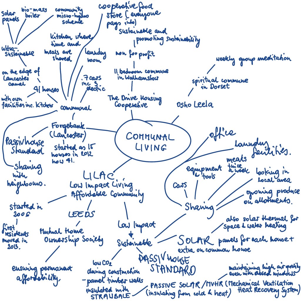

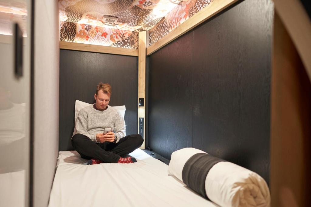

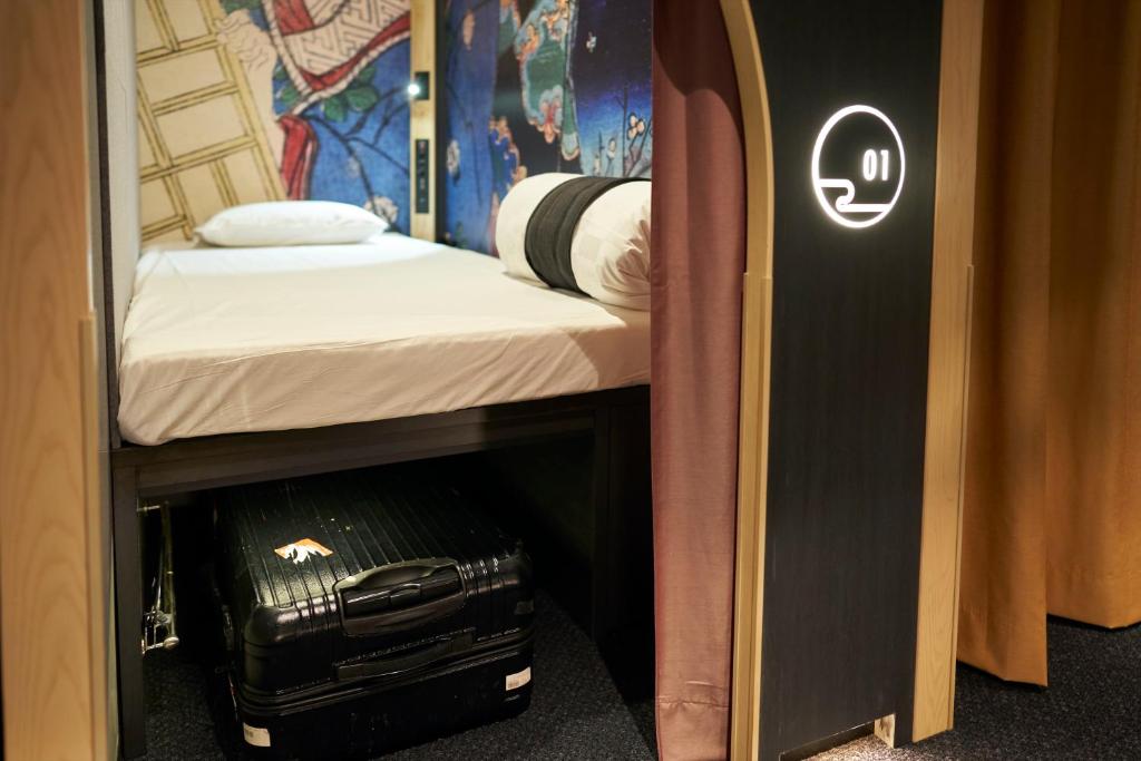
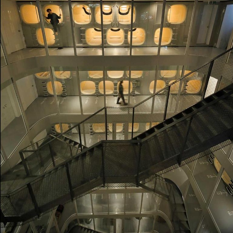
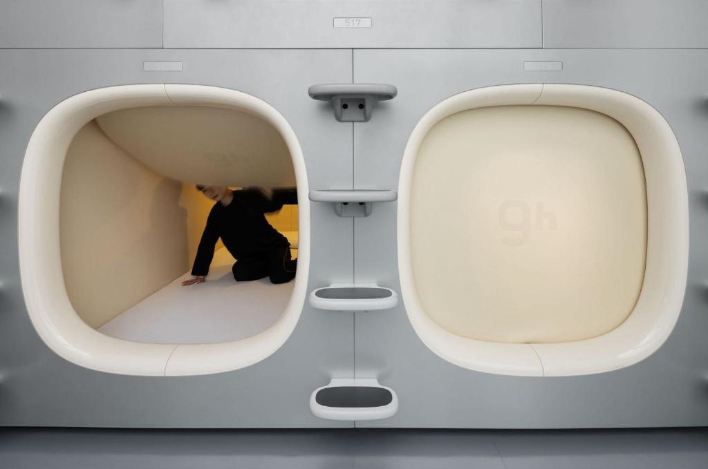
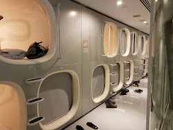
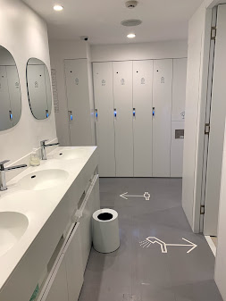
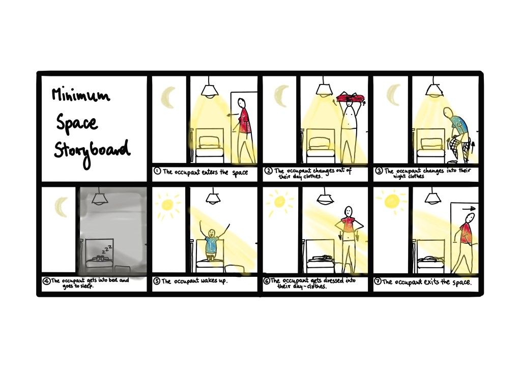
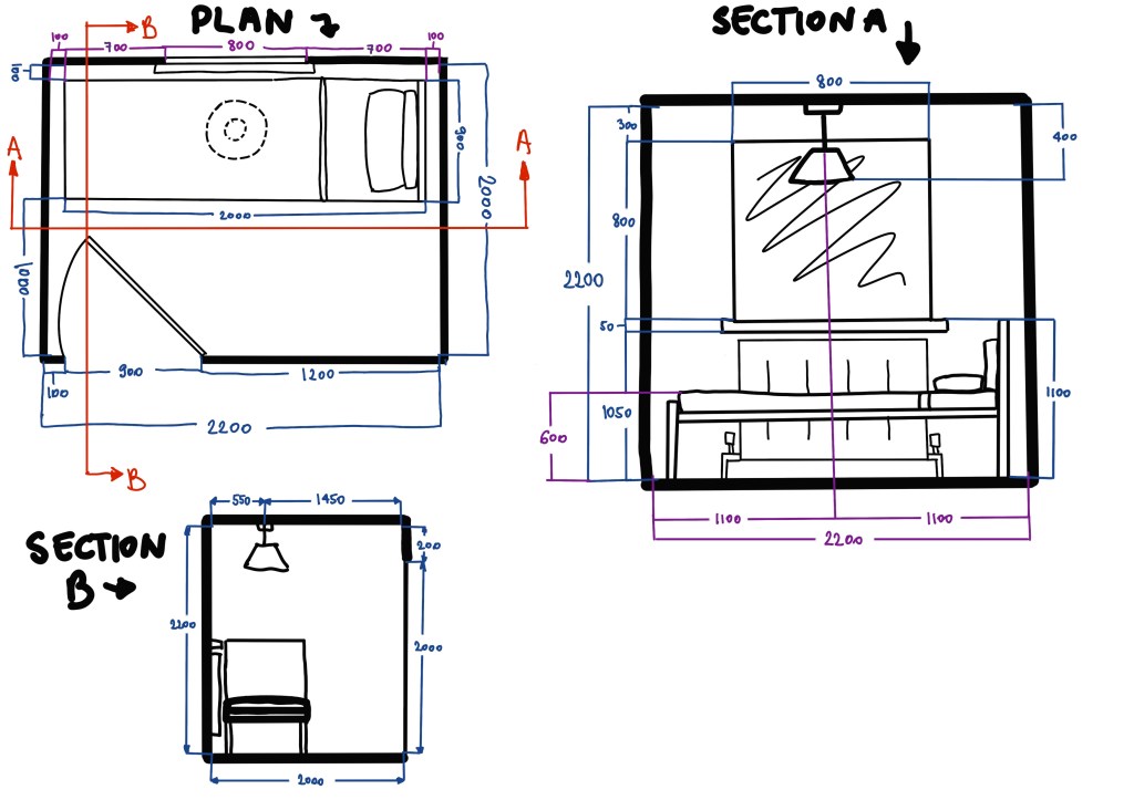
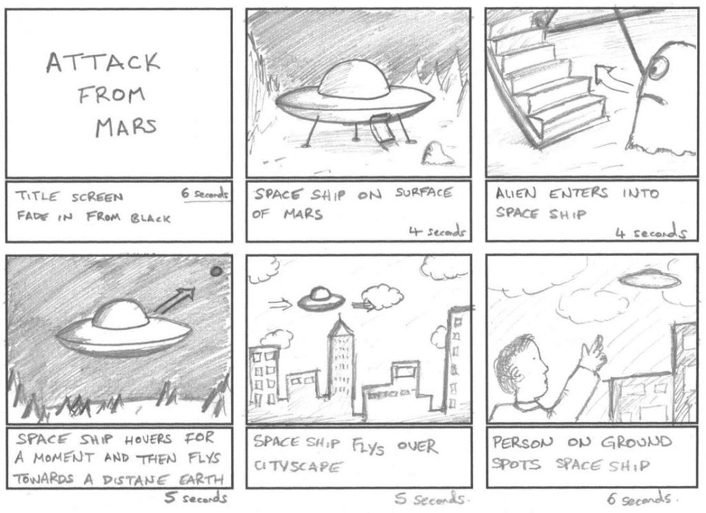
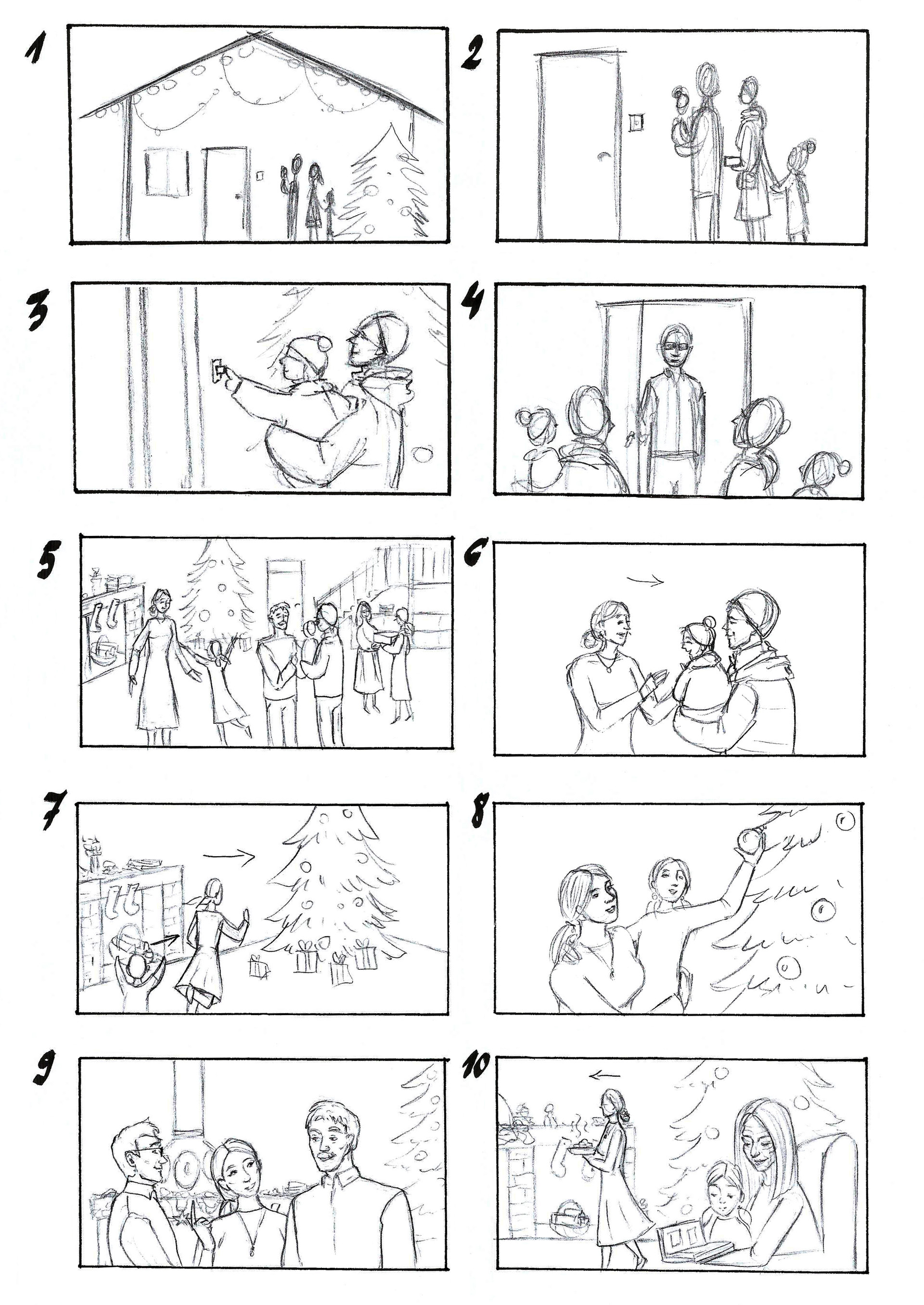
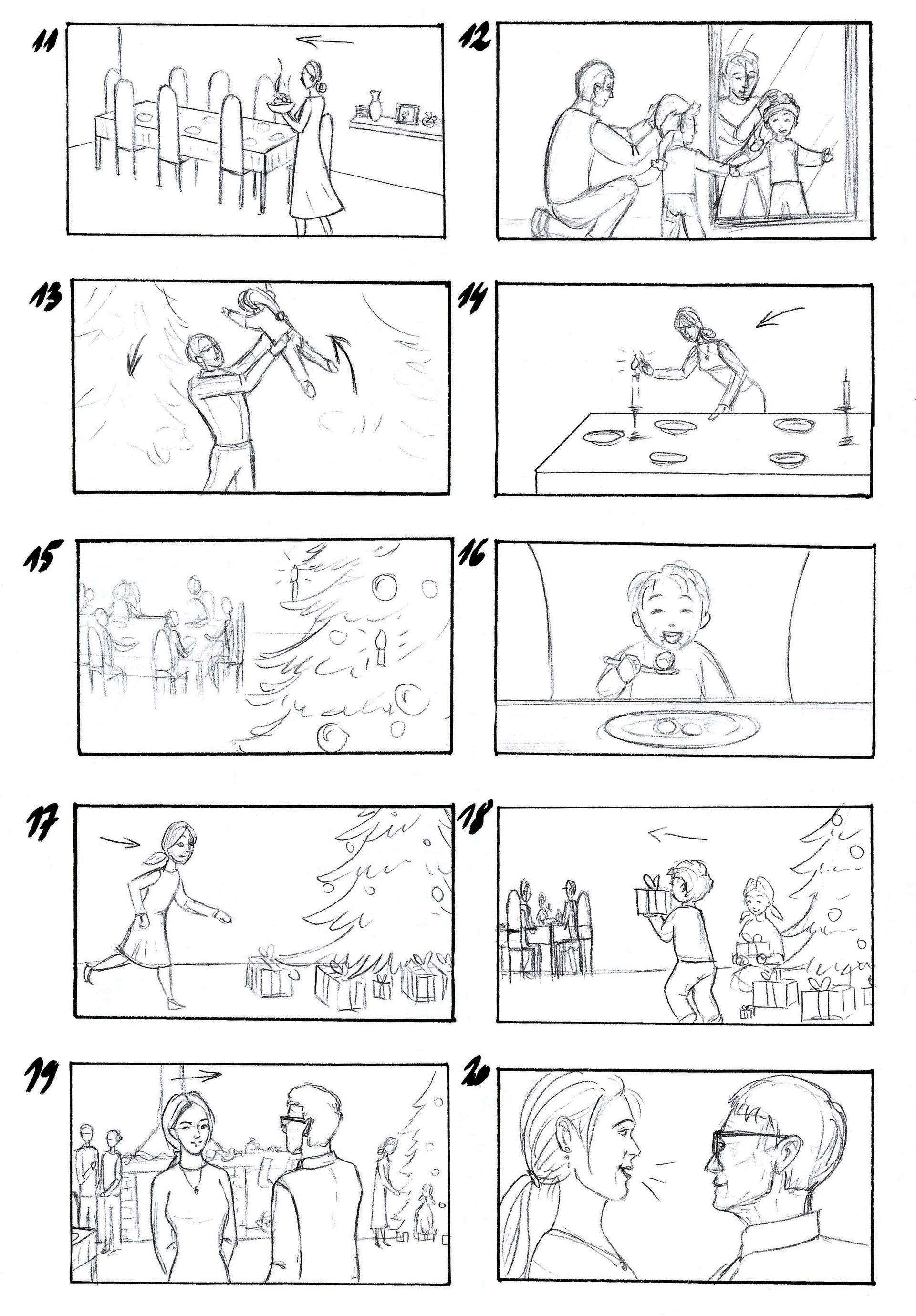
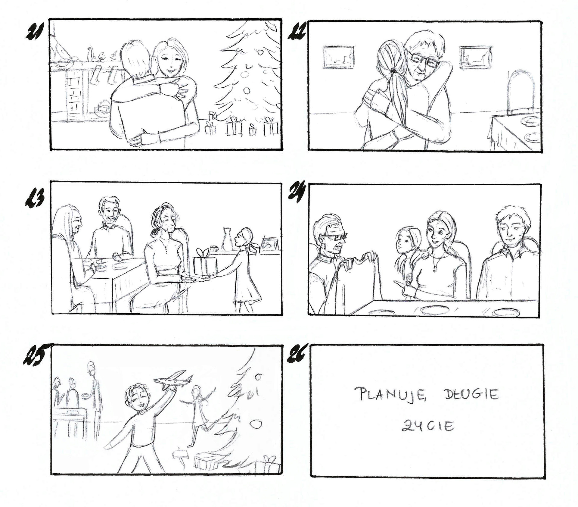
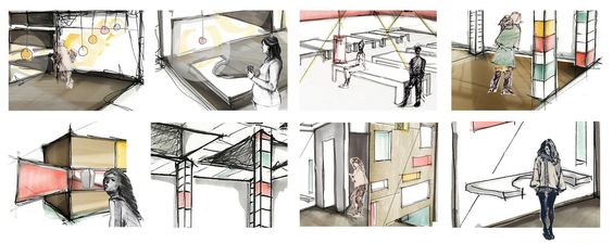
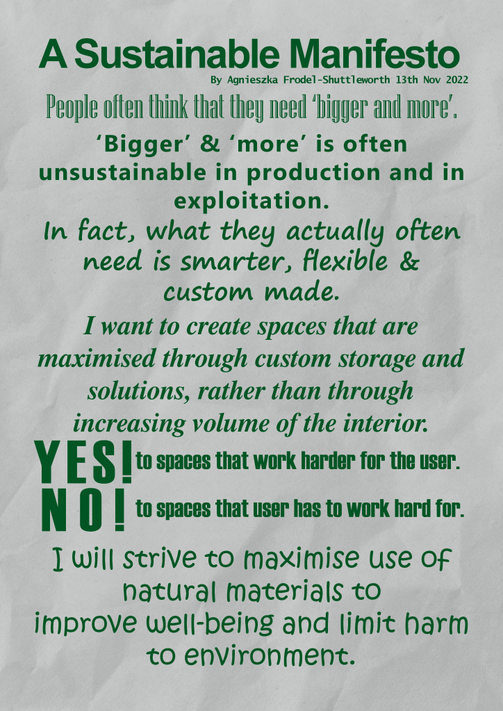
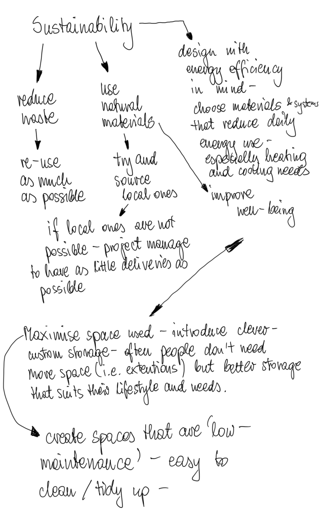
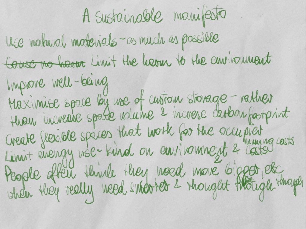
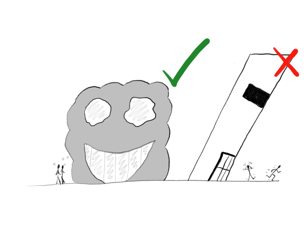
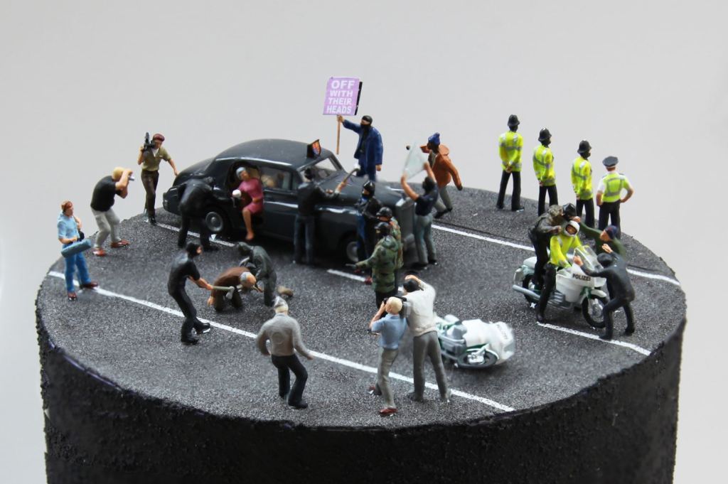
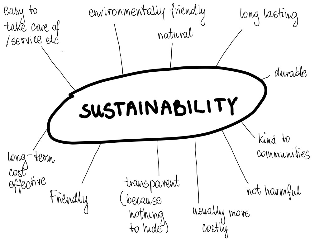
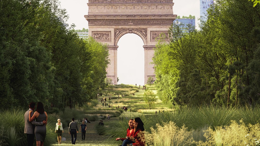
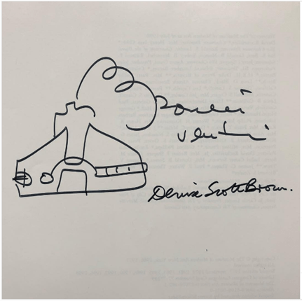
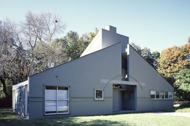
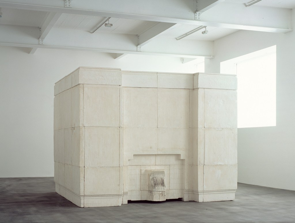

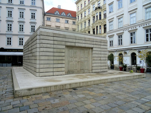
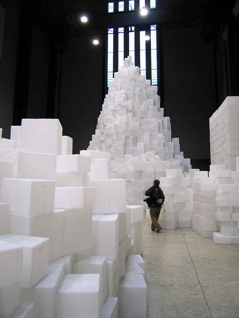
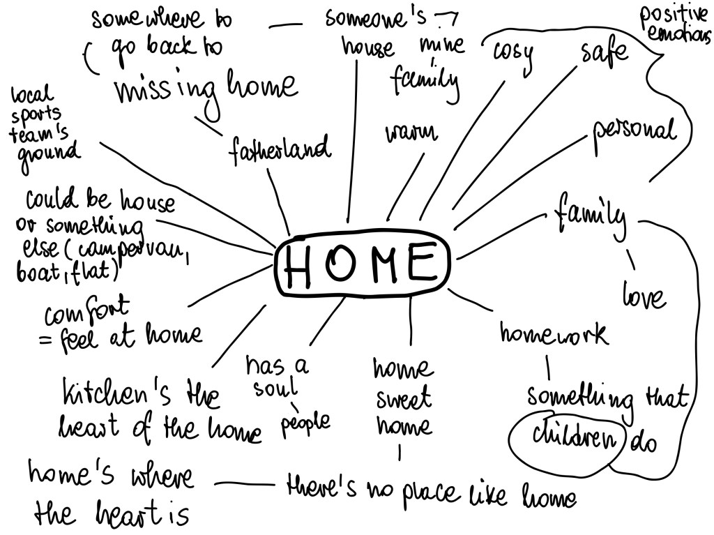
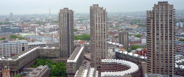
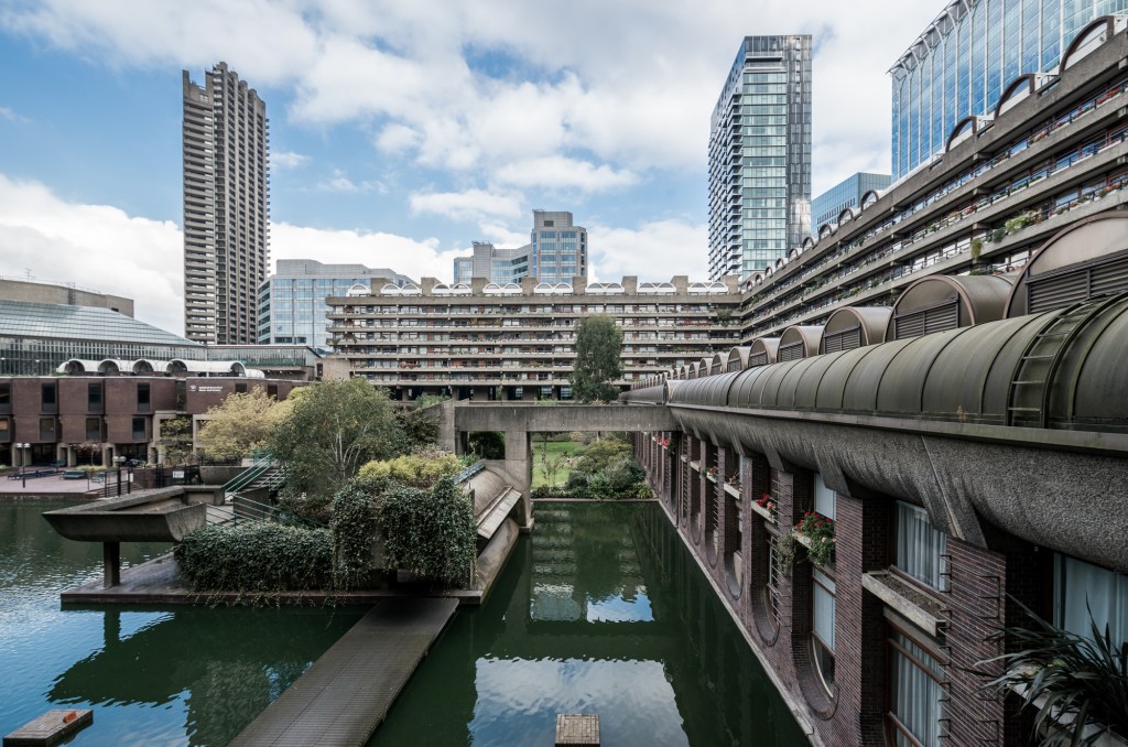
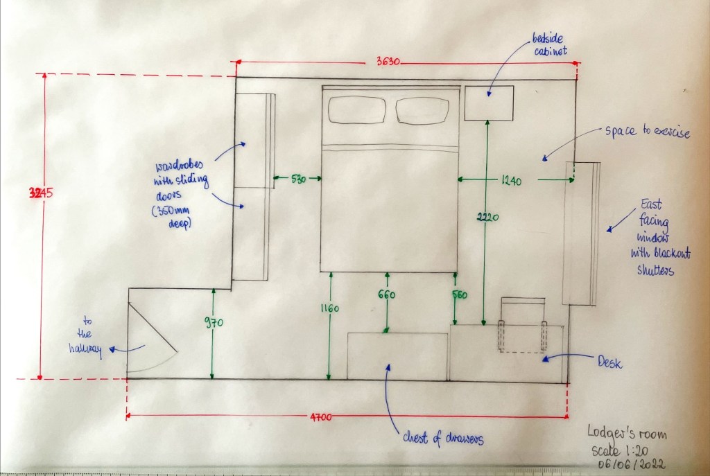
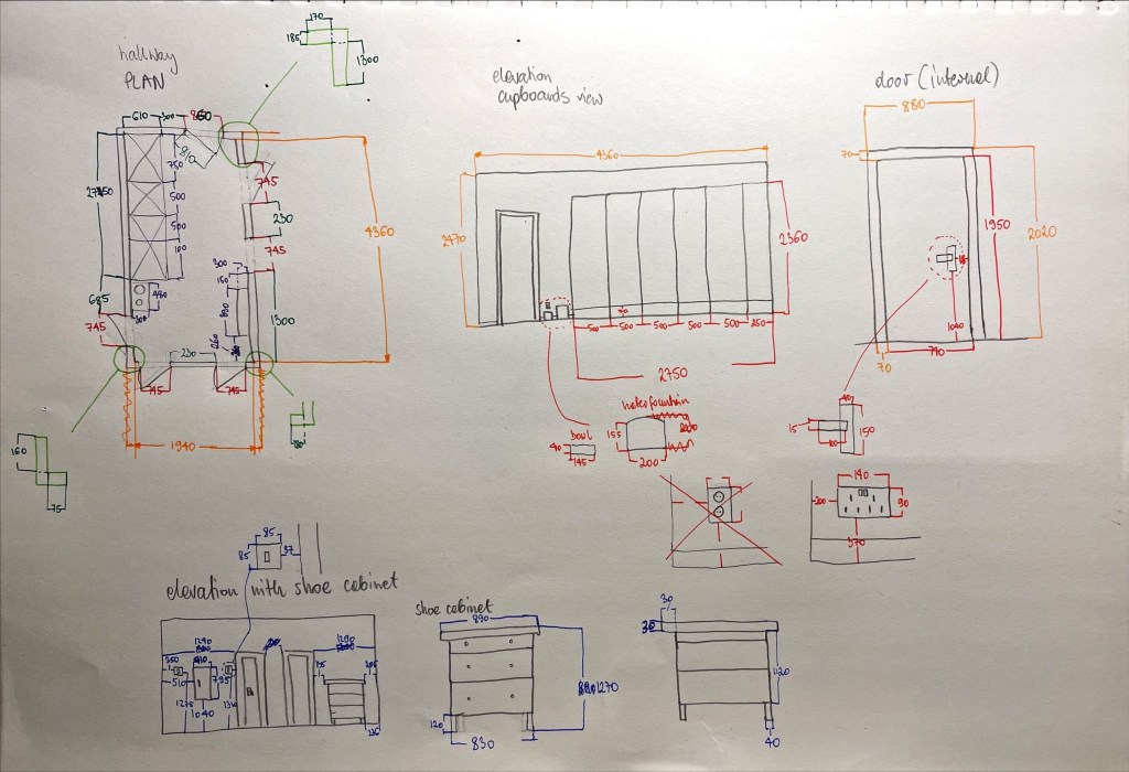
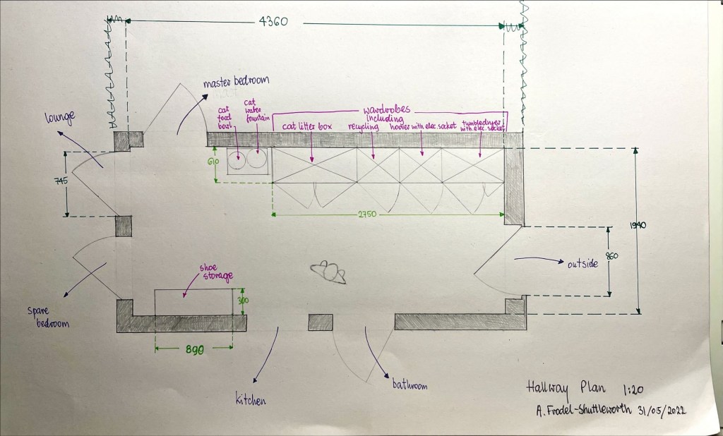
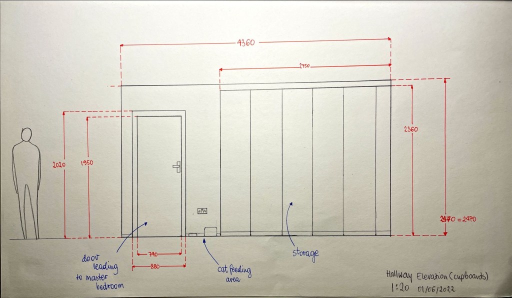
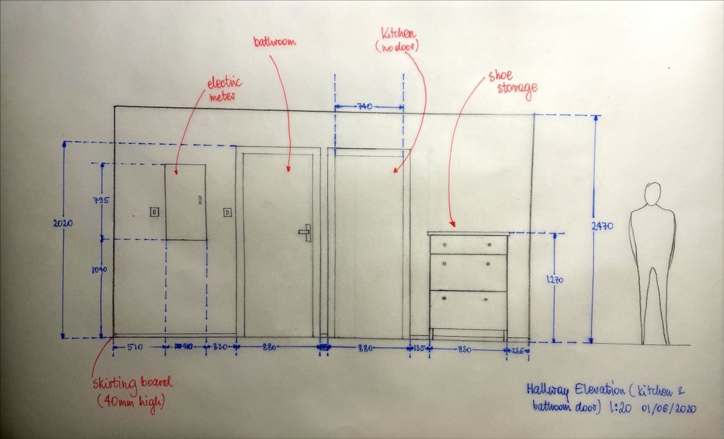
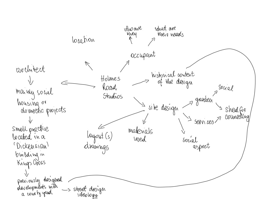
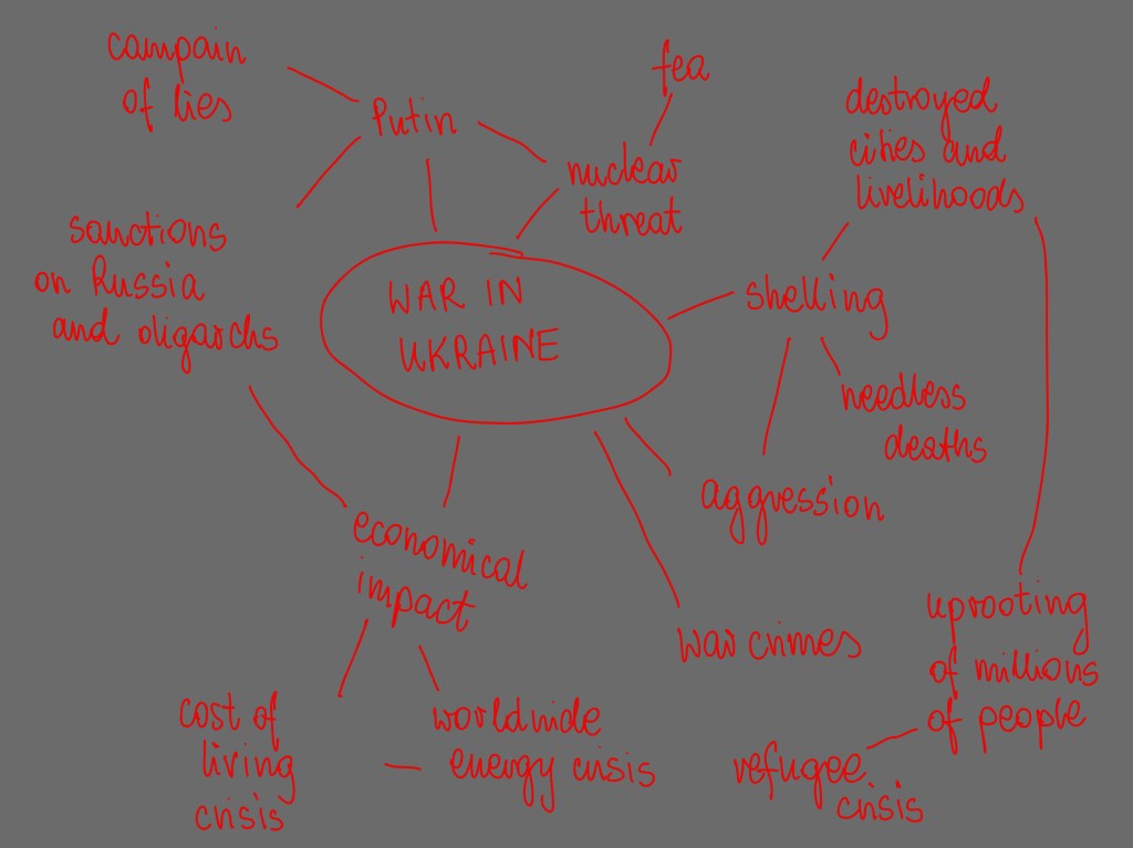
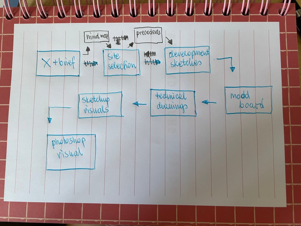

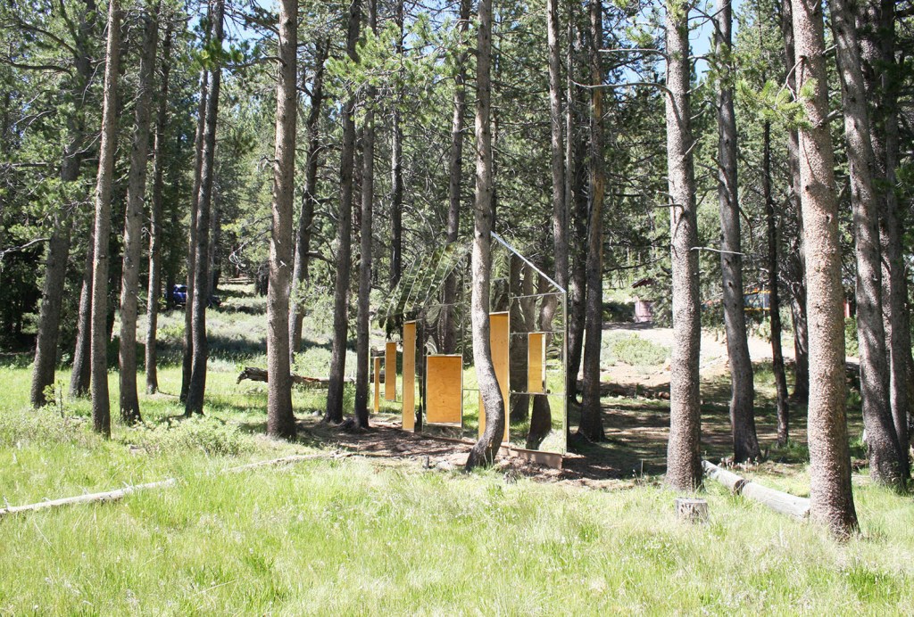
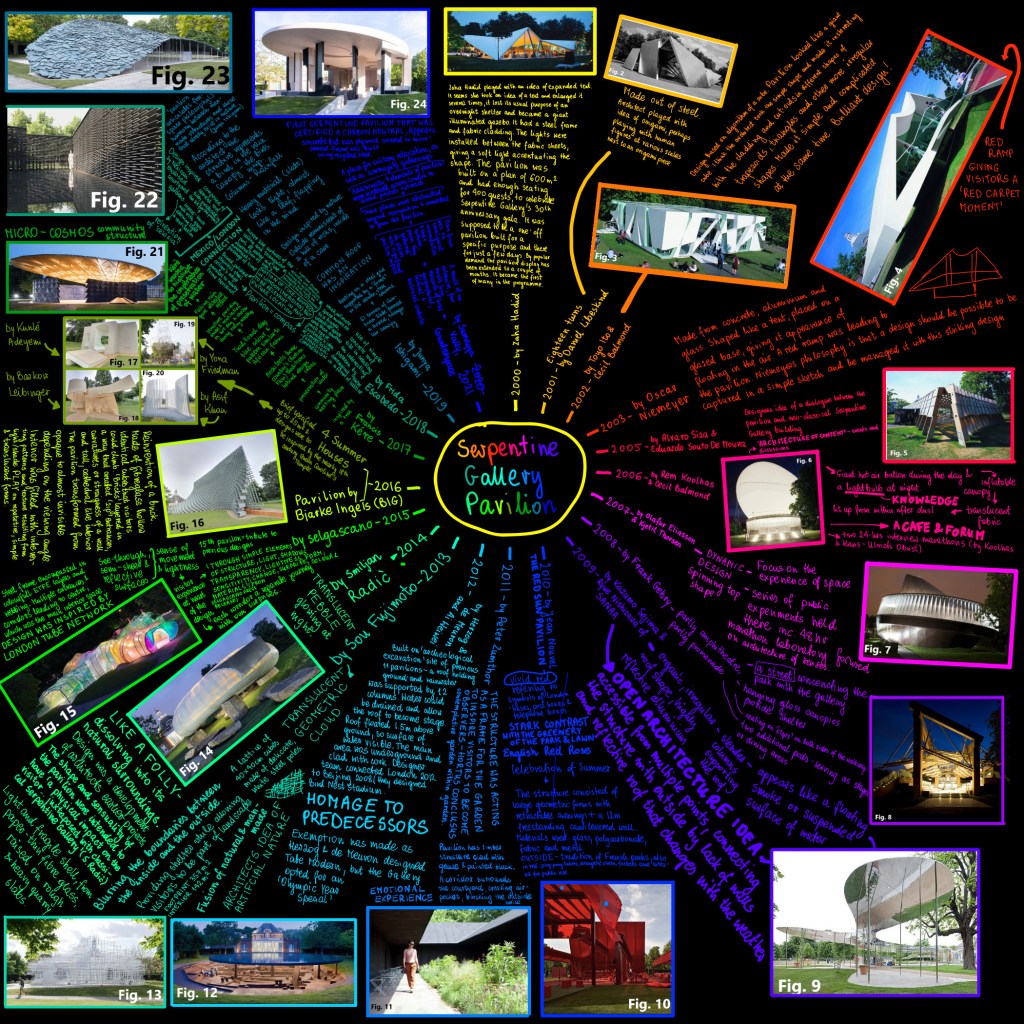
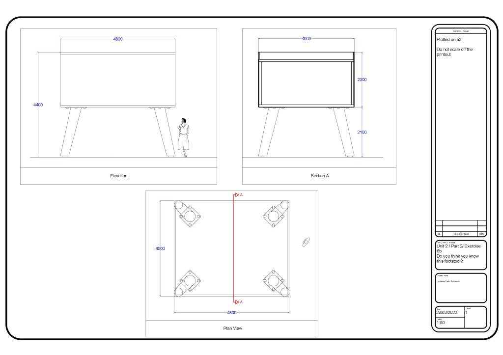
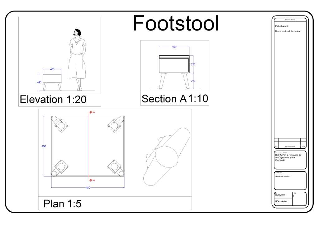
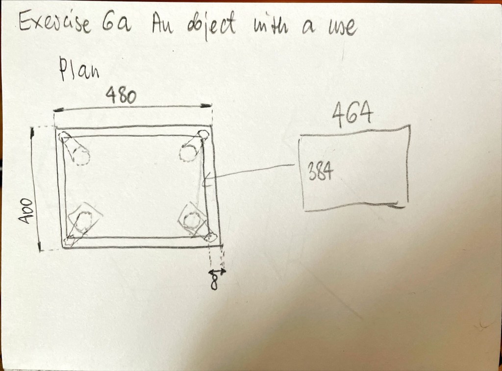
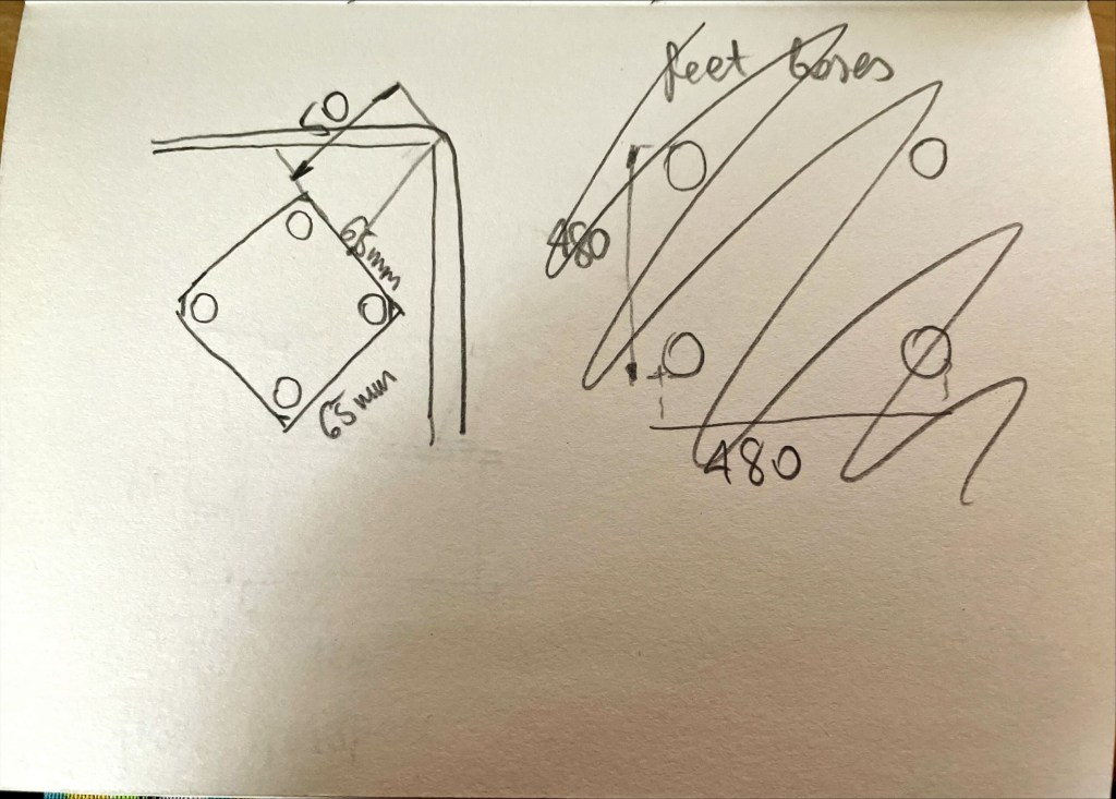
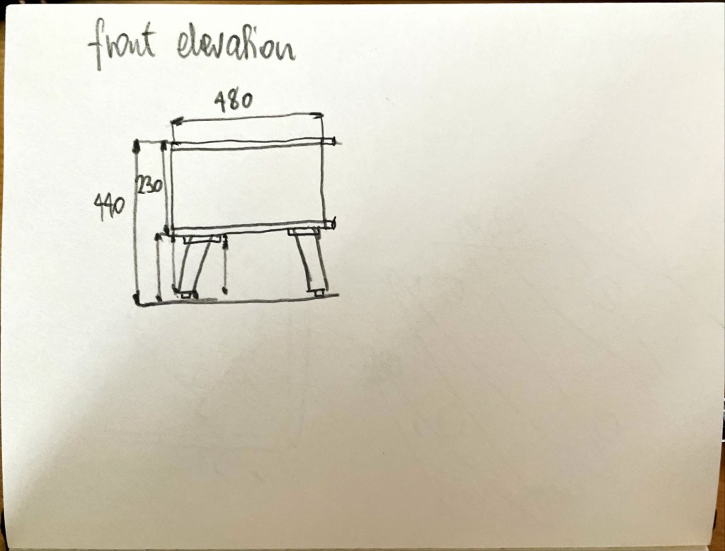
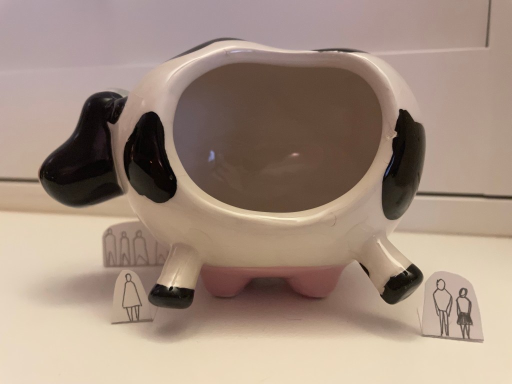
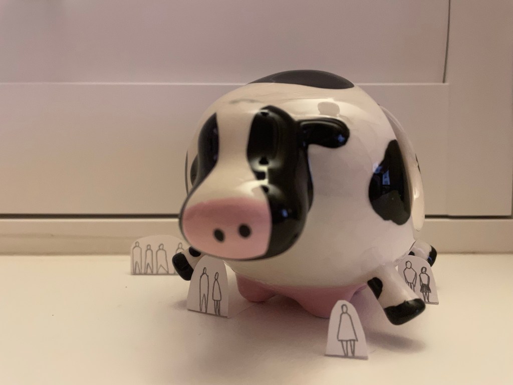
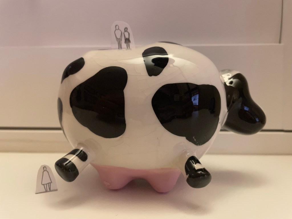
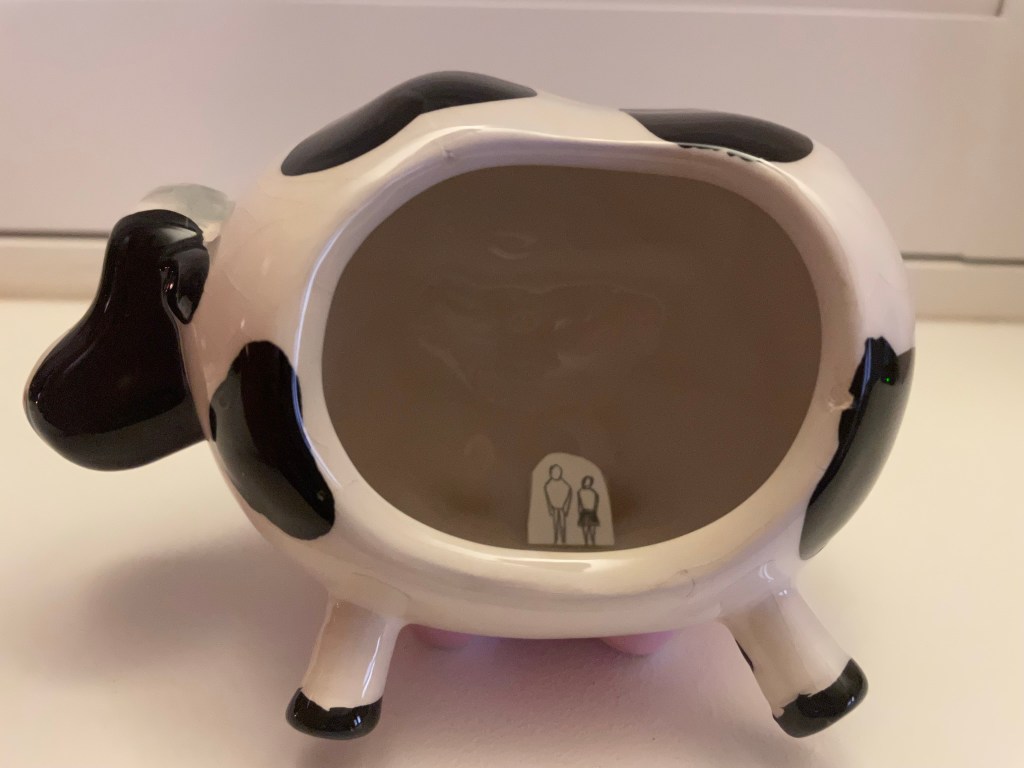
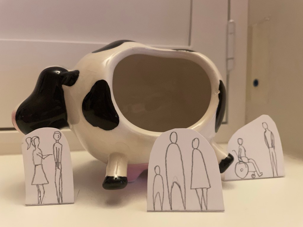
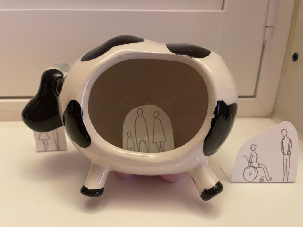
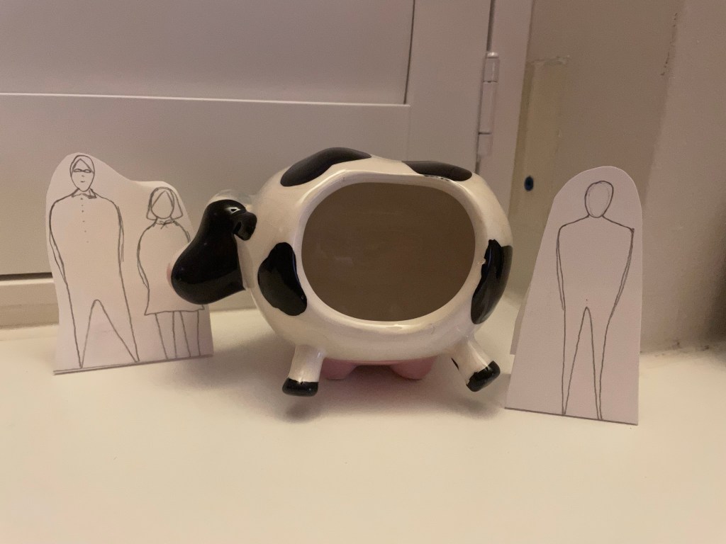
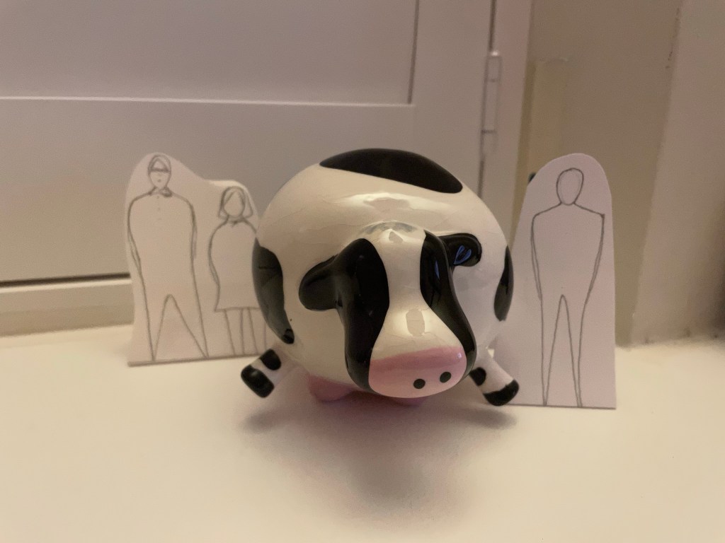
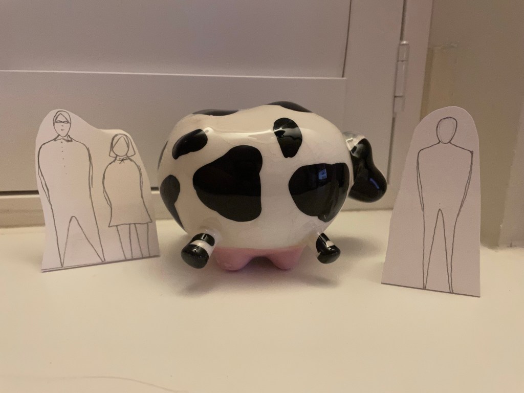
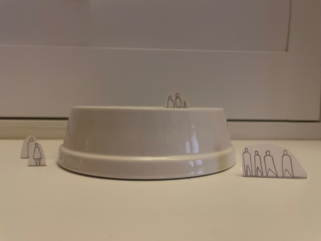
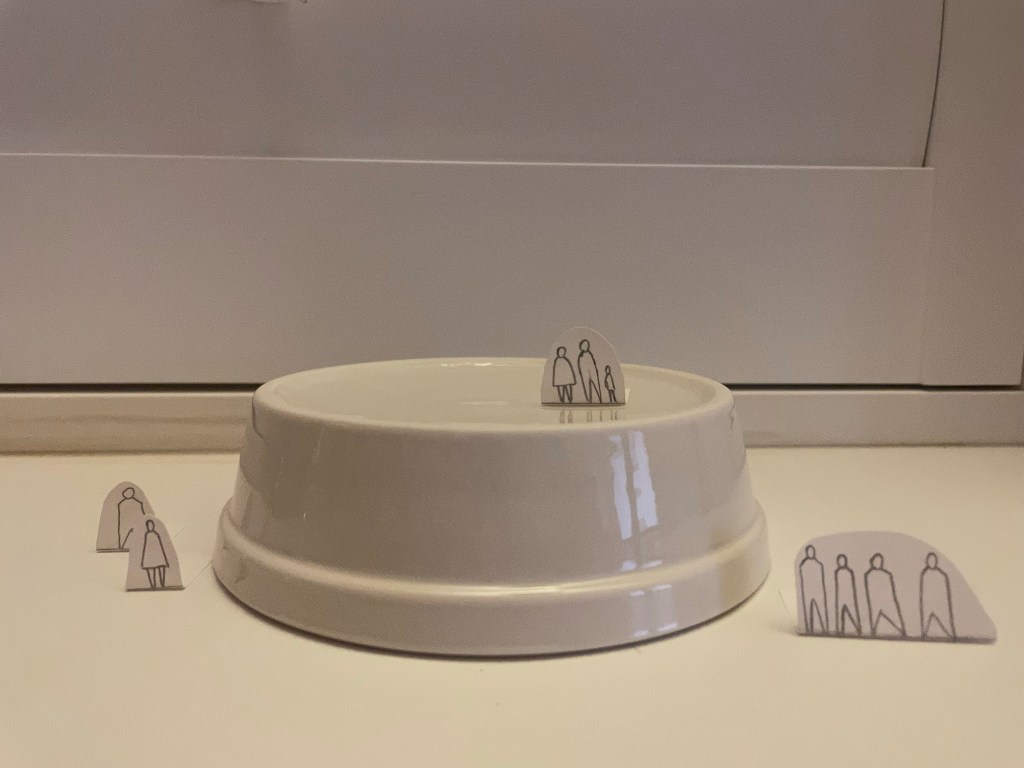
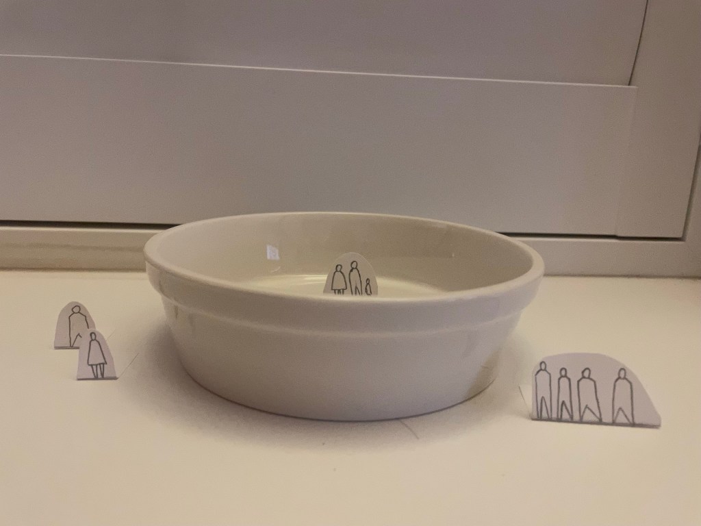
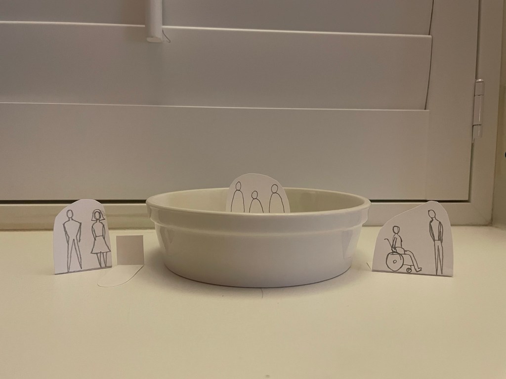
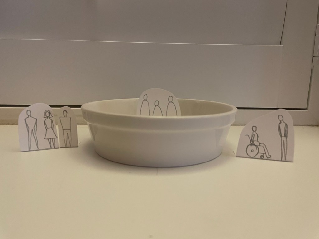
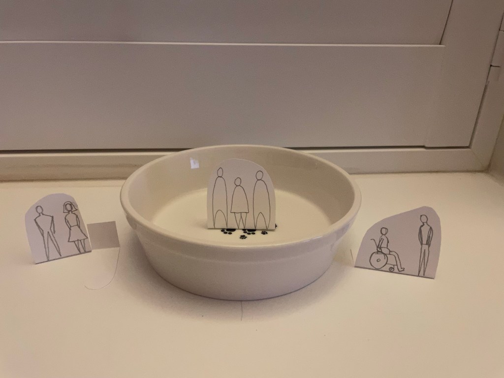
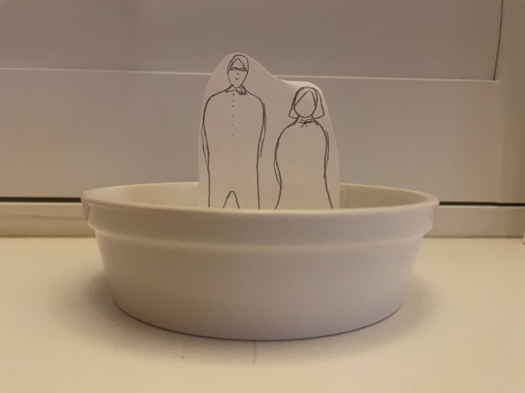
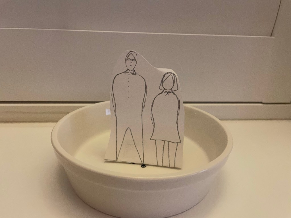
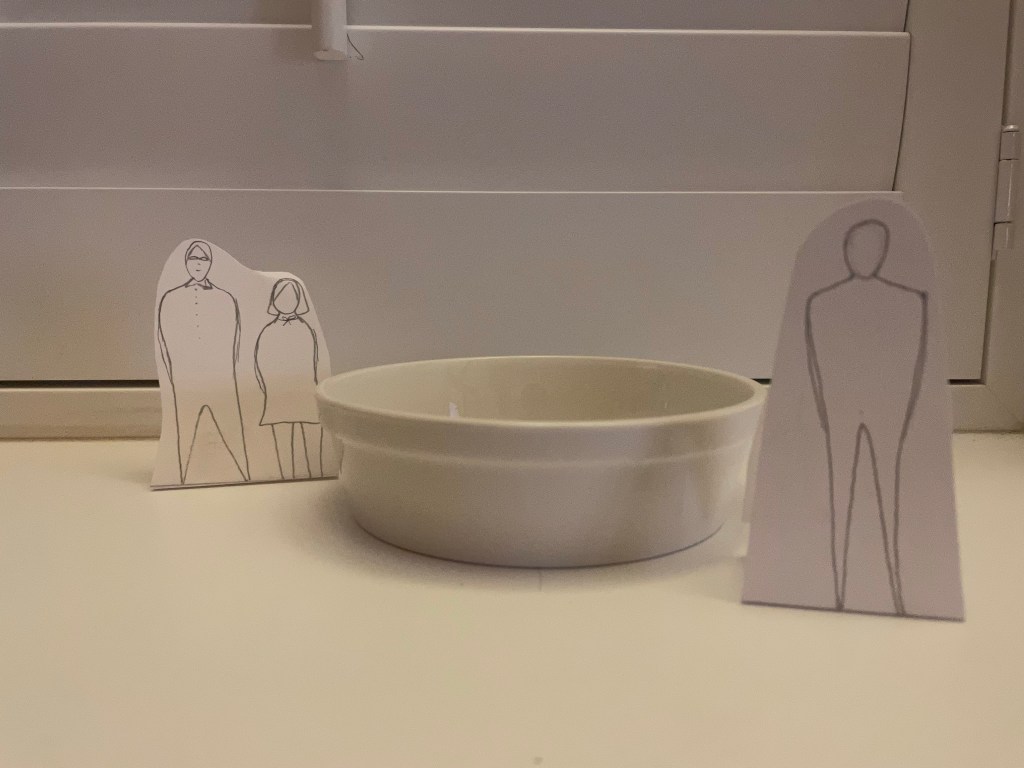
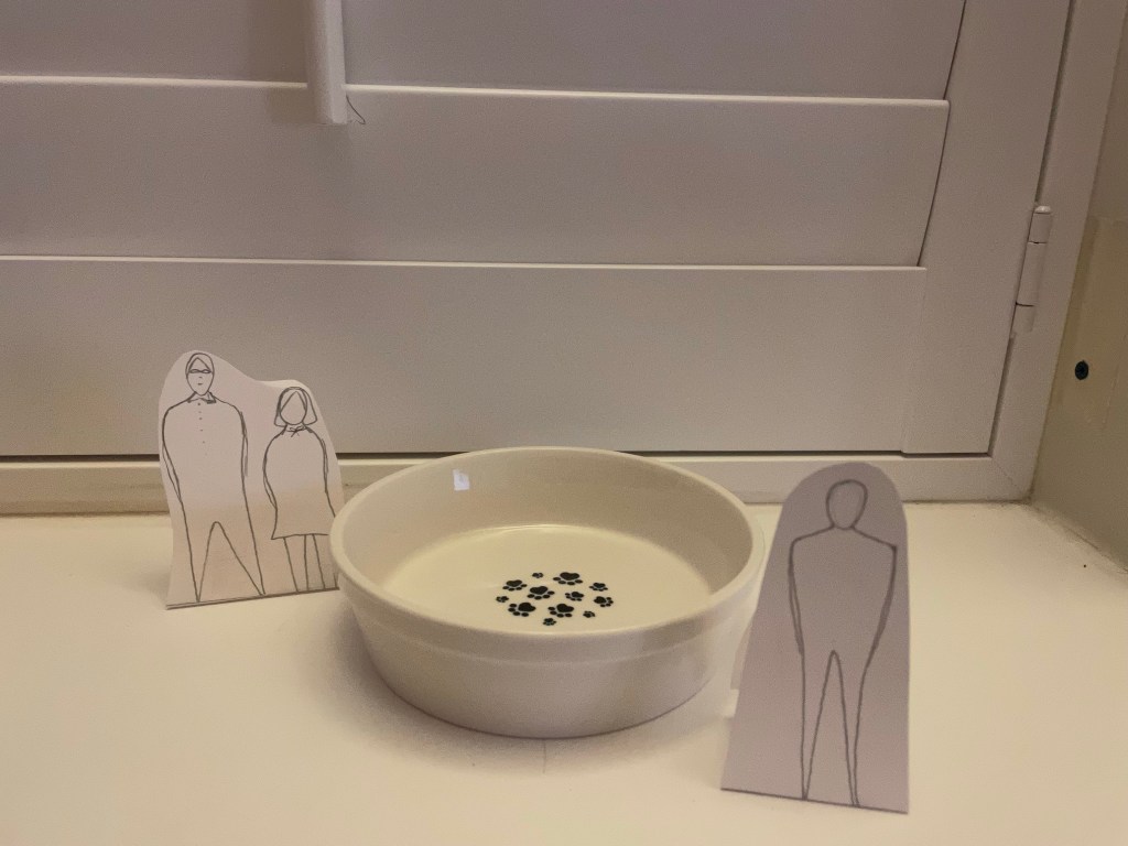
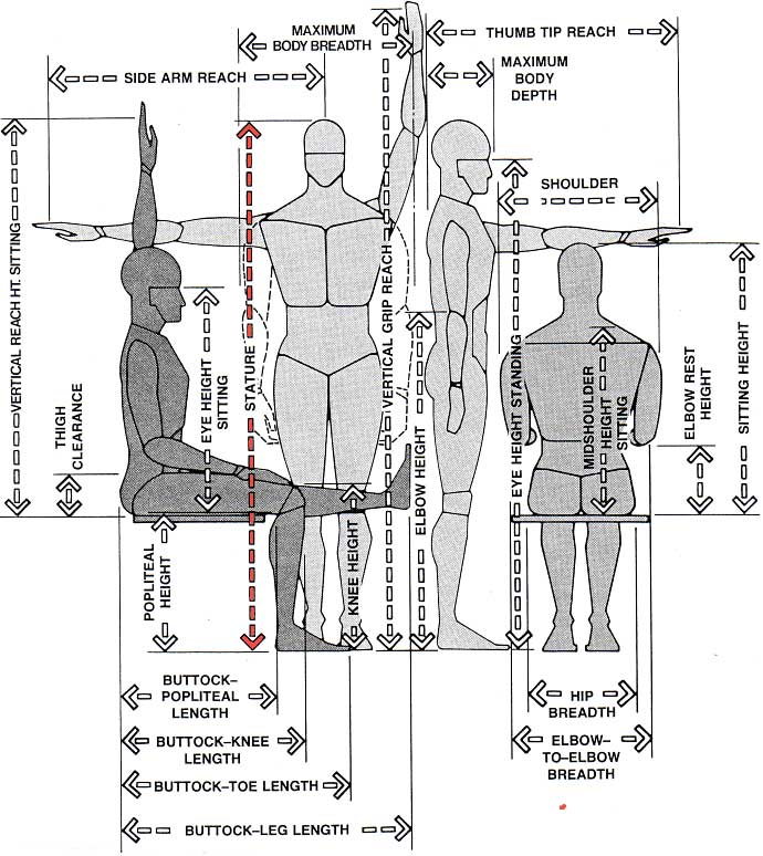
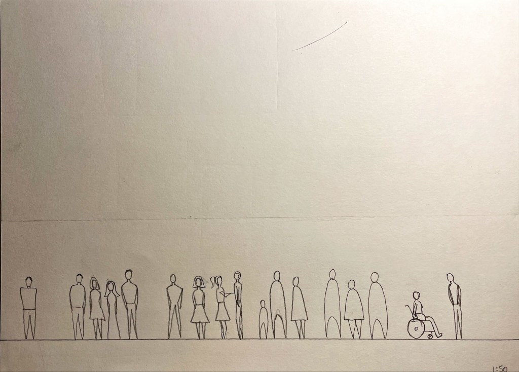
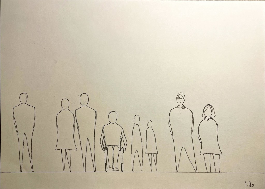
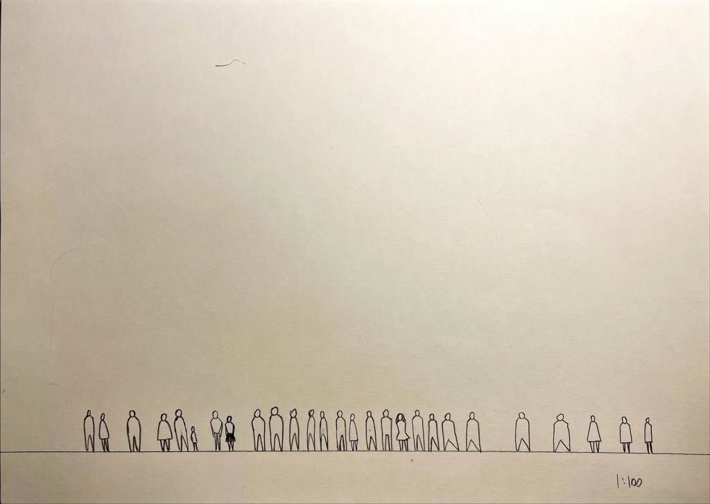
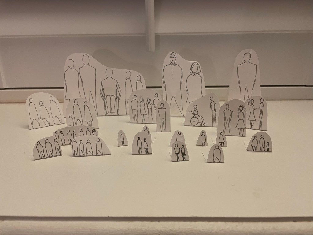
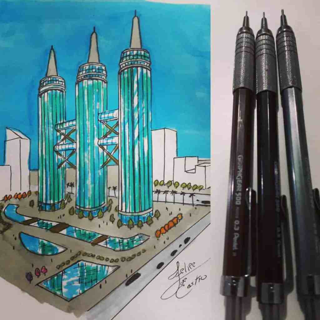
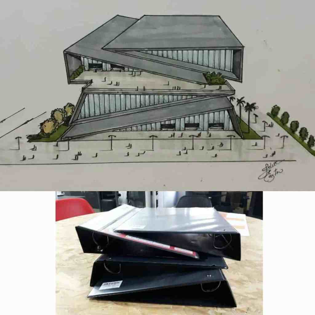
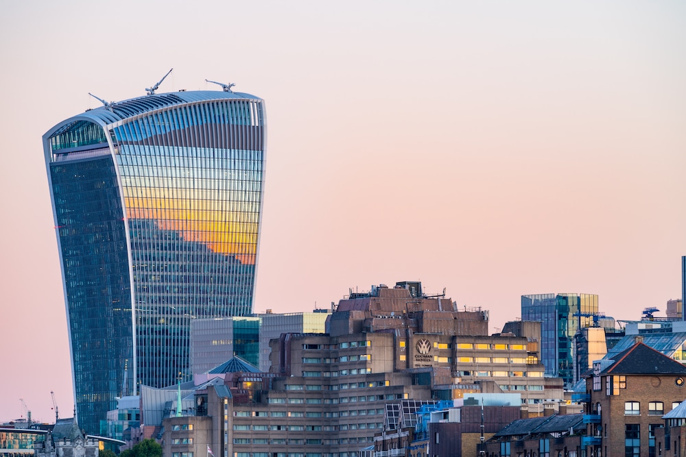

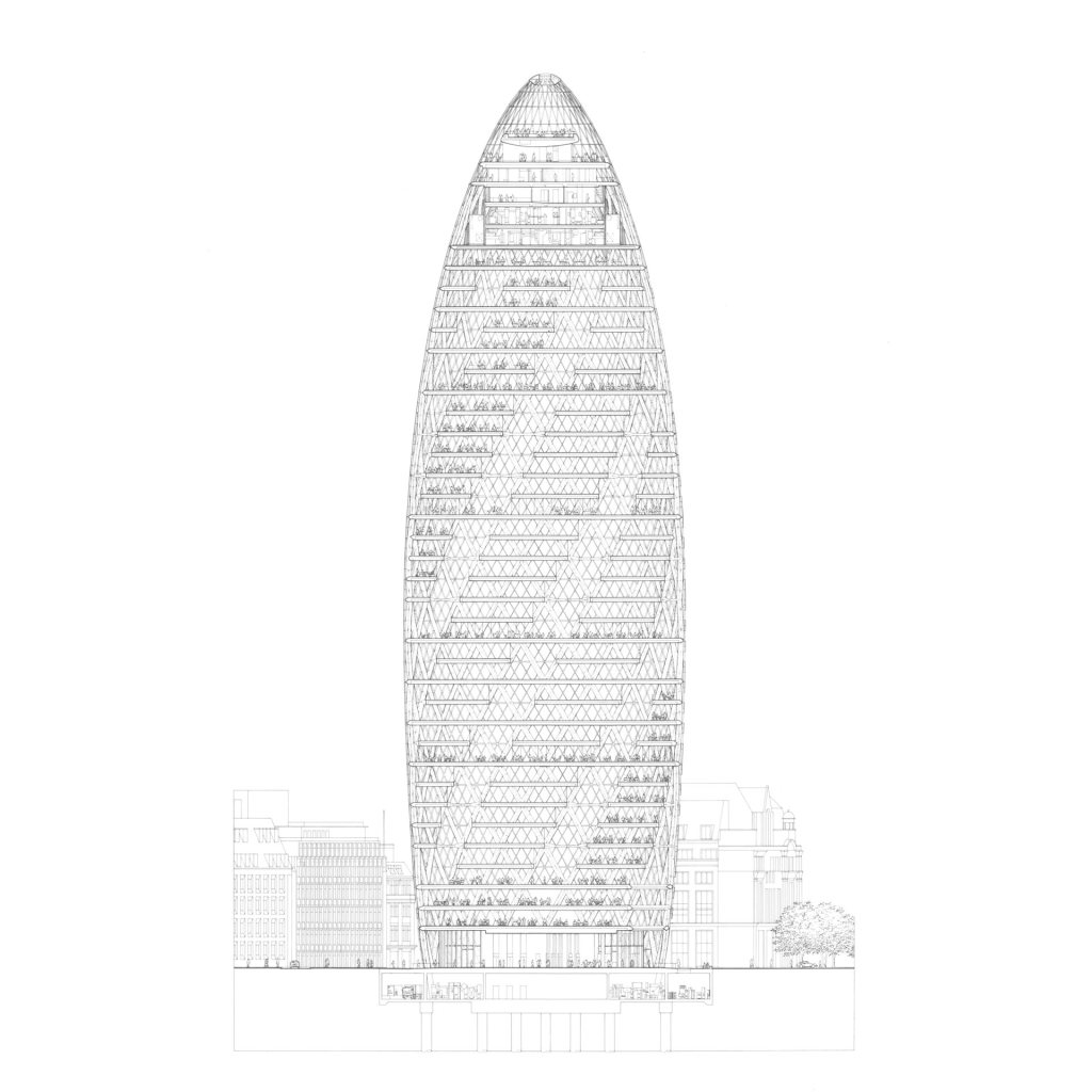
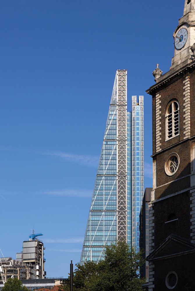

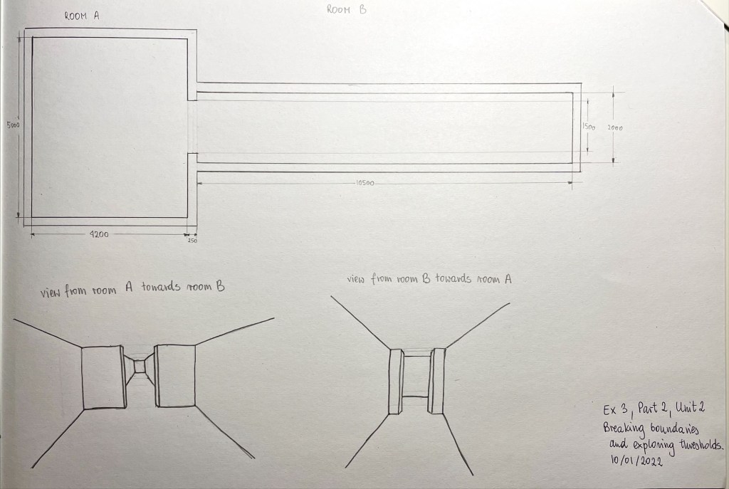
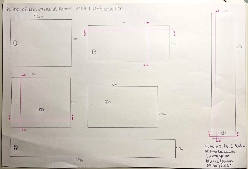
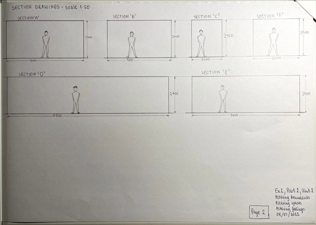
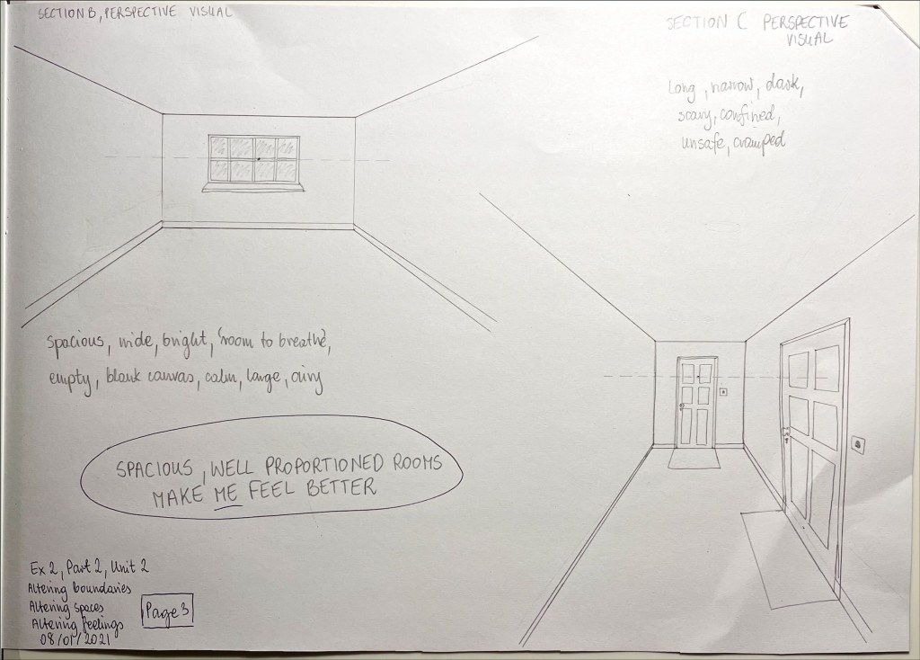
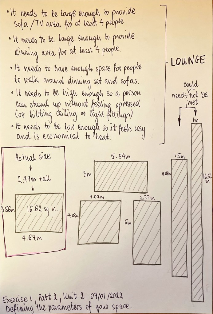
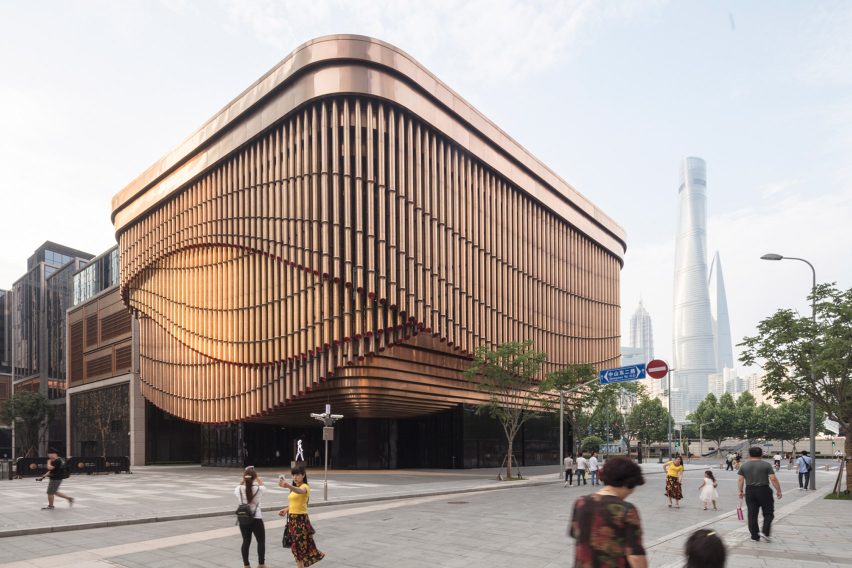
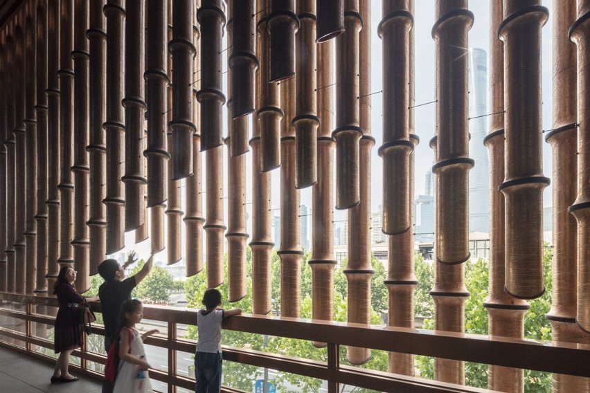


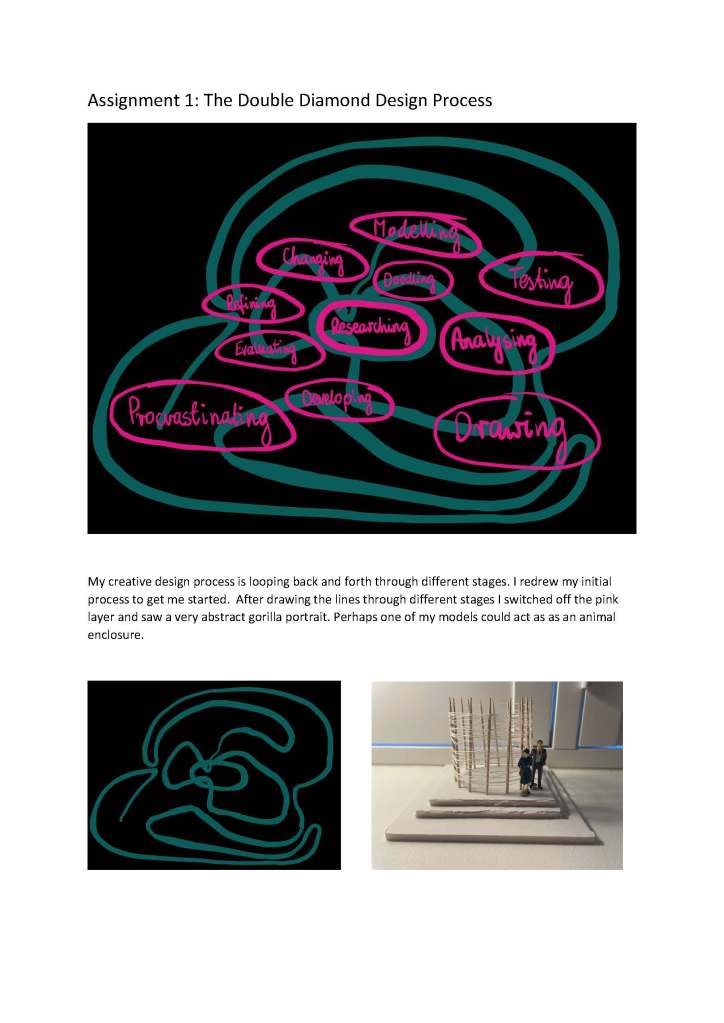
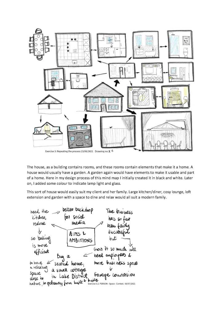
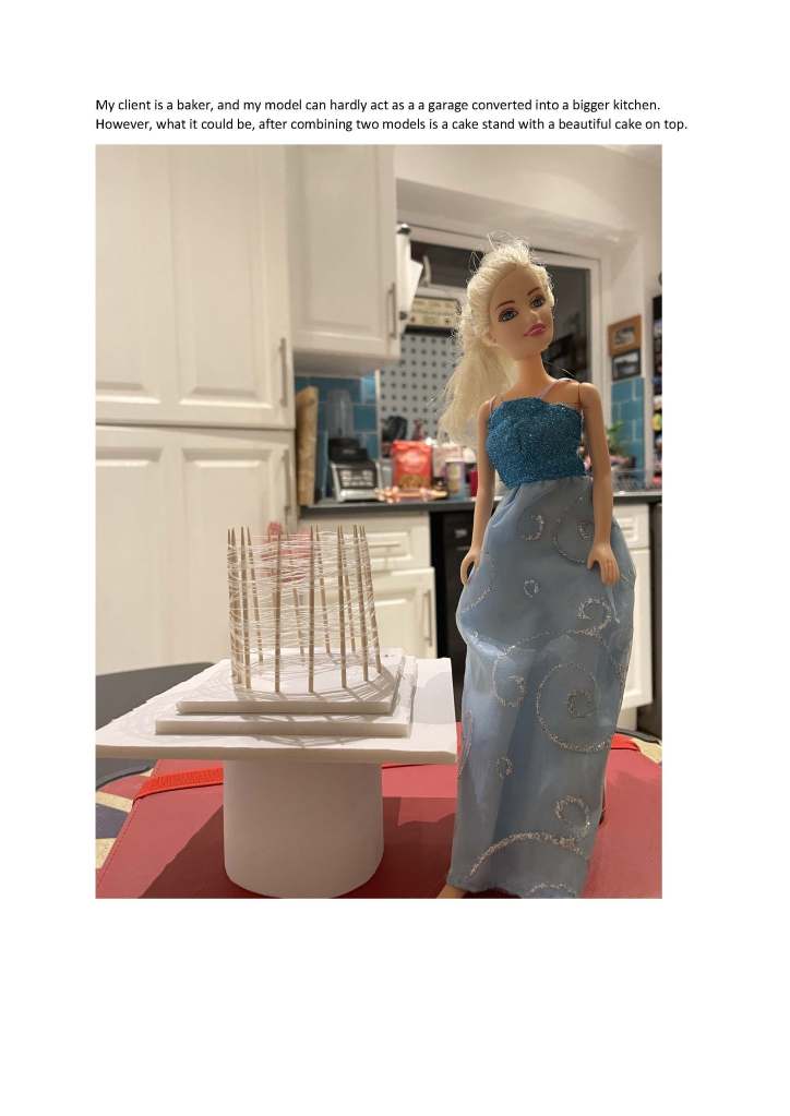
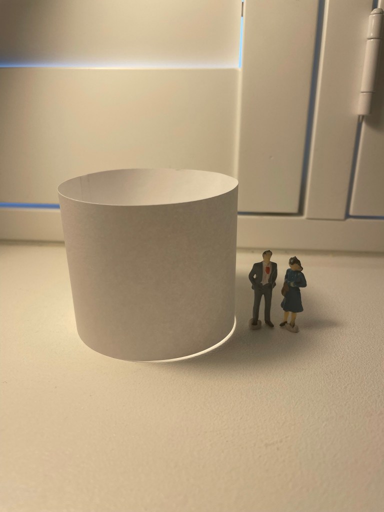
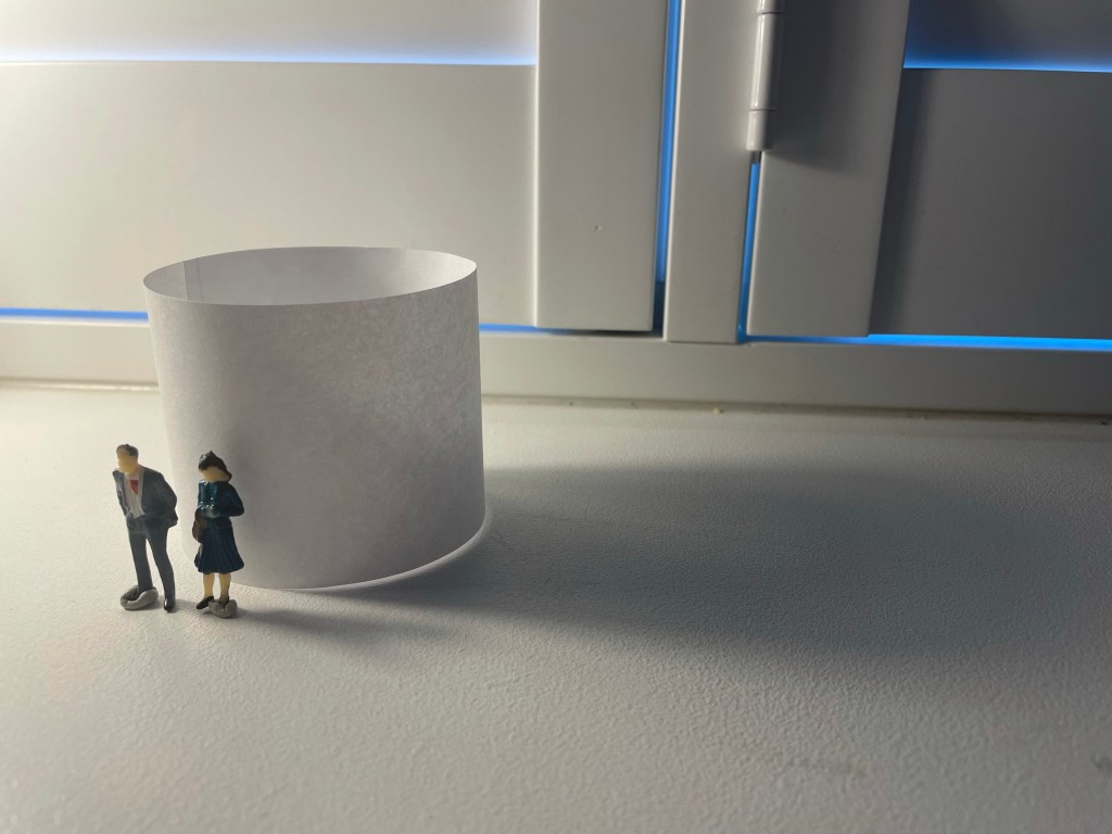
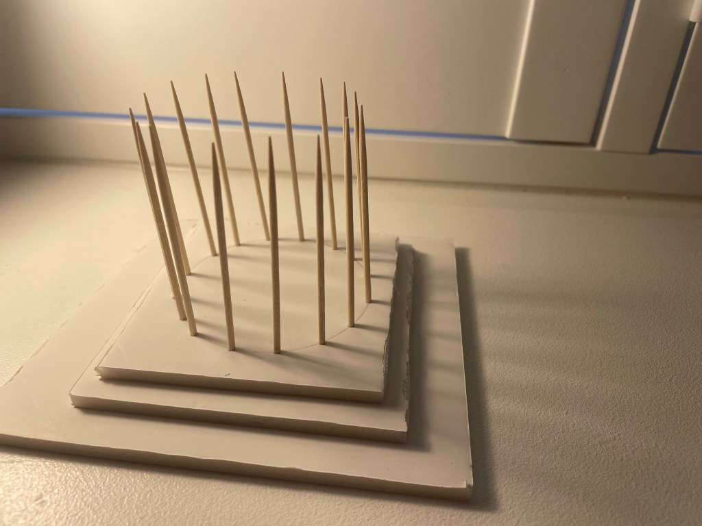
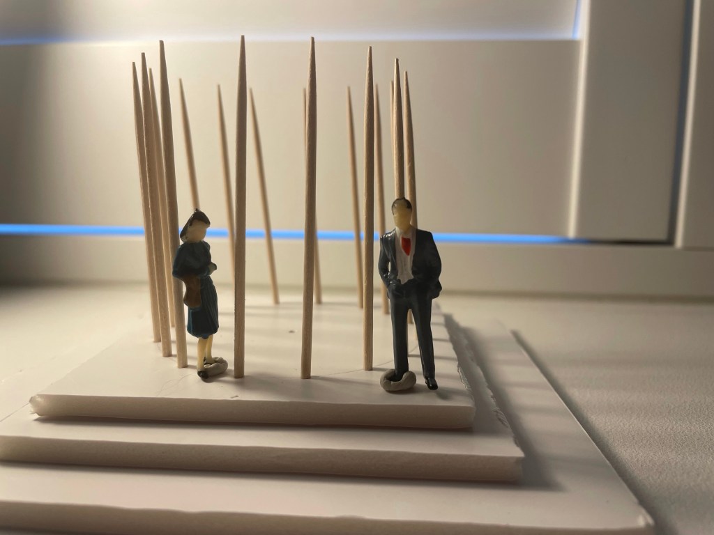
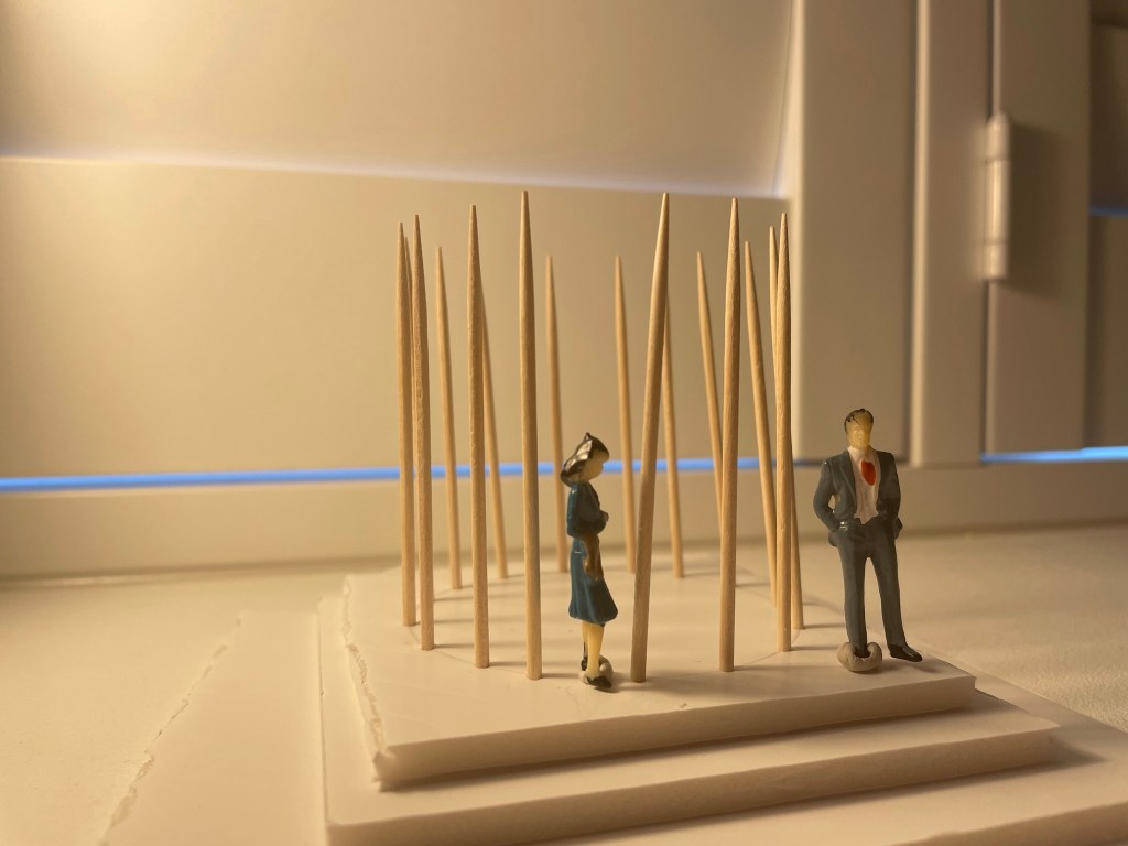
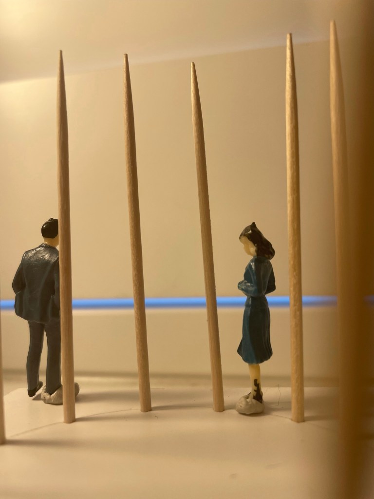
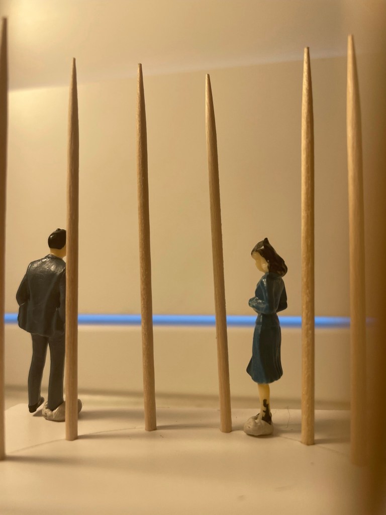
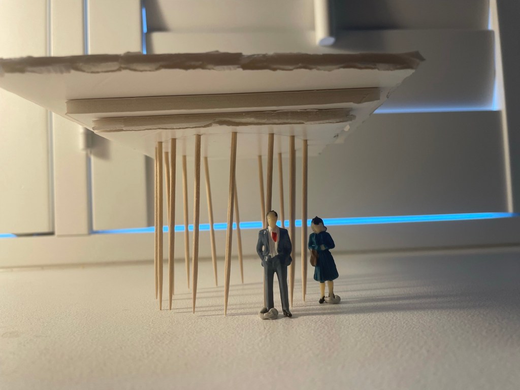
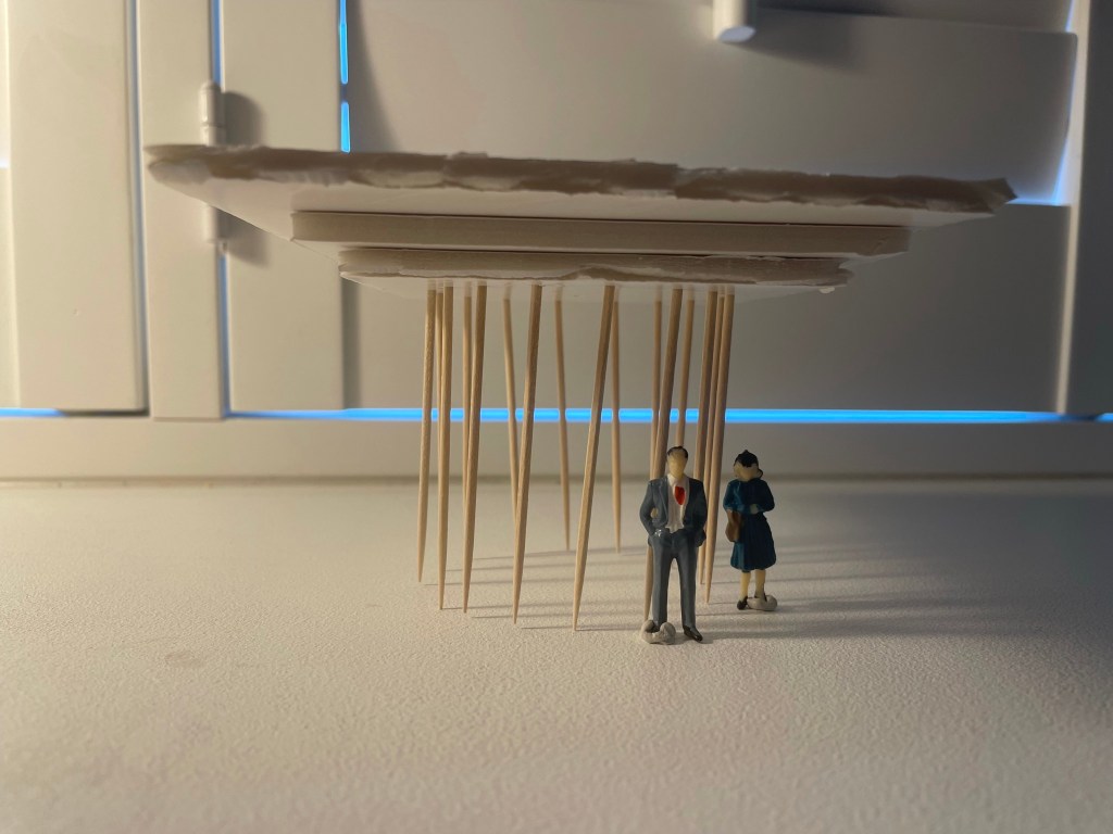
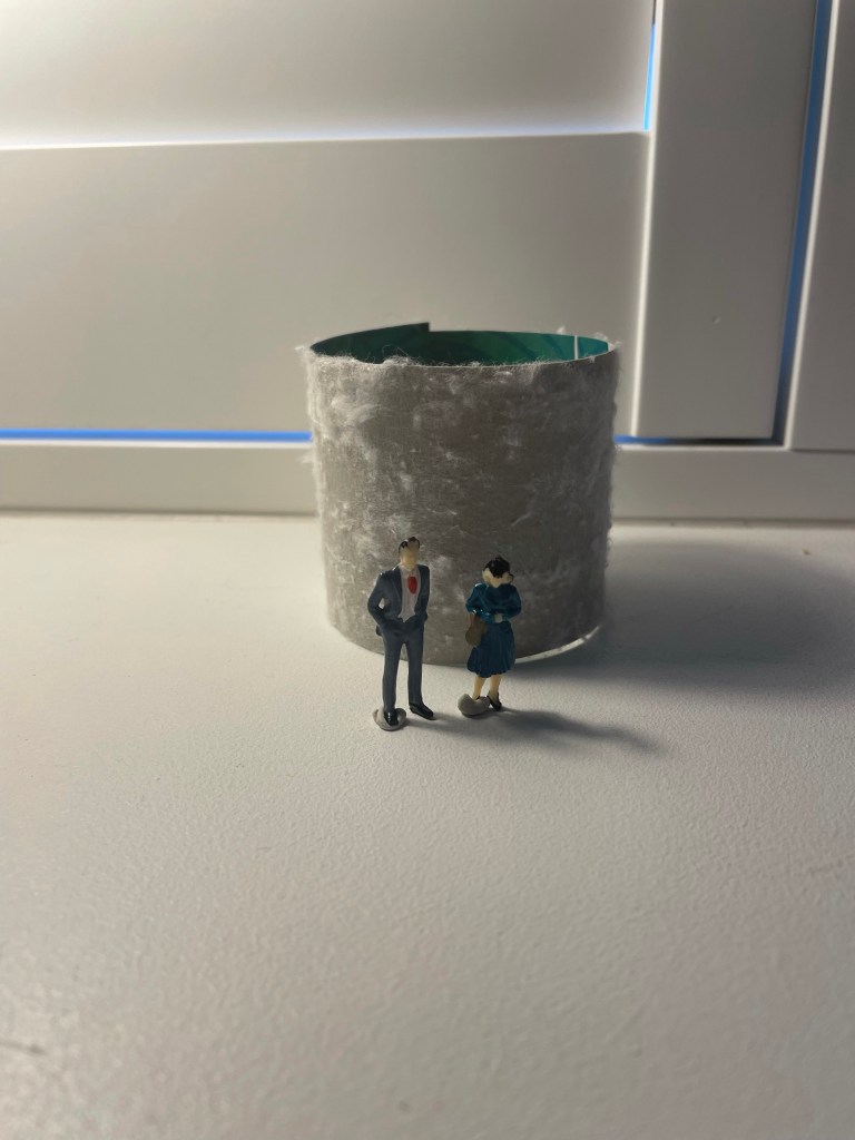
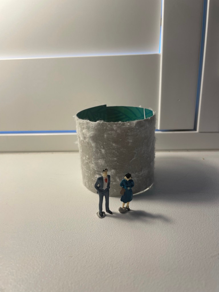
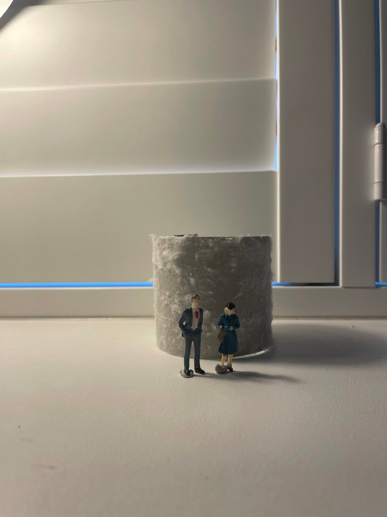
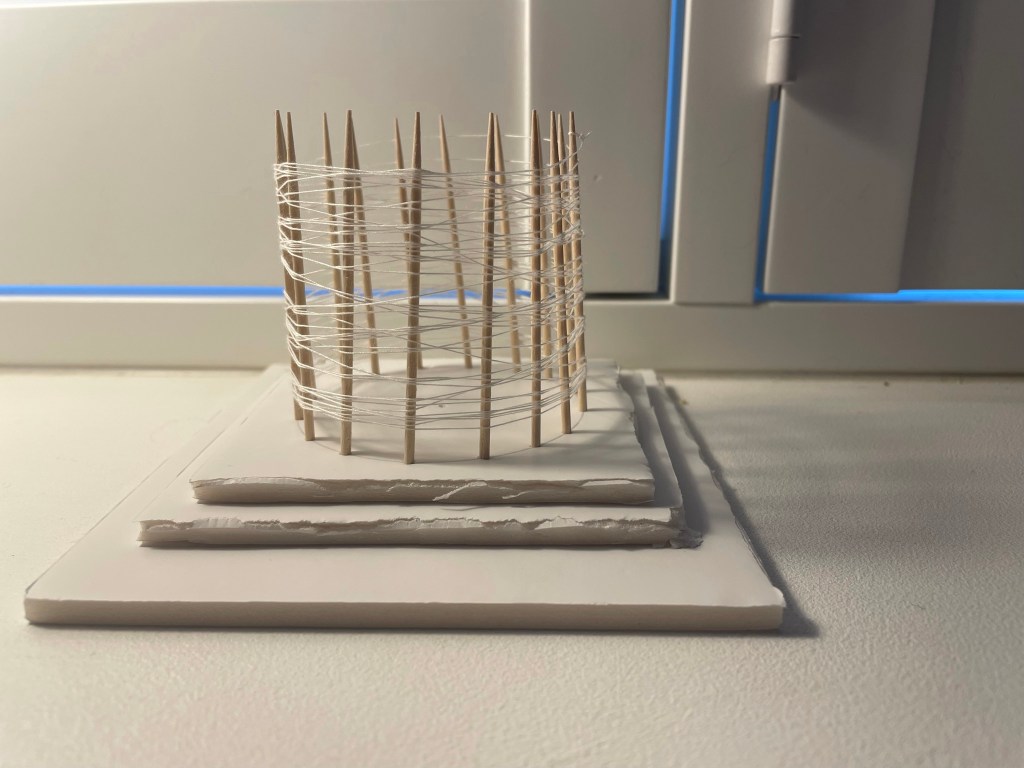
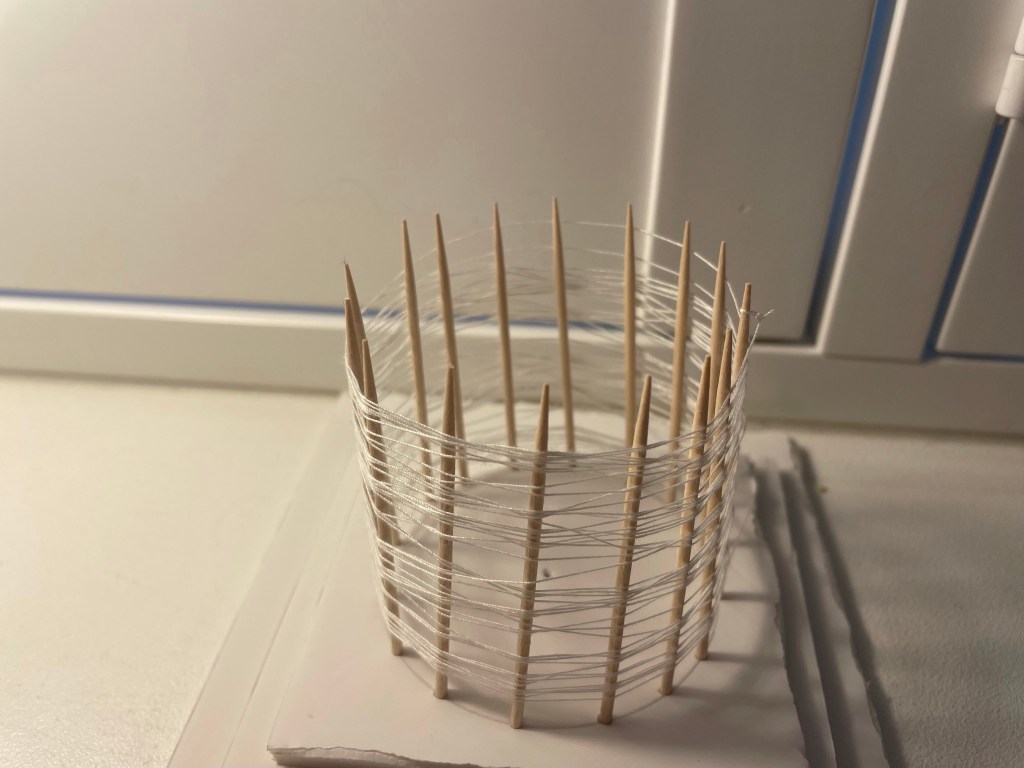
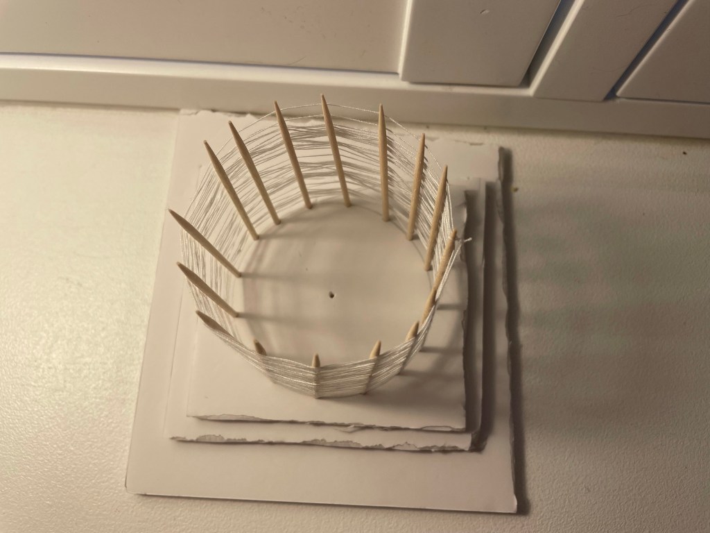
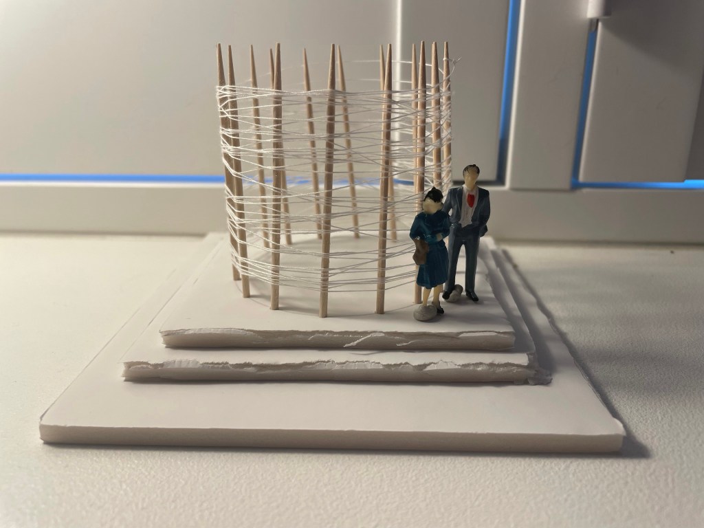
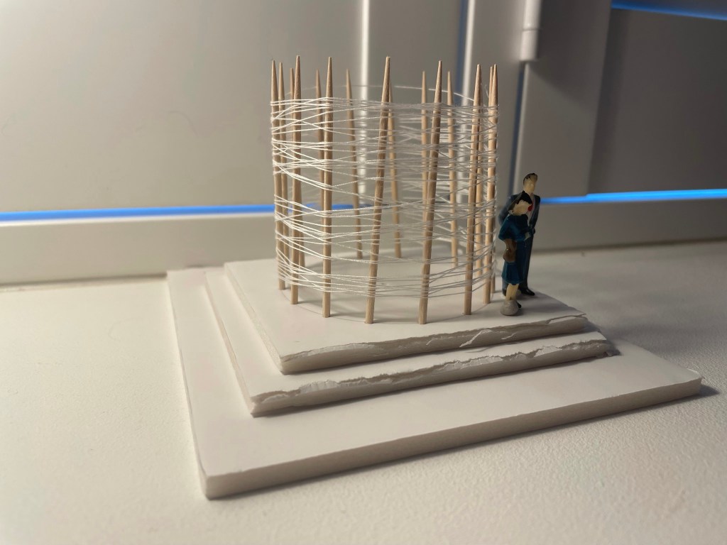
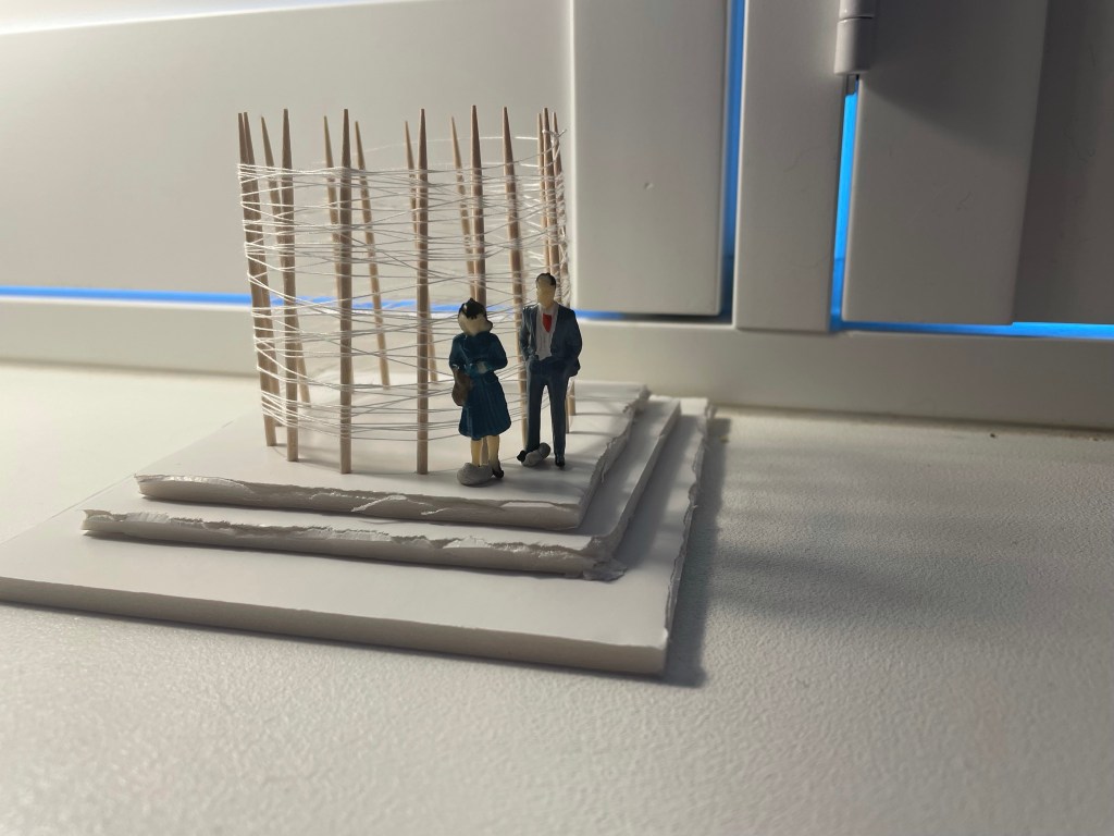
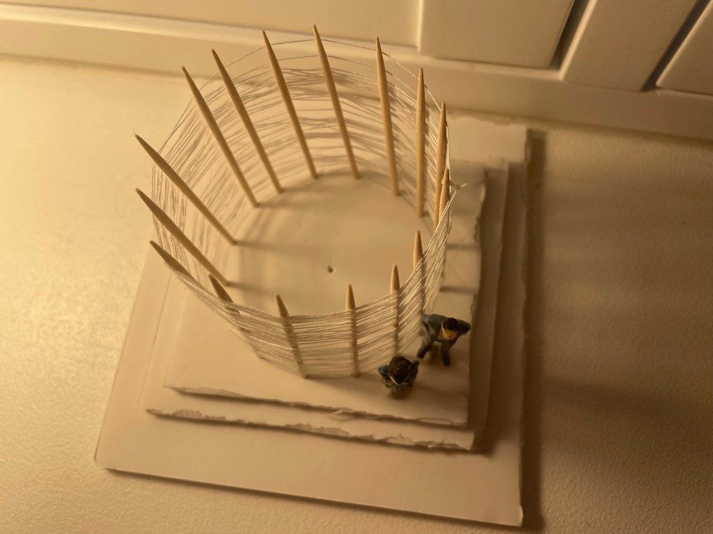
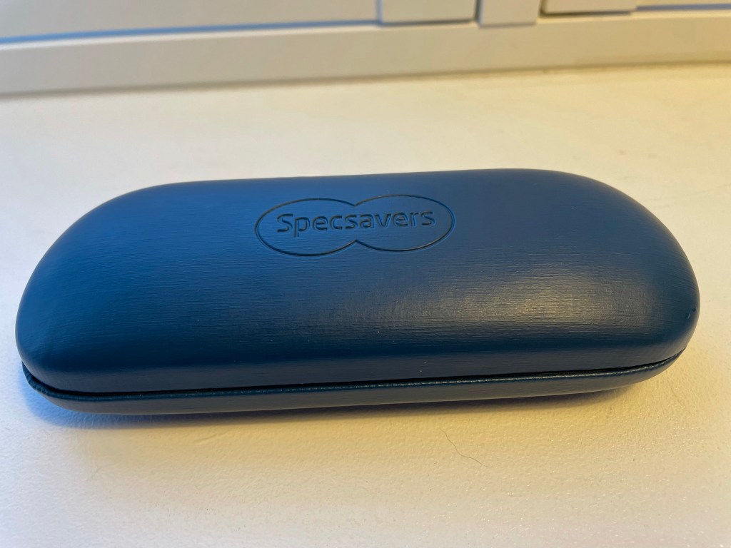
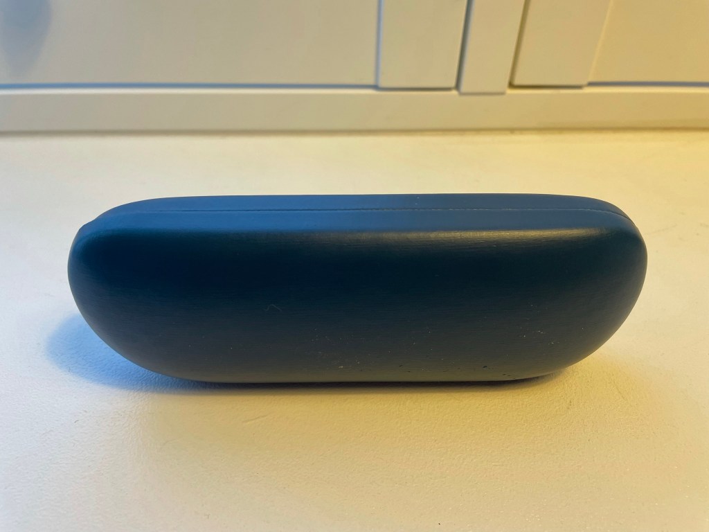
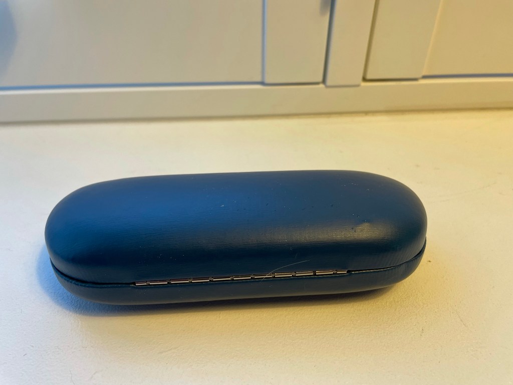
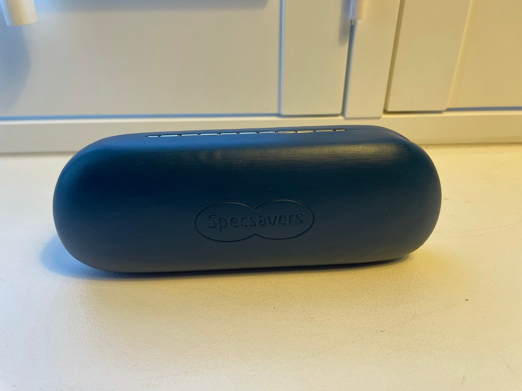
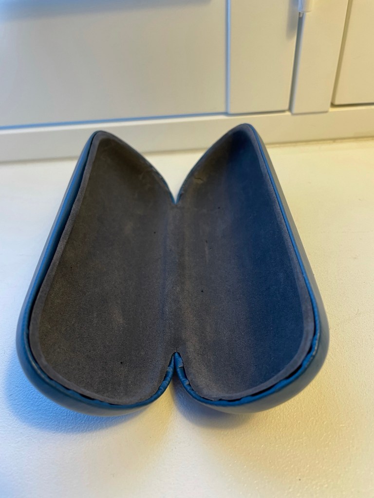
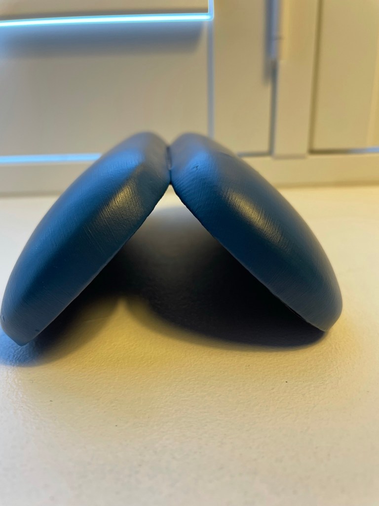
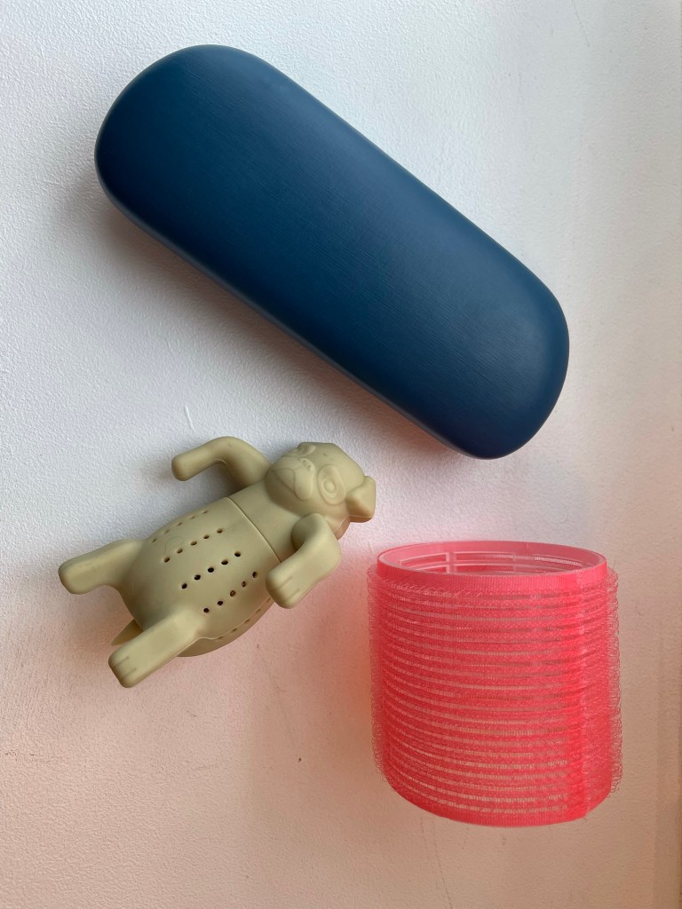
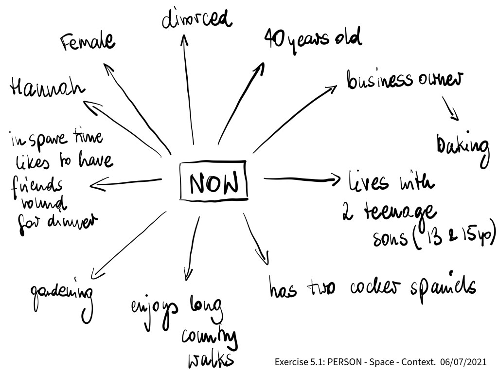
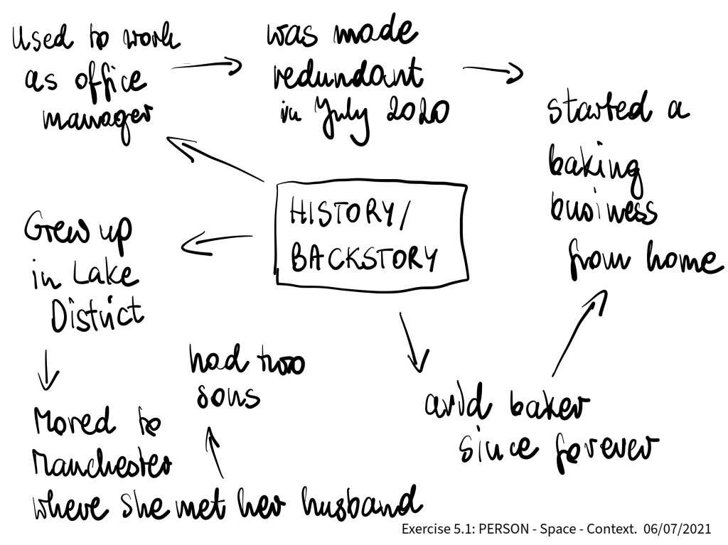
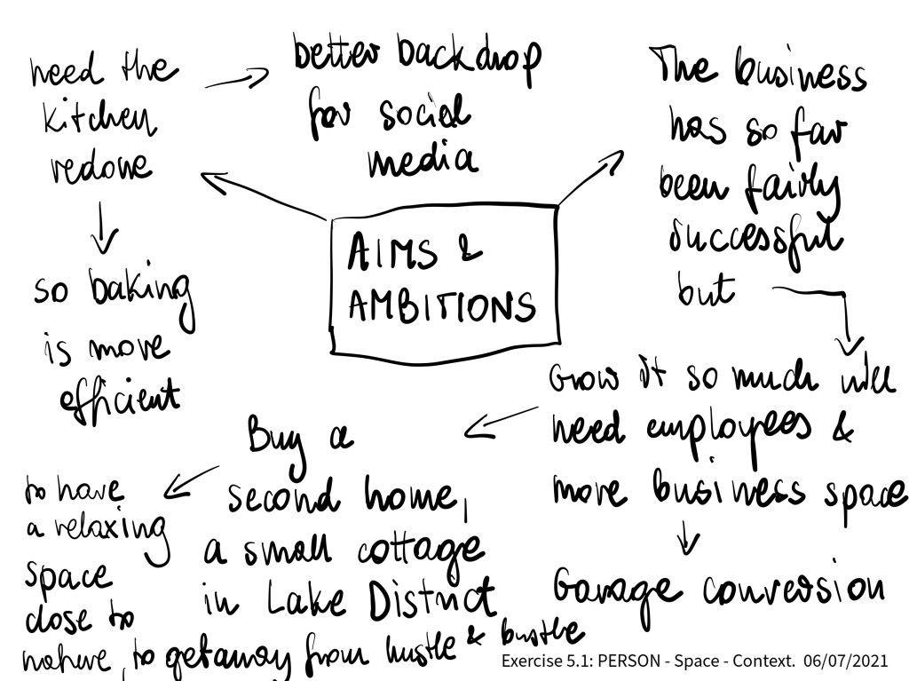
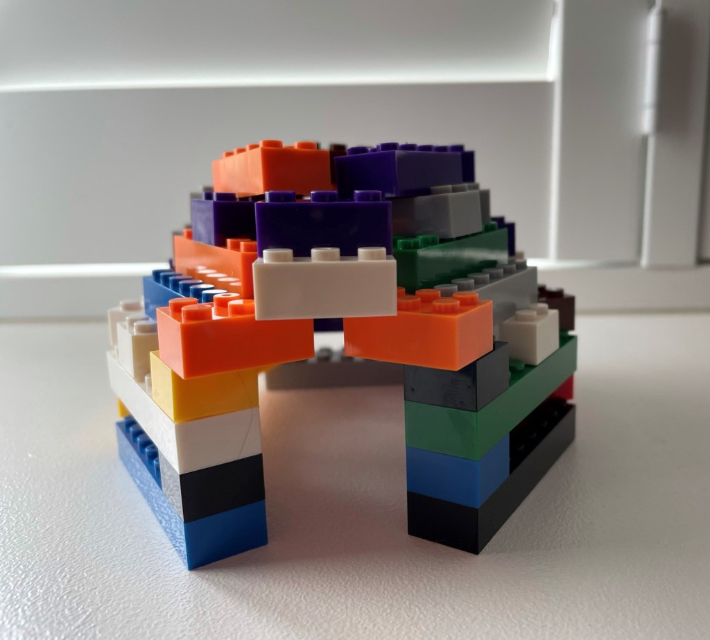
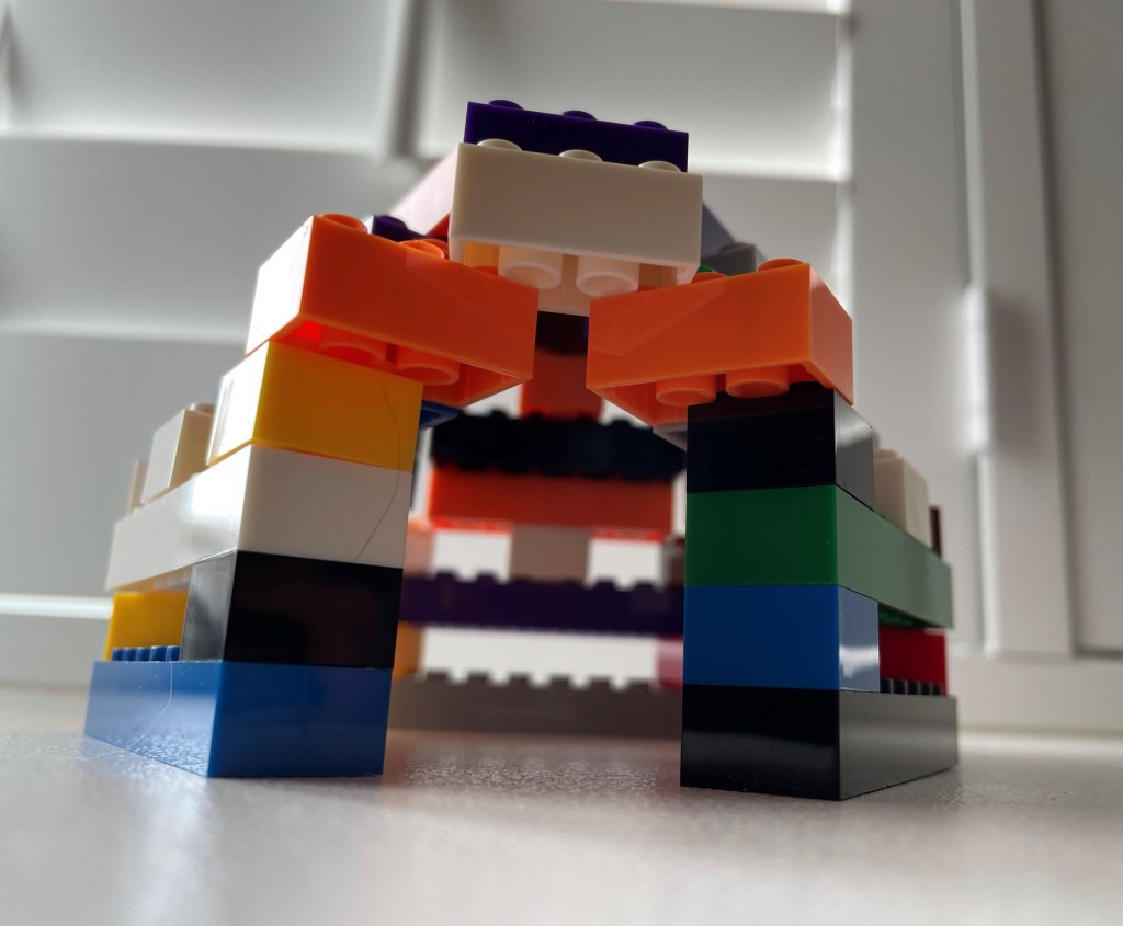
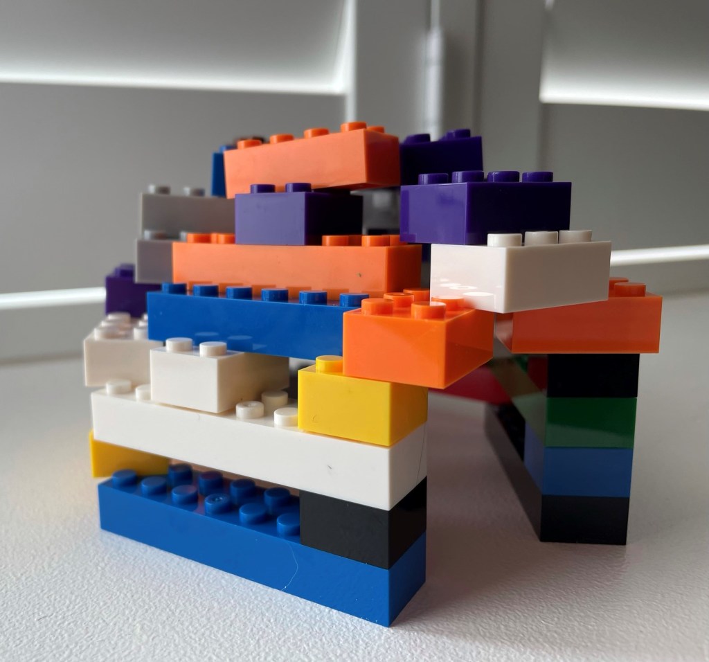
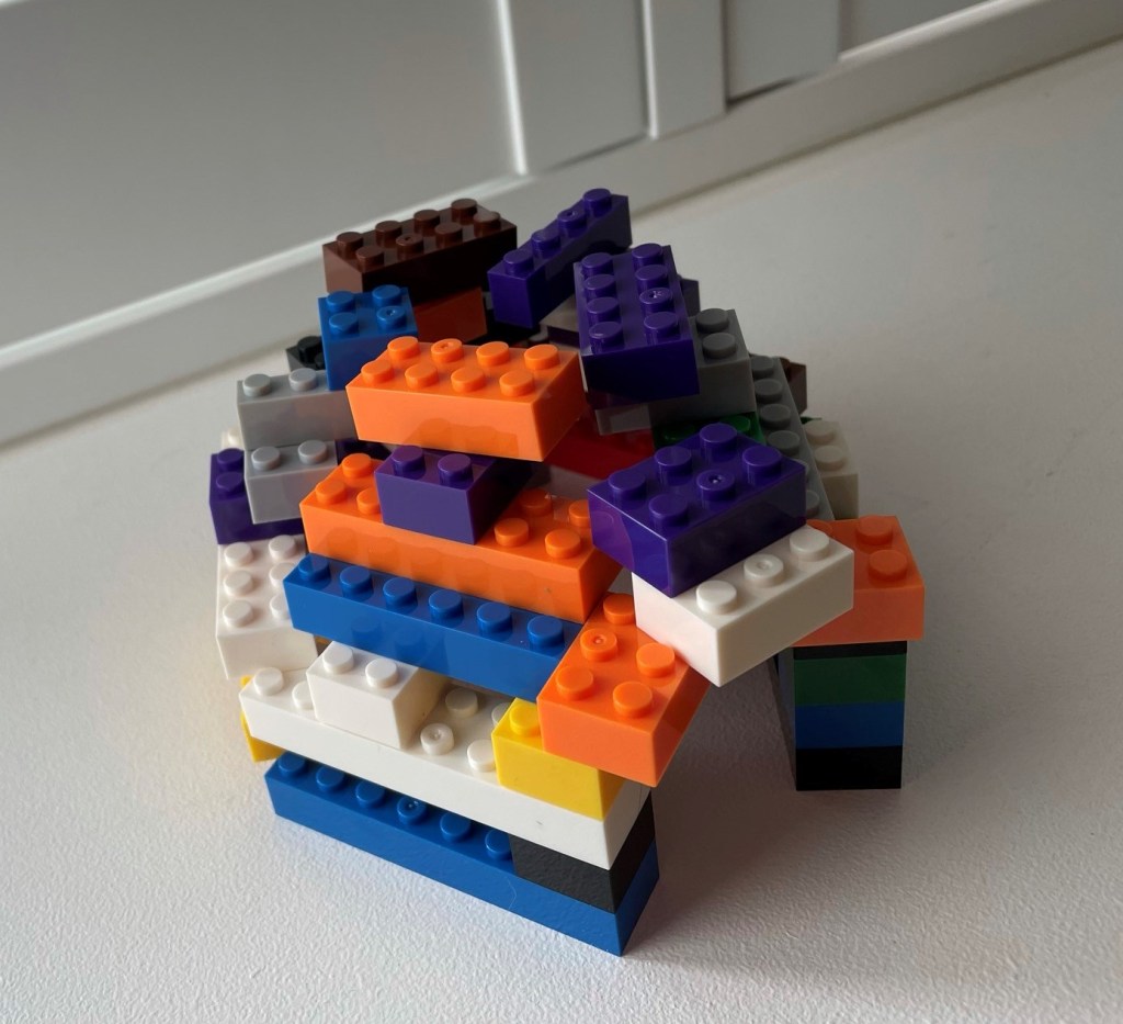
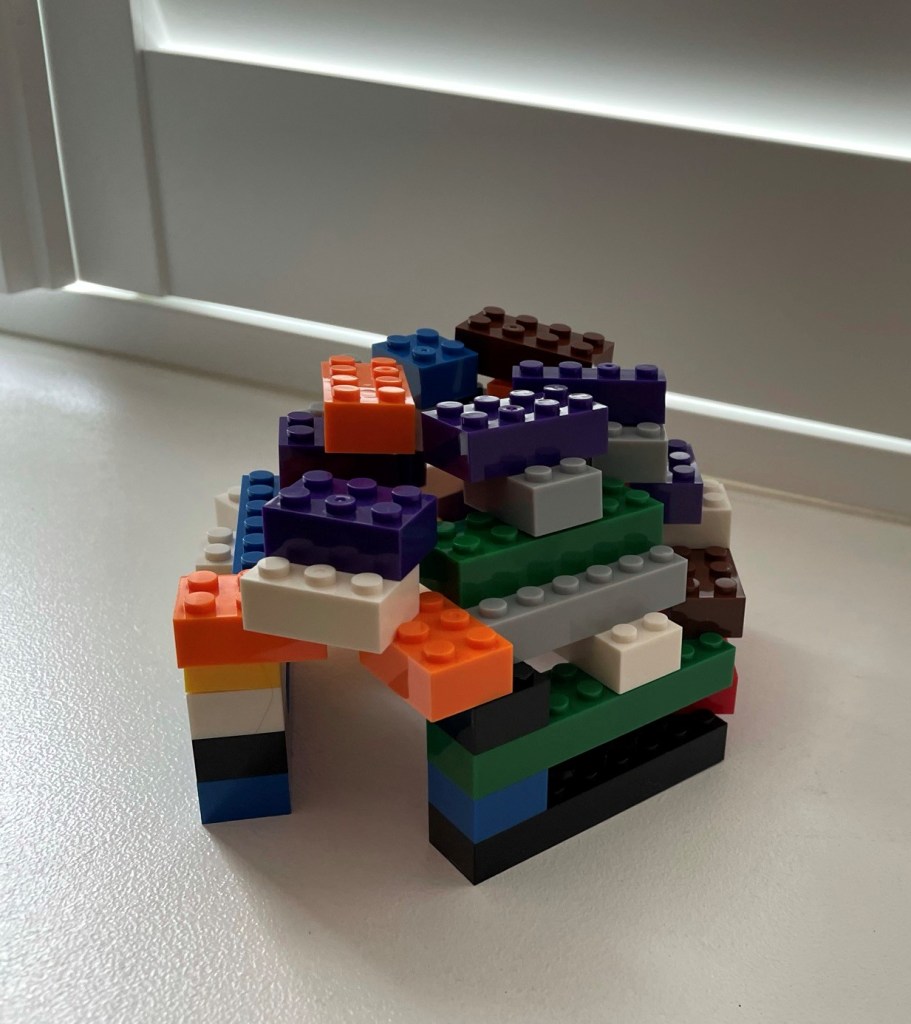
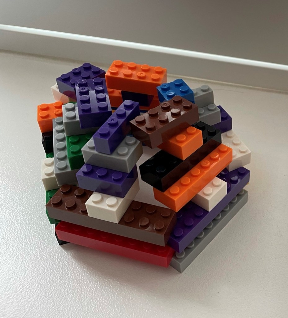
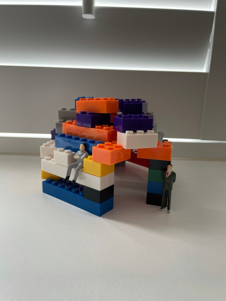
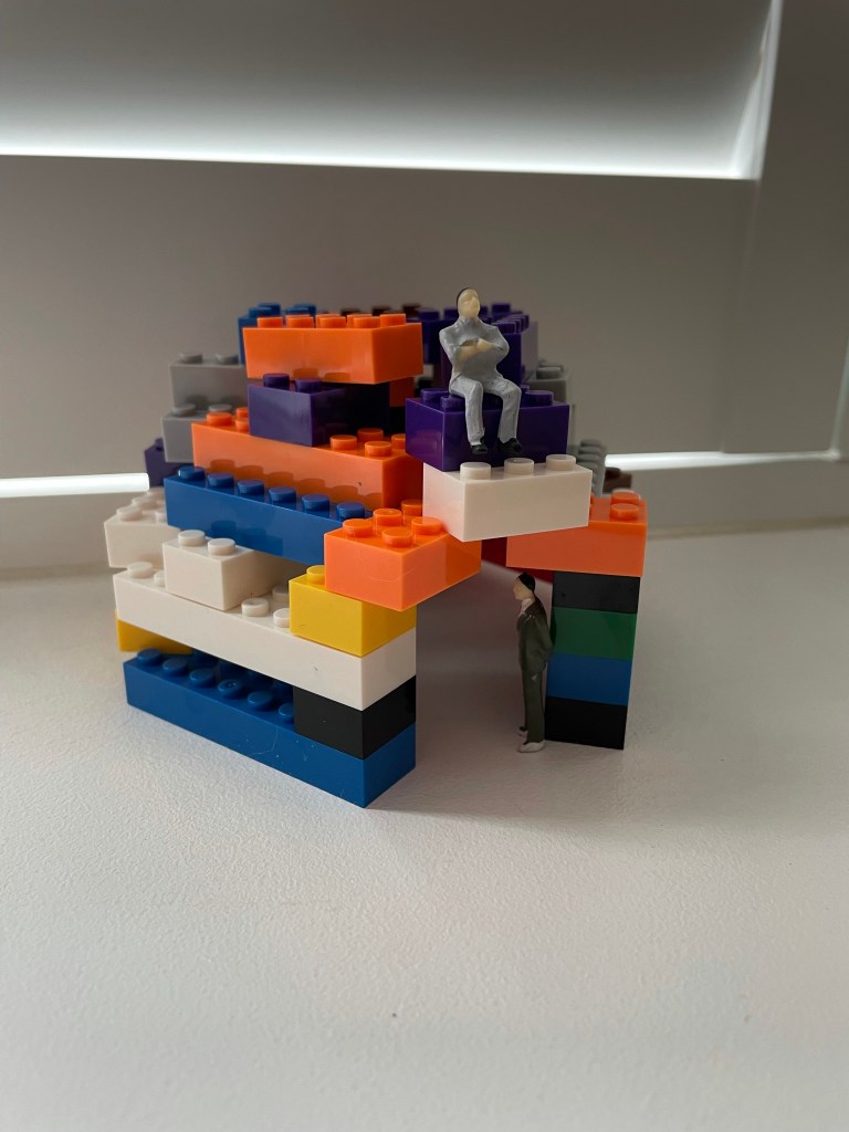
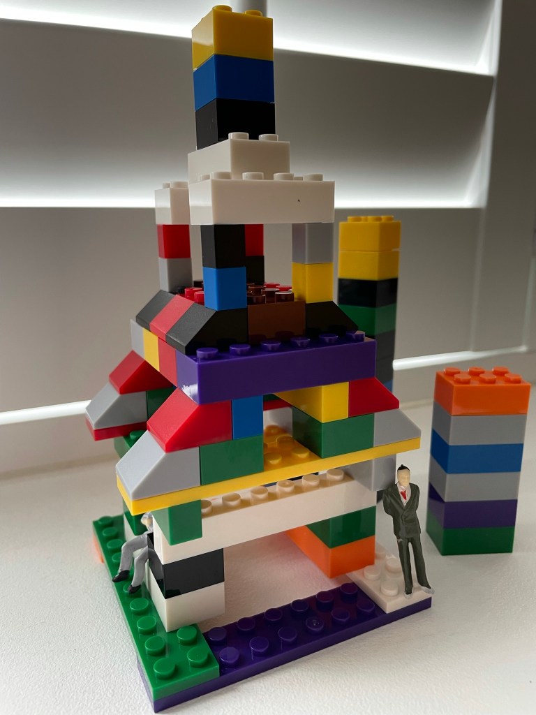
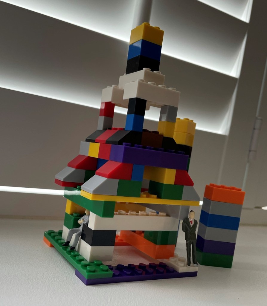
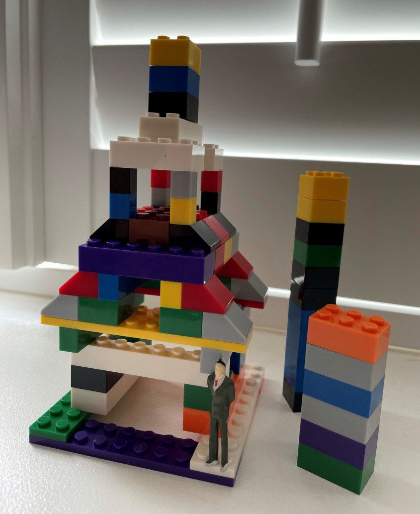
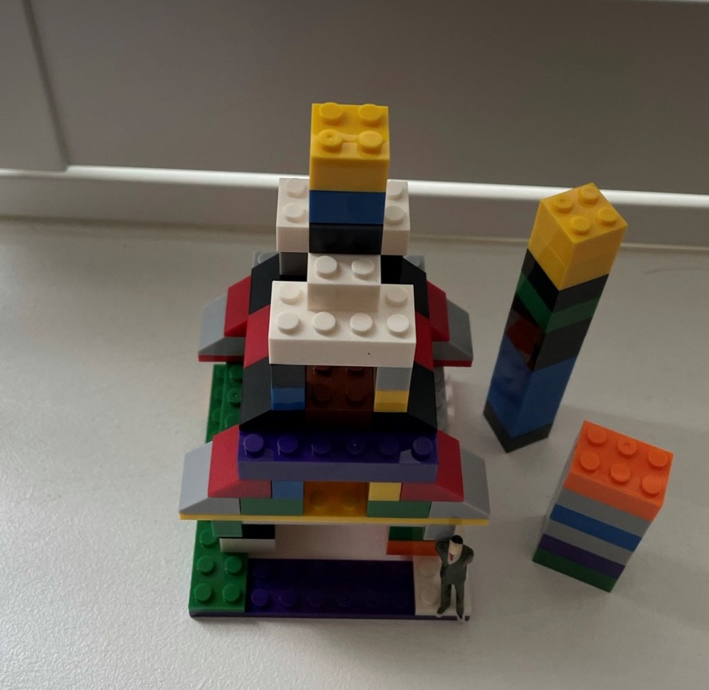
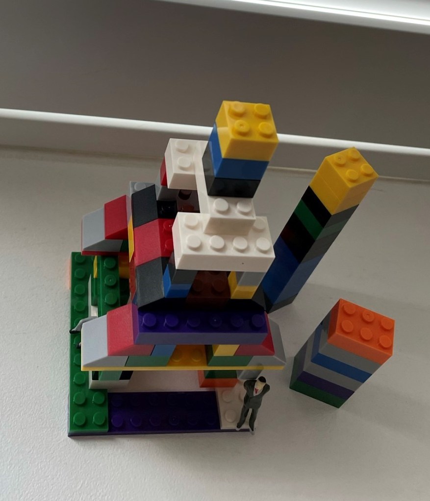
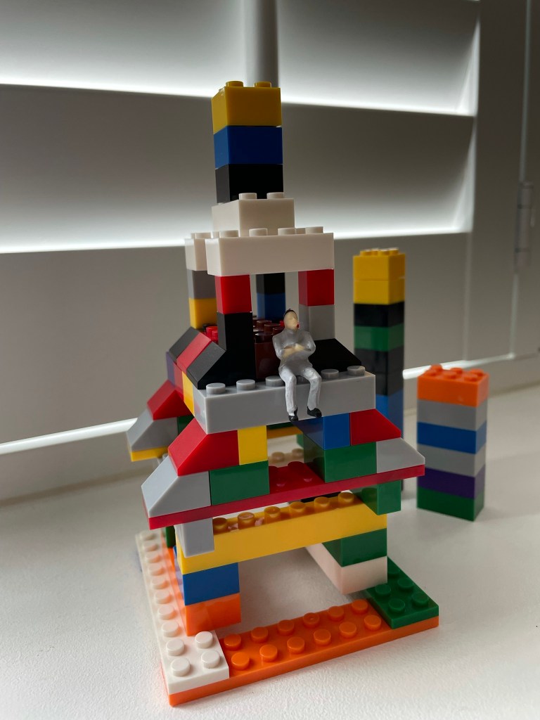
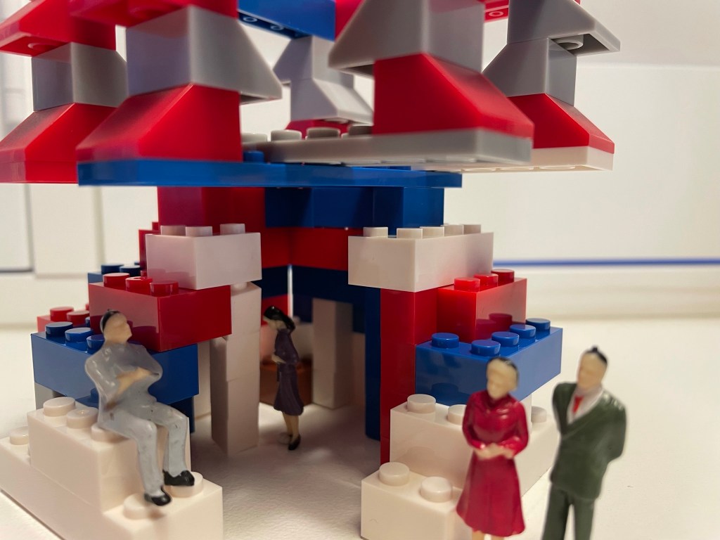
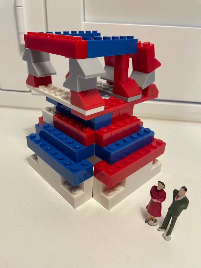
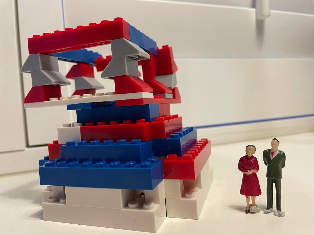
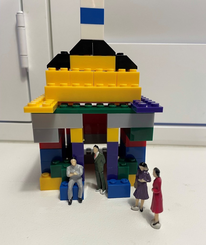
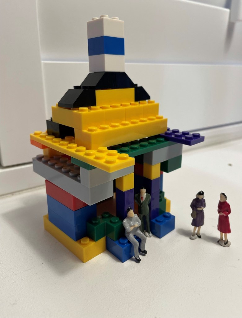
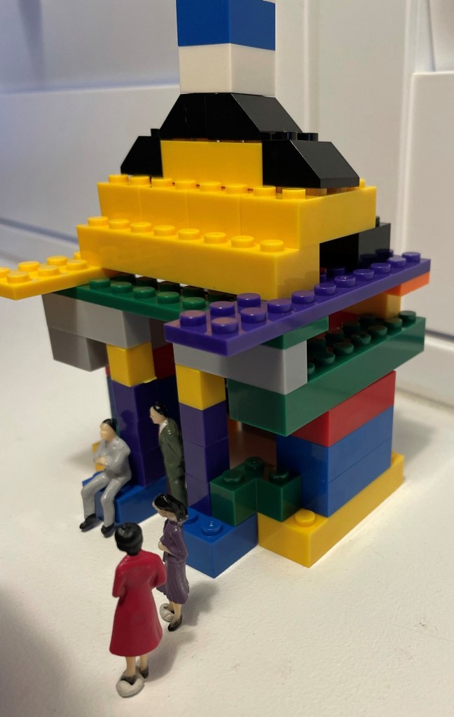
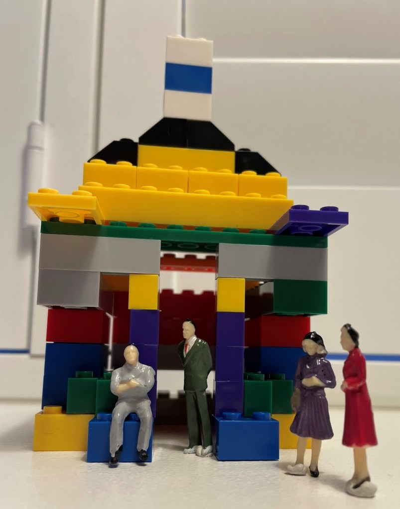
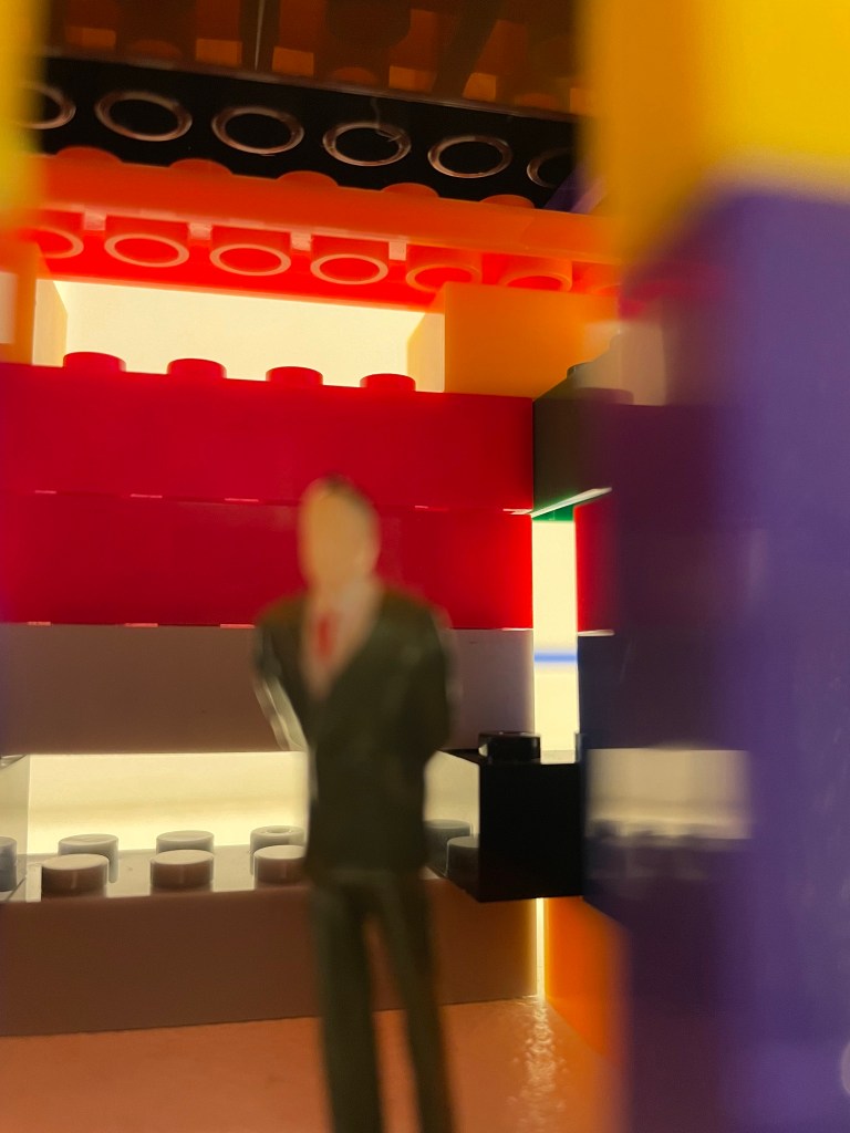
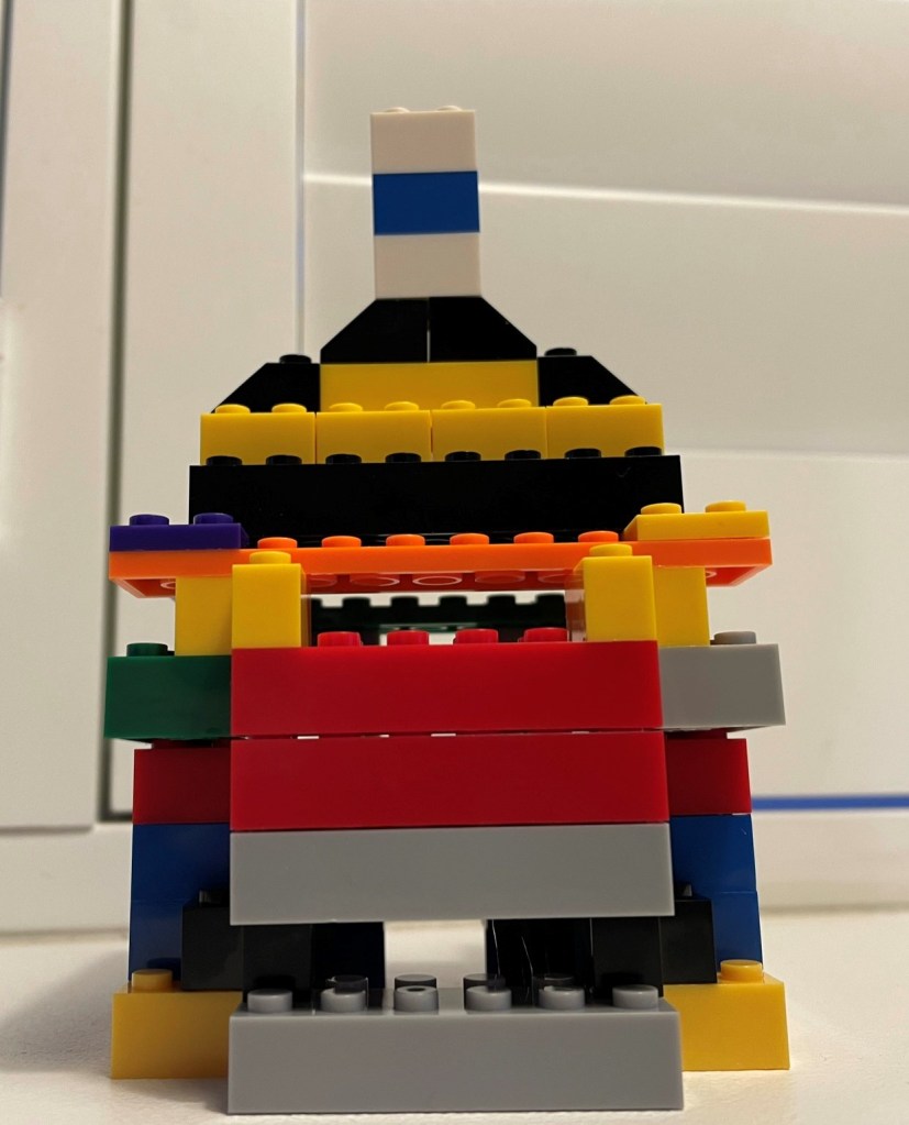
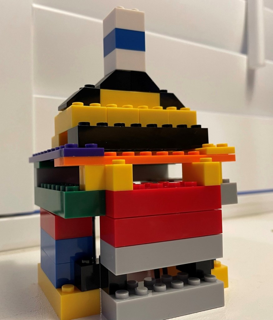
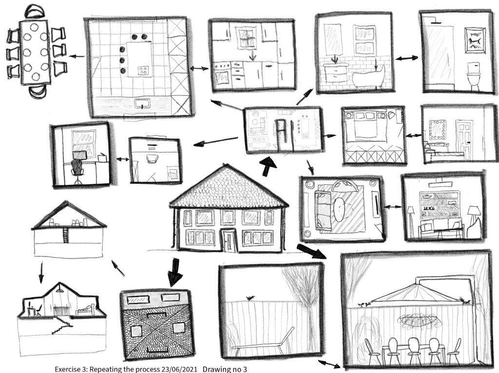
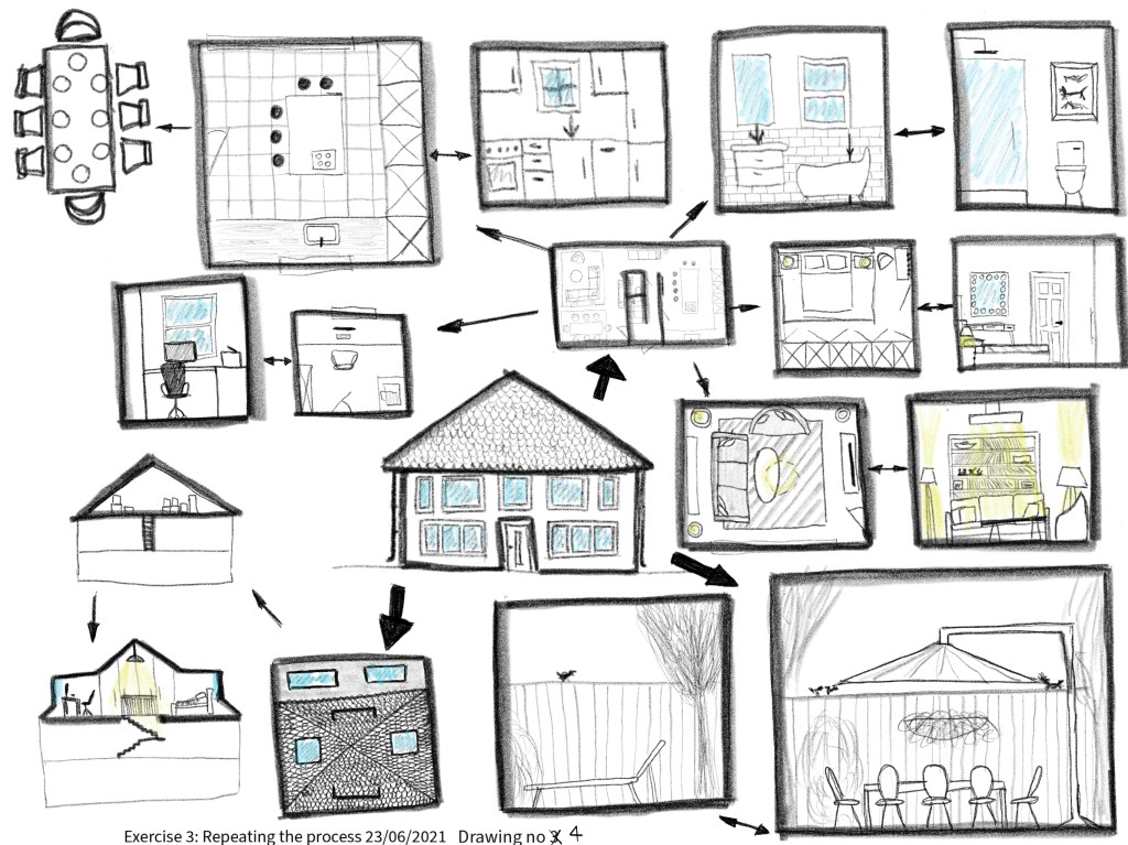

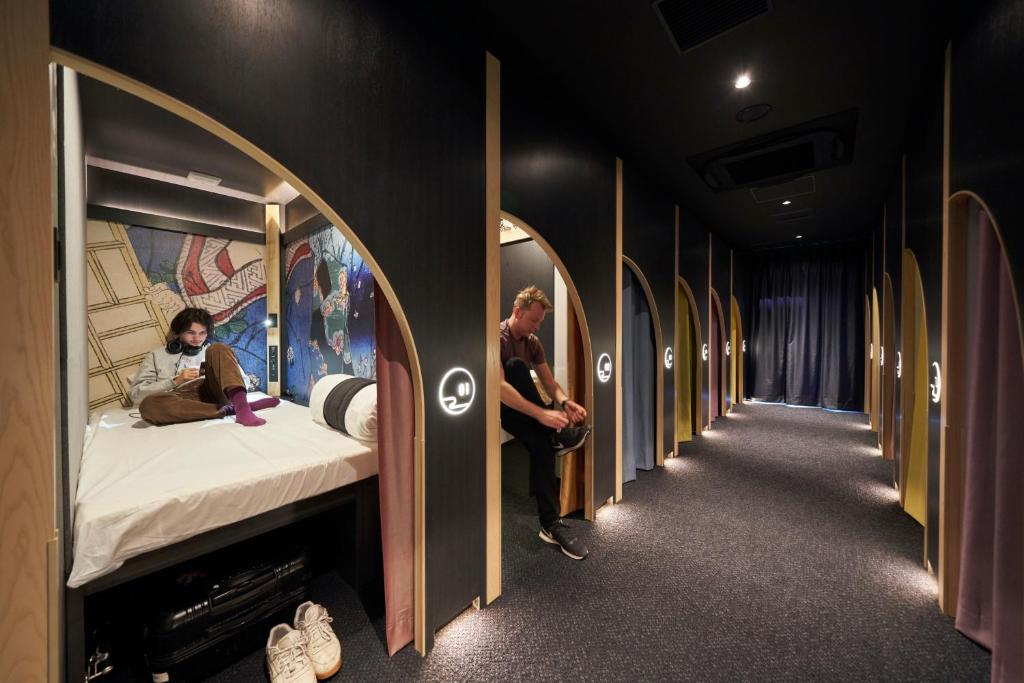
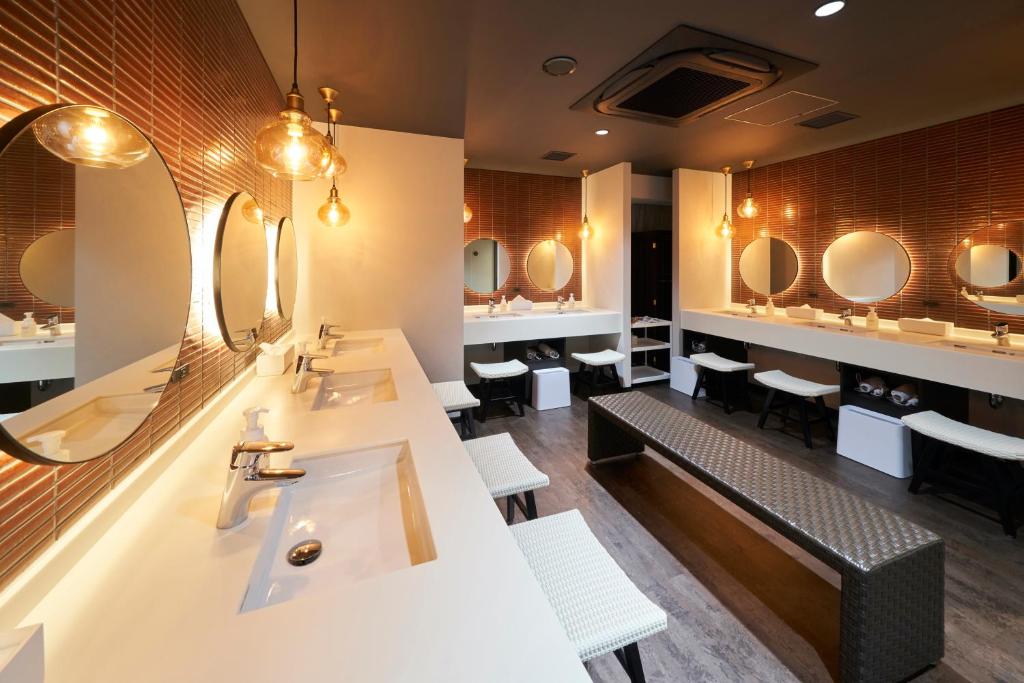
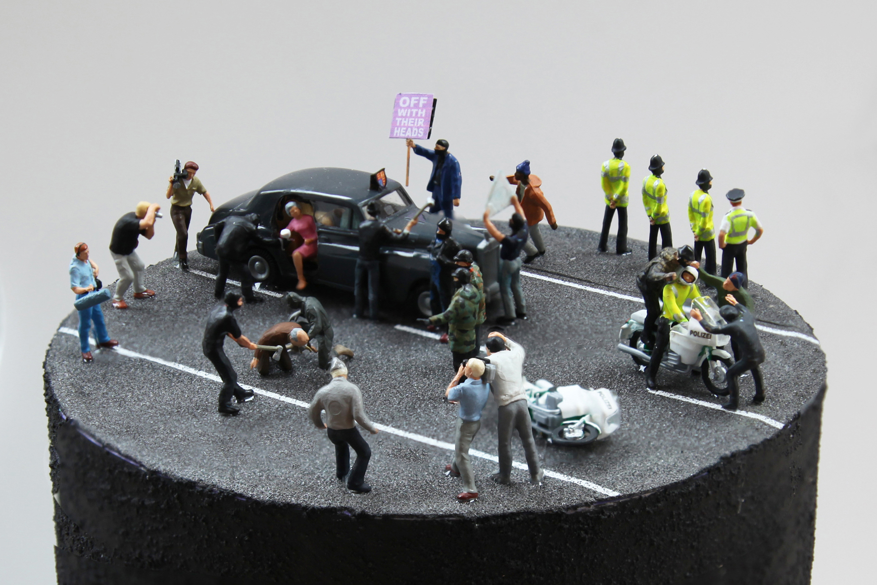
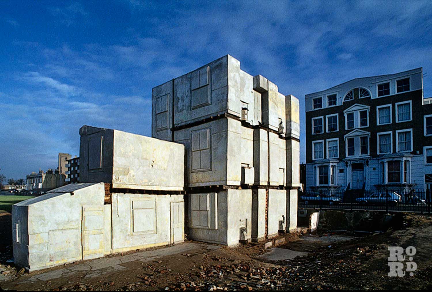
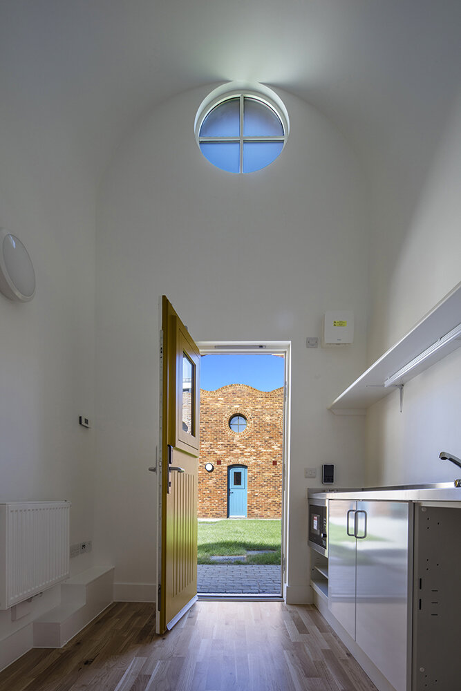
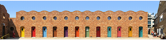
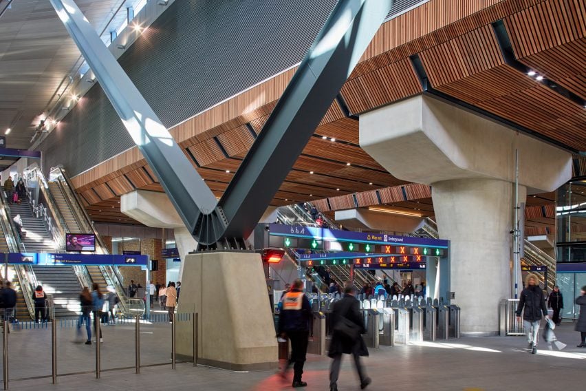
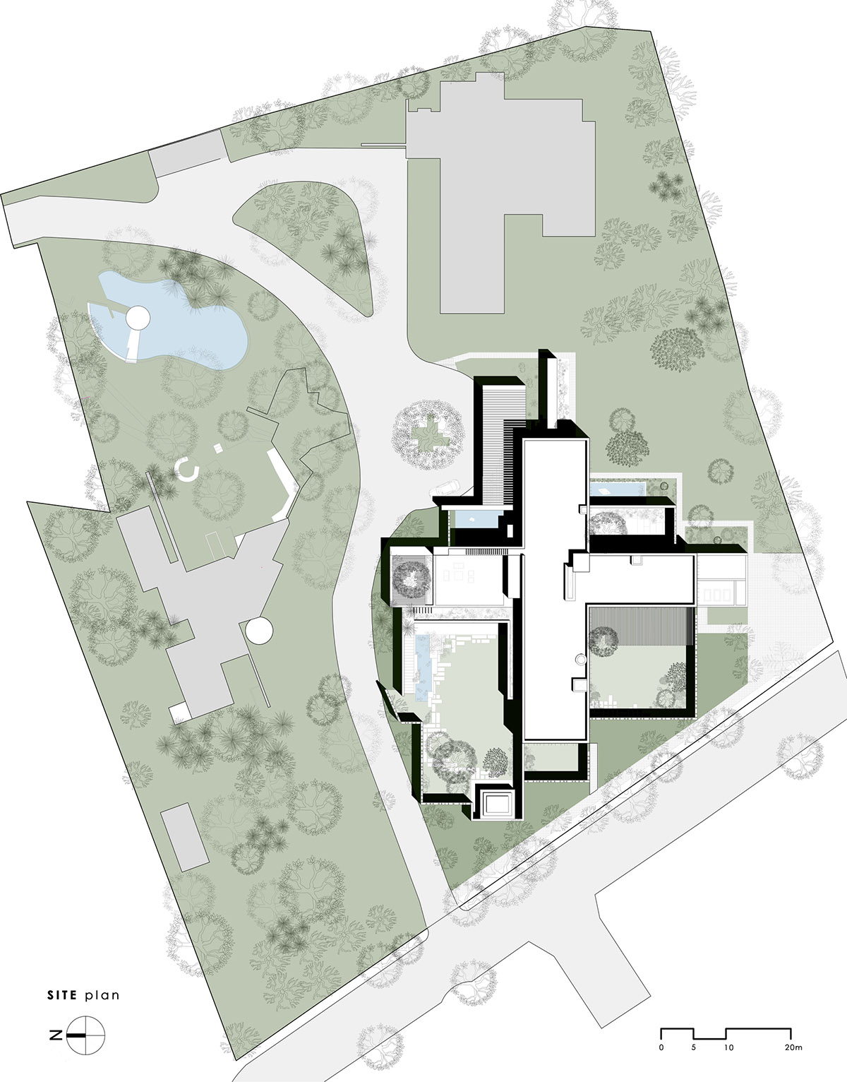
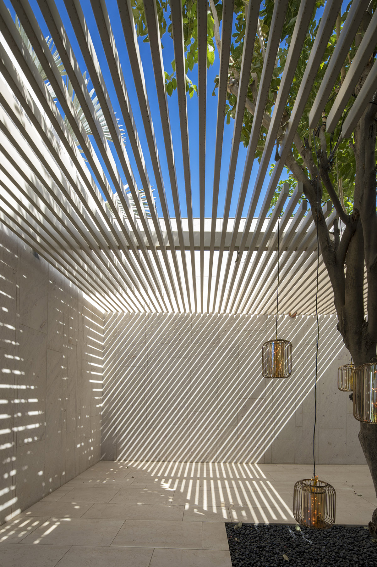
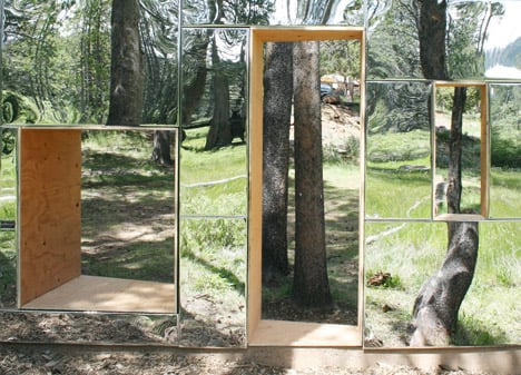
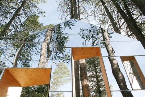
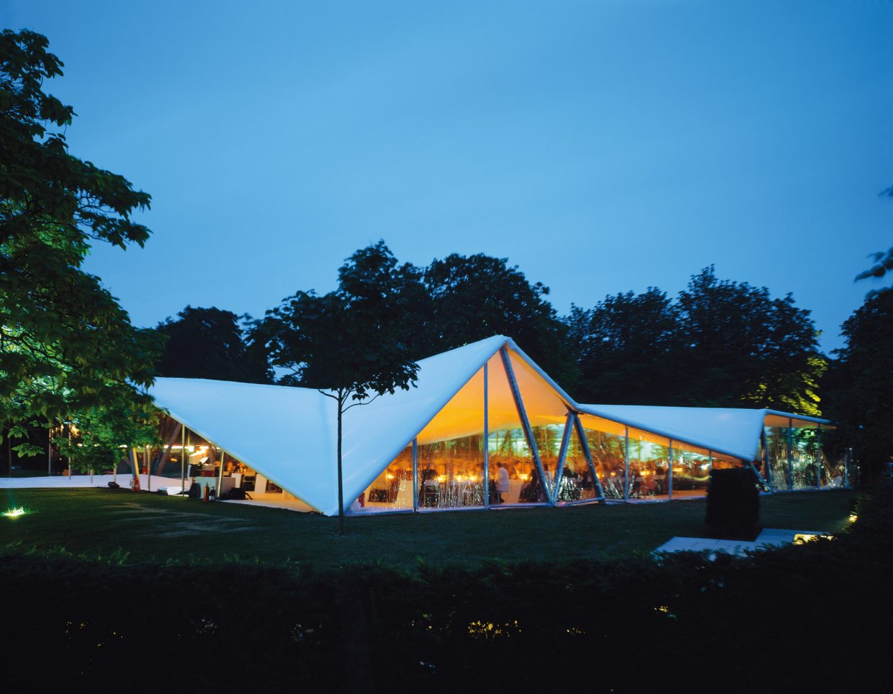
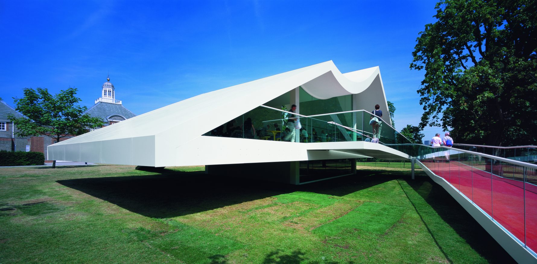
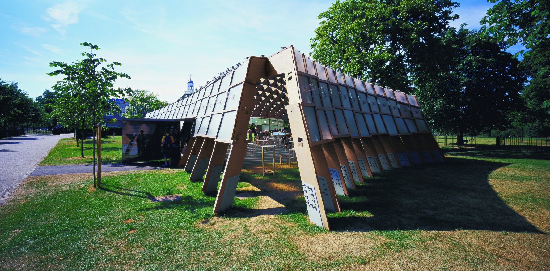
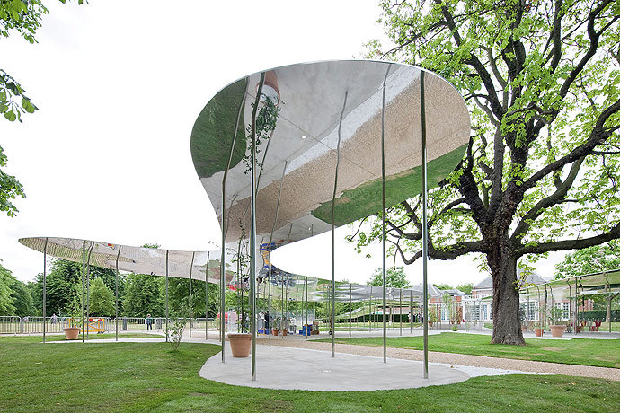
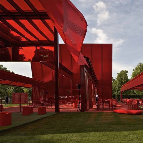
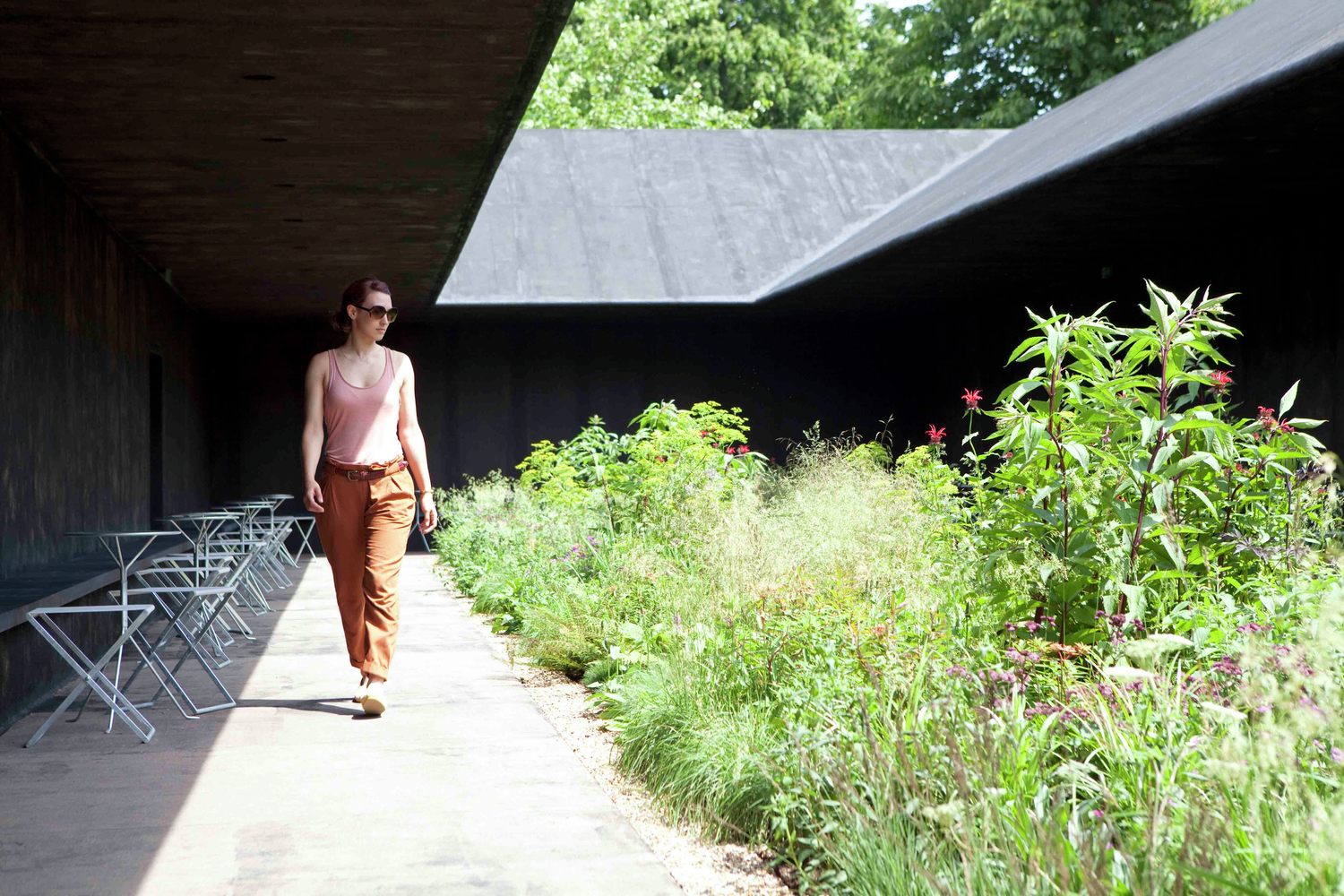
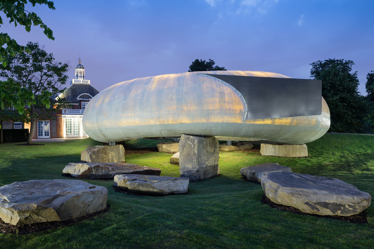
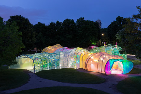
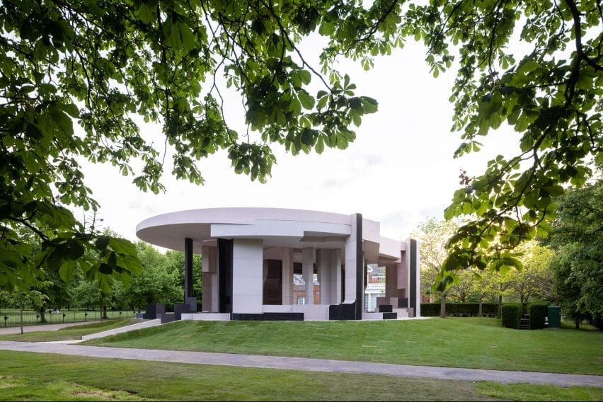
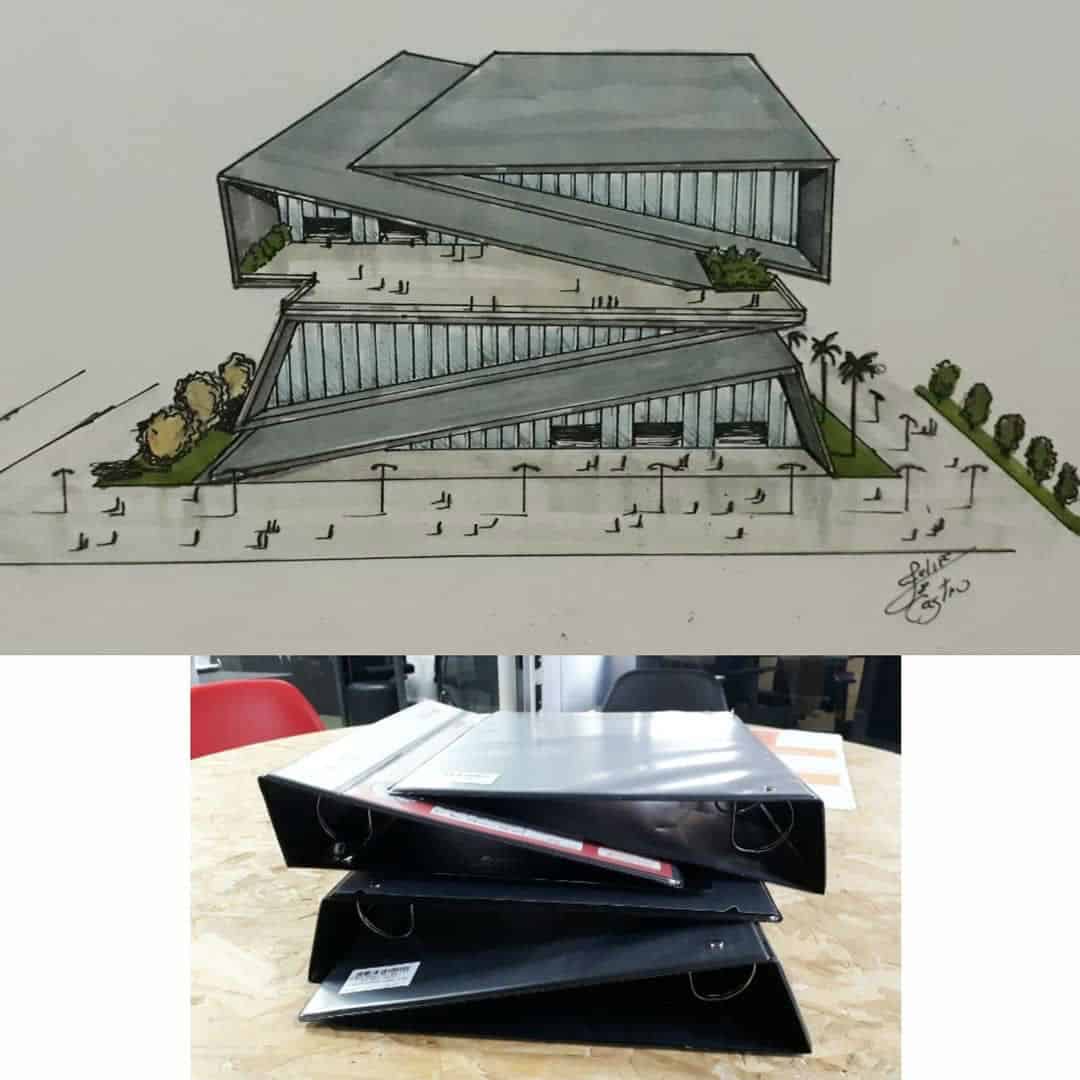
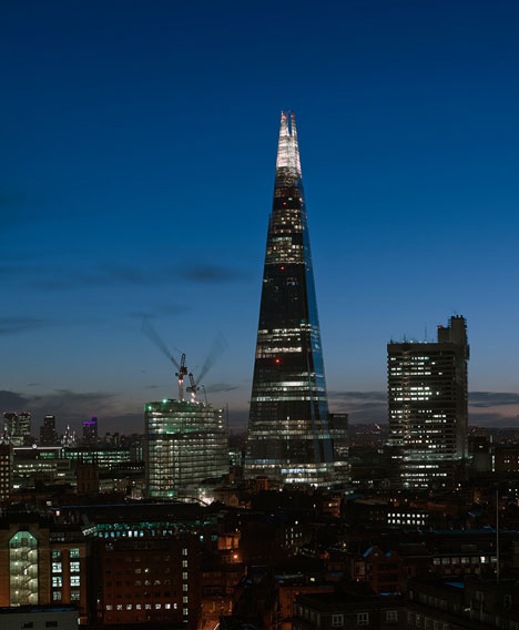
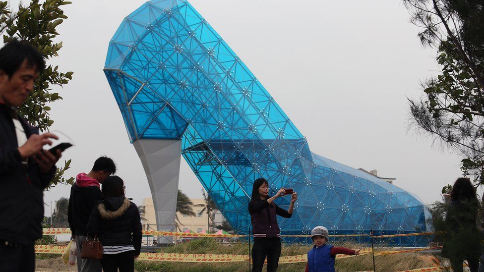
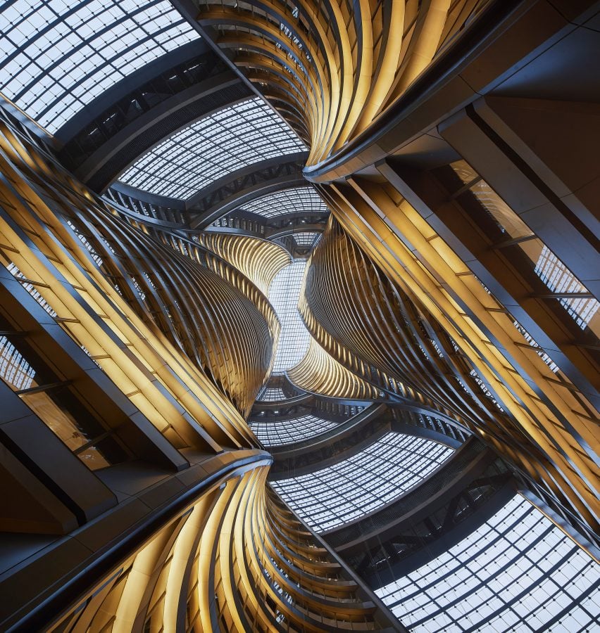
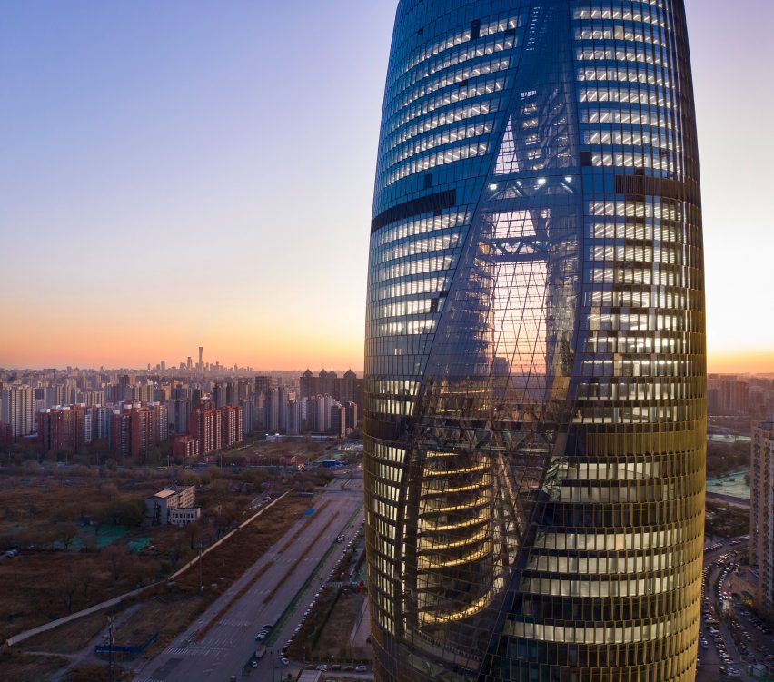
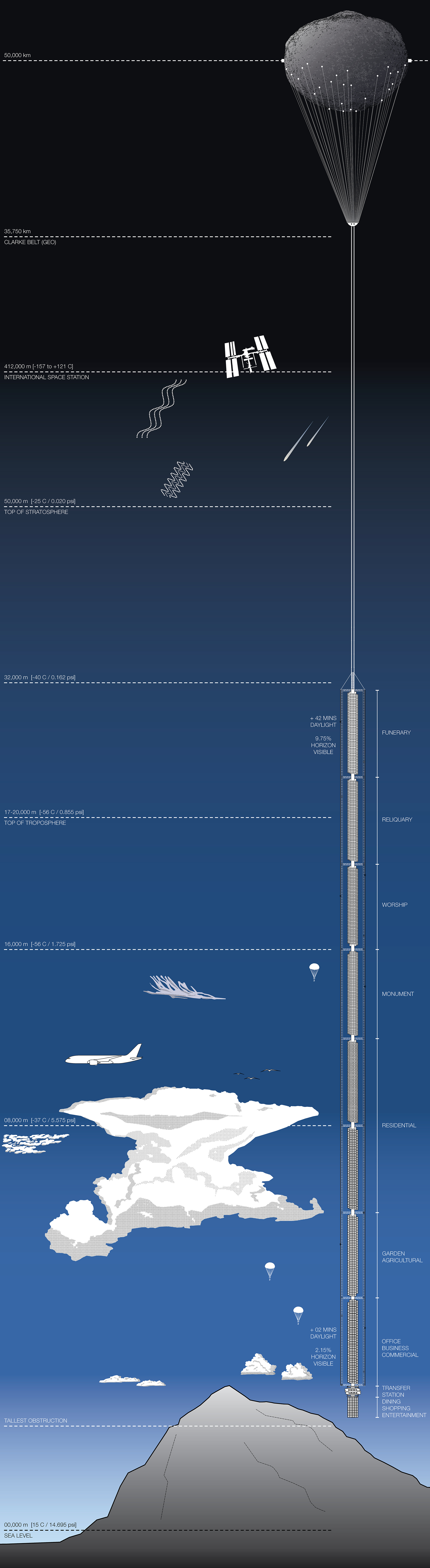