Reflection on the task
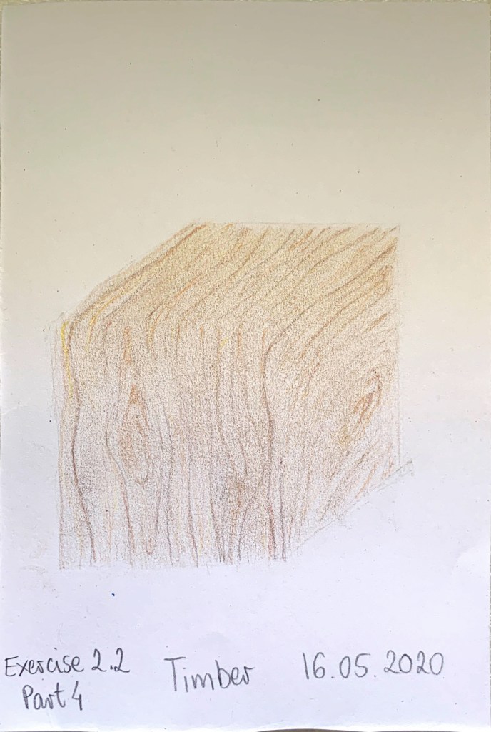
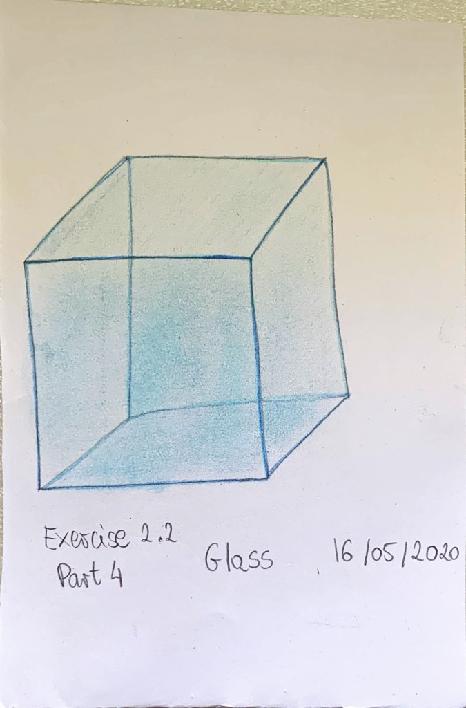
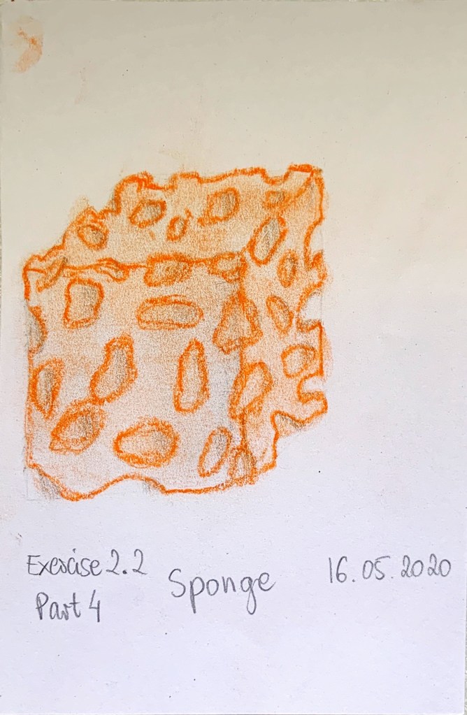
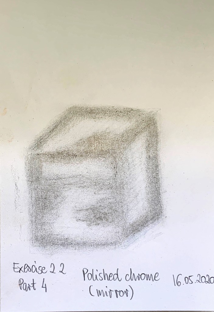
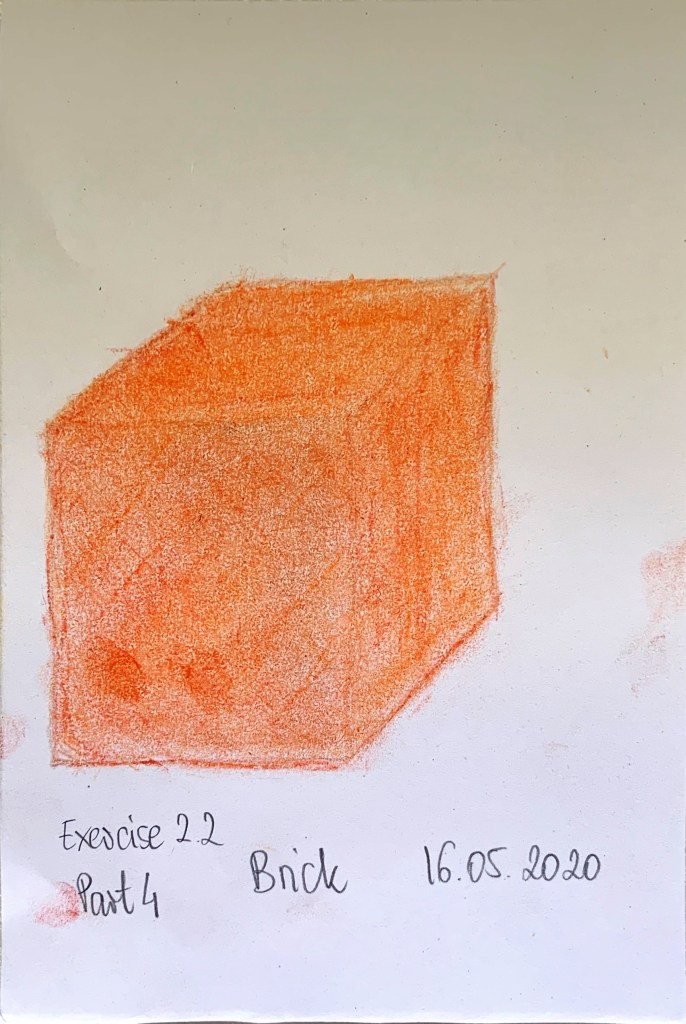
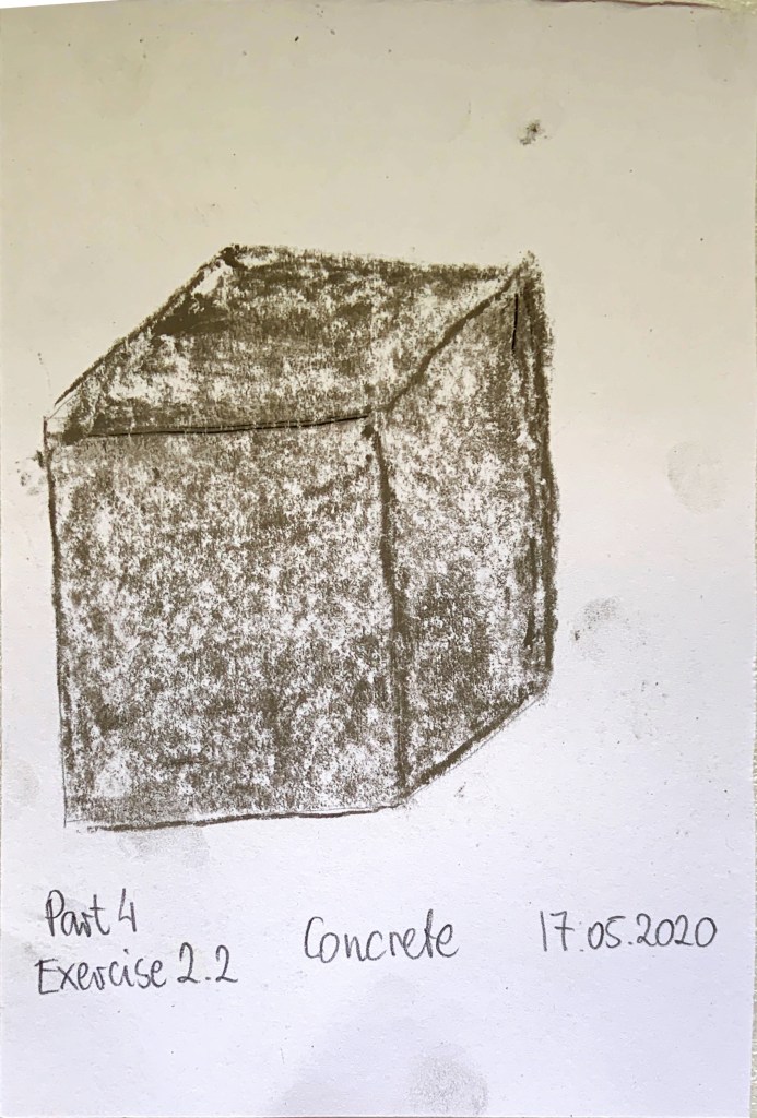
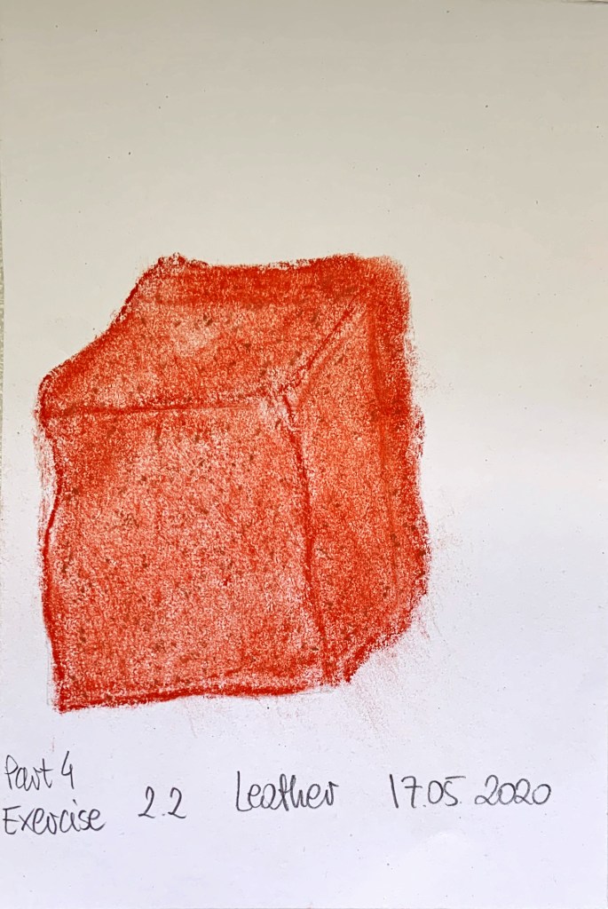
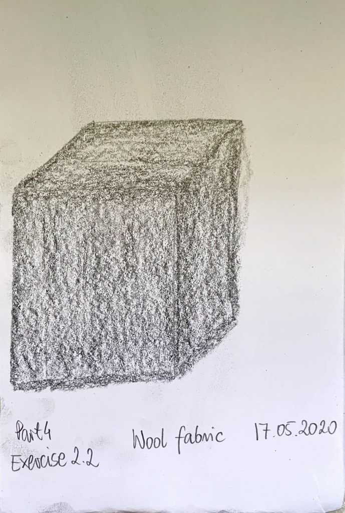
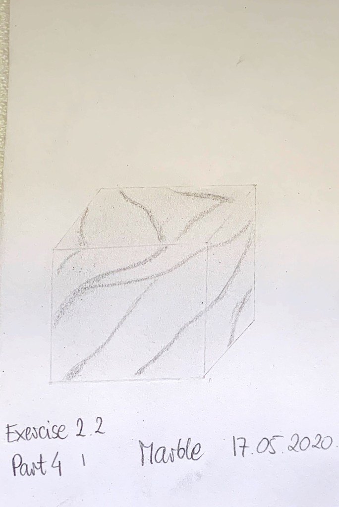
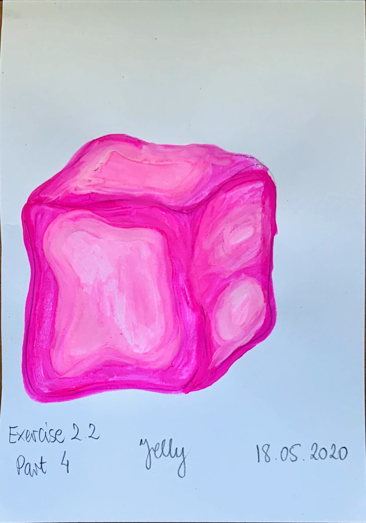
That was a difficult exercise. I think the drawings in exercise 2.2 look more realistic than exercise 2.1 (with exception of marble which gave comparable results in both exercises). The main positive of exercise 2.2 was ability to use colour which helped make the material look more realistic. Being able, have to time to erase bits also helped. Different mediums helped to rely the texture better. Longer drawing times gave me time to rely hardness (or squishiness) and shine (or its lack) and whether its smooth or rough. The hardest one was leather and polished chrome. Pencil was great for marble and wool fabric. I used pencil and grey soft pastel to convey polished chrome, I’m not sure if the result is convincing. Just soft pastels created concrete. Mix of coloured pencils and soft pastels worked great for timber, sponge, glass, and brick while watercolour paints worked wonders on the jelly. Some of these longer drawings were fast (concrete, wool, marble) while others needed more time and attention (sponge, jelly) due to more detailed structure. Being able to use different media helped to convey more detail. Some of the materials I wish I could make a collage off (leather, polished chrome, brick).
