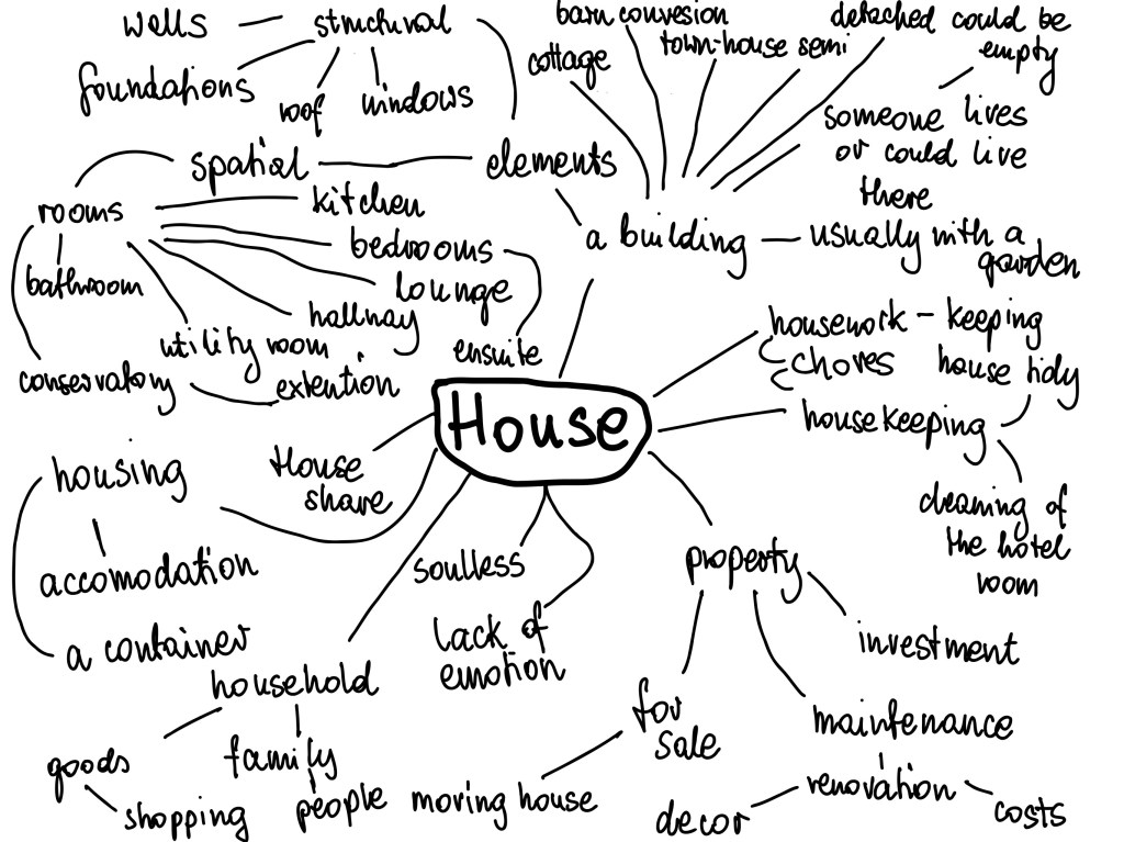
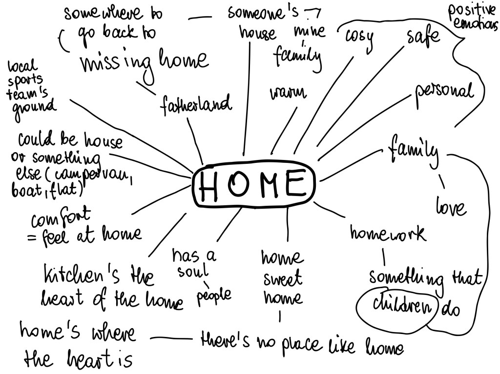
In my opinion the difference between a house and a home is the feeling about the place. A house is just a building, walls with a roof over, no attachment. Home is a place where people go back to, to feel safe and comfortable and cosy.
An interesting thought occurred to me when noting down ‘moving house’ – the actual house, the building does not get moved – but all the home belongings do – to make home in anew place. Yet it is called moving a house.
Home is usually in a house, but it doesn’t have to be.
Home could also be a place, as a foreigner in England I often get asked if I ‘go back home often’. And then I usually say here is ‘home’ now. But many people moving countries may not feel at home in their new location, and for them home is back where they grew up, where their family is.
I often consider differences between English and my mother tongue. In Polish language house and home are the same word. Yet somehow, we can tell the difference between the two meanings of the word.
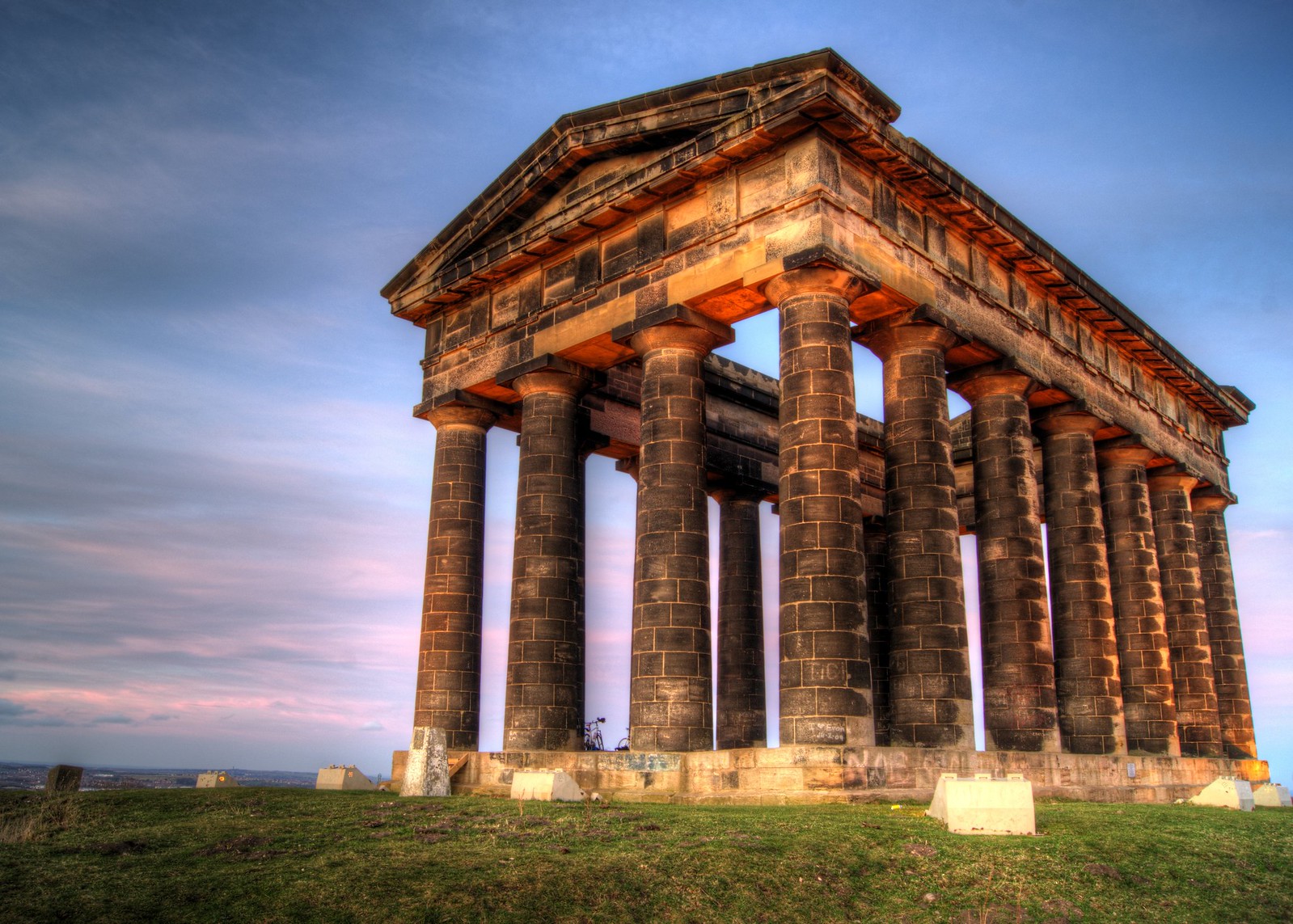
Follies are buildings with no true purpose, apart from pleasure. Traditionally they were garden structures built in English gardens and estates, imitating ruins, or historic buildings. They were supposed to enhance scenery. They were particularly popular in England in the 8th and 19th centuries and were usually inspired by classical ruins and structures seen during estate owners travels to Greece and Italy. Usually they were not very big, but I found a particular example that is rather large and visible from far away.
My chosen folly is the Earls of Durham’s Monument more commonly known as Penshaw Monument. It proudly sits on top of a large hill, surrounded by countryside and offering views all the way to Durham’s Cathedral. It has been designed by architects John and Benjamin Green of Newcastle and built by Thomas Pratt of Sunderland. It is a half-sized replica of Temple of Hephaestus in Athens. The classical greek construction, made of local gritstone is 30 metres long, 16 metres wide and 20 metres high. The built has been completed in 1844 and currently it is in the care of the National Trust. For a small fee, on the spring and summer weekends, the public can climb a staircase hidden within one of its columns and admire the views from top of the structure. The grounds around the monument are always open to the public and free to visit. The building is lit at night.
Fig. 1 Penshaw Monument
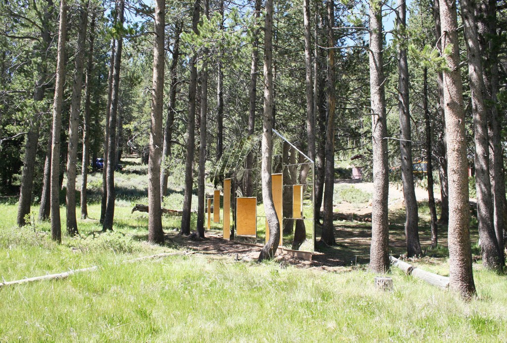
An example of an interesting contemporary folly I found is Invisible Barn. It has been designed by stpmj architects with the context of the site being the centre of attention. This design was desirable in this particular location because of the trees having similarly sized trunk and being equally spaced. This allows the mirrored walls to blend effortlessly with their surroundings. Plywood openings that pierce through the barn seem to be floating mid-air. Aluminized polyester film has been used as the reflective surface. It has been specially selected to give the desired illusion of invisible building but at the same time to be noticeable to birds, thus avoiding the wildlife colliding with the folly.
There seemed to have been an idea for the element of surprise as the ‘windows’ and ‘doors’ appear to be floating, and as curiosity draws the visitor in the structure reveals itself in its shiny blurriness. Part of the concept was for the building to blend within its surroundings, not for the nature to give way to it, but for the building to compliment it and blend within it.
The shape of the structure is unusual. Looking at it from the longer side it has an apparent shape of a typical house built on a rectangular plan, topped by a triangular on two sides and slopes on the other two surfaces roof. As if you look at this usual shape at an angle so you can see two walls, and two of the roofs’ surfaces. Yet on plan it appears as an extremely elongated diamond shape, with very narrow corners furthest apart from the centre.
The folly’s dimensions are 24’x3’x 12’ (approx. 7.3x 0.9x 3.6m) and its footprint is 72 sq. feet (6.68 m2). It has been built in 2015 and it is located in Truckee, United States.
I really like it; the building is enhancing its surroundings and allows public to have a bit of fun with the architecture.
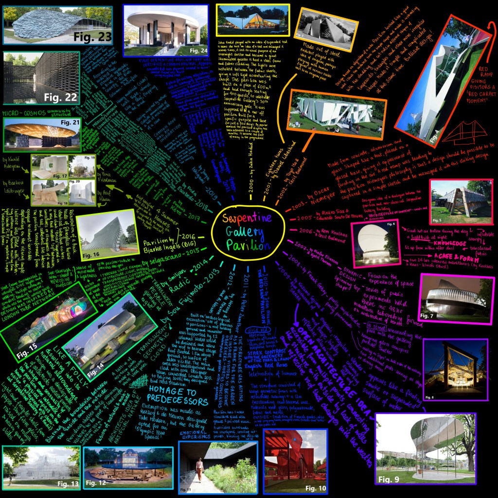
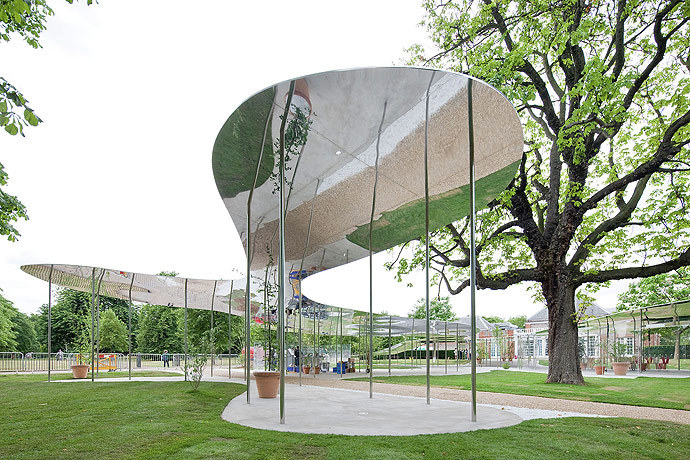
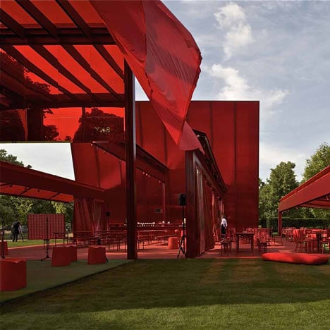
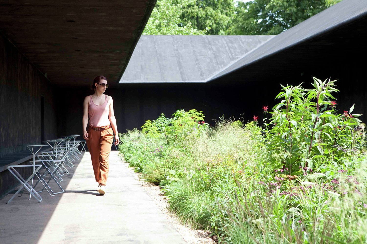
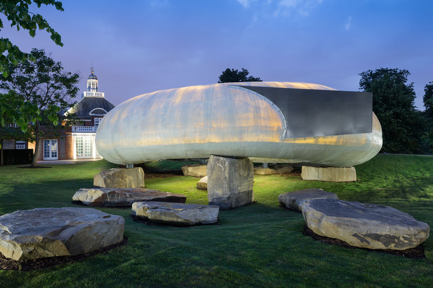
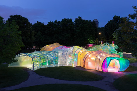
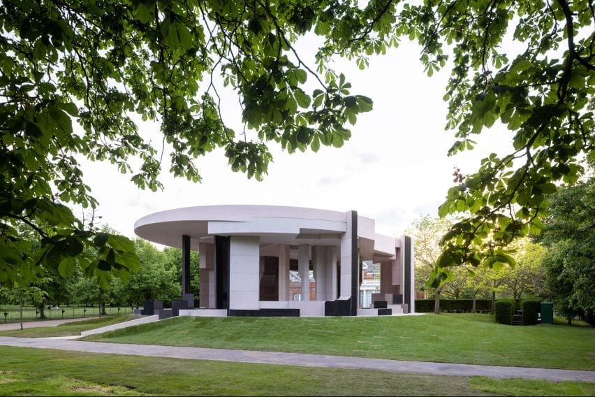
I tried to tackle this task of researching Serpentine Pavilions by simply typing in word. Very soon I realised that I could do it in more interesting way, more interesting for me the maker, and hopefully informative for the reader. I colour coded parts of text and picture frames referring to each pavilion, so hopefully there is no confusion. It was an extensive research task, I feel like it took forever. The references alone are 7 pages long in a word document! At the same time, by undertaking it in such a fun way I feel I memorised a lot more than by simply typing it all up. I completed the mind map using Adobe Fresco on iPad. I am not sure if the image upload is of satisfactory (readable) quality so just in case I will attach a downloadable pdf version of the mind map.
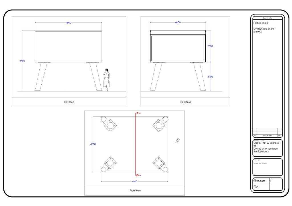
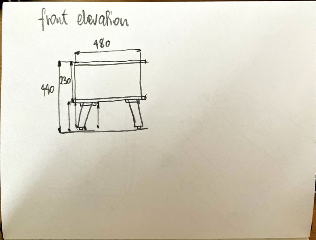
I enlarged by object 10 times. So its overall dimensions are 4.8m long by 4m wide by 4.4m high. Its dimensions and the angled legs remind me a little bit of Peckham library pods. Perhaps that is where Will Allsop got his inspiration from. The footstool use is completely redundant, the object became a space. It could be an elevated pavilion or a tiny house.
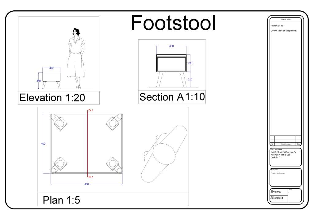
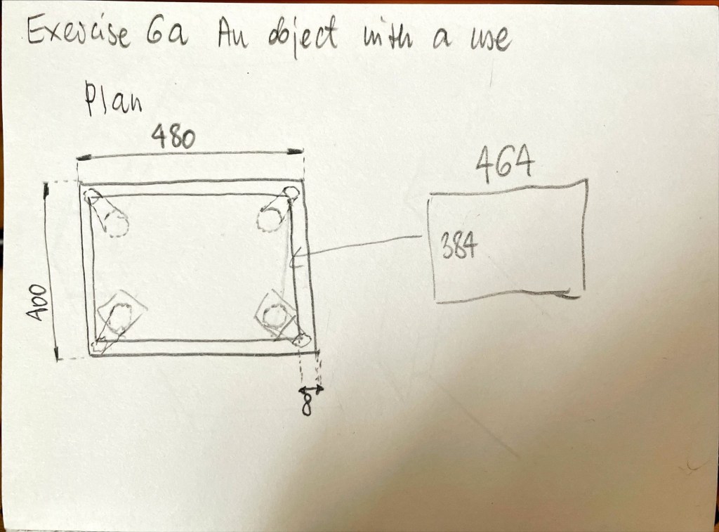
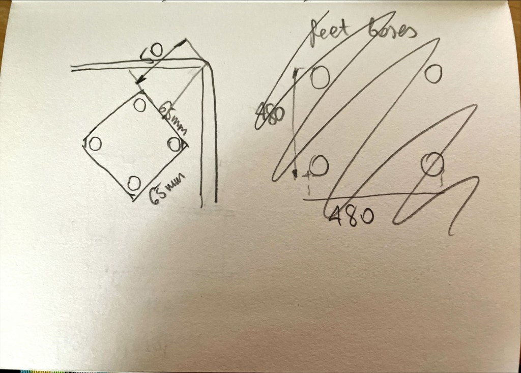
My chosen object is a footstool. It has wooden legs and structure. The seat park is upholstered in grey fabric and foam. The elements are held together with metal screws. The overall dimensions are 480mm long by 400mm wide by 440mm high.
It can be used as a footrest or a seat. In my house it is usually either a footrest or a cat bed.
Reflection:
I decided to make a drawing in CAD, as I felt I needed to practice it some more. Plotting proved difficult again but with some help of online tutorials I got over it. Next exercise should go a little faster as scaling the objects will be at a touch of a button. I enjoyed measuring the object and all its elements. Section was a bit challenging as I don’t actually know what this footstool would look like sliced in half, I had to employ my imagination and use my common sense.
Here is my CAD drawing in PDF, so finer details can be seen.
How do you think ergonomic and anthropometric design, and scale, have been explored in the 2013 project Kroppsrom (Corporeal room) at the National Museum of Architecture by Atelier Oslo? Reflect on your responses to the project in your learning log.
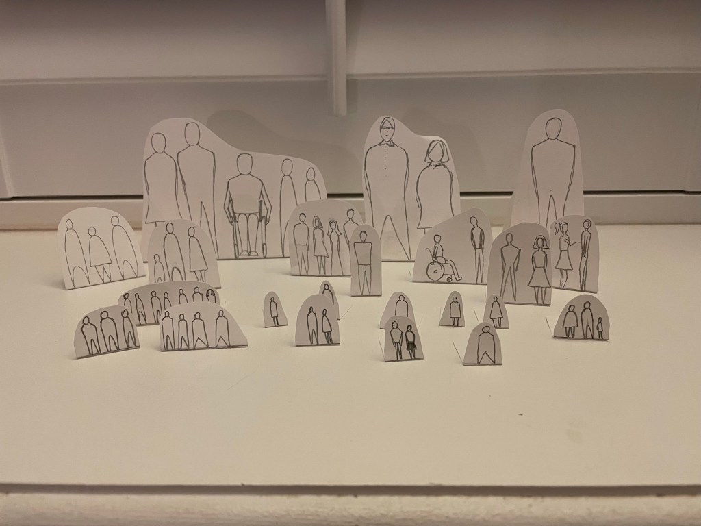
I think the designers explored the anthropometric data of the average human figure and designed the space around them. One of the resources mentioned that the space was supposed to make people move in a way they would not expect, and create the experience through the activity, as well as simple, peaceful and gently lit interior.
I imagine Atelier Oslo drew the human figures as pictured in the data images and made the space flow from one set of dimensions to another and so on. I can sort of see this process in my imagination, but it is quite hard to describe it, but I’ll try anyway. A 3D animation of an opening being created in the solid mass. The solid mass is surrounding (and filling) the human forms being carved out. As the corridors and caverns are created, the human figures remain – they aren’t carved out with the solid mass that they are contained within. As if the figures are in a different layer to the mass. The whole process is smooth and flows easily.
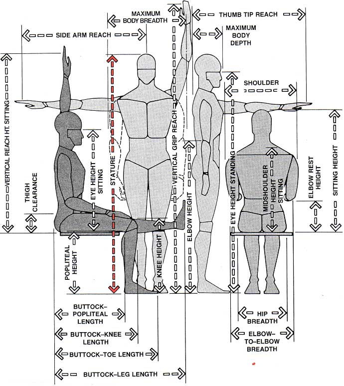
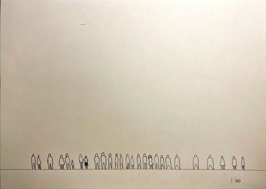
Fig. 1 Body measurements
Considering the process of creation of such an interesting, unusual space is a great activity. I wonder If I am at least a little bit correct in my guessing on how the designers idea started. Thinking about it got my imagination going. I often wonder about hows and whys, it was an enjoyable exercise.
Undertake some research into artists and designers who have challenged and embraced the perception of scale in their work. As a starting point, search online for Sou Fujimoto’s Architecture is Everywhere experiments with scale, or Claes Oldenburg’s giant binoculars. You could also look for food shaped fast-food diners or the Longaberger Company’s basket building in America, or BIG’s Lego House in Denmark.
Document your research in your learning log, and reflect on how they challenge your ideas of scale.
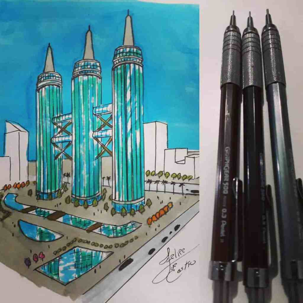
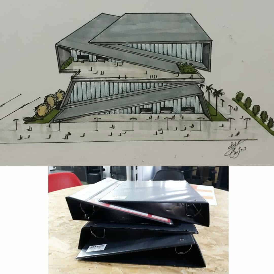
After briefly researching Sou Fujimoto and Claes Oldenburg I stumbled across Felipe De Castro’s work.
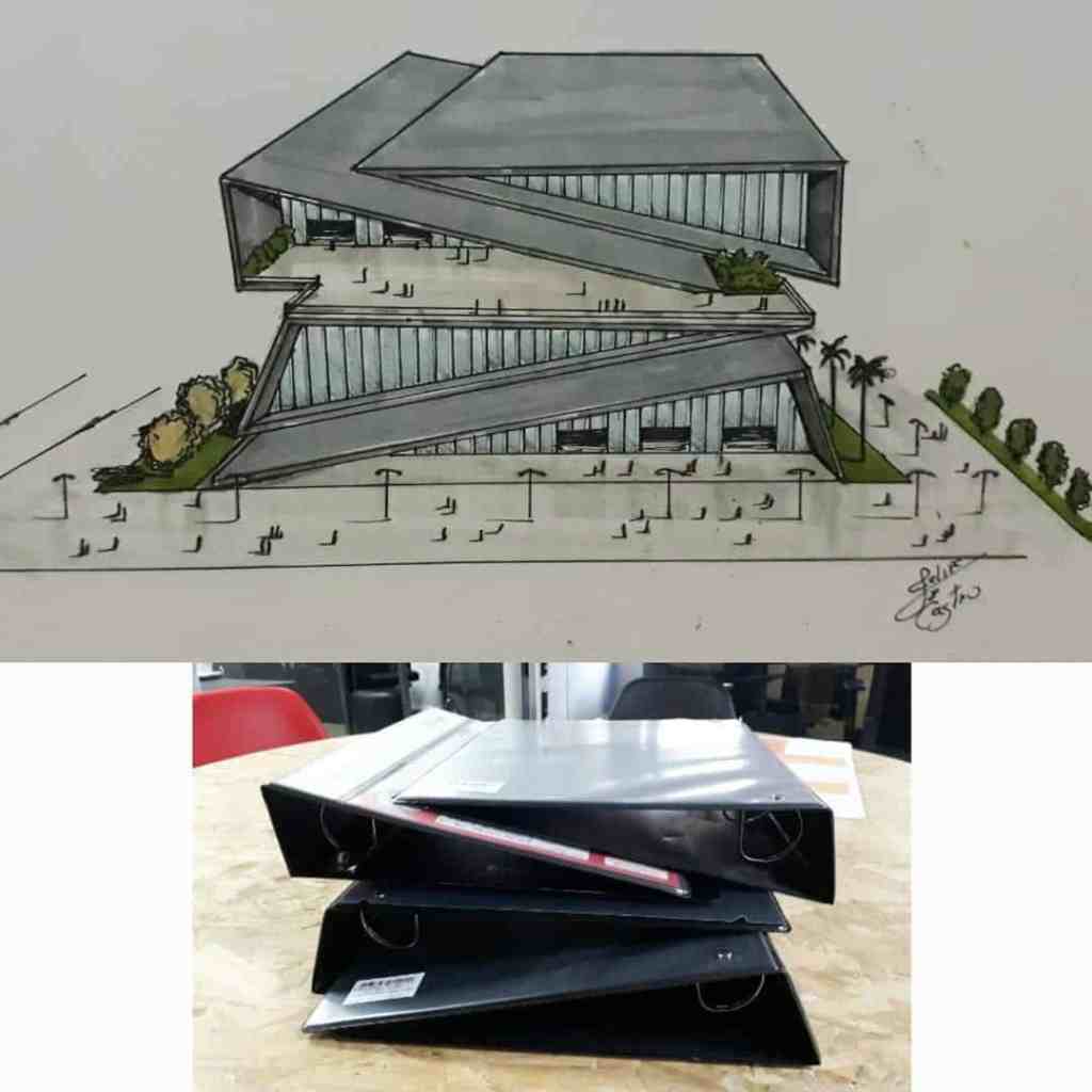
Felipe De Castro is a Brazilian architectural designer who finds inspiration for building designs in everyday objects. In fig. 1 and fig 2. below we can see examples of his work and what objects he based his designs on. Simply brilliant! His Instagram page is full of his unusual ideas fed by usual objects. I simply cannot include too much here but feel free to check it out (Felipe de Castro (@felipedecastro.arq) • Instagram photos and videos )
Fig. 1 Felipe De Castro Automatic Pencil Skyscrapers
Fig. 2 Felipe De Castro Lever Arch Building
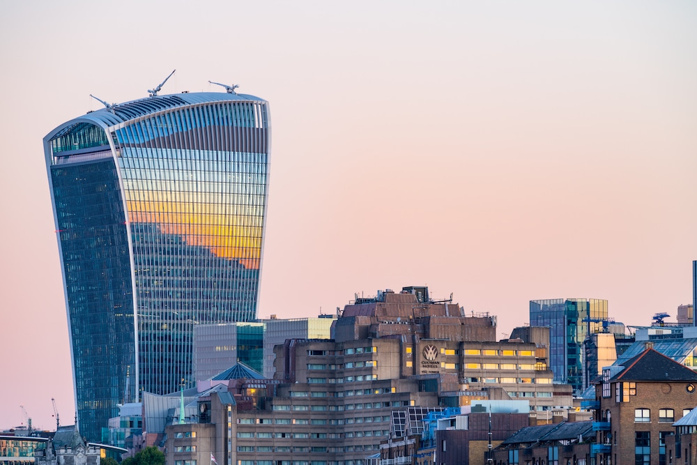
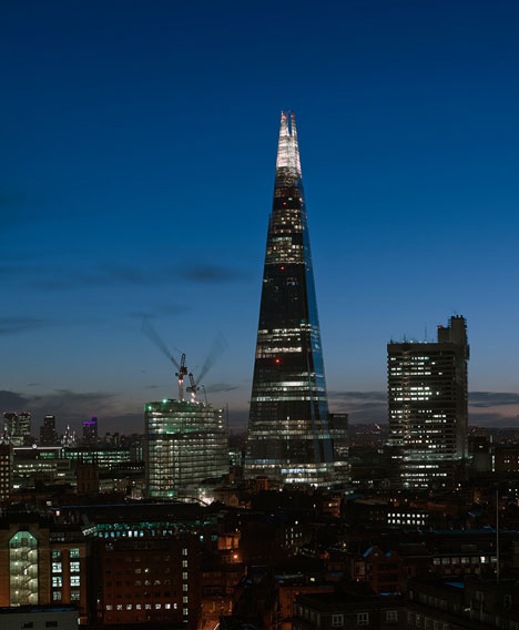
There are several London skyscrapers shaped like everyday objects these include The Walkie Talkie, The Shard, The Gherkin and The Cheese Grater. I wonder if the architects showed the objects to their clients during the sales pitch or whether they mentioned them just in the name.
The Walkie Talkie (20 Fenchurch Street) by Rafael Vinoly became infamous for melting cars (through concentrating reflected sunrays) and it is alleged it creates a strong downright draft. Even though melting problem has been repaired by installing nets on the building it has been awarded the 2015 Carbuncle Cup for Britain ugliest building. I quite like the way it looks, especially the antennas on the roof going with the whole walkie talkie theme. It is unfortunate that not all design shapes can be implemented without causing harm to the surroundings.
Fig. 3 The Walkie Talkie
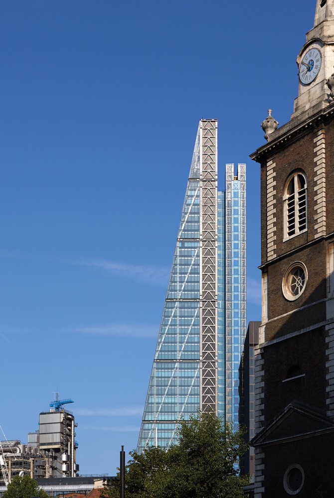
The Shard, reminds me especially of the object it is named after at night, when it is glowing in the night sky. The building has been designed by Renzo Piano and the building was completed in 2012.
Fig. 4 The Shard
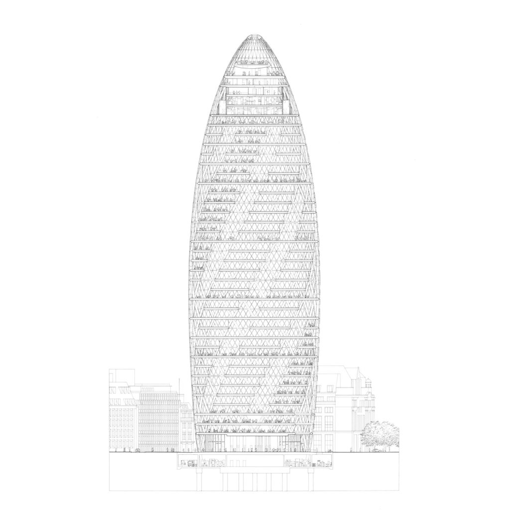
The Gherkin (30 St. Mary Axe) has been designed by Norman Foster and the works finished in 2004.
Fig. 5 30 St Mary Axe Elevation.
The Leadenhall Building has been designed by Roger Strirk Harbour + Partners and works completed in 2014. The building has been nicknamed ‘The Cheesegrater’ as it looks like a giant kitchen tool. At least this one reflects the sunshine upwards, not downwards like the walkie talkie.
Fig. 6 The Leadenhall Building
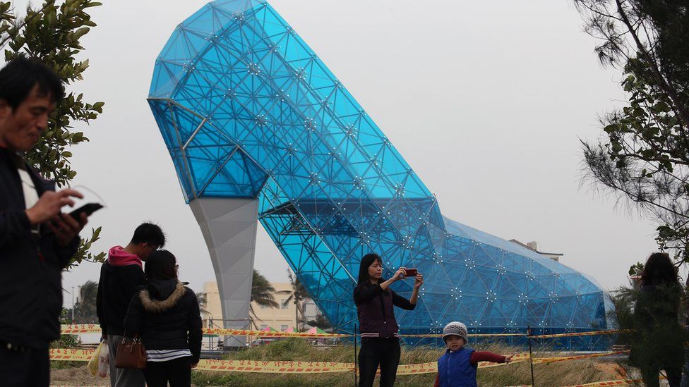
The last piece of my research is a church in Taiwan. It was constructed in 2016. Allegedly its shape is supposed to attract women. It is not supposed to be used for usual mass but for weddings etc. I am not sure how I feel about this building, but there’s something for everyone!
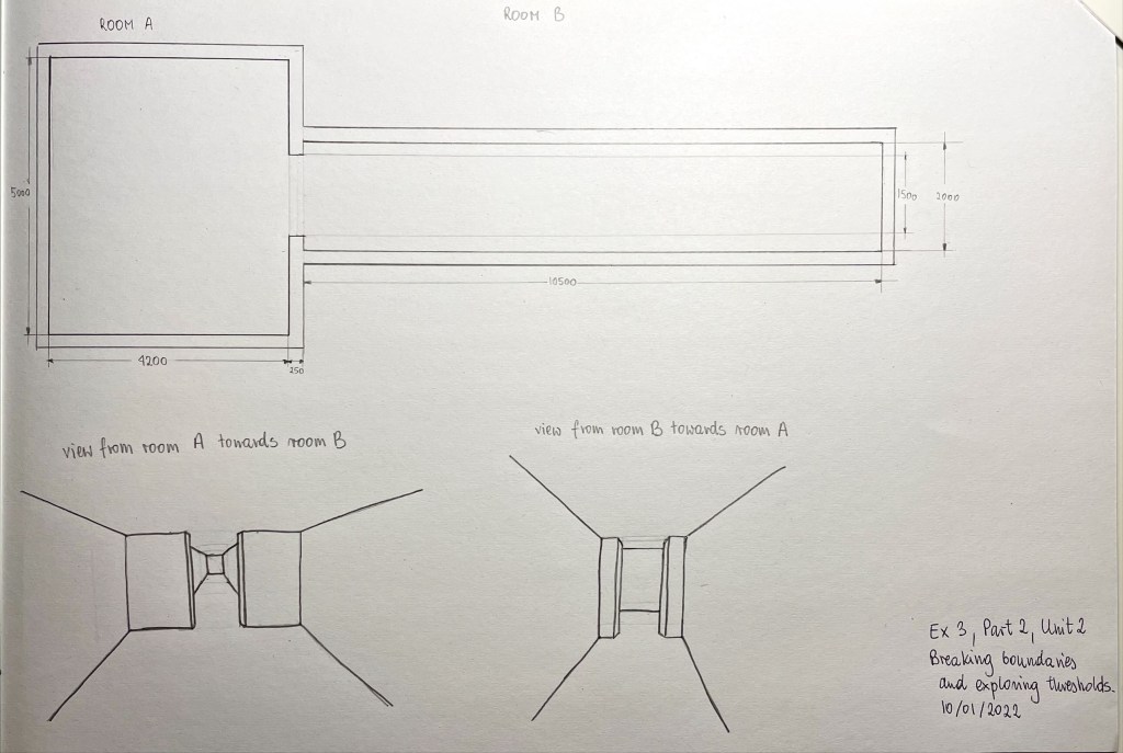
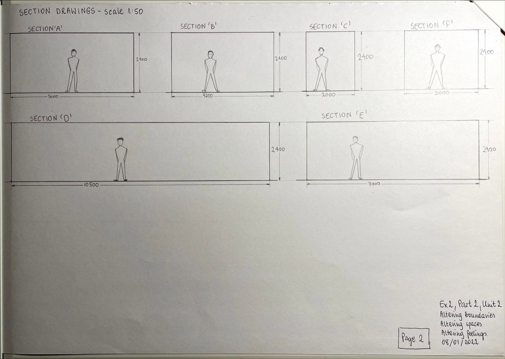
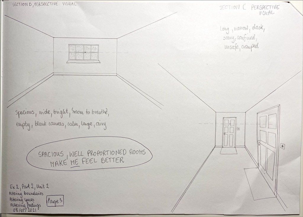
Section B drawing made me feel better than section c. I think this is to do with proportions of the rooms. Room in section C is better proportioned, you can do more in it, section C room could only be used for walking. You can put furniture in, lets say a chair, but you’d either face the wall, making you feel restricted or the long ‘corridor’.
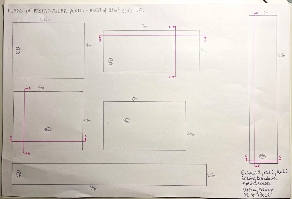
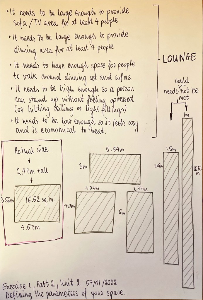
‘If the brief was “design a space with an area of 10m2” which of those plans would you choose? 1m x 10m? 2m x 5m? or 3.33m x 3.33m?’
It really depends on the function of the room.
1m x 10m would only suit a corridor or a hallway, the other two could also be hallways but may be practical to have other rooms in those dimensions.
2m x 5m could be a corridor or a hallway (even with a staircase), bathroom, kitchen or maybe even a really narrow bedroom or a lounge. What it couldn’t be is a family dinning room, it would not fit a dinning set and allow for people to pass around comfortably.
3.33m x 3.33m could be all of these (including the dining room) too but out the 3 options that would be best for the bedroom or kitchen (in my opinion). Just because certain needs for these rooms would be met. Such as – it needs to fit a double bed and have space on both sides.
2m x 5m in my opinion would be best for a nice 4-piece bathroom, there would be space for a large bath, toilet, large shower and a sink. Of course, the layout would depend on other elements of the space, such as positioning of doors and windows, and of course its height. Perhaps each of these spaces could only be used as eaves storage if there wasn’t enough headroom.
3.33m x 3.33m would make a tiny lounge, but with higher ceiling, and hopefully a skylight in it, the room wouldn’t feel too oppressive.
Dimensions on its own are not enough to design the space, windows (and their aspect), doors, existing architectural features all have an impact on design decisions. The space would feel differently if it is a 2m x 5m bedroom or a bathroom. Although on another though that size could be quite nice for a child’s (or a single bedroom), with zoning options despite small size.
Each of these sizes is quite small, 10 sq. m. is not the biggest of rooms. The square one would probably feel nicest, least oppressive, as long as it is not filled up with furniture.
See if you can find other designers and architects who have explored the idea of
Boundary in spatial design.
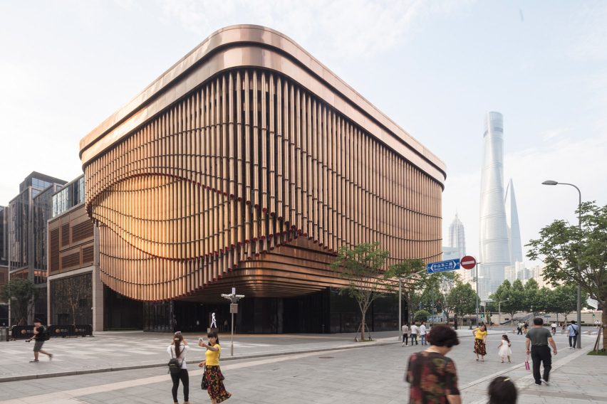
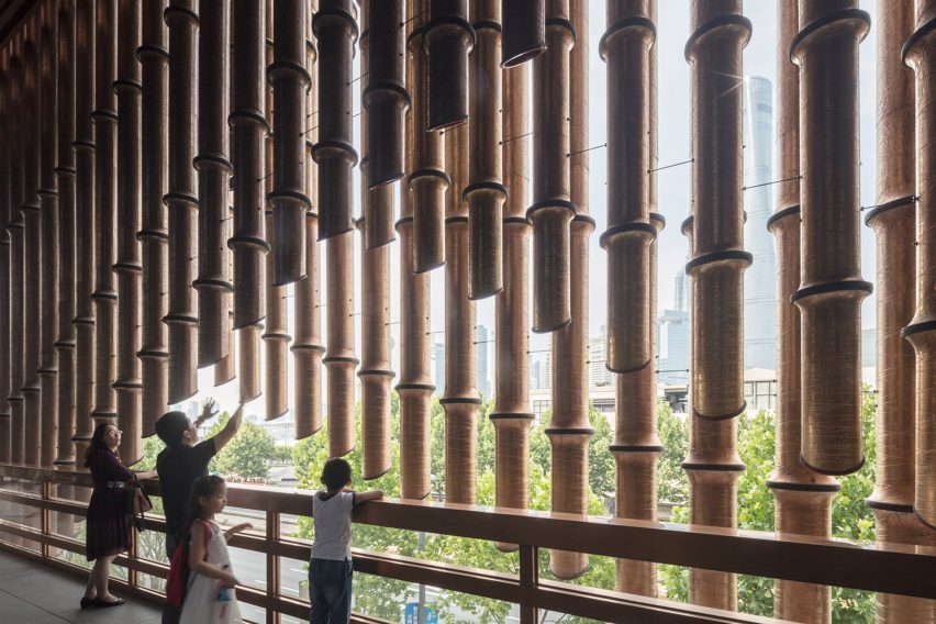
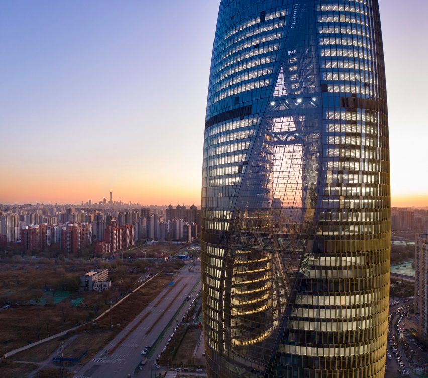
Norman Foster and Thomas Heatherwick. Project: Bund Finance Centre in Shanghai, completed in 2017
The creators of Bund Finance Centre have clearly played with the idea of boundaries in architecture. They created a façade of layered, brass coloured pipes that move in different directions. Behind the curtain is the balcony, which has a moving boundary wall. It must be mesmerising being there, surrounded by this moving, semi open feature. Below is a link to a youtube video, showing timelapse of the Bund Finance Centre in Shanghai.
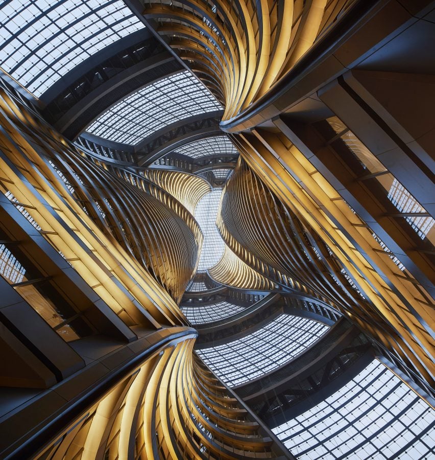
The tower is just over 194m high and the atrium runs through the entire height. The ceiling boundary was literally taken to a new level. The atrium space is fully glazed on its spiralling, swaying sides, making it appear as if it is connecting two separate skyscrapers. The floors inside have different depths and varying shapes, giving the twisting interior appearance of a flow. In this fine example we can see how the idea of internal and external boundaries were explored and pushed to the limits, with massive glass windows and internal boundaries between the atrium and the internal walls and balconies facing it. The interior looks like a skyscraper within a skyscraper, or a skyscraper that split.
Fig. 3 and Fig. 4 Leeza Soho Skyscraper, photographs by Hufton + Crow
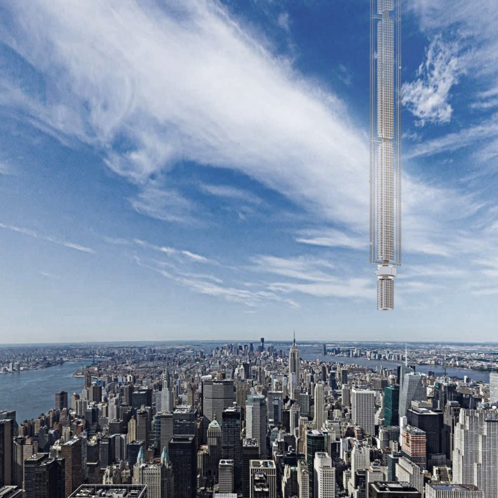
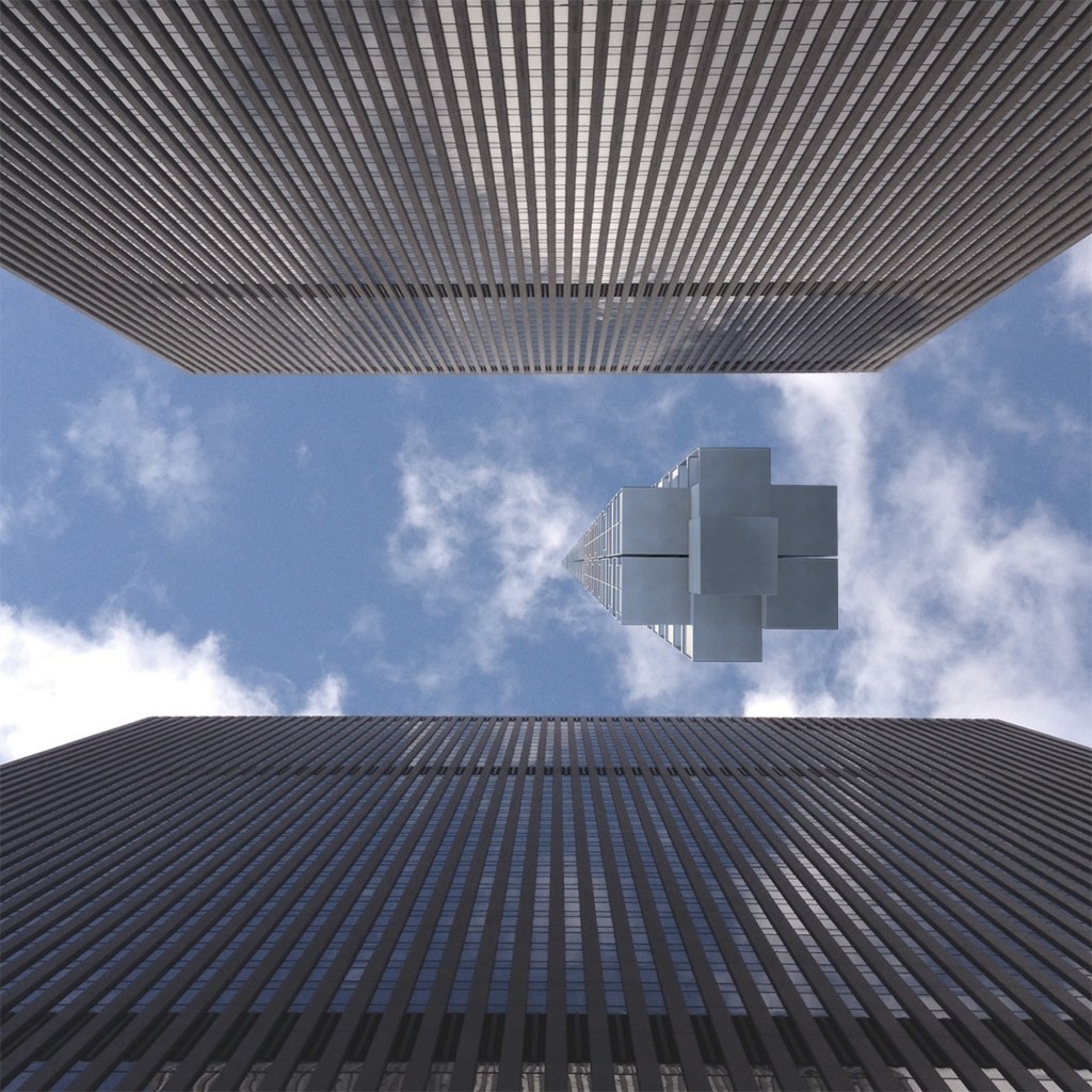
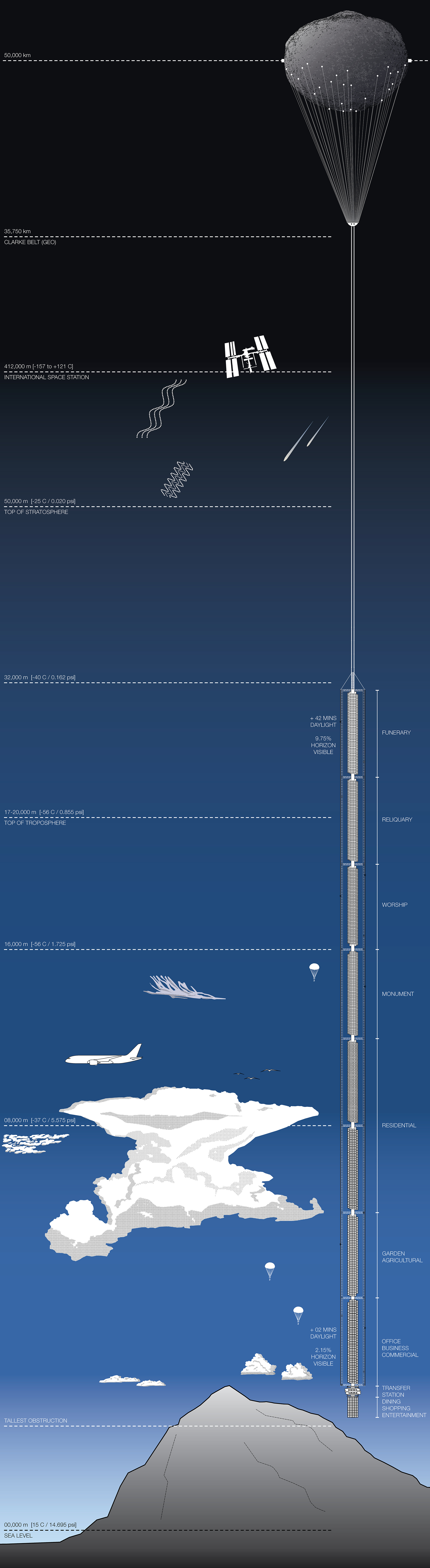
Analemma Tower, Conceptual Design by Clouds Architecture Office.
‘Analemma Tower is a proposal for the world’s tallest building ever. Harnessing the power of planetary design thinking, it taps into the desire for extreme height, seclusion and constant mobility.’ (Clouds Architecture Office, 2021, https://cloudsao.com/ANALEMMA-TOWER)
Proposal, if or when realised will be the tallest building ever with its peak at 32000m above sea level (this is longer than my route to work and back!) The boundary of laws of physics seems to be challenged here. The designers had to consider physics, and think of extreme pressure and temperature outside, for example they considered window designs depending on the level and subsequent atmospheric conditions.
Clouds Architecture seriously defied boundaries with this idea. Ground level line is a crucial part of an elevation or section drawing. Despite that, Analemma Tower is supposed to be suspended off an asteroid, well above ground. Also, location of a skyscraper is normally fixed to one place. Analemma would be following a figure eight trajectory, crossing northern and southern hemispheres, over the same pattern every 24 hours. Perhaps this is the future of building, and the only way to get there is defy boundaries. The tower is set to be self-sufficient, harvesting water from rain and recycling it as much as possible, energy will be provided via solar panels. This is important not only because of sustainability, but also practicality – how else can we deliver water and energy (and I suppose huge amounts of it) to a suspended, moving building? Gravity would be an important aspect of the project planning; it would surely be a very heavy object… Can the ropes supporting it be strong enough? How will people get on and off the tower if it would be in constant motion? The route of the tower would make it slow down on the curved edges, with slowest speed to be above Manhattan in New York. Perhaps platforms moving at exact same speed as the tower would allow ‘passengers’ (residents?) on and off. The varying speed against earth surface is not specified in the project description. How will this building react to extreme weather? Would it sway in strong winds? This is a really exciting proposal, I am curious to see if it will be realised.
Analemma Tower: fig.5 Above Manhattan. Fig. 6 View from street level (visuals by Clouds Architecture Office)
Fig. 7 Analemma tower elevation (drawing by Clouds Architecture Office)


